


css 样式信息
提高团队效率的方法:框架模式——先定义功能,再选择样式;
/*先定义功能   css工具库*/
.red{
  background-color: red;
}
.gray{
  background-color: gray;
}
.green{
  background-color: green;
}
.size1{
  width: 100px;
  height: 100px;
}
.size2{
  width: 200px;
  height: 200px;
}
.size3{
  width: 300px;
  height: 300px;
}
<!--再选择样式-->
<div class="red size1"></div>
<div class="green size2"></div>
<div class="gray size3"></div>
创建css
行间样式、内联样式
在一个元素上应用一次时:
<h1 style="text-align:center;font-size:16px;">一级标题</h1>
内部样式、页面级css
写在<head></head>中
<head>
    <style type="text/css">
        ul{
            boder:1px solid #000;
        }
        li{
            color: #00f;
        }
        ul li{
            background: #ffc;
        }
    </style>
</head>
外部样式表
可应用于多页面,在<head></head>中引入外部样式表
<head>
    <link rel="stylesheet" type="text/css" href="css/demo.css">
</head>
导入式样式表
在头部或者其他css文件中使用
<head>
    <style type="text/css">
        @import url("css/base.css");
    </style>
</head>
样式表优先级
行间 > 内部 > 外部
CSS语法
css语法构成:选择器、属性、值;p{color:#ccc;}
选择器
- 标签选择器
Element:选中所有标签
/*html中的标签直接作为选择器的名称使用*/
p{
    color:#ccc;
}
- 类别选择器
.class(多对多)
<div class="box">box</div>
.box{
    width:100px;
}
- id选择器
#id(一对一)
<div id="box1">box1</div>
#box1{
    width:100px;
}
- 属性选择器
[attr]
<div id="only">box1</div>
<div id="only2" >box2</div>
[id]{ /*有id属性就行,不在乎值是什么*/
    background-color:red;
}
[id="only"]{ /*id属性为"only"才会被选中*/
    background-color:green;
}
- 后代选择器-
空格(选中里面所有的元素)
<div>
    <em>1</em>
    <strong>
        <em>2</em>
    </strong>
</div>
div em{/*会选中<em>1</em>和<em>2</em>*/
    font-size:14px;
}
- 直接子元素选择器
>
<div>
    <em>1</em>
    <strong>
        <em>2</em>
    </strong>
    <em>3</em>
</div>
div > em{/*只会选中<em>1</em>*/
    font-size:14px;
}
- 交集选择器
第1个是标签选择器,第2个是id或者类别选择器,两个选择器之间连续书写
<p id="box2">id</p>
<p class="box">class</p>
p#box2{
    background:#fcc;
}
p.box{
    width:100px;
}
- 并集选择器
h1,
h2,
h3,
h4,
h5,
h6{
    font-size:14px;
}
- 伪类选择器
a:hover{
    background-color:orange;
}
- 通配符
*
所有标签包括html、head、body
*{
    padding:0;
    margin:0;
}
CSS权重
权重大的选择器优先级高
| 选择器 | 权重 |
|---|---|
| !improtant | infinity(正无穷) |
| 行间样式 | 1000 |
| id | 100 |
| class/属性/伪类 | 10 |
| 标签/伪元素 | 1 |
| 通配符 | 0 |
注意:权重的计算是256进制的;infinity+1>infinity;
CSS文字样式
font-weight:文字粗细lighter细normal正常显示 = 400bold加粗 = 700bolder更粗400px数字表示粗细
有些字体在设计的时候,只设计了
normal和bold的样式,其他的样式没有设计,所有有些属性设置了字体也没有变化
font-style:定义字体风格normal默认标准字体italic倾斜的字体oblique倾斜的字体
font-size:设置文字大小(可以理解为设置的是文字高度)font-family:设置字体arial:常用的英文字体,乔布斯发明的"SimSun": 宋体"SimHei":黑体"Microsoft YaHei":微软雅黑- 还有一种用asc码表示字体的形式,如’宋体’:
'\5b8b\4f53'
font: 12px/1.5 tahoma, arial, 'Hiragino Sans GB', '\5b8b\4f53', sans-serif;
p{
    font-size:24px;
        line-height:45px;
        font-family:"Microsoft YaHei";
}

p{/* 与上面相同的效果*/
    font:24px/46px "Microsoft YaHei";
}
color:设置字体颜色- 纯英文单词:
red,green - 颜色代码:每两位代表一种颜色,取值范围00-ff;每两位都一样可缩写:
#ff0044->#f40淘宝红 - 颜色函数:
rgb(255,255,0);
- 纯英文单词:
line-height:行高(多用于文字居中)normal;像素(50px)固定值数字(1.32)相对值1.32(微软雅黑)、1.41(宋体)百分数(200%)相对值1.5em相对值1.5rem相对值,相对根元素
一般用数字作为相对值,子元素会继承这个值1.32,而百分比、em继承的是计算后的像素值;
-
text-indent:2em;首行缩进2个字的位置 -
text-decoration文字修饰none去掉文字修饰underline下划线line-through删除线overline上划线
-
text-align: 文本对齐left左对齐right右对齐center居中对齐justify两端对齐
p{
    text-align:justify;
    text-justify:inter-ideogragh;/*强制对齐*/
}
- vertical-align: 调垂直对齐
- middle; 居中对齐
像素上下调整多少像素
一般的行内元素的垂直对齐方式是底对齐
如果行级块元素中有图片,后面的文字和里面的图片的底边对齐;
如果行级块元素中有文字,后面的文字和里面的文字底对齐;


cursor: 光标(鼠标移上时光标变化)pointer小手help小问号?e-resize双箭头w-resize双箭头copy小加号+move四箭头
white-space:如何处理元素内的空白normal默认,空白被忽略pre空白会保存nowrap在一行显示文本
单行文本显示,溢出隐藏后加省略号:
p{
  white-space:nowrap;
  overflow: hidden;
  text-overflow: ellipsis;
}
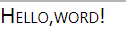
letter-spacing:字符间距 (所有字符之间都有间距)word-spacing: 单词间距 (只有单词之间有间距)font-variant设置小型大写字母nomal默认标准字体small-caps小型大写
<p>Hello,word!</p>

p{
  font-variant: small-caps;
}
direction: 文字方向ltr从左到右(默认)rtl从右到左
text-transform控制文字的大小写none默认标准文本capitalize首字母大写uppercase大写lowercase小
<p>Hello,word!</p>
p{
  text-transform: capitalize;
}
/* Hello,Word! */
p{
  text-transform: uppercase;
}
/* HELLO,WORD! */

p{
  text-transform: lowercase;
}
/* hello,word! */
a链接
a:link: 默认样式a:visited: 设置点击后链接样式a:hover: 设置鼠标悬停时链接样式a:active:设置点击时链接样式
注意:设置导航连文字的内边距(
padding)时,在<a>中设置,这样以后设置鼠标滑过、点击效果时,可以整体控制,若设在<li>上,则不能控制前面的空白位置。
盒子模型
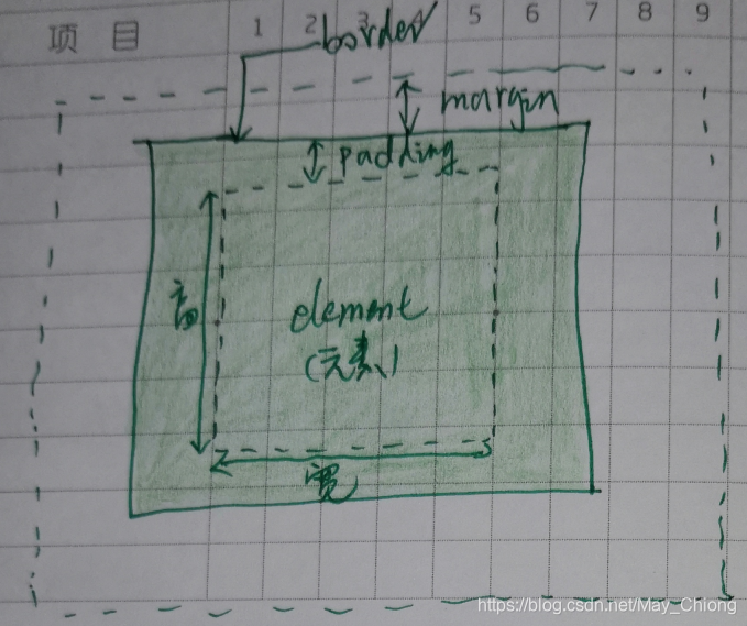
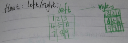
- 盒模型计算——求可视区大小(真正宽高):border + padding + width/height
- padding、margin、border的参数:(值可为负数)
- 1个值:四周相同;
- 2个值: 上下、左右;
- 3个值:上、左右、下;
- 4个值:上top、右right、下bottom、左left;(顺时针)
margin 的常见bug
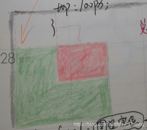
margin塌陷:
父子元素,垂直方向上的margin-top取最大的值;如:
- 父级:margin-top:100px; 子级:margin-top:80px;(不动 );
- 父级:margin-top:100px; 子级:margin-top:120px;(子级margin-top>100px才动 )
修复:触发一个盒子的bfc(block format contest)
position:absolute;display:inline-block;float:left/right;overflow:hidden;
margin合并:
垂直结构的兄弟元素,margin合并(没有累加),如:
<div class="demo1"></div>
<div class="demo2"></div>
/*demo1与demo2之间的距离为200px,没有累加*/
.demo1{
    margin-bottom:200px;
}
.demo2{
    margin-top:100px;
}


/*通过数学方法解决 不设 margin-bottom,只设margin-top:300px;*/
.demo1{
    margin-bottom:200px;
}
.demo2{
    margin-top:300px;
}
边框样式
border-width:边框粗细border-style:边框类型solid实线dotted点状(小方块)虚线dashed条状虚线
border-color:边框颜色border-left-color:半边边框的颜色border:10px solid black;组合属性
<div>
    <em></em>
</div>
div em{
    border-width: 10px;
    border-style: solid;
    border-color: black;
    border-left-color: red;
    border-top-color: green;
    border-right-color: #00f;
    display: block;
    height: 0;
    width: 0;
}

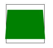
- 例子:山顶角

/*向上的三角*/
.sj1{
	display: block;
	overflow: hidden;
	width: 0;
   	height: 0;
   	border: 8px solid transparent;
   	border-bottom-color: #000;
}
定位 position
relative 相对定位(新的图层)
- 相对于原来的位置进行定位
- 保留原来位置进行定位 (原来位置还在,不能用)
<div class="red"></div>
<div class="green"></div>
.red{
    width:100px;
    height:100px;
    background:red;
    position:reltive;
}
.green{
    width:300px;
    height:300px;
    background:green;
}
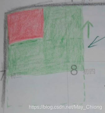
absolute 绝对定位(新的图层)
- 脱离原来位置进行定位(原来位置不在了,可占用)
- 相对于最近有定位的父级(position:relative;)进行定位,如果没有;那么相对于文档进行定位。
<div class="red"></div>
<div class="green"></div>
.red{
    width:100px;
    height:100px;
    background:red;
    position:absolute;
}
.green{
    width:300px;
    height:300px;
    background:green;
}
fixed 固定定位
- 原来位置不保留
- 固定在浏览器不动,一般用于侧边广告
div {
    position:fixed;
    left:0px;
    top:300px;
}
z-index:1;只在position元素上好用,设置定位元素在第几层默认0,越大越靠近我们
元素在浏览器居中
- position 方式
position:absolute;相对于文档居中、fixed;相对于可视窗口居中;- left:50%;
- top:50%;
- margin-top:-width/2;
- margin-left:-height/2;
例:写出五环,并让五环在可视窗口中永远居中
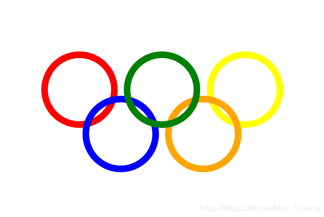
<div class="plat">
    <div class="circle1"></div>
    <div class="circle2"></div>
    <div class="circle3"></div>
    <div class="circle4"></div>
    <div class="circle5"></div>
</div>
.plat {
  width: 380px;
  height: 186px;
  position: absolute;
  /*父级也要定位就不用relative了*/
  left:50%;
  top:50%;
  margin-top: -93px;
  margin-left: -190px;
}

.circle1,
.circle2,
.circle3,
.circle4,
.circle5 {
    width: 100px;
    height: 100px;
    border:10px solid black;
    border-radius: 50%;
    position: absolute;
}
.circle1{
    border-color: red;
    left: 0px;
    top:0px;
}
.circle2{
    border-color: green;
    left: 130px;
    top:0px;
    z-index: 1;
}
.circle3{
    border-color: yellow;
    left: 260px;
    top:0px;
}
.circle4{
    border-color: blue;
    left: 65px;
    top:70px;
}
.circle5{
    border-color: orange;
    left: 195px;
    top:70px;
}
- 垂直居中对齐
/*单元格*/
display:table-cell;
vertical-align:middle;
/*弹性盒模型  IE10+*/
display:flex;
justify-content:space-around;
align-items:center;
例:两栏布局
<div class="right"></div>
<div class="left"></div>
<!--  right在前,顺序不可调 -->
.right {
    position: absolute;
    right: 0;
    width: 100px;
    height: 100px;
    background-color: #fcc;
}
.left {
    margin-right: 100px;
    height: 100px;
    background-color: #123;
}
浮动float
- left
- right
- none
- 谁浮动谁脱离普通流,其他普通流认为它不存在
- 所有产生了浮动流的元素,块级元素看不到他们,而产生了bfc的元素和文本类属性(inline)的元素(文字和图片)以及文本都能看到浮动元素;
- 浮动完要清除浮动,在最后一个浮动元素的后面,清除浮动;不然浮动的位置会被后面的内容补上;
- 元素设置了定位(position:absolute/relative)、浮动(float:left/right)会打内部把元素转换成inline-block;
- 要浮动都浮动,要不浮动都不浮动
- 浮动和宽度有关,最好不要给高
清除浮动
能清除浮动的必须是块级元素
.clearfix:after{ /*clearfix类名加在浮动元素的父级*/
  content: '';
  display: block;
  clear: both;
}
选项卡中的标题元素,不用浮动,可以都转化为行内块元素:
<p>
    <a href="#">1</a>
    <a href="#">2</a>
    <a href="#">3</a>
</p>
p a{
    display:inline-block;
}
伪元素
<sapn>桃子</span>
span::before{
    content:"Hi,";
    /*其他正常样式*/
    font-size:12px;
    color:#f40;
}
span::after{
    content:"你好!";
    /*其他正常样式*/
    font-size:12px;
}
/* Hi,桃子你好!*/
背景图样式
background-image: url(../images/border.png);background-size:100px 100px;background-position:(水平位置)左右 (垂直位置)上下; (默认左上)background-repeat:是否重复no-repeat不重复repeat-x水平平铺repeat-y垂直平铺repeat水平垂直平铺
background-attachment:是否固定或者随页面移动fixed固定scroll滚动(默认)
p{
    background-color: #ccc;
    background-image: url(../images/border.png);
    background-repeat: no-repeat;
    background-position: 22px center;
    background-attachment: fixed;
 }
 p{
    background:#ccc url(../images/border.png) no-repeat 22px center fixed;
    /* 只显示一次不平铺 左 居中*/
}
- 铺多个背景(高版本支持):
background:url(../images/border1.png) no-repeat,url(../images/border2.png) no-repeat,url(../images/border3.png) no-repeat;
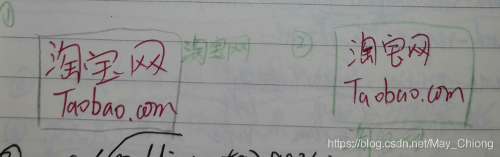
例:图片代替文字怎么做?
有网时显示图片,没网时显示文字
<a href="http://www.taobao.com" target="_blank">淘宝网</a>
- text-indent方法
a{
  display: inline-block;
  width: 190px;
  height: 90px;
  color: #424242;
  background-image: url(../images/border.png) center no-repeat;
  background-size: 190px 90px;
  text-indent: 200px;
  white-space: nowrap;
  overflow: hidden;
}
- padding-top方法
a{
  display: inline-block;
  width: 190px;
  height: 0px;
  padding-top: 90px;
  color: #424242;
  background-image: url(../images/border.png)center no-repeat;
  background-size: 190px 90px;
  overflow: hidden;
}
- img的alt属性
<h1><a href="#"><img src="images/logo.png" alt="淘宝网"></a></h1>
渐变
兼容IE10以上
inear-gradient(to top/right(方向), orange(开始颜色), green(结束颜色));线性渐变radial-gradient(300px 130px at center center,red,#fff,green);径向渐变- 兼容IE:
filter滤镜函数 (GradientType=1表示水平方向,从左到右;=0表示垂直方向,从上到下)
filter:progid:DXImageTransform.Microsoft.gradient(startColorstr='#ffff9000',endColorstr='#ffff5000',GradientType=1);
动画
animation:sky(动画名) 50s(时间) ease-out(以慢速结束) infinite(无限循环);- 兼容: -webkit- 、-ms- 、-moz- 、-o-
div{
  width: 100px;
  height: 100px;
  animation:sky 50s ease-out infinite;
  transform: translate3d(0,0,0);
}
@keyframes sky{ /*规定动画行动样式*/
  0%{background: #007fd5;}
  50%{background: #000;}
  100%{background: #007fd5;}
}
<div class="father">
    <div class="son"></div>
</div>
.father{
  width: 100px;
  height: 100px;
  border: 1px solid black;
  transform-style: preserve-3d;  /* 动画*/
  perspective: 600px;    /* 景深*/
  perspective-origin: top;  /* 视角*/
}
.son{
  width: 100px;
  height: 100px;
  background: green;
  transform: rotateX(45deg);   /* 角度*/
  transition-delay: 100ms;  /*延时*/
}


 扫一扫
扫一扫


 917
917

 被折叠的 条评论
为什么被折叠?
被折叠的 条评论
为什么被折叠?
 到【灌水乐园】发言


