


 本文详细介绍了使用Vue进行京东金融首页的实战过程,包括需求分析、组件设计与实现。涉及组件如头部、轮播图、新手特权、极速借贷等模块的创建,以及路由设计。同时,文中提到了vue-awesome-swiper插件用于实现轮播图,还讨论了自适应布局的实现策略,如引入hotcss.js并配置webpack。
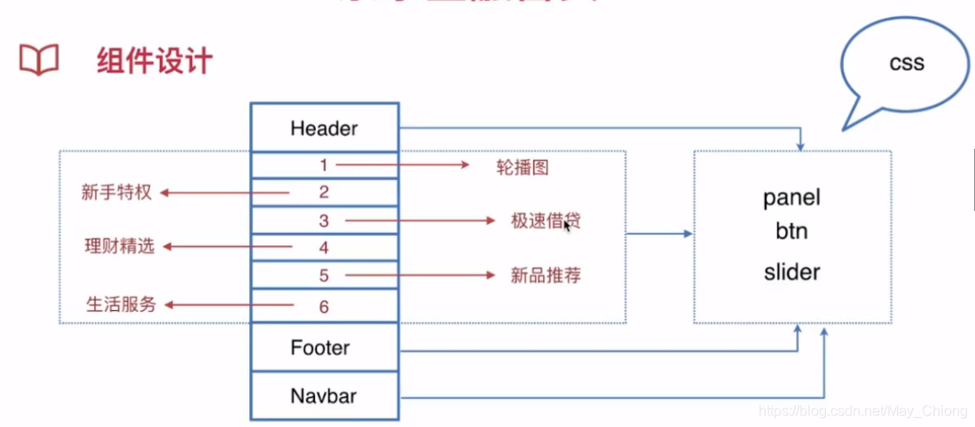
需求分析
头部、轮播图、新手特权、极速借贷、理财精选、新品推荐、生活服务、在线客服、公司介绍、导航条

一定要先思考,先做架构:
组件设计
分析组件该怎么设计?
创建三个组件的文件:
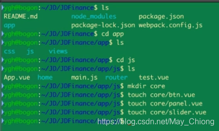
core/btn.vue
<template lang="html">
    <div :class="[btnClass,cname]">//btnClass默认名字,cname传进来的名字
        <slot/>
    </div>
</template>

<script>
export default {


    props: {


        cname: {


            type: String,
            default: "",
        },
    },
    data() {


        return {


            btnClass: "btn",
        }
    },
}
</script>

<style lang="scss">
@import "../../css/element.scss";
.btn{


  @include btn;
}
</style>
实现
core/panel.vue
<template lang="html">
    <section :class="[panelClass,cname]"> //panelClass默认名字,cname传进来的名字
        <h4>-{

   {

    title }}-</h4>
        <slot/>
    </section>
</template>

<script>
export default {


    props: {


        cname: {


            type: String,
            default: "",
        },
        title: {


            type: String,
            default: "",
        },
    },
    data() {


        return {


            panelClass: "panel",
        }
    },
}
</script>

<style lang="scss">
  @import "../../css/element.scss";
  .panel{


    @include panel;
  }
</style>
轮播图组件使用插件:vue-awesome-swiper
安装:npm i vue-awesome-swiper
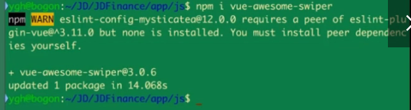
查看装好没有:

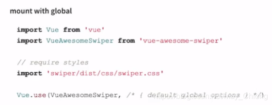
引入:
core/slider.vue
<template lang="html">
    <section :class="cname">//自定义类名,修改样式
        <swiper :options="options" :not-next-tick="options.notNextTick">
            <swiper-slide v-for="item in items" :key="item.href">
                <router-link :to="{ name: item.href}">
                    <img :src="item.src" alt="">
                </router-link>
            </swiper-slide>
            //options.pagination判断是否显示
            <div class="swiper-pagination" v-if="options.pagination" slot="pagination"/>
        </swiper>
    </section>
</template>

<script>
import {

    swiper, swiperSlide } from "vue-awesome-swiper"
export default {


    components: {


        swiper,
        swiperSlide,
    },
    props: {


        cname: {


            type: String,
            default: "",
        },
        options: {


            type: Object,
            default() {


                return {


                    autoplay: true,
                    loop: true,
                    pagination: {


                        el: ".swiper-pagination",
                    },
                    notNextTick: false,
                }
            },
        },
        items: {


            type: Array,
            default() {


                return []
            },
        },
    },
}
</script>

<style lang="css">
  @import "~swiper/dist/css/swiper.css";
</style>
头部
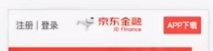
public/header.vue
<template lang="html">
<div :class="$style.header">
<span :class="$style.left">
<em>注册</em> | <em>登录</em>
</span>
<btn :class="$style.btnDownload">APP下载</btn>
</div>
</template>
<script>
import btn from "../core/btn.vue"
export default {
components: {
btn,
},
}
</script>
<style lang="scss" module>
.header{
color: #666;
height: 100px;
line-height: 100px;
position: fixed;
top: 0;
left: 0;
right: 0;
font-size: 32p;
background: #fff url(//m.jr.jd.com/spe/qyy/main/images/jr-logo.png) center center no-repeat;
background-size: auto 50%;
z-index: 100;
.left{
font-size: 28px;
height: 30px;
line-height: 30px;
margin: 17px 0 0 18px;
}
.btnDownload{
float: right;
font-size: 24px;
border-width: 0;
height: 56px;
line-height: 56px;
min-width: 120px;
padding: 0;
border-radius: 4px;
margin: 28px 24px 0 0;
}
}
</style>
home/index.vue
<template lang="html">
    <div>
        <Heador/>
    </div>
</template>

<script>
import Heador from "../public/header.vue"
export default {


    components: {


        Heador
    },
}
</script>
在router/index.js中引入reset样式
import "../../css/reset.scss"
新建个viewport.js文件,把hotcss.js中的代码复制进去,引入自适应代码:
https://github.com/imochen/hotcss/blob/master/src/hotcss.js
然后,在webpack配置文件中,把viewport.js加入->入口文件中
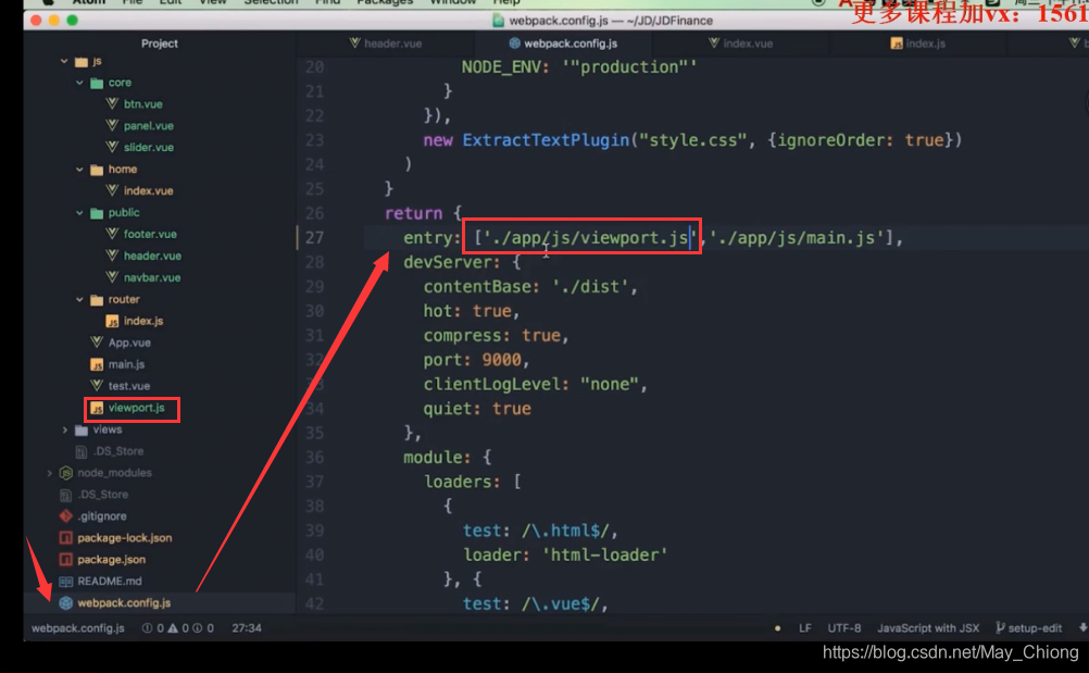
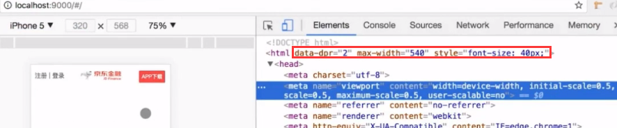
html标签中加入了下面的属性就说明引入成功了:
slider部分和下面的菜单部分

home/hslider.vue
<template lang="html">
    <article class="">
        <Slider :items="items" :cname="$style.slider"/>
        <section :class="$style.list">
            <div :class="$style.item" v-for="item in enters" :key=
最低0.47元/天 解锁文章


 扫一扫
扫一扫


 5864
5864

 被折叠的 条评论
为什么被折叠?
被折叠的 条评论
为什么被折叠?
 到【灌水乐园】发言


