


前言
知识来自大语言模型,我主要做个总结。
箱线图的定义
箱线图(Box Plot,也称为盒须图)是一种统计图形,用于显示数据分布的集中趋势、离散程度和异常值情况。它广泛应用于数据分析、统计学、机器学习的可视化工作中。
简而言之,箱线图就是用一个箱子和两条胡须,绘制一组数据的中位数、四分位数、最大最小值和异常值。
下面一张图比较清晰地展示了箱线图中特殊的标志:

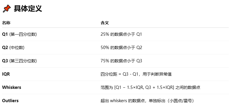
注意,箱线图的两个胡须的边界点,在所有数据都在Whiskers之间时,就是具体的最大、最小数据值;否则,边界点就是Whisker的值,然后用小圆圈表示Whisker之外的异常值。
箱线图的应用
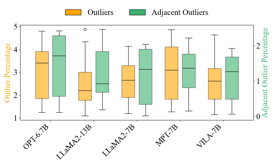
箱线图的绘制示例
我这里是并列画了两组箱线图,代码如下:
"""
绘制箱线图。
参考原图来自论文MicorScopiQ (ISCA 2025)的Figure 2.
"""

import matplotlib.pyplot as plt
import numpy as np
plt.rcParams.update({'font.size': 20, 'font.family': 'Times New Roman'})  # 统一设置字体

# 模拟数据
models = ['OPT-6.7B', 'LLaMA2-13B', 'LLaMA2-7B', 'MPT-7B', 'VILA-7B']
n_models = len(models)
n_samples = 10

np.random.seed(42)
outliers = [np.random.uniform(1, 5, n_samples) for _ in range(n_models)]
adj_outliers = [np.random.uniform(0.0, 2.5, n_samples) for _ in range(n_models)]

# 箱线图的位置
x = np.arange(n_models)
width = 0.3

fig, ax1 = plt.subplots(figsize=(10, 6))
ax2 = ax1.twinx()

# 绘制箱线图(左轴:Outliers)
bp1 = ax1.boxplot(outliers, positions=x - width/2-0.05, widths=width,
                  patch_artist=True, boxprops=dict(facecolor='orange', alpha=0.6),
                  medianprops=dict(color='black'))

# 绘制箱线图(右轴:Adjacent Outliers)
bp2 = ax2.boxplot(adj_outliers, positions=x + width/2+0.05, widths=width,
                  patch_artist=True, boxprops=dict(facecolor='mediumseagreen', alpha=0.6),
                  medianprops=dict(color='black'))

# 设置坐标轴
ax1.set_xticks(x)
ax1.set_xticklabels(models, rotation=45, ha='right')
ax1.set_ylabel("Outlier Percentage", color='orange')
ax2.set_ylabel("Adjacent Outlier Percentage", color='mediumseagreen')

# 图例
from matplotlib.patches import Patch
legend_elements = [
    Patch(facecolor='orange', edgecolor='black', label='Outliers'),
    Patch(facecolor='mediumseagreen', edgecolor='black', label='Adjacent Outliers')
]
ax1.legend(handles=legend_elements, loc='lower center', bbox_to_anchor=(0.5, 1.01), ncol=2, frameon=False)

plt.tight_layout()
plt.show()
绘制效果如下:


 1万+
1万+

 被折叠的 条评论
为什么被折叠?
被折叠的 条评论
为什么被折叠?
 到【灌水乐园】发言


