This chapter focuses on advanced self-service analytics. Self-service analytics can be seen as a form of business intelligence, where people in a business are encouraged to execute queries on datasets themselves, instead of placing requests for queries in a backlog[ˈbæklɔːɡ]积压的工作 with an IT team. Then, query analysis can be done, which should lead to more insights and data-driven decision-making. But how do you start creating useful self-service dashboards if it's your first time doing so? How do you go from a dataset to a product? Have you ever asked yourself how other people start working on a dashboard, how they clean data, and how they come up with a dashboard design? If so, this is the right chapter for you! I want to share three use cases with you, written as a train of thought in order to give you an idea about how I work. Please note that this is just my personal experience; there are many different ways that can lead you to your goal.
We will cover the following topics:
- • Visualizing world indices correlations
- • Geo-spatial analytics地理空间分析 with Chicago traffic violations
- • Extending geo-spatial analytics with distance measures
Now that we have had this introduction, we are good to go and can start with the first use case.
Visualizing world indices correlations
Imagine you are working on the world indices dataset and your line manager(https://www.thebalancecareers.com/role-and-challenges-of-a-line-manager-2275752) gives you the following task:
Create a dashboard for me in which I can easily spot all correlated world indices and their distribution. I need it by tomorrow morning.
Now, take a few minutes before you continue reading and think about how you would tackle this task. The dataset contains 67 columns with various indices, like birth registrations or emission values, exports and imports, and forest areas, divided into 188 rows, where each row represents one country.
Write down your planned steps, open the workbook related to this chapter from https://public.tableau.com/profile/marleen.meier , and follow your steps; time it in order to get a better feel for time estimates when working with Tableau. This way, you can make sure that you can deliver on time and manage expectations if you are ever asked how long it will take to build a certain dashboard.
Plotting a scattergraph
- 1. First, I open the world-indices file in Tableau Prep Builder in order to get more details on the dataset itself; this will help us to describe the data but also to spot obvious data flaws like null values, duplicate entries, and so on:
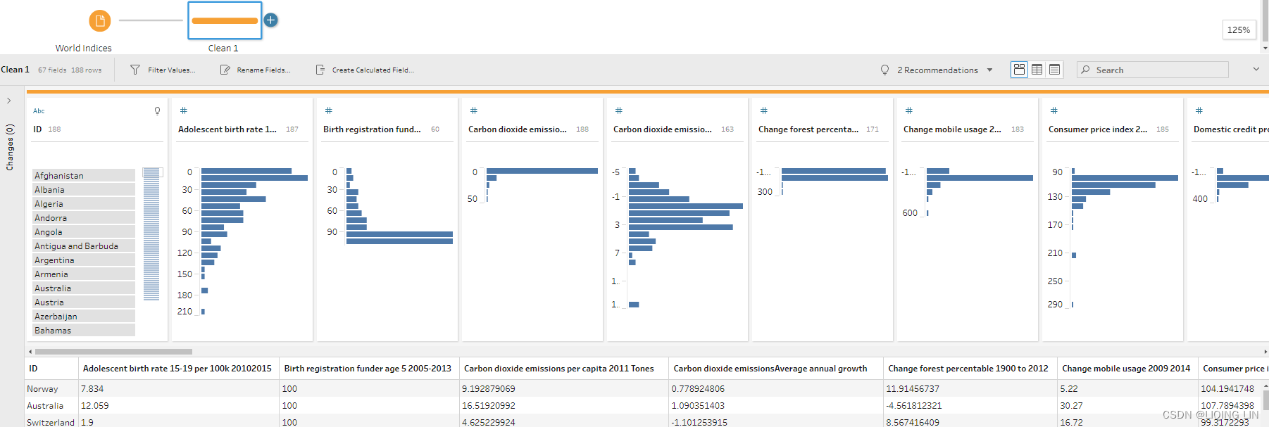
With this dataset, I actually didn't spot any obvious data quality issues in Prep Builder, nor a need to further prepare the data. It's 1 row per country—which you can see in the evenly distributed bars in the ID column—and 65 columns except Number of Records columnfor the different indices per country(188 IDs and the records of other columns will not exceed 188 rows and each ID only has 1 Record ). Since no data preparation is needed, I decide to continue directly with Tableau Desktop. I close Tableau Prep Builder and open Tableau Desktop.
- 2. My next thought is, how can I visualize all correlations at once, yet not have it be too much information? I do have 65 different columns, which makes for 4,225(=65*65) possible combinations.
(similar to https://blog.youkuaiyun.com/Linli522362242/article/details/111307026)
No, I decide that displaying everything won't work. The task is very generic; therefore, I decide to go for a two-parameter approach, which will enable my end user to select each of the index combinations themselves. I start sketching what the dashboard might look like and come up with the following: - 
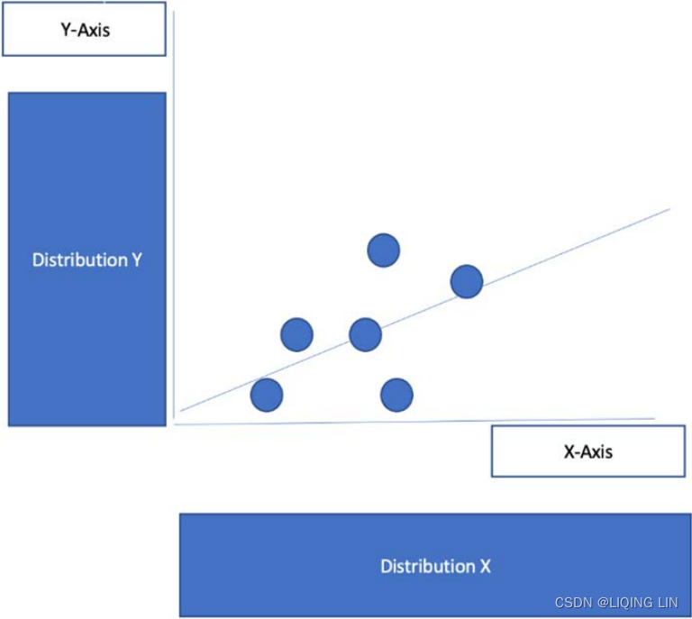
3. In order to execute my plan, I first create two parameters, which I name X-Axis and Y-Axis, which will be used to define the respective axes x and y.
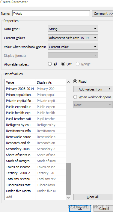
- 4. I define both parameters as String and paste all field names from the clipboard into both of the parameters. To do this, I open the input file in Excel, transpose the header row to a column,
(https://support.microsoft.com/en-us/office/transpose-rotate-data-from-rows-to-columns-or-vice-versa-3419f2e3-beab-4318-aae5-d0f862209744copy the header row
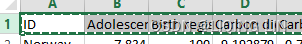
and open an new excel file, then Right-click over the top-left cell of where you want to paste the transposed table in this new excel, and choose Transpose
Next delete the ID row and Number of Records row==>
.)
and press Ctrl + C.
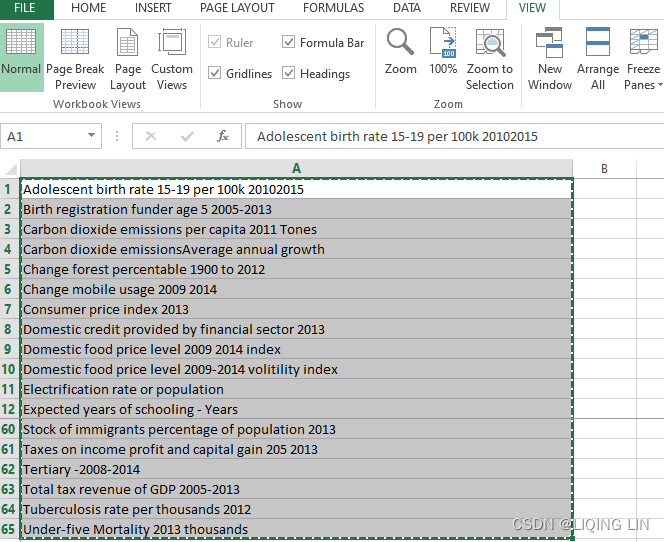
The data can now be pasted into the parameter via the Paste from Clipboard option. This saves time and is less error-prone:
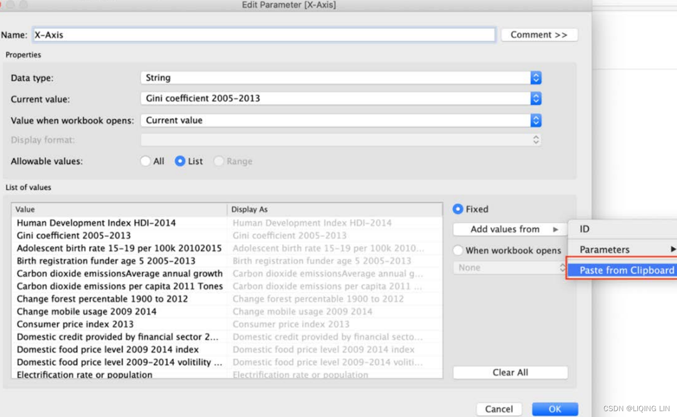
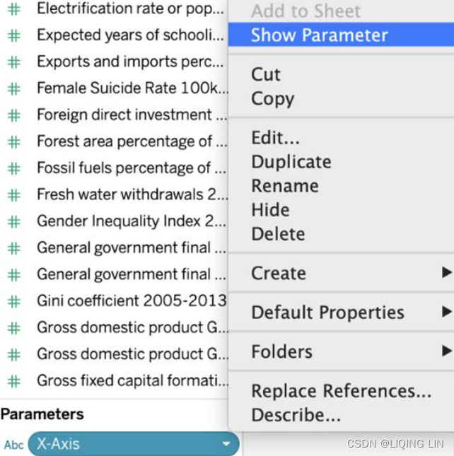
- 5. I also want the parameters to be visible on the dashboard, so I select Show Parameter:
- 6. If you were to test the parameter now, nothing would happen. We need a calculated field that defines that if a selection from the parameter has been made, Tableau will select the appropriate field. I create the following calculated field to achieve this (this field has been made part of the Starter and Solution workbook to make your life easier): X-Axis
If [Parameters].[X-Axis] = 'Human Development Index HDI-2014' then [Human Development Index HDI-2014] Elseif [Parameters].[X-Axis] = 'Gini coefficient 2005-2013' then [Gini coefficient 2005-2013] Elseif [Parameters].[X-Axis] = 'Adolescent birth rate 15-19 per 100k 20102015' then [Adolescent birth rate 15-19 per 100k 20102015] Elseif [Parameters].[X-Axis] = 'Birth registration funder age 5 2005-2013' then [Birth registration funder age 5 2005-2013] Elseif [Parameters].[X-Axis] = 'Carbon dioxide emissionsAverage annual growth' then [Carbon dioxide emissionsAverage annual growth] Elseif [Parameters].[X-Axis] = 'Carbon dioxide emissions per capita 2011 Tones' then [Carbon dioxide emissions per capita 2011 Tones] Elseif [Parameters].[X-Axis] = 'Change forest percentable 1900 to 2012' then [Change forest percentable 1900 to 2012] Elseif [Parameters].[X-Axis] = 'Change mobile usage 2009 2014' then [Change mobile usage 2009 2014] Elseif [Parameters].[X-Axis] = 'Consumer price index 2013' then [Consumer price index 2013] Elseif [Parameters].[X-Axis] = 'Domestic credit provided by financial sector 2013' then [Domestic credit provided by financial sector 2013] Elseif [Parameters].[X-Axis] = 'Domestic food price level 2009 2014 index' then [Domestic food price level 2009 2014 index] Elseif [Parameters].[X-Axis] = 'Domestic food price level 2009-2014 volitility index' then [Domestic food price level 2009-2014 volitility index] Elseif [Parameters].[X-Axis] = 'Electrification rate or population' then [Electrification rate or population] Elseif [Parameters].[X-Axis] = 'Expected years of schooling - Years' then [Expected years of schooling - Years] Elseif [Parameters].[X-Axis] = 'Exports and imports percentage GPD 2013' then [Exports and imports percentage GPD 2013] Elseif [Parameters].[X-Axis] = 'Female Suicide Rate 100k people' then [Female Suicide Rate 100k people] Elseif [Parameters].[X-Axis] = 'Foreign direct investment net inflows percentage GDP 2013' then [Foreign direct investment net inflows percentage GDP 2013] Elseif [Parameters].[X-Axis] = 'Forest area percentage of total land area 2012' then [Forest area percentage of total land area 2012] Elseif [Parameters].[X-Axis] = 'Fossil fuels percentage of total 2012' then [Fossil fuels percentage of total 2012] Elseif [Parameters].[X-Axis] = 'Fresh water withdrawals 2005' then [Fresh water withdrawals 2005] Elseif [Parameters].[X-Axis] = 'Gender Inequality Index 2014' then [Gender Inequality Index 2014] Elseif [Parameters].[X-Axis] = 'General government final consumption expenditure - Annual growth 2005 2013' then [General government final consumption expenditure - Annual growth 2005 2013] Elseif [Parameters].[X-Axis] = 'General government final consumption expenditure - Perce of GDP 2005-2013' then [General government final consumption expenditure - Perce of GDP 2005-2013] Elseif [Parameters].[X-Axis] = 'Gross domestic product GDP 2013' then [Gross domestic product GDP 2013] Elseif [Parameters].[X-Axis] = 'Gross domestic product GDP percapta' then [Gross domestic product GDP percapta] Elseif [Parameters].[X-Axis] = 'Gross fixed capital formation of GDP 2005-2013' then [Gross fixed capital formation of GDP 2005-2013] Elseif [Parameters].[X-Axis] = 'Gross national income GNI per capita - 2011 Dollars' then [Gross national income GNI per capita - 2011 Dollars] Elseif [Parameters].[X-Axis] = 'Homeless people due to natural disaster 2005 2014 per million people' then [Homeless people due to natural disaster 2005 2014 per million people] Elseif [Parameters].[X-Axis] = 'Homicide rate per 100k people 2008-2012' then [Homicide rate per 100k people 2008-2012] Elseif [Parameters].[X-Axis] = 'Infant Mortality 2013 per thousands' then [Infant Mortality 2013 per thousands] Elseif [Parameters].[X-Axis] = 'International inbound tourists thausands 2013' then [International inbound tourists thausands 2013] Elseif [Parameters].[X-Axis] = 'International student mobility of total tetiary enrolvemnt 2013' then [International student mobility of total tetiary enrolvemnt 2013] Elseif [Parameters].[X-Axis] = 'Internet users percentage of population 2014' then [Internet users percentage of population 2014] Elseif [Parameters].[X-Axis] = 'Intimate or nonintimate partner violence ever experienced 2001-2011' then [Intimate or nonintimate partner violence ever experienced 2001-2011] Elseif [Parameters].[X-Axis] = 'Life expectancy at birth- years' then [Life expectancy at birth- years] Elseif [Parameters].[X-Axis] = 'MaleSuicide Rate 100k people' then [MaleSuicide Rate 100k people] Elseif [Parameters].[X-Axis] = 'Maternal mortality ratio deaths per 100 live births 2013' then [Maternal mortality ratio deaths per 100 live births 2013] Elseif [Parameters].[X-Axis] = 'Mean years of schooling - Years' then [Mean years of schooling - Years] Elseif [Parameters].[X-Axis] = 'Mobile phone subscriptions per 100 people 2014' then [Mobile phone subscriptions per 100 people 2014] Elseif [Parameters].[X-Axis] = 'Natural resource depletion' then [Natural resource depletion] Elseif [Parameters].[X-Axis] = 'Net migration rate per 1k people 2010-2015' then [Net migration rate per 1k people 2010-2015] Elseif [Parameters].[X-Axis] = 'Physicians per 10k people' then [Physicians per 10k people] Elseif [Parameters].[X-Axis] = 'Population affected by natural desasters average annual per million people 2005-2014' then [Population affected by natural desasters average annual per million people 2005-2014] Elseif [Parameters].[X-Axis] = 'Population living on degraded land Percentage 2010' then [Population living on degraded land Percentage 2010] Elseif [Parameters].[X-Axis] = 'Population with at least some secondary education percent 2005-2013' then [Population with at least some secondary education percent 2005-2013] Elseif [Parameters].[X-Axis] = 'Pre-primary 2008-2014' then [Pre-primary 2008-2014] Elseif [Parameters].[X-Axis] = 'Primary-2008-2014' then [Primary-2008-2014] Elseif [Parameters].[X-Axis] = 'Primary school dropout rate 2008-2014' then [Primary school dropout rate 2008-2014] Elseif [Parameters].[X-Axis] = 'Prison population per 100k people' then [Prison population per 100k people] Elseif [Parameters].[X-Axis] = 'Private capital flows percentage GDP 2013' then [Private capital flows percentage GDP 2013] Elseif [Parameters].[X-Axis] = 'Public expenditure on education Percentange GDP' then [Public expenditure on education Percentange GDP] Elseif [Parameters].[X-Axis] = 'Public health expenditure percentage of GDP 2013' then [Public health expenditure percentage of GDP 2013] Elseif [Parameters].[X-Axis] = 'Pupil-teacher ratio primary school pupils per teacher 2008-2014' then [Pupil-teacher ratio primary school pupils per teacher 2008-2014] Elseif [Parameters].[X-Axis] = 'Refugees by country of origin' then [Refugees by country of origin] Elseif [Parameters].[X-Axis] = 'Remittances inflows percentual GDP 2013' then [Remittances inflows percentual GDP 2013] Elseif [Parameters].[X-Axis] = 'Renewable sources percentage of total 2012' then [Renewable sources percentage of total 2012] Elseif [Parameters].[X-Axis] = 'Research and development expenditure 2005-2012' then [Research and development expenditure 2005-2012] Elseif [Parameters].[X-Axis] = 'Secondary 2008-2014' then [Secondary 2008-2014] Elseif [Parameters].[X-Axis] = 'Share of seats in parliament percentage held by womand 2014' then [Share of seats in parliament percentage held by womand 2014] Elseif [Parameters].[X-Axis] = 'Stock of immigrants percentage of population 2013' then [Stock of immigrants percentage of population 2013] Elseif [Parameters].[X-Axis] = 'Taxes on income profit and capital gain 205 2013' then [Taxes on income profit and capital gain 205 2013] Elseif [Parameters].[X-Axis] = 'Tertiary -2008-2014' then [Tertiary -2008-2014] Elseif [Parameters].[X-Axis] = 'Total tax revenue of GDP 2005-2013' then [Total tax revenue of GDP 2005-2013] Elseif [Parameters].[X-Axis] = 'Tuberculosis rate per thousands 2012' then [Tuberculosis rate per thousands 2012] Elseif [Parameters].[X-Axis] = 'Under-five Mortality 2013 thousands' then [Under-five Mortality 2013 thousands] END
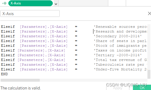
- 7. Now we will do the same thing for the Y-Axis parameter.
In order to create the calculated field for Y-Axis quicker, copy and paste the X-Axis calculated field into Excel and find and replace [Parameters].[X-Axis] with [Parameters].[Y-Axis].
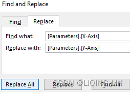
If [Parameters].[Y-Axis] = 'Human Development Index HDI-2014' then [Human Development Index HDI-2014] Elseif [Parameters].[Y-Axis] = 'Gini coefficient 2005-2013' then [Gini coefficient 2005-2013] Elseif [Parameters].[Y-Axis] = 'Adolescent birth rate 15-19 per 100k 20102015' then [Adolescent birth rate 15-19 per 100k 20102015] Elseif [Parameters].[Y-Axis] = 'Birth registration funder age 5 2005-2013' then [Birth registration funder age 5 2005-2013] Elseif [Parameters].[Y-Axis] = 'Carbon dioxide emissionsAverage annual growth' then [Carbon dioxide emissionsAverage annual growth] Elseif [Parameters].[Y-Axis] = 'Carbon dioxide emissions per capita 2011 Tones' then [Carbon dioxide emissions per capita 2011 Tones] Elseif [Parameters].[Y-Axis] = 'Change forest percentable 1900 to 2012' then [Change forest percentable 1900 to 2012] Elseif [Parameters].[Y-Axis] = 'Change mobile usage 2009 2014' then [Change mobile usage 2009 2014] Elseif [Parameters].[Y-Axis] = 'Consumer price index 2013' then [Consumer price index 2013] Elseif [Parameters].[Y-Axis] = 'Domestic credit provided by financial sector 2013' then [Domestic credit provided by financial sector 2013] Elseif [Parameters].[Y-Axis] = 'Domestic food price level 2009 2014 index' then [Domestic food price level 2009 2014 index] Elseif [Parameters].[Y-Axis] = 'Domestic food price level 2009-2014 volitility index' then [Domestic food price level 2009-2014 volitility index] Elseif [Parameters].[Y-Axis] = 'Electrification rate or population' then [Electrification rate or population] Elseif [Parameters].[Y-Axis] = 'Expected years of schooling - Years' then [Expected years of schooling - Years] Elseif [Parameters].[Y-Axis] = 'Exports and imports percentage GPD 2013' then [Exports and imports percentage GPD 2013] Elseif [Parameters].[Y-Axis] = 'Female Suicide Rate 100k people' then [Female Suicide Rate 100k people] Elseif [Parameters].[Y-Axis] = 'Foreign direct investment net inflows percentage GDP 2013' then [Foreign direct investment net inflows percentage GDP 2013] Elseif [Parameters].[Y-Axis] = 'Forest area percentage of total land area 2012' then [Forest area percentage of total land area 2012] Elseif [Parameters].[Y-Axis] = 'Fossil fuels percentage of total 2012' then [Fossil fuels percentage of total 2012] Elseif [Parameters].[Y-Axis] = 'Fresh water withdrawals 2005' then [Fresh water withdrawals 2005] Elseif [Parameters].[Y-Axis] = 'Gender Inequality Index 2014' then [Gender Inequality Index 2014] Elseif [Parameters].[Y-Axis] = 'General government final consumption expenditure - Annual growth 2005 2013' then [General government final consumption expenditure - Annual growth 2005 2013] Elseif [Parameters].[Y-Axis] = 'General government final consumption expenditure - Perce of GDP 2005-2013' then [General government final consumption expenditure - Perce of GDP 2005-2013] Elseif [Parameters].[Y-Axis] = 'Gross domestic product GDP 2013' then [Gross domestic product GDP 2013] Elseif [Parameters].[Y-Axis] = 'Gross domestic product GDP percapta' then [Gross domestic product GDP percapta] Elseif [Parameters].[Y-Axis] = 'Gross fixed capital formation of GDP 2005-2013' then [Gross fixed capital formation of GDP 2005-2013] Elseif [Parameters].[Y-Axis] = 'Gross national income GNI per capita - 2011 Dollars' then [Gross national income GNI per capita - 2011 Dollars] Elseif [Parameters].[Y-Axis] = 'Homeless people due to natural disaster 2005 2014 per million people' then [Homeless people due to natural disaster 2005 2014 per million people] Elseif [Parameters].[Y-Axis] = 'Homicide rate per 100k people 2008-2012' then [Homicide rate per 100k people 2008-2012] Elseif [Parameters].[Y-Axis] = 'Infant Mortality 2013 per thousands' then [Infant Mortality 2013 per thousands] Elseif [Parameters].[Y-Axis] = 'International inbound tourists thausands 2013' then [International inbound tourists thausands 2013] Elseif [Parameters].[Y-Axis] = 'International student mobility of total tetiary enrolvemnt 2013' then [International student mobility of total tetiary enrolvemnt 2013] Elseif [Parameters].[Y-Axis] = 'Internet users percentage of population 2014' then [Internet users percentage of population 2014] Elseif [Parameters].[Y-Axis] = 'Intimate or nonintimate partner violence ever experienced 2001-2011' then [Intimate or nonintimate partner violence ever experienced 2001-2011] Elseif [Parameters].[Y-Axis] = 'Life expectancy at birth- years' then [Life expectancy at birth- years] Elseif [Parameters].[Y-Axis] = 'MaleSuicide Rate 100k people' then [MaleSuicide Rate 100k people] Elseif [Parameters].[Y-Axis] = 'Maternal mortality ratio deaths per 100 live births 2013' then [Maternal mortality ratio deaths per 100 live births 2013] Elseif [Parameters].[Y-Axis] = 'Mean years of schooling - Years' then [Mean years of schooling - Years] Elseif [Parameters].[Y-Axis] = 'Mobile phone subscriptions per 100 people 2014' then [Mobile phone subscriptions per 100 people 2014] Elseif [Parameters].[Y-Axis] = 'Natural resource depletion' then [Natural resource depletion] Elseif [Parameters].[Y-Axis] = 'Net migration rate per 1k people 2010-2015' then [Net migration rate per 1k people 2010-2015] Elseif [Parameters].[Y-Axis] = 'Physicians per 10k people' then [Physicians per 10k people] Elseif [Parameters].[Y-Axis] = 'Population affected by natural desasters average annual per million people 2005-2014' then [Population affected by natural desasters average annual per million people 2005-2014] Elseif [Parameters].[Y-Axis] = 'Population living on degraded land Percentage 2010' then [Population living on degraded land Percentage 2010] Elseif [Parameters].[Y-Axis] = 'Population with at least some secondary education percent 2005-2013' then [Population with at least some secondary education percent 2005-2013] Elseif [Parameters].[Y-Axis] = 'Pre-primary 2008-2014' then [Pre-primary 2008-2014] Elseif [Parameters].[Y-Axis] = 'Primary-2008-2014' then [Primary-2008-2014] Elseif [Parameters].[Y-Axis] = 'Primary school dropout rate 2008-2014' then [Primary school dropout rate 2008-2014] Elseif [Parameters].[Y-Axis] = 'Prison population per 100k people' then [Prison population per 100k people] Elseif [Parameters].[Y-Axis] = 'Private capital flows percentage GDP 2013' then [Private capital flows percentage GDP 2013] Elseif [Parameters].[Y-Axis] = 'Public expenditure on education Percentange GDP' then [Public expenditure on education Percentange GDP] Elseif [Parameters].[Y-Axis] = 'Public health expenditure percentage of GDP 2013' then [Public health expenditure percentage of GDP 2013] Elseif [Parameters].[Y-Axis] = 'Pupil-teacher ratio primary school pupils per teacher 2008-2014' then [Pupil-teacher ratio primary school pupils per teacher 2008-2014] Elseif [Parameters].[Y-Axis] = 'Refugees by country of origin' then [Refugees by country of origin] Elseif [Parameters].[Y-Axis] = 'Remittances inflows percentual GDP 2013' then [Remittances inflows percentual GDP 2013] Elseif [Parameters].[Y-Axis] = 'Renewable sources percentage of total 2012' then [Renewable sources percentage of total 2012] Elseif [Parameters].[Y-Axis] = 'Research and development expenditure 2005-2012' then [Research and development expenditure 2005-2012] Elseif [Parameters].[Y-Axis] = 'Secondary 2008-2014' then [Secondary 2008-2014] Elseif [Parameters].[Y-Axis] = 'Share of seats in parliament percentage held by womand 2014' then [Share of seats in parliament percentage held by womand 2014] Elseif [Parameters].[Y-Axis] = 'Stock of immigrants percentage of population 2013' then [Stock of immigrants percentage of population 2013] Elseif [Parameters].[Y-Axis] = 'Taxes on income profit and capital gain 205 2013' then [Taxes on income profit and capital gain 205 2013] Elseif [Parameters].[Y-Axis] = 'Tertiary -2008-2014' then [Tertiary -2008-2014] Elseif [Parameters].[Y-Axis] = 'Total tax revenue of GDP 2005-2013' then [Total tax revenue of GDP 2005-2013] Elseif [Parameters].[Y-Axis] = 'Tuberculosis rate per thousands 2012' then [Tuberculosis rate per thousands 2012] Elseif [Parameters].[Y-Axis] = 'Under-five Mortality 2013 thousands' then [Under-five Mortality 2013 thousands] END
- 8. Drag the X-Axis calculated field to Columns and Y-Axis to Rows. Also, put the ID field on the Detail shelf.
- 9. In order to see the correlation analytics from Tableau, drag Trend Line onto the sheet:
The sheet with the trend line looks as follows. When hovering over the trend line, you will see the equation of the line, the R-Squared value, and the value for P-value:
- The Y-Axis equation means that, for each point on the X-Axis, the Y-Axis value will increase by 17.9717(slope or weight: the Y-Axis value will increase at a constant rate=17.9717), starting at point 0 on the x-axis and point -4.33685(intercept) on the Y-Axis. Thus, overall the y-term increases faster than the (also increasing) x-term.
- The R-Squared(
OR
) value explains how much variance is explained by the trend line (80.81%), The R-squared for this model is 0.8081 which means that 80.81% of variation in Y-Axis is explained by variation in X-Axishttps://blog.youkuaiyun.com/Linli522362242/article/details/121551663
Here, SSE is the sum of squared errors(OR the sum of squared of residuals)
This yields a list of errors squared, which is then summed and equals the unexplained variance(or the variance of the model's error).
and SST is the total sum of squares(total variance):
the average actual value y.
Let's quickly show thatis indeed just a rescaled version of the MSE
:
#
rescaled by the variance of y :
For the training dataset, theis bounded between 0 and 1, but it can become negative for the test dataset. If
= 1 , the model fits the data perfectly with a corresponding MSE = 0(since Var(y)>0).
the closer thevalue to 1, the better the fit, and the closer the value to 0, the worse the fit.
Negative values mean that the model fits worse than the baseline model. Models with negative values usually indicate issues in the training data or process and cannot be used.
Coefficient of determination, in statistics,(or r^2), a measure that assesses the ability of a model to predict or explain an outcome in the linear regression setting. More specifically, R2 indicates the proportion of the variance方差 in the dependent variable 因变量(Y) that is predicted or explained by linear regression and the predictor variable (X, also known as the independent variable自变量).
The coefficient of determination shows only association. As with linear regression, it is impossible to useto determine whether one variable causes the other. In addition, the coefficient of determination shows only the magnitude of the association, not whether that association is statistically significant.
In general, a high R2 value indicates that the model is a good fit for the data, although interpretations of fit depend on the context of analysis. An R2 of 0.35, for example, indicates that 35 percent of the variation变动,差异 in the outcome has been explained just by predicting the outcome using the covariates(协变量,) included in the model表明仅通过使用模型中包含的协变量, 预测结果即可解释 结果差异的35%. That percentage might be a very high portion of variation to predict in a field such as the social sciences; in other fields, such as the physical sciences, one would expect R2 to be much closer to 100 percent. The theoretical minimum R2 is 0. However, since linear regression is based on the best possible fit, R2 will always be greater than zero, even when the predictor(X) and outcome variables(Y) bear no relationship to one another.
OR
R2 increases when a new predictor variable is added to the model, even if the new predictor is not associated with the outcome. To account for that effect, the adjusted R2 (typically denoted with a bar over the R in R2) incorporates the same information as the usual but then also penalizes for the number(k) of predictor variables included in the model. As a result, R2 increases(since more error) as new predictors are added to a multiple linear regression model, but the adjusted R2 increases only if the increase in R2 is greater than one would expect from chance alone仅当新项对模型的改进超出偶然的预期时,the adjusted R2 才会增加. It decreases when a predictor improves the model by less than expected by chance.In such a model, the adjusted R2 is the most realistic estimate of the proportion of the variation that is predicted by the covariates included in the model - and lastly P-value explains the significance of the model. A P-value value smaller than 0.05 is considered significant and means there is a 5% chance that the data is following the trend line randomly. The trend line in the preceding figure has a P-value of less than 0.01%. We can safely assume, therefore, that there is a real relationship between the two variables.
https://blog.youkuaiyun.com/Linli522362242/article/details/123606731
A P-value is a statistical concept that describes the probability that the results of assuming no relationship between values (random chance) are at least as close as results predicted by the trend model. A P-value of 5% (.05) would indicate a 5% chance of random chance describing the relationship between values at least as well as the trend model. This is why P-value of 5% or less are typically considered to indicate a significant trend model. A P-value higher than 5% often leads statisticians to question the correlation described by the trend model.
The P-value for this model is < 0.0001 which indicates a very strong evidence against null hypothesis(assuming no relationship between values). This means that Y-Axis is linked to X-Axis and that this model will still be valid if we have more data.
P-value(Rejection Region Area, 拒绝域的面积): The probability of obtaining a test statistic result is at least as extreme as the one that was actually observed( the probability we obstain a more extreme value than the observed test statistic Z. 当原假设为真时,所得到的样本观察结果或更极端结果出现的概率), assuming that the null hypothesis is true (usually in modeling, against each independent variable, a p-value < 0.05 is considered significant and > 0.05 is considered insignificant; nonetheless, these values and definitions may change with respect to context).
当p-值足够小时,即小于置信水平 ( assuming that the null hypothesis is true, the probability of the test statistic Z in the Rejection Region)时,我们可以拒绝零假设。
The steps involved in hypothesis testing are as follows:
-
1. Assume a null hypothesis (usually no difference, no significance, and so on; a null hypothesis always tries to assume that there is no anomaly pattern and is always homogeneous同类的, and so on).
OR
State null hypothesisand alternative hypothesis
Check assumptions made about population. -
2. Collect the sample.
-
3. Calculate test statistics from the sample in order to verify whether the hypothesis is statistically significant or not.
OR
Calculate test statistic from a sample to measure the evidence that goes against与...相悖.
-
4. Decide either to accept or reject the null hypothesis based on the test statistic.
OR
Determine rejection region (R), where we believe the evidence is sufficient to reject.
then see whether the test statistic falls in the rejection region and then draw conclusion.
-
- The Y-Axis equation means that, for each point on the X-Axis, the Y-Axis value will increase by 17.9717(slope or weight: the Y-Axis value will increase at a constant rate=17.9717), starting at point 0 on the x-axis and point -4.33685(intercept) on the Y-Axis. Thus, overall the y-term increases faster than the (also increasing) x-term.
-
10. In order to see more coefficients, right-click on the line and select Describe Trend Line…:
If you want to learn more about interpreting trend lines, you can read the following article: https://help.tableau.com/current/pro/desktop/en-us/trendlines_add.htm.
The following window will appear:
Alternatively, you can select the Describe Trend Model… option and you will see this:-
Model formula : This is the formula for the full trend line model. The formula reflects whether you have specified to exclude factors from the model.
-
Number of modeled observations : The number of rows used in the view.
-
Number of filtered observations : The number of observations excluded from the model.
-
Model degrees of freedom : The number of parameters needed to completely specify the model.
Linear, logarithmic, and exponential trends have model degrees of freedom of 2.
Polynomial trends have model degrees of freedom of 1 plus the degree of the polynomial. For example a cubic trend has model degrees of freedom of 4(1+3), since we need parameters for the cubed, squared, linear and constant terms.With the polynomial model type, the response variable is transformed into a polynomial series of the specified degree将响应变量转换为指定次数的多项式序列. The formula is:
Y = b0 + b1 * X^1 + b2 * X^2 + …
With a polynomial model type, you must also select a Degree between 2 and 8. The higher polynomial degrees exaggerate[ɪɡˈzædʒəreɪt]夸大 the differences between the values of your data. If your data increases very rapidly, the lower order terms may have almost no variation compared to the higher order terms, rendering the model impossible to estimate accurately. Also, more complicated higher order polynomial models require more data to estimate. Check the model description of the individual trends line for a red warning message indicating that an accurate model of this type is not possible指示无法建立这种类型的准确模型. -
Residual degrees of freedom (DF) : For a fixed model, this value is defined as the number of observations minus the number of parameters estimated in the model.
-
SSE (sum squared error) : The errors are the difference between the observed value and the value predicted by the model.
In the Analysis of Variance table,
https://blog.youkuaiyun.com/Linli522362242/article/details/123606731
this column is actually the difference between the SSE of the simpler model in that particular row and the full model, which uses all the factors. This SSE also corresponds to the sum of the differences squared of the predicted values from the smaller model and the full model. -
MSE (mean squared error) : The term MSE refers to "mean squared error" which is the SSE quantity divided by its corresponding degrees of freedom. (2.8948883e+12/4=7.23722e+11)
-
R-Squared
: R-squared is a measure of how well the data fits the linear model. It is the ratio of the variance of the model's error, or unexplained variance(SSE), to the total variance of the data(
).
When the y-intercept is determined by the model, R-squared is derived using the following equation:
When the y-intercept is forced to 0, R-squared is derived using this equation instead:
In the latter case, the equation will not necessarily match Excel. This is because R-squared is not well defined in this case, and Tableau's behavior matches that of R instead of that of Excel.
Note: The R-Squared value for a linear trend line model is equivalent to the square of the result from the CORR function. See https://help.tableau.com/current/pro/desktop/en-us/functions_all_alphabetical.htm for syntax and examples for CORR. -
Standard error : The square root of the MSE of the full model. An estimate of the standard deviation (variability) of the "random errors" in the model formula.
-
p-value (significance) : The probability that an F random variable with the above degrees of freedom
exceeds
the observed F in this row of the Analysis of Variance table.
This p-value for a model compares the fit of the entire model to the fit of a model composed solely of the grand mean (the average of data in the data view). That is, it assesses the explanatory power of the quantitative term f(x) in the model formula它评估模型公式中定量项 f(x) =Y-Axis的解释能力, which can be linear, polynomial, exponential, or logarithmic with the factors fixed. It is common to assess significance using the "95% confidence" rule. Thus, as noted above, a p-value of 0.05 or less is considered good.
-
Analysis of Variance : This table, also known as the ANOVA table, lists information for each factor in the trend line model. The values are a comparison of the model without the factor in question to the entire model, which includes all factors.
In the Analysis of Variance table, sometimes referred to as the ANOVA table, each field that is used as a factor in the model is listed. For each field, among other values, you can see the p-value. In this case, the p-value indicates how much that field adds to the significance of the entire model(p 值表示该字段对整个模型的重要性增加了多少). The smaller the p-value the less likely it is that the difference in the unexplained variance(or the variance of the model's error) between models with and without the field was a result of random chance. The values displayed for each field are derived by comparing the entire model to a model that does not include the field in question.
The following image shows the Analysis of Variance table for a view of quarterly sales for the past two years of three different product categories.As you can see, the p-values for Category and Region are both quite small. Both of these factors are statistically significant in this model.
For ANOVA models, trend lines are defined by the mathematical formula:
Y = factor1 * factor2 * ...factorN * f(x) + eThe term
Y
is called the response variable and corresponds to the value you are trying to predict. The termX
is the explanatory variable, and e (epsilon) is random error. The factors in the expression correspond to the categorical fields in the view. In addition, each factor is represented as a matrix. The*
is a particular kind of matrix multiplication operator that takes two matrices with the same number of rows and returns a new matrix with the same number of rows. That means that in the expressionfactor 1 * factor 2
, all combinations of the members of factor 1 and factor 2 are introduced. For example, if factor 1 and factor 2 both have 3 members, then a total of 9 variables are introduced into the model formula by this operator. -
Individual trend lines : This table provides information about each trend line in the view.
Looking at the list you can see which, if any, are the most statistically significant(see p-value). This table also lists coefficient statistics for each trend line. A row describes each coefficient in each trend line model.
For example, a linear model with an intercept requires two rows for each trend line. In the Line column, the p-value and the DF for each line span all the coefficient rows.The DF column under the shows the residual degrees of freedom available during the estimation of each line.
-
Terms : The name of the independent term.
-
Value : The estimated value of the coefficient for the independent term.
-
StdErr : A measure of the spread of the sampling distribution of the coefficient estimate. This error shrinks as the quality and quantity of the information used in the estimate grows.
-
t-value
: The statistic used to test the null hypothesis that the true value of the coefficient is zero.https://blog.youkuaiyun.com/Linli522362242/article/details/91037961
-
p-value : The probability of observing a t-value that large or larger in magnitude if the true value of the coefficient is zero. So, a p-value of .05 gives us 95% confidence that the true value is not zero.
-
- 11. I get a bit distracted by the grid lines, so I decide to remove them by right-clicking on the screen and selecting Format…:
- 12. I select the fifth option in the Format window, the Lines, and remove the Grid Lines value:
- 13. I also change Marks from Automatic to Circle and change the color to black.
- 14. Now, I think it would be helpful to show on the scatterplot which country each point represents, so I change the ID field from Detail to Label in the Marks card; however, this looks a bit too chaotic:
- 15. I click on the undo arrow
and I add a highlighter function by right-clicking on ID and selecting Show Highlighter. Now, the end user will be able to search a country and that point will be highlighted in the scatterplot:
==>
- 16. I also want the country name to show clearly and in red when hovering over any points, and I achieve this by changing the ID color in Edit Tooltip to red and increase the size:
- 17. I have already added the trend line, and I now want to show the Pearson R, (Pearson product-moment correlation coefficient皮尔逊积矩相关系数), value in the view such that the user knows if two indices are correlated;
The symmetric d × d -dimensional covariance matrix, where d is the number of dimensions in the dataset, stores the pairwise成对地 covariances between the different features. For example, the covariance between two featuresand
on the population level can be calculated via the following equation:
VS sample covariances
The reason the sample covariance matrix has N-1 in the denominator rather than N is essentially that the population mean(OR u) is not known and is replaced by the sample mean
.
Here,and
are the sample means of feature j and k, respectively. Note that the sample means are zero if we standardize the dataset
https://blog.youkuaiyun.com/Linli522362242/article/details/108230328.
A positive covariance between two features indicates that the features increase or decrease together,
whereas a negative covariance indicates that the features vary in opposite directions.
For example, a covariance matrix of three features can then be written as (note thatstands for the Greek uppercase letter sigma, which is not to be confused with the sum symbol):
<==
or
<==
We can interpret the correlation matrix as being a rescaled version of the covariance matrix. In fact, the correlation matrix is identical to a covariance matrix computed from standardized features.
Covariance versus correlation for standardized features
Through re-substitution(
We can show that the covariance between a pair of standardized features is, in fact, equal to their linear correlation coefficient. To show this, let's first standardize the features x and y to obtain their z-scores, which we will denote as 𝑥′ and 𝑦′, respectively:
Remember that we compute the (population) covariance between two features as follows:<==
<==
Since standardization centers a feature variable at mean zero, we can now calculate the covariance between the scaled features as follows:), we then get the following result:
==>
==> the correlation matrix is identical to a covariance matrix computed from standardized features
Finally, we can simplify this equation as follows:( correlation coefficient formula)
The correlation matrix相关系数矩阵 is a square matrix that contains the Pearson product-moment correlation coefficient 皮尔逊积矩相关系数 (often abbreviated as Pearson's r), which measures the linear dependence between pairs of features. The correlation coefficients are in the range –1 to 1. Two features have
a perfect positive correlation if r = 1,
no correlation if r = 0,
and a perfect negative correlation if r = –1.
As mentioned previously, Pearson's correlation coefficient can simply be calculated as the covariance between two features, x and y (numerator), divided by the product of their standard deviations (denominator):
( Pearson product-moment correlation coefficient ) Pearson's r :
however, it is not possible to set the Describe Trend Line or Describe Trend Model option to always be shown. Hence, I will calculate the value myself in a new field; I use the CORR() function to do this:Pearson RROUND( CORR([X-Axis],[Y-Axis]), 3)
- 18. But I want to show some text that indicates if two variables are correlated or not instead of the value itself, because I want to make my dashboard clear. Therefore, I create another calculated field called Correlation yes or no with the following code:
IF [Pearson R] > 0.7 THEN 'The two variables <' + [Parameters].[X-Axis]+ '> and <'+ [Parameters].[Y-Axis]+ '> have a very strong positive correlation of: ' + STR([Pearson R]) ELSEIF [Pearson R] < 0.7 and [Pearson R] > 0.4 THEN 'The two variables <' + [Parameters].[X-Axis] + '> and <'+ [Parameters].[Y-Axis]+ '> have a strong positive correlation of: ' + STR([Pearson R]) ELSEIF [Pearson R] < 0.4 and [Pearson R] > 0.2 THEN 'The two variables <' + [Parameters].[X-Axis] + '> and <'+ [Parameters].[Y-Axis]+ '> have a moderate positive correlation of: ' + STR([Pearson R]) ELSEIF [Pearson R] <0.2 and [Pearson R] > -0.2 THEN 'The two variables <' + [Parameters].[X-Axis] + '> and <'+ [Parameters].[Y-Axis]+ '> have no or a weak correlation of:' + STR([Pearson R]) ELSEIF [Pearson R] < -0.2 and [Pearson R] >-0.4 THEN 'The two variables <' + [Parameters].[X-Axis] + '> and <'+ [Parameters].[Y-Axis]+ '> have a moderate negative correlation of: '+ STR([Pearson R]) ELSEIF [Pearson R] < -0.4 and [Pearson R] > -0.7 THEN 'The two variables <' + [Parameters].[X-Axis] + '> and <'+ [Parameters].[Y-Axis]+ '> have a strong negative correlation of: ' + STR([Pearson R]) ELSEIF [Pearson R] < -0.7 THEN 'The two variables <' + [Parameters].[X-Axis] + '> and <'+ [Parameters].[Y-Axis]+ '> have a very strong negative correlation of: ' + STR([Pearson R]) END
- 19. This being done, I create a new sheet Correlation and place Correlation yes or no on the Text shelf. The sheet looks very simple, as you can see:
The value of a parameter is global so that if the value is changed, every view and calculation in the workbook that references the parameter will use the new value.
Therefore, in the same workbook, changing a parameter value of different worksheets will change the parameter value of all worksheets. Therefore, if you change the value of the parameters(X-Axis and Y-Axis) in the previous worksheet Scatterplot, there is no need to display the parameter control here. - 20. I right-click on the title and choose Hide Title.
Finally, almost everything is ready to build the dashboard from the sketch at the beginning of this section. Only the distributions for each of the two axes are still missing.
Adding axis distributions
We have made a start, but now I want to add the distribution plots for the x- and y-axes next to the scatterplot. I take the following steps:
- 1. I start with the x-axis, open another worksheet, and drag ID to Columns and X-Axis to Rows and change the color to gray in the Marks card. I also select Entire View at the top of the page.
- 2. The x-axis distribution should be aligned to the scatterplot; therefore, I want the bars to form from top to bottom. I achieve this by clicking on the x-axis and selecting Reversed for Scale:
- 3. After I close the Edit Axis [X-Axis] window, I right-click on X-Axis and deselect Show Header to not show the header anymore.
- 4. The values should also be sorted from smallest to biggest, just like in the scatterplot. I click on ID in Columns and select Field for Sort By, as shown in the dialog box below:
- 5. I continue with Y-Axis on another new worksheet and drag Y-Axis to Columns and ID to Rows and change the color to gray in the Marks card. I also select Entire View at the top of the page.
- 6. Just like in step 2, the y-axis distribution should be aligned to the scatterplot; therefore, I want the bars to form from right to left. I achieve this by clicking on the y-axis and selecting Reversed for Scale.
- 7. After I close the Edit Axis [Y-Axis] window, I right-click on Y-Axis and deselect Show Header to not show the header anymore.
- 8. The values should also be sorted from biggest to smallest, just like in the scatterplot. I click on ID in Columns and select Field for Sort By, as shown in the next figure:
- 9. In order to put everything together, I open a dashboard page and call it Distribution 1, then I put the scatterplot worksheet at the bottom of the page and the correlation text worksheet at the top of the dashboard canvas:
- 10. I add the distribution worksheet to the related site of the scatterplot (Y to the y-axis and X to the x-axis).
unshow all titles
unshow all headers - 11. Then I add a blank in the lower left-hand corner to align the distribution with the scatterplot edges:
The final layout looks like this: - 12. I want to give the distribution more meaning and add an action that will highlight the country in both distribution plots. I do this so the user can see where a country is located in the range of all countries within one index because it can be hard to see in the scatterplot sometimes. The scatterplot, on the other hand, can be used to get more insights into the relationship between the two indices. For the Highlight action, I need to set the parameters as follows:
Look at the following screenshot: I hovered over the dot that represents the Netherlands荷兰. I can see that the Netherlands is quite high in both selected indices and that it is close to the trend line, but I can also see in the distribution bar chart that in the y-index : Mean years of schooling平均受教育年限中, quite a few countries score higher than the Netherlands, whereas in the x-index : Public health expenditure percentage of GDP 2013公共卫生支出占 GDP 的 2013 年百分比中, there is only one more country that scores higher: - 13. Another idea is to change the distribution plots to a count of values per bin. A bin is a range of values, which is more likely what you will see when people talk about distribution plots. This would basically show which bin contains the most countries, and if the plot is normally distributed or maybe another distribution such as Poisson, Log-Normal, or Student's t-distribution. I think that in this context either factor would add value; therefore, I will add them both and present both to my boss, so there are two options to choose from.
- 14. I duplicate the 2 worksheets(X Axis and Y Axis) that contain the distribution plot by clicking on the tabs and selecting Duplicate.
- 15. I click on X-Axis | Create | Bins…, leave the settings as they are, and click OK. A new X-Axis (bin) field will be created:
==>
- 16. I repeat the previous step for Y-Axis.
- 17. Next, for the Y-Axis, I add Count of Y-Axis to Columns, Y-Axis (bin) to Rows, and ID to Detail in the Marks card. Sort Y-Axis (bin) in descending order:
- 18. For X-Axis, I add Count of X-Axis to Rows, X-Axis (bin) to Columns, and the ID field to Detail in the Marks card. Sort X-Axis (bin) in ascending order.
Show Missing Value
change the color to gray - 19. I duplicate the previously created dashboard Distribution 1 by clicking on the tab and clicking Duplicate. In this new version, I replace the former distributions with the new ones with the bins. The result looks as follows:
If the bin size is too small, go back to the specific worksheet
A bin is a range of values, which is more likely what you will see when people talk about distribution plots. This would basically show which bin contains the most countries, and if the plot is normally distributed or maybe another distribution such as Poisson, Log-Normal, or Student's t-distribution. I think that in this context either factor would add value
Adding a correlation matrix
After clicking through the dashboard and testing the functionality, I realize that it's hard to remember which combinations I have already tried, and also I wish I could filter on highly correlated combinations. To address this, I want to add one more dashboard to this workbook: a correlation matrix with all combinations, color-coded and with an option to filter:
- 1. First, I go back to my data source tab and add the same dataset again, but with a new name: World Indices Correlation Matrix. And I even add it twice because I need every index correlated against every other index:
- 2. The key used is ID:
Note: This does not increase the number of columns - 3. Then, I need to pivot both tables because instead of having one column per index, I need one column with all index names(Pivot Field Names: all fields except ID) and a second column with all values(Pivot Field Values: all values of those fields except ID) in order to create a table with each of them. I select all fields except ID and use Pivot:
==>
- 4. This results in three columns, I rename Pivot Field Values as Value Index A and Pivot Field Names as Index A:
- 5. Now I do this again with the second table and rename the columns Index B(Pivot Field Names: all fields except ID) and Value Index B(Pivot Field Values: all values of those fields except ID) (Note : Any calculated field cannot be excuted the Pivot operation, so I didn't select the calculated fields).
==>
- 6. I open a new worksheet and place Index B on Columns, and Index A on Rows. I create a calculated field named Pearson R with the code
CORR( [Value Index B], [Value Index A] )
and place it on Filters, Colour, and Text. After right-clicking on Pearson R in the Filters shelf, I select Show Filter:
The colors can be adjusted as you like; I chose a 5-stepped color scheme from red to black, indicating that red fields are negatively correlated and black ones positively.
- 7. I open a new dashboard tab and place the worksheet on it. Try adjusting the filter such that you only see the highly correlated range 0.89–0.99, just to have a smaller dataset to work with for now:
This section helped us to create a heatmap of all possible combinations, and we color-coded the correlation value and added a filter to it in order to focus on points of interest. In the preceding screenshot, you can see the highly correlated indices.
To fit a linear regression model, we are interested in those features that have a high correlation with our target variable:https://blog.youkuaiyun.com/Linli522362242/article/details/111307026
Selecting the best individual features : https://blog.youkuaiyun.com/Linli522362242/article/details/120398175
some algorithms struggle when features correlate significantly, or if there are redundant features特征之间相关性很强,或者特征冗余 : solution : Feature creation
There are some basic tests we can perform, such as ensuring that the features are at least different. If a feature's values are all same, it can't give us extra information to perform our data mining. https://blog.youkuaiyun.com/Linli522362242/article/details/120398175
Finalizing the dashboard
To avoid any confusion, I want to explain the Pearson R filter for the user and finalize the dashboard:
- 1. I start by adding a text field to the dashboard. With more time, I could make it a drop-down parameter just like the X-Axis and Y-Axis fields:
- 2. To finalize everything, three actions are needed. First, 2 Parameter actions are needed to enable a click in the correlation matrix to change the values for the X-Axis and Y-Axis parameters, the first of which should be customized as follows:
The action in the preceding screenshot will change the X-Axis parameter to the value from Index A.
- 3. Now, I edit the second parameter action as follows:
The action in the preceding figure will change the Y-Axis parameter to the value from Index B.
- 4. Lastly, I add a Sheet Navigation action called GoToScatterplot that allows the user to change the dashboard after selecting an index combination:
- 5. The preceding action will show a menu to go to the trend line dashboard(Distribution Bins).
- 6. The user can now select a value and click on it. In the background, the parameters X-Axis and Y-Axis will be adjusted to the two indices that relate to that same field. For example, for Mean years of schooling and Human Development Index, a hyperlink appears:
- 7. The user will be redirected to the dashboard(Distribution Bins) with a trend line that is now prefiltered and shows the same two indices: Mean years of schooling and Human Development Index:
From this, we can see that the two selected indices (Mean years of schooling and Human Development Index) are positively correlated by 89.9%. We can also see the distribution per index on the x- and y-axes.
This was a lengthy exercise, but I wanted to present you with my full thought process and look at dashboard creation. With more time, I would definitely add some more insights; for instance:
- • Add an explanation for each index
- • Add a more thorough explanation for the correlation
- • Add the p-value or other coefficients to the analysis and change the text accordingly
And don't forget to get feedback and check with your stakeholders if you are on the right track. Some people use sketches, then work on a draft, and then ask for feedback again, until the product is finalized. I tend to ask my stakeholders questions to better understand what they need and let them walk me through the process they want to replace or change with the Tableau dashboard. Then I present a full version or intermediate version, depending on complexity and timelines. It should be avoided that you spend hours or days on something that is not what the stakeholder wants.
But now, let us have a look at a second short use case that incorporates geo-spatial data.
Geo-spatial analytics with Chicago traffic violations
It's Wednesday morning; your manager comes into your office wanting to check the red-light violations of the last year in Chicago. They ask if you can build a dashboard for that purpose. In particular, you're asked to highlight where the most violations happen and whether there is an overall trend in Chicago traffic light violations over the last few years. You are given 2 datasets, one with the camera locations and one with the violations, and told that the dashboard is needed within the next hour. What do you do?
Before you continue reading, think about how you would approach this problem. Take five minutes, think about the steps you would take, and sketch a dashboard design.
The following is an overview of how I would do it:
- 1. Open the datasets in Tableau Prep Builder
- 2. Join the two datasets
- 3. Clean the data if needed
- 4. Open the output in Tableau
- 5. Use a map to visualize the locations of cameras, if possible
- 6. Add the number of violations per camera
- 7. Establish whether there is a monthly trend
What follows is a rough sketch of how I would design the dashboard:
Up next is a step-by-step description of what I would do. The corresponding Tableau dashboard can be downloaded from Tableau Public, the Tableau Prep Builder file is available on GitHub (https://github.com/PacktPublishing/Mastering-Tableau-2021/tree/main/Chapter%2012), and the dataset itself is publicly available here: https://data.cityofchicago.org/Transportation/Red-Light-Camera-Violations/spqx-js37.
Preparing the data
After loading both files into Tableau Prep Builder, I see that a join on Longitude( Data Type Number(decimal) ) and Latitude( Data Type Number(decimal) ) doesn't get me anywhere, because almost all records are mismatches:
Note:In the Red_Light_Camera_Violations file we have 605,963 lines of records==>
VS
Reason:Preview In Tableau Destop:
Any operation in the Clean Step will cause the output of Clean Step ignores empty value rows, so if necessary type conversions are best done in the Input Step.
I try a different approach: a join on the intersections交叉路口. This results, again, in 0 joined rows, but this time I see why. In one dataset, the Intersection values are separated with a dash (-) and in the other dataset it's AND; also, one uses capital letters, and the other one doesn't:
I could add a cleaning step to make all the letters uppercase and split the intersections into two parts. I can execute Custom Split… on - as well as on AND:
and==>
From the screenshot we know that more processing needs to be performed
Then, I notice that the intersection order is different; for example, Ashland-71st and 71ST AND ASHLAND. I might consider restructuring the datasets and creating a loop that would put the two streets in alphabetical order in the two splits, but I don't have time for this now.
Another solution is to first join split 1 and split 1 as well as split 2 and split 2. In a second join, I could join split 1 and split 2 as well as split 2 and split 1. Afterward, I could union the two joins and create an output file (or directly load the Prep Builder dataset into Tableau Desktop). With this approach, I would still not include all the data, but I would have 380,000 rows out of 444,000. This could be enough to get a rough idea of patterns. If I have any time left, I can continue mapping the remaining mismatches.
However, I instead decide to drop the locations dataset altogether and just use the violations dataset, because it has the location of every violation and therefore the location dataset is not even needed.
Building a map of intersections
I continue by opening the violations dataset in Tableau:
- 1. Longitude and Latitude values are not automatically recognized, so I have to change both to Number (decimal) by clicking on the data type icon:
==>
- 2. Then, I change the Longitude and Latitude fields to Measure by clicking on the drop-down arrow on the field as shown in the preceding figure and select Convert to Measure.
- 3. Now I can click on the data type icon again and change the two fields to Latitude and Longitude:
==>
- 4. By dragging Longitude to Columns, Latitude to Rows, and Intersection to the Text shelf, I visualize the red-light locations—at least the ones that have ever had a violation:
- 5. The name of the worksheet will be Intersection, and since I am looking at violations, I change the color in the Marks card to red. Lastly, I don't need to see the intersection name, so I change Intersection from Text to Detail.
- 6. Next, I like the map better when it shows a few more details, so I use Map Layers… to select some more options:
Select all the layers you want to see on the map:
Another nice functionality of Tableau is that you can add Data Layer to your view. You can see the option in the bottom-left corner of the preceding screenshot. - 7. I use the Population layer by Census Tract, as I hope it will give me some details on whether more or fewer violations happen in densely populated areas:
==>
In the following screenshot, you can see how it looks—note that the darker the red, the denser the area is populated红色越深,该区域人口越密集: - 8. I add MONTH(Violation Date) to Pages; this way, my boss can play through the months and see where and when the amount of violations changes:
- 9. Of course, I need to add the Violations field to make Pages work properly. I decide to use the density feature of Tableau, using red as the color:
Adding a corresponding heatmap worksheet
After clicking on the Pages play button, I notice a pattern in some months. I want to take a closer look, so I open a new worksheet:
- 1. I call the new worksheet Heatmap and place MONTH(Violation Date) on Columns and YEAR(Violation Date) on Rows. Then, I drag Violations to the Colour shelf and select red-gold to get the following:
There are definitely more red-light violations in the summertime, and 2016 and 2020 show the most violations.There are definitely more red-light violations in the summertime, and 2016 and 2021 show the most violations.
- 2. Last but not least, I add a new worksheet called Trend?. I drag MONTH(Violation Date) and drop it on the Columns shelf. The Violations field should be placed on Rows. I make sure that both measures are continuous (green). From the Analytics pane, I drag the linear Trend Line onto the worksheet. Next, I drag Forecast:
In the preceding figure, you can see that the overall trend of red-light violations increases slightly over the years. The forecast shows us that the seasonality of there being more red-light violations in the summertime will probably continue in 2021.
Feel free to check by the end of 2021 how good Tableau's forecast model was! The City of Chicago datasets are continuously refreshed.
Finalizing the dashboard
The hour is almost over and I am just placing the three worksheets onto a dashboard, calling it Red-Light Violations, and formatting it a bit; it looks as follows: You can find the final dashboard in the Tableau workbook associated with this chapter on Tableau Public, here: https://public.tableau.com/profile/marleen.meier/
Can the dashboard be improved? Yes, it always can. But after this first iteration, my boss can let me know if anything needs to be adjusted and I can do so. I am sure that I could spend many more hours improving it, but most of the time dashboarding is more about delivering promptly[ˈprɑːmptli]准时地. And a full production model is a different story than an ad hoc question or a one-off exercise, especially if you work in an agile[ˈædʒ(ə)l]敏捷的,灵活的 manner, split your work into deliverables, get feedback, and continue working on it.
Extending geo-spatial analytics with distance measures
Our last use case is also geo-spatial analysis on the same Chicago traffic dataset, but this time, we will be adding another component. We will be looking to rent a new place but with the requirement that there are no more than n intersections in a radius of x and Navy Pier海军码头 should be at most y miles away. The variables n, x, and y should be interactive in order for us to make changes and have a very flexible dashboard experience. The questions to ask about this task are:
- • How can we add any given location in Chicago to our dataset? It is currently only showing intersections and violations.
- • How can we make the n, x, and y variables?
- • How can we add a radius indicator to any given point on the map?
- • How can we measure the distance between two variable points?
All those questions will be answered in the following steps:
- 1. Go back to the workbook related to this chapter.
- 2. Right-click on the worksheet called Intersection and click on Duplicate.
- 3. Rename the new worksheet Rental.
- 4. Remove MONTH(Violation Date) from Pages and SUM(Violations) from the Colour shelf and the red text (sub-heading) from the title, to make the worksheet look like this:
- 5. Change the Marks type to Map.
- 6. Click on Map | Map Layer and change Data Layer to No Data Layer:
- 7. Place Violation Date on the Filters shelf and select the year 2020.
- 8. Drag Violations on the Colour shelf and select the Red color palette:
We now have a map of Chicago in front of us, on which each point represents an intersection at which violations have happened in 2020. The darker the dot, the more violations there are that were registered at that intersection.
Adding measure points to the map
Next, we have to add functionality that will allow us to set a mark on the map and start measuring from there. This can be achieved by creating longitude and latitude parameters and using them in a calculated field:
- 1. Create the following parameters, Lat and Long:
- 2. Right-click each of the parameters and select Show Parameter.
- 3. Create a calculated field called Address manual:
MAKEPOINT( [Lat], [Long] )
- 4. Drag Address manual onto the map, on top of the Add a Marks Layer popup:
- 5. Change the Marks type of the new layer(Address manual) to Map.
- 6. After these steps, we have a map with intersections and color-coded amounts of violations and a point that we can change by using the Lat and Long parameters. The user can use, for example, Google Maps to find the latitude and longitude; simply select a point on Google Maps that represents a rental home location: 41.915674,-87.644568
- 7. The latitude and longitude will show in the URL and at the bottom of the page. Type them into the Lat and Long parameters and the same points will appear on our Tableau map:
Adding the distance line
In the next steps, we will add a radius and a distance line starting at Navy Pier:
- 1. Create another parameter called Radius in miles as follows:
- 2. Right-click on the Radius in miles parameter and select Show Parameter
- 3. Create a calculated field called Buffer that will be used as our radius around the Address manual point:
BUFFER([Address manual], [Radius in miles], 'miles')
- 4. Drag the Buffer field onto the map just like we did with the Address manual field, on top of the Add a Marks Layer popup.
- 5. Change the Marks type of this new layer(Buffer) to Map.
- 6. Click on Colour, change the opacity to 2%, and choose a gray color:
The Navy Pier coordinates are shown in the URL in the following figure: - 7. Create a calculated field called Navy Pier as follows:
MAKEPOINT( 41.892133, -87.604045 )
- 8. Drag the Navy Pier field on the map on top of the Add a Marks Layer popup.
- 9. Change the Marks type to Map.
- 10. In order to connect Navy Pier to our Address manual point and measure the distance, create another calculated field called Line:
MAKELINE([Address manual], [Navy Pier])
- 11. To measure the distance between the two, create a Distance field with the following code:
DISTANCE([Address manual], [Navy Pier], 'miles')
- 12. Place the Line field on the map on top of the Add a Marks Layer popup.
- 13. Change the Marks type in the new layer(Line) to Map.
- 14. Place Distance on the Label shelf, change the measure to Average, and click on Label to add the text miles.
Our dashboard now looks as follows:
And this makes it complete.
The radius(Buffer Layer) clearly shows how many intersections(Latitude Layer) are within a certain distance;
you can see the amount of intersection violations by hovering over the points(Latitude Layer).
The line(Line Layer) from Navy Pier(Navy Pier Layer) to our current location Address Manual(Address manual Layer) tells us how far away those two points are from each other.
To answer our questions from the beginning
- • How can we add any given location in Chicago to our dataset? It is currently only showing intersections and violations. By using the Makepoint() function in a calculated field.
- • How can we make the n, x, and y variables? By using parameters.
- • How can we add a radius to any given point on the map? By using the Buffer() function.
- • How can we measure the distance between two variable points? By using the Distance() function; by adding the MakeLine() function, a line will be drawn.
This use case can be recreated for the number of supermarkets in an area, schools, public transport points, and so on. Be creative and feel free to upload your dashboards to Tableau Public, and don't forget to add the #MasteringTableau tag!
If you work a lot with spatial data, I would also recommend that you check out these links:
- • https://www.tableau.com/about/blog/2019/6/geospatial-analysis-made-easy-two-new-spatial-functions-makepoint-and-makeline
- • https://www.tableau.com/about/blog/2020/3/seeing-and-understanding-proximity-made-easy-buffer-calculations
- https://blog.youkuaiyun.com/Linli522362242/article/details/124919818
Summary
In this chapter, we looked at three use cases of self-service analytics. One was about world indices, one was about traffic-light violations, and the last one used distance measures to find the radius within which a house could be located given some key variables. Our main takeaway was that you should always start by planning your work, then get to know the data, use descriptive statistics, and adjust your plan according to your intermediate results.
A dashboard is never really finished: you can always change things; your audience might change; stakeholder wishes might differ. Deliver a working visualization with basic functionality and continue to develop after you get feedback. Depending on your backlog or other circumstances, the basics might be enough.
The next chapter will be all about improving performance. With more and more data, performance is key and could mean the difference between success and failure.