


 本文介绍了三种在前端实现细边框和圆角效果的方法:1) 使用伪元素和scale变换;2) 利用背景渐变创建1px边框;3) 通过阴影替代边框。这些方案兼容性良好,适用于不同场景,如单线条边框和精细边框设计。
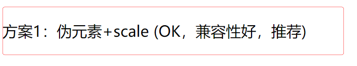
方案1:伪元素+scale (兼容性好,推荐)
实现方式:给容器设置伪元素,设置绝对定位,宽高都是200%,边框是1px,然后使用transform:scale(0.5) 让伪元素缩小原来的一半,此时伪元素的边框和容器的边缘重合。
<div class="box box1"></div>
    .box {
        width: 360px;
        height: 50px;
        border-radius: 5px;
        margin-top: 20px;
        line-height: 50px;
      }
    .box1 {
        position: relative;
     }
     .box1::after {
        position: absolute;
        bottom: 0;
        z-index: -1;
        width: 200%;
        height: 200%;
        content: "";
        display: block;
        border: 1px solid red;
        border-radius: 5px;
        transform: scale(0.5);
        transform-origin: left bottom;
     }
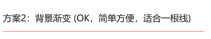
方案2:背景渐变 (简单方便,适合一根线)
给容器设置伪元素,设置绝对定位,高度1px,背景图设置线性渐变,一半有颜色一半透明,视觉上只有0.5px 没办法展示圆角
<div class="box box2"></div>
	.box {
        width: 360px;
        height: 50px;
        border-radius: 5px;
        margin-top: 20px;
        line-height: 50px;
      }
	.box2 {
         	position: relative;
		  }

     .box2::after {
            content: "";
            position: absolute;
            left: 0;
            bottom: 0;
            width: 100%;
            height: 1px;
            background-image: linear-gradient(0deg, red 50%, transparent 50%);
        }
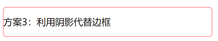
方案3:利用阴影代替边框
能正常展示圆角,而且能实现0.1px等更细的边框,兼容性还行
<div class="box box3"></div>
.box {
        width: 360px;
        height: 50px;
        border-radius: 5px;
        margin-top: 20px;
        line-height: 50px;
      }
.box3 {
        box-shadow: 0 0 0 0.5px red;
      }


 扫一扫
扫一扫


 574
574

 被折叠的 条评论
为什么被折叠?
被折叠的 条评论
为什么被折叠?
 到【灌水乐园】发言


