


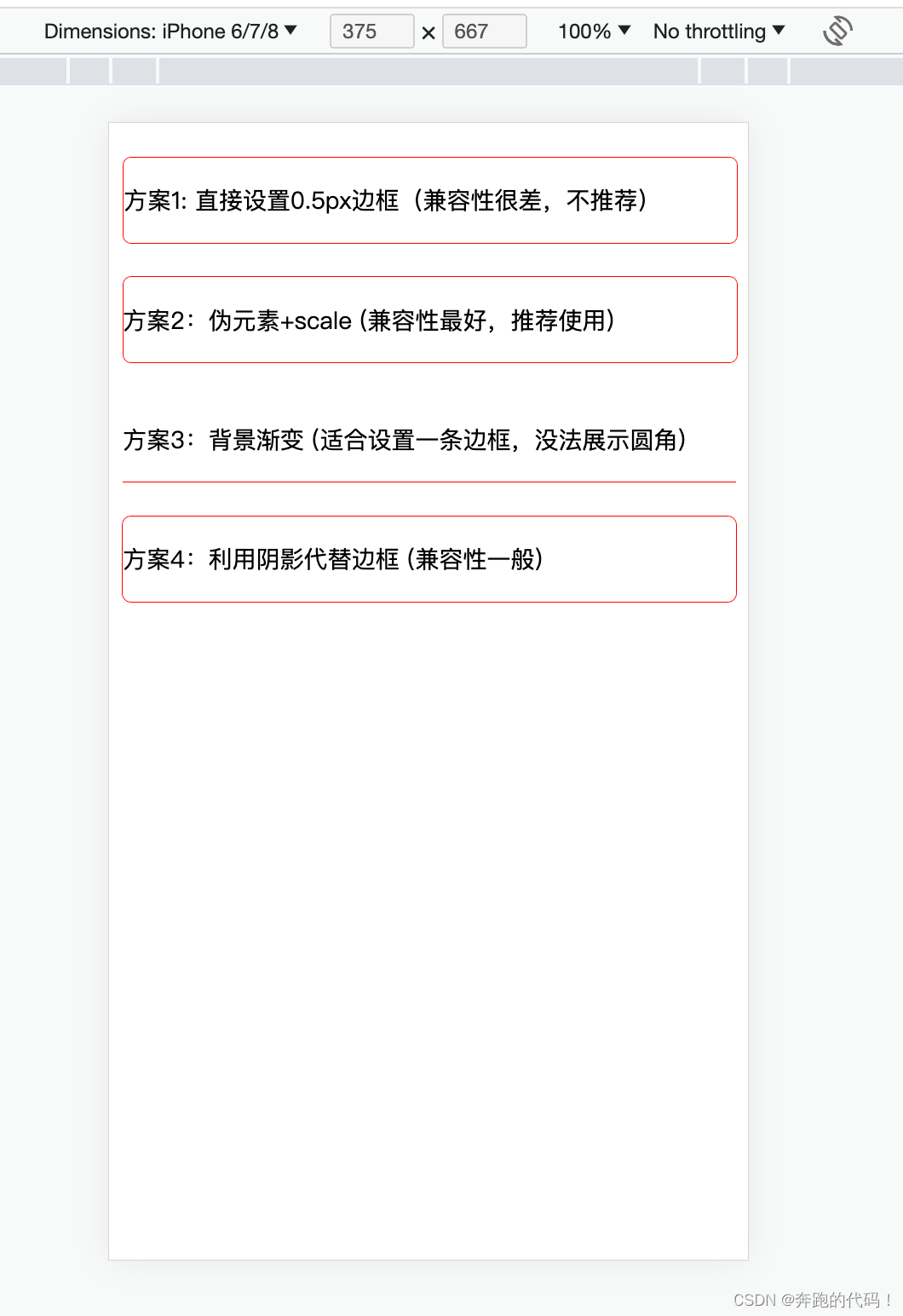
 文章介绍了四种在移动端实现0.5px边框的方法,包括直接设置(兼容性差)、使用伪元素结合transform:scale、背景线性渐变和利用box-shadow。其中,使用伪元素和transform:scale的方案因最佳兼容性和能展示圆角而被推荐。
移动端0.5px边框实现
自我记录
4种方案推荐方案2
方案1:直接设置0.5px边框(兼容性很差,不推荐)
方案2:给容器内设置伪元素,设置绝对定位,宽、高是200%,圆角2倍,边框是1px,然后使用transform: scale(0.5) 让伪元素缩小原来的一半,这时候伪元素的边框和容器的边缘重合,视觉上宽度只有0.5px。这种方法兼容性最好,4个边框都能一次性设置,能正常展示圆角,推荐使用。
方案3:给容器设置伪元素,设置绝对定位,高度为1px,背景图为线性渐变,一半有颜色,一半透明。视觉上宽度只有0.5px。这种方法适合设置一条边框,没法展示圆角。
方案4:用阴影代替边框,设置阴影box-shadow: 0 0 0 0.5px red; 使用方便,能正常展示圆角,兼容性一般。
<!DOCTYPE html>
<html lang="en">

<head>
    <meta charset="UTF-8">
    <meta http-equiv="X-UA-Compatible" content="IE=edge">
    <meta name="viewport" content="width=device-width, initial-scale=1.0">
    <title>Document</title>
</head>
<style>
    .box {
        width: 360px;
        height: 50px;
        border-radius: 5px;
        margin-top: 20px;
        line-height: 50px;
        font-size: 14px;
    }

    /* 方案1:直接设置boder-width */
    .box1 {
        border: 0.5px solid red;
    }

    /* 方案2:伪元素+scale 宽高200% 圆角也要2倍 */
    .box2 {
        position: relative;
    }

    .box2::after {
        position: absolute;
        bottom: 0;
        z-index: -1;
        width: 200%;
        height: 200%;
        content: "";
        display: block;
        border: 1px solid red;
        border-radius: 10px;
        transform: scale(0.5);
        transform-origin: left bottom;
    }

    /* 方案3:背景渐变 适合一根线 */
    .box3 {
        position: relative;
    }

    .box3::after {
        content: "";
        position: absolute;
        left: 0;
        bottom: 0;
        width: 100%;
        height: 1px;
        background-image: linear-gradient(0deg, red 50%, transparent 50%);
    }

    /* 方案4:用阴影代替边框 */
    .box4 {
        box-shadow: 0 0 0 0.5px red;
    }
    /*
     * 向右偏移
     * 向下偏移
     * 模糊度
     * 扩散程度
     * 颜色
    */
</style>

<body>
    <!-- 方案1:直接设置0.5px边框(兼容性很差,不推荐) -->
    <div class="box box1">方案1: 直接设置0.5px边框(兼容性很差,不推荐)</div>
    <!-- 方案2:给容器内设置伪元素,设置绝对定位,宽、高是200%,圆角2倍,边框是1px,然后使用transform: scale(0.5) 让伪元素缩小原来的一半,这时候伪元素的边框和容器的边缘重合,视觉上宽度只有0.5px。这种方法兼容性最好,4个边框都能一次性设置,能正常展示圆角,推荐使用。 -->
    <div class="box box2">方案2:伪元素+scale (兼容性最好,推荐使用)</div>
    <!-- 方案3:给容器设置伪元素,设置绝对定位,高度为1px,背景图为线性渐变,一半有颜色,一半透明。视觉上宽度只有0.5px。这种方法适合设置一条边框,没法展示圆角。 -->
    <div class="box box3">方案3:背景渐变 (适合设置一条边框,没法展示圆角)</div>
    <!-- 方案4: 用阴影代替边框,设置阴影box-shadow: 0 0 0 0.5px red; 使用方便,能正常展示圆角,兼容性一般。 -->
    <div class="box box4">方案4:利用阴影代替边框 (兼容性一般)</div>
</body>

</html>
效果展示


 扫一扫
扫一扫


 688
688

 被折叠的 条评论
为什么被折叠?
被折叠的 条评论
为什么被折叠?
 到【灌水乐园】发言


