


带你用vue2写后台系列(封装Svg组件SvgIcon-挖坑并填埋)
1、组件目录搭建
接下来我们学习一下如何封装一个独立的组件,并且在这个过程之中我们会挖一些新人常见的报错坑并进行填埋
在src文件夹下新建一个components目录,这里我们用来存放公共的组件
这里我已经在对应的文件夹下面放了一些svg图片,当然,也可以自己去iconfont里面下载,下载以后我们就可以自己进行使用
2、思路:
1、封装一个Svgicon组件,全局注册,我们使用的时候,只需要使用上面的名字就可以实现文件夹下icon的使用
2、可以对于icon的颜色和大小进行设置
3、搭建Svgicon组件的页面和传递的参数
4、引入和使用Svgicon组件
3、搭建Svgicon组件
接下来我们就正式搭建Svgicon组件
我们先来一个简单一些的,就是直接使用v-html的方式直接把svgIcon的内容给引入进来
先在局部的组件内部使用一下看看
- 引入和使用

接下来我们就引入和使用这个404试试
这里组件使用我们直接上代码
4、挖坑填埋
坑 vue2 只有一个template根
这边报错,差点忘了vue2 只有一个 template 根的原则 所以外头套个div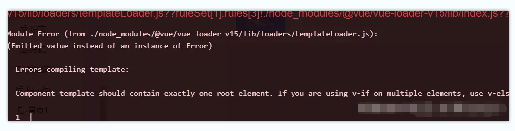
保存以后进行查看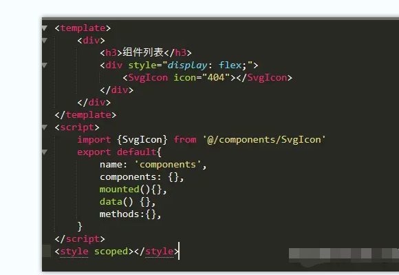
坑 不写组件名字
报错: Unknown custom element: <SvgIcon> - did you register the component correctly? For recursive components, make sure to provide the “name” option.`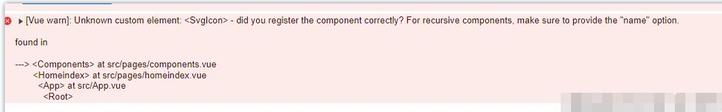
这是因为我们引入组件必须在组件之中写组件名字
在这个过程之中其实学习报错也是非常有必要的,上面不想看的也可以直接贴下面的代码,主要上面针对新人学习的
坑 不写data返回
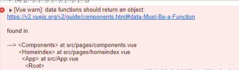
报错的含义就是,你没写data返回 这里我们的data不能写成空的,所以这里我们直接写个返回必须
报错解决
坑 未传递参数
这里是因为我们并没有给组件传递应该有的名字
更改一下
坑 组件写法问题
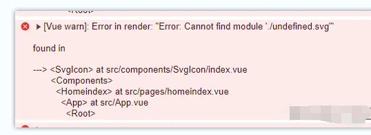
这里可以看到我们渲染成功了,但是只是一个路径是怎么回事呢?
回头看一下我们的svgIcon组件内部,我们使用名字是直接使用的,是不是我们传递参数地址错误了呢?直接改成地址参数试试
预览一下我们可以看出来,根本不是我们外部传递参数的问题,而是我们本身内部就有问题
也就是说我们不能使用v-html,这里我们改成svg的方式,这里svg的使用具体可以查看这篇svg文章,之前看的感觉蛮不错的!也可以看看Element的组件这部分源码!
接下来我们就直接使用一下看看,看如何做一个自己的SvgIcon`组件
5、SvgIcon组件插件svg-sprite-loader
在 Vue2项目中,我们一般会使用使用 svg-sprite-loader` 来处理 SVG 图标并生成 SVG 雪碧图,它可以帮助我们将多个 SVG 图标打包成一个雪碧图,在 Vue 组件中以符号的方式引用,减少 HTTP 请求和优化性能。
这个时候就需要引入一下我们的svg组件(针对webopack的)
安装插件
配置 webpack
在 vue.config.js` 文件中进行配置
主要是针对svg进行配置
完整部分就是如下:
全局注册所有组件
当我们的组件十分多的时候,这个时候我们几百上千个总不可能一个一个去注册吧,这个时候我们就会去自动全几乎注册某个文件夹下面的组件
在在assets/icons/index.js中全局注册组件,完成组件的注册,无需自己一个一个手动引入
对components/SvgIon中组件进行封装 封装一些我们常用的组件参数,通过iconClass 参数来控制组件显示哪一个
引入
这里记得要在我们的main.js之中进行引入啊,不引入如何使用呢
使用svg-icon组件
这里我们之前进行了全局注册,所以使用起来异常的简单
最后来看一下我们最终的效果: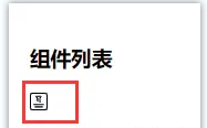
ok! 这就顺利完成了svg-icon组件的封装!
6、展示项目下面所有的icons
接下来我们在pages下面写一个icons,这个部分用于展示我们的所有项目里面的icon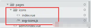
项目结构如下:
- svg-icons.js
其实就是导入,匹配,然后导出所有的
最后我们预览一下
成功!


 扫一扫
扫一扫


 被折叠的 条评论
为什么被折叠?
被折叠的 条评论
为什么被折叠?
 到【灌水乐园】发言


