


 本文详细介绍了CSS的选择器、样式应用(包括字体、颜色、链接、阴影等)、盒子模型、浮动、定位和CSS3特性,助你打造专业级网页布局与美化。
文章目录
HTML + CSS + JavaScript
结构 + 表现 + 交互
1. CSS简介
- CSS是什么
- CSS怎么用
- CSS选择器
- 美化网页(文字,阴影,超链接,列表)
- 盒子模型
- 浮动
- 定位
- 网页动画(特效)
1.1 什么是CSS
Cascading Style Sheet层叠级联样式表
CSS:表现(美化网页)
字体、颜色、边距、高度、背景图片、网页定位、网页浮动…
1.2 发展史
CSS1.0
CSS2.0 Div(块) + CSS , HTML与CSS结构分离的思想,SEO
CSS2.1 浮动、定位
CSS3.0 圆角边框、阴影、动画… 浏览器兼容性
1.3 快速介绍
style
<!DOCTYPE html>
<html lang="en">

<head>
    <meta charset="UTF-8">
    <meta http-equiv="X-UA-Compatible" content="IE=edge">
    <meta name="viewport" content="width=device-width, initial-scale=1.0">
    <title>Document</title>

    <!-- 规范,<style> 可以编写css代码,每一个声明最好使用分号结尾 -->
    <!--
        语法:
            选择器{
                声明1;
                声明2;
                声明3;
            }
     -->
    <style>
        h1 {
            color: brown;
        }
    </style>

</head>

<body>

    <h1>我是标题</h1>

</body>

</html>
结构分离
CSS优势:
- 内容和表现分离
- 网页结构表现统一,可以实现复用
- 样式十分的丰富
- 利用SEO,容易被搜索引擎收录
1.4 CSS的3中导入方式
优先级:就近原则
<!DOCTYPE html>
<html lang="en">
<head>
<meta charset="UTF-8">
<meta http-equiv="X-UA-Compatible" content="IE=edge">
<meta name="viewport" content="width=device-width, initial-scale=1.0">
<title>Document</title>
<!-- 内部样式 -->
<style>
h1 {
color: brown;
}
</style>
<!-- 外部样式 -->
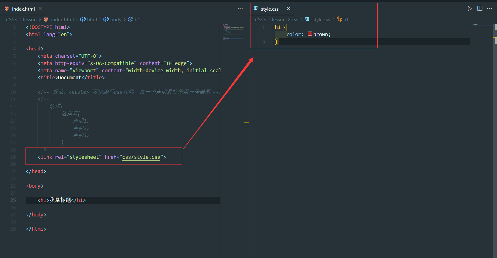
<link rel="stylesheet" href="css/style.css">
</head>
<body>
<!-- 行内样式:在标签元素中,编写一个style属性,编写样式即可 -->
<h1 style="color: red">我是标题</h1>
</body>
</html>
拓展:外部样式两种写法
-
链接式:html
<!-- 外部样式 --> <link rel="stylesheet" href="css/style.css"> -
导入式:@import 是CSS2.1特有
<style>
    /* 导入式 */
    @import url(css/style.css);
</style>
通常建议使用Link式
2. 选择器
作用:选择页面上的某一个或某一类元素
2.1 基本选择器
-
标签选择器:选择一类标签 标签{}
<style> /* 标签选择器,会选择到页面上所有的这个标签的元素 */ h1 { color: rgb(63, 212, 105); } p { font-size: 80px; } </style> </head> <body> <h1>一二三</h1> <p>四五六</p> <h1>七八九</h1> </body> -
类选择器:选中所有的class属性一致的标签 .类名{}
<style> /* 类选择器的格式: .class的名称{} */ /* 好处:可以多个标签归类,是同一个class,可以复用 */ .one { color: rgb(209, 48, 48); } .two { color: rgb(48, 240, 199); } </style> </head> <body> <h1 class="one">标题</h1> <h1 class="two">标题</h1> <h1 class="one">标题</h1> <p class="two">标签</p> </body> -
Id选择器:全局唯一 # id名{}
    <style>
        /*
        id选择器  :id必须保证全局唯一
            #id名称{}
        */
        #one {
            color: red;
        }
    </style>
</head>

<body>
    <h1 id="one">标题1</h1>
    <h1">标题2</h1>
    <h1>标题3</h1>
</body>
不遵循就近原则
优先级:id选择器 > class选择器 > 标签选择器
2.2 层次选择器
-
后代选择器:在某个元素的后面 爷爷、爸爸、儿子
/* 后代选择器 */ body p { background: red; } -
子选择器
-
子选择器: 一代,儿子
/* 子选择器 */ body>p { background: green; } -
相邻兄弟选择器: 第一个弟弟
/* 相邻兄弟选择器 (只有一个,相邻(向下)) */ .active+p { background: brown; } -
通用选择器 : 弟弟们
/* 通用选择器 当前选择元素向下的所有兄弟元素 */
.active~p {
    background: yellow;
}
<body>
    <p>p1</p>
    <p class="active">p2</p>
    <p>p3</p>

    <ul>
        <li>
            <p>p4</p>
        </li>
        <li>
            <p>p5</p>
        </li>
        <li>
            <p>p6</p>
        </li>
    </ul>
</body>
2.3 结构伪类选择器
伪类: 条件
<!DOCTYPE html>
<html lang="en">
<head>
<meta charset="UTF-8">
<meta http-equiv="X-UA-Compatible" content="IE=edge">
<meta name="viewport" content="width=device-width, initial-scale=1.0">
<title>Document</title>
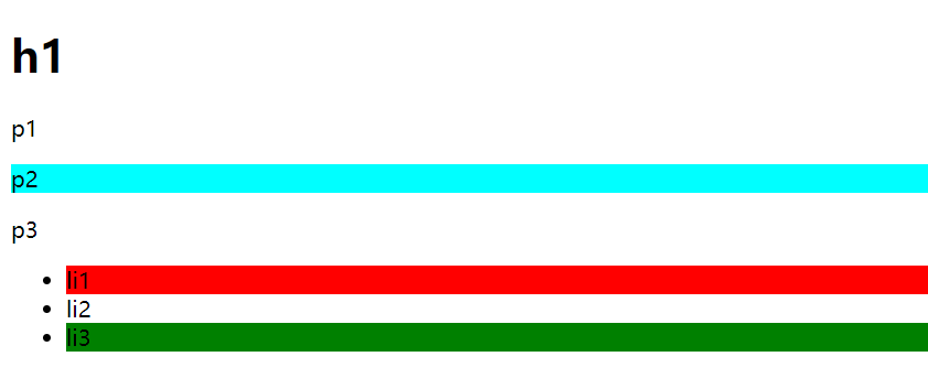
<style>
/* ul的第一个子元素 */
ul li:first-child {
background: red;
}
/* ul的最后一个子元素 */
ul li:last-child {
background: green;
}
/* 选中 p1 : 定位到父元素,选择当前的第一个元素,并且是当前元素才生效 */
p:nth-child(1) {
background: yellow;
}
/* 选中父元素下的,p元素的第二个类型 */
p:nth-of-type(2) {
background: cyan;
}
</style>
</head>
<body>
<h1>h1</h1>
<p>p1</p>
<p>p2</p>
<p>p3</p>
<ul>
<li>li1</li>
<li>li2</li>
<li>li3</li>
</ul>
</body>
</html>
2.4 属性选择器(常用)
id + class 结合
<!DOCTYPE html>
<html lang="en">

<head>
    <meta charset="UTF-8">
    <meta http-equiv="X-UA-Compatible" content="IE=edge">
    <meta name="viewport" content="width=device-width, initial-scale=1.0">
    <title>Document</title>

    <style>
        .demo a {
            float: left;
            display: block;
            height: 50px;
            width: 50px;
            border-radius: 10px;
            background: blue;
            text-align: center;
            color: gainsboro;
            text-decoration: none;
            margin-right: 5px;
            font: bold 20px/50px Arial;
        }

        /* 存在id属性的元素 a[]{}*/
        /* 属性名,属性名 = 属性值(正则) */
        /*
            = : 绝对等于
            *= : 包含这个这个元素
            ^= : 以这个开头
            $= : 以这个结尾
        */
        a[id] {
            background: yellow;
        }

        a[id=second] {
            background: cyan;
        }

        a[class*="links"] {
            background: red;
        }

        /* 选中href中以https开头的元素 */
        a[href^=https] {
            background: black;
        }

        a[href$=pdf] {
            background: brown;
        }
    </style>
</head>

<body>

    <p class="demo">
        <a href="https://www.baidu.com" class="links item first" id="first">1</a>
        <a href="" id="second" target="_blank" title="test">2</a>
        <a href="images/123.html" class="links item">3</a>
        <a href="images/123.png" class="links item">4</a>
        <a href="images/123.jpg" class="links item">5</a>
        <a href="abc" id>6</a>
        <a href="/a.pdf">7</a>
        <a href="/abc.pdf">8</a>
        <a href="abc.doc">9</a>
        <a href="abcd.doc" class="links item last">10</a>
    </p>

</body>

</html>
= : 绝对等于
*= : 包含这个这个元素
^= : 以这个开头
$= : 以这个结尾
3. 美化网页元素
span标签:重点要突出的字,使用span套起来
<!DOCTYPE html>
<html lang="en">

<head>
    <meta charset="UTF-8">
    <meta http-equiv="X-UA-Compatible" content="IE=edge">
    <meta name="viewport" content="width=device-width, initial-scale=1.0">
    <title>Document</title>

    <style>
        #title1 {
            font-size: 50px;
        }
    </style>
</head>

<body>
    这个是<span id="title1">重点</span>
</body>

</html>
3.1 字体样式
<!DOCTYPE html>
<html lang="en">
<head>
<meta charset="UTF-8">
<meta http-equiv="X-UA-Compatible" content="IE=edge">
<meta name="viewport" content="width=device-width, initial-scale=1.0">
<title>Document</title>
<style>
/*
font-family:字体
font-size:字体大小
ont-weight:字体粗细
color:字体颜色
*/
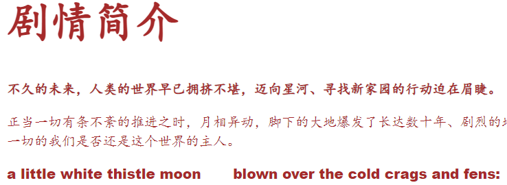
body {
font-family: Arial Black, 楷体;
color: brown;
}
h1 {
font-size: 50px;
}
.p1 {
font-weight: bold;
}
</style>
</head>
<body>
<h1>剧情简介</h1>
<p class="p1">
不久的未来,人类的世界早已拥挤不堪,迈向星河、寻找新家园的行动迫在眉睫。
</p>
<p class="p2">
正当一切有条不紊的推进之时,月相异动,脚下的大地爆发了长达数十年、剧烈的地质变化,人类在这场浩劫中所剩无几。当天地逐渐恢复平静,人们从废墟和深渊中重新踏上了这片熟悉而又陌生的大地。习惯了主宰一切的我们是否还是这个世界的主人。
</p>
<p>
a little white thistle moon
blown over the cold crags and fens:
a little white thistle moon
blown across the frozen heather
</p>
</body>
</html>
3.2 文本样式
- **颜色 **:color rgb rgba
- 文本对齐方式 :text-align =
- 首行缩进 :text-indent = 2em
- 行高: line-height 单行文字上下居中:line-height = hight
- 装饰 :text-decoration
- 文本图片水平对齐: vertical-align: middle;
<!DOCTYPE html>
<html lang="en">
<head>
<meta charset="UTF-8">
<meta http-equiv="X-UA-Compatible" content="IE=edge">
<meta name="viewport" content="width=device-width, initial-scale=1.0">
<title>Document</title>
<style>
/*
颜色:
单词
RGB 0~F
RGBA A(透明度):0~1
text-align:排版
text-indent:首行缩进
line-height:行高
行高 和 块 的高度一致,就可以上下居中
*/
h1 {
color: rgba(0, 255, 255, 0.5);
/*居中*/
text-align: center;
}
.p1 {
text-indent: 2em;
}
.p3 {
background: cyan;
height: 100px;
line-height: 100px;
}
.l1 {
/* 下划线 */
text-decoration: underline;
}
.l2 {
/* 中划线 */
text-decoration: line-through;
}
.l3 {
/* 上划线 */
text-decoration: overline;
}
/* 超链接去下划线 */
a {
text-decoration: none;
}
/* 水平对齐,参照物, a,b */
img,
span {
vertical-align: middle;
}
</style>
</head>
<body>
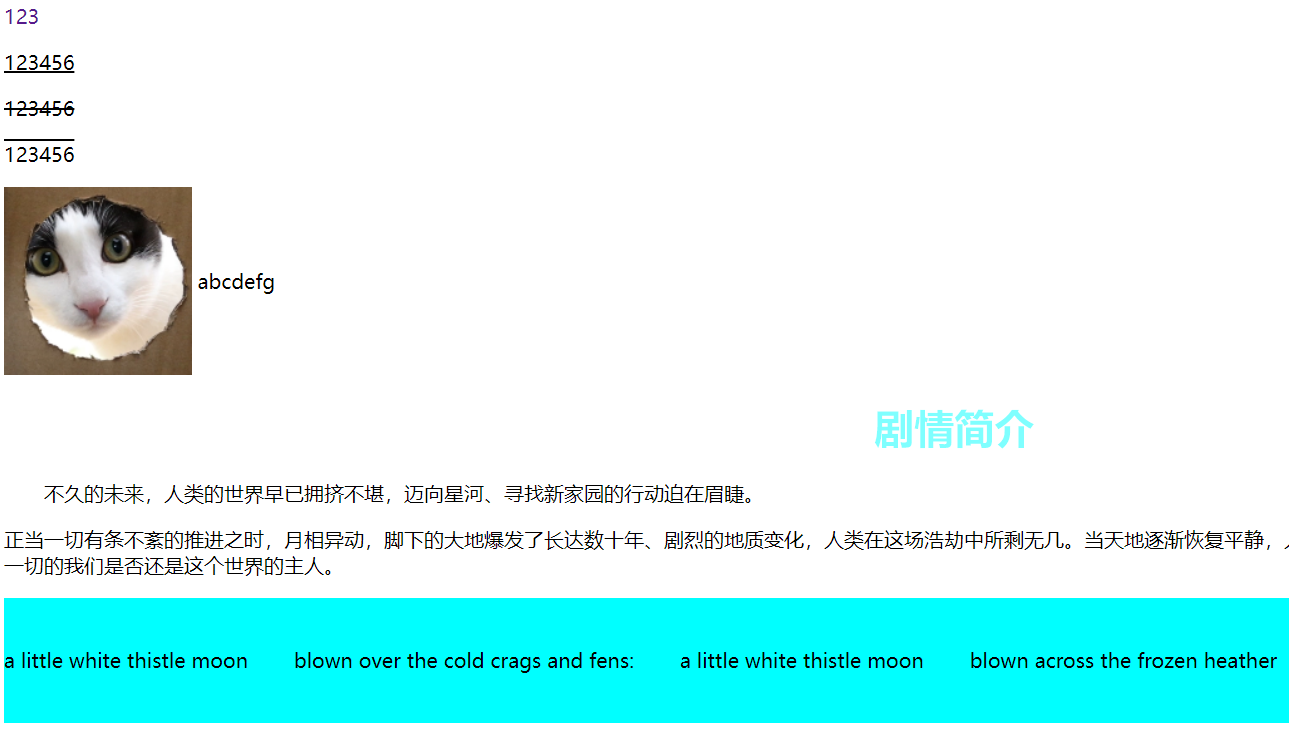
<a href="">123</a>
<p class="l1">123456</p>
<p class="l2">123456</p>
<p class="l3">123456</p>
<img src="images/猫猫.jpg" alt="">
<span>abcdefg</span>
<h1>剧情简介</h1>
<p class="p1">
不久的未来,人类的世界早已拥挤不堪,迈向星河、寻找新家园的行动迫在眉睫。
</p>
<p class="p2">
正当一切有条不紊的推进之时,月相异动,脚下的大地爆发了长达数十年、剧烈的地质变化,人类在这场浩劫中所剩无几。当天地逐渐恢复平静,人们从废墟和深渊中重新踏上了这片熟悉而又陌生的大地。习惯了主宰一切的我们是否还是这个世界的主人。
</p>
<p class="p3">
a little white thistle moon
blown over the cold crags and fens:
a little white thistle moon
blown across the frozen heather
</p>
</body>
</html>
3.3 超链接伪类
- a:link - 正常,未访问过的链接
- a:visited - 用户已访问过的链接
- a:hover - 当用户鼠标放在链接上时
- a:active - 链接被点击的那一刻
<!DOCTYPE html>
<html lang="en">
<head>
<meta charset="UTF-8">
<meta http-equiv="X-UA-Compatible" content="IE=edge">
<meta name="viewport" content="width=device-width, initial-scale=1.0">
<title>Document</title>
<style>
/* 默认的状态 */
a {
text-decoration: none;
color: black;
}
/* 鼠标悬浮的状态 */
a:hover {
color: orange;
}
/* 鼠标按住未释放的状态 */
a:active {
color: green;
}
a.visited {
color: red;
}
</style>
</head>
<body>
<a href="">
<img src="images/码出高效.jpg" alt="">
</a>
<p>
<a href="#">码出高效:Java开发手册</a>
</p>
<p>
<a href="">作者:孤尽老师</a>
</p>
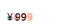
<p id="price">
¥99
</p>
</body>
</html>
3.4 阴影
/* text-shadow:阴影颜色,水平偏移,垂直偏移,阴影半径 */
#price {
text-shadow: tomato 10px 0px 2px;
}
3.5 列表
/* ul li */
/*
list-style
    none:去掉原点
    circle:空心圆
    decimal:数字
    square:方形
*/
/* ul{
    background: whitesmoke;
} */

ul li{
    height: 30px;
    list-style: none;
    text-indent: 1em;
3.6 背景
- 背景颜色
- 背景图片
<style>
        div {
            width: 1000px;
            height: 700px;
            border: 1px solid blue;
            /* 默认全部平铺 */
            background-image: url(images/猫猫.jpg);
        }

        .div1 {
            background-repeat: repeat-x;
        }

        .div2 {
            background-repeat: repeat-y;
        }

        .div3 {
            background-repeat: no-repeat;
        }
  </style>
/*颜,图片,图片位置,平铺方式*/
.title{
    background: red url("...") 200px 10px no-repeat;
}

ul li{
    background-image:url("...");
    background-repeat:no-repeat;
    background-position:200px 2px;
}
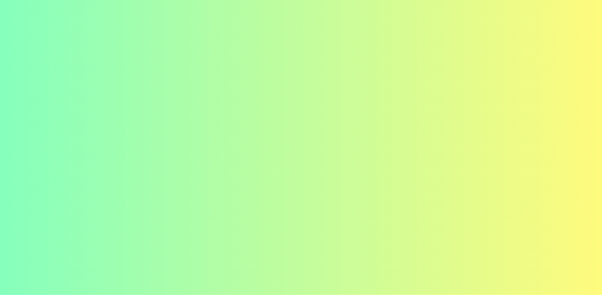
3.7 渐变
渐变色生成网站:https://www.grabient.com/
background-color: #4158D0;
background-image: linear-gradient(303deg, #4158D0 0%, #C850C0 46%, #FFCC70 100%);
4. 盒子模型
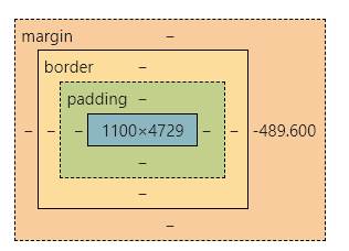
-
margin:外边距
-
padding:内边距
-
border:边框
盒子的计算方式:这个元素到底有多大?
- margin + border + padding + 内部元素
4.1 边框
- 粗细
- 样式
- 颜色
一般浏览器中都对body标签进行默认的margin设置为8px,我们使用时可以对其初始化为0
border:粗细,样式,颜色
<style>
/* body总有一个默认的外边距 */
/* 我们可以对他们进行初始化,常见操作 */
h1,
ul,
li,
a,
body {
margin: 0px;
padding: 0px;
text-decoration: none;
}
h2 {
font-size: 16px;
background: rgb(242, 124, 124);
line-height: 30px;
margin: 0;
color: white;
}
/* border:粗细,样式,颜色 */
#app {
width: 300px;
border: 1px solid red;
}
form {
background: rgb(22, 132, 22);
}
div:nth-of-type(1) input {
border: 2px solid black;
}
</style>
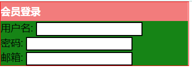
<body>
<div id="app">
<h2>会员登录</h2>
<form action="#">
<div>
<span>用户名:</span>
<input type="text">
</div>
<div>
<span>密码:</span>
<input type="password">
</div>
<div>
<span>邮箱:</span>
<input type="email">
</div>
</form>
</div>
</body>
</html>
4.2 边距
- margin设为一个值时,表明四个子属性均为此值;
- 设为两个值时,表明margin-top和margin-bottom将为第一个值,margin-left和margin-right将为第二个值;
- 设为三个值,表明margin-top取第一个值,margin-left和margin-right取第二个值,margin-bottom取第三个值;
- 设为四个值,则按照top, right, bottom, left的顺序从第一个值开始设置
padding同理
注:
- 可以通过对块级元素设置 text-align:center;的方式来实现内联元素(如文本、图片)居中
- margin:0 auto;可以使盒子居中,text-align:center;可以使此盒子内的内联元素居中,故有时需要两者结合使用才能使得盒子及其中文本一起居中。
4.3 圆角边框
4个角
border-radius:左上 右上 右下 左下 (顺时针)
圆圈: border大小设置为小于长度(宽度)的一半。
<style>
div {
width: 100px;
height: 100px;
border: 10px solid red;
/* 左上,右上,右下,左下 (顺时针) */
/* 圆圈:圆角=宽度 */
border-radius: 50px 20px 10px 5px;
}
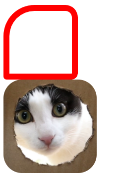
img {
border-radius: 30px;
}
</style>
<body>
<div></div>
<img src="images/猫猫.jpg" alt="">
</body>
4.4 盒子阴影
box-shadow: h-shadow v-shadow blur spread color inset
| 值 | 说明 |
|---|---|
| h-shadow | 必需的。水平阴影的位置。允许负值 |
| v-shadow | 必需的。垂直阴影的位置。允许负值 |
| blur | 可选。模糊距离 |
| spread | 可选。阴影的大小 |
| color | 可选。阴影的颜色。在CSS颜色值寻找颜色值的完整列表 |
| inset | 可选。从外层的阴影(开始时)改变阴影内侧阴影 |
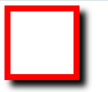
<style>
    div {
        width: 100px;
        height: 100px;
        border: 10px solid red;
        box-shadow: 10px 10px 10px black;
    }
</style>


<body>
    <div>
    </div>
</body>
5. display与浮动
标准文档流:
- 块级元素:独占一行
h1~h6 p div 列表......
- 行内元素:不独占一行
span a img strong......
行内元素可以被包含于块级元素中,反之不可行
5.1 display
常用值
block:块元素
inline:行内元素
inline-block:是块元素,但可以有在一行
none:消失
display可能的值
| 值 | 描述 |
|---|---|
| none | 此元素不会被显示。 |
| block | 此元素将显示为块级元素,此元素前后会带有换行符。 |
| inline | 默认。此元素会被显示为内联元素,元素前后没有换行符。 |
| inline-block | 行内块元素。(CSS2.1 新增的值) |
| list-item | 此元素会作为列表显示。 |
| run-in | 此元素会根据上下文作为块级元素或内联元素显示。 |
| compact | CSS 中有值 compact,不过由于缺乏广泛支持,已经从 CSS2.1 中删除。 |
| marker | CSS 中有值 marker,不过由于缺乏广泛支持,已经从 CSS2.1 中删除。 |
| table | 此元素会作为块级表格来显示,表格前后带有换行符。 |
| inline-table | 此元素会作为内联表格来显示,表格前后没有换行符。 |
| table-row-group | 此元素会作为一个或多个行的分组来显示 |
| table-header-group | 此元素会作为一个或多个行的分组来显示 |
| table-footer-group | 此元素会作为一个或多个行的分组来显示 |
| table-row | 此元素会作为一个表格行显示 |
| table-column-group | 此元素会作为一个或多个列的分组来显示) |
| table-column | 此元素会作为一个单元格列显示 |
| table-cell | 此元素会作为一个表格单元格显示 |
| table-caption | 此元素会作为一个表格标题显示 |
| inherit | 规定应该从父元素继承 display 属性的值。 |
5.2 浮动
CSS 的 Float(浮动),会使元素向左或向右移动,其周围的元素也会重新排列。
-
元素的水平方向浮动,意味着元素只能左右移动而不能上下移动。
-
一个浮动元素会尽量向左或向右移动,直到它的外边缘碰到包含框或另一个浮动框的边框为止。
-
浮动元素之后的元素将围绕它。
-
浮动元素之前的元素将不会受到影响。
-
如果图像是右浮动,下面的文本流将环绕在它左边:
img
{
    float:right;
}
- 元素浮动之后,周围的元素会重新排列,为了避免这种情况,使用 clear 属性。
- clear 属性指定元素两侧不能出现浮动元素。如果你把几个浮动的元素放到一起,如果有空间的话,它们将彼此相邻。
.text_line
{
    clear:both;
}
5.3 父级边框塌陷问题
clear
| 值 | 描述 |
|---|---|
| left | 在左侧不允许浮动元素。 |
| right | 在右侧不允许浮动元素。 |
| both | 在左右两侧均不允许浮动元素。 |
| none | 默认值。允许浮动元素出现在两侧。 |
| inherit | 规定应该从父元素继承 clear 属性的值。 |
解决方案:
-
增加父级元素的高度(不推荐),(元素有了固定宽度就会被限制)
-
在父级边框内部最下方,增加一个空的div标签,清除浮动(代码中尽量避免空div)
<div id = "father"> ... <div class = "clear"></div> </div>.clear{ clear:both; margin:0px; padding:0px; } -
overflow:操作简单,但是有一点不好,在有下拉菜单的时候,下拉菜单会显示不出来,下拉的一些场景避免使用。
/*在父级元素中添加overflow: hidden*/
overflow:hidden;
overflow可能的值
值 描述 visible 默认值。内容不会被修剪,会呈现在元素框之外。 hidden 内容会被修剪,并且其余内容是不可见的。 scroll 内容会被修剪,但是浏览器会显示滚动条以便查看其余的内容。 auto 如果内容被修剪,则浏览器会显示滚动条以便查看其余的内容。 inherit 规定应该从父元素继承 overflow 属性的值。 -
父类添加一个伪类:after(推荐):写法稍微复杂,但是无副作用,推荐使用。
#father: after {
	content: "";
    display: block;
    clear: both;
}
5.4 对比
- display
- 方向不可控制
- float
- 方向可控
- 浮动起来会脱离标准文档流,要解决父级边框塌陷的问题
6. 定位
属性值
| 值 | 描述 |
|---|---|
| absolute | 生成绝对定位的元素,相对于 static 定位以外的第一个父元素进行定位。元素的位置通过 “left”, “top”, “right” 以及 “bottom” 属性进行规定。 |
| fixed | 生成固定定位的元素,相对于浏览器窗口进行定位。元素的位置通过 “left”, “top”, “right” 以及 “bottom” 属性进行规定。 |
| relative | 生成相对定位的元素,相对于其正常位置进行定位。因此,“left:20” 会向元素的 LEFT 位置添加 20 像素。 |
| static | 默认值。没有定位,元素出现在正常的流中(忽略 top, bottom, left, right 或者 z-index 声明)。 |
| sticky | 粘性定位,该定位基于用户滚动的位置。它的行为就像 position:relative; 而当页面滚动超出目标区域时,它的表现就像 position:fixed;,它会固定在目标位置。注意: Internet Explorer, Edge 15 及更早 IE 版本不支持 sticky 定位。 Safari 需要使用 -webkit- prefix (查看以下实例)。 |
| inherit | 规定应该从父元素继承 position 属性的值。 |
| initial | 设置该属性为默认值 |
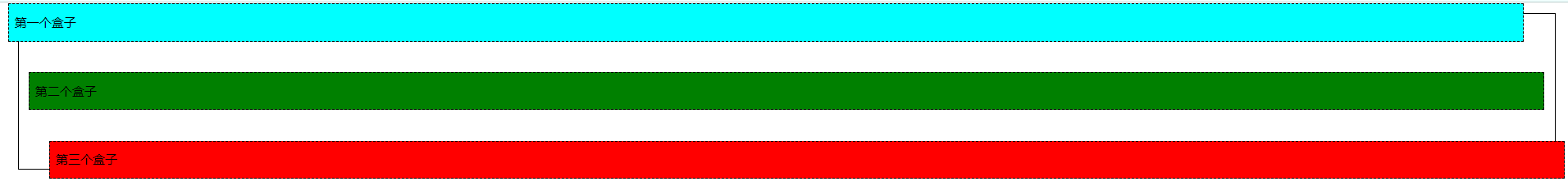
默认状态
<!DOCTYPE html>
<html lang="en">

<head>
    <meta charset="UTF-8">
    <meta http-equiv="X-UA-Compatible" content="IE=edge">
    <meta name="viewport" content="width=device-width, initial-scale=1.0">
    <title>Document</title>

    <style>
        div {
            margin: 10px;
            padding: 5px;
            font-size: 12px;
            line-height: 25px;
        }

        #father {
            border: 1px solid black;
            padding: 0px;
        }

        #first {
            background-color: cyan;
            border: 1px dashed black;
        }

        #second {
            background-color: green;
            border: 1px dashed black;
        }

        #third {
            background-color: red;
            border: 1px dashed black;
        }
    </style>
</head>

<body>
    <div id="father">
        <div id="first">第一个盒子</div>
        <div id="second">第二个盒子</div>
        <div id="third">第三个盒子</div>
    </div>
</body>

</html>
6.1 相对定位
设置为相对定位的元素框会偏移某个距离。元素仍然保持其未定位前的形状,它原本所占的空间仍保留。
相对原来的位置进行指定的偏移,相对定位后,仍然在标准文档流中,原来的位置会被保留
position: relative;
top: -20px;
left: -20px;
bottom: -20px;
right: -20px;
#first {
    background-color: cyan;
    border: 1px dashed black;

    /* 相对定位: */
    position: relative;
    top: -20px;
    left: -20px;
}

#second {
    background-color: green;
    border: 1px dashed black;
}

#third {
    background-color: red;
    border: 1px dashed black;
    position: relative;
    bottom: -20px;
    right: -20px;
}
6.2 绝对定位
- 没有父级元素定位的前提下,相对于浏览器进行定位
- 假设父级元素存在定位,我们通常会相对于父级元素进行偏移
- 在父级元素范围内
相对父级或浏览器的位置进行指定的偏移,绝对定位后,不在标准文档流中,原来的位置不会被保留
#box_relative {
  position: absolute;
  left: 30px;
  top: 20px;
}
例:
#second {
    background-color: green;
    border: 1px dashed black;
    position: absolute;
    right: 20px;
}

6.3 固定定位fixed
-
元素的位置相对于浏览器窗口是固定位置。
-
即使窗口是滚动的它也不会移动:
p.pos_fixed
{
    position:fixed;
    top:30px;
    right:5px;
}
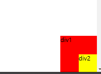
例
<!DOCTYPE html>
<html lang="en">

<head>
    <meta charset="UTF-8">
    <meta http-equiv="X-UA-Compatible" content="IE=edge">
    <meta name="viewport" content="width=device-width, initial-scale=1.0">
    <title>Document</title>

    <style>
        body {
            height: 1000px;
        }

        /* 绝对定位,相对于浏览器 */
        div:nth-of-type(1) {
            width: 100px;
            height: 100px;
            background: red;
            position: absolute;
            right: 0;
            bottom: 0;
        }

        /* fixed:固定定位 */
        div:nth-child(2) {
            width: 50px;
            height: 50px;
            background-color: yellow;
            position: fixed;
            right: 0;
            bottom: 0px;
        }
    </style>
</head>

<body>
    <div>div1</div>
    <div>div2</div>
</body>

</html>
6.4 z-index,透明度
默认是0,最高999
z-index 属性设置元素的堆叠顺序。拥有更高堆叠顺序的元素总是会处于堆叠顺序较低的元素的前面。
**注释:**元素可拥有负的 z-index 属性值。
**注释:**Z-index 仅能在定位元素上奏效(例如 position:absolute;)!
说明
该属性设置一个定位元素沿 z 轴的位置,z 轴定义为垂直延伸到显示区的轴。如果为正数,则离用户更近,为负数则表示离用户更远。
可能的值
| 值 | 描述 |
|---|---|
| auto | 默认。堆叠顺序与父元素相等。 |
| number | 设置元素的堆叠顺序。 |
| inherit | 规定应该从父元素继承 z-index 属性的值。 |
透明度
opacity: value|inherit;
| 值 | 描述 |
|---|---|
| value | 规定不透明度。从 0.0 (完全透明)到 1.0(完全不透明)。 |
| inherit | 应该从父元素继承 opacity 属性的值。 |
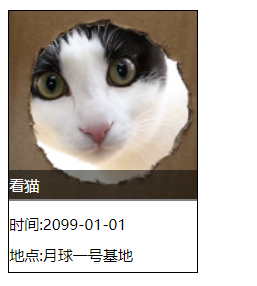
<!DOCTYPE html>
<html lang="en">

<head>
    <meta charset="UTF-8">
    <meta http-equiv="X-UA-Compatible" content="IE=edge">
    <meta name="viewport" content="width=device-width, initial-scale=1.0">
    <title>Document</title>

    <link rel="stylesheet" href="css/style.css">
</head>

<body>
    <div id="content">
        <ul>
            <li><img src="images/猫猫.jpg" alt=""></li>
            <li class="tipText">看猫</li>
            <li class="tigBg"></li>
            <li>时间:2099-01-01</li>
            <li>地点:月球一号基地</li>
        </ul>
</body>
</div>


</html>
#content{
    width: 150px;
    margin: 0px;
    padding: 0px;
    overflow: hidden;
    font-size: 12px;
    line-height: 25px;
    border: 1px black solid;
}

ul,li{
    margin: 0px;
    padding: 0px;
    list-style: none;
}

#content ul{
    position: relative;
}

.tipText, .tigBg{
    position:absolute;
    width: 150px;
    height: 25px;
    top:127px;
}

.tipText{
    color: white;
    /* 堆叠顺序 */
    /* 越高,层级越靠上,覆盖下面的东西 */
    z-index: 999;
}

.tigBg{
    background: black;
    /* 透明度 */
    opacity: 0.5;
}


 扫一扫
扫一扫


 3282
3282

 被折叠的 条评论
为什么被折叠?
被折叠的 条评论
为什么被折叠?
 到【灌水乐园】发言


