


引用声明:
本文绘图白化内容参考了:
数据插值内容参考了:
https://www.bilibili.com/video/BV1G3411271B/?spm_id_from=333.1387.upload.video_card.click
地图数据参考了:
https://blog.youkuaiyun.com/qq_43874102/article/details/129368114?spm=1001.2014.3001.5506
准备工作:
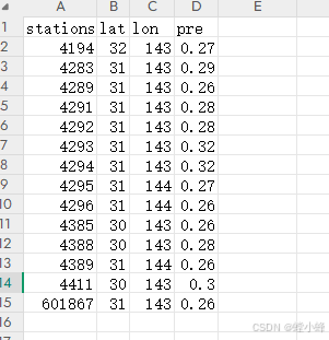
1、已处理好的站点数据(我使用的数据如下*.csv):
2、地图shp文件

3、我这里需要加入“仿宋”字体
![]()
4、白化用的自定义模块,参考第一个引用的帖子
数据处理
首先导入模块,这里使用到了(我使用的python3.9)
maskout(自定义),Basemap,matplotlib,cartopy,numpy,pandas
import maskout         # 该库为该文件夹自定义库
from mpl_toolkits.basemap import Basemap
import matplotlib.pyplot as plt
import cartopy.crs as ccrs
import cartopy.mpl.ticker as cticker
import cartopy.feature as cfeature
from matplotlib.font_manager import FontProperties
import numpy as np
import pandas as pd
# ---------------------------------数据处理部分,包括读取数据,数据插值-----------------------------
# 读取数据
data0 = pd.read_csv('E:\\pre.csv', sep=',')
# 数据插值
# 创建克里金插值对象,不会立即开始插值
from pykrige.ok import OrdinaryKriging
krige = OrdinaryKriging(
data0['lon'],
data0['lat'],
data0['pre'],
variogram_model="linear",
verbose=False,
enable_plotting=False,
)
# 创建插值目标栅格
lat = np.arange(3.5, 4.3+0.01, 0.01)
lon = np.arange(16.7, 18.1+0.01, 0.01)
lat1,lat2 = lat[0],lat[-1]
lon1,lon2 = lon[0],lon[-1]
# 插值
pre_grid, ss = krige.execute("grid", lon, lat)
# 计算插值后数据pre_grid列和行分别有多少格点
nx = pre_grid.shape[1]
ny = pre_grid.shape[0]# ------------------------------------------绘图部分----------------------------------------------
# 绘图
fig = plt.figure(figsize=(16,9))
ax = fig.add_subplot(111, projection=ccrs.PlateCarree())
m = Basemap(llcrnrlon=lon1, llcrnrlat=lat1,
urcrnrlon=lon2, urcrnrlat=lat2,
projection='cyl')
xx, yy = m.makegrid(nx, ny)
# 添加shapefile
m.readshapefile('T2024年初县级', 'whatevername', color='black')
# 设置填色层级
levels = np.arange(0.19, 0.25, 0.01)
# ================== 自定义颜色方案 ==================
# 完全自定义颜色
from matplotlib.colors import LinearSegmentedColormap
# 自定义颜色参数
custom_colors = ['darkviolet', 'blue', 'dodgerblue', 'turquoise',
'greenyellow', 'gold','red']
cmap = LinearSegmentedColormap.from_list('custom_cmap', custom_colors)
# ===================================================
# 生成填色图
cs = m.contourf(xx, yy, pre_grid,
levels=levels,
zorder=0,
extend='both',
transform=ccrs.PlateCarree(),
cmap=cmap, # 使用自定义色图
# norm=norm # 如果需要非均匀色阶可以添加标准化参数
)
# 设置图形范围及刻度
ax.set_xticks(np.arange(116, 120, 1), crs=ccrs.PlateCarree())
ax.set_yticks(np.arange(38, 42, 1), crs=ccrs.PlateCarree())
ax.xaxis.set_major_formatter(cticker.LongitudeFormatter())
ax.yaxis.set_major_formatter(cticker.LatitudeFormatter())
# ================== 添加城市标注 ==================
# 加载仿宋字体
font_path = 'E:\\simfang.ttf' # 请确保路径正确,如果是ttf文件需要扩展名
try:
custom_font = FontProperties(fname=font_path, size=10)
except:
print(f"字体加载失败,请检查路径:{font_path}")
custom_font = FontProperties() # 使用默认字体
# 定义需要标注的城市字典(可自定义修改),经度,纬度
cities = {
"区": (17.4, 4.0),
"市": (18.4, 3.6),
"市区": (15.1,3.4)
}
for city, (lon, lat) in cities.items():
# 将经纬度转换为地图坐标
x, y = m(lon, lat)
# 添加带背景框的文字
ax.text(x, y, city,
fontproperties=custom_font, # 应用自定义字体
fontsize=10,
color='black',
weight='bold', # 字体加粗
ha='center', # 水平居中
va='center', # 垂直居中
transform=ax.projection, # 使用地图坐标系
zorder=20, # 设置在最上层
bbox=dict( # 背景框参数
facecolor='white',
alpha=0.0, # 背景透明度
edgecolor='grey',
boxstyle='round,pad=0.2'
))
# ================================================
# 添加色标(优化显示)
# cbar = fig.colorbar(cs, ax=ax,
# orientation='horizontal', # 水平方向更易配色
# pad=0.05, # 调整色标与地图间距
# aspect=60,
# fraction=0.2) # 控制色标长宽比
cbar = fig.colorbar(cs,ax=ax,pad=0.02,aspect=40,fraction=0.2)
# 裁剪图形
clip = maskout.shp2clip(cs, ax, 'T2024年初县级', '自己修改')
# 调整布局
plt.tight_layout()
plt.savefig('./baihua.eps', bbox_inches='tight', dpi=300)补充说明:
1、在第三段程序倒数第四行有一个“自己修改”
# 裁剪图形
clip = maskout.shp2clip(cs, ax, 'T2024年初县级', '自己修改')这里是根据自己的shp文件与maskout模块去修改,首先读取*.gbk文件,并且将其数据输出
注意:这里虽然只用*.gbk文件,但其他文件同样需要放在同一文件夹下,需要调用;需要安装geopandas模块,我这里使用python3.12安装的,不报错有警告,不影响这里使用。
import geopandas as gpd
shp = gpd.read_file('E:\\T2024年初县级.shp',encodings='gbk')
file_name = "detial1.csv"
shp.to_csv(file_name)
读取的数据如下(从“地名”开始算,为第0列):
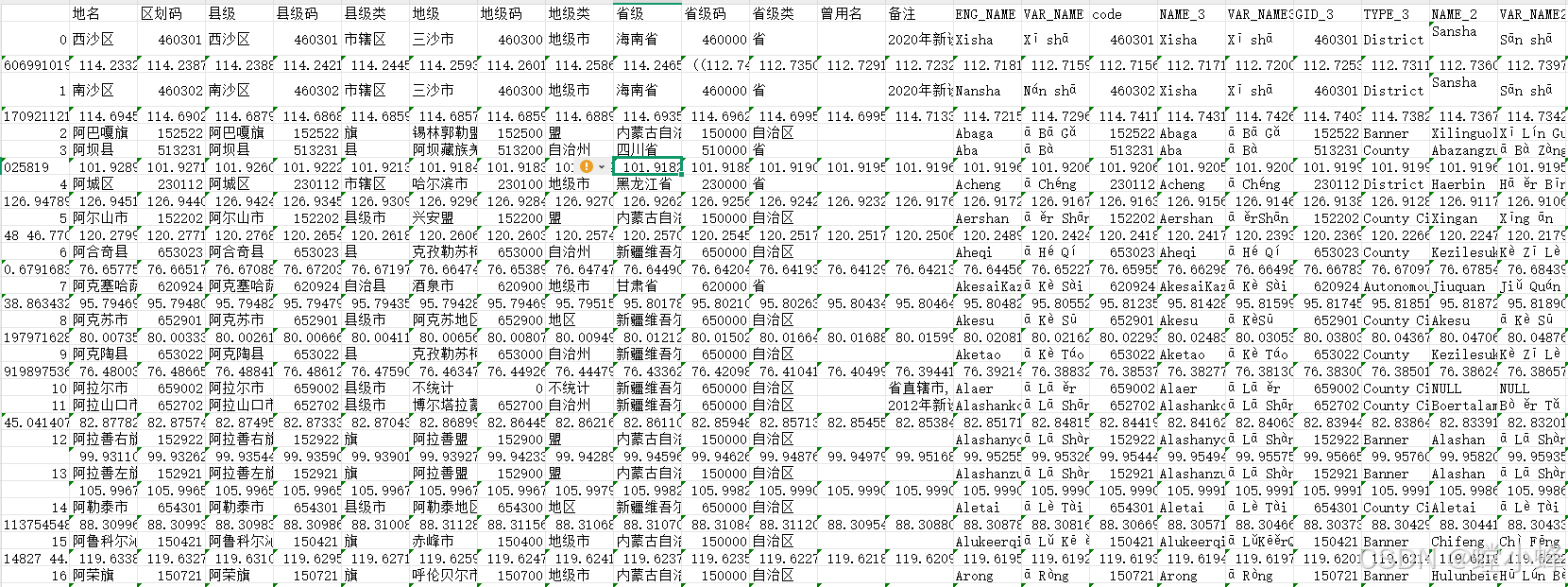
看到上面数据之后,需要确定你要哪一列的数据,比如我想要“省级”那一列中的“海南省”,那么你要数下它是在第几列,然后修改maskout模块中if shape_rec.record[4] in region:里面的数字“4”,为你刚数的那一列。
具体内容来源于,里面有详细介绍:Python完美白化-编程作图-气象家园_气象人自己的家园![]() http://bbs.06climate.com/forum.php?mod=viewthread&tid=42437&highlight=%B0%D7%BB%AF
http://bbs.06climate.com/forum.php?mod=viewthread&tid=42437&highlight=%B0%D7%BB%AF
#coding=utf-8
###################################################################################################################################
#####This module enables you to maskout the unneccessary data outside the interest region on a matplotlib-plotted output instance
####################in an effecient way,You can use this script for free     ########################################################
###############################by 平流层的萝卜####################################################################################
#####USAGE: INPUT  include           'originfig':the matplotlib instance##
#                                    'ax': the Axes instance
#                                    'shapefile': the shape file used for generating a basemap A
#                                    'region':the name of a region of on the basemap A,outside the region the data is to be maskout
#           OUTPUT    is             'clip' :the the masked-out or clipped matplotlib instance.
import shapefile
from matplotlib.path import Path
from matplotlib.patches import PathPatch
def shp2clip(originfig,ax,shpfile,region):
    sf = shapefile.Reader(shpfile)
    vertices = []    ######这块是已经修改的地方
    codes = []    ######这块是已经修改的地方
    for shape_rec in sf.shapeRecords():
        # if shape_rec.record[3] == region:  ####这里需要找到和region匹配的唯一标识符,record[]中必有一项是对应的。
        if shape_rec.record[4] in region:   ######这块是已经修改的地方
            pts = shape_rec.shape.points
            prt = list(shape_rec.shape.parts) + [len(pts)]
            for i in range(len(prt) - 1):
                for j in range(prt[i], prt[i+1]):
                    vertices.append((pts[j][0], pts[j][1]))
                codes += [Path.MOVETO]
                codes += [Path.LINETO] * (prt[i+1] - prt[i] -2)
                codes += [Path.CLOSEPOLY]
            clip = Path(vertices, codes)
            clip = PathPatch(clip, transform=ax.transData)
    for contour in originfig.collections:
        contour.set_clip_path(clip)
    return clip
我用的是上面这个maskout模块。


 1万+
1万+

 被折叠的 条评论
为什么被折叠?
被折叠的 条评论
为什么被折叠?
 到【灌水乐园】发言


