


最近女友生日,我家那口子学语言学的,不会啥编程语言,只能打开个网站或者exe执行文件,所以思来想去,也只有html版本的适合他了,给想要送女友生日快乐代码的做个参考。
写在前面(what you need prepare)
| 在一起的三十张照片,重命名为1到30.jpg放入到photo文件夹中 |
| 一首感人的bgm |
| 一颗诚恳的心(哈哈) |
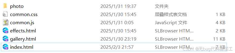
文件目录格式
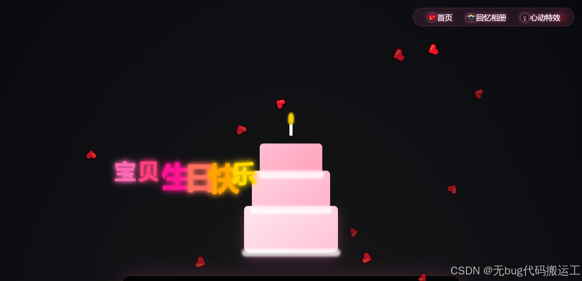
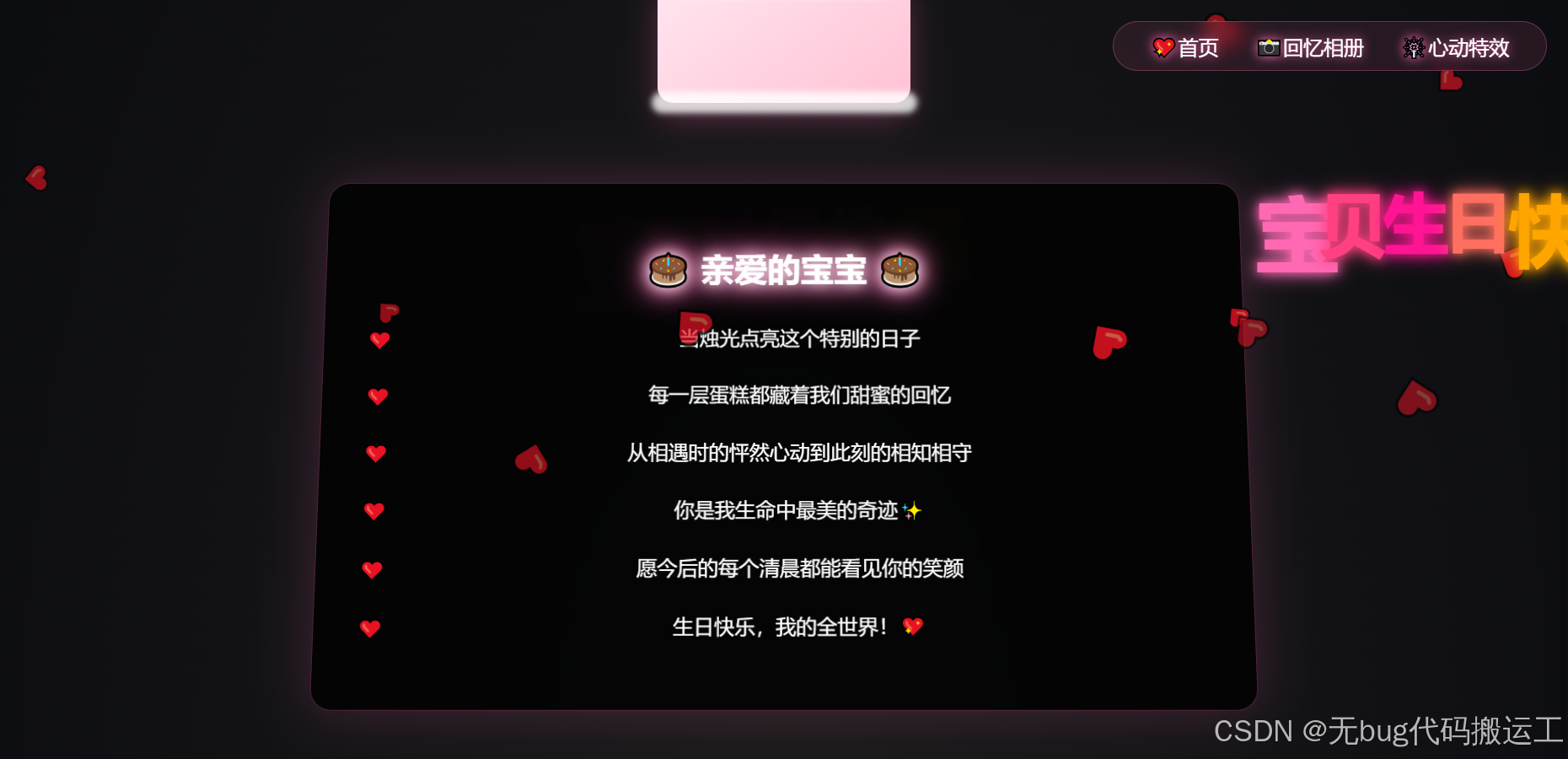
主页面效果:
懒得上动图了(爱心雨和生日快乐是动态的)
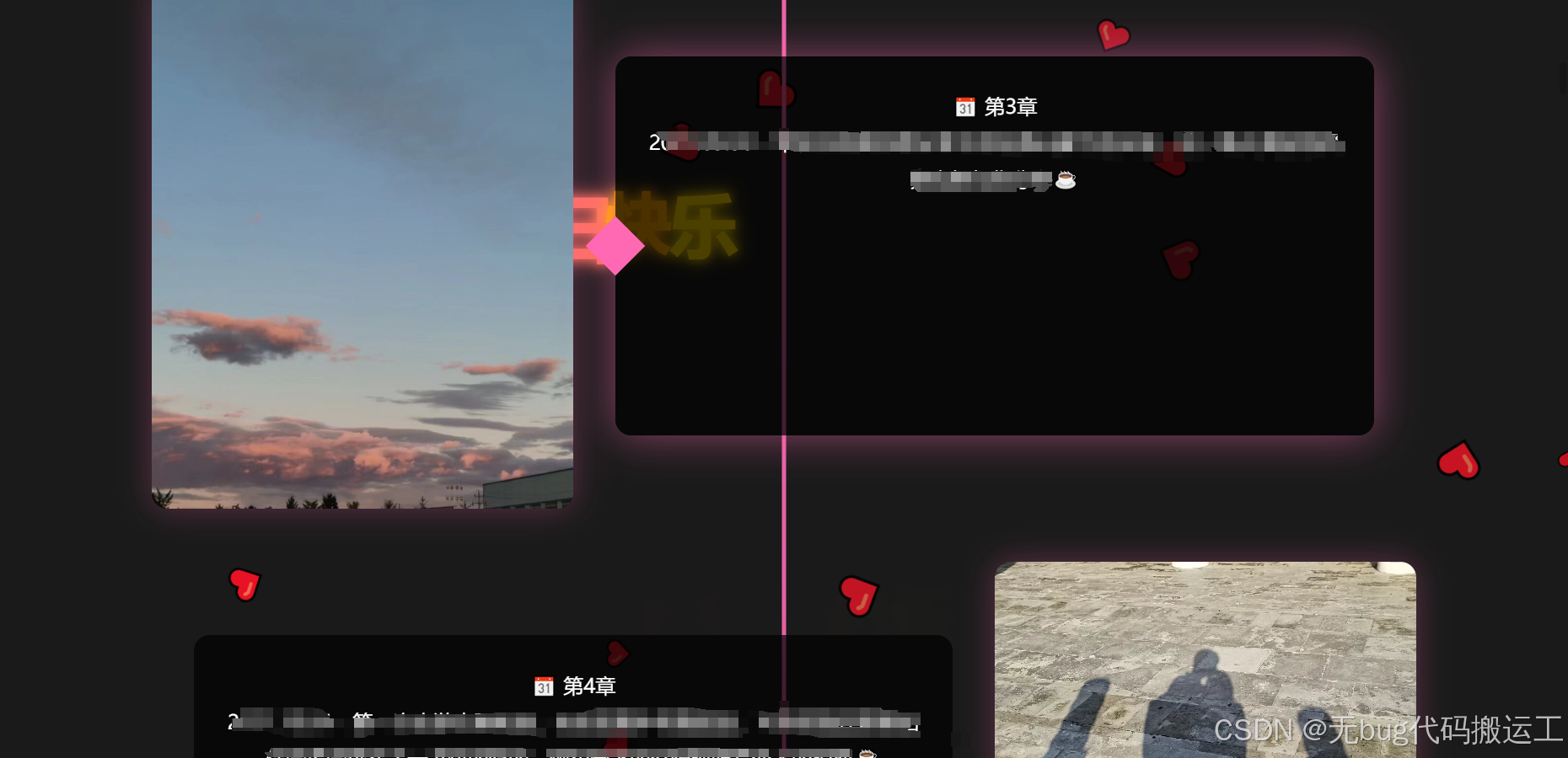
回忆相册效果:
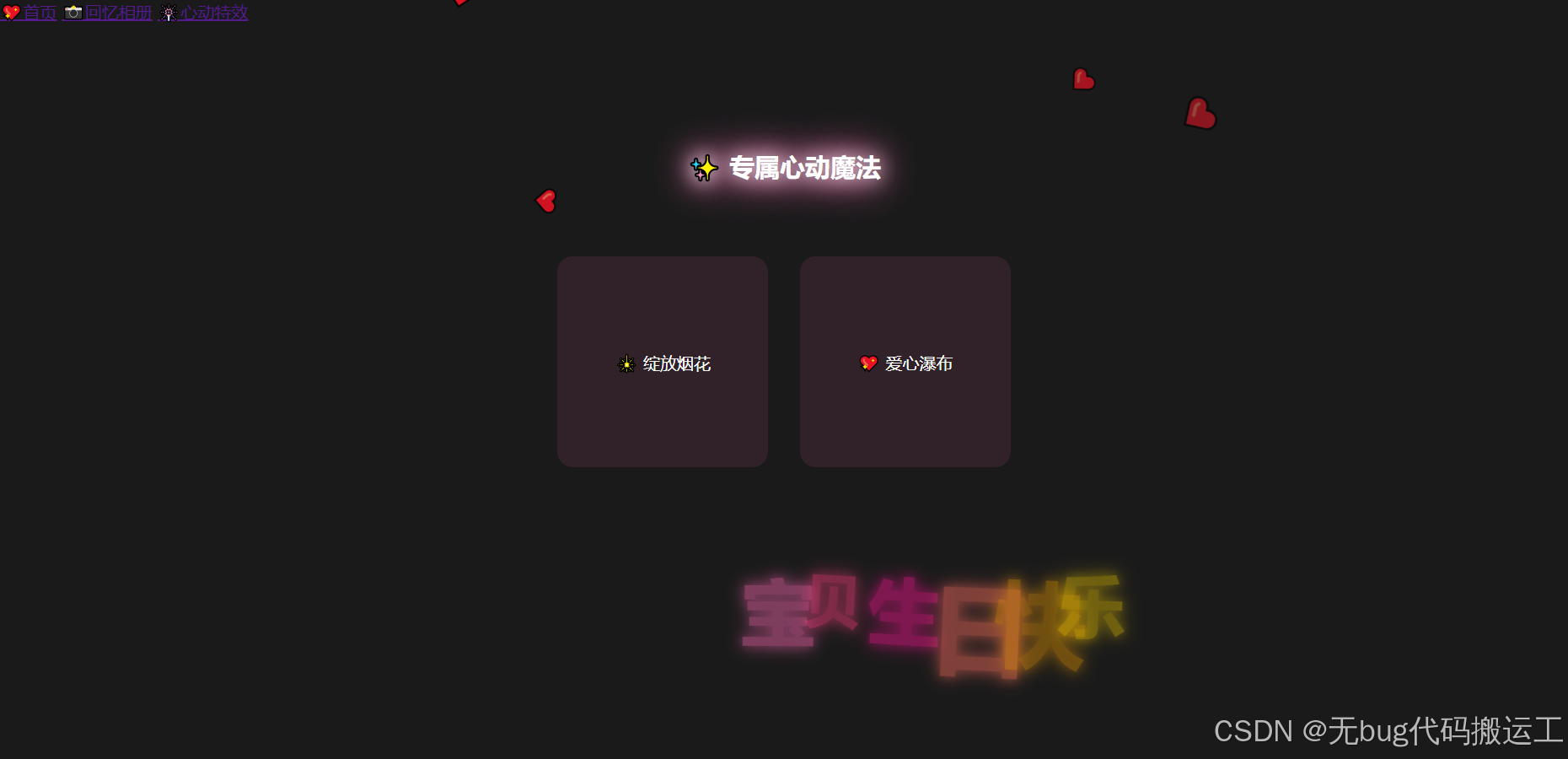
特效页面
没完工,期待各位大神加特效
代码
index.html
<!DOCTYPE html>
<html>
<head>
    <title>生日快乐我的公主</title>
    <link rel="stylesheet" href="common.css">
    <style>
        /* 星空背景升级 */
        body {
            background: radial-gradient(ellipse at bottom, #1a1a1a 0%, #090a0f 100%);
            overflow-x: hidden;
        }

        /* 导航栏动画 */
        nav {
            position: fixed;
            top: 20px;
            right: 20px;
            z-index: 1000;
            backdrop-filter: blur(10px);
            background: rgba(255,105,180,0.1);
            padding: 10px 20px;
            border-radius: 30px;
            border: 1px solid rgba(255,105,180,0.3);
        }

        nav a {
            color: #fff;
            text-decoration: none;
            margin: 0 15px;
            font-size: 1.2em;
            text-shadow: 0 0 10px #ff69b4;
            transition: 0.3s;
            position: relative;
        }

        nav a::after {
            content: '';
            position: absolute;
            bottom: -5px;
            left: 0;
            width: 0;
            height: 2px;
            background: #ff69b4;
            transition: 0.3s;
        }

        nav a:hover::after {
            width: 100%;
        }

        /* 生日蛋糕 */
        .cake-container {
    position: relative;
    width: 400px; /* 增加容器宽度 */
    height: 500px;
    margin: 50px auto;
    transform-style: preserve-3d;
    animation: float 3s ease-in-out infinite;
    perspective: 1000px;
}

/* 重新设计蛋糕层定位 */
.cake {
    position: absolute;
    bottom: 0;
    left: 50%;
    transform: translateX(-50%) rotateY(0deg); /* 移除3D旋转 */
    transform-origin: center bottom;
}

.layer {
    position: absolute;
    border-radius: 10px 10px 15px 15px; /* 增加底部圆角 */
    left: 50%;
    transform: translateX(-50%);
}

.layer-1 {
    width: 240px; /* 加宽底层 */
    height: 120px;
    background: linear-gradient(145deg, #ffe6f0, #ffc2d4);
    bottom: 0;
    box-shadow: 0 15px 30px rgba(255,105,180,0.3);
}

.layer-2 {
    width: 200px;
    height: 100px;
    background: linear-gradient(145deg, #ffd4e1, #ffb0c8);
    bottom: 110px; /* 调整层间距 */
}

.layer-3 {
    width: 160px;
    height: 80px;
    background: linear-gradient(145deg, #ffc0d3, #ff9ebb);
    bottom: 200px;
}
.layer::after {
    content: '';
    position: absolute;
    width: 105%;
    height: 20px;
    bottom: -10px;
    left: -2.5%;
    background: rgba(255,255,255,0.8);
    border-radius: 10px;
    filter: blur(3px);
}
        /* 奶油装饰 */
        .cream {
            position: absolute;
            background: #fff;
            border-radius: 50%;
        }

        .cream::after {
            content: '';
            position: absolute;
            background: #ff69b4;
            width: 10px;
            height: 10px;
            border-radius: 50%;
            filter: blur(2px);
        }

        /* 蜡烛 */
        .candle {
            position: absolute;
            width: 8px;
            height: 200px;
            background: #fff;
            left: 50%;
            transform: translateX(-50%);
            bottom: 300px;
            animation: flame 0.8s alternate infinite;
        }

        .flame {
            position: absolute;
            width: 15px;
            height: 30px;
            background: #ffd700;
            border-radius: 50% 50% 35% 35%;
            bottom: 100%;
            left: 50%;
            transform: translateX(-50%);
            filter: blur(2px);
            animation: flicker 0.1s infinite;
        }

        /* 情书升级 */
        .love-letter {
            background: rgba(0,0,0,0.8);
            padding: 40px;
            border-radius: 20px;
            max-width: 800px;
            margin: 30px auto;
            backdrop-filter: blur(10px);
            border: 1px solid rgba(255,105,180,0.3);
            box-shadow: 0 0 50px rgba(255,105,180,0.2);
            transform: perspective(1000px) rotateX(5deg);
        }

        .neon-text {
            margin-bottom: 30px;
        }

        .message p {
            font-size: 1.2em;
            line-height: 1.8;
            margin: 20px 0;
            position: relative;
            padding-left: 30px;
        }

        .message p::before {
            content: '❤️';
            position: absolute;
            left: 0;
            top: 2px;
        }

        /* 动画 */
        @keyframes float {
            0%, 100% { transform: translateY(0); }
            50% { transform: translateY(-20px); }
        }

        @keyframes flame {
            0% { height: 25px; opacity: 0.9; }
            100% { height: 30px; opacity: 1; }
        }

        @keyframes flicker {
            0% { transform: translateX(-50%) rotate(2deg); }
            100% { transform: translateX(-50%) rotate(-2deg); }
        }
    </style>
</head>
<body>
    <nav>
        <a href="index.html">💖首页</a>
        <a href="gallery.html">📸回忆相册</a>
        <a href="effects.html">🎆心动特效</a>
    </nav>

    <div class="container">
        <!-- 生日蛋糕 -->
        <div class="cake-container">
            <div class="cake">
                <div class="layer layer-1"></div>
                <div class="layer layer-2"></div>
                <div class="layer layer-3"></div>
                <div class="candle">
                    <div class="flame"></div>
                </div>
            </div>
        </div>

        <!-- 情书 -->
        <div class="love-letter">
            <h1 class="neon-text">🎂 亲爱的宝宝 🎂</h1>
            <div class="message">
                <p>当烛光点亮这个特别的日子</p>
                <p>每一层蛋糕都藏着我们甜蜜的回忆</p>
                <p>从相遇时的怦然心动到此刻的相知相守</p>
                <p>你是我生命中最美的奇迹✨</p>
                <p>愿今后的每个清晨都能看见你的笑颜</p>
                <p>生日快乐,我的全世界!💖</p>
            </div>
        </div>
    </div>

    <!-- 背景音乐 -->
    <audio src="photo/起风了.mp3" autoplay loop></audio>


    <script src="common.js"></script>
</body>
</html>
common.js
// common.js

/* 自动烟花特效 */
function createAutoFirework() {
    const texts = ["宝", "贝", "生", "日", "快", "乐"];
    const colors = ['#ff69b4', '#ff4081', '#ff1493', '#ff6f61', '#ffa500', '#ffd700'];
    const x = Math.random() * (window.innerWidth - 300) + 150; // 避免边缘
    const y = Math.random() * (window.innerHeight - 300) + 150;

    texts.forEach((text, index) => {
        const textElement = document.createElement('div');
        textElement.textContent = text;
        textElement.style.cssText = `
            position: fixed;
            font-size: ${Math.random() * 50 + 50}px;
            font-family: 'Microsoft Yahei', cursive;
            font-weight: bold;
            color: ${colors[index % colors.length]};
            left: ${x + index * 60}px;
            top: ${y}px;
            animation: textFloat ${Math.random() * 3 + 2}s ease-in-out infinite, textGlow 1.5s alternate infinite;
            text-shadow: 0 0 10px ${colors[index % colors.length]}, 0 0 20px ${colors[index % colors.length]};
            z-index: 50;
            opacity: 0;
            transform: translateY(-20px) rotate(${Math.random() * 20 - 10}deg);
            transition: opacity 0.5s ease, transform 0.5s ease;
        `;
        document.body.appendChild(textElement);

        // 延迟显示
        setTimeout(() => {
            textElement.style.opacity = 1;
            textElement.style.transform = 'translateY(0)';
        }, 100);

        // 移除元素
        setTimeout(() => {
            textElement.style.opacity = 0;
            textElement.style.transform = 'translateY(20px)';
            setTimeout(() => textElement.remove(), 500);
        }, 3000);
    });
}

/* 自动爱心雨特效 */
function createAutoHearts() {
    const heart = document.createElement('div');
    heart.innerHTML = '❤️';
    heart.style.cssText = `
        position: fixed;
        font-size: ${Math.random()*20 + 20}px;
        color: rgba(255,64,129,${Math.random()*0.5 + 0.5});
        left: ${Math.random()*100}%;
        top: -50px;
        animation: heartFall ${Math.random()*3 + 5}s linear infinite;
        pointer-events: none;
        z-index: 50;
    `;
    document.body.appendChild(heart);
    setTimeout(() => heart.remove(), 8000);
}

/* 初始化特效 */
function initEffects() {
    // 动态添加关键帧
    const style = document.createElement('style');
    style.textContent = `
        @keyframes fireworkExplode {
            0% { transform: scale(1); opacity: 1; }
            100% { transform: translate(${Math.random()*200-100}px, ${Math.random()*200-100}px) scale(0); opacity: 0; }
        }
        @keyframes heartFall {
            0% { transform: translateY(0) rotate(0deg); }
            100% { transform: translateY(120vh) rotate(360deg); }
        }
    `;
    document.head.appendChild(style);

    // 启动特效循环
    setInterval(createAutoFirework, 2000);
    setInterval(createAutoHearts, 500);
}
var audio = new Audio('photo/起风了.mp3');
audio.play();

// 公共初始化
document.addEventListener('DOMContentLoaded', () => {
    initEffects();
});
gallery.html
<!DOCTYPE html>
<html>
<head>
    <title>我们的时光记忆</title>
    <link rel="stylesheet" href="common.css">
    <style>
        /* 时间轴布局 */
        .timeline-container {
            max-width: 1200px;
            margin: 0 auto;
            padding: 40px 20px;
            position: relative;
            z-index: 100;
        }

        .timeline-item {
            display: flex;
            align-items: center;
            margin: 50px 0;
            opacity: 0;
            transform: translateY(20px);
            transition: all 0.8s ease;
        }

        .timeline-item.visible {
            opacity: 1;
            transform: translateY(0);
        }

        /* 图片样式 */
        .photo-frame {
            flex: 0 0 400px;
            height: 500px;
            border-radius: 15px;
            overflow: hidden;
            box-shadow: 0 0 30px rgba(255,105,180,0.3);
            position: relative;
        }

        .photo-frame img {
            width: 100%;
            height: 100%;
            object-fit: cover;
            transition: transform 0.5s ease;
        }

        /* 旁白样式 */
        .caption-box {
            flex: 1;
            padding: 30px;
            background: rgba(0,0,0,0.7);
            border-radius: 15px;
            margin: 0 40px;
            position: relative;
            min-height: 300px;
        }

        .caption-box::before {
            content: '';
            position: absolute;
            width: 40px;
            height: 40px;
            background: #ff69b4;
            transform: rotate(45deg);
            left: -20px;
            top: 50%;
            margin-top: -20px;
        }

        .caption-text {
            font-size: 1.2em;
            line-height: 1.8;
            position: relative;
            z-index: 1;
        }

        /* 时间轴线 */
        .timeline-container::before {
            content: '';
            position: absolute;
            left: 50%;
            top: 0;
            bottom: 0;
            width: 4px;
            background: linear-gradient(to bottom, #ff69b4, transparent);
            transform: translateX(-50%);
        }

        /* 交互效果 */
        .photo-frame:hover img {
            transform: scale(1.05);
        }

        .caption-box:hover {
            box-shadow: 0 0 40px rgba(255,105,180,0.5);
        }

        /* 奇偶排列 */
        .timeline-item:nth-child(even) {
            flex-direction: row-reverse;
        }

        .timeline-item:nth-child(even) .caption-box::before {
            left: auto;
            right: -20px;
        }
    </style>
</head>
<body>
    <nav>
        <a href="index.html">💖首页</a>
        <a href="gallery.html">📸回忆相册</a>
        <a href="effects.html">🎆心动特效</a>
    </nav>

    <div class="container">
        <h2 class="neon-text">📜 我们的爱情编年史</h2>
        <div class="timeline-container" id="timeline"></div>
    </div>

    <script>
        // 爱情时间轴数据
        const loveStory = [
            {
                img: "photo/1.jpg",
                caption: "🌸"
            },
            {
                img: "photo/2.jpg",
                caption: "☕"
            },
            {
                img: "photo/3.jpg",
                caption: "☕"
            },
            {
                img: "photo/4.jpg",
                caption: "☕"
            },
            {
                img: "photo/5.jpg",
                caption: "☕"
            },
            {
                img: "photo/6.jpg",
                caption: "☕"
            },
            {
                img: "photo/7.jpg",
                caption: "?☕"
            },
            {
                img: "photo/8.jpg",
                caption: "☕"
            },
            {
                img: "photo/9.jpg",
                caption: ""
            },
            {
                img: "photo/10.jpg",
                caption: "☕"
            },
            {
                img: "photo/11.jpg",
                caption: "☕"
            },
            {
                img: "photo/12.jpg",
                caption: ""
            },
            {
                img: "photo/13.jpg",
                caption: "☕"
            },
            {
                img: "photo/14.jpg",
                caption: "☕"
            },
            {
                img: "photo/15.jpg",
                caption: ""
            },
            {
                img: "photo/16.jpg",
                caption: ""
            },
            {
                img: "photo/17.jpg",
                caption: ""
            },
            {
                img: "photo/18.jpg",
                caption: "☕"
            },
            {
                img: "photo/19.jpg",
                caption: "☕"
            },
            {
                img: "photo/20.jpg",
                caption: "☕"
            },
            {
                img: "photo/21.jpg",
                caption: "☕"
            },
            {
                img: "photo/22.jpg",
                caption: "☕"
            },
            {
                img: "photo/23.jpg",
                caption: "☕"
            },
            {
                img: "photo/24.jpg",
                caption: "☕"
            },
            {
                img: "photo/25.jpg",
                caption: "☕"
            },
            {
                img: "photo/26.jpg",
                caption: "☕"
            },
            {
                img: "photo/27.jpg",
                caption: "☕"
            },
            {
                img: "photo/28.jpg",
                caption: "☕"
            },
            {
                img: "photo/29.jpg",
                caption: "☕"
            },
            {
                img: "photo/30.jpg",
                caption: "☕"
            },
            // 更多数据...
            // 请补充到30条数据,此处为示例格式
        ];

        // 生成时间轴
        const timeline = document.getElementById('timeline');

        loveStory.forEach((item, index) => {
            const timelineItem = document.createElement('div');
            timelineItem.className = 'timeline-item';
            timelineItem.innerHTML = `
                <div class="photo-frame">
                    <img src="${item.img}" alt="我们的第${index+1}个回忆">
                </div>
                <div class="caption-box">
                    <div class="caption-text">
                        <div class="date">📆 第${index+1}章</div>
                        ${item.caption}
                    </div>
                </div>
            `;
            timeline.appendChild(timelineItem);
        });

        // 滚动动画
        const observer = new IntersectionObserver((entries) => {
            entries.forEach(entry => {
                if(entry.isIntersecting) {
                    entry.target.classList.add('visible');
                }
            });
        }, { threshold: 0.1 });

        document.querySelectorAll('.timeline-item').forEach(item => {
            observer.observe(item);
        });

        // 自动填充示例数据(实际使用时需要替换真实数据)
        while(loveStory.length < 30) {
            loveStory.push({
                img: `photo/${loveStory.length+1}.jpg`,
                caption: `${2020 + Math.floor(loveStory.length/12)}.${String(loveStory.length%12 +1).padStart(2,'0')}.${String(loveStory.length%28 +1).padStart(2,'0')} - 这是我们的第${loveStory.length+1}个珍贵回忆,在${['巴黎铁塔','北海道','马尔代夫','家里沙发'][loveStory.length%4]},你说:"${['要永远在一起','我最喜欢你了','明天也要见面哦','嫁给我好吗'][loveStory.length%4]}" ❤️`
            });
        }
    </script>

    <script src="common.js"></script>
</body>
</html>
注意这里代码中的caption段中需要你自己填入你自己想说的话,需要一一对应图片内容
common.css
/* common.css 公共样式文件 */
body {
    background: #1a1a1a;
    color: #fff;
    margin: 0;
    font-family: 'Microsoft Yahei', sans-serif;
}

.container {
    padding: 100px 20px 20px;
    text-align: center;
}

.neon-text {
    animation: neonPulse 2s infinite alternate;
    color: #fff;
}

@keyframes neonPulse {
    from {
        text-shadow: 0 0 10px #fff,
                     0 0 20px #ff69b4,
                     0 0 30px #ff69b4;
    }
    to {
        text-shadow: 0 0 20px #fff,
                     0 0 30px #ff69b4,
                     0 0 40px #ff69b4;
    }
}
effects.html
<!-- effects.html 特效页面 -->
<!DOCTYPE html>
<html>
<head>
    <title>心动瞬间</title>
    <link rel="stylesheet" href="common.css">
    <style>
        /* 特效页专属样式 */
        .effect-container {
            display: flex;
            flex-wrap: wrap;
            justify-content: center;
            gap: 30px;
            padding: 50px;
        }

        .effect-box {
            width: 200px;
            height: 200px;
            background: rgba(255,105,180,0.1);
            border-radius: 15px;
            display: flex;
            align-items: center;
            justify-content: center;
            cursor: pointer;
            transition: 0.3s;
        }
    </style>
</head>
<body>
    <nav>
        <a href="index.html">💖首页</a>
        <a href="gallery.html">📸回忆相册</a>
        <a href="effects.html">🎆心动特效</a>
    </nav>

    <div class="container">
        <h2 class="neon-text">✨ 专属心动魔法</h2>
        <div class="effect-container">
            <div class="effect-box" onclick="createFirework()">🎇 绽放烟花</div>
            <div class="effect-box" onclick="createHearts()">💖 爱心瀑布</div>
        </div>
    </div>

    <script src="common.js"></script>
</body>
</html>
写在最后
希望大家能遇良人,天长地久,遇见好的人才有好的爱情


 扫一扫
扫一扫


 319
319


 到【灌水乐园】发言


