


js如下:
// 将以下代码保存为一个独立的 JS 文件(如 lantern.js),并在 HTML 中通过 <script src="lantern.js"></script> 引入。
(function () {
// 动态添加样式
const style = document.createElement('style');
style.type = 'text/css';
style.innerHTML = `
.deng-box {
position: fixed;
top: -30px;
left: 10px;
z-index: 9999;
pointer-events: none;
}
.deng-box1 {
position: fixed;
top: -30px;
right: 10px;
z-index: 9999;
pointer-events: none;
}
.deng-box1 .deng,
.deng {
position: relative;
width: 120px;
height: 90px;
margin: 50px;
background: #d8000f;
background: rgba(216, 0, 15, 0.8);
border-radius: 50% 50%;
-webkit-transform-origin: 50% -100px;
-webkit-animation: swing 3s infinite ease-in-out;
box-shadow: -5px 5px 50px 4px rgba(250, 108, 0, 1);
}
.deng-box1 .deng {
-webkit-animation: swing 5s infinite ease-in-out;
box-shadow: -5px 5px 30px 4px rgba(252, 144, 61, 1);
}
.deng-a {
width: 100px;
height: 90px;
background: rgba(216, 0, 15, 0.1);
margin: 12px 8px 8px 8px;
border-radius: 50% 50%;
border: 2px solid #dc8f03;
}
.deng-b {
width: 45px;
height: 90px;
background: rgba(216, 0, 15, 0.1);
margin: -4px 8px 8px 26px;
border-radius: 50% 50%;
border: 2px solid #dc8f03;
}
.xian {
position: absolute;
top: -20px;
left: 60px;
width: 2px;
height: 20px;
background: #dc8f03;
}
.shui-a {
position: relative;
width: 5px;
height: 20px;
margin: -5px 0 0 59px;
-webkit-animation: swing 4s infinite ease-in-out;
-webkit-transform-origin: 50% -45px;
background: #ffa500;
border-radius: 0 0 5px 5px;
}
.shui-b {
position: absolute;
top: 14px;
left: -2px;
width: 10px;
height: 10px;
background: #dc8f03;
border-radius: 50%;
}
.shui-c {
position: absolute;
top: 18px;
left: -2px;
width: 10px;
height: 35px;
background: #ffa500;
border-radius: 0 0 0 5px;
}
.deng:before {
position: absolute;
top: -7px;
left: 29px;
height: 12px;
width: 60px;
content: " ";
display: block;
z-index: 999;
border-radius: 5px 5px 0 0;
border: solid 1px #dc8f03;
background: linear-gradient(to right, #dc8f03, #ffa500, #dc8f03, #ffa500, #dc8f03);
}
.deng:after {
position: absolute;
bottom: -7px;
left: 10px;
height: 12px;
width: 60px;
content: " ";
display: block;
margin-left: 20px;
border-radius: 0 0 5px 5px;
border: solid 1px #dc8f03;
background: linear-gradient(to right, #dc8f03, #ffa500, #dc8f03, #ffa500, #dc8f03);
}
.deng-t {
font-family: 华文行楷, Arial, Lucida Grande, Tahoma, sans-serif;
font-size: 3.2rem;
color: #dc8f03;
font-weight: bold;
line-height: 85px;
text-align: center;
}
@-webkit-keyframes swing {
0% {
-webkit-transform: rotate(-10deg);
}
50% {
-webkit-transform: rotate(10deg);
}
100% {
-webkit-transform: rotate(-10deg);
}
}
`;
document.head.appendChild(style);
// 动态添加灯笼的 HTML
const createLantern = (boxClass, text) => {
const box = document.createElement('div');
box.className = boxClass;
const deng = document.createElement('div');
deng.className = 'deng';
const xian = document.createElement('div');
xian.className = 'xian';
const dengA = document.createElement('div');
dengA.className = 'deng-a';
const dengB = document.createElement('div');
dengB.className = 'deng-b';
const dengT = document.createElement('div');
dengT.className = 'deng-t';
dengT.innerText = text;
const shuiA = document.createElement('div');
shuiA.className = 'shui shui-a';
const shuiC = document.createElement('div');
shuiC.className = 'shui-c';
const shuiB = document.createElement('div');
shuiB.className = 'shui-b';
dengB.appendChild(dengT);
dengA.appendChild(dengB);
shuiA.appendChild(shuiC);
shuiA.appendChild(shuiB);
deng.appendChild(xian);
deng.appendChild(dengA);
deng.appendChild(shuiA);
box.appendChild(deng);
document.body.appendChild(box);
};
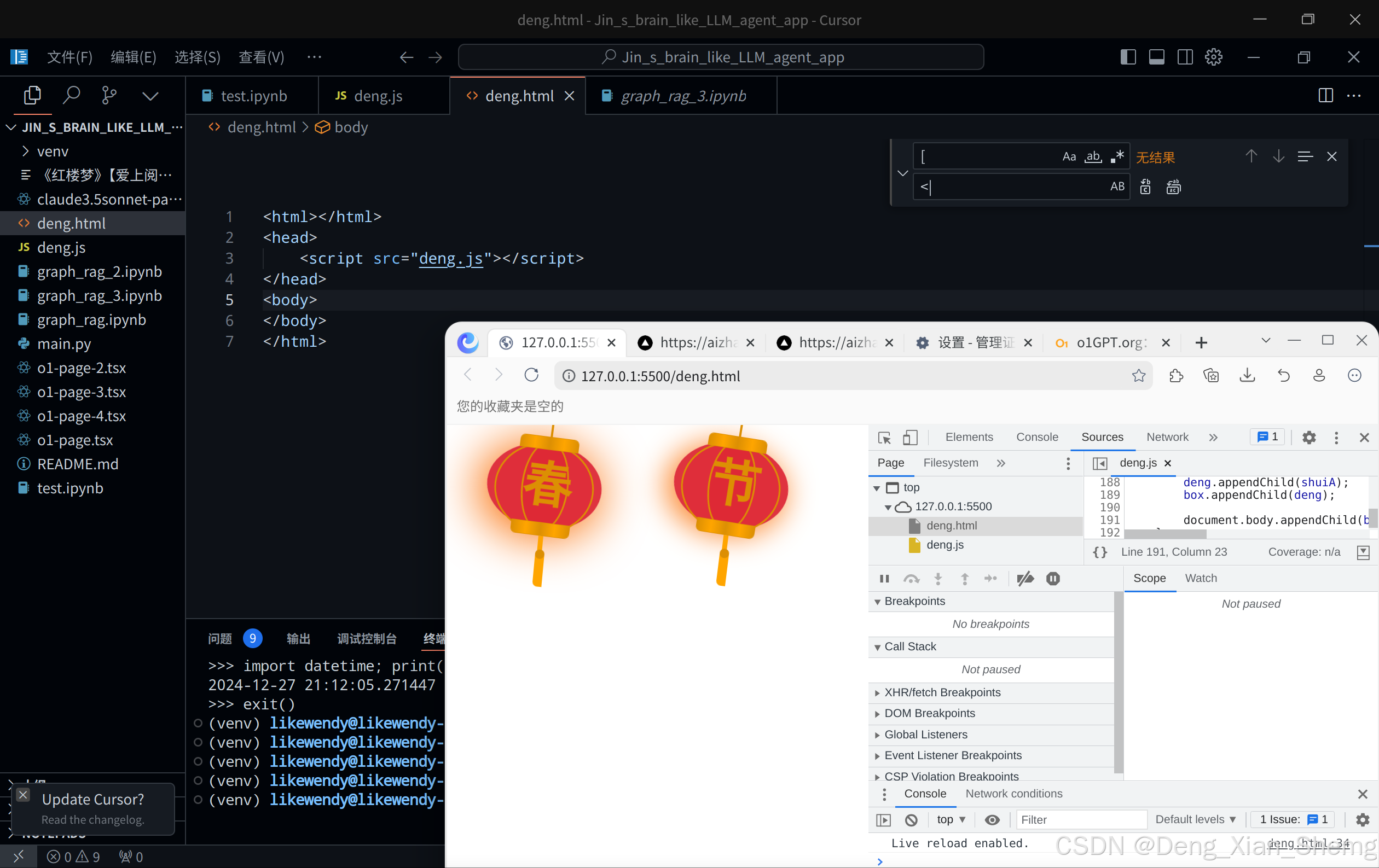
// 创建灯笼1 (春)
createLantern('deng-box', '春');
// 创建灯笼2 (节)
createLantern('deng-box1', '节');
})();
你可以这样引入到html
<html></html>
<head>
    <script src="deng.js"></script>
</head>
<body>
</body>
</html>


 扫一扫
扫一扫


 587
587

 被折叠的 条评论
为什么被折叠?
被折叠的 条评论
为什么被折叠?
 到【灌水乐园】发言


