


根据指定的选择范围创建文本选择器,展示在弹窗上。
说明:
该组件从API Version 8开始支持。后续版本如有新增内容,则采用上角标单独标记该内容的起始版本。
本模块功能依赖UI的执行上下文,不可在UI上下文不明确的地方使用,参见UIContext说明。
从API version 10开始,可以通过使用UIContext中的showTextPickerDialog来明确UI的执行上下文。
TextPickerDialog.show
static show(options?: TextPickerDialogOptions)
定义文本滑动选择器弹窗并弹出。
元服务API: 从API version 11开始,该接口支持在元服务中使用。
系统能力: SystemCapability.ArkUI.ArkUI.Full
参数: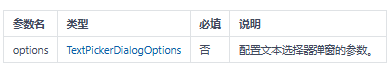
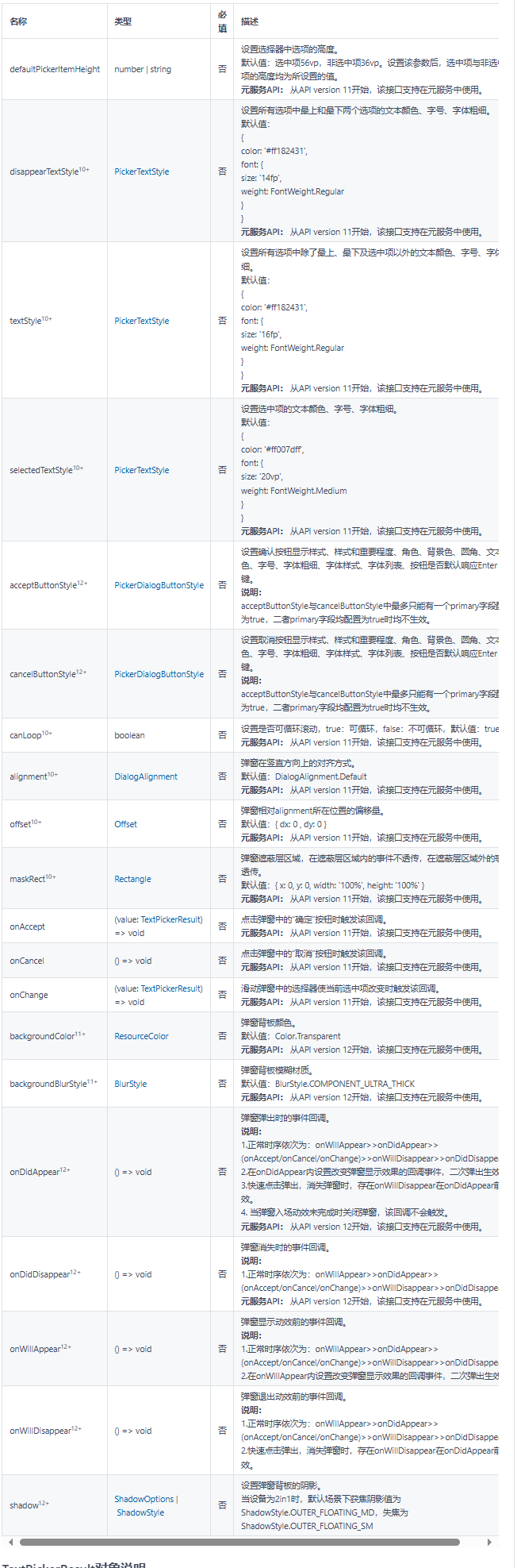
TextPickerDialogOptions对象说明
文本选择器弹窗的参数继承自TextPickerOptions。
TextPickerResult对象说明
元服务API: 从API version 11开始,该接口支持在元服务中使用。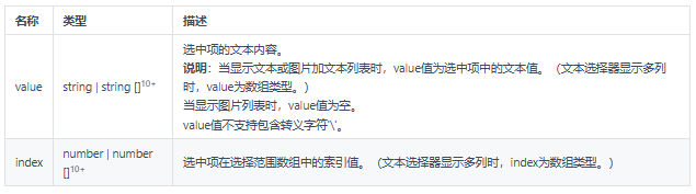
示例
示例1
TextPickerDialog基本使用
// xxx.ets
@Entry
@Component
struct TextPickerDialogExample {
  private select: number | number[] = 0
  private fruits: string[] = ['apple1', 'orange2', 'peach3', 'grape4', 'banana5']
  @State v:string = '';

  build() {
    Row() {
      Column() {
        Button("TextPickerDialog:" + this.v)
          .margin(20)
          .onClick(() => {
            TextPickerDialog.show({
              range: this.fruits,
              selected: this.select,
              disappearTextStyle: {color: Color.Red, font: {size: 15, weight: FontWeight.Lighter}},
              textStyle: {color: Color.Black, font: {size: 20, weight: FontWeight.Normal}},
              selectedTextStyle: {color: Color.Blue, font: {size: 30, weight: FontWeight.Bolder}},
              onAccept: (value: TextPickerR
最低0.47元/天 解锁文章


 扫一扫
扫一扫


 1627
1627

 被折叠的 条评论
为什么被折叠?
被折叠的 条评论
为什么被折叠?
 到【灌水乐园】发言


