


过渡
过渡动画: css样式 出现动画的渐变效果;
过渡属性(注意: 过渡需要从一个值 到另外一个值,一定需要一个初始值;)
-
transition-property: 检索或设置对象中的参与过渡的属性(过渡的属性)
-
transition-duration: 检索或设置对象过渡的持续时间(过渡的时间)
-
transition-delay: 检索或设置对象延迟过渡的时间(过渡要延迟多久执行)
-
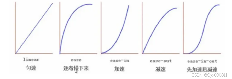
transition-timing-function:检索或设置对象中过渡的动画类型(过渡的加速度类型)
transition-timing-function还可以设置贝塞尔曲线cubic-bezier()
cubic-bezier.com可以到这个网站上调需要的曲线参数
过渡简写
简写:transition:all/具体属性值 运动时间s/ms 延迟时间s/ms 动画类型
<!DOCTYPE html>
<html lang="en">
<head>
    <meta charset="UTF-8">
    <meta name="viewport" content="width=device-width, initial-scale=1.0">
    <title>Document</title>
    <style>
        *{
            margin: 0;
            padding: 0;
        }
        .box{
            width: 100px;
            height: 100px;
            background-color: red;
            transition-property: width;
            transition-duration: 1s;
            transition-delay: 0s;
            transition-timing-function: linear;
        }
        .box:hover{
            width: 500px;
        }

        .box2{
            width: 100px;
            height: 100px;
            background-color: red;
            transition-property: width;
            transition-duration: 1s;
            transition-delay: 0s;
            transition-timing-function: ease;
        }
        .box2:hover{
            width: 500px;
        }

        .box3{
            width: 100px;
            height: 100px;
            background-color: red;
            transition-property: all;
            transition-duration: 1s;
            transition-delay: 0s;
            transition-timing-function: ease-in;
        }
        .box3:hover{
            width: 500px;
        }

        .box4{
            width: 100px;
            height: 100px;
            background-color: red;
            transition-property: width;
            transition-duration: 1s;
            transition-delay: 0s;
            transition-timing-function: ease-out;
        }
        .box4:hover{
            width: 500px;
        }

        .box5{
            width: 100px;
            height: 100px;
            background-color: red;
            transition-property: width;
            transition-duration: 2s;
            transition-delay: 0s;
            transition-timing-function: ease-in-out;
        }
        .box5:hover{
            width: 500px;
        }

        .box6{
            width: 100px;
            height: 100px;
            background-color: blue;
            transition-property: width;
            transition-duration: 2s;
            transition-delay: 0s;
            transition-timing-function: cubic-bezier(.11,1.43,.81,-0.14);/*可以设置贝塞尔曲线*/
        }
        .box6:hover{
            width: 500px;
        }
        .box7{
            width: 100px;
            height: 100px;
            background-color: pink;
            transition-property: all;
            transition-duration: 2s;
            transition-delay: 0s;
            transition-timing-function: linear;/*linear线性,匀速*/
            left: 0px;
            position: absolute;
            bottom: 100px;
        }
        .box7:hover{
           left: 500px;
        }
        .box8{
            margin-top: 150px;
            width: 100px;
            height: 100px;
            background-color: black;
            transition: all 1s linear;
            opacity: 1;/*设置透明度*/
        }
        .box8:hover{
            opacity: 0;
        }
    </style>
</head>
<body>
     <div class="box"></div>
     <hr/>
     <div class="box2"></div>

     <hr/>
     <div class="box3"></div>

     <hr/>
     <div class="box4"></div>
     <hr/>
     <div class="box5"></div>
     <hr/>
     <div class="box6"></div>
     <hr/>
     <div class="box7"></div>
     <hr>
     <div class="box8"></div>
</body>
</html>小知识设置透明度 opacity: 1;
过渡练习1
<!DOCTYPE html>
<html lang="en">
<head>
    <meta charset="UTF-8">
    <meta name="viewport" content="width=device-width, initial-scale=1.0">
    <title>Document</title>
    <style>
        .container{
            width: 227px;
            height: 150px;
            border: 1px solid;
            margin-top: 200px;
            overflow: hidden;
            position: relative;
        }
        .container img{
            /* margin-top: -150px; */
            transition: all 1s;
            position: absolute;
            top: -150px;
        }

        .container img:hover{
            /* margin-top: 0px; */
            top: 0px;
        }
    </style>
</head>
<body>
    <div class="container">
        <img src="./imgs/anli1.png" alt="">
    </div>
</body>
</html>
过渡练习2
<!DOCTYPE html>
<html lang="en">
<head>
    <meta charset="UTF-8">
    <meta name="viewport" content="width=device-width, initial-scale=1.0">
    <title>Document</title>
    <style>
        body{
            background-color: gray;
        }
        *{
            margin: 0;
            padding: 0;
        }
        .contaienr{
            width: 377px;
            height: 280px;
            border: 1px solid;
            margin: 0 auto;
            background-image: url(./imgs/box_img2.png);
            margin-top: 200px;
            position: relative;
        }
        .mytext{
            width: 377px;
            text-align: center;
            color: deepskyblue;
            position:absolute;
            top: -60px;
            transition: all 1s;
        }
        .bg{
            position: absolute;
            left: -100px;
            top:100px ;
            transition: all 1s;
        }
        .search{
            position: absolute;
            right: -100px;
            top: 122px;
            transition: all 1s;
        }

        .contaienr:hover .mytext{
            top: 20px;
        }
        .contaienr:hover .bg{
            left: 150px;
        }
        .contaienr:hover .search{
            right: 172px;
        }
        .mask{
            width: 100%;
            height: 100%;
            background-color: black;
            opacity: 0;
            transition: all 1s;
        }
        .contaienr:hover .mask{
            opacity: .2;
        }

    </style>
</head>
<body>
    <div class="contaienr">
        <div class="mask"></div>
        <h2 class="mytext">商业咨询策划</h2>
        <img class="bg" src="./imgs/l_o.png" alt="">
        <img class="search" src="./imgs/r_f.png" alt="">
    </div>
</body>
</html>
变换transform
1:2D位移(平移 ) transform:translate()
2:2D缩放 transform:scale()
3:2D旋转 transform:rotate()
transform-origin
-
transform-origin是变形原点,也就是该元素围绕着那个点变形或旋转,该属性只有在设置了transform属性的时候起作用
变换-旋转(角度)
旋转: 想旋转一个元素 ,设置元素的 transform:rotate(角度)
度数的单位是deg 360deg就是360度(正的是顺时针,负的是逆时针)
旋转的焦点 : 默认 x轴是 中间 y轴 也是中间
transform-origin: 50%; 一个参数是 设置 x轴的旋转位置 y轴 默认是中间
transform-origin: center bottom;
<!DOCTYPE html>
<html lang="en">
<head>
    <meta charset="UTF-8">
    <meta name="viewport" content="width=device-width, initial-scale=1.0">
    <title>Document</title>
    <style>
        *{
            margin: 0;
            padding: 0;
        }
        .box{
            width: 50px;
            height: 300px;
            background-color: red;
            margin-left: 500px;
            margin-top: 200px;
            transform: rotate(-360deg);
            /* transform-origin: 50%; */ /*只给一个值是 设置 x轴的旋转位置  y轴 默认是中间*/
            transform-origin: left top;
            transition: all 1s;
        }
        .box:hover{
            transform: rotate(360deg);
        }
    </style>
</head>
<body>
     <div class="box"></div>
</body>
</html>
旋转练习
<!DOCTYPE html>
<html lang="en">
<head>
    <meta charset="UTF-8">
    <meta name="viewport" content="width=device-width, initial-scale=1.0">
    <title>Document</title>
    <style>
        *{
            margin: 0;
            padding: 0;
        }
        .clock{
            width: 600px;
            height: 600px;
            border: 1px solid;
            margin: 0 auto;
            border-radius: 50%;
            position: relative;
        }
        .hour{
            width: 10px;
            height: 200px;
            background-color: black;
            position: absolute;
            left: 295px;
            margin-top: 100px;
            transform: rotate(30deg);
            transform-origin: center bottom;
        }
        .minus{
            width: 4px;
            height: 230px;
            background-color: blue;
            position: absolute;
            left: 298px;
            margin-top: 70px;
            transform: rotate(60deg);
            transform-origin: center bottom;
        }
        .second{
            width: 1px;
            height: 260px;
            background-color: red;
            left: 300px;
            position:absolute;
            margin-top: 40px;
            transform: rotate(270deg);
            transform-origin: center bottom;
        }
        .box1{
            width: 20px;
            height: 300px;
            border: 1px;
            text-align: center;
            position: absolute;
            left: 290px;
            transform: rotate(30deg);
            transform-origin: center bottom;
        }
        .box1 span{/*把数字恢复正*/
            transform: rotate(-30deg);
            display: block;
        }

        .box2{
            width: 20px;
            height: 300px;
            border: 1px;
            text-align: center;
            position: absolute;
            left: 290px;
            transform: rotate(60deg);
            transform-origin: center bottom;
        }
        .box2 span{
            transform: rotate(-60deg);
            display: block;
        }

        .box3{
            width: 20px;
            height: 300px;
            border: 1px;
            text-align: center;
            position: absolute;
            left: 290px;
            transform: rotate(90deg);
            transform-origin: center bottom;
        }
        .box4{
            width: 20px;
            height: 300px;
            border: 1px;
            text-align: center;
            position: absolute;
            left: 290px;
            transform: rotate(120deg);
            transform-origin: center bottom;
        }
        .box5{
            width: 20px;
            height: 300px;
            border: 1px;
            text-align: center;
            position: absolute;
            left: 290px;
            transform: rotate(150deg);
            transform-origin: center bottom;
        }
        .box6{
            width: 20px;
            height: 300px;
            border: 1px;
            text-align: center;
            position: absolute;
            left: 290px;
            transform: rotate(180deg);
            transform-origin: center bottom;
        }
        .box7{
            width: 20px;
            height: 300px;
            border: 1px;
            text-align: center;
            position: absolute;
            left: 290px;
            transform: rotate(210deg);
            transform-origin: center bottom;
        }
        .box8{
            width: 20px;
            height: 300px;
            border: 1px ;
            text-align: center;
            position: absolute;
            left: 290px;
            transform: rotate(240deg);
            transform-origin: center bottom;
        }
        .box9{
            width: 20px;
            height: 300px;
            border: 1px ;
            text-align: center;
            position: absolute;
            left: 290px;
            transform: rotate(270deg);
            transform-origin: center bottom;
        }
        .box10{
            width: 20px;
            height: 300px;
            border: 1px ;
            text-align: center;
            position: absolute;
            left: 290px;
            transform: rotate(300deg);
            transform-origin: center bottom;
        }
        .box11{
            width: 20px;
            height: 300px;
            border: 1px ;
            text-align: center;
            position: absolute;
            left: 290px;
            transform: rotate(330deg);
            transform-origin: center bottom;
        }
        .box12{
            width: 20px;
            height: 300px;
            border: 1px ;
            text-align: center;
            position: absolute;
            left: 290px;
            transform: rotate(3600deg);
            transform-origin: center bottom;
        }
    </style>
</head>
<body>
    <div class="clock">
        <div class="hour"></div>
        <div class="minus"></div>
        <div class="second"></div>
        <div class="box1"><span>1</span></div>
        <div class="box2"><span>2</span></div>
        <div class="box3">3</div>
        <div class="box4">4</div>
        <div class="box5">5</div>
        <div class="box6">6</div>
        <div class="box7">7</div>
        <div class="box8">8</div>
        <div class="box9">9</div>
        <div class="box10">10</div>
        <div class="box11">11</div>
        <div class="box12">12</div>

    </div>
</body>
</html>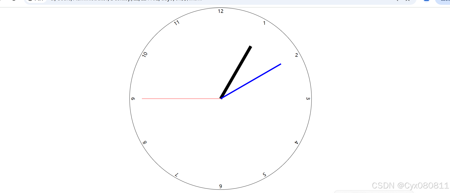
变换-平移和缩放
平移 :
X轴 transform: translateX(50px);
Y轴 transform: translateY(50px);
X轴,Y轴,Z轴(可选) 居中操作 transform: translate3d(50px,50px,0);
position: absolute;
left: 50%; /* transform: translateX(-50%); */
top: 50%;
transform: translate3d(-50%,-50%,0);
缩放 : transform: scale(.5); 参数是 原来元素大小的倍数
如果遇到字体不能设置 更小的时候 可以通过 缩放来解决问题 ;
<!DOCTYPE html>
<html lang="en">
<head>
    <meta charset="UTF-8">
    <meta name="viewport" content="width=device-width, initial-scale=1.0">
    <title>Document</title>
    <style>
        *{
            margin: 0;
            padding: 0;
        }
        .container{
            width: 300px;
            height: 300px;
            border: 1px solid;
            position: relative;
        }
        .box{/*平移*/
            width: 100px;
            height: 100px;
            background-color: red;
            position: absolute;
            left: 50%;  /* left: 50%;的50%是container的 ,transform的50%是自身的 */
            /* transform: translateX(-50%); */
            top: 50%;
            transform: translate3d(-50%,-50%,0);

            /* transform: translateX(50px);
            transform: translateY(50px); */
            /* transform: translate3d(50px,50px,0); */
        }
        .mybox{/*缩放*/
            position: absolute;
            left: 500px;
            top: 200px;
            width: 100px;
            height: 100px;
            background-color: yellow;
            transform: scale(2);
            font-size: 20px;
            transition: all 1s;
        }
        .mybox:hover{
            transform: scale(.5);
        }
    </style>
</head>
<body>
     <div class="container">
        <div class="box"></div>
     </div>
     <div class="mybox">fdsfdsfdsafdsa</div>
</body>
</html>
动画 animation
特点:自动执行 修改执行次数 控制帧数
使用 步骤:
1.定义动画
  @keyframes 动画名称 {  /*@keyframes定义动画*/
        0%{ /*控制关键帧*/
        }
       100%{   /*控制关键帧*/
       }
     }
2.调用动画
animation-name 和animation-duration是必须有的
1. animation-name : 定义动画的名称
2. animation-duration: 动画的执行时间
3. animation-timing-function: steps(4);
和transition-timing-function类似,默认是linear,可以设置linear/ease/ease-in/ ease-out/ease-in-out,可以设置贝塞尔曲线 cubic-bezier(), steps() 设置动画的步数
<!DOCTYPE html>
<html lang="en">
<head>
    <meta charset="UTF-8">
    <meta name="viewport" content="width=device-width, initial-scale=1.0">
    <title>Document</title>
    <style>
        *{
            margin: 0;
            padding: 0;
        }
        .box{
            width: 100px;
            height: 100px;
            background-color: red;
            position: absolute;
            left: 0;
            top: 0;
            animation-name: move;
            animation-duration: 4s;
            animation-timing-function: steps(4);
        }
        @keyframes move {
            0%{  /*left,和top 都要设置*/
                left: 0px;
                top: 0px;
            }
            25%{
                left: 400px;
                top: 0px;
            }
            50%{
                left: 400px;
                top: 400px;
            }
            75%{
                left: 0px;
                top: 400px;
            }
            100%{
                top: 0px;
                left: 0px;
            }
        }
    </style>
</head>
<body>
    <div class="box"></div>
</body>
</html>
4. animation-delay: 1s; 动画的延迟时间
animation-delay 属性规定动画开始的延迟时间。
负值也是允许的。如果使用负值,则动画将开始播放,如同已播放 N 秒。
5. animation-iteration-count: infinite ; 设置执行次数
设置数字就是要执行多少次,设置为infinite是动画执行的次数为无限次
6. animation-fill-mode: ;
动画结束之后的位置 ,
1.开始动画的位置 backwards
2.结束动画的位置 forwards
7. animation-direction: reverse; 控制动画的方向
animation-direction 属性指定是向前播放、向后播放还是交替播放动画。
animation-direction 属性可接受以下值:
1.normal - 动画正常播放(向前)。默认值
2.reverse - 动画以反方向播放(向后)
3.alternate - 动画先向前播放,然后向后
4.alternate-reverse - 动画先向后播放,然后向前
<!DOCTYPE html>
<html lang="en">
<head>
    <meta charset="UTF-8">
    <meta name="viewport" content="width=device-width, initial-scale=1.0">
    <title>Document</title>
    <style>
        *{
            margin: 0;
            padding: 0;
        }
        .box1{
            width: 100px;
            height: 100px;
            background-color: red;
            animation-name: myani;
            animation-duration: 2s;
        }
        .box2{
            width: 100px;
            height: 100px;
            background-color: blue;
            animation-name: myani;
            animation-duration: 2s;
            animation-timing-function: ease;
        }

        .box3{
            width: 100px;
            height: 100px;
            background-color: yellow;
            animation-name: myani;
            animation-duration: 2s;
            animation-timing-function: steps(4);
        }
        .box4{
            width: 100px;
            height: 100px;
            background-color: green;
            animation-name: myani;
            animation-duration: 2s;
            animation-timing-function: ease;
            animation-delay: 1s;
        }
        .box5{
            width: 100px;
            height: 100px;
            background-color: skyblue;
            animation-name: myani;
            animation-duration: 2s;
            animation-timing-function: ease;
            animation-delay: 1s;
            animation-iteration-count: 2;  /* 动画的执行次数*/
            /* animation-iteration-count: infinite */
        }

        .box6{
            width: 100px;
            height: 100px;
            background-color: pink;
            animation-name: myani;
            animation-duration: 2s;
            animation-timing-function: ease;
            animation-delay: 1s;
            animation-iteration-count: 1;  /* 动画的执行次数*/
            /* animation-iteration-count: infinite 动画的执行次数为无限*/
            animation-fill-mode: forwards;  /*动画结束之后的位置 ,1.开始动画的位置 backwards 2.结束动画的位置*/
        }

        .box7{
            width: 100px;
            height: 100px;
            background-color: black;
            animation-name: myani;
            animation-duration: 2s;
            animation-timing-function: ease;
            animation-delay: 1s;
            animation-iteration-count: 1;  /* 动画的执行次数*/
            animation-fill-mode: forwards;
            animation-direction: reverse;
        }

        .box8{
            width: 100px;
            height: 100px;
            background-color: saddlebrown;
            animation-name: myani;
            animation-duration: 2s;
            animation-timing-function: ease;
            animation-delay: 1s;
            animation-iteration-count: 1;  /* 动画的执行次数*/
            animation-fill-mode: forwards;
            animation-direction: reverse;
        }
        .box8:hover{
            animation-play-state: paused;/*光标移动上去动画暂停*/
        }
        @keyframes myani {   /*@keyframes定义动画*/
            0%{
                width: 100px;
            }
            100%{
                width: 500px;
            }
        }
    </style>
</head>
<body>
    <div class="box1"></div>
    <div class="box2"></div>
    <div class="box3"></div>
    <div class="box4"></div>
    <div class="box5"></div>
    <div class="box6"></div>
    <div class="box7"></div>
    <div class="box8"></div>

</body>
</html>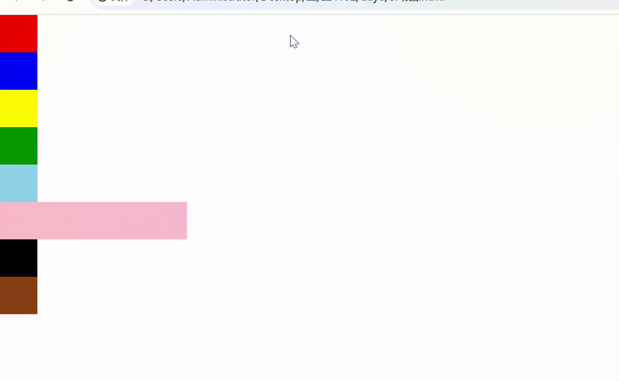
动画简写
div {
  animation-name: example;
  animation-duration: 5s;
  animation-timing-function: linear;
  animation-delay: 2s;
  animation-iteration-count: infinite;
  animation-direction: alternate;
}


div {
  animation: example 5s linear 2s infinite alternate;
}
小知识
animation-play-state: paused;/光标移动上去动画暂停/
雪碧图(精灵图)
精灵图、雪碧图 : 把多个图片整合在一个图片上进行使用
雪碧图
<!DOCTYPE html>
<html lang="en">
<head>
    <meta charset="UTF-8">
    <meta name="viewport" content="width=device-width, initial-scale=1.0">
    <title>Document</title>
    <style>
        .qq{
            width:16px ;
            height: 16px;
            position: relative;
            overflow: hidden;
            float: left;
        }
        .myqqimg{
            position:absolute;
            left: -38px;
            top: 0px;
        }
        .num{
            width: 110px;
            height: 17px;
            overflow: hidden;
            position: relative;
            float: left;

        }
        .box::after{
            content: "";
            display: block;
            clear: both;
        }
        .mynumimg{/*清除浮动*/
            position:absolute;
            left: -85px;
        }
        .qq2{
            width:16px ;
            height: 17px;
            background-image: url(./imgs/a1.png);
            background-position: -38px 0px;
            float: left;
        }
        .num2{
            width: 110px;
            height: 17px;
            background-image: url(./imgs/a1.png);
            background-position: -85px 0px;
            float: left;

        }
    </style>
</head>
<body>
    <!-- 通过img定位来显示需要的雪碧图位置 -->
    <div class="box">
        <div class="qq">
            <img class="myqqimg" src="./imgs/a1.png" alt="">
        </div>
        <div class="num">
            <img class="mynumimg" src="./imgs/a1.png" alt="">
        </div>
    </div>
    <hr>
    <!-- 通过背景图定位来显示雪碧图需要显示的位置 -->
    <div>
        <div class="qq2"></div>
        <div class="num2"></div>
    </div>

</body>
</html>
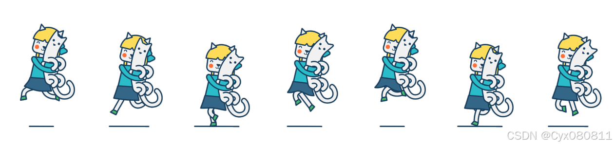
动画练习
1.小女孩动画
<!DOCTYPE html>
<html lang="en">
<head>
    <meta charset="UTF-8">
    <meta name="viewport" content="width=device-width, initial-scale=1.0">
    <title>Document</title>
    <style>
        *{
            margin: 0;
            padding: 0;
        }
        .girl{
            position: absolute;
            left: 500px;
            width: 180px;
            height: 300px;
            background-image: url(./imgs/charector.png);
            background-position: 0px 0px;
            /* animation-name: move;
            animation-duration: 1s;
            animation-timing-function: steps(7);
            animation-iteration-count: infinite; */
            animation: move 1s steps(7) infinite,walk 2s forwards;/*多个动画在后面加上就行了*/
        }
        @keyframes move {
            0%{
                background-position: 0px 0px;
            }
            100%{
                background-position: -1260px 0px;
            }
        }
        @keyframes walk {
            /* from 等同于 0% */
            from{
                left: 500px;
            }
            /* to 等同于 100% */
            to{
                left: 0px;
            }
        }
    </style>
</head>
<body>
    <div class="girl"></div>
</body>
</html>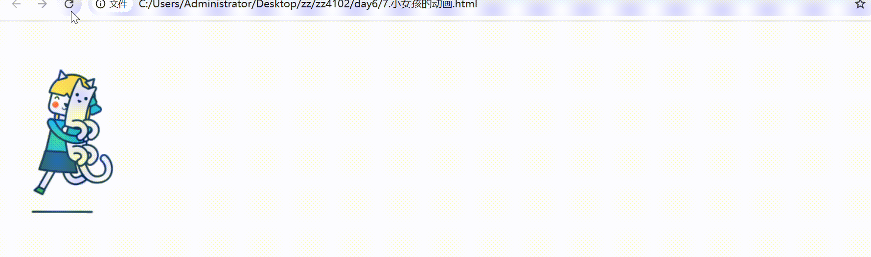
2.恐龙动画

<!DOCTYPE html>
<html lang="en">
<head>
    <meta charset="UTF-8">
    <meta name="viewport" content="width=device-width, initial-scale=1.0">
    <title>Document</title>
    <style>
        .konglong{
            width: 44px;
            height: 47px;
            background-image: url(./imgs/download.png);
            position: absolute;
            left: 0px;
            background-position: -848px -2px;
            animation: move .5s steps(6) infinite,movedis 8s forwards;
        }
        @keyframes movedis{
            from{
                left: 0px;
            }
            to{
                left: 1000px;
            }
        }
        @keyframes move {
            from{
                background-position: -848px -2px;
            }
            to{
                background-position: -1110px -2px;
            }
        }
        .bird{
            width: 46px;
            height: 34px;
            background-image: url(./imgs/download.png);
            background-position:-134px -8px;
            position: absolute;
            right: 0px;
            animation: birdmove .5s steps(2) infinite,birdmovedis 8s forwards;

        }
        @keyframes birdmove {
            from{
                background-position:-134px -8px;
            }
            to{
                background-position:-224px -8px;
            }
        }
        @keyframes birdmovedis {
            from{
               right: 0px;
            }
            to{
               right: 1000px;
            }
        }

    </style>
</head>
<body>
    <div class="konglong"></div>
    <div class="bird"></div>
</body>
</html>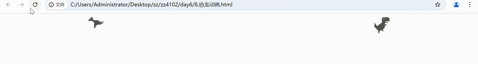
阴影
一、文字的阴影
text-shadow:1.控制阴影在x轴的偏移量(正 : 右 负 : 左) 2.y轴的偏移量(正 向下 负值向上) 3.文字阴影的模糊程度 4.阴影的颜色
 .myp{
            font-size: 40px;
            text-shadow: 10px 10px 5px red;
        }
二、元素的阴影
box-shadow: 1.控制阴影在x轴的偏移量(正 : 右 负 : 左) 2.y轴的偏移量(正 向下 负值向上) 3.阴影的模糊程度 4.阴影的大小 5.阴影的颜色 6.阴影的位置 inset: 阴影在元素内部
<!DOCTYPE html>
<html lang="en">
<head>
    <meta charset="UTF-8">
    <meta name="viewport" content="width=device-width, initial-scale=1.0">
    <title>Document</title>
    <style>
        .myp{
            font-size: 40px;
            text-shadow: 10px 10px 5px red;
        }
        .box{
            width: 100px;
            height: 200px;
            background-color: gray;
            box-shadow: 10px 10px 5px 10px red inset;
        }
    </style>
</head>
<body>
     <p class="myp">hello world</p>
     <div class="box"></div>
</body>
</html>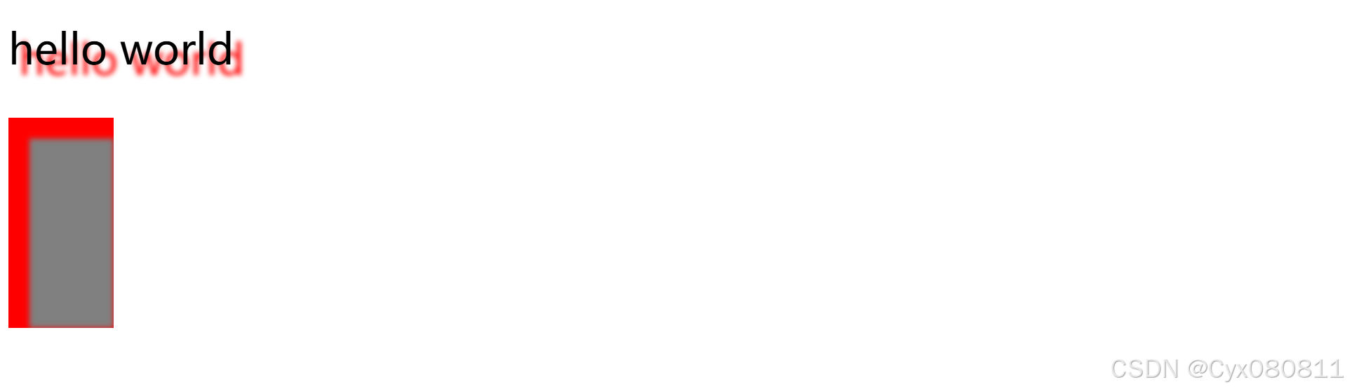
阴影练习
<!DOCTYPE html>
<html lang="en">
<head>
    <meta charset="UTF-8">
    <meta name="viewport" content="width=device-width, initial-scale=1.0">
    <title>Document</title>
    <style>
        .container{
            width: 650px;
        }
        .container div{
            width: 110px;
            height: 200px;
            border: 1px solid;
            float: left;
            margin-left: 10px;
        }
        .container div:hover{
            box-shadow: 0px 1px 5px;
        }

    </style>
</head>
<body>
    <div class="container">
        <div></div>
        <div></div>
        <div></div>
        <div></div>
        <div></div>
    </div>
</body>
</html>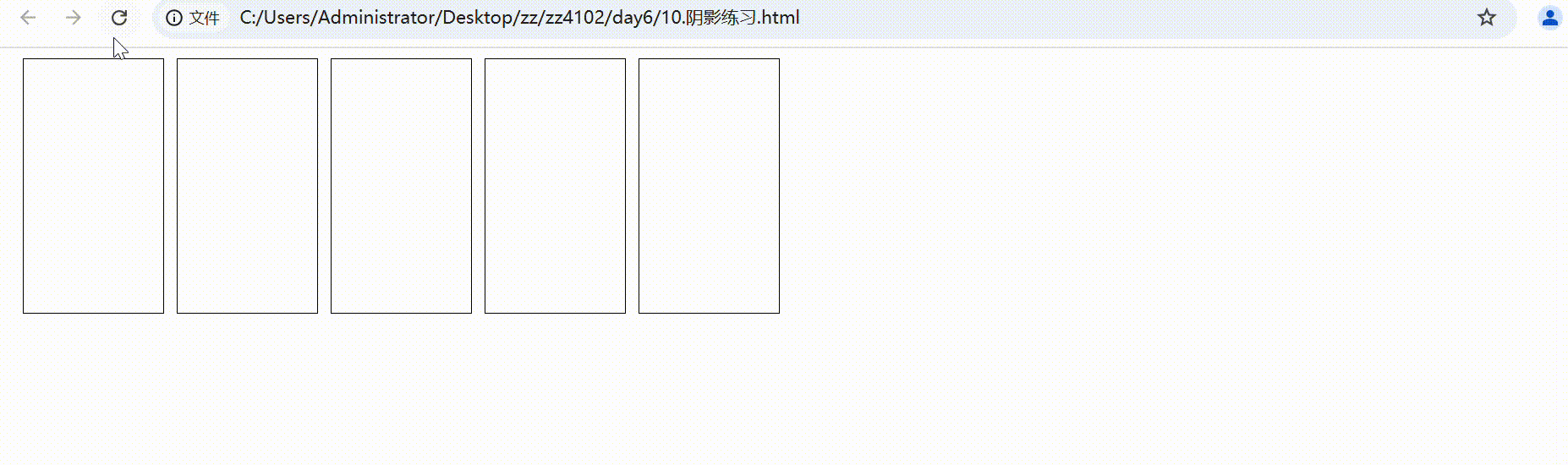
文本换行和字体图标
一、文字的换行 : word-wrap: break-word;
<!DOCTYPE html>
<html lang="en">
<head>
    <meta charset="UTF-8">
    <meta name="viewport" content="width=device-width, initial-scale=1.0">
    <title>Document</title>
    <style>
        .box{
            width: 200px;
            height: 200px;
            border: 1px solid;
            word-wrap: break-word;
        }
    </style>
</head>
<body>

    <div class="box">fdsafdsfdsfdsfdsafdsafdsafdsfsaafdsa</div>
</body>
</html>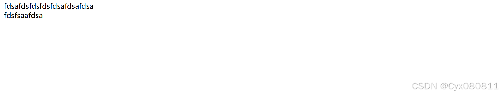
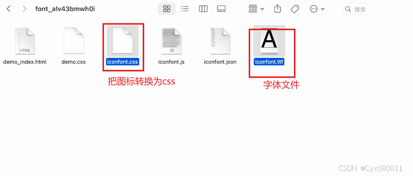
二、字体图标 :把图标当成字体使用
把图标当成字体使用 如何使用 :
-
阿里字体图标库 生成 iconfont-阿里巴巴矢量图标库
选择图标 加入购物车 下载字体图标
iconfont.css 和 iconfont.ttf 文件 在使用的html中引入 iconfont.css文件
2.iconmoon : SVG Icon Libraries and Custom Icon Font Organizer ❍ IcoMoon
这两个文件放在项目里,才能使用字体图标
<!DOCTYPE html>
<html lang="en">
<head>
    <meta charset="UTF-8">
    <meta name="viewport" content="width=device-width, initial-scale=1.0">
    <title>Document</title>
    <link rel="stylesheet" href="./fonts/iconfont.css">
    <!-- <link rel="stylesheet" href="./fonts/style.css"> -->
    <style>
        .myfont{
            font-size: 80px;
        }
        .myfont:hover{
            color: red;
        }
        .mycart{
            font-size: 50px;
            color: blue;
        }
        .mycart:hover{
            color: red;
        }
    </style>
</head>
<body>
    <span class="iconfont icon-shengyin myfont"></span>
    <span class="icon-add_circle"></span>
    <span class="icon-shopping_cart mycart"></span>
</body>
</html>
弹性盒模型
-
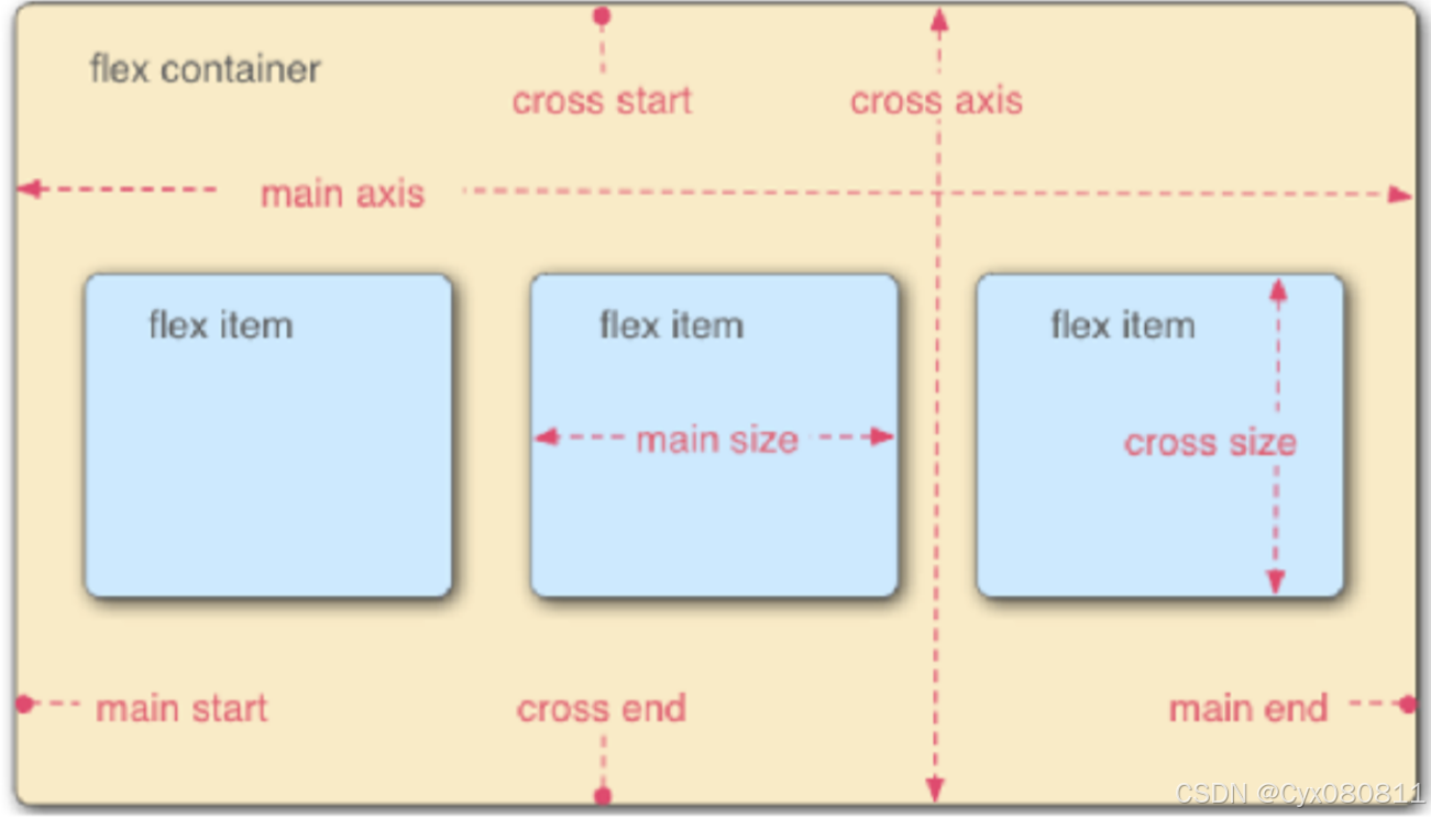
Flex容器:采用 Flex 布局的元素的父元素;
-
Flex项目:采用 Flex 布局的元素的父元素的子元素;
容器默认存在两根轴:水平的主轴(main axis)和垂直的交叉轴(cross axis)。主轴的开始位置(与边框的交叉点)叫做main start,结束位置叫做main end;交叉轴的开始位置叫做cross start,结束位置叫做cross end。
-
项目默认沿主轴排列。单个项目占据的主轴空间叫做main size,占据的交叉轴空间叫做cross size。
一、父元素
1. 声明父类是一个弹性盒模型 display : flex;
注意: 浮动 、clear 、vertical-align 属性会失效 ;
2.父项常用属性(容器属性)
(1) justify-content 主轴的对齐方式
justify-content: flex-start | flex-end | center | space-between | space-around;
flex-start : 元素在主轴开始的地方排列
flex-end : 元素在主轴结束的地方排列
center: 元素在主轴的中间位置排列
space-around: 中间平分;
space-between: 两端对齐 中间平分;
(2) align-items 该属性是控制子项在侧轴(默认是y轴)上的排列方式在子项为单项的时候使用
元素在交叉轴上的对齐方式 ,定义项目在交叉轴上如何对齐 。注意 只能针对一行元素;
align-items: flex-start | flex-end | center | stretch(默认值);
flex-start;交叉轴开始的地方
flex-end : 交叉轴结束的地方
center: 交叉轴中间的地方
stretch: 在交叉轴上 拉伸元素
注意:align-items设置为stretch时,子元素无需给宽度或高度(以侧轴边是宽度还是高度为主)
(3)align-content:设置侧轴上的子元素的排列方式(多行)
-
设置子项在侧轴上的排列方式并且只能用于子项出现换行的情况(多行) , 在单行下是没有效果的。
flex-start 默认值在侧轴的头部排列
flex-end 在侧轴尾部开始排列
center 在侧轴中间显示
space-around 子项在侧轴平分剩余空间
space-between 子项在侧轴先发布在两头,在平分剩余空间
stretch 设置子项元素高度平分父元素高度
align-content和align-items 区别
align-items适用于单行情况下,只有上对齐、下对齐居中和拉伸 align-content适应于换行(多行)的情况下(单行情况下无效),可以设置上对齐、下对齐、 居中、拉伸以及平均分配剩余空间等属性值。 总结就是单行找align-items多行找align-content
(4) flex-direction设置主轴的方向 决定主轴的方向(即项目的排列方向)
在flex布局中,是分为主轴和侧轴(交叉轴)两个方向,同样的叫法有:行和列、x轴和y轴
-
默认主轴方向就是x轴方向,水平向右
-
默认侧轴方向就是y轴方向,水平向下
flex-direction: row | row-reverse | column | column-reverse;
flex-direction: row; 主轴方向是横着 , 默认值从左到右
flex-direction:row-reverse ;从右到左
flex-direction: column; 主轴方向是列 ,从上到下
flex-direction:column-reverse; 从下到上
(5) flex-flow
flex-flow属性是flex-direction属性和flex-wrap属性的简写形式,相当于同时设置了flex-direction 和 flex-wrap
,默认值为row nowrap
(6) flex-wrap属性,定义子元素是否换行显示
flex-wrap: nowrap | wrap | wrap-reverse;
nowrap 默认值不换行
wrap 换行
wrap-reverse; 表示反向换行,第一排会紧贴容器底部,效果与wrap相反。从容器最后一行开始排列,然后向前排列
<!DOCTYPE html>
<html lang="en">
<head>
    <meta charset="UTF-8">
    <meta name="viewport" content="width=device-width, initial-scale=1.0">
    <title>Document</title>
    <style>
        *{
            margin: 0;
            padding: 0;
        }
        .contaienr{
            width: 500px;
            height: 500px;
            border: 1px solid;
            margin: 0 auto;
            display: flex;
            flex-wrap: wrap;
            align-content: flex-start;
        }
        .box{
            width: 100px;
            height: 100px;
            background-color: red;
            box-sizing: border-box;
            border: 1px solid;
        }
    </style>
</head>
<body>
    <div class="contaienr">
        <div class="box"></div>
        <div class="box"></div>
        <div class="box"></div>
        <div class="box"></div>
        <div class="box"></div>
        <div class="box"></div>
        <div class="box"></div>
        <div class="box"></div>
        <div class="box"></div>
        <div class="box"></div>
    </div>
</body>
</html>
二、子项 (item)
flex布局子项常见属性(项目属性)
(1)flex设置子元素在主轴上的比例
flex属性定义好项目分配剩余空间,用flex来表示多少份数。
<!DOCTYPE html>
<html lang="en">
<head>
    <meta charset="UTF-8">
    <meta name="viewport" content="width=device-width, initial-scale=1.0">
    <title>Document</title>
    <style>
        *{
            margin: 0;
            padding: 0;
        }
        .contaienr{
            width: 500px;
            height: 500px;
            border: 1px solid;
            margin: 0 auto;
            display: flex;
            flex-wrap: wrap;
            align-content: flex-start;
        }
        .mydiv{
            flex: 10;
            height: 200px;
            background-color: red;
            box-sizing: border-box;
            border: 1px solid;
        }
        .mydiv2{
            flex: 20;
            height: 200px;
            background-color: red;
            box-sizing: border-box;
            border: 1px solid;
        }
        .mydiv3{
            flex: 30;
            height: 200px;
            background-color: red;
            box-sizing: border-box;
            border: 1px solid;
        }
    </style>
</head>
<body>
    <div class="contaienr">
        <div class="mydiv"></div>
        <div class="mydiv2"></div>
        <div class="mydiv3"></div>
    </div>
</body>
</html>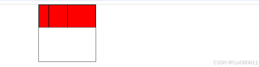
[1]flex-grow
作用:
用于决定项目在有剩余空间的情况下是否放大,默认不放大;注意:即便设置了固定宽度,也会放大。
取值:默认0。
1.假设默认三个项目中前两个个项目都是0,最后一个是1,最后的项目会占满剩余所有空间。
2.假设只有第一个项目默认为0,后面两个项目flex-grow均为1,那么后两个项目平分剩余空间。
3.假设第一个项目默认为0,第二个项目为flex-grow:2,最后一个项目为1,则第二个项目在放大时所占空间是最后项目的两倍。
[2]flex-shrink
作用:用于决定项目在空间不足时是否缩小,默认项目都是1,即空间不足时大家一起等比缩小; 注意:即便设置了固定宽度,也会缩小。
取值:默认1。
如果某个项目flex-shrink设置为0,则即便空间不够,自身也不缩小。
[3] flex-basis
作用:用于设置项目宽度,默认auto时,项目会保持默认宽度,或者以width为自身的宽度,但如果设置了flex-basis,权重会比width属性高,因此会覆盖widtn属性。
取值:默认auto。
div{
flex-basis: 80px;
width: 60px;
height: 50px;
color: white;
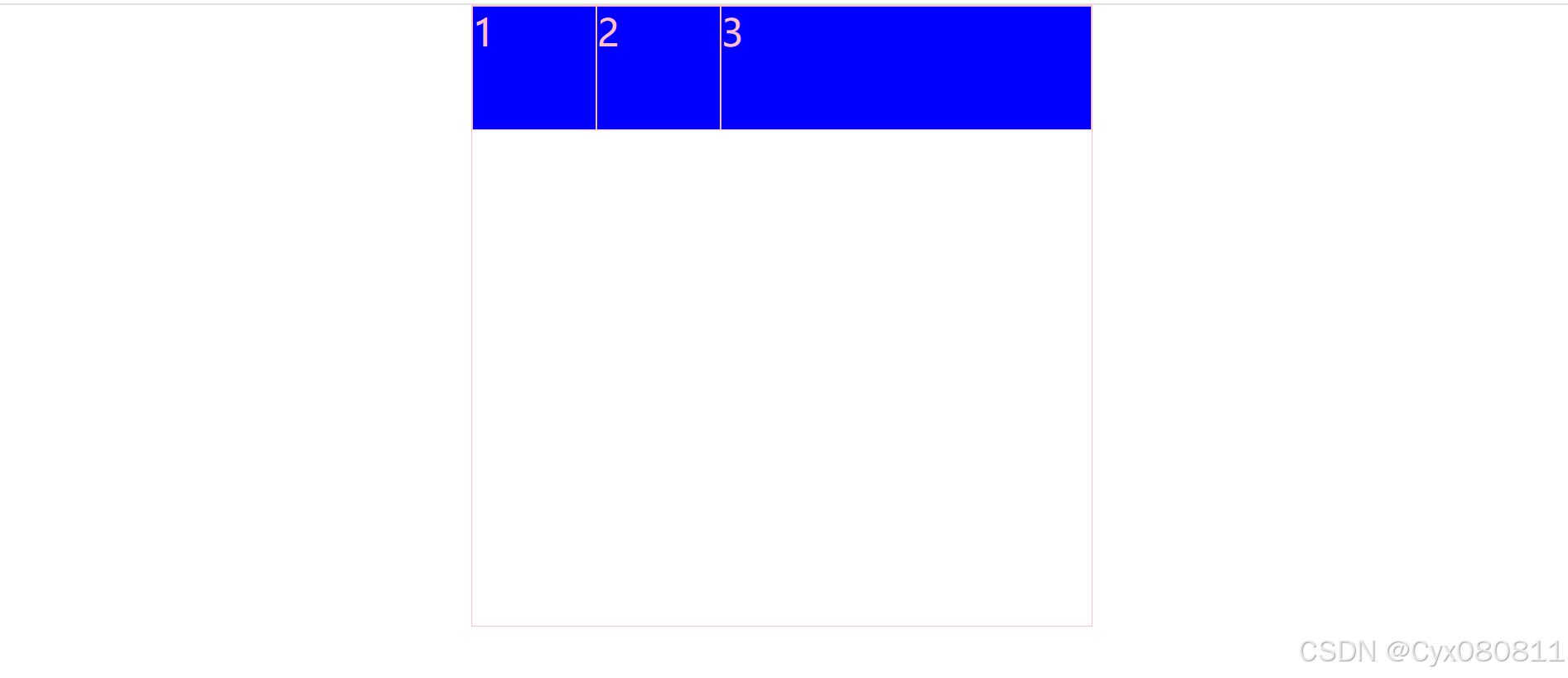
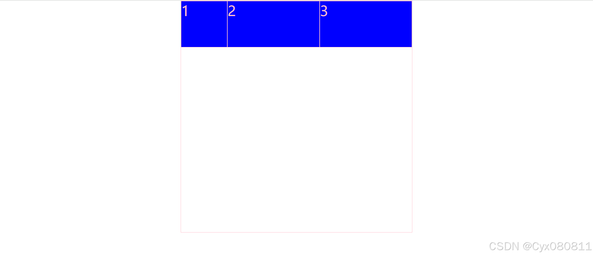
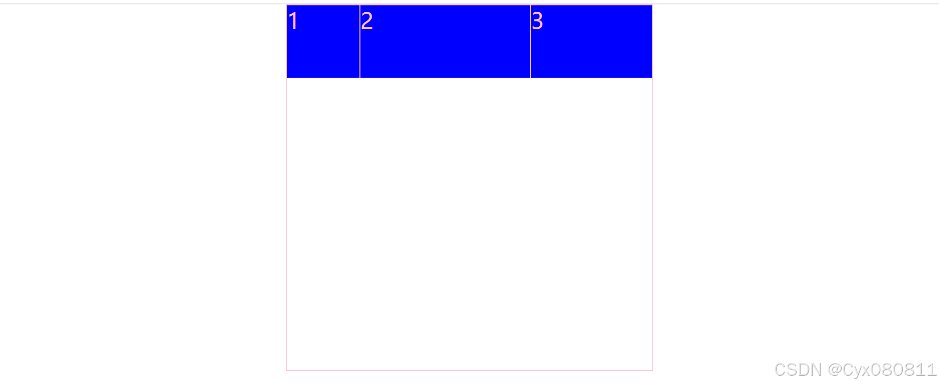
}(2)order : 设置flex子元素的排列优先级 默认 order值是0
用于决定项目排列顺序,数值越小,项目排列越靠前。
<!DOCTYPE html>
<html lang="en">
<head>
    <meta charset="UTF-8">
    <meta name="viewport" content="width=device-width, initial-scale=1.0">
    <title>Document</title>
    <style>
        *{
            margin: 0;
            padding: 0;
        }
        .container{
            width: 500px;
            height: 500px;
            border: 1px solid;
            box-sizing: border-box;
            margin: 0 auto;
            display: flex;
            flex-direction: row;
            flex-wrap: wrap;
            color: pink;
            font-size: 30px;

        }
        .box{
            width:100px;
            height: 100px;
            background-color: blue;
            border: 1px solid;
            box-sizing: border-box;
        }
        .mydiv1{
            order: 3;
        }
        .mydiv2{
            order: 2;
        }
        .active{
            order: 1;
        }
    </style>
</head>
<body>
    <div class="container">
        <div class="box mydiv1">1</div>
        <div class="box mydiv2">2</div>
        <div class="box active">3</div>
    </div>
</body>
</html>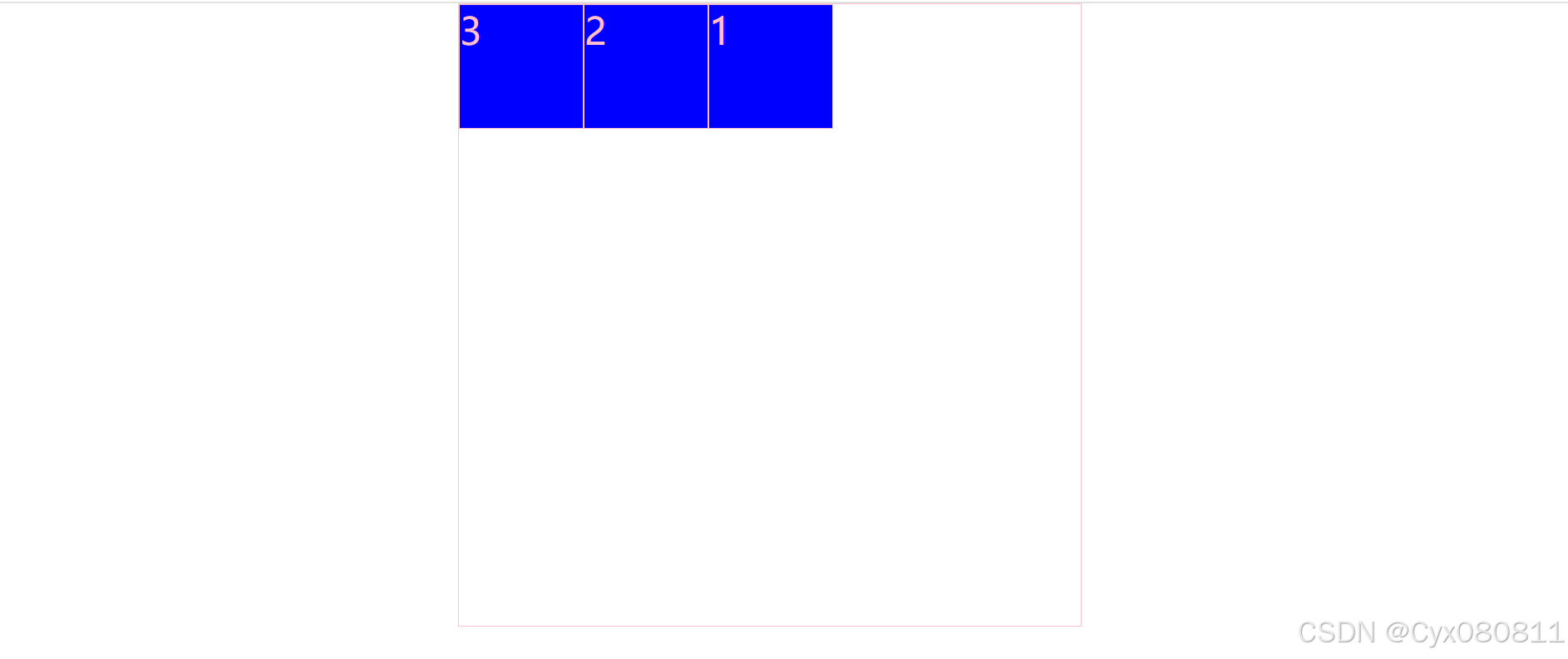
(3)align-self:控制子项自己在侧轴的排列方式
-
align-self属性允许单个项目有与其他项目不一样的对齐方式,可覆盖align-items属性。
-
默认值为auto ,表示继承父元素的align-items属性,如果没有父元素,则等同于stretch.
auto 默认。元素继承其父容器的 align-items 属性,如果没有父容器,则为默认 “stretch”。 stretch 元素被拉伸以适应容器。 center 元素位于容器的中央。 flex-start 元素位于容器的开头。 flex-end 元素位于容器的末端。 baseline 元素被定位到容器的基线。
左右布局
<!DOCTYPE html>
<html lang="en">
<head>
    <meta charset="UTF-8">
    <meta name="viewport" content="width=device-width, initial-scale=1.0">
    <title>Document</title>
    <style>
        *{
            margin: 0;
            padding: 0;
        }
        .container{
            width: 100vw;
            height: 100vh;
            display: flex;
        }
        .left{
            width: 200px;
            height: 100vh;
            background-color: blue;
        }
        .right{
            flex: 1;
            height: 100vh;
            background-color: red;
        }
        .right2{
            flex: 1;
            height: 100vh;
            background-color: yellow;
        }
    </style>
</head>
<body>
    <div class="container">
        <div class="left"></div>
        <div class="right"></div>
        <div class="right2"></div>
    </div>
</body>
</html>
响应式布局概念
设计特点:
面对不同分辨率设备灵活性强
能够快捷解决多设备显示适应问题
随着屏幕的改变 页面大小会自动做出响应
缺点:
兼容各种设备工作量大,效率低下
代码累赘,会出现隐藏无用的元素,加载时间加长
其实这是一种折中性质的设计解决方案,多方面因素影响而达不到最佳效果
一定程度上改变了网站原有的布局结构,会出现用户混淆的情况
使用方案 : 1.flex 2.流式布局 (百分比布局) vh 3. rem 布局
移动端适配准备
-
meta标签设置
<meta name="viewport" content="width=device-width, initial-scale=1.0, maximum-scale=1.0, user-scalable=no">width = device-width:宽度等于当前设备的宽度
initial-scale: 初始的缩放比例(默认设置为1.0)
minimum-scale:允许用户缩放到的最小比例(默认设置为1.0)
maximum-scale:允许用户缩放到的最大比例(默认设置为1.0)
user-scalable:用户是否可以手动缩放(默认设置为no,因为我们不希望用户放大缩小页面)
流式布局
1. 百分比是父级容器的百分比
2. 百分比浏览器的高度不能设置 100% . 100vh 来代替;
3.文字 设置百分比的时候 是父级文字的 百分比比例
4. 计算问题
利用一个 calc 函数 计算不同单位的值 。 px ,em , 百分比 ,rem都可以
常见的运算 + - * /
注意: 如果运算符是加 + 和减-, + - 符号的前后都需要加空格
<!DOCTYPE html>
<html lang="en">
<head>
    <meta charset="UTF-8">
    <meta name="viewport" content="width=device-width, initial-scale=1.0">
    <title>Document</title>
    <style>
        *{
            margin: 0;
            padding: 0;
        }
        .box{
            width: 100%;
            height: 300px;
            /* 没有效果 */
            /* height: 100%; */
            background-color: red;
        }
        .mydiv{
            /* width: 500px; */
            /* width: calc(100% - 100px); */
            width: calc(20%*2);
            height: 500px;
            background-color: blue;
            /* font-size: 200%; */
        }
    </style>
</head>
<body>
     <div class="box">
            <div class="mydiv">
                我是文字
            </div>
     </div>
</body>
</html>
rem布局:
核心思路 :
rem单位 是 根(html标签)字体大小的倍数 ; 1rem = 1倍的根字体大小 ,默认的根字体大小 16px
页面中所有元素的大小 都通过 rem 作为单位
假定 在任意尺寸下 全屏的宽度都是 10rem 怎么办到?动态设置根字体大小
宽度 1000px = 10rem 根字体设置成 100px
宽度 1200px = 10rem 根字体设置成 120px
宽度 x = 10rem 根字体设置成 x/10
方式一: 通过css 来实现
 html{
              font-size: calc( 100vw/10);
      }
可以通过插件完成rem与px直接的转换
安装 vscode 插件
1.搜索 px to rem & rpx & vw (cssrem)
2.配置 : 基准font-size 设置成 75
<!DOCTYPE html>
<html lang="en">
<head>
    <meta charset="UTF-8">
    <meta name="viewport" content="width=device-width, initial-scale=1.0">
    <title>Document</title>
    <style>
        *{
            margin: 0;
            padding: 0;
        }
        html{
            font-size: calc( 100vw/10);
        }

        .box{
            width: 5rem;
            height: 100px;
            background-color: red;
        }
        .container{
            width: 10rem;
            /*
                10rem =  750px
                200px = rem?
            */
            /* 200px ?  rem? */
            height: 2.6rem;
            background-color: red;
        }
        .container div{
            height: 2.6rem;
            width: 2.4933rem;
            background-color: gray;
            float: left;
            font-size: .4267rem;
            display: flex;
            flex-direction: column;
            justify-content: center;
            align-items: center;
        }
        .container div img{
            width: 1.0667rem;
            margin-bottom: .36rem;
        }
    </style>
</head>
<body>
     <div class="container">
        <div>
            <img src="./imgs/1.png" alt="">
            <span>支付宝</span>
        </div>
        <div>
            <img src="./imgs/1.png" alt="">
            <span>支付宝</span>
        </div>
        <div>
            <img src="./imgs/1.png" alt="">
            <span>支付宝</span>
        </div>
        <div>
            <img src="./imgs/1.png" alt="">
            <span>支付宝</span>
        </div>
     </div>
</body>
</html>
方式二: 通过 js来实现
现成的库flexiable.js : 动态的更改 根字体大小
下载
引入js就可以了
flexiable.js只能在宽度是540px 范围内做响应;
包管理器
1.先安装nodejs 。 Node.js — Download Node.js®
偶数版是稳定版
是否安装好了 : 打开命令行 win+r 输入 cmd
输入 node -v
2.npm 包管理器 就会自动安装 npm -v 查看 npm(node package manage) 的版本
在一个 包管理器网站搜索 npm | Home
3.通过 npm 下载 flexiable : npm install lib-flexible
1:引入flxible.js插件
<script src=""></script>
2:去掉html里面默认的meta标签
<meta name="viewport" content="width=device-width, initial-scale=1.0">
<!DOCTYPE html>
<html lang="en">
<head>
    <meta charset="UTF-8">
    <meta name="viewport" content="width=device-width, initial-scale=1.0, maximum-scale=1.0, user-scalable=no">
    <title>Document</title>
    <script src="./node_modules/lib-flexible/flexible.js"></script>/*引入flxible.js插件*/
    <style>
        *{
            margin: 0;
            padding: 0;
        }
        .box{
            width: 5rem;
            height: 200px;
            background-color: red;
        }
    </style>
</head>
<body>
    <div class="box"></div>
</body>
</html>
练习
<!DOCTYPE html>
<html lang="en">
<head>
    <meta charset="UTF-8">
    <meta name="viewport" content="width=device-width, initial-scale=1.0">
    <title>Document</title>
    <link rel="stylesheet" href="./css/phone_common.css">/*默认的样式*/
    <script src="./node_modules/lib-flexible/flexible.js"></script>
    <link rel="stylesheet" href="./css/my.css">/*引入自定义样式*/
</head>
<body>
    <div class="container">
        <div class="header">

            <div class="mask"></div>
            <div class="headerContent">
                <img class="headimg" src="http://static.galileo.xiaojukeji.com/static/tms/seller_avatar_256px.jpg" alt="">
                <div class="right">
                    <div class="title"><img src="./img/brand@2x.png" alt="">粥品香坊(回龙观)</div>
                    <div class="title2">蜂鸟专送</div>
                    <div class="title3"><img src="./img/decrease_1@2x.png" alt="">在线支付满28减5</div>
                </div>
                <div class="mydiv">
                    <img src="./img/bulletin@2x.png" alt="">
                    <span class="textContainer">粥品香坊其烹饪粥料的秘方源于中国千年古法,在融和现代制作工艺,由世界烹饪大师屈浩先生领衔研发。坚守纯天然、0添加的良心品质深得消费者青睐,发展至今成为粥类的引领品牌。是2008年奥运会和2013年园博会指定餐饮服务商</span>
                </div>
            </div>

        </div>
    </div>
</body>
</html>
my.css
.header{
    width: 10rem;
    height: 3.5733rem;
    overflow: hidden;

}
.mask{
    width: 10rem;
    height: 3.5733rem;
    position: absolute;
    left: 0px;
    top: 0px;
    z-index: 1;
    filter: blur(10px);/*模糊效果*/
    background-image: url(http://static.galileo.xiaojukeji.com/static/tms/seller_avatar_256px.jpg);
    background-repeat: no-repeat;
    background-size: 10rem  3.5733rem;
}
.headerContent{
    background-color: rgba(7, 17, 27, .5);
    width: 10rem;
    height: 3.5733rem;
    position: absolute;
    left: 0px;
    top: 0px;
    z-index: 2;
    display: flex;
   position: relative;
}
.headimg{
    margin-left: .6667rem;
    margin-top: .64rem;
    width: 1.7067rem;
    height: 1.7067rem;
    margin-right: .4267rem;
    border-radius: 4px;

}
.right{
    width: 5.0667rem;
    height: 1.7333rem;
    /* background-color: gray; */
    margin-top: .6667rem;
}

.title{
    font-size: .4267rem;
    color: white;
    font-weight: bold;
    line-height: .48rem;
}

.title img{
    width: .8rem;
    height: .48rem;
    margin-right: .2133rem;
}

.title2{
    font-size: .32rem;
    color: white;
    font-weight: 200;
    line-height: .32rem;
    margin-top: .2133rem;
}


.title3{
    font-size: .2667rem;
    color: white;
    font-weight: 200;
    line-height: .32rem;
    margin-top: .2667rem;
}

.title3 img{
    width: .32rem;
    height: .32rem;
    margin-right: .1067rem;
}

.mydiv{
    width: 10rem;
    height: .7467rem;
    background-color: rgba(7, 17, 27, .2);
    position: absolute;
    bottom: 0px;
    display: flex;
    align-items: center;
}

.mydiv img{
    width: .6133rem;
    height: .32rem;
    margin-right: .1067rem;
    margin-left: .32rem;

}
.textContainer{
    width: 8.2667rem;
    display: block;
    font-size: .2667rem;
    color: white;
    overflow: hidden;
    white-space: nowrap;
    text-overflow: ellipsis;
}
小知识:模糊效果filter: blur(10px);
小知识:字体图标的追加
<!DOCTYPE html>
<html lang="en">
<head>
    <meta charset="UTF-8">
    <meta name="viewport" content="width=device-width, initial-scale=1.0">
    <title>Document</title>
    <link rel="stylesheet" href="./css/fonts/iconfont.css">
    <style>
        .container i{
            font-size: 50px;
        }
    </style>
</head>
<body>
    <div class="container">
        <i class="iconfont icon-down"></i>
        <i class="iconfont icon-cart-search"></i>
        <i class="icon-add_circle"></i>
    </div>
</body>
</html>
样式
@font-face {
  font-family: "iconfont"; /* Project id  */
  src: url('iconfont.ttf?t=1715736954214') format('truetype');
}

@font-face {
  font-family: "iconfont"; /* Project id  */
  src: url('iconfont2.ttf?t=1715754078836') format('truetype');
}

@font-face {
  font-family: 'icomoon';
  src:  url('fonts/icomoon.eot?n9x1bk');
  src:  url('fonts/icomoon.eot?n9x1bk#iefix') format('embedded-opentype'),
    url('fonts/icomoon.ttf?n9x1bk') format('truetype'),
    url('fonts/icomoon.woff?n9x1bk') format('woff'),
    url('fonts/icomoon.svg?n9x1bk#icomoon') format('svg');
  font-weight: normal;
  font-style: normal;
  font-display: block;
}


[class^="icon-"], [class*=" icon-"] {
  /* use !important to prevent issues with browser extensions that change fonts */
  font-family: 'icomoon' !important;
  font-style: normal;
  font-weight: normal;
  font-variant: normal;
  text-transform: none;
  line-height: 1;

  /* Better Font Rendering =========== */
  -webkit-font-smoothing: antialiased;
  -moz-osx-font-smoothing: grayscale;
}

.iconfont {
  font-family: "iconfont" !important;
  font-size: 16px;
  font-style: normal;
  -webkit-font-smoothing: antialiased;
  -moz-osx-font-smoothing: grayscale;
}

.icon-down:before {
  content: "\e6da";
}


.icon-cart-search:before {
  content: "\e826";
}


.icon-add_circle:before {
  content: "\e901";
}


 扫一扫
扫一扫


 4235
4235

 被折叠的 条评论
为什么被折叠?
被折叠的 条评论
为什么被折叠?
 到【灌水乐园】发言


