


一.认识盒模型:
html里元素(标签,大标签)都是以盒模型的形式表述的
大标签 小标签 特殊标签
大标签: 元素的宽和高 是由 自身的宽和高 + padding + border的宽度 不需要加margin的宽度
小标签 : 不会独占一行 ,不能设置宽和高 ,横着排列;
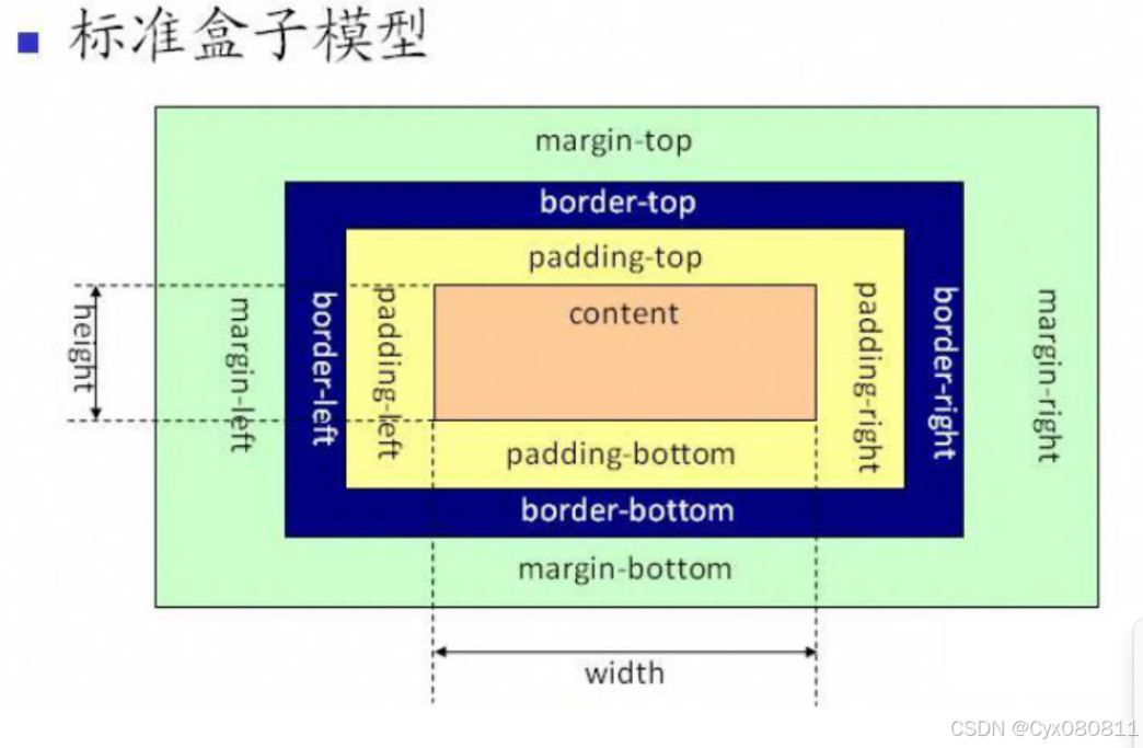
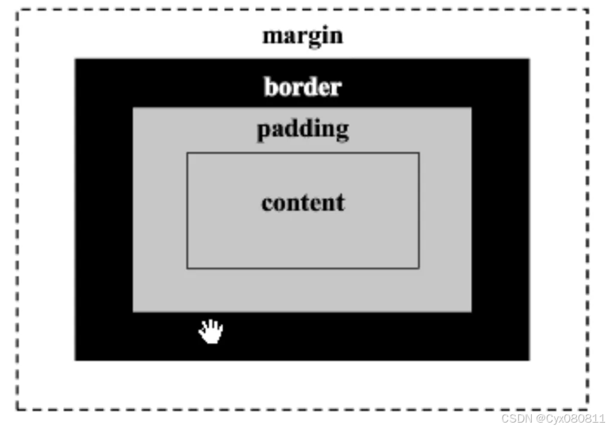
○ 在html中,把每一个元素都当做成一个盒子,拥有盒子的平面外形和空间
○ 盒模型由内容(content)+内边距(padding)+边框(border)+外边距(margin)4部分构成
■ 内容区域:你书写的内容或者子元素能够显示的区域
■ 内边距:撑开内容与边框的距离
■ 边框:元素的边框
■ 外边距:撑开元素和其他元素之间的距离
外边距margin
一、 元素的外边距设置:margin
1.直接给一个像素值 : 给上下左右 都加上改值的 外边距
2.给2个值 : 第一个参数是上下的外边距 ,第二个参数是左右的外边距
3.给三个值: 第一个值是 上 第二个值是 左右 第三个值是 下
4.四个值: 上 右 下 左 顺时针的顺序
5.单独设置 某一个 外边距:
margin-left: 10px;
margin-top: 20px;
margin-right: 30px;
margin-bottom: 40px;
二、margin的问题?
-
上下元素 同时设置margin 只有一个大值会生效
-
如果元素有父级元素 ,设置子元素 margin-top的时候 会加给父元素;
-
如果元 给父级元素加上一个属性 overflow:hidden
margin常出现的bug
两个相邻元素上下的margin值 不会叠加 按照较大值设置。
margin:0 auto;让当前元素在父元素里面左右居中。
可以通过控制外边距来定位色块位置
一般去掉默认的margin和padding
/* 去掉所有元素默认的margin和padding */

*{
            margin: 0;
            padding: 0;
        }
内边距padding
-
1:padding是在盒子里面,在盒子与内容之间。
-
2:padding的作用:控制子元素在父元素里面的位置关系。
-
3:padding会把盒子撑大。
-
4:如果想让盒子保持原有的大小:在宽高基础上减掉。( 如果一个元素是被内容撑 开的,没有设置固定的宽高,padding直接撑开。不用减掉 )
-
5:如果给单一方向添加padding padding-top/bottom/left/right
-
6:padding的设置特点: padding:30px; 四周
padding:10px 30px; 上下 左右
padding:10px 30px 50px 上 左右 下
padding:10px 30px 50px 100px 上右下左
一、padding: 内边距
1.一个参数 : 上 右 下 左 都会添加内边距
2. 2个参数 : 上下 、 左右
3.3个参数 : 上、左右 、下
4.4个参数 : 上 右 下 左
5.分开设置
padding-left: 10px;
padding-right: 20px;
padding-top: 30px;
 padding-bottom: 40px;
二、计算尺寸
1.添加padding之后 注意 总尺寸需要减一个padding 如果有边框 还需要减去边框
2.怪异盒模型 : 把元素变成怪异盒模型 : box-sizing: border-box; 写一个 100 * 100的div 。 边框宽度是5px 四周的padding是10px
<!DOCTYPE html>
<html lang="en">
<head>
    <meta charset="UTF-8">
    <meta name="viewport" content="width=device-width, initial-scale=1.0">
    <title>Document</title>
    <style>
        *{
            margin: 0;
            padding: 0;
        }
        .box{
            width: 70px;
            height: 70px;
            padding: 10px;
            background-color: red;
            border: 5px solid;
            /* padding: 10px; */  /*一个参数 : 上 右  下 左 都会添加内边距*/
            /* padding: 10px 20px; */   /*2个参数  : 上下 、 左右*/
            /* padding: 10px 20px 30px; */   /*3个参数 : 上、左右 、下 */
            /* padding: 10px 20px 30px 40px; */   /*4个参数 : 上 右 下 左*/
            padding: 10px;
            /* padding-right: 20px;
            padding-top: 30px;
            padding-bottom: 40px; */
        }
        .box2{
            width: 100px;
            height: 100px;
            border: 5px solid;
            padding: 10px;
            background-color: blue;
            box-sizing: border-box;/*把元素变成怪异盒模型*/
        }
    </style>
</head>
<body>
     <div class="box"></div>
     <hr/>
     <div class="box2"></div>
</body>
</html>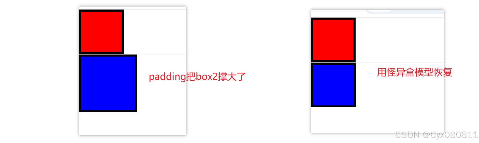
滚动条overflow
overflow : 1.可以隐藏超出的部分 :overflow: hidden;
2.让超出部分 出现滚动条
overflow: auto; overflow: scroll; : 无论在x轴上还是 y轴上超出了都会自动出现滚动条
overflow-x:scroll;
overflow-y: hidden;
只会出现x轴的滚动条 ,y轴也需要控制起来,不然会自动出现滚动条;
overflow-y:scroll;
overflow-x: hidden;
只会出现y轴滚动条
<!DOCTYPE html>
<html lang="en">
<head>
    <meta charset="UTF-8">
    <meta name="viewport" content="width=device-width, initial-scale=1.0">
    <title>Document</title>
    <style>
        .container{
            width: 200px;
            height: 200px;
            border: 1px solid;
            /* overflow: hidden; */
            overflow: auto;
            /* overflow: scroll; */
            /* overflow-x:scroll;
            overflow-y:hidden; */
        }


    </style>
</head>
<body>
    <div class="container">
        <div class="box">
                <p>fdsafdsadfafdsafdsfdfdsadfsaa</p>
                <p>fdsafdsa</p>
                <p>fdsafdsa</p>
                <p>fdsafdsa</p>
                <p>fdsafdsa</p>
                <p>fdsafdsa</p>
                <p>fdsafdsa</p>
        </div>

    </div>
</body>
</html>
元素/标签类型转变
元素/标签的类型
1.大标签 : 块标签 (block)
div /h1-h6 p 。。。
特性 : (1)独占一行 (2)设置宽和高 (3)竖着排列 (4) margin和padding 都有效果
2.小标签: 行内标签 (inline)
span em i b stronge ...
特性 : (1) 不能设置宽和高 (2)横着排列 (3)margin 只有 左右设置的起左右 。padding 在左右和下面 会起作用
3.特殊标签:行内块标签 (inline-block)
img 标签
(1)横着排列 (2)设置宽高 (3) margin padding 都起作用。
标签类型的转换:
display : block 变成块元素
display : inline 变成 行内元素
display : inline-block 变成行块元素
display: none ; 隐藏元素
伪类
在选择器后面用:进行修饰
::before 在元素之前添加内容
::after 在元素之后添加内容
:hover 当光标移动到指定内容上时内容会改变(只能在自身和子类设置)
:hover::before 可以改变文字和颜色
<!DOCTYPE html>
<html lang="en">
<head>
    <meta charset="UTF-8">
    <meta name="viewport" content="width=device-width, initial-scale=1.0">
    <title>Document</title>
    <style>

        .box::after{
            content: "我是加在box之后的内容";
            display: block;
            width: 100px;
            height: 100px;
            background-color: red;
        }
        .box::before{
            content: "我是在box之前添加的内容 ";
        }
        .box2{
            width: 100px;
            height: 100px;
            background-color: red;
        }
        .box2:hover{
            background-color: blue;
        }
        .box3{
            width: 200px;
            height: 200px;
            background-color: skyblue;
        }
        .box4{
            width: 100px;
            height: 100px;
            background-color: pink;
            display: none;
        }
        .box3:hover .box4{
            display: block;
        }
    </style>
</head>
<body>

     <div class="box">我是div

     </div>
     <hr/>
     <h2>hover伪类</h2>
     <div class="box2"></div>
     <div class="box3">
        3333
        <div class="box4">444</div>
     </div>
</body>
</html>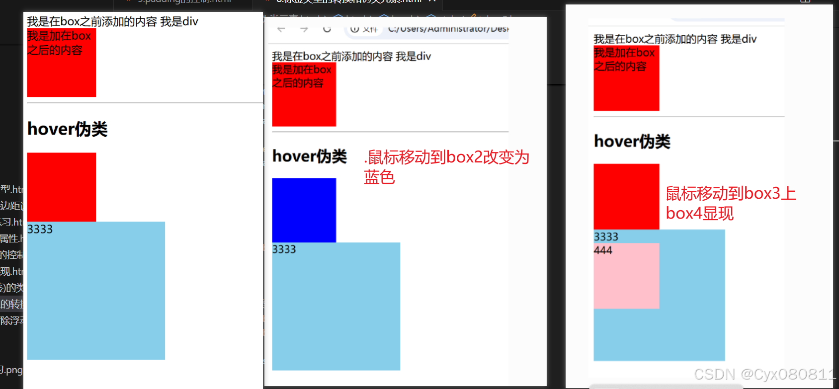
<!DOCTYPE html>
<html lang="en">

<head>
    <meta charset="UTF-8">
    <meta name="viewport" content="width=device-width, initial-scale=1.0">
    <title>Document</title>
    <style>
        .menu {
            width: 900px;
        }
        .menu a{
            width: 92px;
            height: 92px;
            /* border: 1px solid; */
            display: block;
            float: left;
            line-height: 92px;
            /* background-image: url(./images/bg1.png); */
        }
        .menu a:hover{
            background-image: url(./images/bg1.png);
        }
        .menu img{
            vertical-align:middle;
        }
    </style>
</head>
<body>
    <div class="menu">
        <a href="#">
            <img src="./images/logo1.png" alt="">
        </a>
        <a href="#">
            <img src="./images/logo2.png" alt="">
        </a>
        <a href="#">
            <img src="./images/logo3.png" alt="">
        </a>
        <a href="#">
            <img src="./images/logo4.png" alt="">
        </a>
        <a href="#">
            <img src="./images/logo5.png" alt="">
        </a>
        <a href="#">
            <img src="./images/logo6.png" alt="">
        </a>
        <a href="#">
            <img src="./images/logo7.png" alt="">
        </a>
    </div>
</body>
</html>
光标样子改变
cursor: pointer;
<!DOCTYPE html>
<html lang="en">
<head>
    <meta charset="UTF-8">
    <meta name="viewport" content="width=device-width, initial-scale=1.0">
    <title>Document</title>
    <style>
        * {
            margin: 0;
            padding: 0;
        }
        .menu {
            width: 410px;
            height: 20px;
            margin-left: 15px;
        }
        .menu div {
            width: 80px;
            height: 20px;
            background-color: #dfdfdf;
            float: left;
            margin-right: 2px;
            text-align: center;
            font-size: 12px;
            line-height: 20px;
            color: #6c6c6c;
            cursor: pointer;
            /*  光标移动上去的样式由箭头变为手 */
        }
        .line {
            width: 100%;
            height: 10px;
            background-color: #de4d18;
            margin-left: 10px;
        }
        .menu div:hover { /*menu里的每个div*/
            background-color: #de4d18;
        }
        .chin{/*默认为隐藏*/
            display: none;
        }
        .menu div:hover .chin{/*  光标移动上去 .chin显示 */
            display: block;
            color: white;
        }
        .menu div:hover .en{ /*  光标移动上去 .en隐藏 */
            display: none;
        }
    </style>
</head>
<body>
    <div class="menu">
        <div>
            <span class="en">Home</span>
            <span class="chin">主页</span>
        </div>
        <div>
            <span  class="en">Logon</span>
            <span class="chin">登录</span>
        </div>
        <div>
            <span  class="en">News</span>
            <span class="chin">新闻</span>
        </div>
        <div>
            <span  class="en">Culture</span>
            <span class="chin">文化</span>
        </div>
        <div>
            <span  class="en">Brand</span>
            <span class="chin">品牌</span>
        </div>
    </div>
    <div class="line"></div>
</body>

</html>
浮动和清除浮动
● 正常页面流:
○ 在css中,是存在流的概念的,正常情况下,页面总是由左至右,由上至下布局,我们把这种情况称作为正常页面流
○ 但是,在很多情况下,正常页面流有很多效果实现不了,所以需要一些手段来破坏流,而浮动(float)就是破坏流的一种手段
一。浮动:可以实现元素的水平排列 。
特点 :
1.一旦元素浮动起来,那么会把自己的位置让出来,会脱离文档流
2. 浮动的元素会一起排列 使用浮动 : float:left/none/right
左浮动(left):让元素沿着容器左侧放置( 左浮动时会占据左边空间)
右浮动(right):让元素沿着容器右侧放置( 右浮动时会占据右边空间)
none:不浮动
<!DOCTYPE html>
<html lang="en">
<head>
    <meta charset="UTF-8">
    <meta name="viewport" content="width=device-width, initial-scale=1.0">
    <title>Document</title>
    <style>
        .container{
            border: 5px solid;
        }
        .mydiv1{
            width: 100px;
            height: 100px;
            background-color: red;
            float: left;
        }
        .mydiv2{
            width: 200px;
            height: 200px;
            background-color: blue;
            float: left;
        }
    </style>
</head>
<body>
     <div class="container" >
        <div class="mydiv1"></div>
     </div>
     <div class="mydiv2"></div>
</body>
</html>
mydiv1浮动后container没有支撑
二、清除浮动
1.在父级元素后面加上一个div 设置宽和高
 <style>
        .container{
            border: 5px solid;
        }
        .mydiv1{
            width: 100px;
            height: 100px;
            background-color: red;
            float: left;
        }
        .mydiv2{
            width: 200px;
            height: 200px;
            background-color: blue;
            float: left;
        }
         .clearfix{
            height: 100px; /*1.在父级元素后面加上一个div 设置宽和高*/
         }
    </style>
</head>
<body>
     <div class="container" >
        <div class="mydiv1"></div>
        <div class="clearfix"></div>
     </div>
     <div class="mydiv2"></div>
</body>
2.利用一个属性 clear:both
<style>
        .container{
            border: 5px solid;
        }
        .mydiv1{
            width: 100px;
            height: 100px;
            background-color: red;
            float: left;
        }
        .mydiv2{
            width: 200px;
            height: 200px;
            background-color: blue;
            float: left;
        }
         .clearfix{
            clear: both;/*利用一个属性 clear:both*/
         }
    </style>
</head>
<body>
     <div class="container" >
        <div class="mydiv1"></div>
        <div class="clearfix"></div>
     </div>
     <div class="mydiv2"></div>
</body>
3.把这个伪类加给父级
.clearfix::after{
   content: "";
   display: block;
   clear: both;
 }
<style>
.container{
border: 5px solid;
}
.mydiv1{
width: 100px;
height: 100px;
background-color: red;
float: left;
}
.mydiv2{
width: 200px;
height: 200px;
background-color: blue;
float: left;
}
.clearfix::after{
content: "";
display: block;
clear: both;
}
</style>
</head>
<body>
<div class="container clearfix" >
<div class="mydiv1"></div>
</div>
<div class="mydiv2"></div>
</body>
浮动会脱离文档流,但是浮动的文字不会(可以用在文字环绕)
练习:色块练习
<!DOCTYPE html>
<html lang="en">
<head>
    <meta charset="UTF-8">
    <meta name="viewport" content="width=device-width, initial-scale=1.0">
    <title>Document</title>
    <style>
        * {
            margin: 0;
            padding: 0;
        }

        .container {
            width: 900px;
            border: 1px solid;
            margin: 0 auto;

        }

        .header {
            width: 900px;
            height: 100px;
        }
        .box1{
            width: 150px;
            height: 100px;
            background-color: black;
            float: left;
        }
        .box2{
            width: 200px;
            height: 100px;
            background-color: #fa07f7;
            float: left;
        }
        .box3{
            width: 120px;
            height: 100px;
            background-color: blue;
            float: left;
        }
        .box4{
            width: 135px;
            height: 100px;
            background-color: green;
            float: left;
        }
        .box5{
            width: 145px;
            height: 100px;
            background-color: black;
            float: left;
        }
        .box6{
            width: 150px;
            height: 100px;
            background-color: #efeb0d;
            float: left;
        }
        .content1{
            width: 630px;
            height: 130px;
            background-color: #a4154d;
            float: left;
        }
        .content2{
            width: 270px;
            height: 192px;
            background-color: green;
            float:right;
        }
        .content3{
            width: 195px;
            height: 155px;
            background-color: #395c62;
            float: left;
        }
        .content4{
            width: 435px;
            height: 90px;
            background-color: #be06f4;
            float: left;
        }
        .content5{
            width: 195px;
            height: 155px;
            background-color: #dce9e0;
            float: left;
        }
        .contenet6{
            width: 270px;
            height: 248px;
            background-color: #86604d;
            float: right;
        }
        .content7{
            width: 435px;
            height: 155px;
            background-color: #0fdbf3;
            /* float: left; */
            float:right;
        }
        .content8{
            width: 435px;
            height: 65px;
            background-color: #df5912;
            float: left;
        }
        .footer{
            width: 900px;
            height:60px ;
            background-color: #938d03;
            float: left;
        }
    </style>
</head>
<body>
    <div class="container">
        <!-- 头部 -->
        <div class="header">
            <div class="box1"></div>
            <div class="box2"></div>
            <div class="box3"></div>
            <div class="box4"></div>
            <div class="box5"></div>
            <div class="box6"></div>
        </div>

        <!-- 中间部分 -->
        <div class="content1"></div>
        <div class="content2"></div>
        <div class="content3"></div>
        <div class="content4"></div>
        <div class="contenet6"></div>
        <div class="content7"></div>
        <div class="content5"></div>
        <div class="content8"></div>

        <!-- 底下部分 -->
        <div class="footer"></div>
    </div>
</body>

</html>
练习:搜索框
 <style>
        .search{
            width: 230px;
            height: 30px;
            border: 1px solid #e5e5e5;
            background-color: #f1f1f1;
            padding-left: 15px;
            box-sizing: border-box;
            background-image: url(./search.png);
            background-repeat: no-repeat;
            background-position:200px 2px;
            padding-right: 30px;
        }
    </style>
</head>
<body>
    <input class="search" placeholder="SEARCH..." type="text">
</body>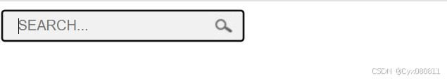
给超出部分加上省略号
1.单行超出显示省略号
<style>
    .box {
     /*强制文本在一行内显示*/
     white-space: nowrap;
     overflow: hidden;
     text-overflow: ellipsis;
       }
</style>
2.多行超出显示省略号
  <style>
     .box {
      overflow: hidden;
      text-overflow: ellipsis;
      width: 200px;
      /* 将对象作为弹性伸缩盒子模型显示 */
      display: -webkit-box;
      /* 限制在一个块元素显示的文本的行数 */
      /* -webkit-line-clamp 其实是一个不规范属性,使用了WebKit的CSS扩展属性,该方法适用于WebKit浏览器及移动端;*/
      -webkit-line-clamp: 2;
      /* 设置或检索伸缩盒对象的子元素的排列方式 */
      -webkit-box-orient: vertical;
}
  </style>
3.利用伪类实现省略号
<style>
.t3{
  width: 200px;
  position: relative;
  height: 40px;
  line-height: 20px;
  overflow: hidden;
}
.t3::after{
  content: '...';
  position: absolute;
  bottom: 0;
  right: 0;
  padding-left: 40px;
  background: linear-gradient(to right, transparent, #fff 55%);
}
  </style>
注意:以上换行只对中文生效,如果是英文字母就不会换行需要以下属性
1.word-break:break-all;只对英文起作用,以字母作为换行依据
2.word-wrap:break-word; 只对英文起作用,以单词作为换行依据
3.white-space:pre-wrap; 只对中文起作用,强制换行
4.white-space:nowrap; 强制不换行,都起作用
5.white-space:nowrap; overflow:hidden; text-overflow:ellipsis;不换行,超出部分隐藏且以省略号形式出现(部分浏览器支持)
定位
定位的基本思想很简单,它允许你定义元素框相对于其正常位置应该出现的位置,或者相对于父元素甚至浏览器窗口本身的位置
定位: 把元素定在某个位置 元素的排列 :
1.正常流(文档流、标准流)
2.浮动流(为了实现 文字环绕元素出来的技术)
<!DOCTYPE html>
<html lang="en">
<head>
    <meta charset="UTF-8">
    <meta name="viewport" content="width=device-width, initial-scale=1.0">
    <title>Document</title>
    <style>
        *{
            margin: 0;
            padding: 0;
        }
        .box2{
            width: 150px;
            height: 100px;
            background-color: blue;
            float: left;
        }
        .box3{
            width: 200px;
            height: 200px;
            background-color: yellow;
        }
    </style>
</head>
<body>
     <div class="box2">
     </div>
     <div class="box3">
        123<br>
        123<br>
        123<br>
        123<br>
        123<br>
        123dsafdsfdsafdsa<br>
     </div>
</body>
</html>
3.定位流 定位流: 关注2点 : 1.定位模式 2.定位偏移量 定位模式 :
(1)position:static (默认模式,没有定位)
(2) position : relative (相对定位) (3)position:absolute(绝对定位)
(4) position:fixed(固定定位)
(5)position:sticky(粘性模式)
相对定位
-
position:relative;
-
让元素相对定位:
-
元素先放置在未添加定位时候的区域
-
然后再不改变页面布局的情况下(
-
1、其他元素没有受到任何影响
-
2、自身原来的位置也保留
-
3、和浮动可以一起使用
-
)进行移动
-
位置设置
-
在相对定位中:left为正 元素向右走
-
在相对定位中:top为正 元素向下走
一、相对定位 : 相对于自身元素定位偏移量
设置 : pisition:relative
设置偏移量 : left 、right 、top 、bottom
1.相对定位会相对于自身来偏移
2.相对定位不会脱离文档流,会把原来的位置占起来;
3.一般情况下,相对定位会配合 绝对定位使用
<!DOCTYPE html>
<html lang="en">
<head>
    <meta charset="UTF-8">
    <meta name="viewport" content="width=device-width, initial-scale=1.0">
    <title>Document</title>
    <style>
        .mydiv{
            width: 100px;
            height: 100px;
            background-color: red;
            /* margin-left: 100px; */
            position: relative;   /* 设置定位模式 */
            /* 左侧偏移量 */
            left: 50px;
            /* left: 50px;
            top: 100px;   */
        }
        .mydiv2{
            width: 100px;
            height: 100px;
            background-color: blue;
            /* float: left; */
        }
    </style>
</head>
<body>
     <div class="mydiv"></div>
     <div class="mydiv2"></div>
</body>
</html>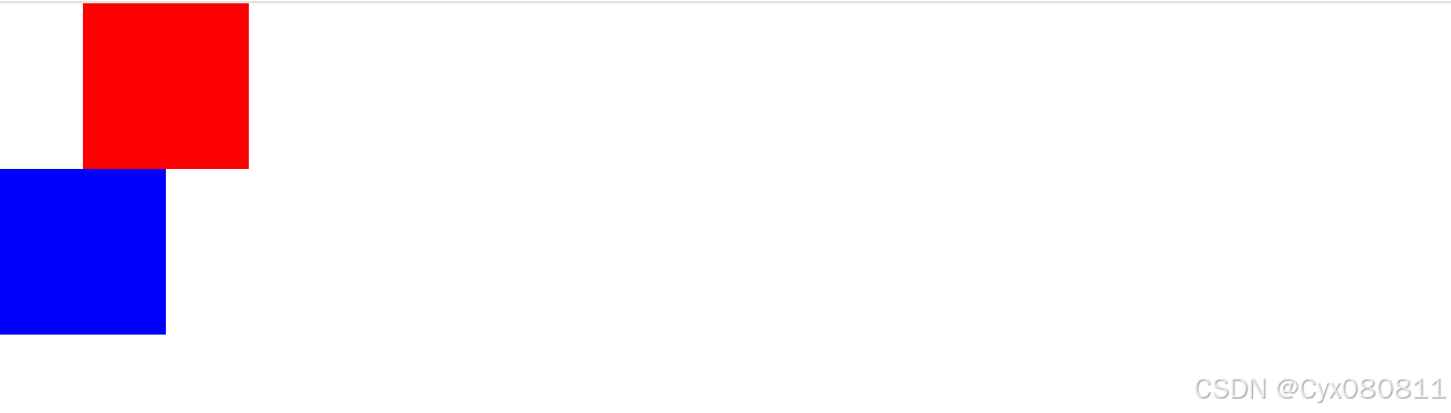
绝对定位
-
不预留任何的空间(脱离页面流)
-
通过指定当前元素 相对于其包含块偏移的量 来确定当前元素的位置
-
绝对定位以后,浮动失效。margin padding仍然可以使用
-
left: 0; 让定位元素的左边距离包含块左边为0
-
top: 0;让定位元素的上边距离包含块上边为0
-
绝对定位 (abolute):
-
一、没有父级以上级别 定位模式设置 ,只设置 绝对定位 ,会相对于浏览器视口(viewport)来设置 偏移量
-
二、父级及以上级别 有定位模式 (position:relative) ,那么偏移量就会参照这个设置定位模式的父级及以上元素的位置
-
三、如果父级有多个定位模式的设置,那么绝对定位会相对于最近设置模式的元素来进行偏移。
-
四、绝对定位的元素会脱离文档流
<!DOCTYPE html>
<html lang="en">
<head>
    <meta charset="UTF-8">
    <meta name="viewport" content="width=device-width, initial-scale=1.0">
    <title>Document</title>
    <style>
        *{
            margin: 0;
            padding: 0;
        }
        .container{
            margin: 0 auto;
            width: 456px;
            height: 254px;
            position: relative;
            border: 1px solid;
        }
        .container img{
            width: 100%;
        }
        .show{
            height: 55px;
            width: 456px;
            position: absolute;
            left: 0;
            bottom: 0;
            color: white;
            font-size: 24px;
        }
        .leftshow{
            width: 40px;
            height: 55px;
            background-color: #d03e2d;
            float: left;
            line-height: 55px;
            text-align: center;
        }

        .rightshow{
            width: 416px;
            height: 55px;
            float: left;
            line-height: 58px;
            background-color: rgba(0,0,0,.2);/*rgba最后一位数是设置透明度的,.2是0.2的意思*/
            padding-left: 20px;
             /* 设为怪异盒模型 */
            box-sizing: border-box;
            /* 给超出部分加上省略号 */
            text-overflow: ellipsis;
            overflow: hidden;
            /* 文字超出部分不能换行 */
            white-space:nowrap;
        }
    </style>
</head>
<body>
    <div class="container">
        <img src="./img1.jpg" >
        <div class="show">
            <div class="leftshow">1</div>
            <div class="rightshow">今日多云转晴天,大家注意多添加衣服加衣服</div>
        </div>
    </div>
</body>
</html>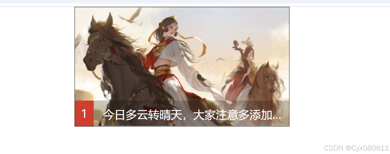
<!DOCTYPE html>
<html lang="en">
<head>
    <meta charset="UTF-8">
    <meta name="viewport" content="width=device-width, initial-scale=1.0">
    <title>Document</title>
    <style>
        *{
            margin: 0;
            padding: 0;
        }
        li{
            list-style: none;
        }
        .menu{
            width: 200px;
        }
        .all{
            width: 200px;
            height: 50px;
            background: skyblue;
            text-align: center;
            line-height: 50px;
            color: white;
            cursor: pointer;
        }
        .cate{
            display: none;
        }
        .cate li{
            width: 200px;
            height: 50px;
            background-color: aquamarine;
            text-align: center;
            line-height: 50px;
            border-bottom: 1px solid;
            position: relative;
            cursor: pointer;
        }
        .cate li:hover{
            background-color: gray;
        }
        .menu:hover .cate{
            display: block;
        }
        .subcate{
            position:absolute;
            top: 0px;
            left: 200px;
            display: none;
            /* right: -200px; */
        }
        .subcate li{
            background-color: blue;
            color: white;
        }

        .cate li:hover .subcate{
            display: block;
        }

    </style>
</head>
<body>
    <div class="menu">
        <div class="all">全部分类</div>
        <ul class="cate">
            <li>分类一
                <ul class="subcate">
                    <li>子分类一</li>
                    <li>子分类二</li>
                </ul>
            </li>
            <li>分类二
                <ul class="subcate">
                    <li>子分类一</li>
                    <li>子分类二</li>
                </ul>

            </li>
            <li>分类三

                <ul class="subcate">
                    <li>子分类一</li>
                    <li>子分类二</li>
                </ul>
            </li>
         </ul>
    </div>
</body>
</html>
固定定位fixed
-
不为元素预留空间(脱离页面流)
-
相对于视口(viewport)的位置来定位元素的
-
滚动页面滚动条的时候,视口不发生改变,元素位置也不会改变
固定定位 : 把元素的位置固定在浏览器上;只会相对于浏览器viewport定位; 设置模式 : position:fixed 相对于浏览器偏移
<!DOCTYPE html>
<html lang="en">
<head>
    <meta charset="UTF-8">
    <meta name="viewport" content="width=device-width, initial-scale=1.0">
    <title>Document</title>
    <style>
        *{
            margin: 0;
            padding: 0;
        }
        .box{
            width: 50px;
            height: 100px;
            background-color: red;/*设置模式 : position:fixed*/
            position: fixed;
            right: 0;
            bottom: 200px;
        }
        .container{
            width: 100px;
            height: 2000px;
            background-color: black;
        }
        li{
            width: 100px;
            height: 500px;
            color: white;
            font-size: 40px;
        }
    </style>
</head>
<body>
     <div class="box"></div>
     <div class="container">
        <li>1111</li>
        <li>2222</li>
        <li>3333</li>
        <li>444</li>
        <li>555</li>
     </div>
</body>
</html>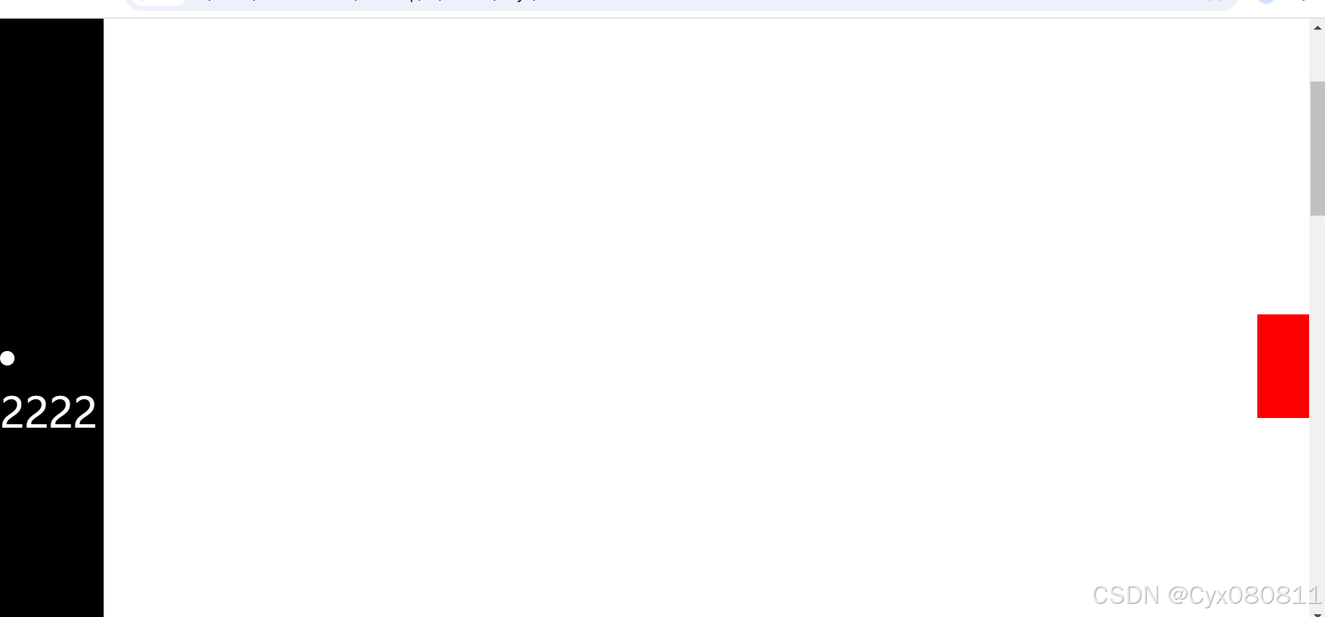
粘性定位sticky
<!DOCTYPE html>
<html lang="en">
<head>
    <meta charset="UTF-8">
    <meta name="viewport" content="width=device-width, initial-scale=1.0">
    <title>Document</title>
    <style>
        *{
            margin: 0;
            padding: 0;
        }
        .header{
            width: 100%;
            /* width: 100vw; */
            /* 高度不能设置 100% */
            /* height: 100%; */
            /* v:viewport(视口的高度)  h:height */
            /* height: 100vh;  100%的视口高度 */
            height: 50px;
            background-color: red;
        }
        .mysearch{
            width: 300px;
            height: 50px;
            background-color: gray;
            border: 1px solid;
            margin: 0 auto;
            position: sticky;
            top: 10px;/*当mysearch距离浏览器是10培训的时候悬停*/
        }
        .mydiv{
            width: 100px;
            height: 2000px;
            background-color: pink;
        }
    </style>
</head>
<body>
    <div class="header"></div>
    <div class="mysearch"></div>
    <div class="mydiv"></div>
</body>
</html>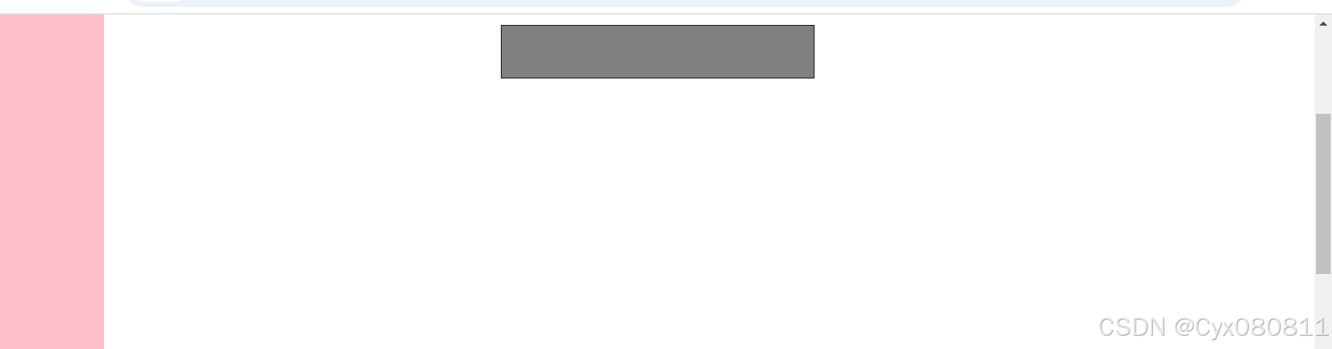
定位层次关系
-
z-index : auto |number 检索或设置对象的层叠顺序。
- auto:默认值。
- number:无单位的整数值。可为负数没有设置z-index时,最后写的对象优先显示在上层,设置后,数值越大,层越靠上;
绝对定位的层级 可以通过 z-index来设置 ,默认值是 z-index:auto , 默认值 是 0; z-index可以给数字 , 数字越大 层级越高
<!DOCTYPE html>
<html lang="en">
<head>
    <meta charset="UTF-8">
    <meta name="viewport" content="width=device-width, initial-scale=1.0">
    <title>Document</title>
    <style>
        *{
            margin: 0;
            padding: 0;
        }
        .container{
            width: 600px;
            height: 600px;
            border: 1px solid;
            margin: 0 auto;
            position: relative;
        }
        .box1{
            width: 100px;
            height: 100px;
            background-color: red;
            position:absolute;
            left: 50px;
            top: 50px;
            z-index: 10;
        }
        .box2{
            width: 100px;
            height: 100px;
            background-color: blue;
            position:absolute;
            left: 60px;
            top: 60px;
            z-index: 5;
        }
        .box3{
            width: 100px;
            height: 100px;
            background-color: yellow;
            position:absolute;
            left: 70px;
            top: 70px;
            z-index: 1;
        }
    </style>
</head>
<body>
    <div class="container">
        <div class="box1"></div>
        <div class="box2"></div>
        <div class="box3"></div>
    </div>
</body>
</html>


 扫一扫
扫一扫


 274
274

 被折叠的 条评论
为什么被折叠?
被折叠的 条评论
为什么被折叠?
 到【灌水乐园】发言


