


 本文深入讲解CSS3动画的使用方法,包括@keyframes定义关键帧、animation属性详解及兼容性处理,通过实例演示动画效果的实现,如元素大小变化、动画状态控制等。
一、概述
css3的animation属性可以制作动画效果,类似flash,他是通过关键帧来控制动画的每一步,达到让“动”起来的效果。
animation的使用方法:
- 定义动画 @keyframes 定义关键帧动画
- 使用动画 利用animation属性调用定义好的动画。
兼容性问题
这个属性有兼用性问题,需要做兼容性处理- InternetExplorer10、Firefox以及Opera浏览器中支持该属性
- Safari和Chrome不支持需要加上-webkit-的前缀
二、animation的用法
1、animation的属性值
- animation-name 动画名称 由@keyframes 声明
animation-name:demo//InternetExplorer10、Firefox以及Opera浏览器中
-webkit-animation-name:demo//Safari和Chrome
-
animation-duration 完成动画所花费的时间(以秒和毫秒为单位)
-
animation-timing-function 动画运动的速度曲线
- linear 匀速
- ease 开始和结束慢速
- ease-in 开始是慢速
- ease-out 结束时慢速
- ease-in-out 开始和结束时慢速
- steps 动画步数
-
animation-delay 动画开始的延迟时间
-
animation-iteration-count 动画播放次数
- n(次)|infinite (无限循环)
-
animation-direction 动画结束后是否反向还原
- normal 默认动画结束不返回
- alternate 动画结束后返回
-
animation-play-state 动画状态
- paused 停止
- running 运动
<!DOCTYPE html>
<html lang="en">

<head>
    <meta charset="UTF-8">
    <meta name="viewport" content="width=device-width, initial-scale=1.0">
    <meta http-equiv="X-UA-Compatible" content="ie=edge">
    <title>Document</title>
    <style type="text/css">
        @keyframes stop {
            from {

                width: 200px;
            }

            to {
                width: 600px;
            }
        }

        div {
            width: 100px;
            height: 30px;
            background-color: #999;
            border-radius: 5px;
            /* 可以复合一起写,也可以当个拿出来写 */
            /* animation: stop 3s ease-in-out 0.2s infinite normal; */
            /* 动画名称 */
            animation-name:stop;
            /* 完成动画所花费的时间 */
            animation-duration :3s;
            /* 动画曲线 */
            animation-timing-function:ease-in-out;
            /* 动画延迟 */
            animation-delay :0.2s;
            /* 动画播放次数 */
            animation-iteration-count: infinite;
            /* 动画状态 */
            animation-direction: normal;
        }
        div:hover {
            animation-play-state: paused;
        }
    </style>
</head>
<body>
    <div></div>
</body>

</html>
- animation-fill-mode 动画前后的状态
- none 不改变默认行为
- forwards 当动画完成后,保持最后一个属性值(在最后一个关键帧中定义)
- backwards 在 animation-delay 所指定的一段时间内,在动画显示之前,应用开始属性值(在第一个关键帧中定义)
- both 向前和向后填充模式都被应用
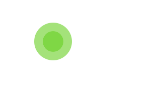
案例
两个原形交替放大缩小
<!DOCTYPE html>
<html lang="en">

<head>
    <meta charset="UTF-8">
    <meta name="viewport" content="width=device-width, initial-scale=1.0">
    <meta http-equiv="X-UA-Compatible" content="ie=edge">
    <title>Document</title>
    <style>
        .cicle {
            width: 60px;
            height: 60px;

            position: relative;
            margin: 100px;
        }

        .cicle1,
        .cicle2 {
            width: 100%;
            height: 100%;
            border-radius: 50%;
            background-color: #67CF22;
            opacity: 0.6;
            position: absolute;
            top: 0;
            left: 0;
            -webkit-animation: bounce 2.0s infinite ease-in-out;
            animation: bounce 2.0s infinite ease-in-out;
        }

        .cicle2 {
            -webkit-animation-delay: -1.0s;
            animation-delay: -1.0s;
        }

        @-webkit-keyframes bounce {
            0%,
            100% {
                -webkit-transform: scale(0.0)
            }

            50% {
                -webkit-transform: scale(1.0)
            }
        }

        @keyframes bounce {
            0%,
            100% {
                transform: scale(0.0);
                -webkit-transform: scale(0.0);
            }

            50% {
                transform: scale(1.0);
                -webkit-transform: scale(1.0);
            }
        }
        .cicle>.cicle1:hover{
            animation-play-state: paused;
            -webkit-animation-play-state: paused;
            /* opacity: 0; */
            background-color: rgb(143, 160, 175)
        }
        .cicle>.cicle2:hover{
            animation-play-state: paused;
            -webkit-animation-play-state: paused;
            /* opacity: 0; */
            background-color: rgb(202, 177, 130);

        }
    </style>
</head>

<body>
    <div class="cicle">
        <div class="cicle1"></div>
        <div class="cicle2"></div>
    </div>
</body>

</html>


 扫一扫
扫一扫


 9062
9062

 被折叠的 条评论
为什么被折叠?
被折叠的 条评论
为什么被折叠?
 到【灌水乐园】发言


