 鸿蒙ArkUI组件动画模糊、阴影与色彩效果


📑往期推文全新看点(附带最新·鸿蒙全栈学习笔记)
模糊
动画效果可以丰富界面的细节,提升UI界面的真实感和品质感。例如,模糊和阴影效果可以让物体看起来更加立体,使得动画更加生动。ArkUI提供了丰富的效果接口,开发者可快速打造出精致、个性化的效果。本章中主要对常用的模糊、阴影和色彩效果等效果接口进行了介绍。
模糊可以用来体现界面空间的纵深感,区分前后元素的层级关系。
| 接口 | 说明 |
|---|---|
| backdropBlur | 为当前组件添加背景模糊效果,入参为模糊半径。 |
| blur | 为当前组件添加内容模糊效果,入参为模糊半径。 |
| backgroundBlurStyle | 为当前组件添加背景模糊效果,入参为模糊样式。 |
| foregroundBlurStyle | 为当前组件添加内容模糊效果,入参为模糊样式。 |
| motionBlur | 为当前组件添加由缩放大小或位移变化引起的运动过程中的动态模糊效果,入参为模糊半径和锚点坐标。 |
说明
以上接口是实时模糊接口,会每帧进行实时渲染,性能负载较高。当模糊内容和模糊半径都不需要变化时,建议使用静态模糊接口 blur 。
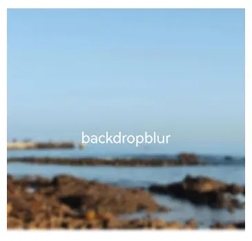
使用backdropBlur为组件添加背景模糊
@Entry
@Component
struct BlurEffectsExample {
  build() {
    Column({ space: 10 }) {
      Text('backdropBlur')
        .width('90%')
        .height('90%')
        .fontSize(20)
        .fontColor(Color.White)
        .textAlign(TextAlign.Center)
        .backdropBlur(10) // 对背景进行模糊
        .backgroundImage($r('app.media.share'))
        .backgroundImageSize({ width: 400, height: 300 })
    }
    .width('100%')
    .height('50%')
    .margin({ top: 20 })
  }
}
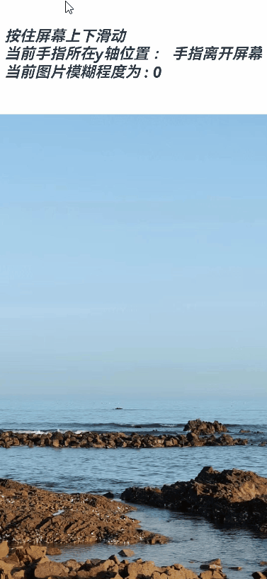
使用blur为组件添加内容模糊
@Entry
@Component
struct Index1 {
  @State radius: number = 0;
  @State text: string = '';
  @State y: string = '手指不在屏幕上';

  aboutToAppear() {
    this.text = "按住屏幕上下滑动\n" + "当前手指所在y轴位置 : " + this.y +
    "\n" + "当前图片模糊程度为 : " + this.radius;
  }

  build() {
    Flex({ direction: FlexDirection.Column, alignItems: ItemAlign.Center, justifyContent: FlexAlign.SpaceBetween }) {
      Text(this.text)
        .height(200)
        .fontSize(20)
        .fontWeight(FontWeight.Bold)
        .fontFamily("cursive")
        .fontStyle(FontStyle.Italic)
      Image($r("app.media.wall"))
        .blur(this.radius) // 使用blur接口为照片组件添加内容模糊效果
        .height('100%')
        .width("100%")
        .objectFit(ImageFit.Cover)
    }.height('100%')
    .width("100%")
    .onTouch((event?: TouchEvent) => {
      if(event){
        if (event.type === TouchType.Move) {
          this.y = Number(event.touches[0].y.toString()).toString();
          this.radius = Number(this.y) / 10; // 根据跟手过程中的滑动距离修改模糊半径,配合模糊接口,形成跟手模糊效果
        }
        if (event.type === TouchType.Up) {
          this.radius = 0;
          this.y = '手指离开屏幕';
        }
      }
      this.text = "按住屏幕上下滑动\n" + "当前手指所在y轴位置 : " + this.y +
      "\n" + "当前图片模糊程度为 : " + this.radius;
    })
  }
}
使用backgroundBlurStyle为组件添加背景模糊效果
@Entry
@Component
struct BackDropBlurStyleDemo {
  build() {
    Grid() {
      GridItem() {
        Column() {
          Column() {
            Text('原图')
              .fontSize(20)
              .fontColor(Color.White)
              .textAlign(TextAlign.Center)
              .width('100%')
              .height('100%')
          }
          .height(100)
          .aspectRatio(1)
          .borderRadius(10)
          .backgroundImage($r('app.media.share'))

          Text('原图')
            .fontSize(12)
            .fontColor(Color.Black)
        }
        .height('100%')
        .justifyContent(FlexAlign.Start)
      }
      .width(200)
      .height(200)

      GridItem() {
        Column() {
          Column() {
            Text('Thin')
              .fontSize(20)
              .fontColor(Color.White)
              .textAlign(TextAlign.Center)
              .width('100%')
              .height('100%')
          }
          .height(100)
          .aspectRatio(1)
          .borderRadius(10)
          .backgroundImage($r('app.media.share'))
          // BlurStyle.Thin: 为组件添加轻薄材质模糊效果
          // ThemeColorMode.LIGHT: 固定使用浅色模式效果
          // AdaptiveColor.DEFAULT: 不使用取色模糊,使用默认的颜色作为蒙版颜色
          // scale: 背景材质模糊效果程度,默认值是1
          .backgroundBlurStyle(BlurStyle.Thin, {
 最低0.47元/天 解锁文章


 扫一扫
扫一扫


 545
545

 被折叠的 条评论
为什么被折叠?
被折叠的 条评论
为什么被折叠?
 到【灌水乐园】发言


