


 本文通过一个小球下落的实例介绍了CSS3中关键帧动画的使用方法。通过定义动画序列,实现小球周期性地从起始位置移动到指定位置再返回的效果,并通过调整延迟时间使多个小球依次动画。
二、关键帧动画
本文大致介绍了CSS3中的技术之一:动画,因为我也是学习者,这只是我自己的观点,如有错误,请指出。废话不多说,开始步入正题:
本文承接上文:上一篇博客仅仅介绍了动画过渡的案例,下面讲解关键帧动画的案例:小球的下落
废话不多说,先上效果:
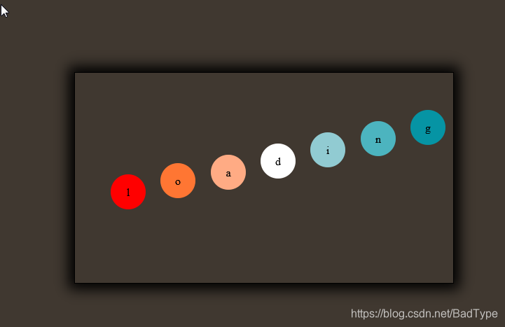
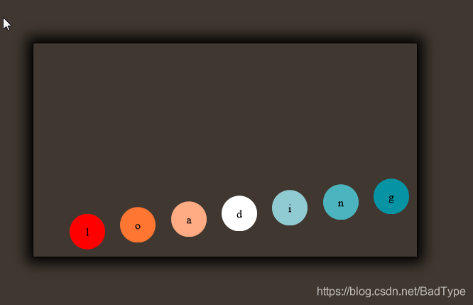
由于视频不好长传,无法给大家展示动态效果,这里我就讲述一下,图中小球会有顺序的往下掉落周而复始,因为里面也会写到其他的小样式,所以如果有看不懂的可以在评论区评论或者私我
<style>
        body {
            background-color: #403830;
        }

        ul {
            margin: 300px 500px;
            width: 500px;
            height: 300px;
            border: 1px solid black;
            /*盒子阴影*/
            box-shadow: 0px 0px 17px 8px black;
            float: left;
            list-style: none;
            /*设置弹性容器*/
            display: flex;
            flex-flow: row nowrap;
        }

        li {
            width: 50px;
            height: 50px;
            margin: 125px auto;
            line-height: 50px;
            /*设置小圆球*/
            border-radius: 50%;
            text-align: center;
        }
        /*写剧本*/
        @keyframes b {
            0% {
                transform: translateY(0px);
            }
            50% {
                transform: translateY(120px);
            }
            75% {
                transform: translateY(-120px);
            }
            100% {
                transform: translateY(0px);
            }
        }

        li:nth-of-type(1) {
            background-color: red;
            /*调用剧本 名称 运行时间 运行方式(匀速) 运行次数(无限次)*/
            animation: b 3s linear infinite;
        }

        li:nth-of-type(2) {
            background-color: #FF7633;
             /*调用剧本*/
            animation: b 3s 0.2s linear infinite;
        }

        li:nth-of-type(3) {
            background-color: #FFAB84;
             /*调用剧本*/
            animation: b 3s 0.3s linear infinite;
        }

        li:nth-of-type(4) {
            background-color: white;
             /*调用剧本*/
            animation: b 3s 0.4s linear infinite;
        }

        li:nth-of-type(5) {
            background-color: #91CBD2;
             /*调用剧本*/
            animation: b 3s 0.5s linear infinite;
        }

        li:nth-of-type(6) {
            background-color: #4CB4BF;
             /*调用剧本*/
            animation: b 3s 0.6s linear infinite;
        }

        li:nth-of-type(7) {
            background-color: #0694A4;
             /*调用剧本*/
            animation: b 3s 0.7s linear infinite;
        }
    </style>

    <body>
    <ul>
        <li>l</li>
        <li>o</li>
        <li>a</li>
        <li>d</li>
        <li>i</li>
        <li>n</li>
        <li>g</li>
    </ul>
</body>
大家对样式或者有疑问的可以提出来,我会及时解答或更正,谢谢大家!


 扫一扫
扫一扫


 784
784

 被折叠的 条评论
为什么被折叠?
被折叠的 条评论
为什么被折叠?
 到【灌水乐园】发言


