


往期鸿蒙全套实战文章必看:(文中附带全栈鸿蒙学习资料)
全屏模态转场
通过bindContentCover属性为组件绑定全屏模态页面,在组件插入和删除时可通过设置转场参数ModalTransition显示过渡动效。
说明
从API Version 10开始支持。后续版本如有新增内容,则采用上角标单独标记该内容的起始版本。
不支持横竖屏切换。
不支持路由跳转。
bindContentCover
bindContentCover(isShow: Optional<boolean>, builder: CustomBuilder, options?: ContentCoverOptions)
给组件绑定全屏模态页面,点击后显示模态页面。模态页面内容自定义,显示方式可设置无动画过渡,上下切换过渡以及透明渐变过渡方式。
元服务API: 从API version 11开始,该接口支持在元服务中使用。
系统能力: SystemCapability.ArkUI.ArkUI.Full
参数:
| 参数名 | 类型 | 必填 | 说明 |
|---|---|---|---|
| isShow | Optional<boolean> | 是 | 是否显示全屏模态页面。 从API version 10开始,该参数支持$$双向绑定变量。 |
| builder | CustomBuilder | 是 | 配置全屏模态页面内容。 |
| options | ContentCoverOptions | 否 | 配置全屏模态页面的可选属性。 |
ContentCoverOptions
继承自BindOptions。
| 名称 | 类型 | 必填 | 描述 |
|---|---|---|---|
| modalTransition | ModalTransition | 否 | 全屏模态页面的转场方式。 元服务API: 从API version 11开始,该接口支持在元服务中使用。 |
| onWillDismiss12+ | Callback<DismissContentCoverAction> | 否 | 全屏模态页面交互式关闭回调函数。 说明: 当用户执行back事件关闭交互操作时,如果注册该回调函数,则不会立刻关闭。在回调函数中可以通过reason得到阻拦关闭页面的操作类型,从而根据原因选择是否关闭全屏模态页面。在onWillDismiss回调中,不能再做onWillDismiss拦截。 元服务API: 从API version 12开始,该接口支持在元服务中使用。 |
| transition12+ | TransitionEffect | 否 | 全屏模态页面的转场方式。 元服务API: 从API version 12开始,该接口支持在元服务中使用。 |
DismissContentCoverAction12+类型说明
元服务API: 从API version 12开始,该接口支持在元服务中使用。
| 名称 | 类型 | 必填 | 描述 |
|---|---|---|---|
| dismiss | function | 是 | 全屏模态页面关闭回调函数。开发者需要退出页面时调用。 |
| reason | DismissReason | 是 | 返回本次拦截全屏模态页面退出的事件原因。 |
示例
示例1(使用全屏模态转场)
该示例主要演示通过bindContentCover来实现全屏模态转场。
// xxx.ets
@Entry
@Component
struct ModalTransitionExample {
  @State isShow: boolean = false
  @State isShow2: boolean = false

  @Builder
  myBuilder2() {
    Column() {
      Button("close modal 2")
        .margin(10)
        .fontSize(20)
        .onClick(() => {
          this.isShow2 = false;
        })
    }
    .width('100%')
    .height('100%')
  }

  @Builder
  myBuilder() {
    Column() {
      Button("transition modal 2")
        .margin(10)
        .fontSize(20)
        .onClick(() => {
          this.isShow2 = true;
        }).bindContentCover(this.isShow2, this.myBuilder2(), {
        modalTransition: ModalTransition.NONE,
        backgroundColor: Color.Orange,
        onWillAppear: () => {
          console.log("BindContentCover onWillAppear.")
        },
        onAppear: () => {
          console.log("BindContentCover onAppear.")
        },
        onWillDisappear: () => {
          console.log("BindContentCover onWillDisappear.")
        },
        onDisappear: () => {
          console.log("BindContentCover onDisappear.")
        }
      })

      Button("close modal 1")
        .margin(10)
        .fontSize(20)
        .onClick(() => {
          this.isShow = false;
        })
    }
    .width('100%')
    .height('100%')
    .justifyContent(FlexAlign.Center)
  }

  build() {
    Column() {
      Button("transition modal 1")
        .onClick(() => {
          this.isShow = true
        })
        .fontSize(20)
        .margin(10)
        .bindContentCover(this.isShow, this.myBuilder(), {
          modalTransition: ModalTransition.NONE,
          backgroundColor: Color.Pink,
          onWillAppear: () => {
            console.log("BindContentCover onWillAppear.")
          },
          onAppear: () => {
            console.log("BindContentCover onAppear.")
          },
          onWillDisappear: () => {
            console.log("BindContentCover onWillDisappear.")
          },
          onDisappear: () => {
            console.log("BindContentCover onDisappear.")
          }
        })
    }
    .justifyContent(FlexAlign.Center)
    .backgroundColor("#ff49c8ab")
    .width('100%')
    .height('100%')
  }
}
示例2(自定义转场动画)
全屏模态无动画转场模式下,自定义转场动画。
// xxx.ets
import { curves } from '@kit.ArkUI';

@Entry
@Component
struct ModalTransitionExample {
  @State @Watch("isShow1Change") isShow: boolean = false
  @State @Watch("isShow2Change") isShow2: boolean = false
  @State isScale1: number = 1;
  @State isScale2: number = 1;

  isShow1Change() {
    this.isShow ? this.isScale1 = 0.95 : this.isScale1 = 1
  }

  isShow2Change() {
    this.isShow2 ? this.isScale2 = 0.95 : this.isScale2 = 1
  }

  @Builder
  myBuilder2() {
    Column() {
      Button("close modal 2")
        .margin(10)
        .fontSize(20)
        .onClick(() => {
          this.isShow2 = false;
        })
    }
    .width('100%')
    .height('100%')
  }

  @Builder
  myBuilder() {
    Column() {
      Button("transition modal 2")
        .margin(10)
        .fontSize(20)
        .onClick(() => {
          this.isShow2 = true;
        }).bindContentCover(this.isShow2, this.myBuilder2(), {
        modalTransition: ModalTransition.NONE,
        backgroundColor: Color.Orange,
        onWillAppear: () => {
          console.log("BindContentCover onWillAppear.")
        },
        onAppear: () => {
          console.log("BindContentCover onAppear.")
        },
        onWillDisappear: () => {
          console.log("BindContentCover onWillDisappear.")
        },
        onDisappear: () => {
          console.log("BindContentCover onDisappear.")
        }
      })

      Button("close modal 1")
        .margin(10)
        .fontSize(20)
        .onClick(() => {
          this.isShow = false;
        })
    }
    .width('100%')
    .height('100%')
    .justifyContent(FlexAlign.Center)
    .scale({ x: this.isScale2, y: this.isScale2 })
    .animation({ curve: curves.springMotion() })
  }

  build() {
    Column() {
      Button("transition modal 1")
        .onClick(() => {
          this.isShow = true
        })
        .fontSize(20)
        .margin(10)
        .bindContentCover(this.isShow, this.myBuilder(), {
          modalTransition: ModalTransition.NONE,
          backgroundColor: Color.Pink,
          onWillAppear: () => {
            console.log("BindContentCover onWillAppear.")
          },
          onAppear: () => {
            console.log("BindContentCover onAppear.")
          },
          onWillDisappear: () => {
            console.log("BindContentCover onWillDisappear.")
          },
          onDisappear: () => {
            console.log("BindContentCover onDisappear.")
          }
        })
    }
    .justifyContent(FlexAlign.Center)
    .backgroundColor("#ff49c8ab")
    .width('100%')
    .height('100%')
    .scale({ x: this.isScale1, y: this.isScale1 })
    .animation({ curve: curves.springMotion() })
  }
}
示例3(上下切换转场)
全屏模态上下切换转场。
// xxx.ets
@Entry
@Component
struct ModalTransitionExample {
  @State isShow: boolean = false
  @State isShow2: boolean = false

  @Builder
  myBuilder2() {
    Column() {
      Button("close modal 2")
        .margin(10)
        .fontSize(20)
        .onClick(() => {
          this.isShow2 = false;
        })
    }
    .width('100%')
    .height('100%')
  }

  @Builder
  myBuilder() {
    Column() {
      Button("transition modal 2")
        .margin(10)
        .fontSize(20)
        .onClick(() => {
          this.isShow2 = true;
        }).bindContentCover(this.isShow2, this.myBuilder2(), {
        modalTransition: ModalTransition.DEFAULT,
        backgroundColor: Color.Gray,
        onWillAppear: () => {
          console.log("BindContentCover onWillAppear.")
        },
        onAppear: () => {
          console.log("BindContentCover onAppear.")
        },
        onWillDisappear: () => {
          console.log("BindContentCover onWillDisappear.")
        },
        onDisappear: () => {
          console.log("BindContentCover onDisappear.")
        }
      })

      Button("close modal 1")
        .margin(10)
        .fontSize(20)
        .onClick(() => {
          this.isShow = false;
        })
    }
    .width('100%')
    .height('100%')
    .justifyContent(FlexAlign.Center)
  }

  build() {
    Column() {
      Button("transition modal 1")
        .onClick(() => {
          this.isShow = true
        })
        .fontSize(20)
        .margin(10)
        .bindContentCover(this.isShow, this.myBuilder(), {
          modalTransition: ModalTransition.DEFAULT,
          backgroundColor: Color.Pink,
          onWillAppear: () => {
            console.log("BindContentCover onWillAppear.")
          },
          onAppear: () => {
            console.log("BindContentCover onAppear.")
          },
          onWillDisappear: () => {
            console.log("BindContentCover onWillDisappear.")
          },
          onDisappear: () => {
            console.log("BindContentCover onDisappear.")
          }
        })
    }
    .justifyContent(FlexAlign.Center)
    .backgroundColor(Color.White)
    .width('100%')
    .height('100%')
  }
}
示例4(透明度渐变转场)
全屏模态透明度渐变转场。
// xxx.ets
@Entry
@Component
struct ModalTransitionExample {
  @State isShow: boolean = false
  @State isShow2: boolean = false

  @Builder
  myBuilder2() {
    Column() {
      Button("close modal 2")
        .margin(10)
        .fontSize(20)
        .onClick(() => {
          this.isShow2 = false;
        })
    }
    .width('100%')
    .height('100%')
    .justifyContent(FlexAlign.Center)
  }

  @Builder
  myBuilder() {
    Column() {
      Button("transition modal 2")
        .margin(10)
        .fontSize(20)
        .onClick(() => {
          this.isShow2 = true;
        }).bindContentCover(this.isShow2, this.myBuilder2(), {
        modalTransition: ModalTransition.ALPHA,
        backgroundColor: Color.Gray,
        onWillAppear: () => {
          console.log("BindContentCover onWillAppear.")
        },
        onAppear: () => {
          console.log("BindContentCover onAppear.")
        },
        onWillDisappear: () => {
          console.log("BindContentCover onWillDisappear.")
        },
        onDisappear: () => {
          console.log("BindContentCover onDisappear.")
        }
      })

      Button("close modal 1")
        .margin(10)
        .fontSize(20)
        .onClick(() => {
          this.isShow = false;
        })
    }
    .width('100%')
    .height('100%')
    .justifyContent(FlexAlign.Center)
  }

  build() {
    Column() {
      Button("transition modal 1")
        .onClick(() => {
          this.isShow = true
        })
        .fontSize(20)
        .margin(10)
        .bindContentCover(this.isShow, this.myBuilder(), {
          modalTransition: ModalTransition.ALPHA,
          backgroundColor: Color.Pink,
          onWillAppear: () => {
            console.log("BindContentCover onWillAppear.")
          },
          onAppear: () => {
            console.log("BindContentCover onAppear.")
          },
          onWillDisappear: () => {
            console.log("BindContentCover onWillDisappear.")
          },
          onDisappear: () => {
            console.log("BindContentCover onDisappear.")
          }
        })
    }
    .justifyContent(FlexAlign.Center)
    .backgroundColor(Color.White)
    .width('100%')
    .height('100%')
  }
}
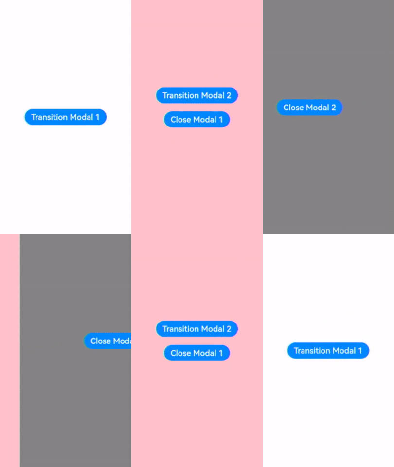
示例5(设置不同效果的自定义转场)
该示例主要演示全屏模态旋转,平移等自定义转场。
// xxx.ets
@Entry
@Component
struct ModalTransitionExample {
  @State isShow: boolean = false
  @State isShow2: boolean = false

  @Builder
  myBuilder2() {
    Column() {
      Button("Close Modal 2")
        .margin(10)
        .fontSize(20)
        .onClick(() => {
          this.isShow2 = false;
        })
    }
    .width('100%')
    .height('100%')
    .justifyContent(FlexAlign.Center)
  }

  @Builder
  myBuilder() {
    Column() {
      Button("Transition Modal 2")
        .margin(10)
        .fontSize(20)
        .onClick(() => {
          this.isShow2 = true;
        })
        .bindContentCover(
          this.isShow2,
          this.myBuilder2(),
          {
            modalTransition: ModalTransition.DEFAULT,
            backgroundColor: Color.Gray,
            transition: TransitionEffect.SLIDE.animation({ duration: 5000, curve: Curve.LinearOutSlowIn }),
            onWillDismiss: ((dismissContentCoverAction: DismissContentCoverAction) => {
              if (dismissContentCoverAction.reason == DismissReason.PRESS_BACK) {
                console.log("BindContentCover dismiss reason is back pressed")
              }
              dismissContentCoverAction.dismiss()
            }),
            onAppear: () => {
              console.info("BindContentCover onAppear.")
            },
            onDisappear: () => {
              this.isShow2 = false;
              console.info("BindContentCover onDisappear.")
            }
          })

      Button("Close Modal 1")
        .margin(10)
        .fontSize(20)
        .onClick(() => {
          this.isShow = false;
        })
    }
    .width('100%')
    .height('100%')
    .justifyContent(FlexAlign.Center)
  }

  build() {
    Column() {
      Button("Transition Modal 1")
        .onClick(() => {
          this.isShow = true
        })
        .fontSize(20)
        .margin(10)
        .bindContentCover(
          this.isShow,
          this.myBuilder(),
          {
            modalTransition: ModalTransition.DEFAULT,
            backgroundColor: Color.Pink,
            transition: TransitionEffect.asymmetric(
              TransitionEffect.OPACITY.animation({ duration: 1100 }).combine(
                TransitionEffect.rotate({ z: 1, angle: 180 }).animation({ delay: 1000, duration: 1000 }))
              ,
              TransitionEffect.OPACITY.animation({ duration: 1200 }).combine(
                TransitionEffect.rotate({ z: 1, angle: 180 }).animation({ duration: 1300 }))
            ),
            onWillDismiss: ((dismissContentCoverAction: DismissContentCoverAction) => {
              if (dismissContentCoverAction.reason == DismissReason.PRESS_BACK) {
                console.log("back pressed");
              }
              dismissContentCoverAction.dismiss()
            }),
            onAppear: () => {
              console.log("BindContentCover onAppear.")
            },
            onDisappear: () => {
              this.isShow = false;
              console.log("BindContentCover onDisappear.")
            }
          })
    }
    .justifyContent(FlexAlign.Center)
    .backgroundColor(Color.White)
    .width('100%')
    .height('100%')
  }
}




 5351


 扫一扫


 被折叠的 条评论
为什么被折叠?
 到【灌水乐园】发言


