


往期鸿蒙全套实战文章必看:(文中附带全栈鸿蒙学习资料)
位置设置
设置组件的对齐方式、布局方向和显示位置。
说明
从API Version 7开始支持。后续版本如有新增内容,则采用上角标单独标记该内容的起始版本。
align
align(value: Alignment)
设置容器元素绘制区域内的子元素的对齐方式。
卡片能力: 从API version 9开始,该接口支持在ArkTS卡片中使用。
元服务API: 从API version 11开始,该接口支持在元服务中使用。
系统能力: SystemCapability.ArkUI.ArkUI.Full
参数:
| 参数名 | 类型 | 必填 | 说明 |
|---|---|---|---|
| value | Alignment | 是 | 设置容器元素绘制区域内的子元素的对齐方式。 只在Stack、Button、Marquee、StepperItem、Text、TextArea、TextInput、FolderStack中生效,其中和文本相关的组件Marquee、Text、TextArea、TextInput的align结果参考textAlign。 不支持textAlign属性的组件则无法设置水平方向的文字对齐。 默认值:Alignment.Center 说明: 在Stack中该属性与alignContent效果一致,只能设置子组件在容器内的对齐方式。 |
direction
direction(value: Direction)
设置容器元素内主轴方向上的布局。
卡片能力: 从API version 9开始,该接口支持在ArkTS卡片中使用。
元服务API: 从API version 11开始,该接口支持在元服务中使用。
系统能力: SystemCapability.ArkUI.ArkUI.Full
参数:
| 参数名 | 类型 | 必填 | 说明 |
|---|---|---|---|
| value | Direction | 是 | 设置容器元素内主轴方向上的布局。 属性配置为auto的时候,按照系统语言方向进行布局。 该属性在Column组件上不生效。 默认值:Direction.Auto |
position
position(value: Position | Edges | LocalizedEdges)
绝对定位,确定子组件相对父组件的位置。
卡片能力: 从API version 9开始,该接口支持在ArkTS卡片中使用。
元服务API: 从API version 11开始,该接口支持在元服务中使用。
系统能力: SystemCapability.ArkUI.ArkUI.Full
参数:
| 参数名 | 类型 | 必填 | 说明 |
|---|---|---|---|
| value | Position | Edges12+ | LocalizedEdges12+ | 是 | 绝对定位,确定子组件相对父组件的位置。当父容器为Row/Column/Flex时,设置position的子组件不占位。 Position类型基于父组件左上角确定位置;Edges类型基于父组件四边确定位置,top/left/right/bottom分别为组件各边距离父组件相应边的边距,通过边距来确定组件相对于父组件的位置;LocalizedEdges类型基于父组件四边确定位置,支持镜像模式。 适用于置顶显示、悬浮按钮等组件在父容器中位置固定的场景。 不支持在宽高为零的布局容器上设置。 当父容器为RelativeContainer, 且子组件设置了alignRules属性, 则子组件的position属性不生效。 |
markAnchor
markAnchor(value: Position | LocalizedPosition)
设置元素在位置定位时的锚点。
卡片能力: 从API version 9开始,该接口支持在ArkTS卡片中使用。
元服务API: 从API version 11开始,该接口支持在元服务中使用。
系统能力: SystemCapability.ArkUI.ArkUI.Full
参数:
| 参数名 | 类型 | 必填 | 说明 |
|---|---|---|---|
| value | Position | LocalizedPosition12+ | 是 | 设置元素在位置定位时的锚点,从position或offset的位置上,进一步偏移。 设置.position({x: value1, y: value2}).markAnchor({x: value3, y: value4}),效果等于设置.position({x: value1 - value3, y: value2 - value4}),offset同理。 单独使用markAnchor,设置.markAnchor({x: value1, y: value2}),效果等于设置.offset({x: -value1, y: -value2})。 API version 9及以前,默认值为: { x: 0, y: 0 } API version 10:无默认值。 |
offset
offset(value: Position | Edges | LocalizedEdges)
相对偏移,组件相对原本的布局位置进行偏移。
卡片能力: 从API version 9开始,该接口支持在ArkTS卡片中使用。
元服务API: 从API version 11开始,该接口支持在元服务中使用。
系统能力: SystemCapability.ArkUI.ArkUI.Full
参数:
| 参数名 | 类型 | 必填 | 说明 |
|---|---|---|---|
| value | Position | Edges12+ | LocalizedEdges12+ | 是 | 相对偏移,组件相对原本的布局位置进行偏移。offset属性不影响父容器布局,仅在绘制时调整位置。 Position类型基于组件自身左上角偏移,Edges类型基于组件自身四边偏移。 offset属性设置 {x: x, y: y} 与设置 {left: x, top: y} 以及 {right: -x, bottom: -y} 效果相同, 类型LocalizedEdges支持镜像模式:LTR模式下start 等同于x,RTL模式下等同于-x API version 9及以前,默认值为: { x: 0, y: 0 } 默认单位:vp API version 10:无默认值。 |
alignRules9+
alignRules(value: AlignRuleOption)
指定设置在相对容器中子组件的对齐规则,仅当父容器为RelativeContainer时生效。
卡片能力: 从API version 9开始,该接口支持在ArkTS卡片中使用。
元服务API: 从API version 11开始,该接口支持在元服务中使用。
系统能力: SystemCapability.ArkUI.ArkUI.Full
参数:
| 参数名 | 类型 | 必填 | 说明 |
|---|---|---|---|
| value | AlignRuleOption | 是 | 指定设置在相对容器中子组件的对齐规则。 |
alignRules12+
alignRules(alignRule: LocalizedAlignRuleOptions)
指定设置在相对容器中子组件的对齐规则,仅当父容器为RelativeContainer时生效。该方法水平方向上以start和end分别替代原方法的left和right,以便在RTL模式下能镜像显示,建议使用该方法指定设置在相对容器中子组件的对齐规则。
卡片能力: 从API version 12开始,该接口支持在ArkTS卡片中使用。
元服务API: 从API version 12开始,该接口支持在元服务中使用。
系统能力: SystemCapability.ArkUI.ArkUI.Full
参数:
| 参数名 | 类型 | 必填 | 说明 |
|---|---|---|---|
| alignRule | LocalizedAlignRuleOptions | 是 | 指定设置在相对容器中子组件的对齐规则。 |
AlignRuleOption对象说明
卡片能力: 从API version 9开始,该接口支持在ArkTS卡片中使用。
| 名称 | 类型 | 描述 |
|---|---|---|
| left | { anchor: string, align: HorizontalAlign } | 设置左对齐参数。 - anchor:设置作为锚点的组件的id值。 - align:设置相对于锚点组件的对齐方式。 元服务API: 从API version 11开始,该接口支持在元服务中使用。 |
| right | { anchor: string, align: HorizontalAlign } | 设置右对齐参数。 - anchor:设置作为锚点的组件的id值。 - align:设置相对于锚点组件的对齐方式。 元服务API: 从API version 11开始,该接口支持在元服务中使用。 |
| middle | { anchor: string, align: HorizontalAlign } | 设置横向居中对齐方式的参数。 - anchor:设置作为锚点的组件的id值。 - align:设置相对于锚点组件的对齐方式。 元服务API: 从API version 11开始,该接口支持在元服务中使用。 |
| top | { anchor: string, align: VerticalAlign } | 设置顶部对齐的参数。 - anchor:设置作为锚点的组件的id值。 - align:设置相对于锚点组件的对齐方式。 元服务API: 从API version 11开始,该接口支持在元服务中使用。 |
| bottom | { anchor: string, align: VerticalAlign } | 设置底部对齐的参数。 - anchor:设置作为锚点的组件的id值。 - align:设置相对于锚点组件的对齐方式。 元服务API: 从API version 11开始,该接口支持在元服务中使用。 |
| center | { anchor: string, align: VerticalAlign } | 设置纵向居中对齐方式的参数。 元服务API: 从API version 11开始,该接口支持在元服务中使用。 |
| bias11+ | Bias | 设置组件在锚点约束下的偏移参数,其值为到左/上侧锚点的距离与锚点间总距离的比值。 卡片能力: 从API version 11开始,该接口支持在ArkTS卡片中使用。 元服务API: 从API version 12开始,该接口支持在元服务中使用。 |
LocalizedAlignRuleOptions12+对象说明
元服务API: 从API version 12开始,该接口支持在元服务中使用。
| 名称 | 类型 | 描述 |
|---|---|---|
| start | LocalizedHorizontalAlignParam | 设置横向对齐方式的参数,LTR模式时为左对齐,RTL模式时为右对齐。 |
| end | LocalizedHorizontalAlignParam | 设置横向对齐方式的参数,LTR模式时为右对齐,RTL模式时为左对齐。 |
| middle | LocalizedHorizontalAlignParam | 设置横向居中对齐方式的参数。 |
| top | LocalizedVerticalAlignParam | 设置纵向顶部对齐的参数。 |
| bottom | LocalizedVerticalAlignParam | 设置纵向底部对齐的参数。 |
| center | LocalizedVerticalAlignParam | 设置纵向居中对齐方式的参数。 |
| bias | Bias | 设置组件在锚点约束下的偏移参数,其值为到左/上侧锚点的距离与锚点间总距离的比值。 |
LocalizedHorizontalAlignParam12+对象说明
元服务API: 从API version 12开始,该接口支持在元服务中使用。
| 名称 | 类型 | 描述 |
|---|---|---|
| anchor | string | 设置作为锚点的组件的id值。 |
| align | HorizontalAlign | 设置相对于锚点组件的横向对齐方式。 |
LocalizedVerticalAlignParam12+对象说明
元服务API: 从API version 12开始,该接口支持在元服务中使用。
| 名称 | 类型 | 描述 |
|---|---|---|
| anchor | string | 设置作为锚点的组件的id值。 |
| align | VerticalAlign | 设置相对于锚点组件的纵向对齐方式。 |
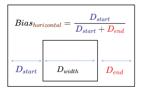
Bias对象说明
设置组件在锚点约束下的偏移参数。
以水平方向Bias为例,其值为组件到左锚点的距离 Dstart与组件到水平方向锚点间总距离 Dstart + Dend的比值。镜像语言下,Dstart为组件到右锚点的距离。下图中Dwidth表示组件宽度。
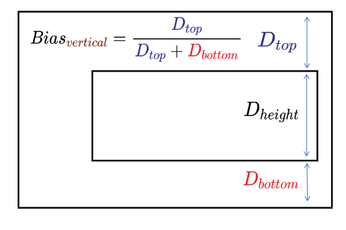
竖直方向同理,其值为组件到上锚点的距离Dtop与组件到竖直方向锚点间总距离Dtop + Dbottom的比值。下图中Dheight表示组件高度。
元服务API: 从API version 12开始,该接口支持在元服务中使用。
| 参数名 | 类型 | 必填 | 说明 |
|---|---|---|---|
| horizontal | number | 否 | 水平方向上的bias值。 当子组件的width属性有正确值并且有2个水平方向的锚点时生效。 默认值: 0.5 |
| vertical | number | 否 | 垂直方向上的bias值。 当子组件的height属性有正确值并且有2个垂直方向的锚点时生效。 默认值: 0.5 |
chainMode12+
chainMode(direction: Axis, style: ChainStyle)
指定以该组件为链头所构成的链的参数,仅当父容器为RelativeContainer时生效。链头指满足规则说明中成链规则时链的第一个组件(水平方向从左边起始,镜像语言下从右边起始;竖直方向从上边起始)。
系统能力: SystemCapability.ArkUI.ArkUI.Full
参数:
| 参数名 | 类型 | 必填 | 说明 |
|---|---|---|---|
| direction | Axis | 是 | 链的方向。 |
| style | ChainStyle | 是 | 链的样式。 |
ChainStyle12+
定义链的风格。
元服务API: 从API version 12开始,该接口支持在元服务中使用。
系统能力: SystemCapability.ArkUI.ArkUI.Full
| 名称 | 说明 |
|---|---|
| SPREAD | 组件在约束锚点间均匀分布。 |
| SPREAD_INSIDE | 除首尾2个子组件的其他组件在约束锚点间均匀分布。 |
| PACKED | 链内子组件无间隙。 |
示例
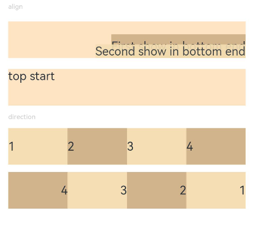
示例1(对齐方式和主轴方向上的布局)
设置内容在元素内的对齐方式和子元素在父容器主轴方向上的布局。
// xxx.ets
@Entry
@Component
struct PositionExample1 {
  build() {
    Column() {
      Column({ space: 10 }) {
        // 元素内容<元素宽高,设置内容在与元素内的对齐方式
        Text('align').fontSize(9).fontColor(0xCCCCCC).width('90%')
        Stack() {
          Text('First show in bottom end').height('65%').backgroundColor(0xD2B48C)
          Text('Second show in bottom end').backgroundColor(0xF5DEB3).opacity(0.9)
        }.width('90%').height(50).margin({ top: 5 }).backgroundColor(0xFFE4C4)
        .align(Alignment.BottomEnd)
        Stack() {
          Text('top start')
        }.width('90%').height(50).margin({ top: 5 }).backgroundColor(0xFFE4C4)
        .align(Alignment.TopStart)

        // 父容器设置direction为Direction.Ltr,子元素从左到右排列
        Text('direction').fontSize(9).fontColor(0xCCCCCC).width('90%')
        Row() {
          Text('1').height(50).width('25%').fontSize(16).backgroundColor(0xF5DEB3)
          Text('2').height(50).width('25%').fontSize(16).backgroundColor(0xD2B48C)
          Text('3').height(50).width('25%').fontSize(16).backgroundColor(0xF5DEB3)
          Text('4').height(50).width('25%').fontSize(16).backgroundColor(0xD2B48C)
        }
        .width('90%')
        .direction(Direction.Ltr)
        // 父容器设置direction为Direction.Rtl,子元素从右到左排列
        Row() {
          Text('1').height(50).width('25%').fontSize(16).backgroundColor(0xF5DEB3).textAlign(TextAlign.End)
          Text('2').height(50).width('25%').fontSize(16).backgroundColor(0xD2B48C).textAlign(TextAlign.End)
          Text('3').height(50).width('25%').fontSize(16).backgroundColor(0xF5DEB3).textAlign(TextAlign.End)
          Text('4').height(50).width('25%').fontSize(16).backgroundColor(0xD2B48C).textAlign(TextAlign.End)
        }
        .width('90%')
        .direction(Direction.Rtl)
      }
    }
    .width('100%').margin({ top: 5 })
  }
}
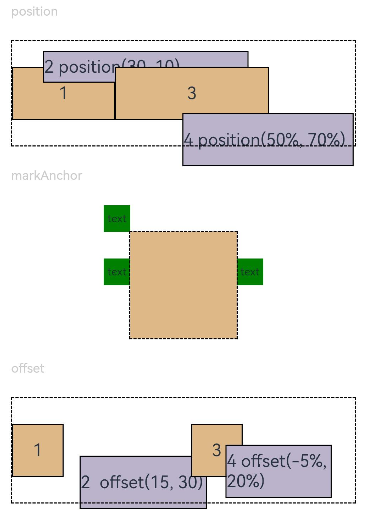
示例2(位置偏移)
基于父组件、相对定位、锚点作出位置偏移。
// xxx.ets
@Entry
@Component
struct PositionExample2 {
build() {
Column({ space: 20 }) {
// 设置子组件左上角相对于父组件左上角的偏移位置
Text('position').fontSize(12).fontColor(0xCCCCCC).width('90%')
Row() {
Text('1').size({ width: '30%', height: '50' }).backgroundColor(0xdeb887).border({ width: 1 }).fontSize(16)
.textAlign(TextAlign.Center)
Text('2 position(30, 10)')
.size({ width: '60%', height: '30' })
.backgroundColor(0xbbb2cb)
.border({ width: 1 })
.fontSize(16)
.align(Alignment.Start)
.position({ x: 30, y: 10 })
Text('3').size({ width: '45%', height: '50' }).backgroundColor(0xdeb887).border({ width: 1 }).fontSize(16)
.textAlign(TextAlign.Center)
Text('4 position(50%, 70%)')
.size({ width: '50%', height: '50' })
.backgroundColor(0xbbb2cb)
.border({ width: 1 })
.fontSize(16)
.position({ x: '50%', y: '70%' })
}.width('90%').height(100).border({ width: 1, style: BorderStyle.Dashed })

// 相对于起点偏移,其中x为最终定位点距离起点水平方向间距,x>0往左,反之向右。
// y为最终定位点距离起点垂直方向间距,y>0向上,反之向下
Text('markAnchor').fontSize(12).fontColor(0xCCCCCC).width('90%')
Stack({ alignContent: Alignment.TopStart }) {
Row()
.size({ width: '100', height: '100' })
.backgroundColor(0xdeb887)
Text('text')
.fontSize('30px')
.textAlign(TextAlign.Center)
.size({ width: 25, height: 25 })
.backgroundColor(Color.Green)
.markAnchor({ x: 25, y: 25 })
Text('text')
.fontSize('30px')
.textAlign(TextAlign.Center)
.size({ width: 25, height: 25 })
.backgroundColor(Color.Green)
.markAnchor({ x: -100, y: -25 })
Text('text')
.fontSize('30px')
.textAlign(TextAlign.Center)
.size({ width: 25, height: 25 })
.backgroundColor(Color.Green)
.markAnchor({ x: 25, y: -25 })
}.margin({ top: 25 }).border({ width: 1, style: BorderStyle.Dashed })

// 相对定位,x>0向右偏移,反之向左,y>0向下偏移,反之向上
Text('offset').fontSize(12).fontColor(0xCCCCCC).width('90%')
Row() {
Text('1').size({ width: '15%', height: '50' }).backgroundColor(0xdeb887).border({ width: 1 }).fontSize(16)
.textAlign(TextAlign.Center)
Text('2 offset(15, 30)')
.size({ width: 120, height: '50' })
.backgroundColor(0xbbb2cb)
.border({ width: 1 })
.fontSize(16)
.align(Alignment.Start)
.offset({ x: 15, y: 30 })
Text('3').size({ width: '15%', height: '50' }).backgroundColor(0xdeb887).border({ width: 1 }).fontSize(16)
.textAlign(TextAlign.Center)
Text('4 offset(-5%, 20%)')
.size({ width: 100, height: '50' })
.backgroundColor(0xbbb2cb)
.border({ width: 1 })
.fontSize(16)
.offset({ x: '-5%', y: '20%' })
}.width('90%').height(100).border({ width: 1, style: BorderStyle.Dashed })
}
.width('100%').margin({ top: 25 })
}
}
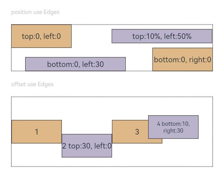
示例3(绝对定位和相对偏移)
使用position设置绝对定位,确定子组件相对父组件的位置。使用offset设置相对偏移,组件相对原本的布局位置进行偏移。
// xxx.ets
@Entry
@Component
struct Example3 {
build() {
Column({ space: 20 }){
Text('position use Edges').fontSize(12).fontColor(0xCCCCCC).width('90%')
Row() {
Text('bottom:0, right:0').size({ width: '30%', height: '50' }).backgroundColor(0xdeb887).border({ width: 1 }).fontSize(16)
.textAlign(TextAlign.Center).position({bottom: 0, right: 0})
Text('top:0, left:0').size({ width: '30%', height: '50' }).backgroundColor(0xdeb887).border({ width: 1 }).fontSize(16)
.textAlign(TextAlign.Center).position({top: 0, left: 0})
Text('top:10%, left:50%').size({ width: '50%', height: '30' }).backgroundColor(0xbbb2cb).border({ width: 1 }).fontSize(16)
.textAlign(TextAlign.Center).position({ top: '10%', left: '50%' })
Text('bottom:0, left:30').size({ width: '50%', height: '30' }).backgroundColor(0xbbb2cb).border({ width: 1 }).fontSize(16)
.textAlign(TextAlign.Center).position({ bottom: 0, left: 30 })
}.width('90%').height(100).border({ width: 1, style: BorderStyle.Dashed })


Text('offset use Edges').fontSize(12).fontColor(0xCCCCCC).width('90%')
Row() {
Text('1').size({ width: '25%', height: 50 }).backgroundColor(0xdeb887).border({ width: 1 }).fontSize(16)
.textAlign(TextAlign.Center)
Text('2 top:30, left:0').size({ width: '25%', height: 50 }).backgroundColor(0xbbb2cb).border({ width: 1 }).fontSize(16)
.textAlign(TextAlign.Center).offset({top: 30, left: 0})
Text('3').size({ width: '25%', height: 50 }).backgroundColor(0xdeb887).border({ width: 1 }).fontSize(16)
.textAlign(TextAlign.Center)
Text('4 bottom:10, right:30').size({ width: '25%', height: 50 }).backgroundColor(0xbbb2cb).border({ width: 1 }).fontSize(12)
.textAlign(TextAlign.Center).offset({bottom: 10, right: 30})
}.width('90%').height(150).border({ width: 1, style: BorderStyle.Dashed })
}.width('100%').margin({ top: 25 })
}
}
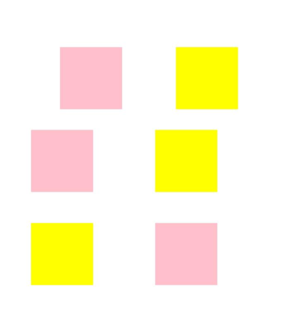
示例4(镜像效果)
通用布局属性支持镜像能力。从上到下依次通过position,offset,markAnchor实现镜像效果。黄色赋值为原本效果,粉色赋值为镜像效果。
// xxx.ets
import { LengthMetrics } from '@kit.ArkUI';
@Entry
@Component
struct Example4 {
  private scroller: Scroller = new Scroller()

  build() {
    Column() {
      Stack({ alignContent: Alignment.End }) {
        Scroll(this.scroller) {
          Flex({ direction: FlexDirection.Column }) {
            RelativeContainer() {
              Row() {
              }
              .position({ start: LengthMetrics.px(200), top: LengthMetrics.px(100) })
              .width("30%")
              .height("20%")
              .backgroundColor(Color.Pink)
              .padding(50)
              .margin(50)
              Row() {
              }
              .position({ left:'200px', top: '100px' })
              .width("30%")
              .height("20%")
              .backgroundColor(Color.Yellow)
              .padding(50)
              .margin(50)
              Row() {
              }
              .offset({ start: LengthMetrics.vp(100), top: LengthMetrics.vp(200)  })
              .width("30%")
              .height("20%")
              .backgroundColor(Color.Pink)
              .padding(50)
              .margin(50)
              Row() {
              }
              .offset({ left: 100, top: 200  })
              .width("30%")
              .height("20%")
              .backgroundColor(Color.Yellow)
              .padding(50)
              .margin(50)
              Row() {
              }
              .markAnchor({ start: LengthMetrics.fp(100), top: LengthMetrics.fp(-350) })
              .width("30%")
              .height("20%")
              .backgroundColor(Color.Pink)
              .padding(50)
              .margin(50)
              Row() {
              }
              .markAnchor({ x: '100fp', y: '-350fp' })
              .width("30%")
              .height("20%")
              .backgroundColor(Color.Yellow)
              .padding(50)
              .margin(50)
            }
            .backgroundColor(Color.White)
            .padding(50)
            .margin(50)
          }
        }
        .width('100%')
        .scrollBar(BarState.Off)
        .scrollable(ScrollDirection.Vertical)

        ScrollBar({ scroller: this.scroller, direction: ScrollBarDirection.Vertical, state: BarState.Auto }) {
          Text()
            .width(20)
            .height(100)
            .borderRadius(10)
            .backgroundColor('#C0C0C0')
        }.width(20).backgroundColor('#ededed')
      }
    }.height('90%')
  }
}


 扫一扫
扫一扫


 757
757

 被折叠的 条评论
为什么被折叠?
被折叠的 条评论
为什么被折叠?
 到【灌水乐园】发言


