 鸿蒙5.0开发:Line组件详解


往期鸿蒙5.0全套实战文章必看:(文中附带全栈鸿蒙5.0学习资料)
Line
直线绘制组件。
说明
该组件从API Version 7开始支持。后续版本如有新增内容,则采用上角标单独标记该内容的起始版本。
子组件
无
接口
Line(value?: {width?: string | number, height?: string | number})
卡片能力: 从API version 9开始,该接口支持在ArkTS卡片中使用。
元服务API: 从API version 11开始,该接口支持在元服务中使用。
系统能力: SystemCapability.ArkUI.ArkUI.Full
参数:
| 参数名 | 类型 | 必填 | 说明 |
|---|---|---|---|
| value | {width?: string | number, height?: string | number} | 否 | width:宽度。 值为异常值或缺省时按照自身内容需要的宽度处理。 默认单位:vp height:高度。 值为异常值或缺省时按照自身内容需要的高度处理。 默认单位:vp |
属性
除支持通用属性外,还支持以下属性:
startPoint
startPoint(value: Array<any>)
设置直线起点坐标点(相对坐标),异常值按照默认值处理。
卡片能力: 从API version 9开始,该接口支持在ArkTS卡片中使用。
元服务API: 从API version 11开始,该接口支持在元服务中使用。
系统能力: SystemCapability.ArkUI.ArkUI.Full
参数:
| 参数名 | 类型 | 必填 | 说明 |
|---|---|---|---|
| value | Array<Length> | 是 | 直线起点坐标点(相对坐标),单位vp。 默认值:[0, 0] |
endPoint
endPoint(value: Array<any>)
设置直线终点坐标点(相对坐标),异常值按照默认值处理。
卡片能力: 从API version 9开始,该接口支持在ArkTS卡片中使用。
元服务API: 从API version 11开始,该接口支持在元服务中使用。
系统能力: SystemCapability.ArkUI.ArkUI.Full
参数:
| 参数名 | 类型 | 必填 | 说明 |
|---|---|---|---|
| value | Array<Length> | 是 | 直线终点坐标点(相对坐标),单位vp。 默认值:[0, 0] |
fill
fill(value: ResourceColor)
设置填充区域颜色。Line组件无法形成闭合区域,该属性设置无效。
卡片能力: 从API version 9开始,该接口支持在ArkTS卡片中使用。
元服务API: 从API version 11开始,该接口支持在元服务中使用。
系统能力: SystemCapability.ArkUI.ArkUI.Full
参数:
| 参数名 | 类型 | 必填 | 说明 |
|---|---|---|---|
| value | ResourceColor | 是 | 填充区域颜色。 默认值:Color.Black |
fillOpacity
fillOpacity(value: number | string | Resource)
设置填充区域透明度。Line组件无法形成闭合区域,该属性设置无效。
卡片能力: 从API version 9开始,该接口支持在ArkTS卡片中使用。
元服务API: 从API version 11开始,该接口支持在元服务中使用。
系统能力: SystemCapability.ArkUI.ArkUI.Full
参数:
| 参数名 | 类型 | 必填 | 说明 |
|---|---|---|---|
| value | number | string | Resource | 是 | 填充区域透明度。 默认值:1 |
stroke
stroke(value: ResourceColor)
设置边框颜色,不设置时,默认没有边框。异常值不会绘制边框线条。
卡片能力: 从API version 9开始,该接口支持在ArkTS卡片中使用。
元服务API: 从API version 11开始,该接口支持在元服务中使用。
系统能力: SystemCapability.ArkUI.ArkUI.Full
参数:
| 参数名 | 类型 | 必填 | 说明 |
|---|---|---|---|
| value | ResourceColor | 是 | 边框颜色。 |
strokeDashArray
strokeDashArray(value: Array<any>)
设置边框间隙。线段相交时可能会出现重叠现象。异常值按照默认值处理。
卡片能力: 从API version 9开始,该接口支持在ArkTS卡片中使用。
元服务API: 从API version 11开始,该接口支持在元服务中使用。
系统能力: SystemCapability.ArkUI.ArkUI.Full
参数:
| 参数名 | 类型 | 必填 | 说明 |
|---|---|---|---|
| value | Array<Length> | 是 | 边框间隙。 默认值:[] 默认单位:vp |
strokeDashOffset
strokeDashOffset(value: number | string)
设置边框绘制起点的偏移量。
卡片能力: 从API version 9开始,该接口支持在ArkTS卡片中使用。
元服务API: 从API version 11开始,该接口支持在元服务中使用。
系统能力: SystemCapability.ArkUI.ArkUI.Full
参数:
| 参数名 | 类型 | 必填 | 说明 |
|---|---|---|---|
| value | number | string | 是 | 边框绘制起点的偏移量。 默认值:0 默认单位:vp |
strokeLineCap
strokeLineCap(value: LineCapStyle)
设置边框端点绘制样式。
卡片能力: 从API version 9开始,该接口支持在ArkTS卡片中使用。
元服务API: 从API version 11开始,该接口支持在元服务中使用。
系统能力: SystemCapability.ArkUI.ArkUI.Full
参数:
| 参数名 | 类型 | 必填 | 说明 |
|---|---|---|---|
| value | LineCapStyle | 是 | 边框端点绘制样式。 默认值:LineCapStyle.Butt |
strokeLineJoin
strokeLineJoin(value: LineJoinStyle)
设置边框拐角绘制样式。Line组件无法形成拐角,该属性设置无效。
卡片能力: 从API version 9开始,该接口支持在ArkTS卡片中使用。
元服务API: 从API version 11开始,该接口支持在元服务中使用。
系统能力: SystemCapability.ArkUI.ArkUI.Full
参数:
| 参数名 | 类型 | 必填 | 说明 |
|---|---|---|---|
| value | LineJoinStyle | 是 | 边框拐角绘制样式。 默认值:LineJoinStyle.Miter |
strokeMiterLimit
strokeMiterLimit(value: number | string)
设置锐角绘制成斜角的极限值。Line组件无法设置锐角图形,该属性设置无效。
卡片能力: 从API version 9开始,该接口支持在ArkTS卡片中使用。
元服务API: 从API version 11开始,该接口支持在元服务中使用。
系统能力: SystemCapability.ArkUI.ArkUI.Full
参数:
| 参数名 | 类型 | 必填 | 说明 |
|---|---|---|---|
| value | number | string | 是 | 锐角绘制成斜角的极限值。 默认值:4 |
strokeOpacity
strokeOpacity(value: number | string | Resource)
设置边框透明度。该属性的取值范围是[0.0, 1.0],若给定值小于0.0,则取值为0.0;若给定值大于1.0,则取值为1.0,其余异常值按1.0处理 。
卡片能力: 从API version 9开始,该接口支持在ArkTS卡片中使用。
元服务API: 从API version 11开始,该接口支持在元服务中使用。
系统能力: SystemCapability.ArkUI.ArkUI.Full
参数:
| 参数名 | 类型 | 必填 | 说明 |
|---|---|---|---|
| value | number | string | Resource | 是 | 边框透明度。 默认值:1 |
strokeWidth
strokeWidth(value: Length)
设置边框宽度。该属性若为string类型, 暂不支持百分比,百分比按照1px处理。
卡片能力: 从API version 9开始,该接口支持在ArkTS卡片中使用。
元服务API: 从API version 11开始,该接口支持在元服务中使用。
系统能力: SystemCapability.ArkUI.ArkUI.Full
参数:
| 参数名 | 类型 | 必填 | 说明 |
|---|---|---|---|
| value | Length | 是 | 边框宽度。 默认值:1 默认单位:vp |
antiAlias
antiAlias(value: boolean)
设置是否开启抗锯齿效果。
卡片能力: 从API version 9开始,该接口支持在ArkTS卡片中使用。
元服务API: 从API version 11开始,该接口支持在元服务中使用。
系统能力: SystemCapability.ArkUI.ArkUI.Full
参数:
| 参数名 | 类型 | 必填 | 说明 |
|---|---|---|---|
| value | boolean | 是 | 是否开启抗锯齿效果。 默认值:true |
示例
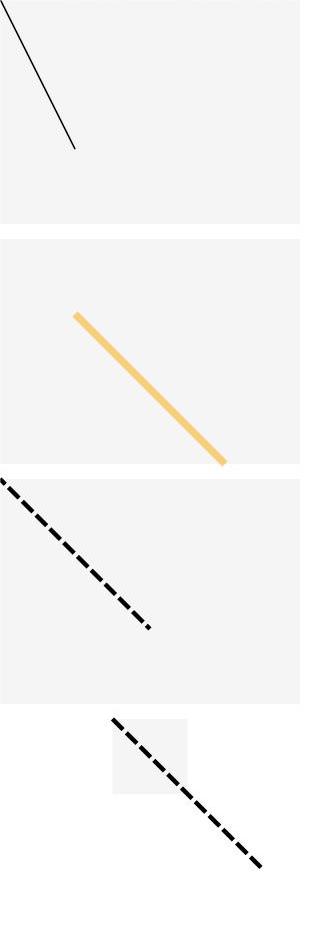
示例1(组件属性绘制)
使用startPoint、endPoint、fillOpacity、stroke、strokeDashArray、strokeDashOffset属性分别绘制直线的起始点、结束点、透明度、直线颜色、边框间隙、绘制起点。
// xxx.ets
@Entry
@Component
struct LineExample {
  build() {
    Column({ space: 10 }) {
      // 线条绘制的起止点坐标均是相对于Line组件本身绘制区域的坐标
      Line()
        .width(200)
        .height(150)
        .startPoint([0, 0])
        .endPoint([50, 100])
        .stroke(Color.Black)
        .backgroundColor('#F5F5F5')
      Line()
        .width(200)
        .height(150)
        .startPoint([50, 50])
        .endPoint([150, 150])
        .strokeWidth(5)
        .stroke(Color.Orange)
        .strokeOpacity(0.5)
        .backgroundColor('#F5F5F5')
      // strokeDashOffset用于定义关联虚线strokeDashArray数组渲染时的偏移
      Line()
        .width(200)
        .height(150)
        .startPoint([0, 0])
        .endPoint([100, 100])
        .stroke(Color.Black)
        .strokeWidth(3)
        .strokeDashArray([10, 3])
        .strokeDashOffset(5)
        .backgroundColor('#F5F5F5')
      // 当坐标点设置的值超出Line组件的宽高范围时,线条会画出组件绘制区域
      Line()
        .width(50)
        .height(50)
        .startPoint([0, 0])
        .endPoint([100, 100])
        .stroke(Color.Black)
        .strokeWidth(3)
        .strokeDashArray([10, 3])
        .backgroundColor('#F5F5F5')
    }
  }
}
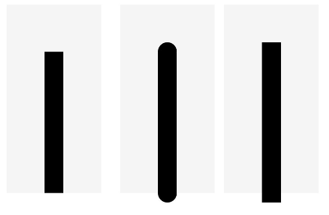
示例2(边框端点绘制)
使用strokeLineCap绘制直线的边框端点样式。
// xxx.ets
@Entry
@Component
struct LineExample1 {
  build() {
    Row({ space: 10 }) {
      // 当LineCapStyle值为Butt时
      Line()
        .width(100)
        .height(200)
        .startPoint([50, 50])
        .endPoint([50, 200])
        .stroke(Color.Black)
        .strokeWidth(20)
        .strokeLineCap(LineCapStyle.Butt)
        .backgroundColor('#F5F5F5')
        .margin(10)
      // 当LineCapStyle值为Round时
      Line()
        .width(100)
        .height(200)
        .startPoint([50, 50])
        .endPoint([50, 200])
        .stroke(Color.Black)
        .strokeWidth(20)
        .strokeLineCap(LineCapStyle.Round)
        .backgroundColor('#F5F5F5')
      // 当LineCapStyle值为Square时
      Line()
        .width(100)
        .height(200)
        .startPoint([50, 50])
        .endPoint([50, 200])
        .stroke(Color.Black)
        .strokeWidth(20)
        .strokeLineCap(LineCapStyle.Square)
        .backgroundColor('#F5F5F5')
    }
  }
}
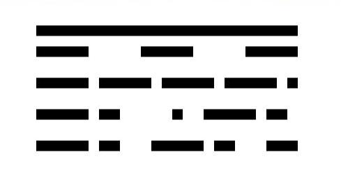
示例3(边框间隙绘制)
使用strokeDashArray绘制直线的边框间隙。
// xxx.ets
@Entry
@Component
struct LineExample {
  build() {
    Column() {
      Line()
        .width(300)
        .height(30)
        .startPoint([50, 30])
        .endPoint([300, 30])
        .stroke(Color.Black)
        .strokeWidth(10)
      // 设置strokeDashArray的数组间隔为 50
      Line()
        .width(300)
        .height(30)
        .startPoint([50, 20])
        .endPoint([300, 20])
        .stroke(Color.Black)
        .strokeWidth(10)
        .strokeDashArray([50])
      // 设置strokeDashArray的数组间隔为 50, 10
      Line()
        .width(300)
        .height(30)
        .startPoint([50, 20])
        .endPoint([300, 20])
        .stroke(Color.Black)
        .strokeWidth(10)
        .strokeDashArray([50, 10])
      // 设置strokeDashArray的数组间隔为 50, 10, 20
      Line()
        .width(300)
        .height(30)
        .startPoint([50, 20])
        .endPoint([300, 20])
        .stroke(Color.Black)
        .strokeWidth(10)
        .strokeDashArray([50, 10, 20])
      // 设置strokeDashArray的数组间隔为 50, 10, 20, 30
      Line()
        .width(300)
        .height(30)
        .startPoint([50, 20])
        .endPoint([300, 20])
        .stroke(Color.Black)
        .strokeWidth(10)
        .strokeDashArray([50, 10, 20, 30])
    }
  }
}


 扫一扫
扫一扫


 1225
1225

 被折叠的 条评论
为什么被折叠?
被折叠的 条评论
为什么被折叠?
 到【灌水乐园】发言


