 HarmonyOS组件数据双向绑定


同样,不多说,直接上代码和实例,还有很多属性互动设置,宝子们自己按个去官网看一看。
实现:harmonyOS一些基础组件的数据双向绑定,主要是$$符号和.onChange(()=>{})方法实现的。
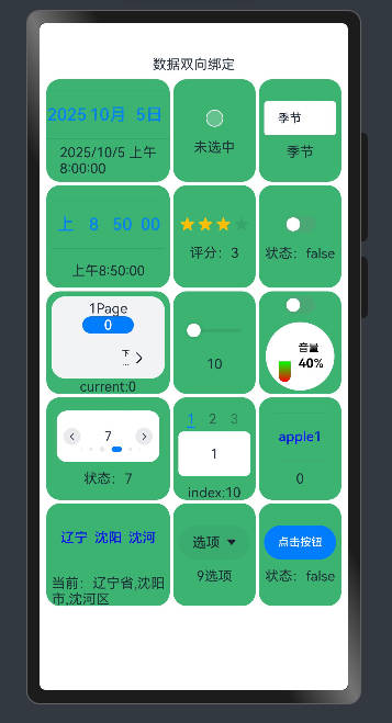
图片
视频
harmonyOS基础组件数据双向绑定
基础组件
        DatePickerDemo() // 日期选择器
        CheckboxDemo() // 提供多选框组件,通常用于某选项的打开或关闭。
        TextInputDemo() // 输入框
        TimePickerDemo() // 时间选择器
        RatingDemo() // 在给定范围内选择评分
        ToggleDemo() // 组件提供勾选框样式、状态按钮样式和开关样式
        StepperDemo() // 步骤导航器
        SliderDemo() // 滑动条组件,用于快速调节设置值,音量调节、亮度调节等应用场景
        SliderExample() // 滑动条:音量样式
        SwiperDemo() // 滑块视图容器,提供子组件滑动轮播显示的能力
        TabsDemo() // Tab标签页
        TextPickerDemo() // 滑动选择器
        TextPickerExample() // 滑动选择器
        SelectDemo() // 下拉选择菜单
        BindSheetDemo() // 半模态页面
代码
import { LengthMetrics, promptAction, SymbolGlyphModifier } from '@kit.ArkUI';

// 提取公共样式
@Styles
function gridItemStyle() {
  .height(120)
  .borderRadius(16)
  .backgroundColor("#3CB371")
}


@Entry
@Component
struct DataDoubleTest {
  @State message: string = '数据双向绑定';

  build() {
    Column() {
      Text(this.message)
      Grid() {
        DatePickerDemo() // 日期选择器
        CheckboxDemo() // 提供多选框组件,通常用于某选项的打开或关闭。
        TextInputDemo() // 输入框
        TimePickerDemo() // 时间选择器
        RatingDemo() // 在给定范围内选择评分
        ToggleDemo() // 组件提供勾选框样式、状态按钮样式和开关样式
        StepperDemo() // 步骤导航器
        SliderDemo() // 滑动条组件,用于快速调节设置值,如音量调节、亮度调节等应用场景
        SliderExample() // 滑动条:音量样式
        SwiperDemo() // 滑块视图容器,提供子组件滑动轮播显示的能力
        TabsDemo() // Tab标签页
        TextPickerDemo() // 滑动选择器
        TextPickerExample() // 滑动选择器
        SelectDemo() // 下拉选择菜单
        BindSheetDemo() // 半模态页面
      }
      .height('100%')
      .width('100%')
      .columnsTemplate("1.5fr 1fr 1fr")
      .rowsGap(4)
      .columnsGap(4)
      .padding(8)
    }
  }
}


@Component
struct DatePickerDemo {
  @State testValue: Date = new Date('2025-10-05')

  build() {

    GridItem() {
      Column() {
        // DatePicker 日期选择器
        DatePicker({
          start: new Date('1970-1-1'),
          end: new Date('2100-1-1'),
          selected: $$this.testValue // 数据双向绑定
        })
          .height(70)
        Text(this.testValue.toLocaleString())
      }

    }
    .height(120)
    .borderRadius(16)
    .backgroundColor("#3CB371")

  }
}

@Component
struct CheckboxDemo {
  @State testValue: boolean = false

  build() {
    GridItem() {
      Column({ space: 10 }) {
        // Checkbox
        Checkbox()
          .select($$this.testValue) // 数据双向绑定
          .unselectedColor("#FAFAFA")
          .selectedColor(0xed6f21)
          .shape(CheckBoxShape.CIRCLE) // CIRCLE圆形 ROUNDED_SQUARE方形
        if (this.testValue) {
          Text("选中")
        } else {
          Text("未选中")
        }

      }
      .padding(6)
    }
    .gridItemStyle() // 公共样式

  }
}

@Component
struct TextInputDemo {
  @State testValue: string = "季节"

  build() {
    GridItem() {
      Column({ space: 10 }) {
        // TextInput
        TextInput({ text: $$this.testValue }) // 数据双向绑定
          .backgroundColor(Color.White)
          .fontSize(14)
          .borderRadius(4)
        Text(this.testValue)
      }
      .padding(6)
    }
    .gridItemStyle() // 公共样式

  }
}

@Component
struct TimePickerDemo {
  @State private selectedTime: Date = new Date('2025-10-06T08:50:00');

  build() {
    GridItem() {
      Column({ space: 10 }) {
        // TimePicker
        TimePicker({
          selected: $$this.selectedTime, // 数据双向绑定
          format: TimePickerFormat.HOUR_MINUTE_SECOND,
          end: new Date('2022-07-22T15:20:00'),
        })
          .height(70)
        // .useMilitaryTime(true) // 24小时制
        Text(this.selectedTime.toLocaleTimeString())
      }
      .padding(6)
    }
    .gridItemStyle() // 公共样式

  }
}

@Component
struct RatingDemo {
  @State rating: number = 3

  build() {
    GridItem() {
      Column({ space: 10 }) {
        // Rating 在给定范围内选择评分的组件
        Rating({ rating: $$this.rating, indicator: false })
          .stars(4) // 评分范围
          .stepSize(0.5)
        Text("评分:" + this.rating)
      }
      .padding(6)
    }
    .gridItemStyle() // 公共样式

  }
}

@Component
struct ToggleDemo {
  @State isOn: boolean = false

  build() {
    GridItem() {
      Column({ space: 10 }) {
        // 状态按钮样式和开关样式
        Toggle({ type: ToggleType.Switch, isOn: $$this.isOn }) // 数据双向绑定
          .selectedColor('#007DFF')
          .switchPointColor('#FFFFFF')
        Text("状态:" + this.isOn)
      }
      .padding(6)
    }
    .gridItemStyle() // 公共样式

  }
}

@Component
struct StepperDemo {
  @State currentIndex: number = 0;
  // 按钮切换的是页面状态: 0 正常 1禁止  2等待 3跳过
  @State firstState: ItemState = ItemState.Normal;
  @State secondState: ItemState = ItemState.Normal;
  @State thirdState: ItemState = ItemState.Normal;

  build() {
    GridItem() {
      Column() {
        // Stepper 步骤导航器
        Stepper({
          index: $$this.currentIndex
        }) {
          // 第一个步骤页
          StepperItem() {
            Column() {
              Text('1Page')
              Button(this.firstState.toString())
                .width(60)
                .height(20)
                .onClick(() => {
                  // Skip 跳过状态,右侧文本按钮默认显示“跳过”
                  this.firstState = this.firstState === ItemState.Skip ? ItemState.Normal : ItemState.Skip;
                })
            }
          }
          .status(this.firstState)

          // 第二个步骤页
          StepperItem() {
            Column() {
              Text('2Page')
              Button('' + this.secondState)
                .width(60)
                .height(20)
                .onClick(() => {
                  this.secondState = this.secondState === ItemState.Disabled ? ItemState.Normal : ItemState.Disabled;
                })
            }
          }
          .status(this.secondState)

          // 第三个步骤页
          StepperItem() {
            Column() {
              Text('3Page')
              Button('' + this.thirdState)
                .width(60)
                .height(20)
                .backgroundColor('#007dFF')
                .onClick(() => {
                  this.thirdState = this.thirdState === ItemState.Waiting ? ItemState.Normal : ItemState.Waiting;
                })
            }
          }
          .status(this.thirdState)

          // 第四个步骤页
          StepperItem() {
            Column() {
              Text('4Page')
            }
          }
        }
        .backgroundColor('#F1F3F5')
        .borderRadius(16)
        .height(96)
        .onFinish(() => {
          // 此处可处理点击最后一页的Finish时的逻辑,例如路由跳转等
          promptAction.openToast({
            message: 'finish',
            duration: 500
          })

        })
        .onSkip(() => {
          // 此处可处理点击跳过时的逻辑,例如动态修改Stepper的index值使其跳转到某一步骤页等
          promptAction.openToast({
            message: '设置跳过',
            duration: 500
          })
        })

        Text("current:" + this.currentIndex)
      }
      .padding(6)
    }
    .gridItemStyle() // 公共样式

  }
}

@Component
struct SliderDemo {
  @State valueTest: number = 10

  build() {
    GridItem() {
      Column({ space: 10 }) {
        // 滑动条组件
        Slider({
          value: $$this.valueTest,
          min: 0,
          max: 100
        })
        Text(this.valueTest.toString())
      }
      .padding(6)
    }
    .gridItemStyle() // 公共样式
  }
}

@Component
struct SliderExample {
  @State inSetValueOne: number = 40
  @State isOn: boolean = false // 切换主题颜色
  @State colorGradientWhite: LinearGradient =
    new LinearGradient([{ color: "#FFFF0000", offset: 0 }, { color: "#00FF00", offset: 1 }])
  @State colorGradientBlack: LinearGradient =
    new LinearGradient([{ color: "#FFFF0000", offset: 0 }, { color: "#FF0000FF", offset: 1 }])
  @State sensitivity: CrownSensitivity | undefined | null = CrownSensitivity.MEDIUM
  scroller: Scroller = new Scroller()

  // 整数
  getIntegerDigits(num: number): string {
    let numRound = Math.round(num);
    return numRound.toString();
  }

  build() {
    GridItem() {
      Column({ space: 10 }) {
        Toggle({ type: ToggleType.Switch, isOn: $$this.isOn }) // 数据双向绑定
          .selectedColor('#007DFF')
          .switchPointColor('#FFFFFF')
          .margin({ top: 0, bottom: 0 })
        Scroll(this.scroller) {
          Column() {
            Row() {
              Stack({ alignContent: Alignment.Top }) {
                // Slider滑动条:音量样式
                Slider({
                  value: $$this.inSetValueOne, // 数据双向绑定
                  min: 0,
                  max: 100,
                  style: SliderStyle.NONE,
                  direction: Axis.Vertical,
                  reverse: true
                })
                  .focusable(true)
                  .defaultFocus(true)
                  .focusOnTouch(true)
                  .digitalCrownSensitivity(this.sensitivity)
                  .trackColor("#26FFFFFF")
                  .trackThickness(14)
                  .selectedColor(this.colorGradientWhite)
              }
              .height(60)
              .width(20)
              .margin({ top: 6, bottom: 6, left: 12 })

              Column({ space: 2 }) {
                Text('音量')
                  .fontSize(12)
                  .fontColor(this.isOn ? "#FFF" : "#000")
                  .textAlign(TextAlign.Start)
                Row() {
                  Text(this.getIntegerDigits(this.inSetValueOne))
                    .fontSize(15)
                    .fontColor(this.isOn ? "#FFF" : "#000")
                    .fontWeight(700)
                    .textAlign(TextAlign.Start)

                  Text('%')
                    .fontSize(14)
                    .fontColor(this.isOn ? "#FFF" : "#000")
                    .textAlign(TextAlign.Start)
                }
              }
              .alignItems(HorizontalAlign.Start)
              .margin({ left: 6 })

            }
            .width(80)
            .aspectRatio(1)
            .borderRadius("50%")
            .backgroundColor(this.isOn ? Color.Black : Color.White)
          }

        }
        .width('100%')
      }
      .padding(6)
    }
    .gridItemStyle() // 公共样式
  }
}

@Component
struct SwiperDemo {
  private swiperController: SwiperController = new SwiperController()
  list: number[] = []
  @State indexTest: number = 0

  aboutToAppear(): void {
    let list: number[] = [];
    for (let i = 0; i <= 10; i++) {
      list.push(i);
    }
    this.list = list
  }

  build() {
    GridItem() {
      Column({ space: 10 }) {
        //  滑块视图容器
        Swiper(this.swiperController) {
          ForEach(this.list, (item: string) => {
            Text(item.toString())
              .width(120)
              .height(60)
              .borderRadius(12)
              .backgroundColor(Color.White)
              .textAlign(TextAlign.Center)
              .fontSize(16)
          })
        }
        .index($$this.indexTest)
        .autoPlay(true)
        .interval(3000)
        // .indicator(false) // 设置是否有导航点
        // .displayArrow(true, false) // 设置导航点箭头样式
        .indicator(
          // 设置圆点导航样式
          new DotIndicator()
            .maxDisplayCount(6)
        )
        .displayArrow({
          // 设置导航点箭头样式
          showBackground: true,
          isSidebarMiddle: true,
          backgroundSize: 20,
        }, false)


        Text("状态:" + this.indexTest)
      }
      .padding(6)
    }
    .gridItemStyle() // 公共样式

  }
}

@Component
struct TabsDemo {
  @State indexTest: number = 10

  build() {
    GridItem() {
      Column({ space: 10 }) {
        // Tab标签页
        Tabs({ index: $$this.indexTest }) {
          TabContent() {
            Column() {
              Text("1")
            }
          }
          .tabBar("1")
          .backgroundColor(Color.White)
          .borderRadius(6)

          TabContent() {
            Column() {
              Text("2")
            }
          }
          .tabBar("2")
          .backgroundColor(Color.Pink)
          .borderRadius(6)

          TabContent() {
            Column() {
              Text("3")
            }
          }
          .tabBar("3")
          .backgroundColor(Color.Grey)
          .borderRadius(6)

          TabContent() {
            Column() {
              Text("4")
            }
          }
          .tabBar("4")
          .backgroundColor(Color.Orange)
          .borderRadius(6)

          TabContent() {
            Column() {
              Text("5")
            }
          }
          .tabBar("5")
          .backgroundColor(Color.Pink)
          .borderRadius(6)
        }
        .barWidth(80)
        .barHeight(34)
        .barMode(BarMode.Scrollable)
        .barBackgroundColor("#3CB371")
        .height(86)

        Text("index:" + this.indexTest)
      }
      .padding(6)
    }
    .gridItemStyle() // 公共样式
  }
}

@Component
struct TextPickerDemo {
  private fruits: string[] = ['apple1', 'orange2', 'peach3', 'grape4'];
  @State selectTest: number = 0

  build() {
    GridItem() {
      Column({ space: 10 }) {
        // 滑动选择器
        TextPicker({
          range: this.fruits,
          selected: $$this.selectTest
        })
          .height(60)
          .width(60)
          .textStyle({ color: Color.Black, font: { size: 12, weight: FontWeight.Normal } })
          .disappearTextStyle({ color: Color.Red, font: { size: 12, weight: FontWeight.Lighter } })
          .selectedTextStyle({ color: Color.Blue, font: { size: 16 } })
        // .divider(null)// 无分割线


        Text(this.selectTest.toString())
      }
      .padding(6)
    }
    .gridItemStyle() // 公共样式
  }
}

@Component
struct TextPickerExample {
  @State selectTest: number | number[] = 0
  @State valueTest: string | string[] = ["辽宁省", "沈阳市", "沈河区"]
  private cascade: TextCascadePickerRangeContent[] = [
    {
      text: '辽宁省',
      children: [{ text: '沈阳市', children: [{ text: '沈河区' }, { text: '和平区' }, { text: '浑南区' }] },
        { text: '大连市', children: [{ text: '中山区' }, { text: '金州区' }, { text: '长海县' }] }]
    },
    {
      text: '吉林省',
      children: [{ text: '长春市', children: [{ text: '南关区' }, { text: '宽城区' }, { text: '朝阳区' }] },
        { text: '四平市', children: [{ text: '铁西区' }, { text: '铁东区' }, { text: '梨树县' }] }]
    },
    {
      text: '黑龙江省',
      children: [{ text: '哈尔滨市', children: [{ text: '道里区' }, { text: '道外区' }, { text: '南岗区' }] },
        { text: '牡丹江市', children: [{ text: '东安区' }, { text: '西安区' }, { text: '爱民区' }] }]
    }
  ];
  private cascadeColumnWidths: LengthMetrics[] = [
    LengthMetrics.percent(30),
    LengthMetrics.percent(30),
    LengthMetrics.percent(30)
  ];

  build() {
    GridItem() {
      Column({ space: 10 }) {
        // 滑动选择器
        TextPicker({
          range: this.cascade,
          columnWidths: this.cascadeColumnWidths,
        })
          .layoutWeight(1)
          .divider(null)
          .textStyle({ color: Color.Black, font: { size: 10 } })
          .disappearTextStyle({ color: Color.Red, font: { size: 10 } })
          .selectedTextStyle({ color: Color.Blue, font: { size: 16 } })
          // .onScrollStop((value: string | string[], index: number | number[]) => {
          //   promptAction.openToast({
          //     message: JSON.stringify(value) + 'index: ' +
          //     JSON.stringify(index)
          //   })
          // })
          .onChange((value: string | string[], index: number | number[]) => {
            this.selectTest = index
            this.valueTest = value
          })
        Row() {
          Text("当前:" + this.valueTest.toString())
        }
        .height(30)

      }
      .padding(6)
    }
    .gridItemStyle() // 公共样式
  }
}

@Component
struct SelectDemo {
  @State index: number = 9
  @State text: string = "选项"

  build() {
    GridItem() {
      Column({ space: 10 }) {
        // 下拉选择菜单
        Select([
          { value: 'aaa', symbolIcon: new SymbolGlyphModifier($r('sys.symbol.ohos_wifi')).fontColor([Color.Green]) },
          { value: 'bbb', symbolIcon: new SymbolGlyphModifier($r('sys.symbol.ohos_star')).fontColor([Color.Red]) },
          { value: 'ccc', symbolIcon: new SymbolGlyphModifier($r('sys.symbol.ohos_trash')).fontColor([Color.Gray]) },
          { value: 'ddd', symbolIcon: new SymbolGlyphModifier($r('sys.symbol.exposure')).fontColor([Color.Gray]) }
        ])
          .selected($$this.index)
          .value($$this.text)
        Text(this.index + this.text)
      }
      .padding(6)
    }
    .gridItemStyle() // 公共样式
  }
}

@Component
struct BindSheetDemo {
  @State isShow: boolean = false

  @Builder
  myBuilder() {
    Column() {
      Button('内容1:按钮').margin(10)
        .onClick(() => {
          promptAction.openToast({ message: "恭喜你完成新手任务!" })
        })
      Text('内容2:文本').margin(10)
    }
    .width("100%")
  }

  build() {
    GridItem() {
      Column({ space: 10 }) {
        Button("点击按钮")
          .onClick(() => {
            this.isShow = true
          })
          // BindSheet 半模态窗
          .bindSheet($$this.isShow, this.myBuilder(), {
            showClose: true,
            title: { title: '标题', subtitle: "副标题" },
            detents: [200, SheetSize.MEDIUM, SheetSize.LARGE]
          })

        Text("状态:" + this.isShow)
      }
      .padding(6)
    }
    .gridItemStyle() // 公共样式

  }
}
完


 扫一扫
扫一扫


 377
377

 被折叠的 条评论
为什么被折叠?
被折叠的 条评论
为什么被折叠?
 到【灌水乐园】发言


