


5.1盒模型的定义
web页面上大部分的元素(特别是块状元素)都可以看作是一个盒子,W3C组织建议把所有网页上的对象都放在一个盒子(box)中没设计者可以通过创建定义来控制这个盒子的各种属性,这些对象包括段落、列表、标题、图片及层。
5.2 CSS元素的高度和宽度
当设计者布局一个网页时,网页最终的宽度和高度会超预计的数值,这是因为盒模型的宽度和高度计算误差造成的。指定一个CSS元素的宽度和高度属性时,只是设置内容区域的高度和宽度。而浏览器史记大小的元素,还必须添加内边距、外边距和边框。而增加减少内边距、外边距和边框,不会影响内容区域的尺寸,只会增加盒模型的总尺寸。
5.2.1 盒模型的宽度
盒模型的宽度=左外边距(margin-left)+左边框(border-left)+左内边边距(padding-left)+内容宽度(width)+右内边距(padding-right)+右边框(boder-right)+右外边距(margin-right)。
5.1.2 盒模型的高度
盒模型的高度=上外边距(margin-top)+上边框(border-top)+上内边框(border-left)+左内边距(padding-left)+内容宽度(width)+右内边距(padding-right)+右边框(border-right)+右外边距(margin-right)。
5.3 边距设置和边框设置
margin-border-padding模型是最常用的盒子布局形式。对于任何一个盒子,都可以分别通过设置四条边各自的外边距(margin)、边框(border)和内边距(padding),实现各种各样的排版效果,而且它们各自的四条边在多参数同时设置时,均按照上→右→下→左的顺序(顺时针)。
5.3.1 外边距设置
通常,盒子与盒子之间的外边距会相遇会相互影响,必须对margin属性深入了解,才能精准地控制盒子的位置。
5.3.1.1 上外边距
语法:margin-top:length | percent | auto
参数:length包括长度值和长度单位。包括绝对单位和相对单位。percent是基于父对象的高度、auto值为自动提取边距值,是默认值。
说明:设置对象上外边距,外边距始终透明。内联元素要使用该属性,必须先设定元素的height属性或width属性,或者设定position属性为absolute。
5.3.1.2 右外边距
语法:margin-right:length | percent | auto
参数:同margin-top。
说明:同margin-top。
5.3.1.3 下外边距
语法:margin-bottom:length | percent | auto
参数:同margin-top。
说明:同margin-top。
5.3.1.4 左外边距
语法:margin-left:length | percent | auto
参数:同margin-top。
说明:同margin-top。
5.3.1.5 外边距
语法:margin:length | percent | auto
参数:length包括长度值和长度单位,包括绝对单位和相对单位、percent是基于父对象的高度,左右外边距允许使用负数。auto值自动提取边距值,是默认值。
说明:设置对象四边的外边距,包括margin-top(上外边距)、margin-right(右外边距)、margin-bottom下外边距、margin-left(左外边距),外边距始终是透明的。
如果只提供1个参数,将应用于全部的外边距。
如果只提供2个参数,第1个参数应用于上、下外边距,第2个参数应用于左右外边距。
如果提供3个参数,第1个参数应用于上外边距,第2个参数应用于左、右外边距,第3个参数应用于下外边距。
5.3.2 外边距的合并
通常,盒子与盒子之间的外边距相遇会互相影响,必须对margin属性深入了解,才能精确地控制盒子的位置。
5.3.2.1 行级元素外边距合并
行级元素的盒子相遇,盒子与盒子之间的距离等于两个盒子外边距的总和。
5.3.2.2 块级元素外边距合并
块级元素的盒子相遇,盒子与盒子之间的距离等于两盒子中外边距的较大者。
5.3.3 内边距设置
元素的内边距用来控制边框和内容去之间的空白距离,并非实体,用padding属性表示,类似于HTML中表格单元格的填充属性。内边距(padding)和外边距(margin)很相似,都是透明不可见的,只是内边距和外边距之间还有边框。从语法和用法上来说,内边距的属性与外边距的属性也是类似的,既可以使用复合属性,也可以使用单边属性,padding属性接收length值,区别于外边距,内边距不可以使用负值。
5.3.4 边框设置
元素外边距内就是元素的边框(border),它是围绕内边距和元素内容的一条或多条线,在内边距和外边距之间。边框的四条边分别用border-top、border-right、border-bottom、bottom-left表示,它们的属性与内边距的属性也是类似的,既可以使用复合属性,也可以使用单边属性。
边框作为盒模型的某个组成部分,边框的CSS样式设置将直接影响到盒子的尺寸和外观。而通过使用border属性,可以创建出更佳的边框效果,还可以应用于任何元素。border属性设置通常由3种:样式(border-style)、宽度(border-width)和颜色(border-color)
5.3.4.1上边框
语法:border-top:border-style | border-width | border-color
参数:该属性是复合属性。需要通过参数设置来实现
<!DOCTYPE html>
<html>
<head>
<meta charset="utf-8" />
<title></title>
<style>
img{
width: 60px;
height: 40px;
}
div{
/*5.1盒模型的定义*/
/*5.2 CSS元素的高度和宽度*/
/*5.2.1 盒模型的宽度*/
width:60px;
/*5.1.2 盒模型的高度*/
height:40px;
5.3 边距设置和边框设置
border:10px #ff0000 solid;
5.3.1 外边距设置
margin: 30px;
/*5.3.1.1 上外边距
/*5.3.1.2 右外边距*/
/*5.3.1.3 下外边距*/
/*5.3.1.4 左外边距*/
/*5.3.1.5 外边距*/
/*5.3.2 外边距的合并*/
/*5.3.2.1 行级元素外边距合并*/
/*5.3.2.2 块级元素外边距合并*/
/*5.3.3 内边距设置*/
padding: 30px;
/*5.3.4 边框设置*/
/*5.3.4.1上边框*/
border-top: 10px #ff0000 solid;
/*5.3.4.2右边框*/
/* border-right: thin #00ff00 dashed; */
/*5.3.4.3下边框*/
/* border-bottom: medium #0000ff dotted; */
/*5.3.4.4 左边框*/
/* border-left: thick #000000 double; */
/*5.3.4.5 边框样式*/
/*5.3.4.6 边框宽度*/
/*5.3.4.7 边框颜色*/
/*5.3.5 新增边框属性*/
/*5.3.5.1圆角边框*/
/* border-radius: 20px; */
/*5.3.5.2阴影边框 右偏移量 下偏移量 宽度 颜色*/
/* box-shadow: -20px 10px 30px #ffff00; */
}
</style>
</head>
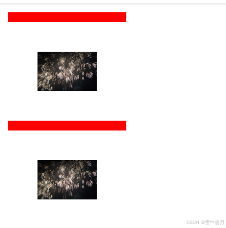
<div><img src="img/photo.jpg"/></div>
<div><img src="img/photo.jpg"/></div>
</body>
</html>
5.3.4.2右边框
语法:border-right:border-style | border-width | border-color
参数:该属性是复合属性。需要通过参数设置来实现
<!DOCTYPE html>
<html>
<head>
<meta charset="utf-8" />
<title></title>
<style>
img{
width: 60px;
height: 40px;
}
div{
/*5.1盒模型的定义*/
/*5.2 CSS元素的高度和宽度*/
/*5.2.1 盒模型的宽度*/
width:60px;
/*5.1.2 盒模型的高度*/
height:40px;
5.3 边距设置和边框设置
border:10px #ff0000 solid;
5.3.1 外边距设置
margin: 30px;
/*5.3.1.1 上外边距
/*5.3.1.2 右外边距*/
/*5.3.1.3 下外边距*/
/*5.3.1.4 左外边距*/
/*5.3.1.5 外边距*/
/*5.3.2 外边距的合并*/
/*5.3.2.1 行级元素外边距合并*/
/*5.3.2.2 块级元素外边距合并*/
/*5.3.3 内边距设置*/
padding: 30px;
/*5.3.4 边框设置*/
/*5.3.4.1上边框*/
border-top: 10px #ff0000 solid;
/*5.3.4.2右边框*/
border-right: thin #00ff00 dashed;
/*5.3.4.3下边框*/
/* border-bottom: medium #0000ff dotted; */
/*5.3.4.4 左边框*/
/* border-left: thick #000000 double; */
/*5.3.4.5 边框样式*/
/*5.3.4.6 边框宽度*/
/*5.3.4.7 边框颜色*/
/*5.3.5 新增边框属性*/
/*5.3.5.1圆角边框*/
/* border-radius: 20px; */
/*5.3.5.2阴影边框 右偏移量 下偏移量 宽度 颜色*/
/* box-shadow: -20px 10px 30px #ffff00; */
}
</style>
</head>
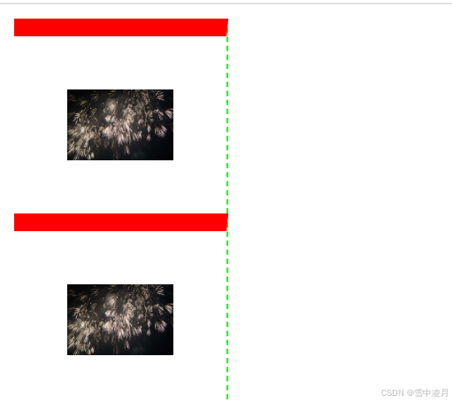
<div><img src="img/photo.jpg"/></div>
<div><img src="img/photo.jpg"/></div>
</body>
</html>
5.3.4.3下边框
语法:border-bottom:border-style | border-width | border-color
参数:该属性是复合属性。需要通过参数设置来实现
<!DOCTYPE html>
<html>
<head>
<meta charset="utf-8" />
<title></title>
<style>
img{
width: 60px;
height: 40px;
}
div{
/*5.1盒模型的定义*/
/*5.2 CSS元素的高度和宽度*/
/*5.2.1 盒模型的宽度*/
width:60px;
/*5.1.2 盒模型的高度*/
height:40px;
5.3 边距设置和边框设置
border:10px #ff0000 solid;
5.3.1 外边距设置
margin: 30px;
/*5.3.1.1 上外边距
/*5.3.1.2 右外边距*/
/*5.3.1.3 下外边距*/
/*5.3.1.4 左外边距*/
/*5.3.1.5 外边距*/
/*5.3.2 外边距的合并*/
/*5.3.2.1 行级元素外边距合并*/
/*5.3.2.2 块级元素外边距合并*/
/*5.3.3 内边距设置*/
padding: 30px;
/*5.3.4 边框设置*/
/*5.3.4.1上边框*/
border-top: 10px #ff0000 solid;
/*5.3.4.2右边框*/
border-right: thin #00ff00 dashed;
/*5.3.4.3下边框*/
border-bottom: medium #0000ff dotted;
/*5.3.4.4 左边框*/
/* border-left: thick #000000 double; */
/*5.3.4.5 边框样式*/
/*5.3.4.6 边框宽度*/
/*5.3.4.7 边框颜色*/
/*5.3.5 新增边框属性*/
/*5.3.5.1圆角边框*/
/* border-radius: 20px; */
/*5.3.5.2阴影边框 右偏移量 下偏移量 宽度 颜色*/
/* box-shadow: -20px 10px 30px #ffff00; */
}
</style>
</head>
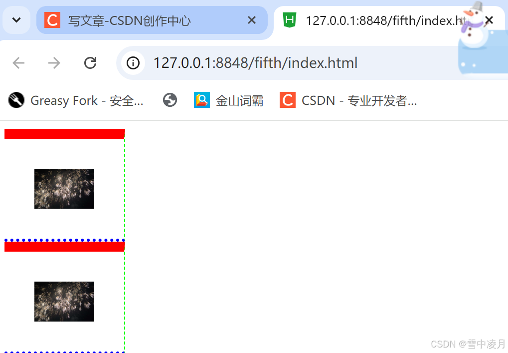
<div><img src="img/photo.jpg"/></div>
<div><img src="img/photo.jpg"/></div>
</body>
</html>
5.3.4.4 左边框
语法:border-left:border-style | border-width | border-color
参数:该属性是复合属性。需要通过参数设置来实现
<!DOCTYPE html>
<html>
<head>
<meta charset="utf-8" />
<title></title>
<style>
img{
width: 60px;
height: 40px;
}
div{
/*5.1盒模型的定义*/
/*5.2 CSS元素的高度和宽度*/
/*5.2.1 盒模型的宽度*/
width:60px;
/*5.1.2 盒模型的高度*/
height:40px;
5.3 边距设置和边框设置
border:10px #ff0000 solid;
5.3.1 外边距设置
margin: 30px;
/*5.3.1.1 上外边距
/*5.3.1.2 右外边距*/
/*5.3.1.3 下外边距*/
/*5.3.1.4 左外边距*/
/*5.3.1.5 外边距*/
/*5.3.2 外边距的合并*/
/*5.3.2.1 行级元素外边距合并*/
/*5.3.2.2 块级元素外边距合并*/
/*5.3.3 内边距设置*/
padding: 30px;
/*5.3.4 边框设置*/
/*5.3.4.1上边框*/
border-top: 10px #ff0000 solid;
/*5.3.4.2右边框*/
border-right: thin #00ff00 dashed;
/*5.3.4.3下边框*/
border-bottom: medium #0000ff dotted;
/*5.3.4.4 左边框*/
border-left: thick #000000 double;
/*5.3.4.5 边框样式*/
/*5.3.4.6 边框宽度*/
/*5.3.4.7 边框颜色*/
/*5.3.5 新增边框属性*/
/*5.3.5.1圆角边框*/
/* border-radius: 20px; */
/*5.3.5.2阴影边框 右偏移量 下偏移量 宽度 颜色*/
/* box-shadow: -20px 10px 30px #ffff00; */
}
</style>
</head>
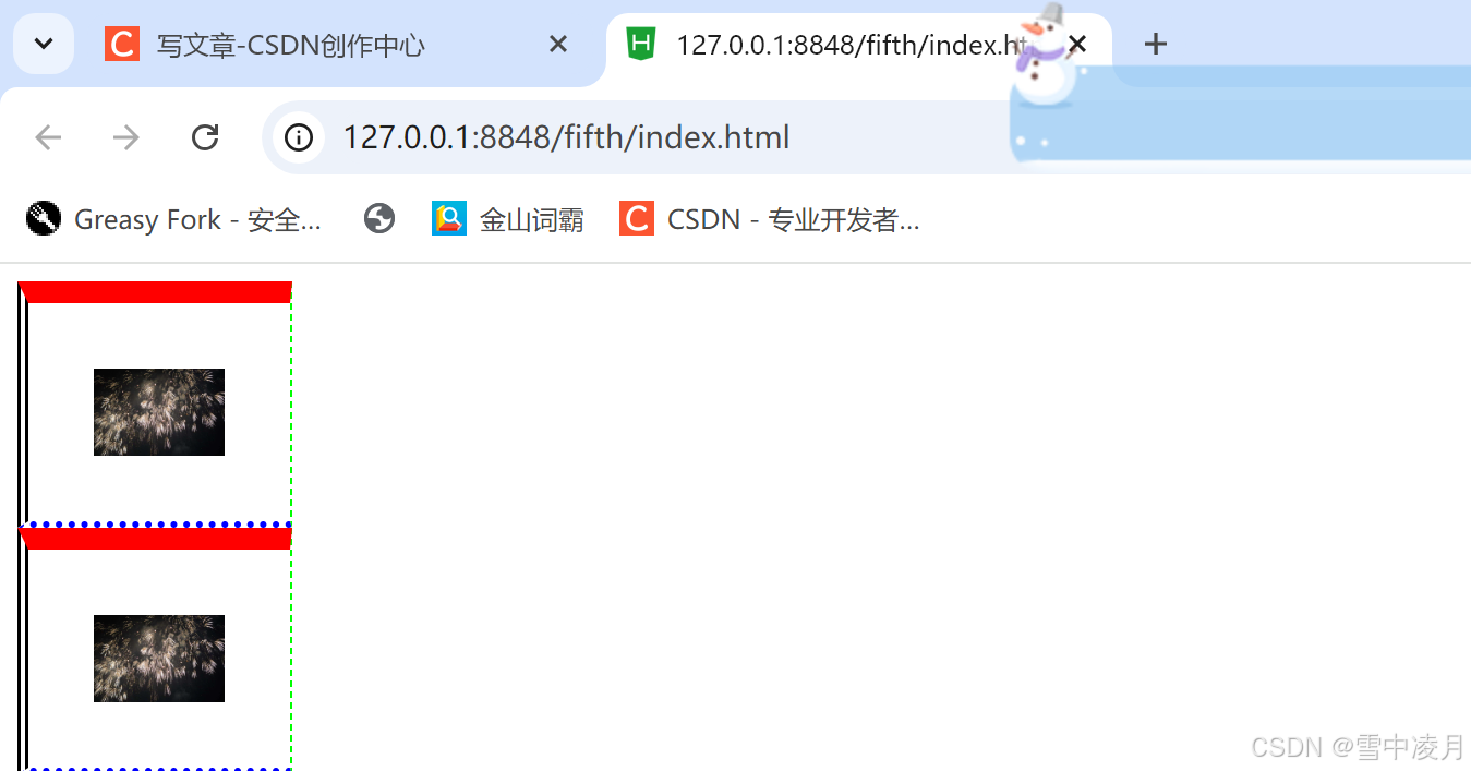
<div><img src="img/photo.jpg"/></div>
<div><img src="img/photo.jpg"/></div>
</body>
</html>
5.3.4.5 边框样式
在CSS中,样式是边框最重要的一个设置,因为如果没有样式,在Web页面中边框就不会显示。
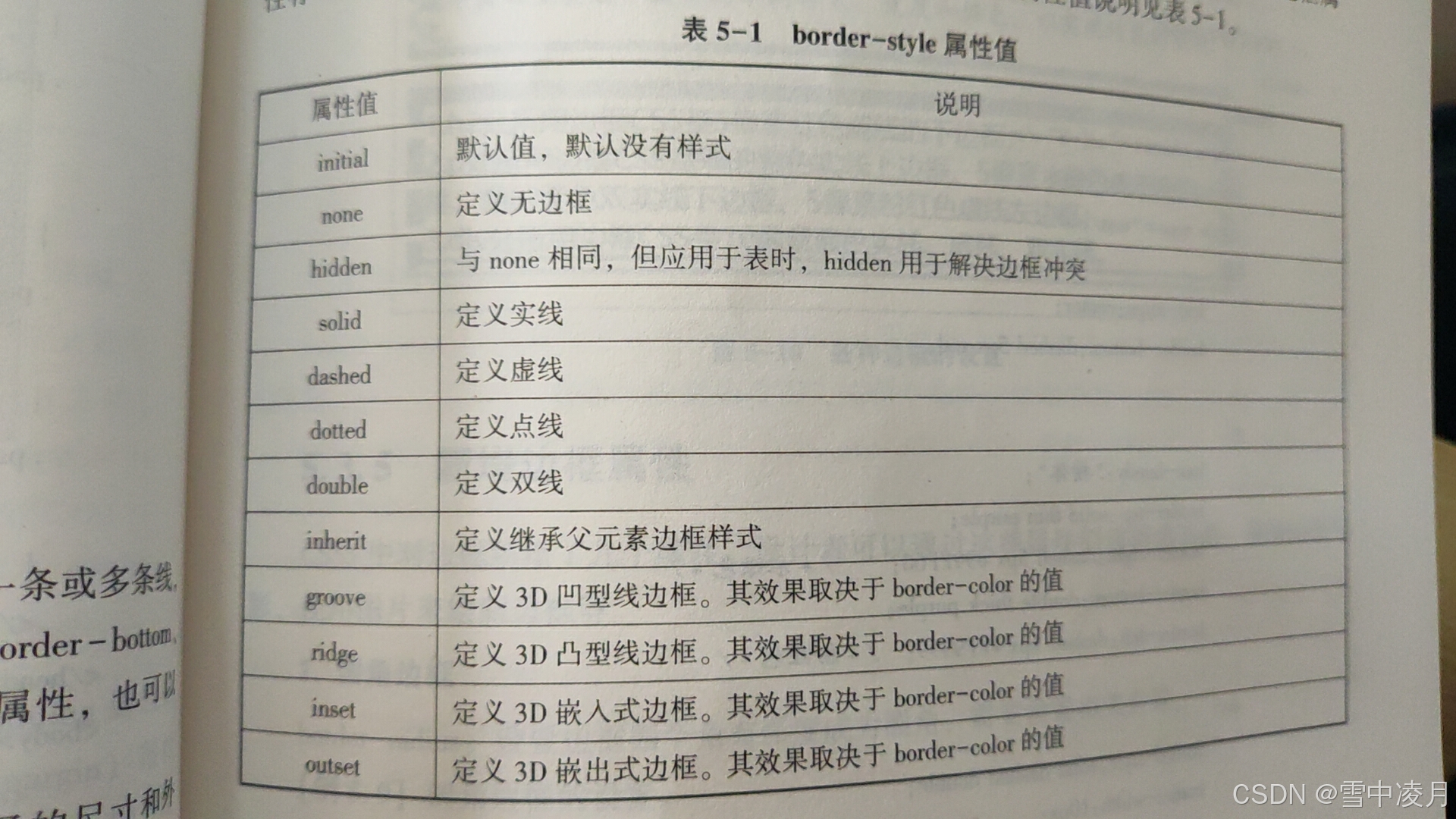
border-style是一个复合属性,可以同时取1~4个值,取值方法与外边距相似。边框属性有12个值可选,包括默认(initial)和无边框(none)。
5.3.4.6 边框宽度
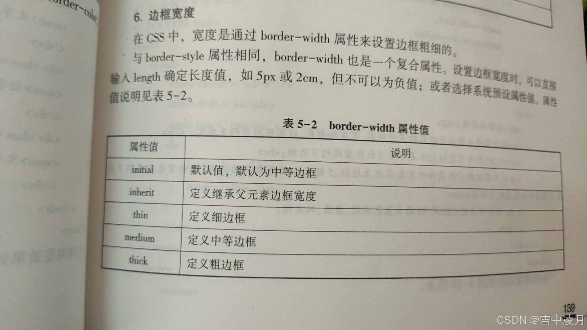
在CSS中,宽度是通过border-width属性来设置边框粗细的。
与border-style属性相同,border-width也是一个复合属性。设置边框宽度时,可以直接输入length确定长度值,如5px或2cm,但不可以为负值;或者选择系统预设属性值。
5.3.4.7 边框颜色
在CSS中,边框颜色是通过border-color属性来设置的,该属性可以使用任何类型的颜色值,包括用颜色命名的值,十六进制参数或RGB值。但是如果对象的border-style设置为none或者border-width设置为0,本属性将失去作用。
5.3.5 新增边框属性
CSS3中对边框新增了几个属性,设计者可以通过这些属性创建圆角边框、添加边框阴影,使用图片来绘制边框等。
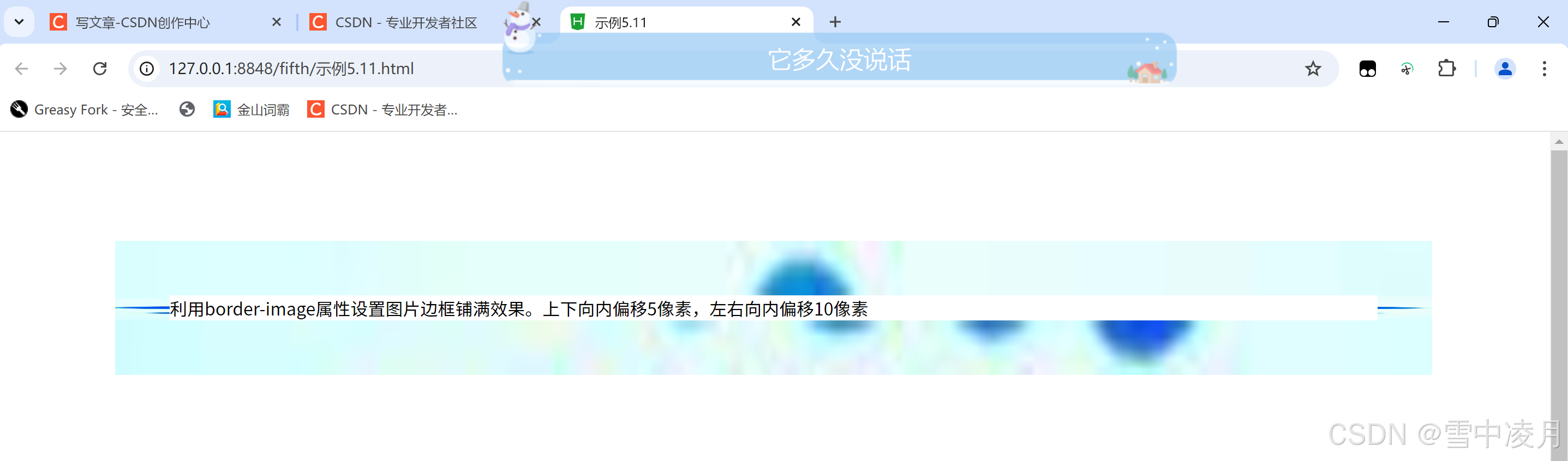
5.3.5.1圆角边框
border-radius:设置边框四个角有弧度成为圆角,需要设置相关参数。
示例代码:
<!DOCTYPE html>
<html>
	<head>
		<meta charset="utf-8">
		<title>示例5.11</title>
		<style type="text/css">
			div{
				margin: 100px;
				border: 50px solid blue;
				border-image: url(img/border.jpg) 5 10 round;
			}
		</style>
	</head>
	<body>
		<div>利用border-image属性设置图片边框铺满效果。上下向内偏移5像素,左右向内偏移10像素</div>
	</body>
</html>
运行结果:
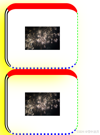
5.3.5.2阴影边框
border-shadow:向四个边框增加一到多个阴影,需要设置相关参数。
5.3.5.3图片绘制边框
border-shadow:设置所有边框显示,需要嵌入相关图片,但是部分浏览器不支持此属性。
示例代码:
<!DOCTYPE html>
<html>
	<head>
		<meta charset="utf-8" />
		<title></title>
		<style>
			img{
				width: 60px;
				height: 40px;
			}
			div{
				/*5.1盒模型的定义*/
				/*5.2 CSS元素的高度和宽度*/
				/*5.2.1 盒模型的宽度*/
				width:60px;
				/*5.1.2 盒模型的高度*/
				height:40px;
				5.3 边距设置和边框设置
				border:10px #ff0000 solid;
				5.3.1 外边距设置
				margin: 30px;
				/*5.3.1.1 上外边距
				/*5.3.1.2 右外边距*/
				/*5.3.1.3 下外边距*/
				/*5.3.1.4 左外边距*/
				/*5.3.1.5 外边距*/
				/*5.3.2 外边距的合并*/
				/*5.3.2.1 行级元素外边距合并*/
				/*5.3.2.2 块级元素外边距合并*/
				/*5.3.3 内边距设置*/
				padding: 30px;
				/*5.3.4 边框设置*/
				/*5.3.4.1上边框*/
				border-top: 10px #ff0000 solid;
				/*5.3.4.2右边框*/
				border-right: thin #00ff00 dashed;
				/*5.3.4.3下边框*/
				border-bottom: medium #0000ff dotted;
				/*5.3.4.4 左边框*/
				border-left: thick #000000 double;
				/*5.3.4.5 边框样式*/
				/*5.3.4.6 边框宽度*/
				/*5.3.4.7 边框颜色*/
				/*5.3.5 新增边框属性*/
				/*5.3.5.1圆角边框*/
				border-radius: 20px;
				/*5.3.5.2阴影边框 右偏移量 下偏移量 宽度 颜色*/
				box-shadow: -20px 10px 30px #ffff00;
				}
		</style>
	</head>
		<div><img src="img/photo.jpg"/></div>
		<div><img src="img/photo.jpg"/></div>
	</body>
</html>
运行结果:
5.4 CSS元素的定位
盒子的定位来增加牌匾的灵活性和适应性。
定位的思想是,它允许你定义元素框相对于其正常位置应该出现的位置或者相对于父元素、另一个元素甚至浏览器窗口本身的位置。
position属性值有4个:static | relative | absolute | fixed
5.4.1 static 定位
static是HTML元素的默认值,不受top、right、bottom和left属性影响,元素出现在正常的文档流中。
<!DOCTYPE html>
<html>
	<head>
		<meta charset="utf-8">
		<title>示例5.12</title>
		<style type="text/css">
			.father{
				border:2px solid red;
				width:300px;
				height: 250px;
			}
			.son1{
				border: 2px double red;
				background-color: yellow;
				width: 200px;
				height: 80px;
				/*5.4 CSS元素的定位*/
				/*5.4.1 static 定位*/
				position: static;
				/*5.4.2 relative定位*/
				/*5.4.3 absolute定位*/
				/*5.4.3.1 相对浏览器绝对定位*/
				/*5.4.3.2 相对父盒子绝对定位*/
				/*5.4.4 fixed定位*/
			}
			.son2{
				border: 2px double red;
				width: 200px;
				height: 25px;
				margin-top: 50px;
			}
		</style>
	</head>
	<body>
		<div class="father">父盒子:无定位
		<div class="son1">子盒子:无定位的盒子
		<h2>静态定位的盒子</h2>
		</div>
		<div class="son2">子盒子:无定位的盒子
		</div>
		</div>
	</body>
</html>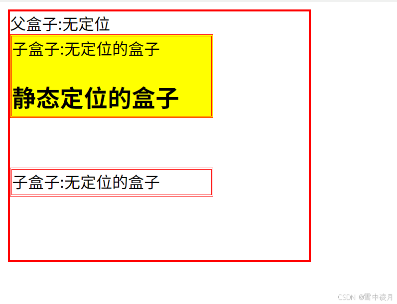
5.4.2 relative定位
relative不脱离文档流的布局,需要参加父元素的四条边(不是浏览器),设置自身的top,right,bottom和left属性的参数,从盒子中独立出来浮在上面。相对定位只改变自身的位置,在文档流原先的位置留出空白区域。定位的起始位置为此元素原先在文档流的位置。
示例:
<!DOCTYPE html>
<html>
	<head>
		<meta charset="utf-8">
		<title>示例5.12</title>
		<style type="text/css">
			.father{
				border:2px solid red;
				width:300px;
				height: 250px;
			}
			.son1{
				border: 2px double red;
				background-color: yellow;
				width: 200px;
				height: 80px;
				/*5.4 CSS元素的定位*/
				/*5.4.1 static 定位*/
				/* position: static; */
				/*5.4.2 relative定位*/
				position: relative;
				top: 30px;
				left: 40px;
				/*5.4.3 absolute定位*/
				/*5.4.3.1 相对浏览器绝对定位*/
				/*5.4.3.2 相对父盒子绝对定位*/
				/*5.4.4 fixed定位*/
			}
			.son2{
				border: 2px double red;
				width: 200px;
				height: 25px;
				margin-top: 50px;
			}
		</style>
	</head>
	<body>
		<div class="father">父盒子:无定位
		<div class="son1">子盒子:无定位的盒子
		<h2>静态定位的盒子</h2>
		</div>
		<div class="son2">子盒子:无定位的盒子
		</div>
		</div>
	</body>
</html>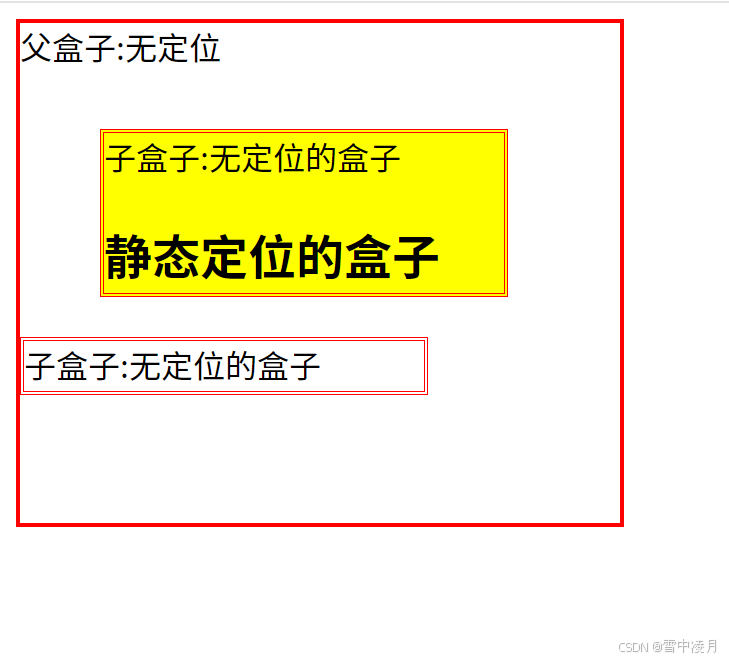
5.4.3 absolute定位
absolute脱离原来文档流的布局,浮在其他盒子上面,独立出来。子盒子原来位置的空间由后面的盒子填充。绝对定位的起始位置为最近已定位的父盒子,如果父盒子没有定位,那么子盒子的起始位置为浏览器,并随着滚动条的移动而改变位置。
<!DOCTYPE html>
<html>
	<head>
		<meta charset="utf-8">
		<title>示例5.12</title>
		<style type="text/css">
			.father{
				border:2px solid red;
				width:300px;
				height: 250px;
			}
			.son1{
				border: 2px double red;
				background-color: yellow;
				width: 200px;
				height: 80px;
				/*5.4 CSS元素的定位*/
				/*5.4.1 static 定位*/
				/* position: static; */
				/*5.4.2 relative定位*/
				/* position: relative;
				top: 30px;
				left: 40px; */
				/*5.4.3 absolute定位*/
				position: absolute;
				top: 30px;
				left: 40px;
				/*5.4.3.1 相对浏览器绝对定位*/
				/*5.4.3.2 相对父盒子绝对定位*/
				/*5.4.4 fixed定位*/
			}
			.son2{
				border: 2px double red;
				width: 200px;
				height: 25px;
				margin-top: 50px;
			}
		</style>
	</head>
	<body>
		<div class="father">父盒子:无定位
		<div class="son1">子盒子:无定位的盒子
		<h2>静态定位的盒子</h2>
		</div>
		<div class="son2">子盒子:无定位的盒子
		</div>
		</div>
	</body>
</html>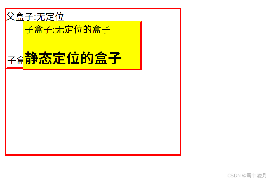
5.4.3.1 相对浏览器绝对定位
<!DOCTYPE html>
<html>
	<head>
		<meta charset="utf-8">
		<title>示例5.12</title>
		<style type="text/css">
			.father{
				border:2px solid red;
				width:300px;
				height: 250px;
			}
			.son1{
				border: 2px double red;
				background-color: yellow;
				width: 200px;
				height: 80px;
				/*5.4 CSS元素的定位*/
				/*5.4.1 static 定位*/
				/* position: static; */
				/*5.4.2 relative定位*/
				/* position: relative;
				top: 30px;
				left: 40px; */
				/*5.4.3 absolute定位*/
				position: absolute;
				bottom: 30px;
				right: 40px;
				/*5.4.3.1 相对浏览器绝对定位*/
				/*5.4.3.2 相对父盒子绝对定位*/
				/*5.4.4 fixed定位*/
			}
			.son2{
				border: 2px double red;
				width: 200px;
				height: 25px;
				margin-top: 50px;
			}
		</style>
	</head>
	<body>
		<div class="father">父盒子:无定位
		<div class="son1">子盒子:无定位的盒子
		<h2>静态定位的盒子</h2>
		</div>
		<div class="son2">子盒子:无定位的盒子
		</div>
		</div>
	</body>
</html>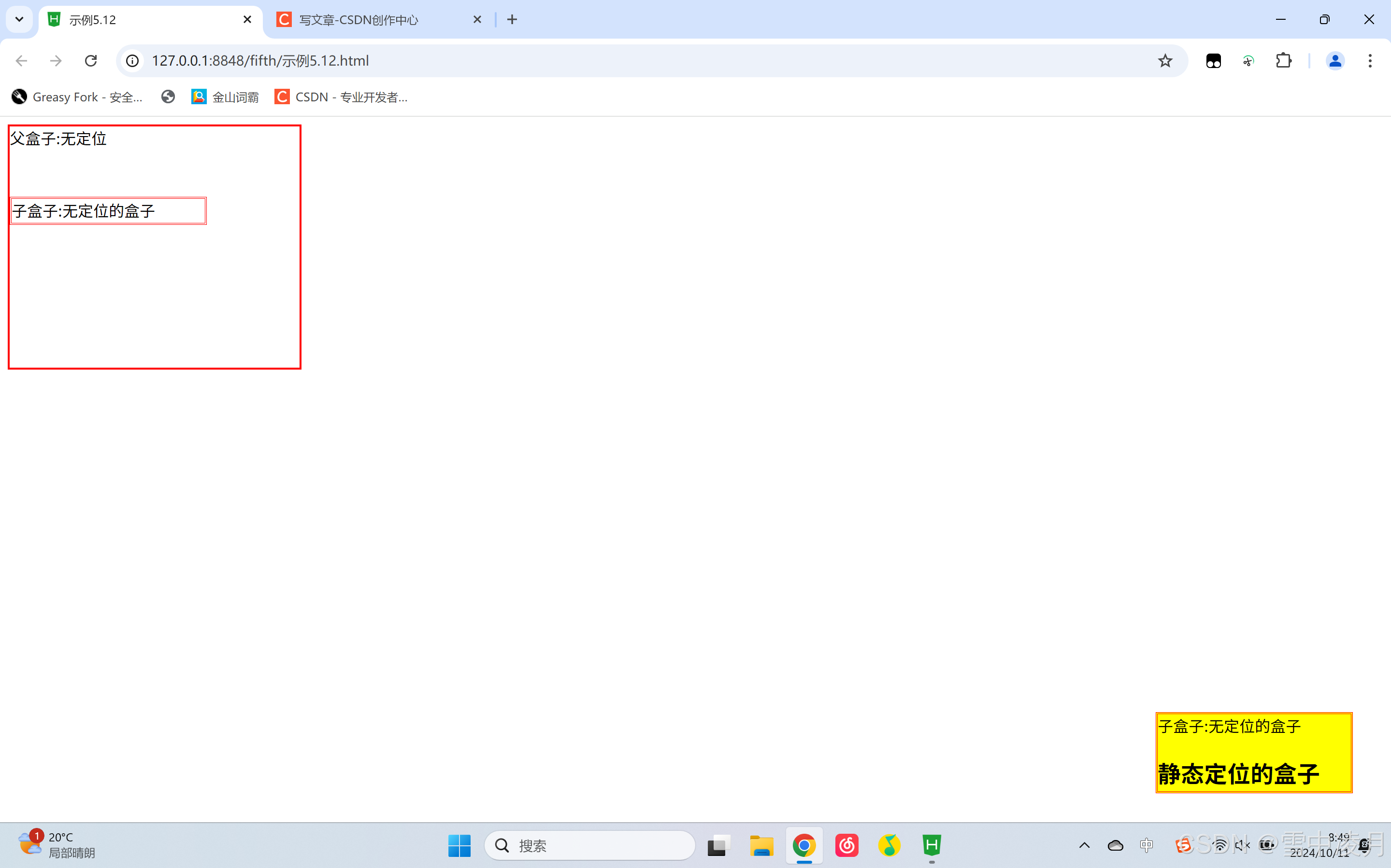
5.4.3.2 相对父盒子绝对定位
示例:
<!DOCTYPE html>
<html>
	<head>
		<meta charset="utf-8">
		<title>示例5.12</title>
		<style type="text/css">
			.father{
				border:2px solid red;
				width:300px;
				height: 250px;
				/*5.4.3.2 相对父盒子绝对定位*/
				position: relative;
			}
			.son1{
				border: 2px double red;
				background-color: yellow;
				width: 200px;
				height: 80px;
				/*5.4 CSS元素的定位*/
				/*5.4.1 static 定位*/
				/* position: static; */
				/*5.4.2 relative定位*/
				/* position: relative;
				top: 30px;
				left: 40px; */
				/*5.4.3 absolute定位*/
				/* position: absolute;
				top: 30px;
				left: 40px; */
				/*5.4.3.1 相对浏览器绝对定位*/
				position: absolute;
				bottom: 30px;
				right: 40px;
				/*5.4.3.2 相对父盒子绝对定位*/
				/*5.4.4 fixed定位*/
			}
			.son2{
				border: 2px double red;
				width: 200px;
				height: 25px;
				margin-top: 50px;
			}
		</style>
	</head>
	<body>
		<div class="father">父盒子:无定位
		<div class="son1">子盒子:无定位的盒子
		<h2>静态定位的盒子</h2>
		</div>
		<div class="son2">子盒子:无定位的盒子
		</div>
		</div>
	</body>
</html>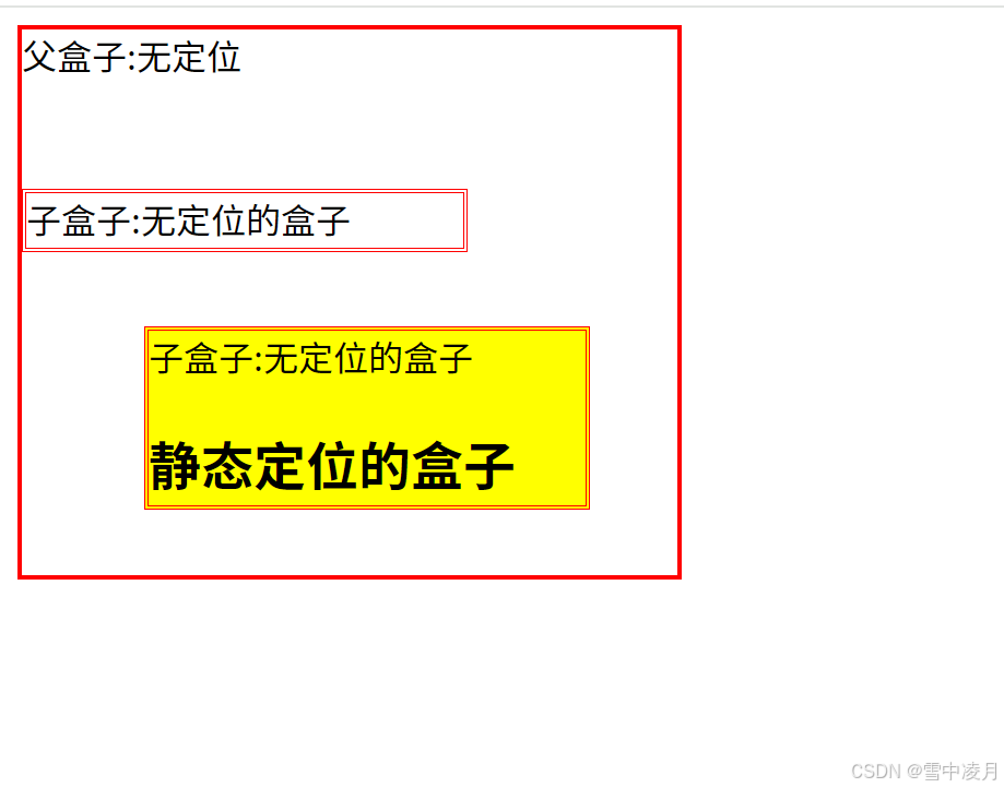
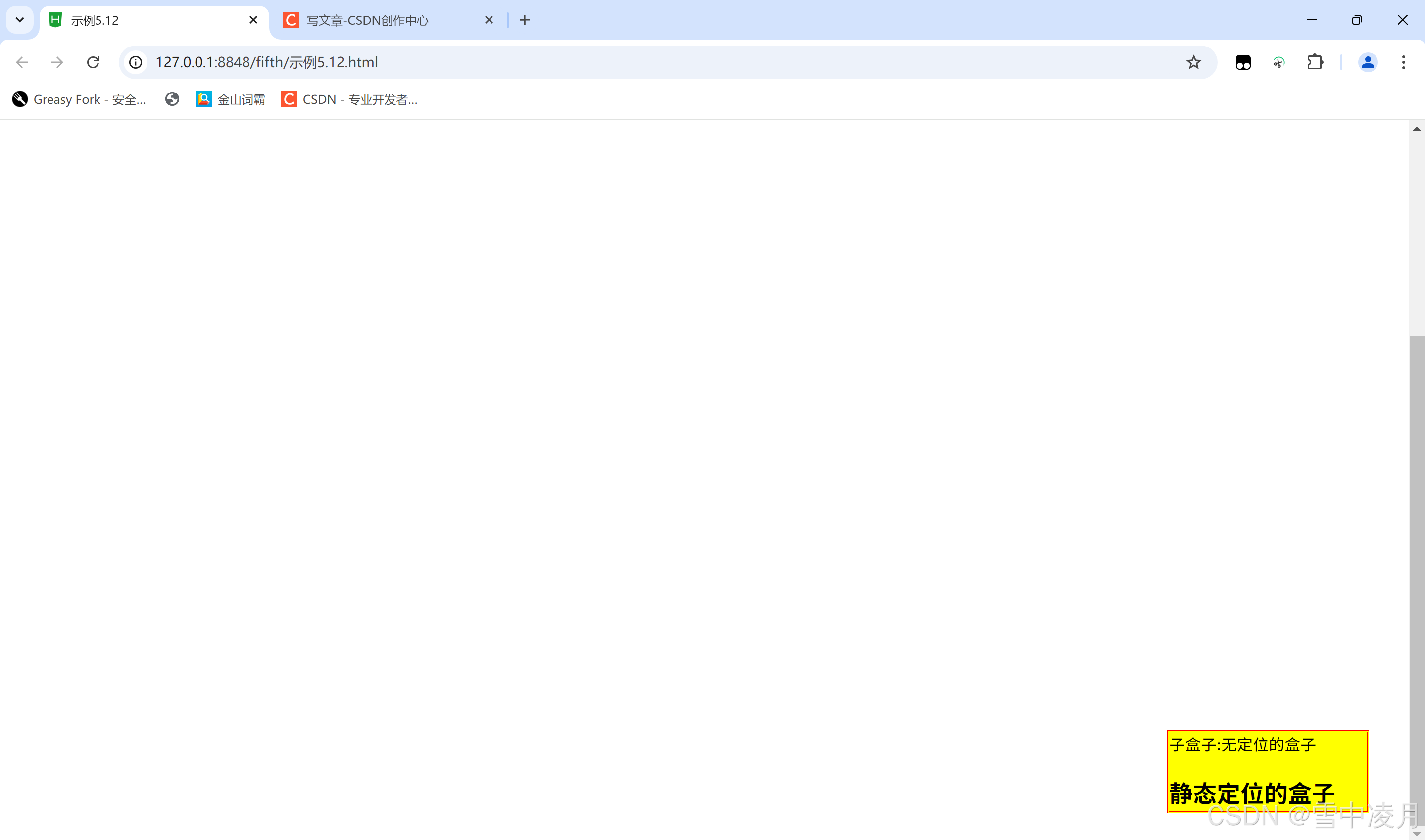
5.4.4 fixed定位
fixed类似于absolute,但在固定定位中,盒子的位子不随着滚动条的移动而移动而改变位子相对于浏览器窗口是固定不变的。
示例:
<!DOCTYPE html>
<html>
	<head>
		<meta charset="utf-8">
		<title>示例5.12</title>
		<style type="text/css">
			.father{
				border:2px solid red;
				width:300px;
				height: 250px;
				/*5.4.3.2 相对父盒子绝对定位*/
				/* position: relative; */
			}
			.son1{
				border: 2px double red;
				background-color: yellow;
				width: 200px;
				height: 80px;
				/*5.4 CSS元素的定位*/
				/*5.4.1 static 定位*/
				/* position: static; */
				/*5.4.2 relative定位*/
				/* position: relative;
				top: 30px;
				left: 40px; */
				/*5.4.3 absolute定位*/
				/* position: absolute;
				top: 30px;
				left: 40px; */
				/*5.4.3.1 相对浏览器绝对定位*/
				/* position: absolute;
				bottom: 30px;
				right: 40px; */
				/*5.4.3.2 相对父盒子绝对定位*/
				/*5.4.4 fixed定位*/
				position: fixed;
				bottom: 30px;
				right: 40px;
			}
			.son2{
				border: 2px double red;
				width: 200px;
				height: 25px;
				margin-top: 50px;
			}
		</style>
	</head>
	<body>
		<div class="father">父盒子:无定位
		<div class="son1">子盒子:无定位的盒子
		<h2>静态定位的盒子</h2>
		</div>
		<div class="son2">子盒子:无定位的盒子
		</div>
		</div>
		<br><br><br><br><br><br><br><br><br><br><br><br><br><br><br><br><br><br><br><br><br><br><br><br><br><br><br><br><br><br><br><br><br>
		</body>
</html>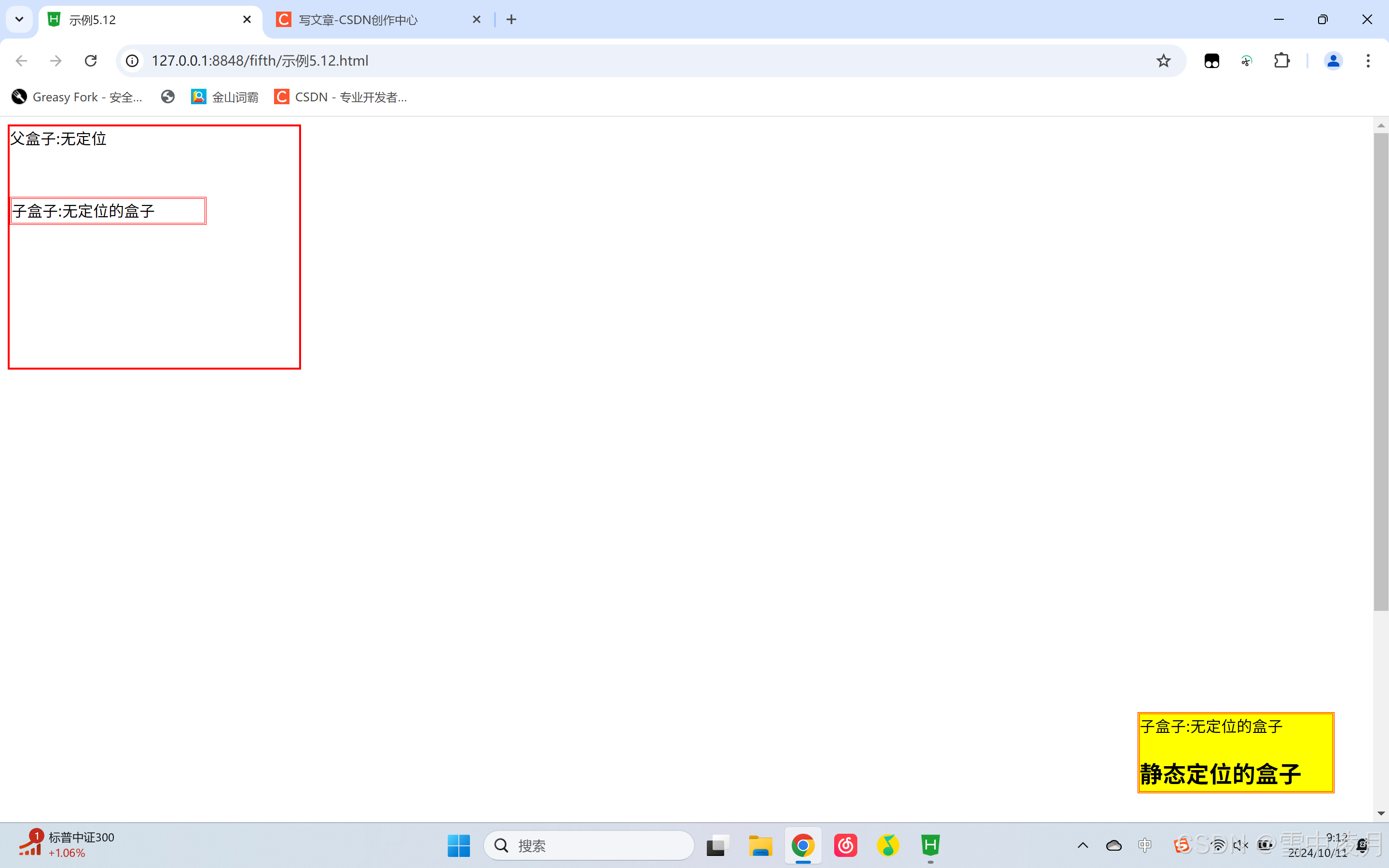
5.5 CSS元素的浮动
在CSS的盒模型布局上,除了使用定位避免按照标准流的方式进行排版的限制性问题,还可以使用浮动来避免。而使用浮动(float)和清除(clear)属性设置,可以解决各种页面错位的现象。
5.5.1 盒子的浮动添加
一般情况下,页面中的块状元素在水平方向上宽度会自动延伸。直到父元素的边界,而在垂直方向上会按照元素在页面中出现的先后次序依次排列,即所说的标准流排列。
任何元素都可以浮动,浮动元素会变成一个块状元素,元素的水平浮动就是通过其float属性的设置,使元素向其父元素的左侧或右侧靠拢,间接设置一个元素的文本环绕方式,从而改变原来的竖直排列方式。此时元素的宽度不再延伸,大小将尤其内容的宽度而定。
示例:
<!DOCTYPE html>
<html>
	<head>
		<meta charset="utf-8">
		<title>示例5.17</title>
		<style type="text/css">
			.father{
				background-color: #FFCCFF;
				border: 2px solid red;
				padding: 5px;
			}
			.father div{
				width: 100px;
				height: 20px;
				padding: 10px;
				margin: 10px;
				border: 2px dashed blue;
				background-color: #CCFFFF;
			}
			.father p{
				border: 2px dotted green;
				background-color: #FFFF99;
			}
		</style>
	</head>
	<body>
		<div class="father">
			<h2>父盒子</h2>
			<div style="float: right;">右浮动盒子1</div>
			<div>标准流盒子2</div>
			<div>标准流盒子3</div>
			<p>css中,有一个float属性。默认为none,也就是标准流通常的情况,若果将float属性的值设
			置为left或right,元素就会向其父级元素的左侧或右侧靠近,同时默认的情况下,盒子的宽度不再伸展,而是根据盒子里面的内容的宽度确定</p>
		</div>
	</body>
</html>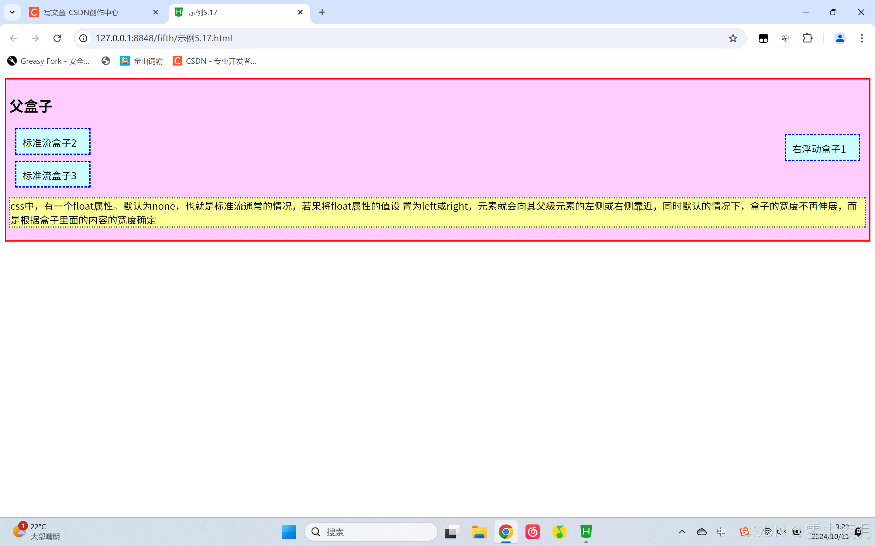
5.5.2 盒子的浮动清除
元素浮动后,下面的元素内容会自动上移,结果就会收到上面浮动元素的影响,如果想要清除这种影响,需要使用clear属性完成。
由于浮动元素可以清除,是相对定位属性的优势,因而浮动属性成为控制分栏布局的最好工具。
语法:clear:left | right |both |none
参数:乐翻天清除左边浮动元素,即不允许左边有浮动对象;right清除右边浮动元素,即不允许右边有浮动对象;both同时清除左右两边的浮动对象,即不允许左右两边有浮动对象;默认值为none。
示例:
<!DOCTYPE html>
<html>
	<head>
		<meta charset="utf-8">
		<title>示例5.17</title>
		<style type="text/css">
			.father{
				background-color: #FFCCFF;
				border: 2px solid red;
				padding: 5px;
			}
			.father div{
				width: 100px;
				height: 20px;
				padding: 10px;
				margin: 10px;
				border: 2px dashed blue;
				background-color: #CCFFFF;
			}
			.father p{
				border: 2px dotted green;
				background-color: #FFFF99;
			}
		</style>
	</head>
	<body>
		<div class="father">
			<h2>父盒子</h2>
			<!-- 5.5 CSS元素的浮动 -->
			<!-- 5.5.1 盒子的浮动添加 -->
			<div style="float: right;">右浮动盒子1</div>
			<div style="float: right;">标准流盒子2</div>
			<div style="float: right;">标准流盒子3</div>
			<!-- 5.5.2 清除盒子浮动造成的影响 -->
			<p style="clear: both;">css中,有一个float属性。默认为none,也就是标准流通常的情况,若果将float属性的值设
			置为left或right,元素就会向其父级元素的左侧或右侧靠近,同时默认的情况下,盒子的宽度不再伸展,而是根据盒子里面的内容的宽度确定</p>
		</div>
	</body>
</html>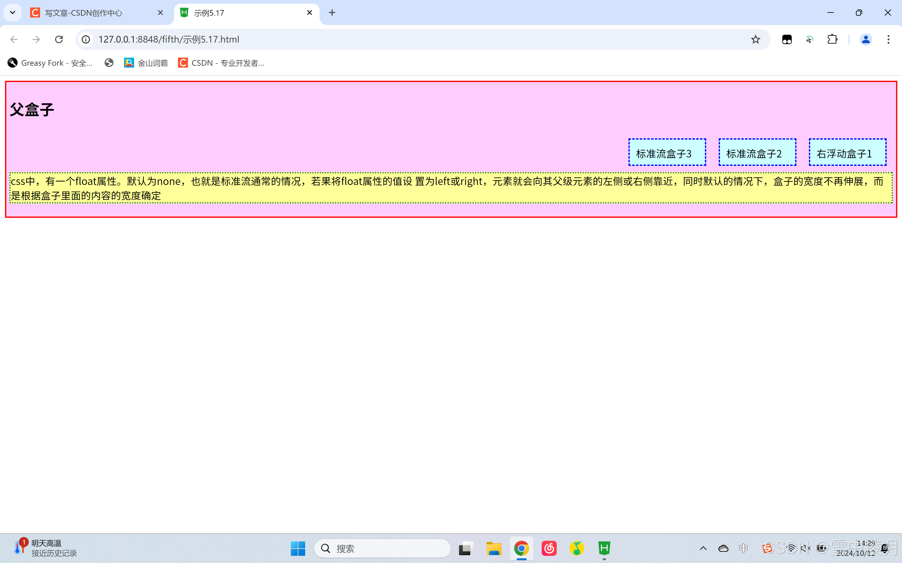
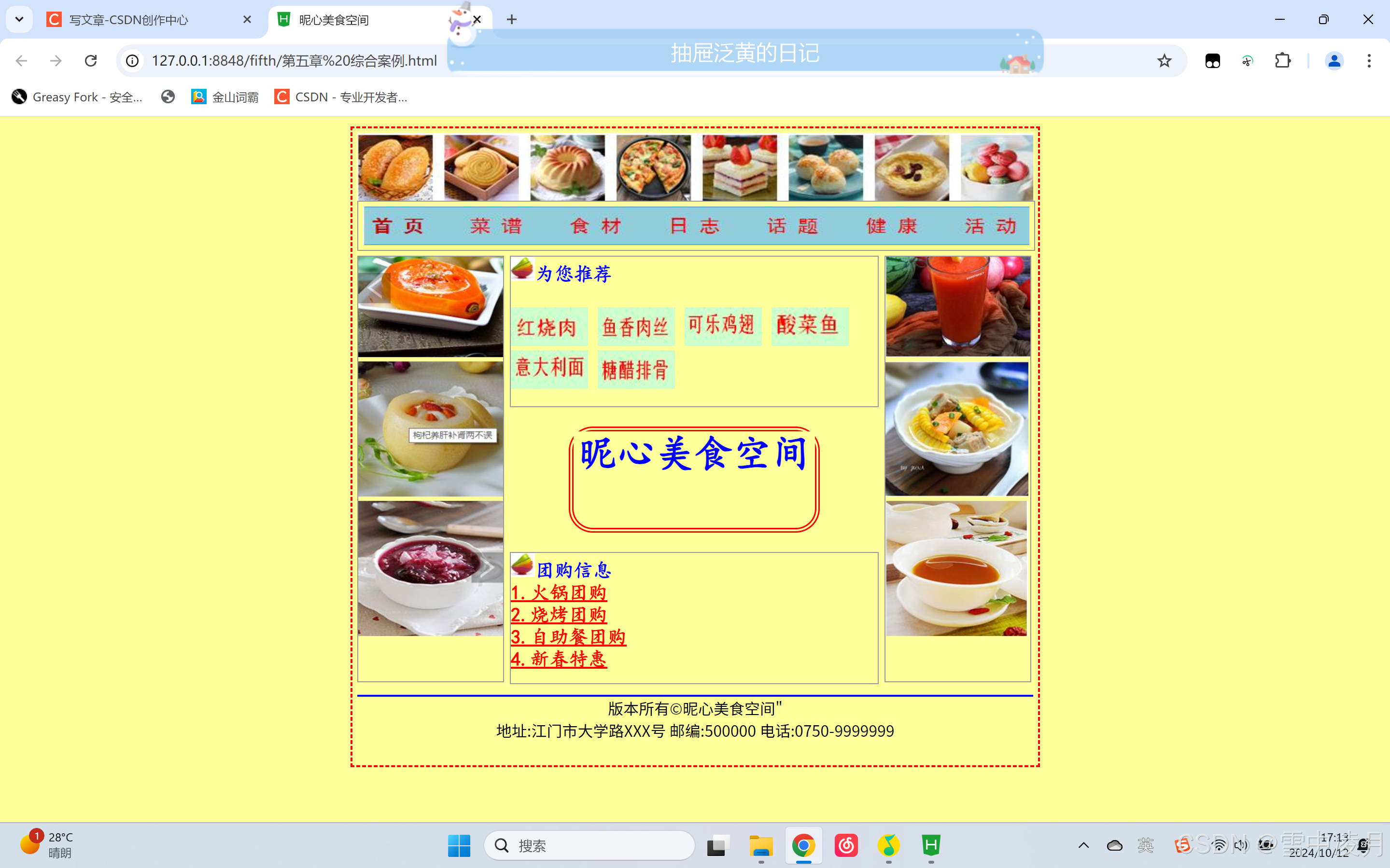
5.6 综合案例——昵心美食空间
示例代码:
<!DOCTYPE html>
<html>
<head>
<meta charset="utf-8">
<title>昵心美食空间</title>
<style type="text/css">
a{
color: red;
}
*{
margin: 0px auto;
background-color: #FFFF99;
}
.all{
width: 700px;
height: 650px;
border: 2px dashed red;
margin: 10px auto;
padding: 5px;
}
.banner{
width: 700px;
height: 70px;
}
.menu{
width: 690px;
height: 40px;
border: 1px solid #999;
padding: 5px;
}
.main{
width:700px;
height: 450px ;
margin:5px 0px;
position:relative;
}
.left{
width: 150px;
height:440px ;
border: 1px solid #999 ;
float : left ;
}
.middle{
width :384px;
height : 450px ;
margin :0px 5px ;
float : left ;
font-size: 20px;
font-family: "楷体";
font-weight: 700;
color: #0000FF;
}
.one{
width :380px;
height : 155px;
border : 1px solid #999 ;
}
.two{
width :250px;
height : 100px;
border :5px double red ;
margin-top :20px ;
margin-bottom :20px;
border-radius :25px ;
}
.three{
width :380px;
height:135px;
border :1px solid #999 ;
}
.right{
width: 150px;
height:440px;
border: 1px solid #999;
float: left;
}
.bottom{
width :700px ;
height : 70px ;
}
</style>
</head>
<body>
<div class= " all">
<div class= " banner" >
<img src="img/banner.jpg" width="700px" height="70px"/>
</div>
<div class=" menu" >
<img src="img/menu.jpg" width="690px" height="40px"/>
</div>
<div class= " main" >
<div class= " left" >
<marquee direction="up">
<img src="img/mm_1.jpg" width="150px" height="140px"/>
<img src="img/mm_2.jpg" width="150px" height="140px"/>
<img src="img/mm_3.jpg" width="150px" height="140px"/>
</marquee>
</div>
<div class= " middle" >
<div class= " one" >
<img src="img/font.jpg" width="25px" height="25px"/>为您推荐
<br><br>
<img src="img/x_1.jpg" width="80px" height="40px"/>
<img src="img/x_2.jpg" width="80px" height="40px"/>
<img src="img/x_3.jpg" width="80px" height="40px"/>
<img src="img/x_4.jpg" width="80px" height="40px"/>
<img src="img/x_5.jpg" width="80px" height="40px"/>
<img src="img/x_6.jpg" width="80px" height="40px"/>
</div>
<center>
<div class= " two" >
<h1>昵心美食空间</h1>
</div>
</center>
<div class= " three" >
<img src="img/font.jpg" width="25px" height="25px"/>团购信息
<br>
<a href="#">1.火锅团购</a><br>
<a href="#">2.烧烤团购</a><br>
<a href="#">3.自助餐团购</a><br>
<a href="#">4.新春特惠</a>
</div>
</div>
<div class = " right" >
<marquee direction="up">
<img src="img/good_1.jpg" width="150px" height="140px"/>
<img src="img/good_2.jpg" width="148px" height="140px"/>
<img src="img/good_3.jpg" width="148px" height="140px"/>
</marquee>
</div>
</div>
<div class = " bottom" >
<hr color="#0000FF">
<center style="font-family: "楷体";>版本所有©昵心美食空间"<br />
地址:江门市大学路XXX号 邮编:500000 电话:0750-9999999
</center>
</div>
</div>
</body>
</html>运行结果:


 扫一扫
扫一扫


 被折叠的 条评论
为什么被折叠?
被折叠的 条评论
为什么被折叠?
 到【灌水乐园】发言


