


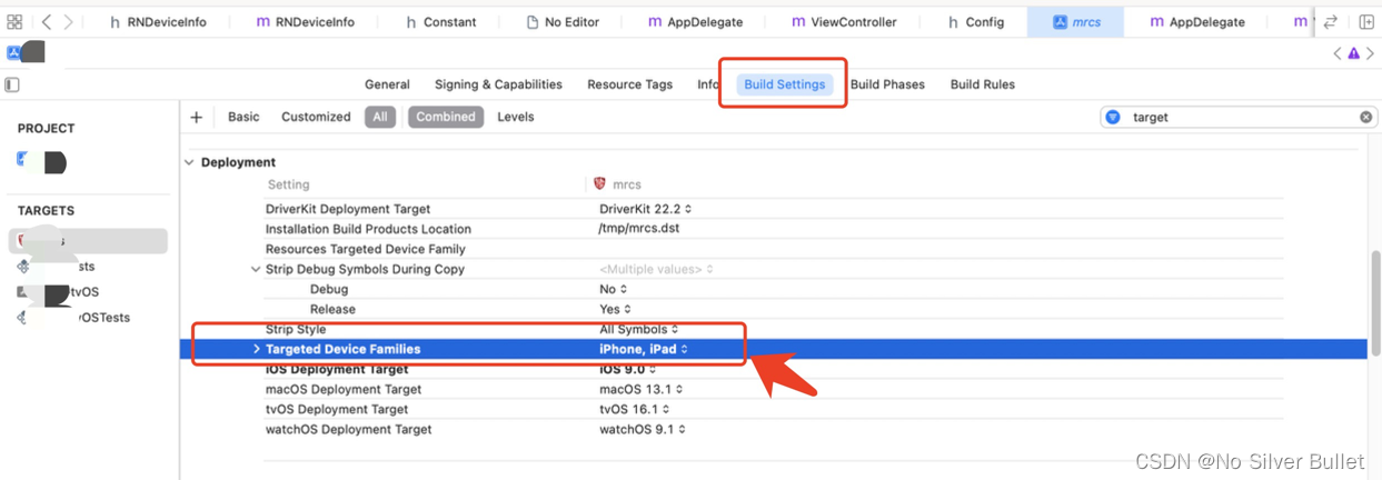
在Xcode项目中把相对应的勾去掉即可。
基于项目为react-native技术栈实现,不涉及原生代码,可借助react-native第三方组件:react-native-orientation实现。
安装步骤:
npm i --save react-native-orientation
react-native link react-native-orientation (自动link不成功,建议手动link)
进入功能模块时,
import Orientation from 'react-native-orientation';

onPress={() => {
  // 解除屏幕方向锁定,让屏幕方向根据设备的物理方向自动调整
  console.log('----------解除屏幕方向锁定,让屏幕方向根据设备的物理方向自动调整---------');
  Orientation.unlockAllOrientations();
  ....
}}
退出功能模块时,
import Orientation from 'react-native-orientation';

initData = () => {
  // 锁定屏幕竖屏锁定
  console.log('----------锁定屏幕竖屏锁定---------');
  Orientation.lockToPortrait();
};
按照以上实现思路实施后,发现android系统下的pad表现较好,能够按照预期设想自动实现APP横竖屏切换,且内容适配。
但是,iOS系统下的iPhone、iPad表现不尽如人意,虽然可以实现屏幕横竖屏自动切换,但是当APP处于横屏状态下时,页面展示效果存在未完全铺展开的适配问题。
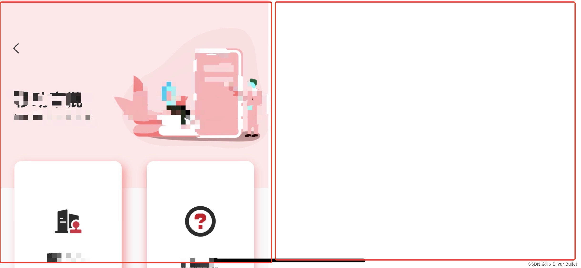
显而易见,iOS系统中当旋转物理设备至横屏时,仍然沿用的设备竖屏状态下的宽高进行页面绘制。关键问题就出在这里。
且发现在RN页面及webview中均存在横屏状态下沿用竖屏状态宽高问题。
按照网上给出的解决方案:
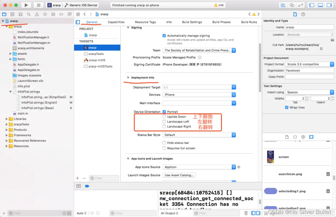
对于iOS,在ios/Info.plist文件中包括以下行就可以了:
<key>UISupportedInterfaceOrientations</key>
<array>
    <string>UIInterfaceOrientationPortrait</string>
</array>

<key>UISupportedInterfaceOrientations~ipad</key>
<array>
最低0.47元/天 解锁文章


 扫一扫
扫一扫


 1万+
1万+

 被折叠的 条评论
为什么被折叠?
被折叠的 条评论
为什么被折叠?
 到【灌水乐园】发言


