


5.1盒模型的定义
CSS 盒模型是网页设计和布局的基础概念,用于描述元素如何在页面上占用空间。
默认情况下盒子的边框是“无”,背景色是透明的,所以在默认的情况下看不到盒子,内边距、边框和外边距这些属性都是可选,默认值都是0。
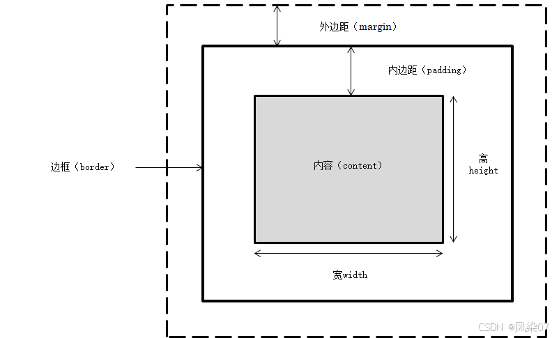
5.2 CSS元素的高度和宽度
5.2.1 盒模型的宽度
盒模型的宽度=左外边距(margin-left)+左边框(border-left)+左内边距(padding-left)+内容宽度(width)+右内边距(padding-right)+右边框(border-nght)+右外边距(margin-right)。
5.1.2 盒模型的高度
盒模型的高度=上外边距(margin-top)+上边框(border-top)+上内边距(paddingtop)+内容高度(height)+下内边距(padding-bottom)+下边框(border-bottom)+下外边距(margin-bottom)。
<!DOCTYPE html>
<html>
	<head>
		<meta charset="utf-8" />
		<title>第五章——CSS盒模型</title>
		<style>
			*{
				margin: 0px;
				padding: 0px;
			}
			div{
				width: 40px;	/*设置宽*/
				height: 30px;	/*设置高*/
				border: 5px solid red;	/*设置边框*/
				margin: 20px;	/*设置外边距*/
				padding: 20px;	/*设置内边距*/
			}
			img{
				width: 40px;
				height: 30px;
			}
		</style>
	</head>
	<body>
		<div><img src="img/01111.jpg" /></div>
		<div><img src="img/01111.jpg" /></div>
	</body>
</html>
5.3 边距设置和边框设置
5.3.1 外边距设置
语法:margin-top:length | percent | auto
参数:length包括长度和长度单位,percent是基于父对象的高度,auto值为自动提取边距值,是默认值。
5.3.1.1 上外边距
语法:margin-top:length | percent | auto
参数:同上
5.3.1.2 右外边距
语法:margin-right:length | percent | auto
参数:同上
5.3.1.3 下外边距
语法:margin-bottom:length | percent | auto
参数:同上
5.3.1.4 左外边距
语法:margin-left:length | percent | auto
参数:同上
5.3.1.5 外边距
语法:margin:length | percent | auto
参数:length包括长度和长度单位,percent是基于父对象的高度,左右外边距可以使用负数,auto值为自动提取边距值,是默认值。
5.3.2 外边距的合并
5.3.2.1 行级元素外边距合并
行级元素的盒子相遇,盒子与盒子之间的距离等于两个盒子外边距的总和。
5.3.2.2 块级元素外边距合并
块级元素的盒子相遇,盒子与盒子之间的距离等于两个盒子外边距的较大者。
5.3.3 内边距设置
5.3.4 边框设置
包括上下左右四个方向的边框,样式(border-style)、宽度(border-width)和颜色(border-color)
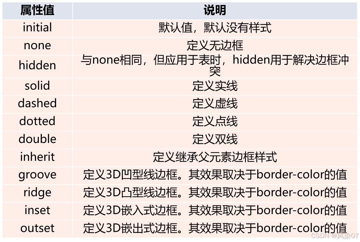
5.3.4.1 边框样式
5.3.4.2 边框宽度
| 属性值 | 说明 |
| initial | 默认值,默认中等边框 |
| inherit | 定义继承父元素边框宽度 |
| thin | 定义细边框 |
|
medium | 定义中等边框 |
| thick | 定义粗边框 |
5.3.5 新增边框属性
5.3.5.1圆角边框
border-radius:设置边框四个角有弧度成为圆角
5.3.5.2阴影边框
box-shadow:向四个边框添加一到多个阴影
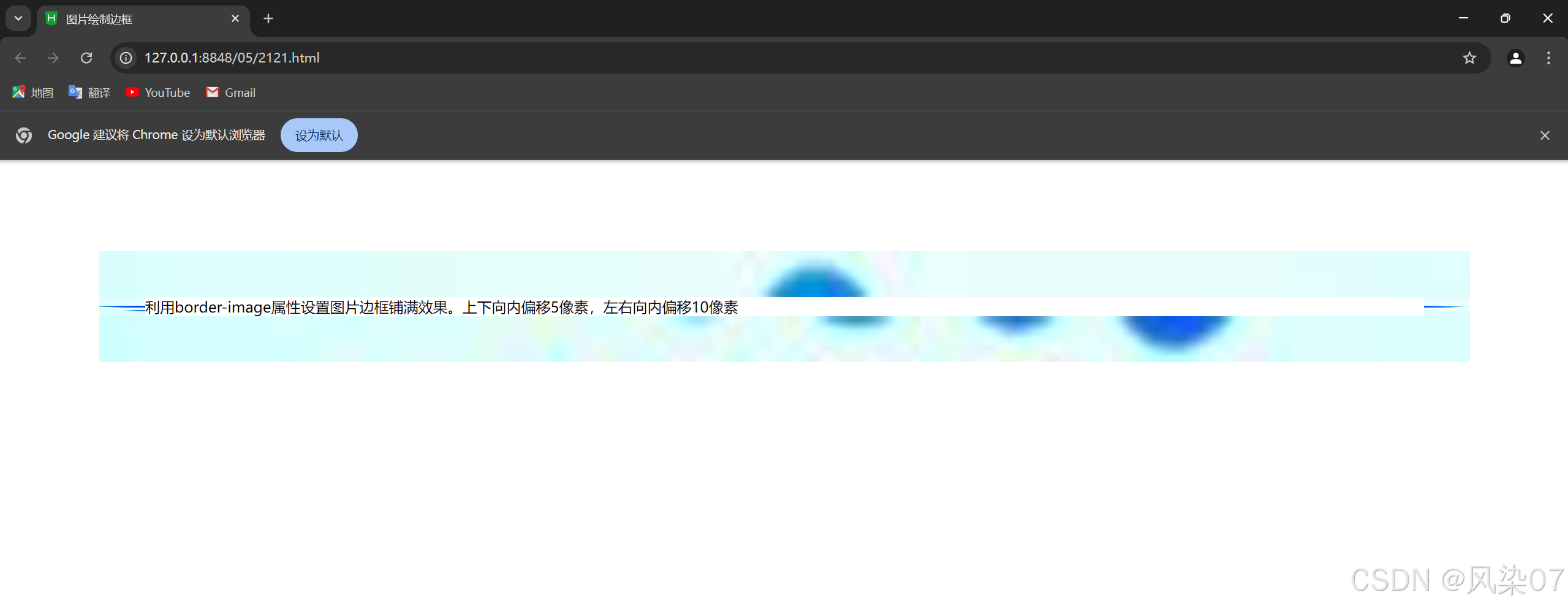
5.3.5.3图片绘制边框
border-image:设置所有边框用图片显示
<!DOCTYPE html>
<html>
<head>
<meta charset="utf-8">
<title>图片绘制边框</title>
<style type="text/css">
div{
margin: 100px;
border:50px solid blue;
border-image: url(img/01.jpg)5 10 round;
}
</style>
</head>
<body>
<div>利用border-image属性设置图片边框铺满效果。上下向内偏移5像素,左右向内偏移10像素</div>
</body>
</html>
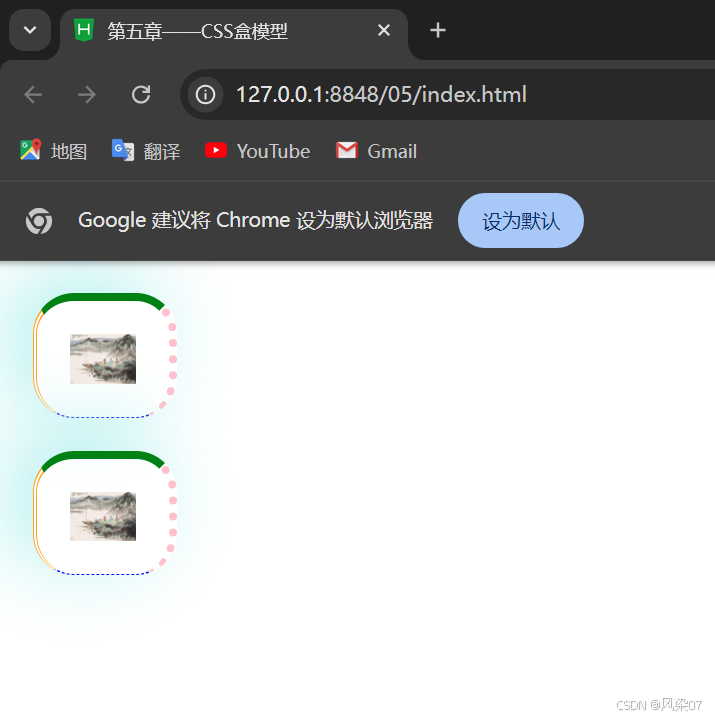
上面知识点总结
<!DOCTYPE html>
<html>
	<head>
		<meta charset="utf-8" />
		<title>第五章——CSS盒模型</title>
		<style>
			*{
				margin: 0px;
				padding: 0px;
			}
			div{
				width: 40px;	/*设置盒子宽*/
				height: 30px;	/*设置盒子高*/
				border: 5px solid red;	/*设置边框*/
				margin: 20px;	/*设置外边距*/
				padding: 20px;	/*设置内边距*/
				border-top: 5px solid green;	/*设置上边框、边框样式和边框宽度*/
				border-bottom: thin dashed blue;	/*设置下边框、边框样式和边框宽度*/
				border-left: medium double orange;	/*设置左边框、边框样式和边框宽度*/
				border-right: thick dotted pink;	/*设置右边框、边框样式和边框宽度*/
				border-radius: 25px;	/*设置圆角边框*/
				box-shadow: -15px -10px 50px paleturquoise;	/*设置边框阴影,其中阴影向左偏移15像素,向上偏移20像素,模糊距离为50像素,颜色 (如果是正数表示相反的方向)*/
			}
			img{
				width: 40px;
				height: 30px;
			}
		</style>
	</head>
	<body>
		<div><img src="img/01111.jpg" /></div>
		<div><img src="img/01111.jpg" /></div>
	</body>
</html>
5.4 CSS元素的定位
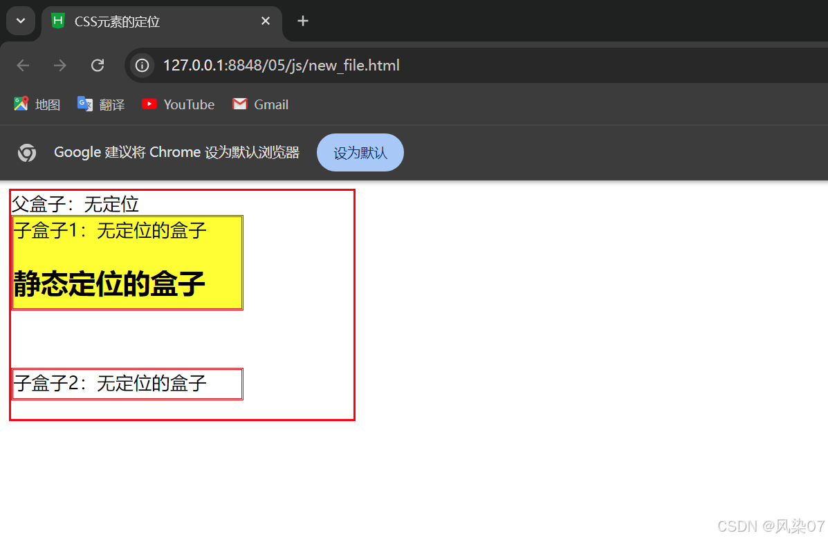
5.4.1 static 定位
static是HTML元素的默认值,不受top、right、bottom和left属性影响,元素出现在正常的文档流中。
<!DOCTYPE html>
<html>
	<head>
		<meta charset="utf-8">
		<title>CSS元素的定位</title>
		<style type="text/css">
			.father{
				border: 2px solid red;
				width: 300px;
				height: 200px;
			}
			.son1{
				border: 2px double red;
				background-color: yellow;
				width: 200px;
				height: 80px;
			}
			.son2{
				border: 2px double red;
				width: 200px;
				height: 25px;
				margin-top: 50px;
			}
		</style>
	</head>
	<body>
		<div class="father">父盒子:无定位
		<div class="son1">子盒子1:无定位的盒子
			<h2>静态定位的盒子</h2>
		</div>
		<div class="son2">子盒子2:无定位的盒子
		</div>
		</div>
	</body>
</html>
5.4.2 relative定位
relative 不脱离文档流的布局,需要参照父元素的四条边(不是浏览器),设置自身的top、night、bottom 和 let 属性的参数,从盒子中独立出来浮在上面。相对定位只改变自身的位置,在文档流原先的位置留出空白区域。定位的起始位置为此元素原先在文档流的位置。
<!DOCTYPE html>
<html>
	<head>
		<meta charset="utf-8">
		<title>CSS元素的定位</title>
		<style type="text/css">
			.father{
				border: 2px solid red;
				width: 300px;
				height: 200px;
			}
			.son1{
				border: 2px double red;
				background-color: yellow;
				width: 200px;
				height: 80px;
				position: relative;		/*绝对定位*/
				top: 10px;
				left: 30px;
			}
			.son2{
				border: 2px double red;
				width: 200px;
				height: 25px;
				margin-top: 50px;
			}
		</style>
	</head>
	<body>
		<div class="father">父盒子:无定位
		<div class="son1">子盒子1:无定位的盒子
			<h2>静态定位的盒子</h2>
		</div>
		<div class="son2">子盒子2:无定位的盒子
		</div>
		</div>
	</body>
</html>
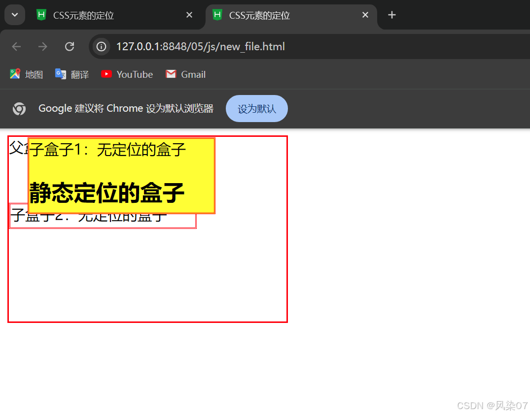
5.4.3 absolute定位
absolute 脱离原来文档流的布局,浮在其他盒子上面,独立出来。子盒子原来位置的空间由后面的盒子填充。绝对定位的起始位置为最近已定位的父盒子,如果父盒子没有定位:那么子盒子的起始位置为浏览器,并随着滚动条的移动而改变位置。
5.4.3.1 相对浏览器绝对定位
<!DOCTYPE html>
<html>
	<head>
		<meta charset="utf-8">
		<title>CSS元素的定位</title>
		<style type="text/css">
			.father{
				border: 2px solid red;
				width: 300px;
				height: 200px;
			}
			.son1{
				border: 2px double red;
				background-color: yellow;
				width: 200px;
				height: 80px;
				position: absolute;		/*相对浏览器绝对定位*/
				top: 10px;
				left: 30px;
			}
			.son2{
				border: 2px double red;
				width: 200px;
				height: 25px;
				margin-top: 50px;
			}
		</style>
	</head>
	<body>
		<div class="father">父盒子:无定位
		<div class="son1">子盒子1:无定位的盒子
			<h2>静态定位的盒子</h2>
		</div>
		<div class="son2">子盒子2:无定位的盒子
		</div>
		</div>
	</body>
</html>
5.4.3.2 相对父盒子绝对定位
<!DOCTYPE html>
<html>
<head>
<meta charset="utf-8">
<title>CSS元素的定位</title>
<style type="text/css">
.father{
border: 2px solid red;
width: 300px;
height: 200px;
position: relative;
}
.son1{
border: 2px double red;
background-color: yellow;
width: 200px;
height: 80px;
position: absolute;
top: 10px;
left: 30px;
}
.son2{
border: 2px double red;
width: 200px;
height: 25px;
margin-top: 50px;
}
</style>
</head>
<body>
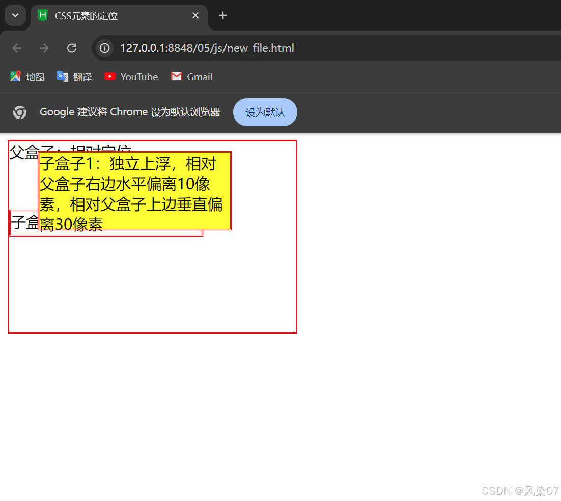
<div class="father">父盒子:相对定位
<div class="son1">子盒子1:独立上浮,相对父盒子右边水平偏离10像素,相对父盒子上边垂直偏离30像素
</div>
<div class="son2">子盒子2:无定位的盒子
</div>
</div>
</body>
</html>
5.4.4 fixed定位
hxed 类似于 absolute,但在固定定位中,盒子的位置不随着滚动条的移动而改变位置。
相对于浏览器窗口是固定不变的。
<!DOCTYPE html>
<html>
<head>
<meta charset="utf-8">
<title>CSS元素的定位</title>
<style type="text/css">
.father{
border: 2px solid red;
width: 300px;
height: 200px;
/* position: relative; */
}
.son1{
border: 2px double red;
background-color: yellow;
width: 200px;
height: 80px;
position: fixed;
top: 10px;
right: 30px;
}
.son2{
border: 2px double red;
width: 200px;
height: 25px;
margin-top: 50px;
}
</style>
</head>
<body>
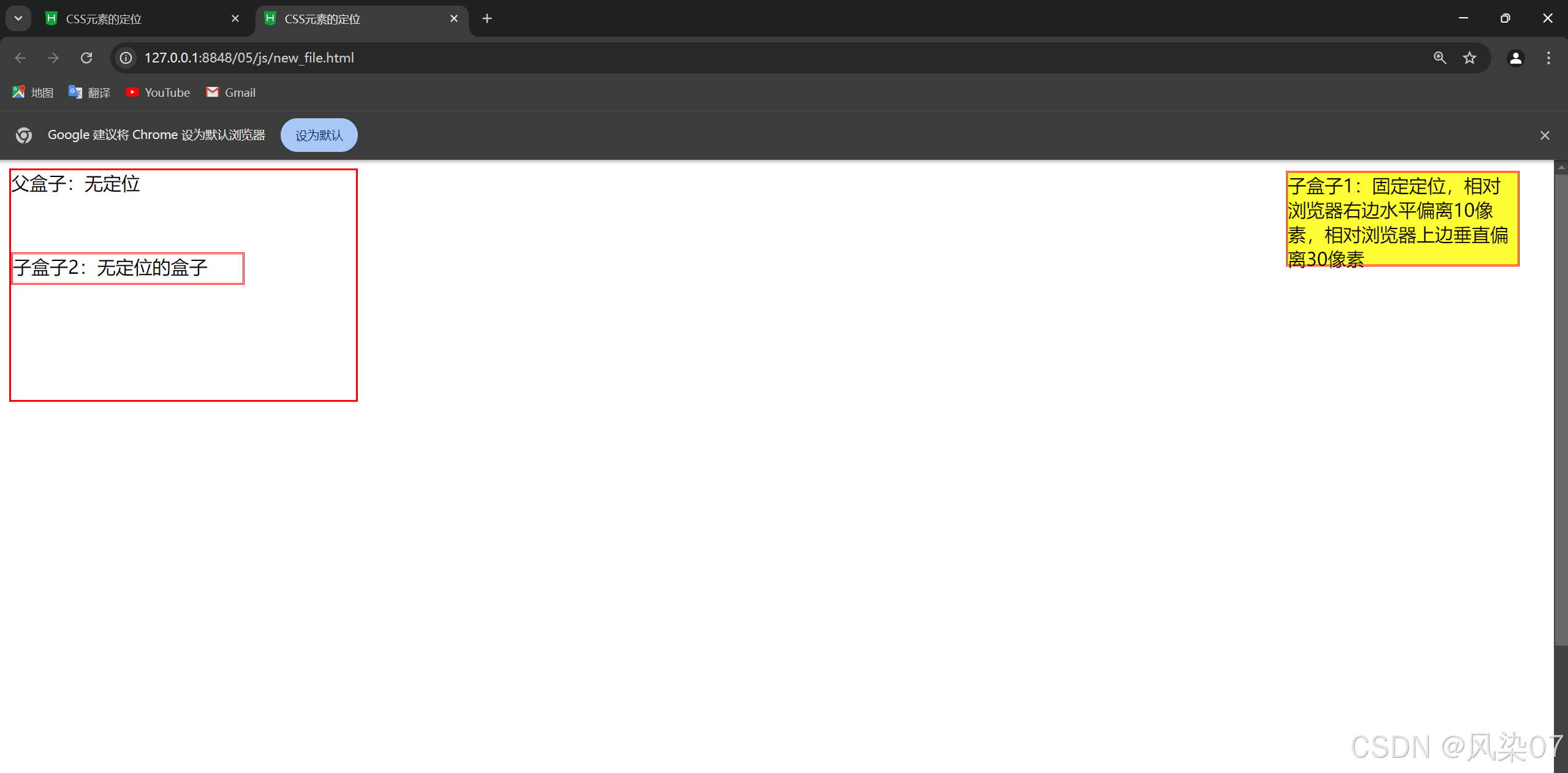
<div class="father">父盒子:无定位
<div class="son1">子盒子1:固定定位,相对浏览器右边水平偏离10像素,相对浏览器上边垂直偏离30像素
</div>
<div class="son2">子盒子2:无定位的盒子
</div>
</div>
<br><br><br><br><br><br><br><br><br><br><br><br><br><br><br><br><br><br><br><br>
<br><br><br><br><br><br><br><br><br><br><br><br><br><br><br><br><br><br><br><br>
</body>
</html>
5.5 CSS元素的浮动
5.5.1 盒子的浮动添加
- float 属性: 用于控制元素的浮动方向。可以取值:
left: 元素向左浮动,允许文本和内联元素在其右侧环绕。right: 元素向右浮动,允许文本和内联元素在其左侧环绕。none: 默认值,元素不浮动。inherit: 继承父元素的 float 属性。
<!DOCTYPE html>
<html>
<head>
<meta charset="utf-8">
<title>CSS元素的浮动</title>
<style type="text/css">
.father{
border: 2px solid red;
background-color: #ffCCff;
padding: 5px;
}
.father div{
border: 2px dashed blue;
background-color: #CCFFFF;
width: 100px;
height: 20px;
margin: 10px;
padding: 10px;
}
.father p{
border: 2px dotted green;
background-color: #FFFF99;
}
</style>
</head>
<body>
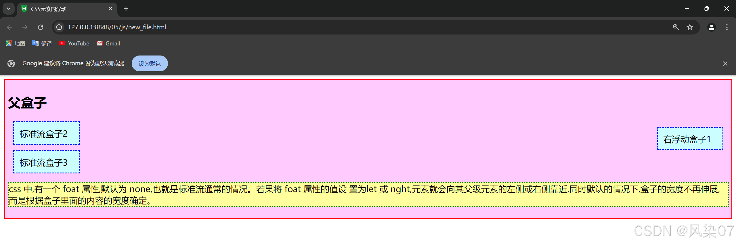
<div class="father">
<h2>父盒子</h2>
<div style="float: right;">右浮动盒子1</div>
<div>标准流盒子2</div>
<div>标准流盒子3</div>
<p>css 中,有一个 foat 属性,默认为 none,也就是标准流通常的情况。若果将 foat 属性的值设
置为let 或 nght,元素就会向其父级元素的左侧或右侧靠近,同时默认的情况下,盒子的宽度不再伸展,
而是根据盒子里面的内容的宽度确定。</p>
</div>
</body>
</html>
5.5.2 盒子的浮动清除
浮动会导致父元素的高度塌陷,因为浮动的元素不占据空间。为了解决这个问题,可以使用以下几种方式清除浮动:
5.5.2.1 使用 overflow 属性
设置父容器的 overflow 属性为 auto 或 hidden:
css
.container { overflow: auto; /* 或者 overflow: hidden; */ }
5.5.2.2 使用 clear 方法
语法: clear:left | right | both | none
参数:left清除左边浮动,right清除右边浮动,both清除左右边浮动。
1.没有清除浮动
<!DOCTYPE html>
<html>
<head>
<meta charset="utf-8">
<title>CSS元素的浮动</title>
<style type="text/css">
.father{
border: 2px solid red;
background-color: #ffCCff;
padding: 5px;
}
.father div{
border: 2px dashed blue;
background-color: #CCFFFF;
width: 100px;
height: 20px;
margin: 10px;
padding: 10px;
}
.father p{
border: 2px dotted green;
background-color: #FFFF99;
}
</style>
</head>
<body>
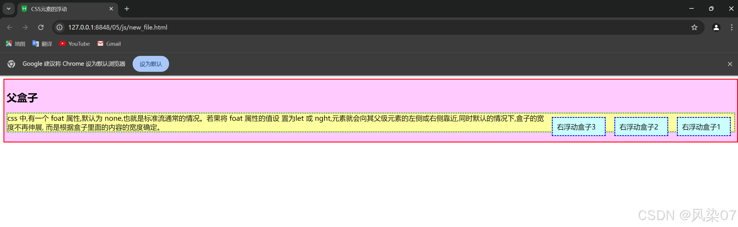
<div class="father">
<h2>父盒子</h2>
<div style="float: right;">右浮动盒子1</div>
<div style="float: right;">右浮动盒子2</div>
<div style="float: right;">右浮动盒子3</div>
<p>css 中,有一个 foat 属性,默认为 none,也就是标准流通常的情况。若果将 foat 属性的值设
置为let 或 nght,元素就会向其父级元素的左侧或右侧靠近,同时默认的情况下,盒子的宽度不再伸展,
而是根据盒子里面的内容的宽度确定。</p>
</div>
</body>
</html>
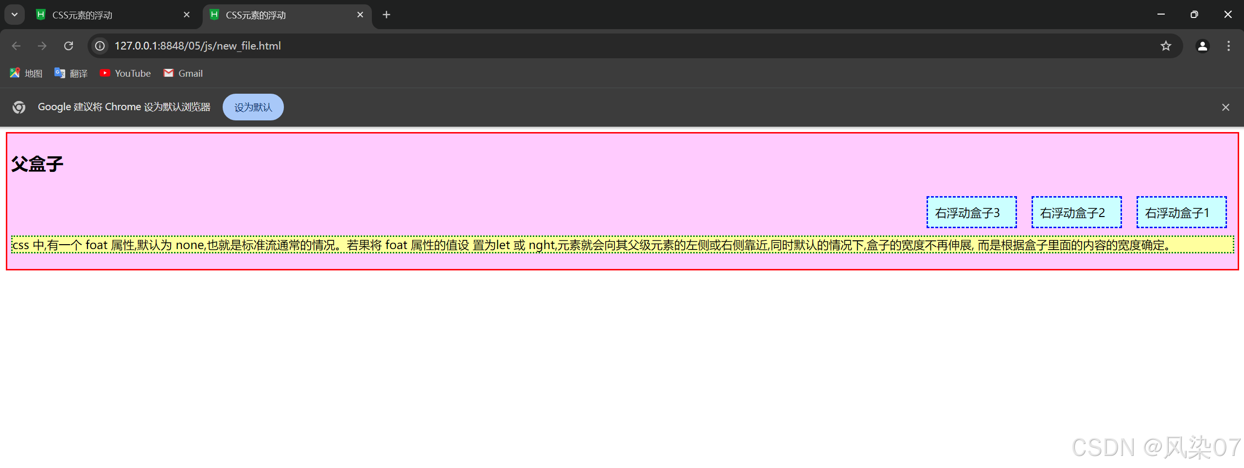
2.清除了浮动
<!DOCTYPE html>
<html>
	<head>
		<meta charset="utf-8">
		<title>CSS元素的浮动</title>
		<style type="text/css">
			.father{
				border: 2px solid red;
				background-color: #ffCCff;
				padding: 5px;
			}
			.father div{
				border: 2px dashed blue;
				background-color: #CCFFFF;
				width: 100px;
				height: 20px;
				margin: 10px;
				padding: 10px;

			}
			.father p{
				border: 2px dotted green;
				background-color: #FFFF99;
			}
		</style>
	</head>
	<body>
		<div class="father">
		<h2>父盒子</h2>
		<div style="float: right;">右浮动盒子1</div>
		<div style="float: right;">右浮动盒子2</div>
		<div style="float: right;">右浮动盒子3</div>
		<p style="clear: both;">css 中,有一个 foat 属性,默认为 none,也就是标准流通常的情况。若果将 foat 属性的值设
		置为let 或 nght,元素就会向其父级元素的左侧或右侧靠近,同时默认的情况下,盒子的宽度不再伸展,
		而是根据盒子里面的内容的宽度确定。</p>
		</div>
	</body>
</html>
5.5.3 浮动的局限性
- 布局复杂性: 使用浮动会增加布局的复杂性,尤其是在复杂的布局中,可能会导致不可预期的问题。
- 高度塌陷: 浮动元素可能导致父元素高度塌陷,需要清除浮动。
- 响应式设计: 在响应式设计中,浮动可能会变得不那么灵活,使用 Flexbox 或 Grid 布局通常会更容易处理。
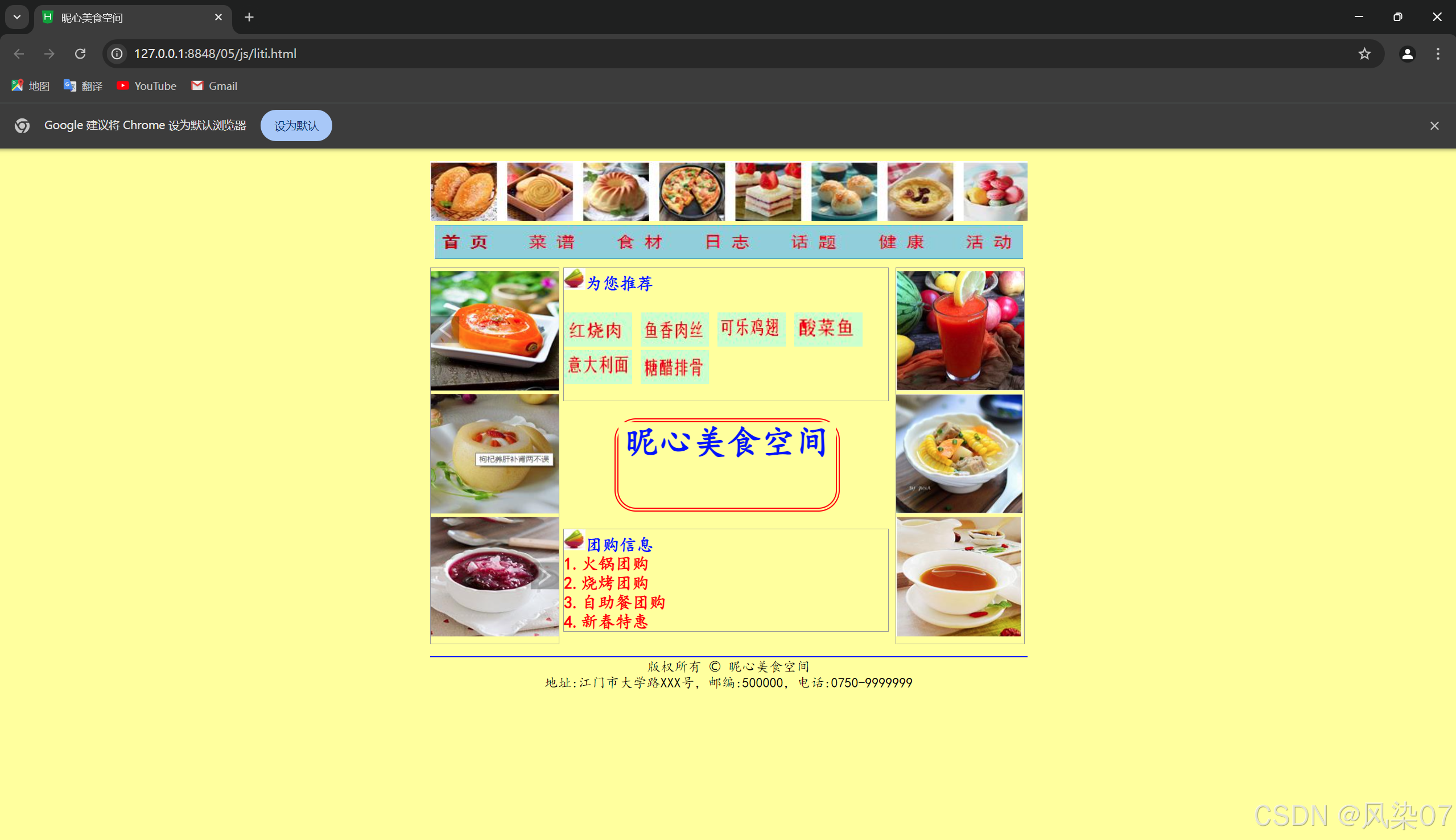
5.6 综合案例——昵心美食空间
<!DOCTYPE html>
<html lang="zh">
<head>
<meta charset="utf-8">
<title>昵心美食空间</title>
<style type="text/css">
* {
background-color: #ffff99;
margin: 0;
padding: 0;
}
a {
color: red;
}
.all {
width: 700px;
height: 650px;
margin: 10px auto;
padding: 5px;
background-image: url(img/bg1.JPG);
}
.banner {
width: 700px;
height: 70px;
}
.menu {
width: 690px;
height: 40px;
padding: 5px;
}
.main {
width: 700px;
height: 450px;
margin: 5px 0;
position: relative;
}
.left, .right {
width: 150px;
height: 440px;
border: 1px solid #999;
float: left;
}
.middle {
width: 384px;
height: 450px;
margin: 0 5px;
float: left;
font-size: 20px;
font-family: "楷体";
font-weight: 700;
color: #0000ff;
}
.one {
width: 380px;
height: 155px;
border: 1px solid #999;
}
.two {
width: 255px;
height: 100px;
border: 5px double red;
margin-top: 20px;
margin-bottom: 20px;
border-radius: 25px;
}
.three{
width: 380px;
height: 155px;
border: 1px solid #999;
}
.bottom {
width: 700px;
height: 70px;
}
</style>
</head>
<body>
<div class="all">
<div class="banner">
<img src="../img/banner.jpg" width="700" height="70" />
</div>
<div class="menu">
<img src="../img/menu.jpg" width="690" height="40" />
</div>
<div class="main">
<div class="left">
<marquee direction="up">
<img src="../img/mm_1.jpg" width="150" height="140" />
<img src="../img/mm_2.jpg" width="150" height="140" />
<img src="../img/mm_3.jpg" width="150" height="140" " />
</marquee>
</div>
<div class="middle">
<div class="one">
<img src="../img/font.jpg" width="25" height="25" />为您推荐
<br><br>
<img src="../img/x_1.jpg" width="80" height="40" />
<img src="../img/x_2.jpg" width="80" height="40" />
<img src="../img/x_3.jpg" width="80" height="40" />
<img src="../img/x_4.jpg" width="80" height="40" />
<img src="../img/x_5.jpg" width="80" height="40" />
<img src="../img/x_6.jpg" width="80" height="40" />
</div>
<div class="two">
<h1>昵心美食空间</h1>
</div>
<div class="three">
<img src="../img/font.jpg" width="25" height="25" />团购信息
<br>
<a href="#">1.火锅团购</a><br>
<a href="#">2.烧烤团购</a><br>
<a href="#">3.自助餐团购</a><br>
<a href="#">4.新春特惠</a><br>
</div>
</div>
<div class="right">
<marquee direction="up">
<img src="../img/good_1.jpg" width="150" height="140" />
<img src="../img/good_2.jpg" width="148" height="140" />
<img src="../img/good_3.jpg" width="148" height="140" />
</marquee>
</div>
</div>
<div class="bottom">
<hr color="#0000FF">
<center style="font-family:'楷体';">版权所有 © 昵心美食空间<br />
地址:江门市大学路XXX号,邮编:500000,电话:0750-9999999</center>
</div>
</div>
</body>
</html>


 扫一扫
扫一扫


 1644
1644

 被折叠的 条评论
为什么被折叠?
被折叠的 条评论
为什么被折叠?
 到【灌水乐园】发言


