


本文介绍基于Python3.9.7的Pyecharts制作柱状图/条形图/瀑布图 (bar)时使用的一般参数设置和demo,可根据实际情况对案例中的内容进行调整,获得自己想要的图形样式。
使用Pyecharts进行数据可视化时可提供直观、交互丰富、可高度个性化定制的数据可视化图表。案例中的代码内容基于Pyecharts 1.9.1 版本。集成开发环境为Anaconda中自带的jupter-notebook6.4.5,为达到同样效果,建议在使用pyecharts时安装1.9.1版本。
pip install pyecharts==1.9.1一.标准柱状图
1.运行结果
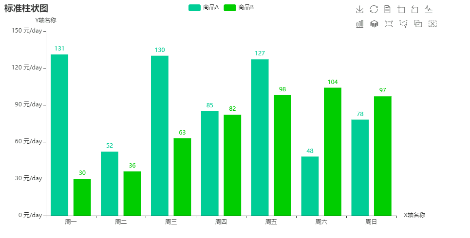
2.demo代码
from pyecharts.charts import Bar
from pyecharts.faker import Faker
from pyecharts.globals import ThemeType

c = (
    Bar()
    .add_xaxis(Faker.choose())
    .add_yaxis("商品A", Faker.values(),itemstyle_opts=opts.ItemStyleOpts(color="#00CD96"))#自定义颜色
    .add_yaxis("商品B", Faker.values(),itemstyle_opts=opts.ItemStyleOpts(color="#00CD00"))
    .set_global_opts(
        title_opts={"text": "标准柱状图"},
        brush_opts=opts.BrushOpts(), # 设置操作图表的画笔功能
        toolbox_opts=opts.ToolboxOpts(), # 设置操作图表的工具箱功能
        yaxis_opts=opts.AxisOpts(axislabel_opts=opts.LabelOpts(formatter="{value} 元/day"),name="Y轴名称"), # 设置Y轴名称、定制化刻度单位
        xaxis_opts=opts.AxisOpts(name="X轴名称"), # 设置X轴名称

    )
#     .render("标准柱状图.html")
)
c.render_notebook()
二、堆积柱形图
1.运行效果图

2.demo代码
from pyecharts import options as opts
from pyecharts.charts import Bar
from pyecharts.commons.utils import JsCode
from pyecharts.globals import ThemeType

list1 = [
    {"value": 17, "percent": 1},
    {"value": 29, "percent": 1},
    {"value": 21, "percent": 1},
    {"value": 33, "percent": 1},
    {"value": 19, "percent": 1},
]

list2 = [
    {"value": 12, "percent": 12 / (12 + 3)},
    {"value": 23, "percent": 23 / (23 + 21)},
    {"value": 33, "percent": 33 / (33 + 5)},
    {"value": 3, "percent": 3 / (3 + 52)},
    {"value": 33, "percent": 33 / (33 + 43)},
]

list3 = [
    {"value": 3, "percent": 3 / (12 + 3)},
    {"value": 21, "percent": 21 / (23 + 21)},
    {"value": 5, "percent": 5 / (33 + 5)},
    {"value": 52, "percent": 52 / (3 + 52)},
    {"value": 43, "percent": 43 / (33 + 43)},
]

chart = (
    Bar(
        init_opts=opts.InitOpts(
            theme=ThemeType.LIGHT, # 设置主题类别
            animation_opts=opts.AnimationOpts(animation_delay=2000, animation_easing="elasticOut") # 设置显示延迟
        )
    )
        .add_xaxis(["Type A", "Type B", "Type C", "Type D", "Type E"])  # 添加X轴坐标
        .add_yaxis("Lab A", list1, stack="stack0", gap="0%",itemstyle_opts=opts.ItemStyleOpts(color="#00CD96"))  # 添加Y轴坐标,设置间距
        .add_yaxis("Lab B", list2, stack="stack1", category_gap="50%",itemstyle_opts=opts.ItemStyleOpts(color="#00CD00"))  # 添加Y轴坐标
        .add_yaxis("Lab C", list3, stack="stack1", category_gap="50%",itemstyle_opts=opts.ItemStyleOpts(color="#99CD00"))  # 添加Y轴坐标
        .set_series_opts(
        label_opts=opts.LabelOpts(
            position="inside",
            formatter=JsCode("function(x){return Number(x.data.percent * 100).toFixed() + '%';}"), # 设置标签显示格式化数据
        )

    )
        .set_global_opts(
        xaxis_opts=opts.AxisOpts(
            axislabel_opts=opts.LabelOpts(rotate=-15)  # 设置X轴字体旋转
        ),
        toolbox_opts=opts.ToolboxOpts(), # 设置操作图表的工具箱功能
        title_opts=opts.TitleOpts(
            title="分类聚合堆积柱状图",
        ),
    )
    #     .render("分类聚合堆积柱状图.html")
)
chart.render_notebook()三、在柱状图中设置标记
1.运行效果图

2.demo代码
from pyecharts import options as opts
from pyecharts.charts import Bar
from pyecharts.faker import Faker

c = (
    Bar()
    .add_xaxis(Faker.choose())
    .add_yaxis("商品A", Faker.values(),itemstyle_opts=opts.ItemStyleOpts(color="#00CD96"))
    .add_yaxis("商品B", Faker.values(), is_selected=False,itemstyle_opts=opts.ItemStyleOpts(color="#00CD00"))#默认商品B为未选中状态
    .set_global_opts(title_opts=opts.TitleOpts(title="柱状图中设置标记"))
    .set_series_opts(
        label_opts=opts.LabelOpts(is_show=False),
        markpoint_opts=opts.MarkPointOpts(
            data=[
                opts.MarkPointItem(type_="max", name="max"),
                opts.MarkPointItem(type_="min", name="min"),
                opts.MarkPointItem(type_="average", name="avg"),
                opts.MarkPointItem(name="自定义标记点", coord=[x[2], y[2]], value=y[2]) # 自定义标记点
            ]
        ),
        markline_opts=opts.MarkLineOpts(
            data=[
                opts.MarkLineItem(type_="min", name="min"),
                opts.MarkLineItem(type_="max", name="max"),
                opts.MarkLineItem(type_="average", name="avg"),
                opts.MarkLineItem(y=99, name="自定义标记线")  # 自定义标记线
            ]
        ),
    )
#     .render("柱状图中设置标记.html")
)
c.render_notebook()
四、在柱状图中设置滑动状态
1.运行效果
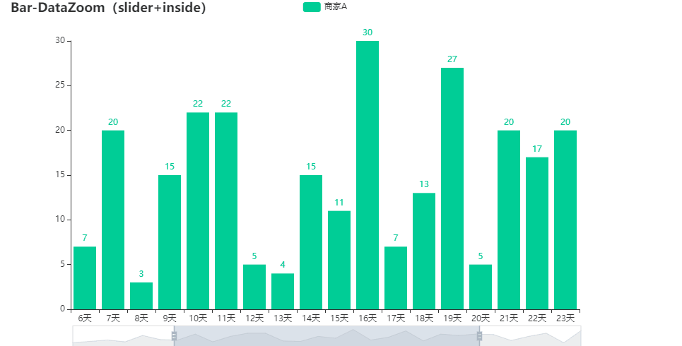
2.demo代码
from pyecharts import options as opts
from pyecharts.charts import Bar
from pyecharts.faker import Faker

c = (
    Bar()
    .add_xaxis(Faker.days_attrs)
    .add_yaxis("商家A", Faker.days_values, color="#00CD96")
    .set_global_opts(
        title_opts=opts.TitleOpts(title="Bar-DataZoom(slider+inside)"),
        #设置操作图表缩放功能,orient="vertical" 为Y轴 滑动
        datazoom_opts=[opts.DataZoomOpts(), opts.DataZoomOpts(type_="inside")],
    )
    #.render("bar_datazoom_both.html")
)
c.render_notebook()
五、自定义背景图片/设置渐变色/设置圆角
1.运行效果图

2.demo代码
from pyecharts import options as opts
from pyecharts.charts import Bar
from pyecharts.commons.utils import JsCode
from pyecharts.faker import Faker

c = (
    Bar(
        init_opts=opts.InitOpts(
            bg_color={"type": "pattern", "image": JsCode("img"), "repeat": "no-repeat"}
        )
    )

    .add_xaxis(Faker.choose())
    .add_yaxis("商品A", Faker.values())
    .add_yaxis("商品B", Faker.values())
    .set_global_opts(
        title_opts=opts.TitleOpts(
            title="柱状图设置自定义背景图片",
            subtitle="这里是副标题",
            title_textstyle_opts=opts.TextStyleOpts(color="white"),
        )
        #x轴设置
        ,xaxis_opts=opts.AxisOpts(name=''
                                     ,name_location='right' #坐标轴名字所在的位置
                                     ,name_gap=25#坐标轴名字与坐标轴之间的距离
                                     ,name_rotate=0 #坐标轴名字旋转角度
                                     ,offset=5 #坐标轴X的值距离X轴的距离
                                     ,name_textstyle_opts=opts.TextStyleOpts(color='white'
                                                                             ,font_style='italic'## 可选:'normal','italic','oblique'
                                                                             ,font_weight='bolder'    #粗细 'normal','bold','bolder','lighter'
                                                                             ,font_family= 'monospace'# 还可以是 'serif' , 'monospace', 'Arial', 'Courier New', 'Microsoft YaHei', ...
                                                                             ,font_size=14
                                                                             ,background_color='grey'#文字背景颜色
                                                                             ,border_color='black' #文字块边框颜色
                                                                             )##X轴名称的格式配置
                                     ,axistick_opts=opts.AxisTickOpts(is_inside=True #刻度线是否在内侧
                                                                      ) #坐标轴刻度配置项
                                     ,axisline_opts=opts.AxisLineOpts(linestyle_opts=opts.LineStyleOpts(width=3 ##设置宽度
                                                                                                           ,opacity=0 #设置透明度
                                                                                                           ,type_='dashed'  # 'solid', 'dashed', 'dotted'
                                                                                                           ,color='white') #坐标轴上的文字颜色
                                                                      )#坐标轴线的配置项
                                     ,axislabel_opts=opts.LabelOpts(font_size=13#字的大小
                                                                    ,rotate=0 #字旋转的角度
                                             )##坐标轴标签的格式配置
                                     )
        #y轴设置
        ,yaxis_opts=opts.AxisOpts(axisline_opts=opts.AxisLineOpts(linestyle_opts=opts.LineStyleOpts(width=3 ##设置宽度
                                                                                                          # ,opacity=0 #设置透明度
                                                                                                           ,type_='dashed'  # 'solid', 'dashed', 'dotted'
                                                                                                           ,color='white'   )
                                                                      )###坐标轴线的配置项
                                    # ,splitarea_opts  ##分割区域配置项
                                     )

    )
     .set_series_opts( # 自定义图表样式
        itemstyle_opts={
            "normal": {
                "color": JsCode(
                    """new echarts.graphic.LinearGradient(0, 0, 0, 1, [{offset: 0,color: 'rgba(0, 244, 255, 1)'}, {offset: 1,color: 'rgba(0, 77, 167, 1)'}], false)"""
                ),
                "barBorderRadius": [30, 30, 0, 0],"shadowColor": "rgb(0, 160, 221)",
            }
        }
    )
)
c.add_js_funcs(
    """
    var img = new Image(); img.src = '20220308143136.png';
    """
)
# c.render("柱状图设置自定义背景图片.html")
c.render_notebook()六、瀑布柱状图
1.运行效果图

2.demo代码
from pyecharts.charts import Bar
from pyecharts import options as opts

x_data = [f"Feb. {str(i)} " for i in range(1, 12)]
y_total = [0, 900, 1245, 1530, 1376, 1376, 1511, 1689, 1856, 1495, 1292]
y_in = [900, 345, 393, "-", "-", 135, 178, 286, "-", "-", "-"]
y_out = ["-", "-", "-", 108, 154, "-", "-", "-", 119, 361, 203]


bar = (
    Bar()
    .add_xaxis(xaxis_data=x_data)
    .add_yaxis(
        series_name="",
        y_axis=y_total,
        stack="Total",
        itemstyle_opts=opts.ItemStyleOpts(color="rgba(0,0,0,0)"),
    )
    .add_yaxis(series_name="收入", y_axis=y_in, stack="Total",color="red")
    .add_yaxis(series_name="支出", y_axis=y_out, stack="Total",color="#00CD96")
    .set_global_opts(yaxis_opts=opts.AxisOpts(type_="value"))
#     .render("瀑布柱状图.html")
)
bar.render_notebook()
七、条形图-坐标轴反转
1.运行效果图

2.demo代码
from pyecharts import options as opts
from pyecharts.charts import Bar
from pyecharts.faker import Faker

c = (
    Bar()
    .add_xaxis(Faker.choose())
    .add_yaxis("商家A", Faker.values(),color="#00CD96")
    .add_yaxis("商家B", Faker.values(),color="#00CD00")
    .reversal_axis()
    .set_series_opts(label_opts=opts.LabelOpts(position="right"))
    .set_global_opts(title_opts=opts.TitleOpts(title="Bar-翻转 XY 轴"))
    #.render("bar_reversal_axis.html")
)
c.render_notebook()
八、直方图
1.运行效果图

2.demo代码
from pyecharts import options as opts
from pyecharts.charts import Bar
from pyecharts.faker import Faker


x = Faker.dogs + Faker.animal
xlen = len(x)
y = []
for idx, item in enumerate(x):
    if idx <= xlen / 2:
        y.append(
            opts.BarItem(
                name=item,
                value=(idx + 1) * 10,
                itemstyle_opts=opts.ItemStyleOpts(color="#00CD96"),
            )
        )
    else:
        y.append(
            opts.BarItem(
                name=item,
                value=(xlen + 1 - idx) * 10,
                itemstyle_opts=opts.ItemStyleOpts(color="#00CD00"),
            )
        )

c = (
    Bar()
    .add_xaxis(x)
    .add_yaxis("series0", y, category_gap=0, color=Faker.rand_color())
    .set_global_opts(title_opts=opts.TitleOpts(title="Bar-直方图(颜色区分)"))
    #.render("bar_histogram_color.html")
)
c.render_notebook()
九、颜色自定义
1.运行效果图

2.demo代码
from pyecharts import options as opts
from pyecharts.charts import Bar
from pyecharts.commons.utils import JsCode
from pyecharts.faker import Faker


color_function = """
        function (params) {
            if (params.value > 0 && params.value < 50) {
                return 'red';
            } else if (params.value > 50 && params.value < 100) {
                return 'blue';
            }
            return 'green';
        }
        """
c = (
    Bar()
    .add_xaxis(Faker.choose())
    .add_yaxis(
        "商家A",
        Faker.values(),
        itemstyle_opts=opts.ItemStyleOpts(color=JsCode(color_function)),
    )
    .add_yaxis(
        "商家B",
        Faker.values(),
        itemstyle_opts=opts.ItemStyleOpts(color=JsCode(color_function)),
    )
    .add_yaxis(
        "商家C",
        Faker.values(),
        itemstyle_opts=opts.ItemStyleOpts(color=JsCode(color_function)),
    )
    .set_global_opts(title_opts=opts.TitleOpts(title="Bar-自定义柱状颜色"))
    #.render("bar_custom_bar_color.html")
)
c.render_notebook()


 4万+
4万+

 被折叠的 条评论
为什么被折叠?
被折叠的 条评论
为什么被折叠?
 到【灌水乐园】发言


