


第 11章——时间序列分析和预测
【例11-1】 绘制时间序列折线图—观察成分
【代码框11-1】——绘制时间序列折线图
# 图11-2的绘制代码
import pandas as pd
import matplotlib.pyplot as plt
plt.rcParams['font.sans-serif']=['SimHei']
df = pd.read_csv('./pydata/example/chap11/example11_1.csv')

# 绘制折线图
plt.subplots(2, 2, figsize=(8.5, 6.5))
plt.subplot(221)
df['净利润'].plot(kind='line',linewidth=1,marker='o',\
               markersize=4,xlabel='年份',ylabel='净利润')
plt.xticks(range(0, 18, 2), df['年份'][::2])
plt.title('(a) 净利润序列')

plt.subplot(222)
df['产量'].plot(kind='line',linewidth=1,marker='o',\
              markersize=4,xlabel='年份',ylabel='产量')
plt.xticks(range(0, 18, 2), df['年份'][::2])
plt.title('(b) 产量序列')

plt.subplot(223)
df['管理成本'].plot(kind='line',linewidth=1,marker='o',\
                markersize=4,xlabel='年份',ylabel='管理成本')
plt.xticks(range(0, 18, 2), df['年份'][::2])
plt.title('(c) 管理成本序列')

plt.subplot(224)
df['销售价格'].plot(kind='line',linewidth=1,marker='o',\
                markersize=4,xlabel='年份',ylabel='销售价格')
plt.xticks(range(0, 18, 2), df['年份'][::2])
plt.title('(d) 销售价格序列')

plt.tight_layout()   # 紧凑布局
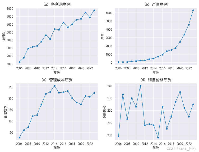
df.head()#;df.tail()
| 年份 | 净利润 | 产量 | 管理成本 | 销售价格 | |
|---|---|---|---|---|---|
| 0 | 2006 | 1200.6 | 46 | 28.0 | 199 |
| 1 | 2007 | 1750.7 | 56 | 60.3 | 233 |
| 2 | 2008 | 2938.1 | 63 | 73.5 | 213 |
| 3 | 2009 | 3126.0 | 129 | 121.3 | 230 |
| 4 | 2010 | 3250.3 | 173 | 126.9 | 223 |
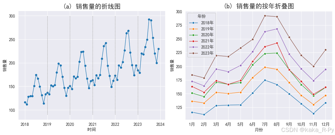
【例11-2】 绘制时间序列折线图
【代码框11-2】——绘制时间序列折线图
# 图11-3的绘制代码
import pandas as pd
import matplotlib.pyplot as plt
import seaborn as sns

plt.rcParams['font.sans-serif'] = ['SimHei']  # 用来正常显示中文标签
plt.rcParams['axes.unicode_minus'] = False  # 用来正常显示负号

# 加载数据
example11_2 = pd.read_csv('./pydata/example/chap11/example11_2.csv')

# 融合数据
df = pd.melt(example11_2, id_vars=['月份'], var_name='年份', value_name='销售量')
df['日期'] = df['年份'] + "-" + df['月份']  # 添加带有年份和月份的日期列
df['日期'] = pd.to_datetime(df['日期'].map(lambda x: x.replace("年", '').replace("月", '')))  # 创建时间序列
df.index = df['日期']  # 将日期设置为索引

plt.subplots(1, 2, figsize=(11, 4.5))

# (a)销售量的折线图
plt.subplot(121)
plt.plot(df['销售量'], marker='o', linewidth=1, markersize=4)
plt.xlabel('时间')
plt.ylabel('销售量')
plt.title("(a) 销售量的折线图", size=15)
for i in range(2019, 2024):
    plt.vlines(pd.to_datetime(str(i) + "-01-01"), 90, 300, linestyles='--', linewidth=0.6, color='grey')

# (b)销售量的按年折叠图
plt.subplot(122)
sns.lineplot(x='月份', y='销售量', hue='年份', data=df, marker='o', markersize=5, linewidth=1)
plt.title("(b) 销售量的按年折叠图", size=15)

plt.tight_layout()  # 紧凑布局
plt.show()

# (c)销售量的按月箱形图
# plt.subplot(313)
# sns.boxplot(df['月份'],df['销售量'])
# plt.title("(c)按月箱线图")

plt.tight_layout()   # 紧凑布局
<Figure size 640x480 with 0 Axes>
【例11-3】 成分分解
【代码框11-3】——饮料销售量的成分分解
# 序列成分分解(使用代码框11-2创建的时间序列df)
import pandas as pd
import matplotlib.pyplot as plt
from statsmodels.tsa.seasonal import seasonal_decompose
plt.rcParams['font.sans-serif']=['SimHei']
example11_2 = pd.read_csv('./pydata/example/chap11/example11_2.csv')

df = pd.melt(example11_2,id_vars=['月份'],var_name='年份',value_name='销售量')# 融合数据
df['日期'] = df['年份']+"-"+df['月份']  # 添加带有年份和月份的日期列
df['日期'] = pd.to_datetime(df['日期'].map(lambda x : x.replace("年",'').replace("月",'')))
                                                             # 创建时间序列
df.index=df['日期']  # 将日期设置为索引

# 销售量的成分分解(采用乘法模型)
sale_compose = seasonal_decompose(df['销售量'],
                                  model='multiplicative',    # 采用乘法模型分解
                                  period=12,                 # 设置序列周期
                                  two_sided=True,            # 默认,使用中心化移动平均
                                  extrapolate_trend='freq')  # 输出趋势成分和随机成分
# 展示各成分的分解结果和观测值
df_sale=pd.concat([sale_compose.seasonal,          # 季节成分
                   sale_compose.trend,             # 趋势成分
                   sale_compose.resid,             # 随机成分
                   sale_compose.observed],axis=1)  # 观测值
round(df_sale,4)     # 展示结果的前5行和后5行
| seasonal | trend | resid | 销售量 | |
|---|---|---|---|---|
| 日期 | ||||
| 2018-01-01 | 0.8967 | 125.8756 | 1.0295 | 116.2 |
| 2018-02-01 | 0.8488 | 127.7587 | 1.0309 | 111.8 |
| 2018-03-01 | 0.9828 | 129.6418 | 1.0062 | 128.2 |
| 2018-04-01 | 0.9571 | 131.5249 | 1.0256 | 129.1 |
| 2018-05-01 | 0.9826 | 133.4080 | 0.9887 | 129.6 |
| ... | ... | ... | ... | ... |
| 2023-08-01 | 1.2541 | 232.6218 | 0.9961 | 290.6 |
| 2023-09-01 | 1.0645 | 234.7136 | 1.0134 | 253.2 |
| 2023-10-01 | 0.9207 | 236.8054 | 1.0086 | 219.9 |
| 2023-11-01 | 0.8049 | 238.8972 | 1.0401 | 200.0 |
| 2023-12-01 | 0.8983 | 240.9890 | 1.0629 | 230.1 |
72 rows × 4 columns
# 绘制成分分解图(图11-4)
#plt.rcParams.update({'figure.figsize':(6,10)})# 设置图形大小
#sale_compose.plot()  # 绘制成分分解图

fig = sale_compose.plot()  # 绘制成分分解图
fig.set_size_inches(6,8)  # 设置图形大小
plt.tight_layout()   # 紧凑布局
函数默认model=‘additive’,即采用加法模型进行分解
运行sale_compose.seasonal[0:12] 可得12个月的季节指数
sale_compose.seasonal[0:12].plot(marker=‘o’)# 绘制季节指数图
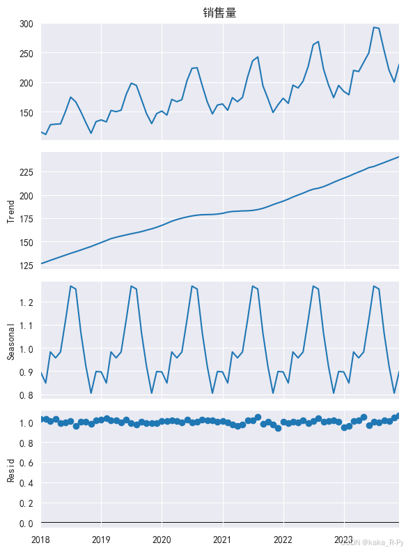
?sale_compose.plot
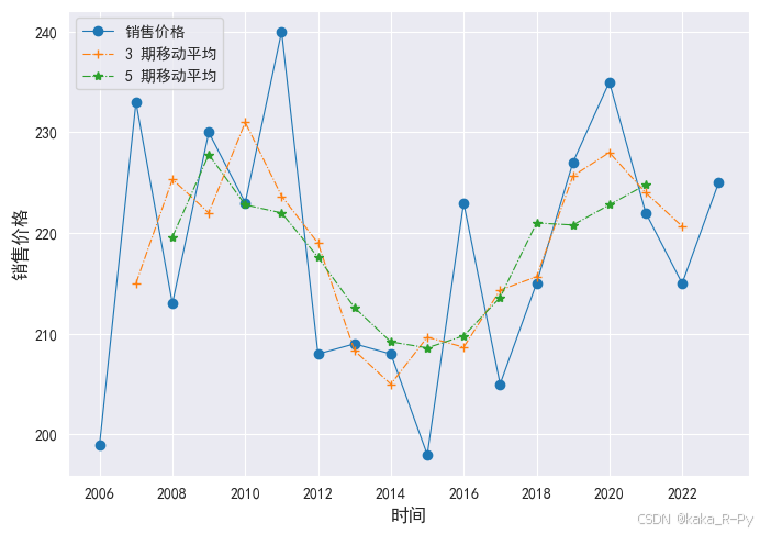
【例11-4】 移动平均平滑
【代码框11-4】——销售价格的移动平均平滑
import pandas as pd
df = pd.read_csv('./pydata/example/chap11/example11_1.csv')

# 移动平均法绘制时间序列图
ma3 = df['销售价格'].rolling(window=3, center=True).mean() # 3期移动平均
ma5 = df['销售价格'].rolling(window=5, center=True).mean() # 5期移动平均
df_ma = pd.DataFrame({"年份":df['年份'],"销售价格": df['销售价格'],
                      "3期移动平均": ma3, "5期移动平均": ma5})
round(df_ma,2).head()  # 显示前5行规
| 年份 | 销售价格 | 3期移动平均 | 5期移动平均 | |
|---|---|---|---|---|
| 0 | 2006 | 199 | NaN | NaN |
| 1 | 2007 | 233 | 215.00 | NaN |
| 2 | 2008 | 213 | 225.33 | 219.6 |
| 3 | 2009 | 230 | 222.00 | 227.8 |
| 4 | 2010 | 223 | 231.00 | 222.8 |
# 绘制实际值和平滑值的折线图(图11-5)
import matplotlib.pyplot as plt
plt.rcParams['font.sans-serif']=['SimHei']

plt.figure(figsize=(8,5.5))
l1,= plt.plot(df_ma['销售价格'],linestyle='-', marker='o',linewidth=0.8)
l2,= plt.plot(df_ma['3期移动平均'],linestyle='-.', marker='+',linewidth=0.8)
l3,= plt.plot(df_ma['5期移动平均'],linestyle='-.', marker='*',linewidth=0.8)
plt.xticks(range(0, 18, 2), df['年份'][::2])
plt.legend(handles=[l1,l2,l3],labels=['销售价格','3 期移动平均','5 期移动平均'],
           loc='best',prop={'size': 10})
plt.xlabel('时间',size=12)
plt.ylabel("销售价格",size=12)
Text(0, 0.5, '销售价格')
# 11.3 指数平滑预测
【例11-5】——销售价格的简单指数平滑预测
【代码框11-5】——销售价格的简单指数平滑预测
import pandas as pd
import matplotlib.pyplot as plt
from statsmodels.tsa.holtwinters import SimpleExpSmoothing
plt.rcParams['font.sans-serif']=['SimHei']
plt.rcParams['axes.unicode_minus']=False
df = pd.read_csv('./pydata/example/chap11/example11_1.csv')

df.index= pd.date_range(start='2006', end='2023', freq='AS')
                                           # 返回从1月1日开始的固定频率的日期时间索引

# 拟合简单指数平滑模型(alpha=0.3)
model = SimpleExpSmoothing(df['销售价格']).fit(smoothing_level=0.3, optimized=True)
model.params     # 输出模型参数
C:\Users\VICTUS\AppData\Local\Temp\ipykernel_9600\2524019978.py:8: FutureWarning: 'AS' is deprecated and will be removed in a future version, please use 'YS' instead.
  df.index= pd.date_range(start='2006', end='2023', freq='AS')
D:\python\Lib\site-packages\pandas\util\_decorators.py:213: EstimationWarning: Model has no free parameters to estimate. Set optimized=False to suppress this warning
  return func(*args, **kwargs)


{'smoothing_level': 0.3,
 'smoothing_trend': nan,
 'smoothing_seasonal': nan,
 'damping_trend': nan,
 'initial_level': 199.0,
 'initial_trend': nan,
 'initial_seasons': array([], dtype=float64),
 'use_boxcox': False,
 'lamda': None,
 'remove_bias': False}
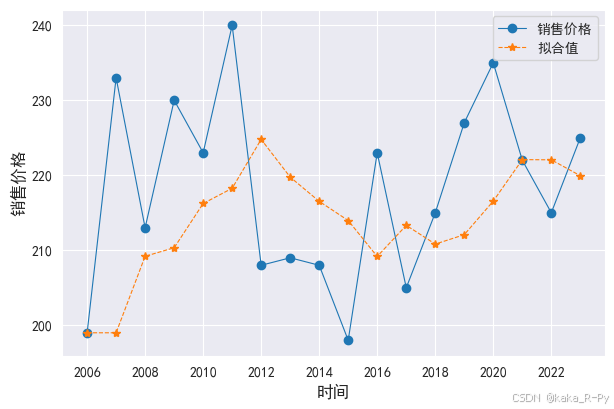
# 绘制实际值和拟合值图(图11-6)
df['price_ses'] = model.fittedvalues
plt.figure(figsize=(7,4.5))
l1, = plt.plot(df['销售价格'],linestyle='-', marker='o',linewidth=0.8)
l2, = plt.plot(df['price_ses'],linestyle='--', marker='*',linewidth=0.8)
plt.legend(handles=[l1,l2],labels=['销售价格','拟合值'],loc='best',prop={'size': 10})
plt.xlabel('时间',size=12)
plt.ylabel("销售价格",size=12)
Text(0, 0.5, '销售价格')
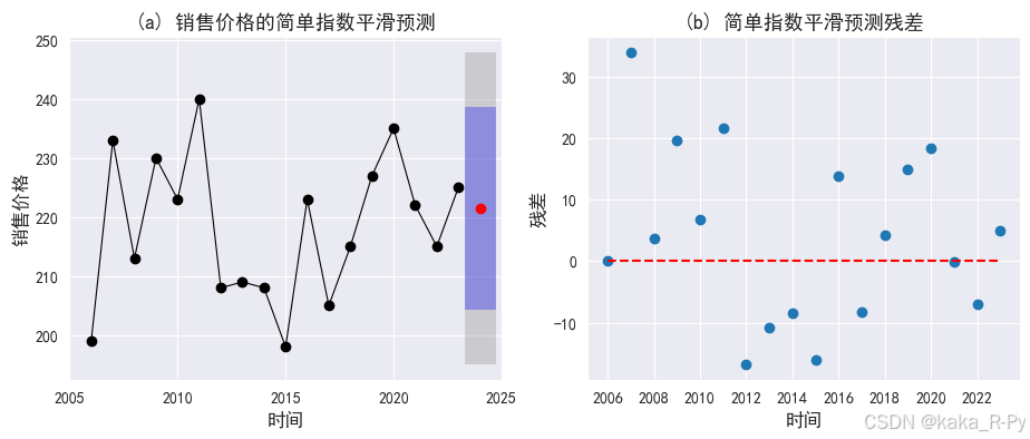
# 计算2024年的预测值
p_model = model.forecast(1)  # 向后预测1期
p_model
2024-01-01    221.460406
Freq: YS-JAN, dtype: float64
# 绘制预测图和残差图(图11-7)
import scipy

# 图(a)预测图
plt.subplots(1, 2, figsize=(11, 4))
plt.subplot(121)

ax = df['销售价格'].plot(marker="o",linewidth=0.8,color="black")     # 绘制实际值
ax.set_ylabel("销售价格",size=12)
ax.set_xlabel("时间",size=12)
model.forecast(1).plot(ax=ax, style="--", marker="o", color="red")  # 绘制预测值
simulations = model.simulate(nsimulations=2, repetitions=1000,
                             error="add",random_errors=scipy.stats.norm)
                                 # 重复模拟100次,模拟步长为2;random_errors="bootstrap"
# 计算置信区间并绘图
low_CI_95 = p_model-1.96*simulations.std(axis=1)
high_CI_95 = p_model+1.96*simulations.std(axis=1)
low_CI_80 = p_model-1.28*simulations.std(axis=1)
high_CI_80 = p_model+1.28*simulations.std(axis=1)

plt.fill_between(['2024'],low_CI_95,high_CI_95,alpha=0.3,color='grey',linewidth=20)
plt.fill_between(['2024'],low_CI_80,high_CI_80,alpha=0.3,color='blue',linewidth=20)
plt.xlim('2005','2025')
plt.title('(a) 销售价格的简单指数平滑预测',size=13)

# 图(b)残差图
res = model.resid
plt.subplot(122)
plt.scatter(range(len(res)),res, marker='o')
plt.hlines(0,0,17,linestyle='--',color='red')
plt.xticks(range(0, 18, 2), df['年份'][::2])
plt.xlabel('时间',size=12)
plt.ylabel("残差",size=12)
plt.title('(b) 简单指数平滑预测残差',size=13)
Text(0.5, 1.0, '(b) 简单指数平滑预测残差')
# 补充——简单指数平滑预测
import pandas as pd
#from statsmodels.tsa.holtwinters import SimpleExpSmoothing
#import matplotlib.pyplot as plt
#plt.rcParams['font.sans-serif']=['SimHei']
#plt.rcParams['axes.unicode_minus']=False  # 用来正常显示负号
df = pd.read_csv('./pydata/chap12/example12_3.csv',encoding='gbk')
#df.index= pd.date_range(start='2006', end='2022', freq='AS')    # 返回从1月1日开始的固定频率的日期时间索引
#df['简单指数平滑预测']=df['销售价格'].ewm(alpha=0.3).mean()
【例11-6】——净利润的Holt指数平滑预测
【代码框11-6】——净利润的Holt指数平滑预测
import pandas as pd
import matplotlib.pyplot as plt
from statsmodels.tsa.holtwinters import SimpleExpSmoothing,ExponentialSmoothing,Holt

plt.rcParams['font.sans-serif']=['SimHei'] #用来正常显示中文标签
plt.rcParams['axes.unicode_minus']=False  # 用来正常显示负号

df = pd.read_csv('./pydata/example/chap11/example11_1.csv')
df.index=pd.date_range(start="2006", end="2023", freq="AS")

# 拟合Holt指数平滑模型(model_h)
model_h = Holt(df['净利润']).fit(optimized=True)
model_h.params     # 输出模型系数
C:\Users\VICTUS\AppData\Local\Temp\ipykernel_9600\3727735978.py:9: FutureWarning: 'AS' is deprecated and will be removed in a future version, please use 'YS' instead.
  df.index=pd.date_range(start="2006", end="2023", freq="AS")


{'smoothing_level': 0.33499999999999996,
 'smoothing_trend': 0.33499999999999996,
 'smoothing_seasonal': nan,
 'damping_trend': nan,
 'initial_level': 1200.6,
 'initial_trend': 550.1000000000001,
 'initial_seasons': array([], dtype=float64),
 'use_boxcox': False,
 'lamda': None,
 'remove_bias': False}
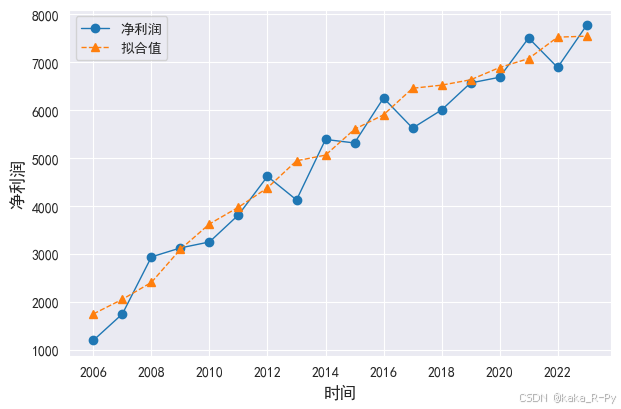
# 绘制实际值和拟合值图(图11-8)
df['净利润_holt'] = model_h.fittedvalues
plt.figure(figsize=(7,4.5))
l1, = plt.plot(df['净利润'],linestyle='-', marker='o',linewidth=1)
l2, = plt.plot(df['净利润_holt'],linestyle='--', marker='^',linewidth=1)
plt.legend(handles=[l1,l2],labels=['净利润','拟合值'],loc='best',prop={'size': 10})
plt.xlabel('时间',size=12)
plt.ylabel("净利润",size=12)
Text(0, 0.5, '净利润')
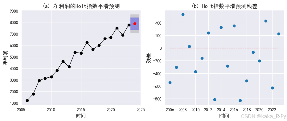
# 2024净利润的预测
model_h.forecast(1)
2024-01-01    7871.893322
Freq: YS-JAN, dtype: float64
# 绘制预测图和残差图(图11-9)
import scipy

# 图(a)预测图
plt.subplots(1, 2, figsize=(11, 4))
plt.subplot(121)

ax = df['净利润'].plot(marker="o",linewidth=1,color="black")  # 绘制实际值
ax.set_ylabel("净利润",size=12)
ax.set_xlabel("时间",size=12)
model_h.forecast(1).plot(ax=ax, style="--", marker="o", color="red")# 绘制预测值
# 绘制置信区间
simulations = model_h.simulate(2, repetitions=1000, error="add",
                           random_errors=scipy.stats.norm)
low_CI_95 = model_h.forecast(1)-1.96*simulations.std(axis=1)
high_CI_95 = model_h.forecast(1)+1.96*simulations.std(axis=1)
low_CI_80 = model_h.forecast(1)-1.28*simulations.std(axis=1)
high_CI_80 = model_h.forecast(1)+1.28*simulations.std(axis=1)

plt.fill_between(['2024'],low_CI_95,high_CI_95,alpha=0.3,color='grey',linewidth=20)
plt.fill_between(['2024'],low_CI_80,high_CI_80,alpha=0.3,color='blue',linewidth=20)
plt.xlim('2005','2025')
plt.title('(a) 净利润的Holt指数平滑预测',size=13)

# 图(b)残差图
plt.subplot(122)
res = model_h.resid
plt.scatter(range(len(res)),res, marker='o')
plt.hlines(0,0,17,linestyle='--',linewidth=1,color='red')
plt.xlabel('时间',size=12)
plt.xticks(range(0, 18, 2), df['年份'][::2])
plt.ylabel("残差",size=12)
plt.title('(b) Holt指数平滑预测残差',size=13)

plt.show()
【例11-7】——饮料销售量的Winters指数平滑预测
【代码框11-7】——饮料销售量的Winters指数平滑预测
import pandas as pd
import matplotlib.pyplot as plt
import seaborn as sns
import numpy as np
from statsmodels.tsa.holtwinters import SimpleExpSmoothing,ExponentialSmoothing,Holt
plt.rcParams['font.sans-serif']=['SimHei']
plt.rcParams['axes.unicode_minus']=False
df = pd.read_csv('./pydata/example/chap11/example11_2.csv')

df = pd.melt(df,id_vars=['月份'],var_name='年份',value_name='销售量')
df['日期'] = df['年份']+"-"+df['月份']
df['日期'] = pd.to_datetime(df['日期'].map(lambda x : x.replace("年",'').replace("月",'')))

#  拟合Winters模型((model_w)),并确定模型参数α,β和γ以及模型系数a,b和s
model_w = ExponentialSmoothing(df['销售量'],
                                    trend="add",
                                    seasonal="add",seasonal_periods=12,
                                    initialization_method="estimated",).fit()
model_w.params
{'smoothing_level': 0.26747342753802866,
 'smoothing_trend': 0.0,
 'smoothing_seasonal': 0.7325265724619714,
 'damping_trend': nan,
 'initial_level': 125.54947674056427,
 'initial_trend': 1.7032392870942314,
 'initial_seasons': array([-11.05258326, -15.44428272,   0.80581954,   0.11696509,
         -0.25575943,  19.38978389,  38.33927594,  26.48675657,
          4.15733834, -17.23933032, -36.32966176, -18.17728823]),
 'use_boxcox': False,
 'lamda': None,
 'remove_bias': False}
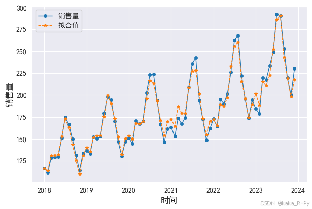
# Winters模型的拟合图(图11-10)
df['销售量_hw'] = model_w.fittedvalues
plt.figure(figsize=(7,4.5))
l1, = plt.plot(df['日期'],df['销售量'],linestyle='-', marker='o',linewidth=1,markersize=4)
l2, = plt.plot(df['日期'],df['销售量_hw'],linestyle='--', marker='*',linewidth=1,markersize=4)
plt.legend(handles=[l1,l2],labels=['销售量','拟合值'],loc='best',prop={'size': 10})
plt.xlabel('时间',size=12)
plt.ylabel("销售量",size=12)
Text(0, 0.5, '销售量')
# Winters 模型2024年销售量的预测
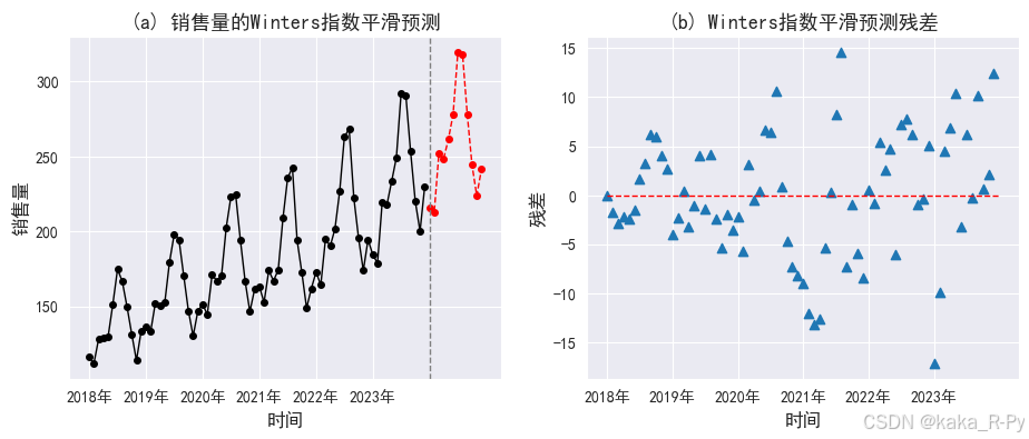
model_w1 = model_w.forecast(12)
round(model_w1,4) # np.array(model_w1)
72    215.5819
73    212.5197
74    252.3115
75    248.5671
76    261.3794
77    278.0306
78    319.3686
79    317.8368
80    277.7175
81    244.2291
82    223.7609
83    241.4409
dtype: float64
# 绘制预测图和残差图(图11-11)
import scipy

# 图(a)预测图
plt.subplots(1, 2, figsize=(11, 4))
plt.subplot(121)

ax = df['销售量'].plot(marker="o",markersize=4,linewidth=1,color="black")# 绘制实际值
ax.set_ylabel("销售量",size=12)
ax.set_xlabel("时间",size=12)
# 绘制2024年12个月的预测值
model_w.forecast(12).plot(ax=ax, style="--", marker="o",linewidth=1, markersize=4,color="red")
plt.xticks(range(0, 72, 12), df['年份'][::12])
plt.axvline(72, ls='--', c='grey',linewidth=1)
plt.title('(a) 销售量的Winters指数平滑预测',size=13)

# 图(b)残差图
plt.subplot(122)
res = model_w.resid
plt.scatter(range(len(res)),res, marker='^')
plt.hlines(0,0,72,linestyle='--',linewidth=1,color='red')
plt.xlabel('时间',size=12)
plt.ylabel("残差",size=12)
plt.xticks(range(0, 72, 12), df['年份'][::12])
plt.title('(b) Winters指数平滑预测残差',size=13)

plt.show()
# 11.4 趋势外推预测
【例11-8】——净利润的一元线性回归预测
【代码框11-8】——净利润的一元线性回归预测
import pandas as pd
from statsmodels.formula.api import ols
import matplotlib.pyplot as plt
plt.rcParams['font.sans-serif']=['SimHei']
plt.rcParams['axes.unicode_minus']=False
df = pd.read_csv('./pydata/example/chap11/example11_1.csv')

# 拟合一元线性回归模型(l_model)
l_model = ols("净利润~年份",data=df).fit()
print(l_model.summary())  # 输出模型结果
                            OLS Regression Results
==============================================================================
Dep. Variable:                    净利润   R-squared:                       0.952
Model:                            OLS   Adj. R-squared:                  0.949
Method:                 Least Squares   F-statistic:                     314.7
Date:                Thu, 14 Nov 2024   Prob (F-statistic):           6.03e-12
Time:                        17:47:21   Log-Likelihood:                -134.04
No. Observations:                  18   AIC:                             272.1
Df Residuals:                      16   BIC:                             273.9
Df Model:                           1
Covariance Type:            nonrobust
==============================================================================
                 coef    std err          t      P>|t|      [0.025      0.975]
------------------------------------------------------------------------------
Intercept  -7.092e+05   4.03e+04    -17.617      0.000   -7.95e+05   -6.24e+05
年份           354.5140     19.985     17.739      0.000     312.148     396.880
==============================================================================
Omnibus:                        0.082   Durbin-Watson:                   1.812
Prob(Omnibus):                  0.960   Jarque-Bera (JB):                0.306
Skew:                           0.051   Prob(JB):                        0.858
Kurtosis:                       2.369   Cond. No.                     7.82e+05
==============================================================================

Notes:
[1] Standard Errors assume that the covariance matrix of the errors is correctly specified.
[2] The condition number is large, 7.82e+05. This might indicate that there are
strong multicollinearity or other numerical problems.


D:\python\Lib\site-packages\scipy\stats\_stats_py.py:1806: UserWarning: kurtosistest only valid for n>=20 ... continuing anyway, n=18
  warnings.warn("kurtosistest only valid for n>=20 ... continuing "
# 计算各年的预测值和预测残差
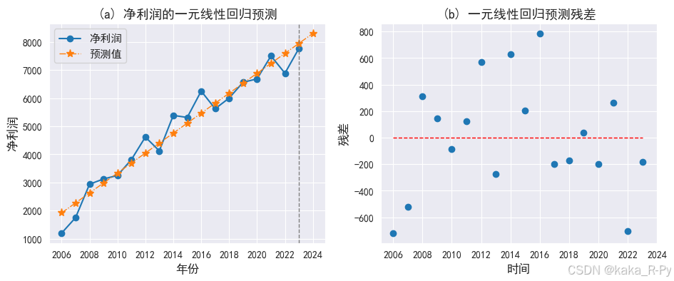
df_pre = pd.DataFrame({"年份": df['年份'], "净利润": df['净利润'],
"预测值": l_model.fittedvalues, "预测残差": l_model.resid})
df_pre.loc[18, '年份'] = 2024
df_pre = df_pre.astype({'年份': int}) # 年份为整数
df_pre.loc[18, '预测值'] = l_model.predict(exog=dict(年份=2024)).values # 2024年的预测值
round(df_pre,2).head()
| 年份 | 净利润 | 预测值 | 预测残差 | |
|---|---|---|---|---|
| 0 | 2006 | 1200.6 | 1919.55 | -718.95 |
| 1 | 2007 | 1750.7 | 2274.06 | -523.36 |
| 2 | 2008 | 2938.1 | 2628.58 | 309.52 |
| 3 | 2009 | 3126.0 | 2983.09 | 142.91 |
| 4 | 2010 | 3250.3 | 3337.60 | -87.30 |
# 绘制预测图和残差图(图11-12)
import matplotlib.pyplot as plt
plt.rcParams['font.sans-serif'] = ['SimHei']
plt.rcParams['axes.unicode_minus'] = False

# 图(a)预测图
plt.subplots(1, 2, figsize=(11, 4))
plt.subplot(121)
l1=plt.plot(df_pre['净利润'], marker='o')
l2=plt.plot(df_pre['预测值'], marker='*',linewidth=1,markersize=8,ls='-.')
plt.axvline(17, ls='--', c='grey',linewidth=1)
plt.xticks(range(0, 19, 2), df_pre['年份'][::2])
plt.xlabel('年份',size=12)
plt.ylabel('净利润',size=12)
plt.legend(['净利润', '预测值'],prop={'size': 11})
plt.title('(a) 净利润的一元线性回归预测',size=13)

# 图(b)残差图
plt.subplot(122)
res = l_model.resid  # 计算残差
plt.scatter(range(len(res)),res, marker='o',linewidth=1)
plt.hlines(0,0,17,linestyle='--',color='red',linewidth=1)
plt.xlabel('时间',size=12)
plt.xticks(range(0, 19, 2), df_pre['年份'][::2])
plt.ylabel("残差",size=12)
plt.title('(b) 一元线性回归预测残差',size=13)

plt.show()
【例11-9】——产量的指数曲线预测
【代码框11-9】——产量的指数曲线预测
import pandas as pd
import numpy as np
from statsmodels.formula.api import ols
import matplotlib.pyplot as plt
plt.rcParams['font.sans-serif']=['SimHei']
plt.rcParams['axes.unicode_minus']=False
df = pd.read_csv('./pydata/example/chap11/example11_1.csv')

# 拟合指数曲线模型(e_model)
e_model = ols("np.log(产量)~年份",data=df).fit()
print(e_model.summary())   # 输出模型结果
                            OLS Regression Results
==============================================================================
Dep. Variable:             np.log(产量)   R-squared:                       0.993
Model:                            OLS   Adj. R-squared:                  0.992
Method:                 Least Squares   F-statistic:                     2184.
Date:                Thu, 14 Nov 2024   Prob (F-statistic):           1.54e-18
Time:                        17:47:33   Log-Likelihood:                 11.497
No. Observations:                  18   AIC:                            -18.99
Df Residuals:                      16   BIC:                            -17.21
Df Model:                           1
Covariance Type:            nonrobust
==============================================================================
                 coef    std err          t      P>|t|      [0.025      0.975]
------------------------------------------------------------------------------
Intercept   -573.2192     12.401    -46.224      0.000    -599.508    -546.930
年份             0.2877      0.006     46.733      0.000       0.275       0.301
==============================================================================
Omnibus:                        0.827   Durbin-Watson:                   1.471
Prob(Omnibus):                  0.661   Jarque-Bera (JB):                0.552
Skew:                          -0.406   Prob(JB):                        0.759
Kurtosis:                       2.720   Cond. No.                     7.82e+05
==============================================================================

Notes:
[1] Standard Errors assume that the covariance matrix of the errors is correctly specified.
[2] The condition number is large, 7.82e+05. This might indicate that there are
strong multicollinearity or other numerical problems.


D:\python\Lib\site-packages\scipy\stats\_stats_py.py:1806: UserWarning: kurtosistest only valid for n>=20 ... continuing anyway, n=18
  warnings.warn("kurtosistest only valid for n>=20 ... continuing "
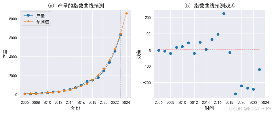
# 计算各年的预测值和预测残差
df_pre = pd.DataFrame({"年份": df['年份'], "产量": df['产量'],
                       "预测值": np.exp(e_model.fittedvalues)})
df_pre['残差'] = df_pre['产量'] - df_pre['预测值']
df_pre.loc[18, '年份'] = 2024
df_pre = df_pre.astype({'年份': int})
df_pre.loc[18, '预测值'] = np.exp(e_model.predict(exog=dict(年份=2024)).values)

round(df_pre,2).head()
| 年份 | 产量 | 预测值 | 残差 | |
|---|---|---|---|---|
| 0 | 2006 | 46.0 | 48.13 | -2.13 |
| 1 | 2007 | 56.0 | 64.17 | -8.17 |
| 2 | 2008 | 63.0 | 85.56 | -22.56 |
| 3 | 2009 | 129.0 | 114.08 | 14.92 |
| 4 | 2010 | 173.0 | 152.11 | 20.89 |
# 绘制预测图和残差图(图11-13)
import matplotlib.pyplot as plt
plt.rcParams['font.sans-serif'] = ['SimHei']
plt.rcParams['axes.unicode_minus']=False

# 图(a)预测图
plt.subplots(1, 2, figsize=(11, 4))
plt.subplot(121)

l1=plt.plot(df_pre['产量'], marker='o',linewidth=1)
l2=plt.plot(df_pre['预测值'], marker='*',markersize=6,linewidth=1,ls='-.')
plt.axvline(17, ls='--', c='grey',linewidth=1)
plt.xticks(range(0, 19, 2), df_pre['年份'][::2])
plt.xlabel('年份',size=12)
plt.ylabel('产量',size=12)
plt.legend(['产量', '预测值'],prop={'size': 11})
plt.title('(a) 产量的指数曲线预测',size=13)

# 图(b)残差图
plt.subplot(122)
df_pre['残差'] = df_pre['产量'] - df_pre['预测值']
plt.scatter(range(len(df_pre['残差'])),df_pre['残差'], marker='o')
plt.hlines(0,0,17,linestyle='--',linewidth=1,color='red')
plt.xlabel('时间',size=12)
plt.xticks(range(0, 19, 2), df_pre['年份'][::2])
plt.ylabel("残差",size=12)
plt.title('(b) 指数曲线预测残差',size=13)

plt.show()
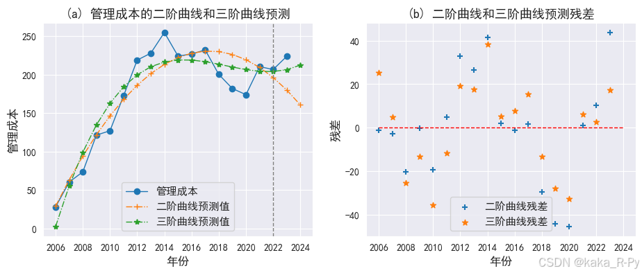
【例11-10】管理成本的二阶曲线和三阶曲线预测
【代码框11-10】——管理成本的二阶曲线和三阶曲线预测
import pandas as pd
import numpy as np
import matplotlib.pyplot as plt
import seaborn as sns
from statsmodels.formula.api import ols
plt.rcParams['font.sans-serif']=['SimHei']
plt.rcParams['axes.unicode_minus']=False
df = pd.read_csv('./pydata/example/chap11/example11_1.csv')

# 拟合二阶曲线模型(model2)和三阶曲线模型(model3)
df['t'] = df['年份']-2005
model2 = ols("管理成本~t+pow(t,2)",data=df).fit()           # 拟合二阶曲线
model3 = ols("管理成本~t+pow(t,2)+pow(t,3)",data=df).fit()  # 拟合三阶曲线

# 计算二阶曲线和三阶曲线的预测值和残差
df_pre = pd.DataFrame({"年份": df['年份'], "管理成本": df['管理成本'],
                       "二阶曲线预测值": model2.fittedvalues,"二阶曲线残差": model2.resid,
                       "三阶曲线预测值": model3.fittedvalues,"三阶曲线残差": model3.resid})

df_pre.loc[18, '年份'] = 2024
df_pre = df_pre.astype({'年份': int})
df_pre.loc[18, '二阶曲线预测值'] = model2.predict(exog=dict(t=19)).values
df_pre.loc[18, '三阶曲线预测值'] = model3.predict(exog=dict(t=19)).values
round(df_pre,2)
| 年份 | 管理成本 | 二阶曲线预测值 | 二阶曲线残差 | 三阶曲线预测值 | 三阶曲线残差 | |
|---|---|---|---|---|---|---|
| 0 | 2006 | 28.0 | 29.07 | -1.07 | 2.60 | 25.40 |
| 1 | 2007 | 60.3 | 63.07 | -2.77 | 55.29 | 5.01 |
| 2 | 2008 | 73.5 | 93.93 | -20.43 | 98.99 | -25.49 |
| 3 | 2009 | 121.3 | 121.65 | -0.35 | 134.50 | -13.20 |
| 4 | 2010 | 126.9 | 146.23 | -19.33 | 162.58 | -35.68 |
| 5 | 2011 | 172.4 | 167.66 | 4.74 | 184.01 | -11.61 |
| 6 | 2012 | 218.7 | 185.96 | 32.74 | 199.58 | 19.12 |
| 7 | 2013 | 227.7 | 201.11 | 26.59 | 210.06 | 17.64 |
| 8 | 2014 | 254.6 | 213.12 | 41.48 | 216.23 | 38.37 |
| 9 | 2015 | 224.0 | 221.98 | 2.02 | 218.87 | 5.13 |
| 10 | 2016 | 226.5 | 227.71 | -1.21 | 218.76 | 7.74 |
| 11 | 2017 | 232.0 | 230.30 | 1.70 | 216.67 | 15.33 |
| 12 | 2018 | 200.1 | 229.74 | -29.64 | 213.39 | -13.29 |
| 13 | 2019 | 181.8 | 226.04 | -44.24 | 209.69 | -27.89 |
| 14 | 2020 | 173.8 | 219.20 | -45.40 | 206.35 | -32.55 |
| 15 | 2021 | 210.2 | 209.22 | 0.98 | 204.16 | 6.04 |
| 16 | 2022 | 206.5 | 196.09 | 10.41 | 203.88 | 2.62 |
| 17 | 2023 | 223.6 | 179.83 | 43.77 | 206.30 | 17.30 |
| 18 | 2024 | NaN | 160.42 | NaN | 212.19 | NaN |
# 实际值和预测值曲线(图11-14)
import matplotlib.pyplot as plt
plt.rcParams['font.sans-serif'] = ['SimHei']
plt.rcParams['axes.unicode_minus']=False

# 图(a)预测图
plt.subplots(1, 2, figsize=(11, 4))
plt.subplot(121)
l1=plt.plot(df_pre['管理成本'], marker='o',linewidth=1)
l2=plt.plot(df_pre['二阶曲线预测值'], marker='+', ls='-.',linewidth=1)
l3=plt.plot(df_pre['三阶曲线预测值'], marker='*', ls='-.',linewidth=1)

plt.axvline(16, ls='--', c='grey',linewidth=1)
plt.xticks(range(0, 19, 2), df_pre['年份'][::2])
plt.xlabel('年份',size=12)
plt.ylabel('管理成本',size=12)
plt.legend(['管理成本', '二阶曲线预测值','三阶曲线预测值'],prop={'size': 11})
plt.title('(a) 管理成本的二阶曲线和三阶曲线预测',size=13)

# 图(b)残差图
plt.subplot(122)
plt.scatter(range(len(df_pre['二阶曲线残差'])),df_pre['二阶曲线残差'], marker='+')
plt.scatter(range(len(df_pre['三阶曲线残差'])),df_pre['三阶曲线残差'], marker='*',linewidth=1)
plt.hlines(0,0,18,linestyle='--',color='red',linewidth=1)

plt.xticks(range(0, 19, 2), df_pre['年份'][::2])
plt.xlabel('年份',size=12)
plt.ylabel('残差',size=12)
plt.legend([ '二阶曲线残差','三阶曲线残差'],prop={'size': 11})
plt.title('(b) 二阶曲线和三阶曲线预测残差',size=13)

plt.show()


 被折叠的 条评论
为什么被折叠?
被折叠的 条评论
为什么被折叠?
 到【灌水乐园】发言


