


一、感想
作为一名拥有11年经验的Android开发者,我亲历了Android从高速发展到如今面临“僧多粥少”的过程。技术的世界瞬息万变,没有一种技术能够让人依赖一辈子。去年初,我自学了鸿蒙系统,并顺利通过了鸿蒙官方的初级和高级认。

然而,由于一年来几乎没有实际应用,很多知识已经生疏。如今,我决定重新拾起鸿蒙开发,并通过笔记记录学习过程。
二、Harmony工程目录结构

在工程目录下,存在以下文件/文件夹:
AppScope, entry,hvigor,build-profile.json5,code-linter.json,hvigorfile.ts,oh-package.json5,oh-package-lock.json5。
build-profile.json5:工程级配置信息,包括签名signingConfigs、产品配置products等,模块信息在此处配置。
{
    "app": {
        "buildModeSet": [
            {
                "name": "debug"
            },
            {
                "name": "release"
            }
        ],
        "products": [
            {
                "buildOption": {
                    "strictMode": {
                        "caseSensitiveCheck": true,
                        "useNormalizedOHMUrl": true
                    }
                },
                "compatibleSdkVersion": "5.0.2(14)",
                "name": "default",
                "runtimeOS": "HarmonyOS",
                "signingConfig": "default"
            }
        ],
        "signingConfigs": []
    },
    "modules": [
        {
            "name": "entry",
            "srcPath": "./entry",
            "targets": [
                {
                    "applyToProducts": [
                        "default"
                    ],
                    "name": "default"
                }
            ]
        }
    ]
}code-linter.json:是代码检查工具的配置文件,用于定义代码风格和质量规则。
hvigorfile.ts:工程级编译构建任务脚本
oh-package.json5:主要用来描述全局配置,如:依赖覆盖(overrides)、依赖关系重写(overrideDependencyMap)和参数化配置(parameterFile)等
oh-package-lock.json5:是依赖锁文件,用于精确记录当前项目中所有依赖的实际安装版本及其依赖树结构。它的作用是确保在不同环境中安装的依赖版本完全一致,避免因依赖版本不一致导致的问题。

AppScope:包含了resources 和 app.json5
resources:全局使用的资源,如图片、字符串等
app.json5:应用信息
{
  "app": {
    "bundleName": "com.zzw.harmonyapp",
    "vendor": "example",
    "versionCode": 1000000,
    "versionName": "1.0.0",
    "icon": "$media:app_icon",
    "label": "$string:app_name"
  }
}
entry:这个就跟Android的 app 一样的作用了

entry 之中也包含了:build-profile.json5,hvigorfile.ts,oh-package.json5。三个的作用上面做了介绍,区别在于entry中的是针对模块级别的。
entry目录中的其他元素,后面专门学习介绍。
hvigor:包含了hvigor-config.json5文件,hvigor-config.json5是 HarmonyOS 开发中用于配置 Hvigor 构建工具 的配置文件。Hvigor 是 HarmonyOS 的构建工具,类似于 Android 的 Gradle,用于管理项目的构建、依赖和任务执行。
三、ArkTS语法
ArkTs 是基于TypeScript 的语言,又“遥遥领先”了,跟前端的语法有点类似,主要记载一些常用的,要熟悉还是得靠日常的积累。
1.ArkTS的基本组成

四、沉浸式效果
在开发App时候,都会有个占满整个屏幕的Splash(启动)页面,鸿蒙开发同样有个启动页:
@Entry
@Component
struct Splash {
  @State message: string = 'Hello World';

  build() {
    Stack() {
      Image($r('app.media.app_bg_splash')).width('100%').height('100%')
    }.width('100%').height('100%')
  }
}
整个页面就一张图片,希望整张图片充满整个屏幕,运行后效果:

这个明显不是期望的效果。
来看看遥遥领先官方的说明:
典型应用全屏窗口UI元素包括状态栏、应用界面和底部导航条,其中状态栏和导航条,通常在沉浸式布局下称为避让区;避让区之外的区域称为安全区。开发应用沉浸式效果主要指通过调整状态栏、应用界面和导航条的显示效果来减少状态栏导航条等系统界面的突兀感,从而使用户获得最佳的UI体验。

从这里可以看出来,上面应用截图中的启动页,只有应用界面的区域,启动页的图片并没有占位到状态栏和导航条。
开发应用沉浸式效果主要要考虑如下几个设计要素:
- UI元素避让处理:导航条底部区域可以响应点击事件,除此之外的可交互UI元素和应用关键信息不建议放到导航条区域。状态栏显示系统信息,如果与界面元素有冲突,需要考虑避让状态栏。
- 沉浸式效果处理:将状态栏和导航条颜色与界面元素颜色相匹配,不出现明显的突兀感。
针对上面的设计要求,可以通过如下两种方式实现应用沉浸式效果:
a.窗口全屏布局方案:调整布局系统为全屏布局,界面元素延伸到状态栏和导航条区域实现沉浸式效果。当不隐藏避让区时,可通过接口查询状态栏和导航条区域进行可交互元素避让处理,并设置状态栏或导航条的颜色等属性与界面元素匹配。当隐藏避让区时,通过对应接口设置全屏布局即可。
b.组件安全区方案:布局系统保持安全区内布局,然后通过接口延伸绘制内容(如背景色,背景图)到状态栏和导航条区域实现沉浸式效果。
以下将分别用这两种方案实现。
4.1 窗口全屏布局方案
窗口全屏布局方案主要涉及以下应用扩展布局,全屏显示,不隐藏避让区和应用扩展布局,隐藏避让区两个应用场景。
4.1.1 应用扩展布局,全屏显示,不隐藏避让区
  /*应用扩展布局,全屏显示,不隐藏避让区*/
  static setFullScreenNoHiddenBar(windowStage: window.WindowStage): void {
    let windowClass: window.Window = windowStage.getMainWindowSync(); // 获取应用主窗口
    // 1. 设置窗口全屏
    let isLayoutFullScreen = true;
    windowClass.setWindowLayoutFullScreen(isLayoutFullScreen).then(() => {
      console.info('Succeeded in setting the window layout to full-screen mode.');
    }).catch((err: BusinessError) => {
      console.error('Failed to set the window layout to full-screen mode. Cause:' + JSON.stringify(err));
    });
  }
显示效果:

4.1.2 应用扩展布局,隐藏避让区
  /*应用扩展布局,全屏显示,隐藏避让区*/
  static setFullScreenHiddenBar(windowStage: window.WindowStage): void {
    let windowClass: window.Window = windowStage.getMainWindowSync(); // 获取应用主窗口
    // 1. 设置窗口全屏
    let isLayoutFullScreen = true;
    windowClass.setWindowLayoutFullScreen(isLayoutFullScreen).then(() => {
      console.info('Succeeded in setting the window layout to full-screen mode.');
    }).catch((err: BusinessError) => {
      console.error(`Failed to set the window layout to full-screen mode. Code is ${err.code}, message is ${err.message}`);
    });
    // 2. 设置状态栏隐藏
    windowClass.setSpecificSystemBarEnabled('status', false).then(() => {
      console.info('Succeeded in setting the status bar to be invisible.');
    }).catch((err: BusinessError) => {
      console.error(`Failed to set the status bar to be invisible. Code is ${err.code}, message is ${err.message}`);
    });
    // 2. 设置导航条隐藏
    windowClass.setSpecificSystemBarEnabled('navigationIndicator', false).then(() => {
      console.info('Succeeded in setting the navigation indicator to be invisible.');
    }).catch((err: BusinessError) => {
      console.error(`Failed to set the navigation indicator to be invisible. Code is ${err.code}, message is ${err.message}`);
    });
  }
效果如下:

4.2 组件安全区方案
应用未使用setWindowLayoutFullScreen()接口设置窗口全屏布局时,默认使能组件安全区布局。
应用在默认情况下窗口背景绘制范围是全屏,但UI元素被限制在安全区内(自动排除状态栏和导航条)进行布局,来避免界面元素被状态栏和导航条遮盖。
4.2.1 设置窗口背景色
通过设置整个窗口的背景色,和应用颜色一致,实现全屏的效果:
  static setWindowBackgroundColor(windowStage: window.WindowStage,colorStr:string): void {
    windowStage.getMainWindowSync().setWindowBackgroundColor(colorStr);
  }
效果如下(这里为了便于观察,颜色和应用颜色不一致):

4.2.2 使用expandSafeArea属性扩展安全区域
状态栏和导航条颜色不同时,可以用如下方案:
import { window } from '@kit.ArkUI';

@Entry
@Component
struct Splash {
  @State message: string = 'Hello World';

  build() {
    Stack() {
      Image($r('app.media.app_bg_splash')).width('100%').height('100%')
        .expandSafeArea([SafeAreaType.SYSTEM],
          [SafeAreaEdge.TOP, SafeAreaEdge.BOTTOM]) // 图片组件的绘制区域扩展至状态栏和导航条。
    }.width('100%').height('100%')
  }
}
效果如下:

通过上面四种方法的实现,在对应的场景下使用对应的方案,就非常清楚了。
五、页面的跳转
在Android的开发中,有了启动页,接下来就是从启动页跳转到主页了,然后关闭启动页。同样的鸿蒙也是需要这样做。
组件导航(Navigation)和页面路由(@ohos.router)均支持应用内的页面跳转,但组件导航支持在组件内部进行跳转,使用更灵活。组件导航具备更强的一次开发多端部署能力,可以进行更加灵活的页面栈操作,同时支持更丰富的动效和生命周期。因此,推荐使用组件导航(Navigation)来实现页面跳转以及组件内的跳转,以获得更佳的使用体验。
5.1 @ohos.router (页面路由)(不推荐)
在启动页中,通过router进行跳转到主页:
import { router } from '@kit.ArkUI';

@Entry
@Component
struct Splash {
  // 定时器 ID(用于跳转前取消定时器)
  private timerId: number = -1;

  build() {
    Stack() {
      Image($r('app.media.app_bg_splash')).width('100%').height('100%')
    }.width('100%').height('100%')
  }

  // 页面显示时触发
  onPageShow() {
    // 设置 1.5 秒后跳转
    this.timerId = setTimeout(() => {
      // 跳转到 Main 页面,并清除 Splash 页面
      router.replaceUrl({ url: 'pages/Main' });
    }, 1500); // 1500ms = 1.5秒
  }

  // 页面隐藏时触发(清除定时器)
  onPageHide() {
    if (this.timerId !== -1) {
      clearTimeout(this.timerId);
    }
  }
}
在这个使用了 router.replaceUrl,会将splash 进行替换成主页Main。
router.pushUrl :将Main压入栈之中,并不会清除Splash。
5.2 组件导航 (Navigation)(推荐)

看上面这张图,Navigation 更适合类似 Android 中一个Activity多个fragment 的形式,用于管理多个fragment。这点跟 Android 还是很像的,遥遥领先。
在这里不拓展Navigation的用法,再后面进行使用介绍。
附上官网中Navigation和Router的对比:
| 业务场景 | Navigation | Router |
|---|---|---|
| 一多能力 | 支持,Auto模式自适应单栏跟双栏显示 | 不支持 |
| 跳转指定页面 | pushPath & pushDestination | pushUrl & pushNameRoute |
| 跳转HSP中页面 | 支持 | 支持 |
| 跳转HAR中页面 | 支持 | 支持 |
| 跳转传参 | 支持 | 支持 |
| 获取指定页面参数 | 支持 | 不支持 |
| 传参类型 | 传参为对象形式 | 传参为对象形式,对象中暂不支持方法变量 |
| 跳转结果回调 | 支持 | 支持 |
| 跳转单例页面 | 支持 | 支持 |
| 页面返回 | 支持 | 支持 |
| 页面返回传参 | 支持 | 支持 |
| 返回指定路由 | 支持 | 支持 |
| 页面返回弹窗 | 支持,通过路由拦截实现 | showAlertBeforeBackPage |
| 路由替换 | replacePath & replacePathByName | replaceUrl & replaceNameRoute |
| 路由栈清理 | clear | clear |
| 清理指定路由 | removeByIndexes & removeByName | 不支持 |
| 转场动画 | 支持 | 支持 |
| 自定义转场动画 | 支持 | 支持,动画类型受限 |
| 屏蔽转场动画 | 支持全局和单次 | 支持 设置pageTransition方法duration为0 |
| geometryTransition共享元素动画 | 支持(NavDestination之间共享) | 不支持 |
| 页面生命周期监听 | UIObserver.on('navDestinationUpdate') | UIObserver.on('routerPageUpdate') |
| 获取页面栈对象 | 支持 | 不支持 |
| 路由拦截 | 支持通过setInterception做路由拦截 | 不支持 |
| 路由栈信息查询 | 支持 | getState() & getLength() |
| 路由栈move操作 | moveToTop & moveIndexToTop | 不支持 |
| 沉浸式页面 | 支持 | 不支持,需通过window配置 |
| 设置页面标题栏(titlebar)和工具栏(toolbar) | 支持 | 不支持 |
| 模态嵌套路由 | 支持 | 不支持 |
六、App基础实现
简单介绍一个常用App的基础功能的开发,包含:底部Tab实现、列表、加载网络数据。
6.1 底部Tab
先看效果:
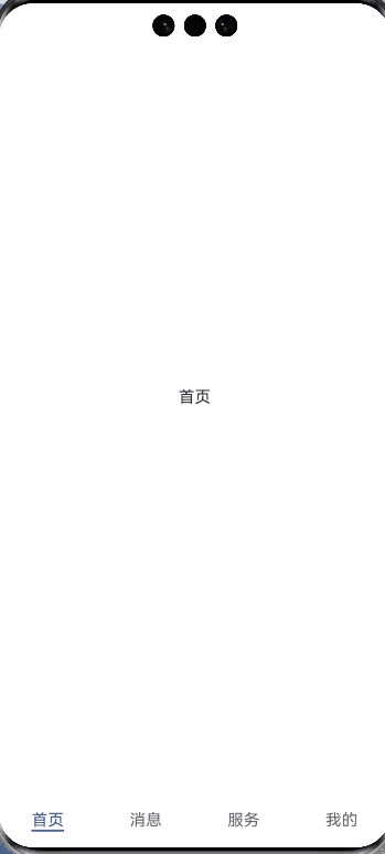
通过 Tabs(选项卡)实现的底部导航栏,有四个标签页:
标签页:
@Component
export default struct HomeContent {
  @State home: string = '首页'
  build() {
    Text('首页')
  }
}
Tabs实现:
     Tabs({
        barPosition: BarPosition.End,
        controller: this.tabController
      }) {
        TabContent() {
          HomeContent()
        }.tabBar("首页")

        TabContent() {
          MessageContent()
        }.tabBar("消息")

        TabContent() {
          ServiceContent()
        }.tabBar("服务")

        TabContent() {
          MineContent()
        }.tabBar("我的")
      }.height('100%')
      .width('100%')
BarPosition.End: tabs在底部;BarPosition.Start:tabs在顶部;
上面Tabs的效果只有文字,现在的App都是文字+图片,有的甚至是动画。
看下新效果:
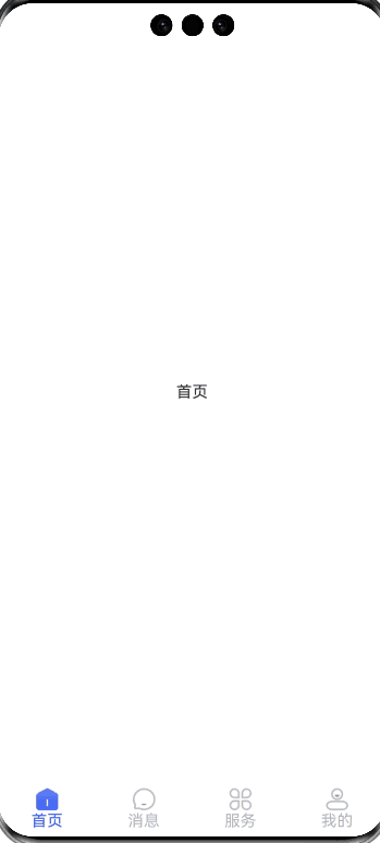
图片+文字的效果就好看多了,具体实现代码如下:
import HomeContent from './main/HomeContent'
import MessageContent from './main/MessageContent'
import MineContent from './main/MineContent'
import ServiceContent from './main/ServiceContent'

@Entry
@Component
struct Main {
  @State private currentIndex: number = 0
  private tabController: TabsController = new TabsController()

  build() {
    Column() {
      Tabs({
        barPosition: BarPosition.End,
        controller: this.tabController
      }) {
        TabContent() {
          HomeContent()
        }.tabBar(this.tabBuilder('首页', 0, $r('app.media.tab_home_press'), $r('app.media.tab_home_normal')))

        TabContent() {
          MessageContent()
        }.tabBar(this.tabBuilder('消息', 1, $r('app.media.tab_msg_press'), $r('app.media.tab_msg_normal')))

        TabContent() {
          ServiceContent()
        }.tabBar(this.tabBuilder('服务', 2, $r('app.media.tab_service_press'), $r('app.media.tab_service_normal')))

        TabContent() {
          MineContent()
        }.tabBar(this.tabBuilder('我的', 3, $r('app.media.tab_mine_press'), $r('app.media.tab_mine_normal')))
      }.height('100%')
      .width('100%').onChange((index: number) => {
        this.currentIndex = index
      })
    }
    .height('100%')
    .width('100%')
  }

  @Builder
  tabBuilder(title: string, targetIndex: number, selectedImg: Resource, normalImg: Resource) {
    Column() {
      Image(this.currentIndex === targetIndex ? selectedImg : normalImg)
        .size({ width: 25, height: 25 })
      Text(title)
        .fontColor(this.currentIndex === targetIndex ? '#335DFF' : '#B5B6B6')
    }
    .width('100%')
    .height(50)
    .justifyContent(FlexAlign.Center)
  }
}
6.2 列表
常见的App中,列表是一个常见的页面,页面中包含了下拉刷新,上滑加载更多。

简单讲述下逻辑:
当初始化页面数据时候, 先显示loading,待显示数据后,显示列表。下拉列表进行刷新,上滑到页面数据时候,加载下一页的数据。
创建自定义的组件:
export enum LoadState {
  LOADING,
  SUCCESS,
  FAIL,
  EMPTY
}

@Component
export struct PageLoading {
  @Prop loadState: LoadState;
  onReload?: () => void;
  @Prop showLoading: boolean;
  @BuilderParam content: () => void;

  build() {
    Stack() {
      if (this.loadState === LoadState.LOADING) {
        LoadingProgress()
          .width(50)
          .height(50)
          .color($r("app.color.themeColor"))
      } else if (this.loadState === LoadState.SUCCESS) {
        this.content();
        if (this.showLoading) {
          Stack() {
            Stack() {
              LoadingProgress()
                .width(50)
                .height(50)
                .color($r("app.color.white"))
            }
            .width(100)
            .height(100)
            .backgroundColor($r("app.color.black50"))
            .borderRadius(8)
          }
          .width('100%')
          .height('100%')
        }
      } else if (this.loadState === LoadState.FAIL) {
        Stack() {
          Text("加载失败,点击重试")
        }
        .width('100%')
        .height('100%')
        .onClick(() => {
          if (this.onReload) {
            this.onReload();
          }
        })
      } else {
        Stack() {
          Text("这里什么都没有")
        }
        .width('100%')
        .height('100%')
        .onClick(() => {
          if (this.onReload) {
            this.onReload();
          }
        })
      }
    }
    .width('100%')
    .height('100%')
  }
}
使用:
 build() {
    PageLoading({
      loadState: this.loadState,
      showLoading: this.showLoading,
      onReload: () => {
        LogUtils.error("onReload");
        this.initData()
      }
    }) {
      Column() {

        ...
        ...

      }.width('100%')
      .height('100%')
    }
  }
下拉刷新和加载更多,用的是 pulltorefresh:
    "@ohos/pulltorefresh@2.1.2": {
      "name": "@ohos/pulltorefresh",
      "version": "2.1.2",
      "integrity": "sha512-IbzsUNSpdxctptAwBiotLXGi0wQWICM8TIMHWuiyjBx+NQy99IqNfaCgnMnOkBWtfZRGIXWMe2lxOmt8HAUTtA==",
      "resolved": "https://repo.harmonyos.com/ohpm/@ohos/pulltorefresh/-/pulltorefresh-2.1.2.har",
      "registryType": "ohpm"
}鸿蒙开发过程中,除了常用的githua,还可以用遥遥领先官方的网站:OpenHarmony三方库中心仓
pulltorefresh 的使用:
PullToRefresh({
          data: $home,
          scroller: this.scroller,
          customList: () => {
            this.listViewBuilder();
          },
          onRefresh: () => {
            return new Promise<string>((resolve, reject) => {
              loadHomeData(0).then(
                (data) => {
                  this.nextPage = 1;
                  this.dataList = data;
                  resolve('刷新成功');
                },
                () => {
                  resolve('刷新失败');
                }
              )
            });
          },
          onLoadMore: () => {
            return new Promise<string>((resolve, reject) => {
              if (this.hasMore) {
                loadHomeData(this.nextPage).then(
                  (data) => {
                    if (data.length > 0) {
                      this.nextPage++
                      this.dataList = this.dataList.concat(data);
                      resolve('加载成功');
                    } else {
                      this.hasMore = false;
                      resolve('没有更多了')
                    }
                  },
                  () => {
                    resolve('加载失败');
                  }
                )
              } else {
                resolve('没有更多了')
              }
            });
          },
          customLoad: null,
          customRefresh: null,
        })
代码中包含了onRefresh,用于下拉刷新时候的回调。onLoadMore 用于上滑加载更多。
列表:
 @Builder
  private listViewBuilder() {
    List({ scroller: this.scroller }) {
      ForEach(this.dataList, (item: HomeItemData) => {
        ListItem() {
          HomeItem({
            home: item as HomeItemData,
            clearTop: true,
          })
        }
      })
    }
    .width('100%')
    .height('100%')
    .listDirection(Axis.Vertical)
    .divider({
      strokeWidth: 0.5,
      color: $r("app.color.divider"),
      startMargin: 16,
      endMargin: 16
    })
    .edgeEffect(EdgeEffect.None) // 必须设置列表为滑动到边缘无效果
  }
列表的item样式为 HomeItem:
import { getChapter, getTagColor, HomeItemData } from '../../bean/home/HomeItemData';
import { TagsData } from '../../bean/home/TagsData';
import { LogUtils } from '../../utils/LogUtils';

@Component
export struct HomeItem {
  home: HomeItemData = new HomeItemData();
  clearTop: boolean = false
  onCollectClick?: (home: HomeItemData) => void;

  build() {
    Column() {
      Row() {
        ForEach(this.home.tags, (item: TagsData) => {
          Text(item.name)
            .fontColor(getTagColor(item))
            .fontSize(10)
            .textAlign(TextAlign.Center)
            .borderWidth(0.5)
            .border({
              width: 0.5,
              color: getTagColor(item),
              radius: 3
            })
            .padding({
              left: 2,
              top: 1,
              right: 2,
              bottom: 1
            })
          Divider()
            .width(8)
            .height(0)
            .color(Color.Transparent)
        })
        Text(this.home.author)
          .layoutWeight(1)
          .fontColor($r("app.color.text_h1"))
          .fontSize(12)
        Divider()
          .width(8)
          .height(0)
          .color(Color.Transparent)
        Text(this.home.niceDate)
          .fontColor($r("app.color.text_h2"))
          .fontSize(12)
      }

      Divider()
        .width('100%')
        .height(4)
        .color(Color.Transparent)
      Text(this.home.title)
        .width('100%')
        .fontColor($r("app.color.text_h1"))
        .fontSize(15)
        .maxLines(2)
        .textOverflow({ overflow: TextOverflow.Ellipsis })
      Divider()
        .width('100%')
        .height(5)
        .color(Color.Transparent)
      Row() {
        Text(getChapter(this.home))
          .fontColor($r("app.color.text_h2"))
          .fontSize(12)
        Blank()
      }
      .justifyContent(FlexAlign.Center)
      .width('100%')
    }
    .width('100%')
    .padding({
      left: 16,
      top: 10,
      right: 16,
      bottom: 10
    })
    .onClick((e) => {
      LogUtils.error("点击了哟:" + JSON.stringify(this.home))
    })
  }
}


 扫一扫
扫一扫


 235
235

 被折叠的 条评论
为什么被折叠?
被折叠的 条评论
为什么被折叠?
 到【灌水乐园】发言


