


 本文介绍了如何使用淘宝提出的布局模式,通过CSS的float和margin属性实现左、中、右三部分在屏幕上的左中右布局,确保先加载中间内容,同时让左右两侧元素宽度固定,中间区域高度自适应并居中。
由淘宝提出的一种布局模式
要求:左中右布局占满屏幕,左右固定宽200px, 中间自适应,要求先加载中间块
第一步:
先写出简单的页面结构布局,要求先加载中间部分,两边元素宽度为200px,中间自适应
    <style>
      *{margin: 0; padding: 0;}
      .center{
        width: 100%;
        height: 100px;
        background: pink;
      }
      .left{
        width: 200px;
        background: yellow;
        height: 100px;
      }
      .right{
        width: 200px;
        background: blue;
        height: 100px;
      }
    </style>
  </head>
  <body>
    <div class="container">
      <!-- 先写中间的元素 -->
      <div class="center">中间</div>
      <div class="left">左</div>
      <div class="right">右</div>
    </div>
</body>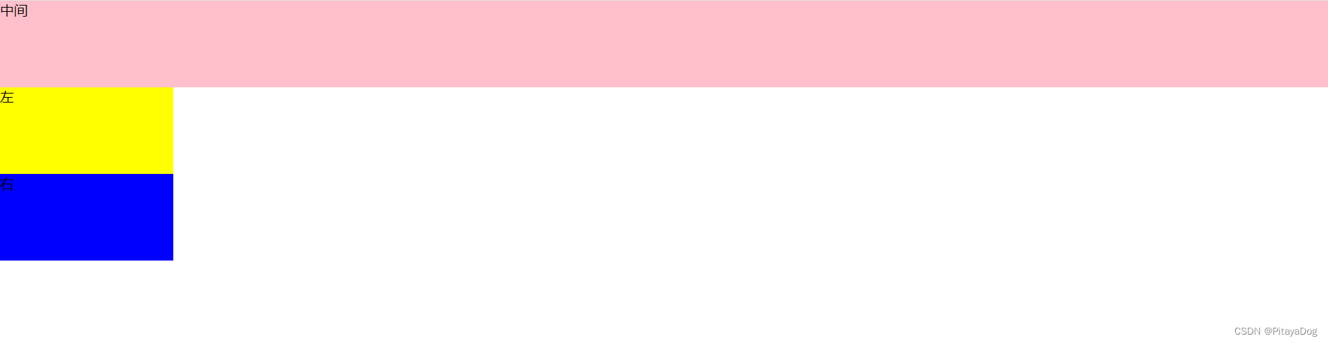 第二步:使用float让左边和右边的元素浮动,脱离文档流,使用margin属性将左边和右边的元素定位成左中右布局
<style>
*{margin: 0; padding: 0;}
.container > div{
/* width: 100%; */
float: left;
}
.center{
width: 100%;
height: 100px;
background: pink;
}
.left{
width: 200px;
background: yellow;
height: 100px;
margin-left: -100%;
}
.right{
width: 200px;
background: blue;
height: 100px;
margin-left: -200px;
}
</style>
</head>
<body>
<div class="container">
<div class="center">中间</div>
<div class="left">左</div>
<div class="right">右</div>
</div>
</body>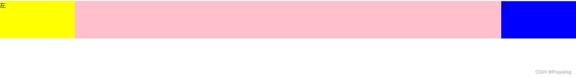 第三步 让中间的文档内容显示居中,将高度撑满页面的高度
    <style>
      *{margin: 0; padding: 0;}
      .container > div{
        /* width: 100%; */
        float: left;
      }
      .center{
        width: 100%;
        height: 100vh;
        background: pink;
      }
      .left{
        width: 200px;
        background: yellow;
        height: 100vh;
        margin-left: -100%;
      }
      .right{
        width: 200px;
        background: blue;
        height: 100vh;
        margin-left: -200px;
      }
      .main{
        padding: 0 200px;
      }
    </style>
  </head>
  <body>
    <div class="container">
      <div class="center"><div class="main">中间</div></div>
      <div class="left">左</div>
      <div class="right">右</div>
    </div>
  </body>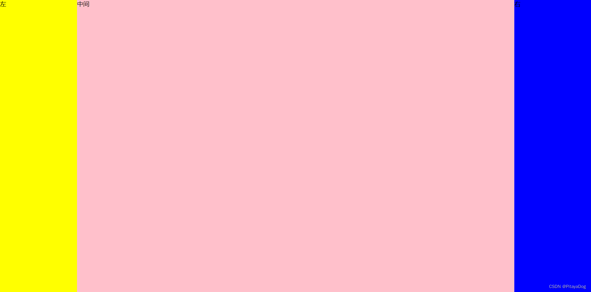


 扫一扫
扫一扫


 被折叠的 条评论
为什么被折叠?
被折叠的 条评论
为什么被折叠?
 到【灌水乐园】发言


