


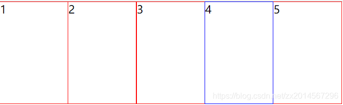
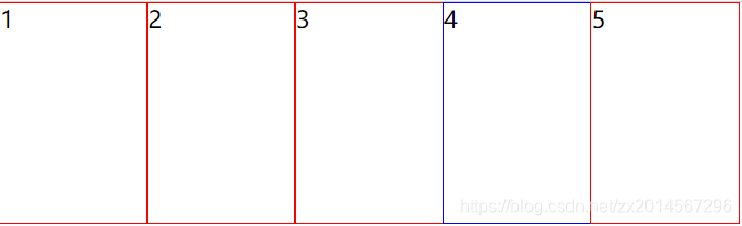
一、margin负值的运用
效果:每个盒子相互紧挨,但是鼠标选中时整个盒子边框都能变色。
代码部分:
<div class="box1">
        <ul>
            <li>1</li>
            <li>2</li>
            <li>3</li>
            <li>4</li>
            <li>5</li>
        </ul>
    </div>
.box1 ul li {
    float: left;
    width: 100px;
    height: 150px;
    list-style: none;
    border: 1px solid red;
    margin-left: -1px;
    /* 向左移-1px,让后面的边框压住前面的 */
}

ul li:hover {
    /* 如果没有定位,则鼠标经过添加相对定位即可(保留位置) */
    position: relative;
    border: 1px solid blue;
}

.box1 ul li:hover {
    /* 如果有定位,则运用z-index提高层级 */
    z-index: 1;
    border: 1px solid blue;
}
没有加定位或者z-index提高层级就会被压住
二、文字围绕浮动
浮动最开始的初衷就是为了让文字环绕。
效果:文字围绕浮动的图片
<div class="box2">
        <div class="pic">
            <img src="image/新闻.png" alt="">
        </div>
        <p>哈哈哈哈哈哈哈哈哈哈哈哈哈哈哈哈哈哈哈哈哈哈</p>
    </div>
.box2 {
    width: 300px;
    height: 70px;
    background-color: chocolate;
    margin: 50px auto;
    padding: 5px;
}

.box2 .pic {
    /* 浮动最开始就是为了让文字环绕,因此给图片左浮动文字会默认环绕图片,不用给文字再添加浮动 */
    float: left;
    width: 120px;
    height: 70px;
    margin-right: 5px;
}

.box2 .pic img {
    width: 100%;
    height: 100%;
}
三、行内块元素运用
行内块元素默认元素一行显示,但彼此之间会有一点空隙,因此可以利用这点省略边距的设置。
效果:元素之间会有空隙

<div class="box3">
<a href="#" class="up"><<上一页</a>
<a href="#">1</a>
<a href="#" class="no">2</a>
<a href="#">3</a>
<a href="#">4</a>
<a href="#">5</a>
<a href="#" class="no">...</a>
<a href="#" class="down">下一页>></a> 共10页 到第
<input type="text">页
<button>确定</button>
</div>
.box3 {
    /* 父元素设置居中对齐后,里面的行内块元素也会跟着居中,减少了工作量 */
    text-align: center;
}

.box3 a {
    /* 把每个a变为行内块元素,这样既能设置宽高,又能同一行。同时行内块元素之间默认有空隙,减少了代码量 */
    display: inline-block;
    font-size: 12px;
    padding: 10px 15px;
    text-decoration: none;
    background-color: #ccc;
    color: rgb(49, 48, 48);
}

.box3 .no {
    border: 0;
    background-color: white;
}

.box3 input {
    width: 40px;
    height: 36px;
    outline: none;
}

.box3 button {
    width: 46px;
    height: 36px;
    font-size: 16px;
    font-weight: 500;
}
四、CSS制作三角形
<div class="box4"> </div>
.box4 {
    width: 0;
    height: 0;
    /* 然后把上边距宽度设置大点,颜色改为透明
    border-top: 150px solid transparent;
    border-right: 50px solid yellow;
    先把左边框和下边框的宽度设置为0,做出直角三角形
    border-bottom: 0 solid blue;
    border-left: 0 solid purple; */
    /* 简写代码如下所示 */
    border-color: transparent red transparent transparent;
    border-style: solid;
    border-width: 22px 8px 0 0;
}
应用场景
五、CSS制作三角框
一个盒子设置上边框和右边框,然后沿着z轴旋转45deg(下右边框则需要旋转-45deg)
效果
<div class="box6">
</div>
.box6 {
    margin: 0 auto;
    width: 50px;
    height: 50px;
    border-top: 5px solid #ccc;
    border-right: 5px solid #ccc;
    transform: rotateZ(45deg);
}


 扫一扫
扫一扫


 878
878

 被折叠的 条评论
为什么被折叠?
被折叠的 条评论
为什么被折叠?
 到【灌水乐园】发言


