


 CoordinatorLayout是Google在Android L后引入的新控件,用于实现Material Design的滚动效果。它通过与AppBarLayout、FloatingActionButton等组件配合,简化了创建酷炫动画的过程。布局通常包括顶部区域(如AppBarLayout)、内容部分(如RecyclerView)和悬浮元素。通过标识滚动视图和定义滚动行为,如scroll、enterAlways等,可以实现各种交互。CollapsingToolbarLayout则允许toolbar的伸缩,并有多种自定义样式选项。
CoordinatorLayout是google在android L之后引入的新控件,用于实现Material Design的多种滚动效果。而关键在于我们使用CoordinatorLayout不用写多少代码就能实现一些非常酷的动画,能够极大的提升我们的效率。
那么,听起来很神奇的CoordinatorLayout要怎么使用呢?
通常情况下,我们一个界面的元素包括
- 顶部区域,比如Toolbar,或是其他有时可见有时不可见的元素,通常为其元素为android.support.design.widget.AppBarLayout
- 内容部分,可以滚动的部分,比如ViewPage, RecyclerView,NestedScrollView等
- 一些悬浮的元素,比如FloatActioningButton

因此,要使用CoordinatorLayout,通常的布局是这样子三段式的(当然根据实际情况比这个复杂,这里先讨论简单的原理)

CoordinatorLayout的作用,就是把内容部分的滚动功能扩散到其他部分,让其他部分也能随着滚动事情作一些交互。因此它要知道在它的子View中,哪个是具有原生的滚动功能。
要标识具有滚动行为的View,
app:layout_behavior="@string/appbar_scrolling_view_behavior"需要加上这句话。
当然appbar_scrolling_view_behavior定义的是默认的滚动行为,你可以添加自定义的行为
现在我们定义了滚动视图,现在来讨论怎么配合滚动事件进行响应。
这里我们要引入另一个Layout:android.support.design.widget.AppBarLayout。通过它才能配合coordinatorLayout进行工作。
要定义滚动行为,在AppBarLayout中定义了几个行为(FLAG),
- scroll: 对于要响应滚动事件(随着滚动消失或出现的)的VIEW都要加上这个标志。而且使用这个标志的VIEW必须写在AppBarLayout子View的前面,如果从上到下其中有一个View没这个标志,那么其后的就算带上了这个标志也无效。
- enterAlways: 这个标志指示这个View向上滚动消失,向下滚动就又显示出来了,
- enterAlwaysCollapsed: 这个标志一般配合minHeight使用。当滑动时,View保持在最小高度,一旦滑动到顶部,才能继续扩展这个View.
- exitUntilCollapsed:这个标志指示当滑动向最小高度时(minHeight),再继续滑,就会向上滑动消失。
- snap: 自动依附功能,防止出现半截VIEW显示的效果。
有上面的理论,我们再看一段代码,对代码的解释见注释。
<android.support.design.widget.CoordinatorLayout xmlns:android="http://schemas.android.com/apk/res/android"
    xmlns:app="http://schemas.android.com/apk/res-auto"
    android:id="@+id/main_content"
    android:layout_width="match_parent"
    android:layout_height="match_parent">

    <android.support.design.widget.AppBarLayout
        android:id="@+id/appbar"
        android:layout_width="match_parent"
        android:layout_height="wrap_content"
        android:theme="@style/ThemeOverlay.AppCompat.Dark.ActionBar">

<!-- 这个Toolbar首先加了scroll事件,表示这个toolbar会随着滚动消失
enterAlways,表示在任何时候,指要向下滑动,toolbar就又会出来。如果不加这句,那么只要滑到顶部,才能看到toolar.snap就是自动依附,好理解。
-->
        <android.support.v7.widget.Toolbar
            android:id="@+id/toolbar"
            android:layout_width="match_parent"
            android:layout_height="?attr/actionBarSize"
            android:background="?attr/colorPrimary"
            app:popupTheme="@style/ThemeOverlay.AppCompat.Light"
            app:layout_scrollFlags="scroll|enterAlways|snap" />

        <android.support.design.widget.TabLayout
            android:id="@+id/tabs"
            android:layout_width="match_parent"
            android:layout_height="wrap_content" />

    </android.support.design.widget.AppBarLayout>

<!-- 这儿指定了viewpage的滚动行为-->
    <android.support.v4.view.ViewPager
        android:id="@+id/viewpager"
        android:layout_width="match_parent"
        android:layout_height="match_parent"
        app:layout_behavior="@string/appbar_scrolling_view_behavior" />

    <android.support.design.widget.FloatingActionButton
        android:id="@+id/fab"
        android:layout_width="wrap_content"
        android:layout_height="wrap_content"
        android:layout_gravity="end|bottom"
        android:layout_margin="@dimen/fab_margin"
        android:src="@drawable/ic_done" />

</android.support.design.widget.CoordinatorLayout>
我们来看一个更加复杂的例子。
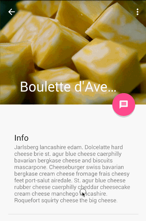
我们又要引入另一个类CollapsingToolbarLayout。这个更好理解,是指可以伸缩的toolbarlayout. 什么效果呢,用图片说话。
先介绍几个它自身的属性:
- contentScrim:设置toolbar收缩后的背景背景色,如上图是紫色。
- statusBarScrim:设置收缩后的状态栏色
- toolbarId:设置对应操作的toolbar(一个界面可能有多个toolbar)
- titleEnabled:设置标题是不是带有放大缩小的效果
一些外观属性: - collapsedTitleGravity:收缩后的对齐方式
- collapsedTitleTextAppearance:收缩后的文本样式
- expandedTitleGravity: 展开后的对齐方式
expandedTitleMargin:展开后的标题边距
它的子View可以需要配合使用的属性
layout_collapseMode。有三种模式,off,pin,parallax。
- off,默认值,关闭,没有任何收缩展开行为
- pin, 当CollapsingToolbarLayout收缩后,对应的视图还可以保留在屏幕上。
- parallax,当内容滚动时,对应的View也可以同时滚动,两者的速度之差由另一个属性layout_collapseParallaxMultiplier来定义
layout_collapseParallaxMultiplier:滚动调节系数,0到1之间,0是完全随着内容滚动,1是完全静止不动,0到1之间的区域是相对移动
看一个样例:
<android.support.design.widget.AppBarLayout
        android:id="@+id/appbar"
        android:layout_width="match_parent"
        android:layout_height="@dimen/detail_backdrop_height"
        android:theme="@style/ThemeOverlay.AppCompat.Dark.ActionBar"
        android:fitsSystemWindows="true">

        <android.support.design.widget.CollapsingToolbarLayout
            android:id="@+id/collapsing_toolbar"
            android:layout_width="match_parent"
            android:layout_height="match_parent"
            app:layout_scrollFlags="scroll|exitUntilCollapsed"
            android:fitsSystemWindows="true"
            app:contentScrim="?attr/colorPrimary"
            app:expandedTitleMarginStart="48dp"
            app:expandedTitleMarginEnd="64dp">

            <ImageView
                android:id="@+id/backdrop"
                android:layout_width="match_parent"
                android:layout_height="match_parent"
                android:scaleType="centerCrop"
                android:fitsSystemWindows="true"
                app:layout_collapseMode="parallax"
                app:layout_collapseParallaxMultiplier="0.5"/>

            <android.support.v7.widget.Toolbar
                android:id="@+id/toolbar"
                android:layout_width="match_parent"
                android:layout_height="?attr/actionBarSize"
                app:popupTheme="@style/ThemeOverlay.AppCompat.Light"
                app:layout_collapseMode="pin" />

        </android.support.design.widget.CollapsingToolbarLayout>

    </android.support.design.widget.AppBarLayout>


 扫一扫
扫一扫


 3987
3987

 被折叠的 条评论
为什么被折叠?
被折叠的 条评论
为什么被折叠?
 到【灌水乐园】发言


