


Bootstrap 3 是移动设备优先的,在这个意义上,Bootstrap 代码从小屏幕设备(比如移动设备、平板电脑)开始,然后扩展到大屏幕设备(比如笔记本电脑、台式电脑)上的组件和网格。
移动设备优先策略
- 内容
- 决定什么是最重要的。
- 布局
- 优先设计更小的宽度。
- 基础的 CSS 是移动设备优先,媒体查询是针对于平板电脑、台式电脑。
- 渐进增强
- 随着屏幕大小的增加而添加元素。
响应式网格系统随着屏幕或视口(viewportwww.qcw58.com)尺寸的增加,系统会自动分为最多12列。如下图:
Bootstrap 网格系统(Grid System)的工作原理
网格系统通过一系列包含内容的行和列来创建页面布局。下面列出了 Bootstrap www.qcw58.com网格系统是如何工作的:
- 行必须放置在 .container class 内,以便获得适当的对齐(alignment)和内边距(padding)。
- 使用行来创建列的水平组。
- 内容应该放置在列内,且唯有列可以是行的直接子元素。
- 预定义的网格类,比如 .row 和 .col-xs-4,可用于快速创建网格布局。LESS 混合类可用于更多语义布局。
- 列通过内边距(padding)来创建列内容之间的间隙。该内边距是通过 .rows 上的外边距(margin)取负,表示第一列和最后一列的行偏移。
- 网格系统是通过指定您想要横跨的十二个可用的列来创建的。例如,要创建三个相等的列,则使用三个 .col-xs-4。
媒体查询
媒体查询是非常别致的"有条件的 CSS 规则"。它只适用于一些基于某些规定条件的 CSS。如果满足那些条件,则应用相应的样式。
Bootstrap 中的媒体查询允许您基于视口大小移动、显示并隐藏内容。下面的媒体查询在 LESS 文件中使用,用来创建 Bootstrap 网格系统中的关键的分界点阈值。
|
1
2
3
4
5
6
7
8
9
10
11
|
/*
 超小设备(手机,小于 768px) */
/*
Bootstrap 中默认情况下没有媒体查询 *//*
小型设备(平板电脑,768px 起) */@media
(min-width: @screen-sm-min) { ... }/*
中型设备(台式电脑,992px 起) */ www.qcw58.com@media
(min-width: @screen-md-min) { ... }/*
大型设备(大台式电脑,1200px 起) */@media
(min-width: @screen-lg-min) { ... } |
我们有时候也会在媒体查询代码中包含 max-width,从而将 CSS 的影响限制在更小范围的屏幕大小之内。
|
1
2
3
4
|
@media
 (max-width: @screen-xs-max) { ... }
@media
(min-width: @screen-sm-min) and (max-width: @screen-sm-max) { ... }@media
(min-width: @screen-md-min) and (max-width: @screen-md-max) { ... }@media
(min-width: @screen-lg-min) { ... } |
媒体查询有两个部分,先是一个设备规范,然后是一个大小规则。在上面的案例中,设置了下列的规则:
让我们来看下面这行代码:
|
1
|
@media
(min-width: @screen-sm-min) and (max-width: @screen-sm-max) { ... } |
对于所有带有 min-width: @screen-sm-min 的设备,如果屏幕的宽度小于 @screen-sm-max,则会进行一些处理。
网格选项
下表总结了 Bootstrap 网格系统如何跨多个设备工作:
| 超小设备手机(<768px) | 小型设备平板电脑(≥768px) | 中型设备台式电脑(≥992px) | 大型设备台式电脑(≥1200px) | |
|---|---|---|---|---|
| 网格行为 | 一直是水平的 | 以折叠开始,断点以上是水平的 | 以折叠开始,断点以上是水平的 | 以折叠开始,断点以上是水平的 |
| 最大容器宽度 | None (auto)www.qcw58.com | 750px | 970px | 1170px |
| Class 前缀 | .col-xs- | .col-sm- | .col-md- | .col-lg- |
| 列数量和 | 12 | 12 | 12 | 12 |
| 最大列宽 | Auto | 60px | 78px | 95px |
| 间隙宽度 |
30px (一个列的每边分别 15px) |
30px (一个列的每边分别 15px) |
30px (一个列的每边分别 15px) |
30px (一个列的每边分别 15px) |
| 可嵌套 | Yes | Yes | Yes | Yes |
| 偏移量 | Yes | Yes | Yes | Yes |
| 列排序 | Yes | Yes | Yes | Yes |
基本的网格结构
下面是 Bootstrap 网格的基本结构:
|
1
2
3
4
5
6
7
8
|
<div class="container"> <div class="row"> <div class="col-*-*"></div> <div class="col-*-*"></div> </div>www.qcw58.com <div class="row">...</div></div><div class="container">.... |
下面是个具体代码实例:
|
1
2
3
4
5
6
7
8
9
10
11
12
13
14
15
16
17
18
19
20
21
22
23
24
25
26
27
28
29
30
31
32
33
34
|
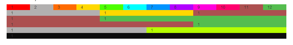
<div class="container"> <h1>Hello,
world!</h1> <div class="row"> <!--超小设备手机(<768px)
--> <div class="col-xs-1" style="background:
#f00">1</div> <div class="col-xs-1" style="background:
#b2b0b0">2</div> <div class="col-xs-1" style="background:
#ff6a00">3</div> <div class="col-xs-1" style="background:
#ffd800">4</div> <div class="col-xs-1" style="background:
#4cff00">5</div> <div class="col-xs-1" style="background:
#0ff">6</div> <div class="col-xs-1" style="background:
#0094ff">7</div> <div class="col-xs-1" style="background:
#b200ff">8</div> <div class="col-xs-1" style="background:
#ff00dc">9</div> <div class="col-xs-1" style="background:
#ff006e">10</div> <div class="col-xs-1" style="background:
#ac5050">11</div> <div class="col-xs-1" style="background:
#54bd4f">12</div> </div> <div class="row">www.qcw58.com <!--小型设备平板电脑(≥768px)
--> <div class="col-sm-4" style="background:
#b2b0b0">1</div> <div class="col-sm-4" style="background:
#ffd800">1</div> <div class="col-sm-4" style="background:
#ac5050">1</div> </div> <div class="row"> <!--中型设备台式电脑(≥992px)
--> <div class="col-md-4" style="background:
#ac5050">1</div> <div class="col-md-8" style="background:
#54bd4f">1</div> </div> <div class="row"> <!--大型设备台式电脑(≥1200px)
--> <div class="col-lg-8" style="background:
#ac5050">1</div> <div class="col-lg-4" style="background:
#54bd4f">1</div> </div> </div>qcw58.com |
偏移列
偏移是一个用于更专业的布局的有用功能。它们可用来给列腾出更多的空间。例如,.col-xs=* 类不支持偏移,但是它们可以简单地通过使用一个空的单元格来实现该效果。
为了在大屏幕显示器上使用偏移,请使用 .col-md-offset-* 类。这些类会把一个列的左外边距(margin)增加 * 列,其中 * 范围是从 1到 11。
在下面的实例中,我们有 <div class="col-md-6">..</div>,我们将使用 .col-md-offset-3 class 来居中这个 div。
|
1
2
3
4
5
6
7
8
9
10
11
12
13
14
15
16
17
18
19
20
21
22
23
24
|
<div class="container"> <div class="row"> <div class="col-xs-6
col-md-offset-3" style="background-color:
#dedef8;"> <p> 测试偏移列---此处往右偏移了3列 </p> </div> </div> <div class="row" qcw58.com> <div class="col-xs-1" style="background:
#f00">1</div> <div class="col-xs-1" style="background:
#b2b0b0">2</div> <div class="col-xs-1" style="background:
#ff6a00">3</div> <div class="col-xs-1" style="background:
#ffd800">4</div> <div class="col-xs-1" style="background:
#4cff00">5</div> <div class="col-xs-1" style="background:
#0ff">6</div> <div class="col-xs-1" style="background:
#0094ff">7</div> <div class="col-xs-1" style="background:
#b200ff">8</div> <div class="col-xs-1" style="background:
#ff00dc">9</div> <div class="col-xs-1" style="background:
#ff006e">10</div> <div class="col-xs-1" style="background:
#ac5050">11</div> <div class="col-xs-1" style="background:
#54bd4f">12</div> </div> </div> |
显示效果:

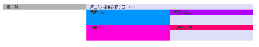
嵌套列
为了在内容中嵌套默认的网格,请添加一个新的 .row,并在一个已有的 .col-md-* 列内添加一组 .col-md-* 列。被嵌套的行应包含一组列,这组列个数不能超过12(其实,没有要求你必须占满12列)。
在下面的实例中,布局有两个列,第二列被分为两行四个盒子。
|
1
2
3
4
5
6
7
8
9
10
11
12
13
14
15
|
<div class="container"> <div class="row" www.qcw58.com> <div class="col-xs-4" style="background:
#b2b0b0">第一列</div> <div class="col-xs-8" style="background:
#dedef8">第二列--里面嵌套了四个DIV <div class="row"> <div class="col-xs-6" style="background:
#0094ff">我是内容一<br
/><br /><br /></div> <div class="col-xs-6" style="background:
#b200ff">我是内容二</div> </div> <div class="row"> <div class="col-xs-6" style="background:
#ff00dc">我是内容三<br
/><br /><br /></div> <div class="col-xs-6" style="background:
#ff006e">我是内容四</div> </div> </div> </div> </div> |
显示效果:
列排序
Bootstrap 网格系统另一个完美的特性,就是您可以很容易地以一种顺序编写列,然后以另一种顺序显示列。
您可以很轻易地改变带有 .col-md-push-* 和 .col-md-pull-* 类的内置网格列的顺序,其中 * 范围是从 1 到 11。
在下面的实例中,我们有两列布局,左列很窄,作为侧边栏。我们将使用 .col-md-push-* 和 .col-md-pull-* www.qcw58.com 类来互换这两列的顺序。
|
1
2
3
4
5
6
|
<div class="container"> <div class="row"> <div class="col-xs-4
col-md-push-8" style="background:
#ff00dc">左边</div> <div class="col-xs-8
col-md-pull-4" style="background:
#ff006e">右边</div> </div> </div> |
显示效果:


 扫一扫
扫一扫


 620
620

 被折叠的 条评论
为什么被折叠?
被折叠的 条评论
为什么被折叠?
 到【灌水乐园】发言


