边框
border-radiusbox-shadowborder-image
背景
background-sizebackground-origin
文本效果
多列
column-count:定义列数column-gap:列之间的宽度column-rule:设置列之间的宽度,样式和颜色
用户界面
resizebox-sizing
content-box:标准盒模型border-box:IE盒模型
outline-offset:轮廓框架在 border 边缘外的偏移
2D
transformchrome和safari需要前缀-webkit-,IE9加-ms-
translate(X,Y):相对原来的位置向X轴偏移Xpx,向Y轴便宜Ypxrotate():以图案中心为旋转点,正值为顺时针旋转,负值逆时针scale(x,y):宽,高各放大为原来的x和y倍,x为负值则左右翻转,y为负值则上下翻转skew():matrix()
transform-origin:设置元素的旋转基点
3D
rotateX():rotateY():rotateZ():
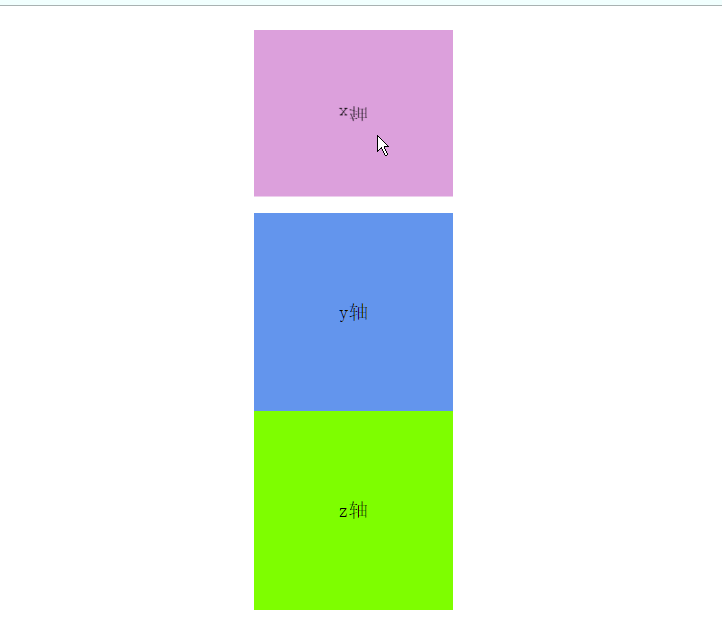
		.xRotate{
            width:  200px;
            height: 200px;
            background-color: plum;
            margin: 0 auto;
            transition: all 5s;
            text-align: center;
            line-height: 200px;
            font-size: 20px;
        }
        .xRotate:hover{
            transform: rotateX(360deg);
        }
        .yRotate{
            width:  200px;
            height: 200px;
            background-color: cornflowerblue;
            margin: 0 auto;
            transition: all 5s;
            text-align: center;
            line-height: 200px;
            font-size: 20px;
        }
        .yRotate:hover{
            transform: rotateY(360deg);
        }
        .zRotate{
            width:  200px;
            height: 200px;
            background-color: chartreuse;
            margin: 0 auto;
            transition: all 5s;
            text-align: center;
            line-height: 200px;
            font-size: 20px;
        }
        .zRotate:hover{
            transform: rotateZ(360deg);
        }
    </style>
</head>
<body>
<div class="xRotate">x轴</div>
<div class="yRotate">y轴</div>
<div class="zRotate">z轴</div>
</body>
动画
transition:@keyframes:animation:


 扫一扫
扫一扫


 被折叠的 条评论
为什么被折叠?
被折叠的 条评论
为什么被折叠?
 到【灌水乐园】发言


