


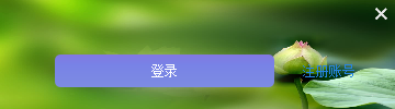
Qt中默认的按钮样式比较一般,为了实现优美的界面Qt支持对按键的样式自定义。一般有两种途径来自定义按键样式,第一种是通过设置按键在不同状态(常规、鼠标停留、鼠标按下)的颜色和样式、第二种是设置按键在不同状态下显示不同的图片,下面通过实现下面界面来展示这两种方法:
一、通过设置按键颜色
下面先给出上图中所展示的“注册账号”这个按键的实现方法:
	m_registerAccountBtn = new QPushButton(this);
    m_registerAccountBtn->resize(80, 30);
    m_registerAccountBtn->move(260, 50);
    m_registerAccountBtn->setText("注册账号");
    QString btnStyle1 = "\
        QPushButton{\
            color: rgb(38, 133, 227);\
            border:1px;\
        }\
        QPushButton:hover{\
            color: rgb(97, 179, 246);\
        }\
        QPushButton:pressed{\
            color: rgb(38, 133, 227);\
        }";
    m_registerAccountBtn->setStyleSheet(btnStyle1);
这里分别制定了按键在三种状态下的颜色。下面给出“登录”按键的实现代码:
	m_loginBtn = new QPushButton(this);
    m_loginBtn->setText("登录");
    m_loginBtn->resize(200, 30);
    m_loginBtn->move(50, 50);
    QString btnStyle2 =
        "QPushButton{\
            color: rgb(255, 255, 255);\
            background: qlineargradient(x1:0, y1:0, x2:0, y2:1, stop:0 rgb(166,164,208), stop:0.3 rgb(171,152,230), stop:1 rgb(152,140,220));\
            border:1px;\
            border-radius:5px; /*border-radius控制圆角大小*/\
            padding:2px 4px;  \
        }\
        QPushButton:hover{\
            color: rgb(255, 255, 255); \
            background: qlineargradient(x1:0, y1:0, x2:0, y2:1, stop:0 rgb(130,120,226), stop:0.3 rgb(120,130,230), stop:1 rgb(125,140,226));\
            border:1px;  \
            border-radius:5px; /*border-radius控制圆角大小*/\
            padding:2px 4px; \
        }\
        QPushButton:pressed{    \
            color: rgb(255, 255, 255); \
            background: qlineargradient(x1:0, y1:0, x2:0, y2:1, stop:0 rgb(240,156,121), stop:0.3 rgb(220,160,140), stop:1 rgb(230,140,120));  \
            border:1px;  \
            border-radius:5px; /*border-radius控制圆角大小*/\
            padding:2px 4px; \
        }";
    m_loginBtn->setStyleSheet(btnStyle2);
上述代码不仅指定了按键在三种状态下的颜色,还指定了按键的样式等。
二、通过设置按键图片
除了可以设置按键不同状态下的颜色之外,还可以设置按键在不同状态下锁显示的图片,下面给出上图右上角关闭按钮的实现:
	m_closeBtn = new QPushButton(this);
    this->setAutoFillBackground(true);
    QPalette palette;
    QPixmap pixmap(":/img/backImg.JPG");
    pixmap = pixmap.scaled(width(), height());
    palette.setBrush(QPalette::Window, QBrush(pixmap));
    this->setPalette(palette);

    m_closeBtn->setFixedSize(24, 24);
    m_closeBtn->move(this->width()-24, 0);
    QString closeBtnStyle = "\
        QPushButton{\
            border-image:url(:/img/close.png);\
        }\
        QPushButton:hover{\
            border-image:url(:/img/closeHover.png);\
        }\
        QPushButton:pressed{\
            border-image:url(:/img/closePressed.png);\
        }";
    m_closeBtn->setStyleSheet(closeBtnStyle);
这里设置也相对比较简单,只是指定了三种状态下显示不同的图片。
三、总结
本文所采用的方法均是通过设置控件的StyleSheet来实现的,是通过QStyle来表述的,QStyle语法本文不再详细解说。本文的工程代码以及资源可以在我的优快云资源下载。下面给出整个工程代码:
Widget.h
#ifndef WIDGET_H
#define WIDGET_H

#include <QWidget>
#include <QPushButton>

class Widget : public QWidget
{
    Q_OBJECT
private:
    QPushButton* m_closeBtn;
    QPushButton* m_loginBtn;
    QPushButton* m_registerAccountBtn;
public:
    Widget(QWidget *parent = 0);
    ~Widget();

    void connectSlots();

private slots:
    void onRegisterCount();
    void onLoginBtn();
    void onCloseBtn();

};

#endif // WIDGET_H
Widget.cpp
#include "Widget.h"

Widget::Widget(QWidget *parent)
    : QWidget(parent)
{
    // 取消边框
    setWindowFlags(Qt::FramelessWindowHint | Qt::WindowStaysOnTopHint);

    resize(360, 100);

    m_closeBtn = new QPushButton(this);
    this->setAutoFillBackground(true);
    QPalette palette;
    QPixmap pixmap(":/img/backImg.JPG");
    pixmap = pixmap.scaled(width(), height());
    palette.setBrush(QPalette::Window, QBrush(pixmap));
    this->setPalette(palette);

    m_closeBtn->setFixedSize(24, 24);
    m_closeBtn->move(this->width()-24, 0);
    QString closeBtnStyle = "\
        QPushButton{\
            border-image:url(:/img/close.png);\
        }\
        QPushButton:hover{\
            border-image:url(:/img/closeHover.png);\
        }\
        QPushButton:pressed{\
            border-image:url(:/img/closePressed.png);\
        }";
    m_closeBtn->setStyleSheet(closeBtnStyle);

    m_registerAccountBtn = new QPushButton(this);
    m_registerAccountBtn->resize(80, 30);
    m_registerAccountBtn->move(260, 50);
    m_registerAccountBtn->setText("注册账号");
    QString btnStyle1 = "\
        QPushButton{\
            color: rgb(38, 133, 227);\
            border:1px;\
        }\
        QPushButton:hover{\
            color: rgb(97, 179, 246);\
        }\
        QPushButton:pressed{\
            color: rgb(38, 133, 227);\
        }";
    m_registerAccountBtn->setStyleSheet(btnStyle1);

    m_loginBtn = new QPushButton(this);
    m_loginBtn->setText("登录");
    m_loginBtn->resize(200, 30);
    m_loginBtn->move(50, 50);
    QString btnStyle2 =
        "QPushButton{\
            color: rgb(255, 255, 255);\
            background: qlineargradient(x1:0, y1:0, x2:0, y2:1, stop:0 rgb(166,164,208), stop:0.3 rgb(171,152,230), stop:1 rgb(152,140,220));\
            border:1px;\
            border-radius:5px; /*border-radius控制圆角大小*/\
            padding:2px 4px;  \
        }\
        QPushButton:hover{\
            color: rgb(255, 255, 255); \
            background: qlineargradient(x1:0, y1:0, x2:0, y2:1, stop:0 rgb(130,120,226), stop:0.3 rgb(120,130,230), stop:1 rgb(125,140,226));\
            border:1px;  \
            border-radius:5px; /*border-radius控制圆角大小*/\
            padding:2px 4px; \
        }\
        QPushButton:pressed{    \
            color: rgb(255, 255, 255); \
            background: qlineargradient(x1:0, y1:0, x2:0, y2:1, stop:0 rgb(240,156,121), stop:0.3 rgb(220,160,140), stop:1 rgb(230,140,120));  \
            border:1px;  \
            border-radius:5px; /*border-radius控制圆角大小*/\
            padding:2px 4px; \
        }";
    m_loginBtn->setStyleSheet(btnStyle2);

    connectSlots();
}

void Widget::connectSlots()
{
    connect(m_registerAccountBtn, SIGNAL(clicked(bool)), this, SLOT(onRegisterCount()));
    connect(m_loginBtn, SIGNAL(clicked(bool)), this, SLOT(onLoginBtn()));
    connect(m_closeBtn, SIGNAL(clicked(bool)), this, SLOT(onCloseBtn()));
}

void Widget::onRegisterCount()
{

}

void Widget::onLoginBtn()
{

}

void Widget::onCloseBtn()
{
    this->close();
}

Widget::~Widget()
{

}
main.cpp
#include "Widget.h"
#include <QApplication>

int main(int argc, char *argv[])
{
    QApplication a(argc, argv);
    Widget w;
    w.show();

    return a.exec();
}
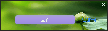
下面是运行效果:


 扫一扫
扫一扫


 2万+
2万+

 被折叠的 条评论
为什么被折叠?
被折叠的 条评论
为什么被折叠?
 到【灌水乐园】发言


