QCustomPlot系列2—绘制折线图(X轴为时间)

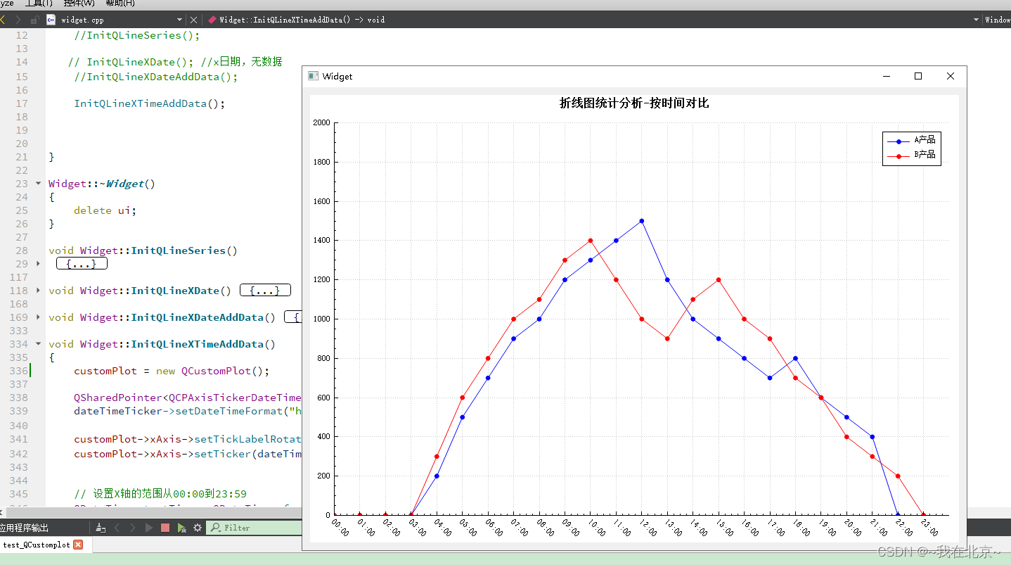
void Widget::InitQLineXTimeAddData()
{
    customPlot = new QCustomPlot();

    QSharedPointer<QCPAxisTickerDateTime> dateTimeTicker(new QCPAxisTickerDateTime);
    dateTimeTicker->setDateTimeFormat("hh:mm"); // 设置时间格式为小时:分钟

    customPlot->xAxis->setTickLabelRotation(45); // 设置刻度标签旋转角度,以便更好地显示
    customPlot->xAxis->setTicker(dateTimeTicker);


    // 设置X轴的范围从00:00到23:59
    QDateTime startTime = QDateTime::fromString("00:00", "hh:mm");
    QDateTime endTime = QDateTime::fromString("23:59", "hh:mm");
    customPlot->xAxis->setRange(startTime.toMSecsSinceEpoch()/1000.0, endTime.toMSecsSinceEpoch()/1000.0);

    // 动态生成X轴的刻度
    int numHours = startTime.secsTo(endTime) / 3600 + 1; //计算时间范围内的小时数
   // 设置 tickCount 为时间范围内的小时数
    dateT
### 如何使用 QCustomPlot 绘制折线图 为了在应用程序中利用 `QCustomPlot` 创建折线图,可以遵循以下方法。此过程涉及初始化 `QCustomPlot` 对象并设置数据点来形成所需的线条。 #### 初始化和配置 QCustomPlot 实例 创建一个新的 `QCustomPlot` 实例,并将其集成到界面布局中: ```cpp // 假设有一个 QWidget* ui; QCustomPlot *customPlot = new QCustomPlot(ui); ui->verticalLayout->addWidget(customPlot); // 将 customPlot 添加至垂直布局中 ``` #### 设置坐标标签 定义 X 和 Y 上的文字描述以便于理解图表含义: ```cpp customPlot->xAxis->setLabel("X Axis Label"); customPlot->yAxis->setLabel("Y Axis Label"); ``` #### 准备数据向量 准备两个容器存储横纵坐标的数值对,这些值决定了折线的位置走向: ```cpp std::vector<double> xData{0, 1, 2, 3, 4}; std::vector<double> yData{0, 2, 4, 8, 16}; ``` #### 向图形对象添加数据序列 通过调用 `addGraph()` 方法获取新的图形实例,并将之前准备的数据填充进去: ```cpp QCPGraph *graph = customPlot->addGraph(); for (size_t i = 0; i < xData.size(); ++i){ graph->addData(xData[i], yData[i]); } ``` #### 自动调整坐标范围适应所有数据点 为了让所有的数据都能清晰可见,自动计算合适的坐标边界是非常重要的一步操作: ```cpp customPlot->rescaleAxes(); customPlot->replot(); ``` 上述代码片段展示了如何快速构建一个基本的折线图[^1]。对于更复杂的需求,比如改变颜色、样式或是增加额外的功能特性,则可以根据官方文档中的指导进一步探索更多可能性[^2]。
评论
添加红包

请填写红包祝福语或标题

红包个数最小为10个

红包金额最低5元

当前余额3.43前往充值 >
需支付:10.00
成就一亿技术人!
领取后你会自动成为博主和红包主的粉丝 规则
hope_wisdom
发出的红包
实付
使用余额支付
点击重新获取
扫码支付
钱包余额 0

抵扣说明:

1.余额是钱包充值的虚拟货币,按照1:1的比例进行支付金额的抵扣。
2.余额无法直接购买下载,可以购买VIP、付费专栏及课程。

余额充值