


问题:
假设高度已知,请写出三栏布局,其中左栏、右烂宽度各为300px,中间自适应
方式一:使用浮动解决
<!DOCTYPE html>
<html lang="en">
<head>
    <meta charset="UTF-8">
    <title>Title</title>
    <style>
        html *{
            padding:0;
            margin:0;
        }
        div{
            height: 100px;
        }
        .left{
            float: left;
            width:300px;
            background: red
        }
        .center{
            background: gold;
        }
        .right{
            float:right;
            width: 300px;
            background: green;
        }
    </style>
</head>
<body>
    <div class="left-right-center">
        <div class="left"></div>
        <div class="right"></div>
        <div class="center"></div>   <!--这里的中间center要写在left和right后面,否则得不到想要的结果-->
    </div>
</body>
</html>
方式二:使用绝对定位
<!DOCTYPE html>
<html lang="en">
<head>
    <meta charset="UTF-8">
    <title>Title</title>
    <style>
        html *{
            padding:0;
            margin:0;
        }
        div{
            height: 100px;
        }
        .left-right-center{
            width: 100%;
            position: absolute;
        }
        .left{
            width:300px;
            background: red;
            position: absolute;
            left:0;
        }
        .center{
            background: yellow;
            position: absolute;
            right:300px;
            left:300px;
        }
        .right{
            width: 300px;
            background: blue;
            position: absolute;
            right:0;
        }
    </style>
</head>
<body>
<div class="left-right-center">
    <div class="left"></div>
    <div class="center"></div>    <!--此时center在中间,这样布局的结果是当浏览器宽度小于600px时,两个左右300px的元素会重合-->
    <div class="right"></div>
</div>
</body>
</html>
方式三:使用flexbox
<!DOCTYPE html>
<html lang="en">
<head>
    <meta charset="UTF-8">
    <title>Title</title>
    <style>
        html *{
            padding:0;
            margin:0;
        }
        div{
            height: 100px;
        }
        .left-right-center{
            display:flex;
        }
        .left{
            width:300px;
            background: red;
        }
        .center{
            background: yellow;
            flex: 1;
        }
        .right{
            width: 300px;
            background: blue;
        }
    </style>
</head>
<body>
<div class="left-right-center">
    <div class="left"></div>
    <div class="center"></div>   <!--这里要注意,当屏幕宽度小于600px以后,左右两侧的300px也会减少-->
    <div class="right"></div>
</div>
</body>
</html>
方式四:使用表格布局
<!DOCTYPE html>
<html lang="en">
<head>
    <meta charset="UTF-8">
    <title>Title</title>
    <style>
        html *{
            padding:0;
            margin:0;
        }
        div{
            height: 100px;
        }
        .left-right-center{
            width:100%;
            display: table;
            height:100px;
        }
        .left{
            width:300px;
            background: red;
            display:table-cell;
        }
        .center{
            background: yellow;
        }
        .right{
            width: 300px;
            background: blue;
            display:table-cell;
        }
    </style>
</head>
<body>
<div class="left-right-center">
    <div class="left"></div>
    <div class="center"></div>    <!--这里要注意,当屏幕宽度小于600px以后,左右两侧的300px也会减少-->
    <div class="right"></div>
</div>
</body>
</html>
方式五:使用网格布局
<!DOCTYPE html>
<html lang="en">
<head>
    <meta charset="UTF-8">
    <title>Title</title>
    <style>
        html *{
            padding:0;
            margin:0;
        }
        div{
            height: 100px;
        }
        .left-right-center{
            width:100%;
            display:grid;
            grid-template-rows: 100px;
            grid-template-columns: 300px auto 300px;
        }
        .left{
            background: red;
        }
        .center{
            background: yellow;
        }
        .right{
            background: blue;
        }
    </style>
</head>
<body>
<div class="left-right-center">
    <div class="left"></div>
    <div class="center"></div>
    <div class="right"></div>
</div>
</body>
</html>
问题延申
一、每个解决方案的优缺点?
解答:(1)浮动,是脱离文档流的,会带来很多问题。但是兼容性比较好。
(2)绝对定位,适用快捷。因为你已经脱离文档流了,那么你下面的子元素也必须脱离文档流。导致了可使用性差。
(3)flexbox布局,是CSS3中新出现的布局方式,为了解决上述两种方案的不足才出现的。它比较完美,在移动端基本都是flex布局。
(4)表格布局的兼容性是非常好的,三栏布局当其中一个单元格超出的时候,两侧的单元格也会调整高度。
(5)网格布局,代码少。
二、假设把高度去掉,考虑纵向,哪个不适用了?
方式一、方式二、方式五不能用。
三、考虑到兼容性,真正的运用到业务中去,哪个是最适用的?
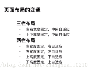
四、页面布局的变通


 扫一扫
扫一扫


 1560
1560

 被折叠的 条评论
为什么被折叠?
被折叠的 条评论
为什么被折叠?
 到【灌水乐园】发言


