


 本文详细介绍了使用Python的Matplotlib库进行数据可视化的方法,包括如何创建图表、设置坐标轴颜色和位置,以及调整刻度位置,使图表更具可读性和吸引力。
import matplotlib.pyplot as plt #导入模块matplotlib.pyplot
%matplotlib inline
import numpy as np
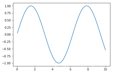
x = np.linspace(0.05,10,1000) #在0.05~10之间等间隔取1000个数
y = np.sin(x)
plt.plot(x,y)
[<matplotlib.lines.Line2D at 0x1729fd7c940>]
plt.gcf()和plt.gca()
当前的图表和子图可以使用plt.gcf()和plt.gca()获得,分别表示Get Current Figure和Get Current Axes。在pyplot模块中,许多函数都是对当前的Figure或Axes对象进行处理,比如:plt.plot()实际上会通过plt.gca()获得当前的Axes对象ax,然后再调用ax.plot()方法实现真正的绘图。
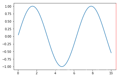
plt.plot(x,y)
ax = plt.gca()
ax.spines[“right”].set_color(‘red’)
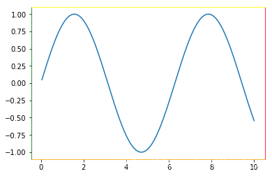
plt.plot(x,y)
ax = plt.gca()
ax.spines[“right”].set_color(‘red’)
ax.spines[“left”].set_color(‘green’)
ax.spines[“top”].set_color(‘yellow’)
ax.spines[“bottom”].set_color(‘orange’)
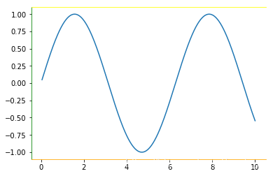
plt.plot(x,y)
ax = plt.gca()
ax.spines[“right”].set_color(‘none’)
ax.spines[“left”].set_color(‘green’)
ax.spines[“top”].set_color(‘yellow’)
ax.spines[“bottom”].set_color(‘orange’)
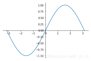
x = np.linspace(-3.15,3.15,100)
y = np.sin(x)
plt.plot(x,y)
ax = plt.gca()
ax.spines[“right”].set_color(‘none’)
ax.spines[“top”].set_color(‘none’)
ax.xaxis.set_ticks_position('bottom') #把x轴的刻度设置为‘bottom’
ax.yaxis.set_ticks_position('left') #把y轴的刻度设置为‘left’

ax.spines['bottom'].set_position(('data',0)) #设置left对应到0点
ax.spines['left'].set_position(('data',0)) #设置left对应到0点


 2万+
2万+

 被折叠的 条评论
为什么被折叠?
被折叠的 条评论
为什么被折叠?
 到【灌水乐园】发言


