


复习日啦复习日啦,坚持打卡对笨人这种三分钟热度的小孩来说还是微微有些挑战的。
继续加油!!!
回顾一下前面六天学的内容,主要是一些简单的数据预处理
- 清洗异常值,连续特征用箱线图,离散特征用直方图来判断,将异常值删去视为缺失值
- 对于缺失值,数值型的数据用中位数,均值啥的来补充,分类型的数据用众数来补充
- 对于离散特征,有顺序关系,标签编码(还没学);无顺序关系,独热编码
- 对于连续特征,根据后续模型需要选择是否进行归一化和对数化
- 进行一些基本的可视化,单特征的可视化,特征与标签之间的可视化,特征与特征之间的可视化
针对心脏病数据集进行预处理
读取数据,判断离散特征与连续特征
import pandas as pd
import matplotlib.pyplot as plt
import seaborn as sns

# 设置全局字体为支持中文的字体 (例如 SimHei)
plt.rcParams['font.sans-serif'] = ['SimHei']
# 解决负号'-'显示为方块的问题
plt.rcParams['axes.unicode_minus'] = False

data = pd.read_csv(r'heart.csv')
print(data.head())

discrete_feature = []
continue_feature = []

for feature in data.columns:
    if data[feature].dtype == 'object':
        # 字符串类型直接判定为离散特征
        discrete_feature.append(feature)
        print(f'离散特征(字符串):{feature}')
    else:
        # 数值类型按唯一值数量判断
        unique_count = data[feature].nunique()
        if unique_count <= 5:
            discrete_feature.append(feature)
            print(f'分类型特征(数值编码):{feature},值有:{data[feature].unique()}')
        else:
            continue_feature.append(feature)
            print(f'连续特征:{feature},共{unique_count}个不同值')

 age  sex  cp  trestbps  chol  ...  oldpeak  slope  ca  thal  target
0   63    1   3       145   233  ...      2.3      0   0     1       1
1   37    1   2       130   250  ...      3.5      0   0     2       1
2   41    0   1       130   204  ...      1.4      2   0     2       1
3   56    1   1       120   236  ...      0.8      2   0     2       1
4   57    0   0       120   354  ...      0.6      2   0     2       1

[5 rows x 14 columns]
连续特征:age,共41个不同值
分类型特征(数值编码):sex,值有:[1 0]
分类型特征(数值编码):cp,值有:[3 2 1 0]
连续特征:trestbps,共49个不同值
连续特征:chol,共152个不同值
分类型特征(数值编码):fbs,值有:[1 0]
分类型特征(数值编码):restecg,值有:[0 1 2]
连续特征:thalach,共91个不同值
分类型特征(数值编码):exang,值有:[0 1]
连续特征:oldpeak,共40个不同值
分类型特征(数值编码):slope,值有:[0 2 1]
分类型特征(数值编码):ca,值有:[0 2 1 3 4]
分类型特征(数值编码):thal,值有:[1 2 3 0]
分类型特征(数值编码):target,值有:[1 0]
在查阅特征中文时发现,虽然部分特征看似为数值型但实则为分类型
对离散特征进行独热编码,类型转化
encode_data = pd.get_dummies(data,columns=discrete_feature,prefix=discrete_feature,drop_first=False)
# 将布尔型转化为数值型
encode_data = encode_data.astype(int)
print(encode_data.head())

   age  trestbps  chol  thalach  ...  thal_2  thal_3  target_0  target_1
0   63       145   233      150  ...       0       0         0         1
1   37       130   250      187  ...       1       0         0         1
2   41       130   204      172  ...       1       0         0         1
3   56       120   236      178  ...       1       0         0         1
4   57       120   354      163  ...       1       0         0         1

[5 rows x 32 columns]
判断是否有缺失值,发现无缺失值
print(data.isnull().sum())

[5 rows x 32 columns]
age         0
sex         0
cp          0
trestbps    0
chol        0
fbs         0
restecg     0
thalach     0
exang       0
oldpeak     0
slope       0
ca          0
thal        0
target      0
dtype: int64
一些基本的可视化
一、年龄段与心脏病之间的关系
plt.figure(figsize=(12,6))
sns.histplot(data=data,x='age',hue='target',multiple='stack',bins=20,palette=['#1f77b4', '#ff7f0e'])
plt.title('不同年龄段的心脏病患病分布', fontsize=15)
plt.xlabel('年龄')
plt.ylabel('人数')
plt.legend(['健康', '患病'])
plt.tight_layout()
plt.show()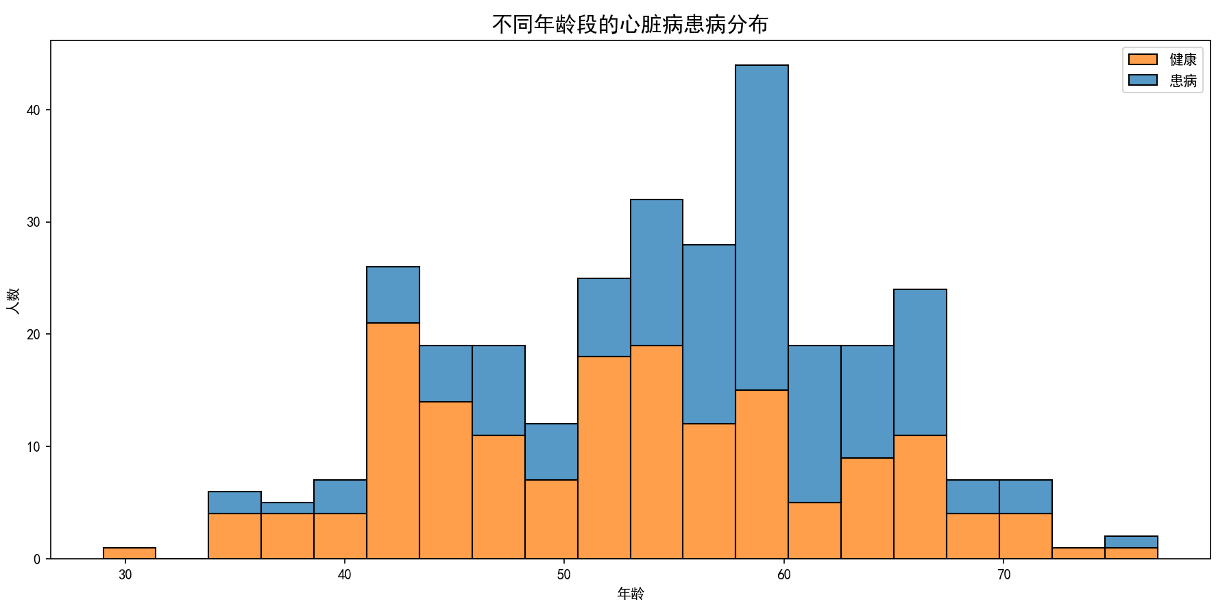
可以从图中看出来50-70这个年龄段是心脏病人群的高发年龄
二、性别与心脏病之间的关系
plt.figure(figsize=(8, 6))
# 计算不同性别的患病比例
gender_data = data.groupby('sex')['target'].mean().reset_index()
# 绘制柱状图
ax = sns.barplot(x='sex', y='target', data=gender_data, palette=['#e377c2', '#7f7f7f'])
# 添加百分比标签
for p in ax.patches:
    ax.annotate(f'{p.get_height():.1%}',
                (p.get_x() + p.get_width()/2., p.get_height()),
                ha='center', va='bottom', fontsize=12)
plt.title('性别与心脏病患病率关系', fontsize=15)
plt.xlabel('性别(0=女,1=男)')
plt.ylabel('患病比例')
plt.tight_layout()
plt.show()
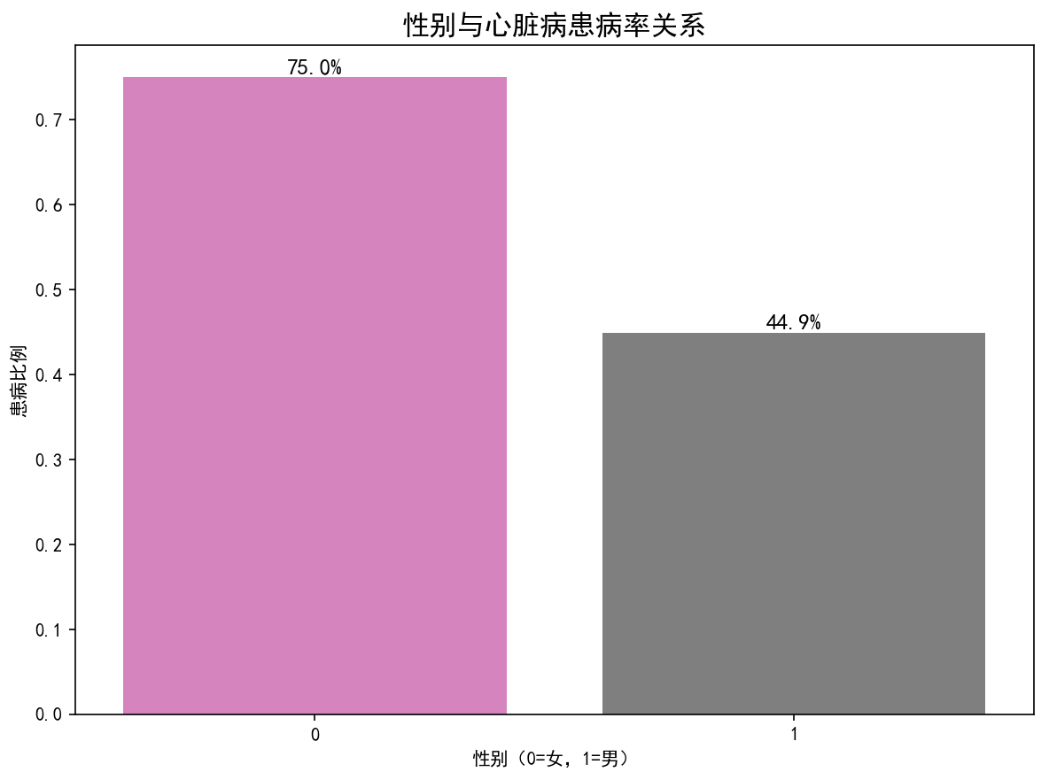
女性患病率是男性患病率的1.6倍
三、不同胸痛类型的患病情况
plt.figure(figsize=(10, 6))
# 胸部疼痛类型与患病关系
cp_order = sorted(data['cp'].unique())
sns.countplot(x='cp', hue='target', data=data, order=cp_order, palette='Set2')
plt.title('不同胸部疼痛类型的患病情况', fontsize=15)
plt.xlabel('胸部疼痛类型(0-3)')
plt.ylabel('人数')
plt.legend(['健康', '患病'])
plt.tight_layout()
plt.show()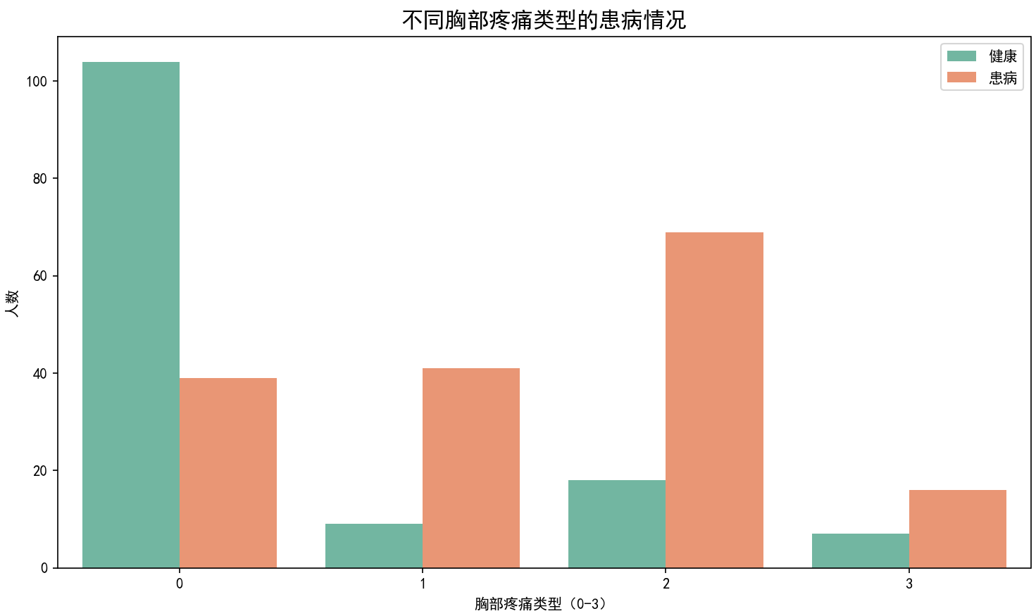
疼痛类型为2的非典型心绞痛患病人数与患病率都最高
四、心脏病患者与健康人群的血压对比
plt.figure(figsize=(10, 6))
# 血压与患病关系箱线图
ax = sns.boxplot(x='target', y='trestbps', data=data, palette=['#1f77b4', '#ff7f0e'])
plt.title('心脏病患者与健康人群的血压对比', fontsize=15)
plt.xlabel('是否患病(0=健康,1=患病)')
plt.ylabel('静息血压(mmHg)')
plt.xticks([0, 1], ['健康', '患病'])
plt.tight_layout()
plt.show()
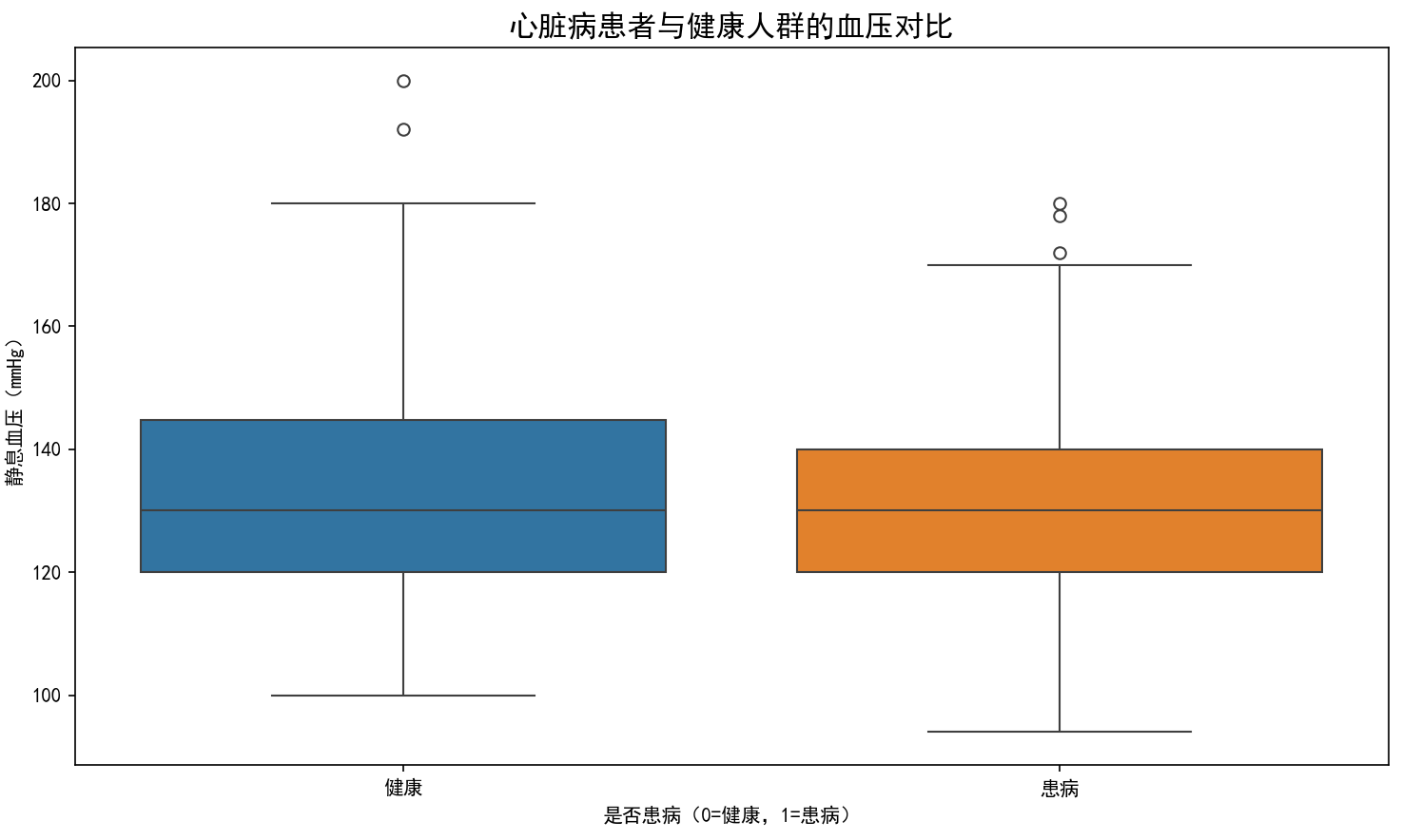
发现患病患者的血压高压最高值低于健康人群,但均值是差不多的,血压可能与是否患病的关系不大
五、心脏病人群与健康人群的最大心率对比
plt.figure(figsize=(10, 6))
# 最大心率与患病关系小提琴图
sns.violinplot(x='target', y='thalach', data=data, palette=['#2ca02c', '#d62728'], inner='quartile')
plt.title('心脏病患者与健康人群的最大心率对比', fontsize=15)
plt.xlabel('是否患病')
plt.ylabel('最大心率(次/分钟)')
plt.xticks([0, 1], ['健康', '患病'])
plt.tight_layout()
plt.show()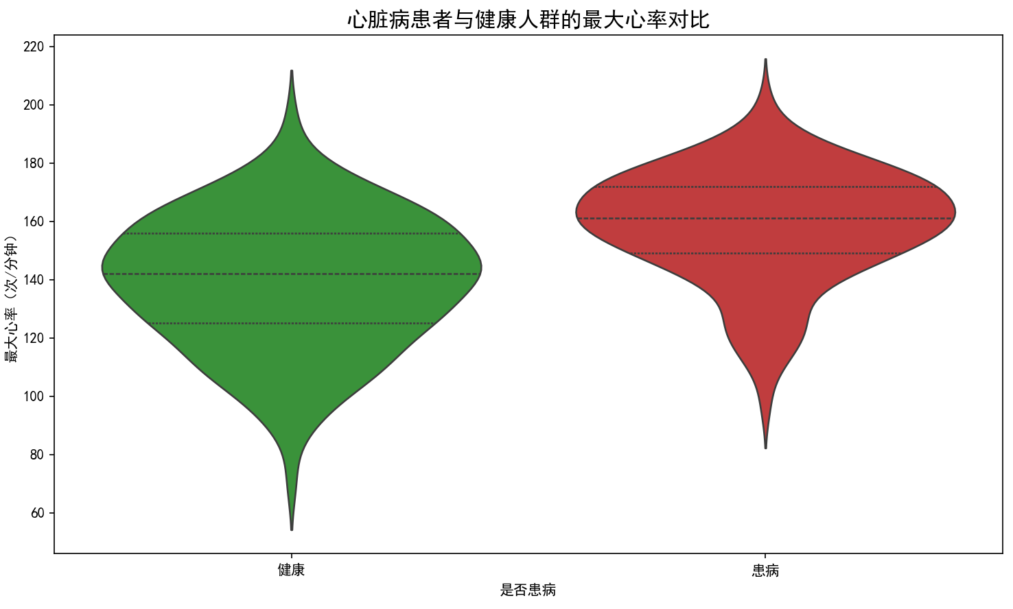
患病人群的最大心率普遍高于健康人群,分布集中在160次/分钟
六、不同性别和疼痛类型的患病比例
# 性别与疼痛类型交叉分析
# 数据预处理:添加性别和疼痛类型的中文标签
data['性别'] = data['sex'].map({0: '女性', 1: '男性'})
# UCI数据集中cp字段含义:0=典型心绞痛,1=非典型心绞痛,2=非心绞痛,3=无症状
data['疼痛类型'] = data['cp'].map({0: '典型心绞痛', 1: '非典型心绞痛', 2: '非心绞痛', 3: '无症状'})

# 绘制交叉分析图
plt.figure(figsize=(10, 6))
sns.barplot(
    data=data,
    x='疼痛类型',  # 分组轴:疼痛类型
    y='target',    # 指标轴:患病比例
    hue='性别',    # 分组变量:性别
    ci=None,       # 关闭置信区间
    palette=['#1f77b4', '#ff7f0e']
)

# 完善图表要素
plt.title('不同性别和疼痛类型的患病比例', fontsize=14)
plt.ylabel('患病比例', fontsize=12)
plt.xlabel('胸部疼痛类型', fontsize=12)
plt.ylim(0, 1)  # 设置y轴范围为0-1(比例)
plt.legend(title='性别')  # 图例标题与hue对应
plt.tight_layout()
plt.show()
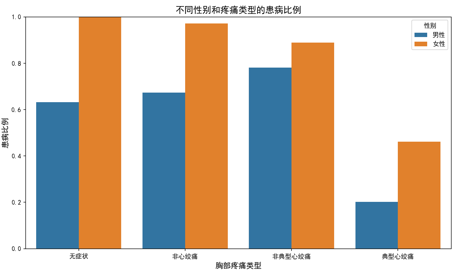
患病比例总体上仍是女性高于男性,但在与疼痛类型的关系上男性与女性显现出较大不同,男性的胸部疼痛类型与患病比例与所有性别疼痛患病比例一致,均为非典型心绞痛患病比例最大。但女性在无症状与非心绞痛的疼痛类型中也有很高的患病率。这个是值得重点探究原因的。


 238
238

 被折叠的 条评论
为什么被折叠?
被折叠的 条评论
为什么被折叠?
 到【灌水乐园】发言


