


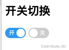
最终实现效果
使用场景:当使用的UI框架没提供类似的switch开关组件或者组件不能完全满足UI设计的显示需求,需要进行样式自定义,或者作为组件形式引入
<h2>开关切换</h2>

<!--开-->
<label class="switch" >
  <input type="checkbox" >
  <div class="slider round checked">
    <span  class="slider-text on" >开</span>
  </div>
 </label>
<!--关-->
<label class="switch" >
  <input type="checkbox" >
  <div class="slider round">
    <span class="slider-text">关</span>
  </div>
 </label>
说明:以下html+css实现了带有“开”、“关”文字标识的基本switch开关样式, 通过class="round"控制圆角的显示,通过class="checked" 及class="on" 控制选中样式显示
css
.switch {
  position: relative;
  display: inline-block;
  width: 44px;
  height: 22px;
}

.switch input {
  display:none;
}
.slider {
  position: absolute;
  cursor: pointer;
  top: 0;
  left: 0;
  right: 0;
  bottom: 0;
  background-color: #ccc;
  -webkit-transition: .4s;
  transition: .4s;
}

.slider:before {
  position: absolute;
  content: "";
  height: 18px;
  width: 18px;
  left: 2px;
  bottom: 2px;
  background-color: white;
  -webkit-transition: .4s;
  transition: .4s;
}

.slider.checked {
  background-color: #2196F3;
}

.slider.checked:before {
  -webkit-transform: translateX(22px);
  -ms-transform: translateX(22px);
  transform: translateX(22px);
}
.slider.round {
  border-radius: 34px;
}

.slider.round:before {
  border-radius: 50%;
}
.slider-text{
  color: #fff;
  position: absolute;
  left: 24px;
  margin: 0 auto;
  font-size:12px;
  line-height: 22px
}
.on.slider-text{
   left: 8px;
}


 扫一扫
扫一扫


 6063
6063

 被折叠的 条评论
为什么被折叠?
被折叠的 条评论
为什么被折叠?
 到【灌水乐园】发言


