


构建一个页面的骨架
wxml
<view class="chunck color_1">1</view>
<view class="chunck color_2">2</view>
<view class="chunck color_3">3</view>
wxss
.chunck{
  width: 100px;
  height: 100px;
}
.color_1{
  background-color: red;
}
.color_2{
  background-color: blue;
}
.color_3{
  background-color: green;
}
| 说明 | 效果 |
|---|---|
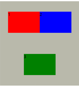
| 默认是块级元素,每个块一行。三个快每个块占一行。 | 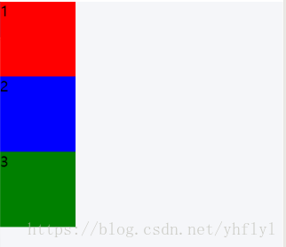 |
如何将这个块级元素变为行级元素
我们原来的方法1:
.chunck{
  display: inline;
  width: 100px;  // 在小程序中是width波浪线
  height: 100px;// 在小程序中是height波浪线
}
| 说明 | 效果 |
|---|---|
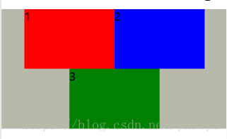
| 结果呢?成了这个样子。并不符合我们的需求。 | 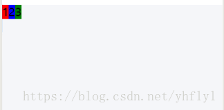 |
原来的方法2:
.chunck{
  display: inline-block;
  width: 100px;
  height: 100px;
}
| 说明 | 效果 |
|---|---|
| 这样就可以了,初步满足需求。 | 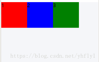 |
利用flex容器(弹性布局)
在view块外面添加一个容器
<view class="container">
  <view class="chunk color_1">1</view>
  <view class="chunk color_2">2</view>
  <view class="chunk color_3">3</view>
</view>
.chunk{
  width: 100px;
  height: 100px;
}
.container{
  display: flex;  // 使用flex布局
  background-color: #b9b9ab;
}
.color_1{
  background-color: red;
}
.color_2{
  background-color: blue;
}
.color_3{
  background-color: green;
}
| 说明 | 效果 |
|---|---|
| 这样就实现有块级元素变为行级。 | 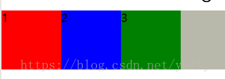 |
flex-direction
.container{
  display: flex;
  flex-direction: row;  //  不设置默认为row (行布局)
  /*flex-direction: column;*/ // 设置为列布局
  background-color: #b9b9ab;
}
效果和上面的一样。
其他:
| 属性 | 说明 | 效果 |
|---|---|---|
| flex-direction: row-reverse | 将行级元素倒叙布局 | 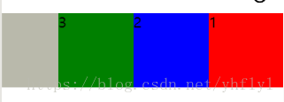 |
| flex-direction: column-reverse | 将块级元素倒叙布局 | 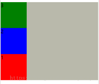 |
如何将对齐方向改变呢?
.container{
  display: flex;
  flex-direction: column-reverse;  /*再将元素颠倒时可以使用flex-end对齐, 在没有颠倒时使用上(左)对齐使用flex-start。下(右)对齐flex-end,*/
  /* justify-content: flex-end; */
  background-color: #b9b9ab;
  height: 400px;
}
| 添加的属性 | 原来 | 结果 |
|---|---|---|
| justify-content: flex-end; | 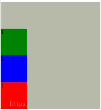 | 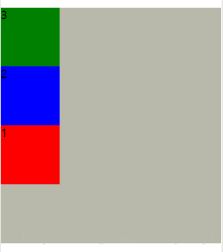 |
其他:
| 属性 | 效果 |
|---|---|
| justify-content: center; /* 居中 */ | 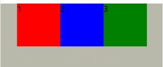 |
| justify-content: space-between; /* 平均分布 */ | 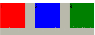 |
| justify-content: space-around; /* 等距分布 */ | 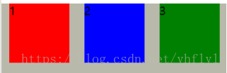 |
关于主轴和交叉轴
| 描述 | 效果 |
|---|---|
| 主轴和交叉轴主要看flex-direction: row,如果row方向布局那么row方向就是主轴(从左到右),否则就是交叉轴(从上到下)。 | 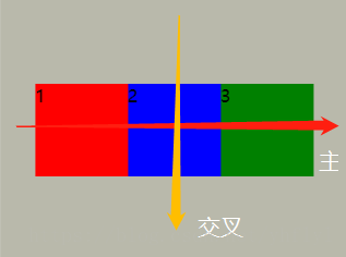 |
消除间距
当你使用flex-wrap进行超过换行是会发现这样的效果:
.chunk{
  width: 150px;
  height: 100px;
}
.container{
  display: flex;
  flex-direction: row;
  flex-wrap: wrap;
  justify-content: center;
  align-items: center;
  background-color: #b9b9ab;
  height: 400px;
}
| 效果 | 解决后 | 解决 |
|---|---|---|
 |  | height: 200px; |
**原因:**flex会做自适应布局,每个元素的上下间距是相等的,所以会出现效果图中的结果,当你把容器的高度设置为200就不会有间隙。


 扫一扫
扫一扫


 743
743

 被折叠的 条评论
为什么被折叠?
被折叠的 条评论
为什么被折叠?
 到【灌水乐园】发言


