


 本文详细介绍了在ArkTS中如何创建自定义组件,包括@Component装饰器的使用、组件结构、页面与自定义组件的区别,以及@Builder和@BuilderParam装饰器在参数传递和事件处理中的作用。
文章目录
这个ArkTS-自定义component引入只是一个入坑
创建自定义组件
@Component
export  struct compTest{
  @State one:string = "Test"
  build(){
    // Row(){} //build中只能一个Row(横向)或者是Column(纵向)
    Column(){
      Text(this.one)//Text文本和文本内容
        .fontSize(25)//文本字体大小
        .fontColor("#f00")//文本字体颜色
        .onClick(()=>{//文本字体的点击事件
          this.one = 'hello ArkTS' //改变文本
        })
    }
  }
}
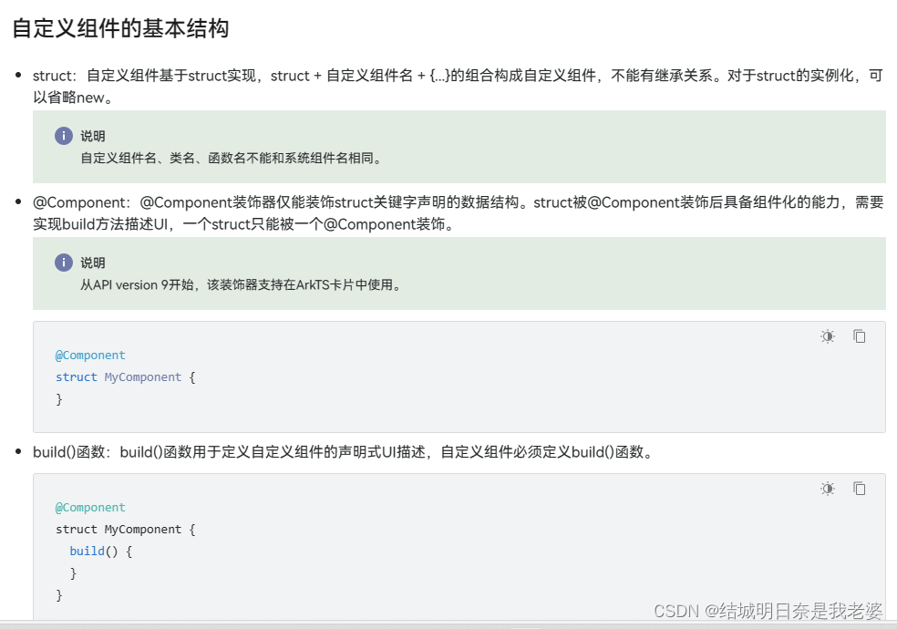
创建组件,以上三个是关键信息,意思就是组件就要有@Component装饰器和struct(跟java中的class一个性质),在ArkTS中必须要定义build(){}固定格式
页面和自定义组件生命周期
自定义组件和页面的区别
- 自定义组件:@Component装饰的UI单元,可以组合多个系统组件实现UI的复用。
- 页面:即应用的UI页面。可以由一个或者多个自定义组件组成,@Entry装饰的自定义组件为页面的入口组件,即页面的根节点,一个页面有且仅能有一个@Entry。
只有被@Entry装饰的组件才可以调用页面的生命周期。
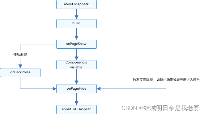
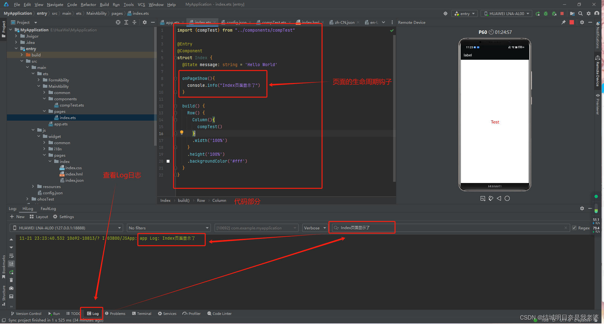
页面生命周期(即被@Entry修饰的组件)
- onPageShow:页面每次显示时触发。
- onPageHide:页面每次隐藏时触发一次。
- onBackPress:当用户点击返回按钮时触发。
@Entry
@Component
struct Index {

  onPageShow(){
    console.info("Index页面显示了")
  }

  build() {
    Row() {
      //...
    }
  }
}
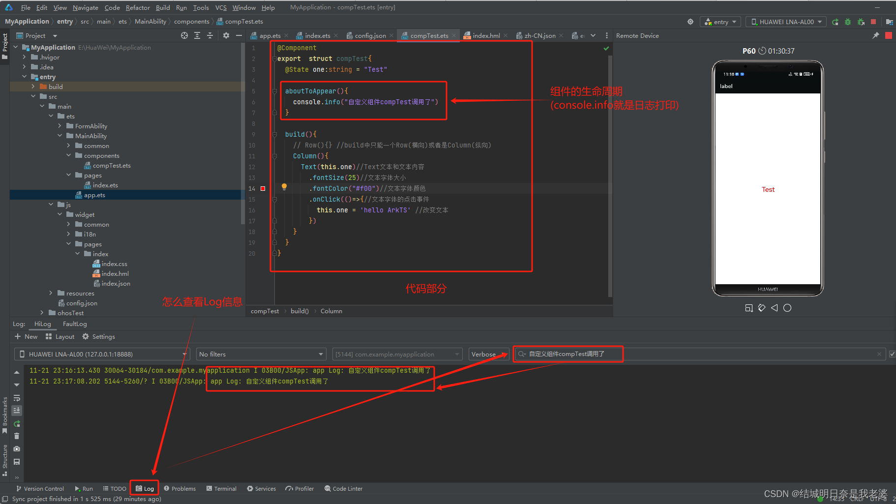
组件生命周期(即被@Component修饰的组件)
- aboutToAppear :组件即将出现时回调该接口,具体时机为在创建自定义组件的新实例后,在执行其build()函数之前执行。
- aboutToDisappear:在自定义组件即将析构销毁时执行。
@Component
export  struct compTest{
  @State one:string = "Test"

  aboutToAppear(){
    console.info("自定义组件compTest调用了")
  }

  build(){
    // Row(){} //build中只能一个Row(横向)或者是Column(纵向)
    Column(){
      //...
    }
  }
@Builder装饰器:自定义构建函数
按引用传递参数
ABuilder( $$ : { paramA1: string, paramB1 : string } );
示例
@Builder function myBuilderTest($$: { param: string }){
Row(){
Text(`${$$.param}`)
}
}
@Entry
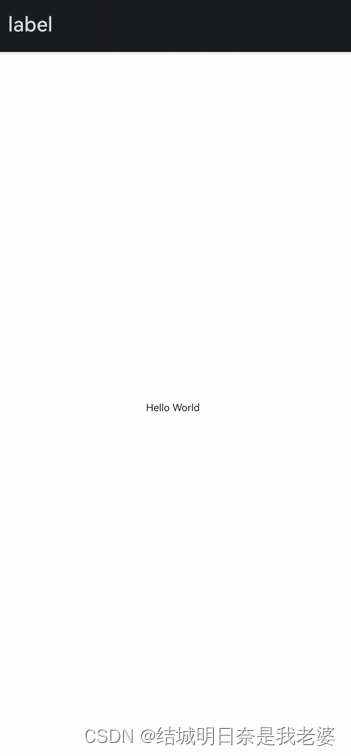
@Component
struct Index {
@State message: string = 'Hello World'
build() {
Row() {
Column(){
myBuilderTest({param:this.message})
}
.width('100%')
}
.height('100%')
.backgroundColor('#fff')
}
}
按值传递参数
@Builder function myBuilderTest(param: string){
  Row(){
    Text(`${param}`)
  }
}

@Entry
@Component
struct Index {
  @State message: string = 'Hello World'

  build() {
    Row() {
      Column(){
        myBuilderTest(this.message)
      }
      .width('100%')
    }
    .height('100%')
    .backgroundColor('#fff')
  }
}
也是上面的效果,但是按引用传递参数可以传入对象形式的参数
@BuilderParam装饰器:引用@Builder函数
意思就是自定义组件中添加跳转操作和事件方法会导致引入所有引入该组件的自定义组件都会添加这个功能。为了解决这个问题所以出现了@BuilderParam装饰器
@Builder function myBuilderTest($$: { param: string,param1:string }){
  Row(){
    Button(`区分${$$.param1}`).onClick(()=>{
      console.info(`${$$.param}触发事件了`)
    })
  }
}

@Entry
@Component
struct Index {
  @Builder myBuildTest2(){
    Column(){
      Button(`额`).onClick(()=>{
        console.info(`额触发事件了`)
      })
    }
  };

  @BuilderParam Build1: ($$:{ param: string,param1:string }) => void = myBuilderTest;
  @BuilderParam Build2: () => void = this.myBuildTest2;

  build() {
    Row() {
      Column(){
        myBuilderTest({param:this.message,param1:'这是事件1'})
        this.Build2()
      }
      .width('100%')
    }
    .height('100%')
    .backgroundColor('#fff')
  }
}
子组件中@BuilderParam.父组件@Builder使用
@Component
struct Child {
  label: string = `Child`
  @BuilderParam aBuilder0: () => void;

  build() {
    Column() {
      this.aBuilder0()
    }
  }
}

@Entry
@Component
struct Parent {
  label: string = `Parent`

  @Builder componentBuilder() {
    Text(`${this.label}`)
  }

  build() {
    Column() {
      this.componentBuilder()
      Child({ aBuilder0: this.componentBuilder })
    }
  }
}
俩个组件之间的Builder
@Builder function GlobalBuilder1($$ : {label: string }) {
  Text($$.label)
    .width(400)
    .height(50)
    .backgroundColor(Color.Blue)
}

@Component
struct Child {
  label: string = 'Child'
  // 无参数类,指向的componentBuilder也是无参数类型
  @BuilderParam aBuilder0: () => void;
  // 有参数类型,指向的GlobalBuilder1也是有参数类型的方法
  @BuilderParam aBuilder1: ($$ : { label : string}) => void;

  build() {
    Column() {
      this.aBuilder0()
      this.aBuilder1({label: 'global Builder label' } )
    }
  }
}

@Entry
@Component
struct Parent {
  label: string = 'Parent'

  @Builder componentBuilder() {
    Text(`${this.label}`)
  }

  build() {
    Column() {
      this.componentBuilder()
      Child({ aBuilder0: this.componentBuilder, aBuilder1: GlobalBuilder1 })
    }
  }
}


 扫一扫
扫一扫


 1088
1088

 被折叠的 条评论
为什么被折叠?
被折叠的 条评论
为什么被折叠?
 到【灌水乐园】发言


