<!DOCTYPE html>
<html>
	<head>
		<meta charset="utf-8">
		<title>多列布局:定宽+自适应</title>
		<!-- 使用float+overflow
		左侧固定+右侧自适应
		-->
		<!-- 通过将左边框脱离文本流,设置右边,当内容溢出元素框时,隐藏 -->
		<style type="text/css">
			.left{
				float: left;
				width: 100px;
				height: 100px;
				margin-right: 20px;
				background-color: aqua;
			}
			.right{
				display: flex;
				justify-content: center;
				overflow: hidden;
				height: 100px;
				background-color: red;
			}
		</style>
	</head>
	<body>
		<div>
			<div class="left">
				<p>我在左边</p>
			</div>
			<div class="right">
				<p>我在右边我在右边我在右边我在右边我在右边我在右边我在右边我在右边我在右边我在右边我在右边我在右边我在右边我在右边我在右边我在右边我在右边我在右边</p>
			</div>
		</div>

	</body>
</html>
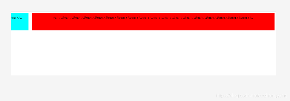


 本文介绍了一种使用float和overflow属性实现的网页布局技巧,左侧为固定宽度,右侧内容自适应。通过脱离文本流并设置右侧内容溢出隐藏,达到美观且实用的多列布局效果。


 扫一扫
扫一扫


 593
593

 被折叠的 条评论
为什么被折叠?
被折叠的 条评论
为什么被折叠?
 到【灌水乐园】发言


