


文字渐变效果是提升网页视觉吸引力的常用技巧,尤其适用于标题、按钮、品牌标识等关键元素。本文将基于给定的 SCSS 代码,深入探讨文字渐变效果的实现原理、优化技巧、浏览器兼容性解决方案以及实际应用场景。
1. 基础实现:如何让文字呈现渐变效果?
核心代码解析
$gold-colors: linear-gradient(90deg, #fff2c6 0%, #efce79 43%, #f8e6ab 100%);

@mixin text-gold-color {
  display: inline-block;       // 必须设置为 inline-block 或 block
  background: $gold-colors;    // 应用渐变背景
  background-clip: text;       // 背景仅作用于文字区域
  color: transparent;          // 使文字透明,露出背景
}
关键点:
-
background-clip: text-
限制背景仅填充文字部分(需配合
color: transparent)。 -
兼容性:现代浏览器支持良好,但需加
-webkit-前缀。
-
-
display: inline-block-
渐变背景需要块级或行内块元素才能生效。
-
-
color: transparent-
使文字透明,否则会覆盖渐变背景。
-
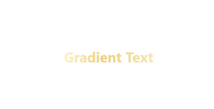
使用方法
<h1 class="gold-text">Gradient Text</h1>
.gold-text {
  @include text-gold-color;
  font-size: 3rem;
  font-weight: bold;
}
效果:
2. 进阶优化:提升兼容性与视觉效果
(1)添加浏览器前缀
由于 background-clip: text 在某些浏览器中需要前缀,建议完善 Mixin:
@mixin text-gradient($gradient) {
  display: inline-block;
  background: $gradient;
  -webkit-background-clip: text;
  background-clip: text;
  color: transparent;
}

// 使用方式
.title {
  @include text-gradient(linear-gradient(90deg, #ff00cc, #3333ff));
}
(2)支持多种渐变方向
扩展 Mixin,允许自定义角度和颜色:
@mixin text-gradient($angle: 90deg, $colors...) {
  background: linear-gradient($angle, $colors);
  -webkit-background-clip: text;
  background-clip: text;
  color: transparent;
}

// 示例:斜向渐变
.heading {
  @include text-gradient(45deg, #ff0000, #00ff00, #0000ff);
}
(3)添加文字阴影增强可读性
如果背景色与渐变冲突,可通过阴影提升对比度:
.gold-text {
  @include text-gold-color;
  text-shadow: 0 2px 4px rgba(0, 0, 0, 0.2); // 深色阴影增强可读性
}
3. 实际应用场景
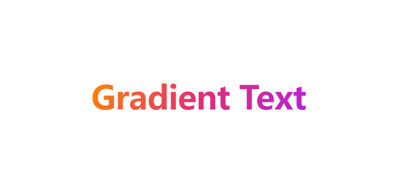
(1)品牌标题设计
.brand-title {
  @include text-gradient(120deg, #ff8a00, #e52e71, #b620e0);
  font-family: "Montserrat", sans-serif;
  font-size: 4rem;
  letter-spacing: -1px;
}
效果:
(2)按钮悬停动画
结合 transition 实现动态渐变:
.button {
  @include text-gradient(90deg, #333, #555);
  transition: background 0.3s;

  &:hover {
    @include text-gradient(90deg, #ff0000, #ff9900);
  }
}
(3)代码高亮显示
.code-keyword {
  @include text-gradient(135deg, #6e45e2, #88d3ce);
}
4. 浏览器兼容性解决方案
(1)回退方案(非渐变浏览器)
.gold-text {
  color: #efce79; // 回退颜色(渐变的主色)
  @supports (background-clip: text) {
    @include text-gold-color;
  }
}
(2)使用 SVG 替代(更广泛兼容)
<svg width="300" height="80">
  <defs>
    <linearGradient id="gold-gradient" x1="0%" y1="0%" x2="100%" y2="0%">
      <stop offset="0%" style="stop-color:#fff2c6" />
      <stop offset="43%" style="stop-color:#efce79" />
      <stop offset="100%" style="stop-color:#f8e6ab" />
    </linearGradient>
  </defs>
  <text x="0" y="50" font-size="40" fill="url(#gold-gradient)">SVG Gradient Text</text>
</svg>
5. 性能优化建议
-
避免过度使用
-
渐变文字会触发额外的渲染计算,大量使用可能影响性能。
-
-
预渲染静态文本
-
对固定文字(如 Logo)使用 SVG 或 PNG 图片替代。
-
-
硬件加速
-
添加
transform: translateZ(0)强制 GPU 加速(谨慎使用)。
-
6. 创意扩展
(1)动态渐变动画
@keyframes shimmer {
  0% { background-position: 0% 50%; }
  100% { background-position: 100% 50%; }
}

.animated-gradient {
  @include text-gradient(90deg, #ff0000, #ffff00, #ff0000);
  background-size: 200% auto;
  animation: shimmer 2s linear infinite;
}
(2)背景 + 文字双重渐变
.card {
  background: linear-gradient(135deg, #f5f7fa 0%, #c3cfe2 100%);
  h2 {
    @include text-gradient(90deg, #667eea, #764ba2);
  }
}
7. 总结
| 技术点 | 关键代码 | 适用场景 |
|---|---|---|
| 基础文字渐变 | background-clip: text + color: transparent | 标题、按钮 |
| 浏览器兼容 | -webkit-background-clip + @supports | 跨浏览器支持 |
| 动态效果 | transition 或 animation | 悬停交互 |
| SVG 回退 | <linearGradient> + <text> | 兼容旧浏览器 |
最佳实践:
-
优先使用 CSS 渐变,必要时回退 SVG。
-
为重要内容提供非渐变回退方案。
-
避免在小字号文本上使用渐变(可能影响可读性)。
通过灵活运用这些技巧,你可以轻松实现从简约到炫酷的各种文字渐变效果! 🎨


 扫一扫
扫一扫


 840
840

 被折叠的 条评论
为什么被折叠?
被折叠的 条评论
为什么被折叠?
 到【灌水乐园】发言


