


 本文深入探讨了Android中Drawable的功能,包括获取和设定可绘制区域、显示级别、视图状态等,并介绍了各种Drawable类型如ColorDrawable、BitmapDrawable的使用。此外,还提供了自定义Drawable的实例,如绘制圆角图片、进度条等。
Drawable 功能
获取和设定可绘制区域
public final Rect getBounds()
 public void setBounds(int left, int top, int right, int bottom)
 public void setBounds(Rect bounds)
 //显示级别,从0到10000
public final boolean setLevel(int level)
public final int getLevel()
public void onLevelChange()
//视图状态
//常见状态有:state_window_focused state_pressed  state_selected state_focused state_enabled
public boolean setState(final int[] stateSet)
public int[] getState()
//滤镜效果,其中PorterDuffColorFilter提供各种融合的模式算法
public void setColorFilter(int color, PorterDuff.Mode mode) {
 public abstract void setColorFilter(ColorFilter cf);
 public void clearColorFilter()  //清除颜色过滤器。
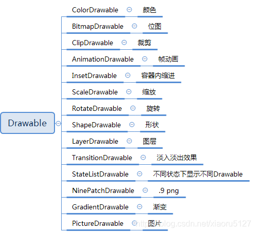
ColorDrawable
颜色
BitmapDrawable
位图
//画布上的密度比值
 public void setTargetDensity(Canvas canvas)
//当前屏幕的密度比值
public void setTargetDensity(DisplayMetrics metrics)
//指定密度比值,注意这里的密度是DisplayMetrics中的DENSITY_XXX。
public void setTargetDensity(int density)

//平铺方式
public final void setTileModeY(Shader.TileMode mode)
public void setTileModeX(Shader.TileMode mode)

//设置是否使用抗锯齿功能,会消耗较大资源,绘制图形速度会变慢。
void setAntiAlias(boolean aa);

//设定是否使用图像抖动处理,会使绘制出来的图片颜色更加平滑和饱满,图像更加清晰
void setDither(boolean dither);

// 如果该项设置为true,则图像在动画进行中会滤掉对Bitmap图像的优化操作,加快显示速度,本设置项依赖于dither和xfermode的设置
 void setFilterBitmap(boolean filter);

//设置颜色过滤器,可以在绘制颜色时实现不用颜色的变换效果
void setColorFilter(ColorFilter colorfilter);
xml中使用
<bitmap>
android:antialias=["true" | "false"]//抗锯齿效果
android:dither=["true" | "false"]//抖动效果
android:filter=["true" | "false"]//是否允许对位图进行滤波。当图片被压缩或者拉伸时,使用滤波可以获得平滑的外观效果
android:gravity=["top" | "bottom" | "left" | "right" | "center_vertical" |
                      "fill_vertical" | "center_horizontal" | "fill_horizontal" |
                      "center" | "fill" | "clip_vertical" | "clip_horizontal"]
android:tileMode=["disabled" | "clamp" | "repeat" | "mirror"]//平铺模式
ClipDrawable
裁剪
AnimationDrawable
帧动画
public void addFrame(Drawable frame, int duration)  //添加要播放的Drawable帧以及播放时长。
public int getDuration(int i)   //每帧时长
public Drawable getFrame(int index) //获取帧
public int getNumberOfFrames()   //得到总帧数
public void setOneShot(boolean oneShot)  //单次还是循环
InsetDrawable
实现容器内Drawable四个方向缩进或者某个方向的缩进。如果为负数则是外缩进
ScaleDrawable
缩放
RotateDrawable
旋转
ShapeDrawable
形状
常见的Shape有:
ArcShape 弧形
OvalShape 椭圆形
PathShape 路径,相当于自定义图形
RectShape 矩形
RoundRectShape 圆角矩形
PaintDrawable ,ShapeDrawable的派生类。圆角矩形RoundRectShape的简化版本,只会设置外圆角,只需要设置一个或者8个即可
xml中的使用
<?xml version="1.0" encoding="utf-8"?>
<shape
    xmlns:android="http://schemas.android.com/apk/res/android"
    android:shape=["rectangle" | "oval" | "line" | "ring"] >
    <corners
        android:radius="integer"
        android:topLeftRadius="integer"
        android:topRightRadius="integer"
        android:bottomLeftRadius="integer"
        android:bottomRightRadius="integer" />
    <gradient
        android:angle="integer"
        android:centerX="integer"
        android:centerY="integer"
        android:centerColor="integer"
        android:endColor="color"
        android:gradientRadius="integer"
        android:startColor="color"
        android:type=["linear" | "radial" | "sweep"]
        android:usesLevel=["true" | "false"] />
    <padding
        android:left="integer"
        android:top="integer"
        android:right="integer"
        android:bottom="integer" />
    <size
        android:width="integer"
        android:height="integer" />
    <solid
        android:color="color" />
    <stroke
        android:width="integer"
        android:color="color"
        android:dashWidth="integer"
        android:dashGap="integer" />
</shape>
-
android:shape=[“rectangle” | “oval” | “line” | “ring”] 矩形、椭圆、横线、圆环
- ring圆环下的一些配置
- android:innerRadius 圆环半径
- android:innerRadiusRatio 内半径占整个Drawable宽度的比例
- android:thickness 圆环的厚度
- android:thicknessRatio 厚度占整个Drawable宽度比例
- android:useLevel 一般都应该使用false,否则可能无法达到预期显示效果,除非它被当做LevelListDrawable来使用
- ring圆环下的一些配置
-
corners 圆角
- android:radius 四个角的半径
- android:topLeftRadius 左上角的半径
- android:topRightRadius
- android:bottomLeftRadius
- android:bottomRightRadius
-
gradient 渐变填充
- android:angle 渐变角度
- android:centerX android:centerY 渐变中心x、y
- android:startColor android:centerColor android:endColor 开始中间结束的颜色
- android:gradientRadius 渐变的半径,当android:type=”radial”有效
- android:useLevel 一般为false
- android:type 渐变类别,linear(线性)为默认值,radial(径内渐变),sweep(扫描渐变)
-
solid 纯色填充
- android:color 填充色
-
stroke 描边
- android:width 描述边框的宽度,数值越大,越边框越厚
- android:color 边框的颜色
- android:dashWidth 组成虚线的线段宽度
- android:dashGap 组成虚线的线段之间的间隔,间隔越大,虚线看起的间隙就越大
-
padding 表示内容或子标签边距,4个属性top、bottom、left、right,需要注意的是这个标签的作用是为内容设置与当前应用此shape的View的边距,而不是设置当前View与父元素的边距
-
size 设置背景大小,width和height俩属性。一般来说这个值不是shape的最终显示大小,因为shape作为背景时会根据View的大小而填充其背景,因此Shape的大小很多时候是View的大小决定的
LayerDrawable
图层
xml中的使用
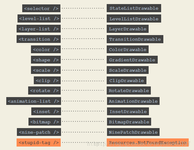
< layer-list >
< item >
TransitionDrawable
淡入淡出效果
LevelListDrawable
等级显示
xml中的使用
< level-list >
< item >
StateListDrawable
不同状态下显示不同Drawable
xml中的使用
< selector >
< item >
NinePatchDrawable
.9格式
GradientDrawable
渐变
PictureDrawable
图片
视图状态
状态设置说明
android:state_enabled                **设置触摸或点击事件是否可用状态**,一般只在false时设置该属性,表示不可用状态
android:state_pressed                **设置是否按压状态**,一般在true时设置该属性,表示已按压状态,默认为false
android:state_selected               **设置是否选中状态**,true表示已选中,false表示未选中
android:state_checked:               **设置是否勾选状态**,主要用于CheckBox和RadioButton,true表示已被勾选,false表示未被勾选
android:state_checkable              **设置勾选是否可用状态**,类似state_enabled,只是state_enabled会影响触摸或点击事件,state_checkable影响勾选事件
android:state_focused                **设置是否获得焦点状态**,true表示获得焦点,默认为false,表示未获得焦点
android:state_window_focused         **设置当前窗口是否获得焦点状态**,true表示获得焦点,false表示未获得焦点,例如拉下通知栏或弹出对话框时, 当前界面就会失去焦点;另外,ListView的ListItem获得焦点时也会触发true状态,可以理解为当前窗口就是ListItem本身
android:state_activated              **设置是否被激活状态**,true表示被激活,false表示未激活,API Level 11及以上才支持,可通过代码调用控件的setActivated(boolean)方法设置是否激活该控件
android:state_hovered                **设置是否鼠标在上面滑动的状态**,true表示鼠标在上面滑动,默认为false,API Level 14及以上才支持
补充:selector标签下有两个比较有用的属性要说一下,添加了下面两个属性之后,则会在状态改变时出现淡入淡出效果,
但必须在API Level 11及以上才支持
android:exitFadeDuration             **状态改变时,旧状态消失时的淡出时间,以毫秒为单位**
android:enterFadeDuration            **状态改变时,新状态展示时的淡入时间,以毫秒为单位**
focused:一个窗口只能一个View处于focused,一般由按键操作引起
selected:允许同时多个处于selected状态,一般由程序主动调用
pressed:一般由触摸消息引起
背景设置实例
<?xml version="1.0" encoding="utf-8"?>
<selector xmlns:android="http://schemas.android.com/apk/res/android">
<!-- 当前窗口失去焦点时 -->
<item android:drawable="@drawable/bg_btn_lost_window_focused" android:state_window_focused="false" />
<!-- 不可用时 -->
<item android:drawable="@drawable/bg_btn_disable" android:state_enabled="false" />
<!-- 按压时 -->
<item android:drawable="@drawable/bg_btn_pressed" android:state_pressed="true" />
<!-- 被选中时 -->
<item android:drawable="@drawable/bg_btn_selected" android:state_selected="true" />
<!-- 被激活时 -->
<item android:drawable="@drawable/bg_btn_activated" android:state_activated="true" />
<!-- 默认时 -->
<item android:drawable="@drawable/bg_btn_normal" />
</selector>
颜色设置实例
<?xml version="1.0" encoding="utf-8"?>
<selector xmlns:android="http://schemas.android.com/apk/res/android">
<!-- 当前窗口失去焦点时 -->
<item android:color="@android:color/black" android:state_window_focused="false" />
<!-- 不可用时 -->
<item android:color="@android:color/background_light" android:state_enabled="false" />
<!-- 按压时 -->
<item android:color="@android:color/holo_blue_light" android:state_pressed="true" />
<!-- 被选中时 -->
<item android:color="@android:color/holo_green_dark" android:state_selected="true" />
<!-- 被激活时 -->
<item android:color="@android:color/holo_green_light" android:state_activated="true" />
<!-- 默认时 -->
<item android:color="@android:color/white" />
</selector>
常见例子
利用drawable来绘制圆角/圆形图片
public class RoundImageDrawable extends Drawable
{

    private Paint mPaint;
    private Bitmap mBitmap;

    private RectF rectF;

    public RoundImageDrawable(Bitmap bitmap)
    {
        mBitmap = bitmap;
        BitmapShader bitmapShader = new BitmapShader(bitmap, TileMode.CLAMP,
                TileMode.CLAMP);
        mPaint = new Paint();
        mPaint.setAntiAlias(true);
        mPaint.setShader(bitmapShader);
    }

    @Override
    public void setBounds(int left, int top, int right, int bottom)
    {
        super.setBounds(left, top, right, bottom);
        rectF = new RectF(left, top, right, bottom);
    }

    @Override
    public void draw(Canvas canvas)
    {
        canvas.drawRoundRect(rectF, 30, 30, mPaint); //画圆角
        //也可以画圆
        //canvas.drawCircle(mWidth / 2, mWidth / 2, mWidth / 2, mPaint);
    }

    @Override
    public int getIntrinsicWidth()
    {
        return mBitmap.getWidth();
    }

    @Override
    public int getIntrinsicHeight()
    {
        return mBitmap.getHeight();
    }

    @Override
    public void setAlpha(int alpha)
    {
        mPaint.setAlpha(alpha);
    }

    @Override
    public void setColorFilter(ColorFilter cf)
    {
        mPaint.setColorFilter(cf);
    }

    @Override
    public int getOpacity()
    {
        return PixelFormat.TRANSLUCENT;
    }

}
使用
Bitmap bitmap = BitmapFactory.decodeResource(getResources(),
                R.drawable.mv);
ImageView iv = (ImageView) findViewById(R.id.id_one);
iv.setImageDrawable(new RoundImageDrawable(bitmap));
自定义进度条
自定义旋转动画progress_rotate.xml,drawable可定义为任何自旋转可做进度条的视图
<?xml version="1.0" encoding="utf-8"?>
<rotate xmlns:android="http://schemas.android.com/apk/res/android"
    android:drawable="@drawable/shape_drawable"
    android:pivotX="50%"
    android:pivotY="50%"
    android:fromDegrees="0"
    android:toDegrees="360"
    >
</rotate>
设置style
<style name="CustomProgressStyle" >
    <item name="android:indeterminateDrawable">@drawable/progress_rotate</item>
    <item name="android:minWidth">72dp</item>
    <item name="android:maxWidth">72dp</item>
    <item name="android:minHeight">72dp</item>
    <item name="android:maxHeight">72dp</item>
</style>
使用
<ProgressBar
     android:layout_width="100dp"
     android:layout_height="100dp"
     android:layout_centerInParent="true"
     style="@style/CustomProgressStyle"
     android:indeterminateDuration="700"
     />
圆形角标
<?xml version="1.0" encoding="utf-8"?>
<shape xmlns:android="http://schemas.android.com/apk/res/android"
    android:shape="oval"
    >
    <solid android:color="#D90E0E" />
    <size android:height="10dp" android:width="10dp" />
</shape>
使用
<TextView
    android:layout_width="30dp"
    android:layout_height="30dp"
    android:layout_centerInParent="true"
    android:gravity="center"
    android:textColor="#fff"
    android:text="99"
    android:background="@drawable/shape_circle_number"
    />
输入框效果
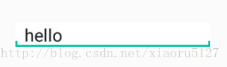
<?xml version="1.0" encoding="utf-8"?>
<layer-list xmlns:android="http://schemas.android.com/apk/res/android">
    <item>
      <shape android:shape="rectangle">
          <solid android:color="@color/colorAccent" />
      </shape>
    </item>

    <item android:bottom="6dp">
        <shape android:shape="rectangle">
            <solid android:color="#ffffff"/>
        </shape>
    </item>

    <item android:bottom="2dp"
          android:left="2dp"
          android:right="2dp">
        <shape android:shape="rectangle">
            <solid android:color="#ffffff" />
        </shape>
    </item>
</layer-list>
使用
<EditText
  android:layout_width="200dp"
  android:layout_height="wrap_content"
  android:layout_centerInParent="true"
  android:background="@drawable/layer_drawable"
  />


 扫一扫
扫一扫


 2021
2021

 被折叠的 条评论
为什么被折叠?
被折叠的 条评论
为什么被折叠?
 到【灌水乐园】发言


