


 本文介绍了网页三栏布局的三种常见方法:圣杯布局、双飞翼布局和弹性盒子布局。圣杯布局利用浮动定位,通过负margin和padding实现;双飞翼布局则使用浮动和margin,中心部分再加一个内嵌div调整;弹性盒子布局最为简便,通过flexbox的定位顺序和伸缩属性轻松实现三栏布局。
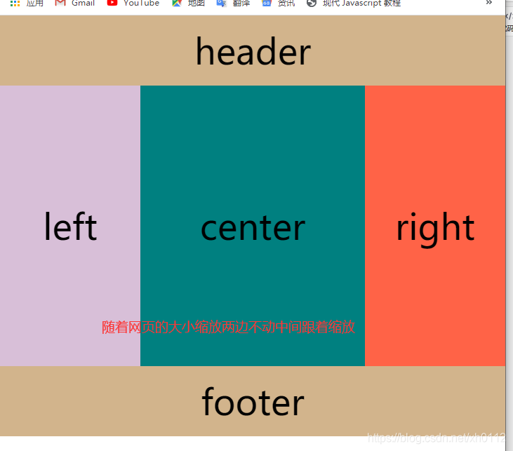
圣杯布局
利用浮动定位进行布局
<header>header</header>
    <div class="clearfix">
        <div class="center">center</div>
        <div class="left">left</div>
        <div class="right">right</div>
    </div>
    <footer>footer</footer>
- 在主体内部外面嵌套了一个div
- center在结构上靠前
- center,left,right都浮动
- 清除浮动
- center宽度为100%,left,right宽度固定
- left通过margin-left为负值(-100%),移动到center最左边
- right通过margin-left为负值(自身的宽度),移动到center的最右边。
- center的内容会被left,right遮盖
- 最外层div添加一个padding,padding的宽度为left,right的宽度。
- left,right相对定位,移动到相应的位置。位移量为自身的宽度。
        * {
            /* 清零样式 */
            margin: 0;
            padding: 0;
        }
        body {
            font-size: 50px;
            /* 设置body的最小宽度 */
            min-width: 620px;
            /* 设置body的最大宽度 */
        }
        header,
        footer {
            width: 100%;
            height: 100px;
            background-color: tan;
            text-align: center;
            line-height: 100px;
        }
        .left,
        .right,
        .center {
            float: left;
            height: 400px;
            text-align: center;
            line-height: 400px;
        }
        /* 左右两侧宽度固定 */
        .left,
        .right {
            width: 200px;
        }
        .center {
            width: 100%;
            background-color: teal;
        }
        .left {
            margin-left: -100%;
            background-color: thistle;
            position: relative;
            left: -200px;
        }
        .right {
            margin-left: -200px;
            background-color: tomato;
            position: relative;
            right: -200px;
        }
        .clearfix {
            padding: 0px 200px;
        }
        .clearfix::after {
            clear: both;
            display: block;
            content: "";
        }
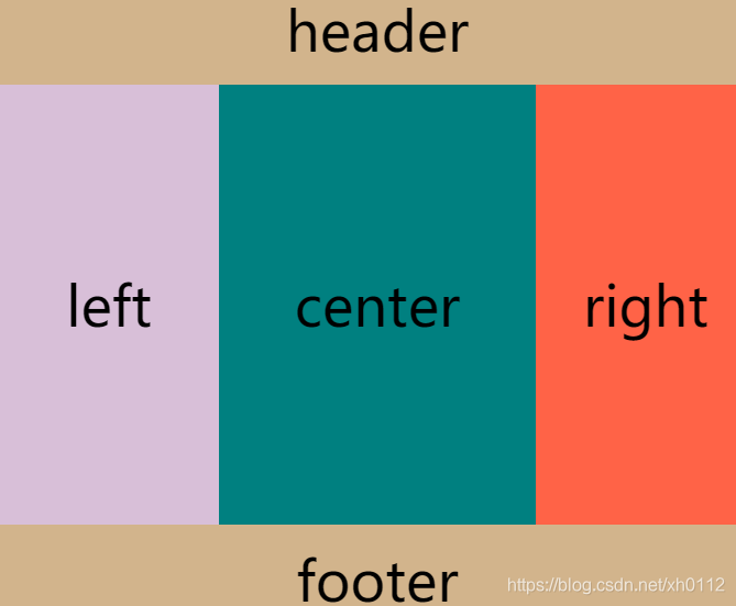
双飞翼方式布局
用浮动和margin来实现
<header>header</header>
    <div class="center">
        <div class="home">center</div>
    </div>
    <div class="left">left</div>
    <div class="right">right</div>
    <footer>footer</footer>
- 让left right center浮动
- 设置left的margin-left为-100%
- 设置right的margin-left为负的自身宽度
- 在center中添加一个div,将内容写在这个div中
- 为这个div添加一个margin,左右margin的值为left right的宽度。
 body{
            font-size: 50px;
            /* 设置body的最小宽度 */
            min-width: 620px;
        }
        header,footer{
            width: 100%;
            height: 100px;
            background-color: tan;
            text-align: center;
            line-height: 100px;
        }
        .left,.right,.center{
            float: left;
            height: 400px;
            text-align: center;
            line-height: 400px;
        }
        /* 左右两侧宽度固定 */
        .left,.right{
            width: 200px;
        }
        .center{
            width: 100%;
            background-color: teal;
        }
        .left{
            margin-left: -100%;
            background-color: thistle;
        }
        .right{
            margin-left: -200px;
            background-color: tomato;
        }
        footer{
            clear: both;
        }
        .home{
            /* 空出两边的距离 */
            margin: 0 200px;
        }
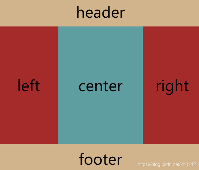
弹性盒子实现三栏
这个方法也是这几个中最方便的方法
利用弹性盒子的定位顺序
<header>header</header>
    <div class="home">
        <div class="center">center</div>
        <div class="left">left</div>
        <div class="right">right</div>
    </div>
    <footer>footer</footer>
- 添加一个最外层的div home
- 将home设置为弹性盒子
- left right 固定宽度 center不设置宽度
- 将center设置为 flex-grow: 1;
- 调整顺序,left:1 center:2 right:3
body{
            font-size: 50px;
            /* 设置body的最小宽度 */
            min-width: 620px;
        }
        header,footer{
            width: 100%;
            height: 100px;
            background-color: tan;
            text-align: center;
            line-height: 100px;
        }
        .home{
            display: flex;
            width: 100%;
            height: 400px;
            font-size: 50px;
            line-height: 400px;
            text-align: center;
        }
        .left,.right{
            width: 200px;
            background-color: brown;
        }
        .left{
            order: 1;
        }
        .center{
            order: 2;
        }
        .right{
            order: 3;
        }
        .center{
            flex-grow: 1;
            background-color: cadetblue;
        }
达到的都是一样的效果


 扫一扫
扫一扫


 859
859

 被折叠的 条评论
为什么被折叠?
被折叠的 条评论
为什么被折叠?
 到【灌水乐园】发言


