


 本文介绍了CSS3中的动画原理和滤镜应用。通过@keyframes定义动画,并详细讲解了animation属性的各个参数,如duration、iteration-count、delay等。此外,文章还展示了滤镜的不同效果,包括opacity、grayscale、invert、brightness、saturate、sepia、blur、hue-rotate、contrast和drop-shadow,并比较了滤镜阴影与盒子阴影的区别。
css动画案例,用案例看出其用法
动画
动画
- 通过@keyframs定义动画。
- 在指定元素中,通过animation属性来调用动画。
定义动画
-
格式:
@keyframes 动画名{
from{ 初始帧
}
to{
结束帧
}
}
【注】动画名不要起关键词,最好见名知意。
动画的调用:
通过animation属性来调用动画。
示例

-
animation-name:动画名称
-
animation-duration 执行一次动画的完成时间。
-
animation-iteration-count: 动画的执行次数
infinite 表示无数次。 -
animation-delay: 动画延迟执行的时间。
-
animation-fill-mode:
forwards:在动画结束后,盒子保持结束帧状态。
backwards 在动画开始时,包含延迟时间,让盒子保持初始帧状态
both 是 backwards forwards都生效
none(默认值) -
animation-direction: 动画的执行方式
alternate:交替执行。
normal 正常(默认)
reverse 反向 从结束帧开始到初始帧结束。
【注】alternate 反向也会算一次执行时间。 -
animation-timing-function:linear;
linear 匀速
ease-in 加速
ease-out 减速
ease-in-out 先加速后减速 -
animation-play-state 动画运行状态
paused:暂停
running 运行
复合写法
animation: move 1s
动画名称 执行时间这两个必须要写在最前面,后面的属性没有顺序 ,每个属性要用空格隔开。

这里上面用的复合属性下面用的分解属性,运用效果是一样的。
案例,制作音乐盒
<head>
    <meta charset="UTF-8">
    <meta name="viewport" content="width=device-width, initial-scale=1.0">
    <title>Document</title>
    <style>
        .box{
            position: absolute;
            left: 50%;
            top: 50%;
            width: 300px;
            height: 300px;
            margin-left: -150px;
            margin-top:-150px;
            background: url("img/hb.png") no-repeat;
            background-size: 300px;
            border-radius: 50%;
            animation: spin 3s infinite linear;
        }
        @keyframes spin {
            to{
                transform: rotate(360deg);
            }
        }
        .box:hover{
            /* 暂停 */
            animation-play-state: paused;

        }
    </style>
</head>
<body>
    <div class="box"></div>
</body>
这里制作的一个会旋转的人物头像音乐盒
infinite代表无数次,可以不停的旋转。
滤镜
看下滤镜各个属性的展示效果
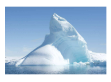
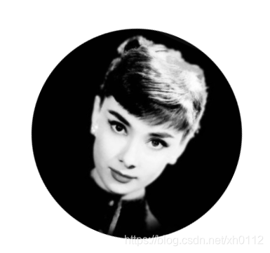
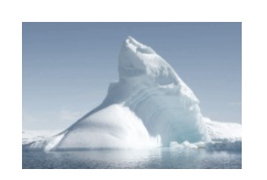
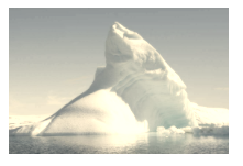
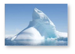
这是原图,来对比一下
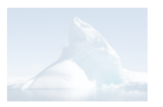
/* 透明度 */
filter: opacity(25%);
设置透明度
/* 灰度 */
filter: grayscale(50%);
设置灰度。
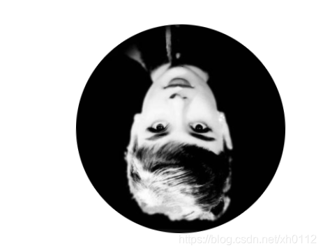
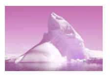
/* 反色 */
filter: invert(1);
设置翻转颜色。
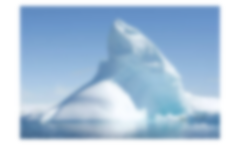
/* 亮度 0-1 */
filter: brightness(.5);
设置亮度。
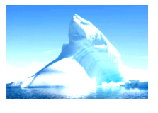
/* 饱和度 0-1 */
filter: saturate(60%);
设置饱和度。
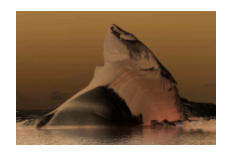
/* 褐色 0-1 */
filter: sepia(60%);
设置褐色比例。
/* 模糊 0-1 */
filter: blur(2px);
设置模糊。
/* 色相翻转 deg */
filter: hue-rotate(90deg);
/* 对比度 */
filter: contrast(2)
设置对比度。
/* 阴影 */
filter: drop-shadow(5px 5px 5px #aaa);
设置阴影
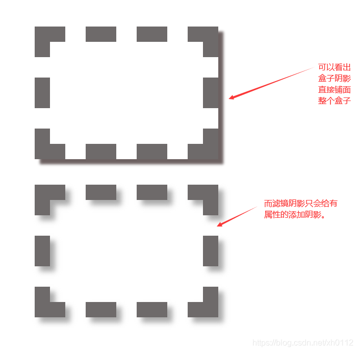
滤镜阴影与盒子阴影的对比。
box-shadow: 10px 10px 5px rgb(109, 97, 97);盒子阴影
filter: drop-shadow(10px 10px 5px #aaa);滤镜阴影
示例
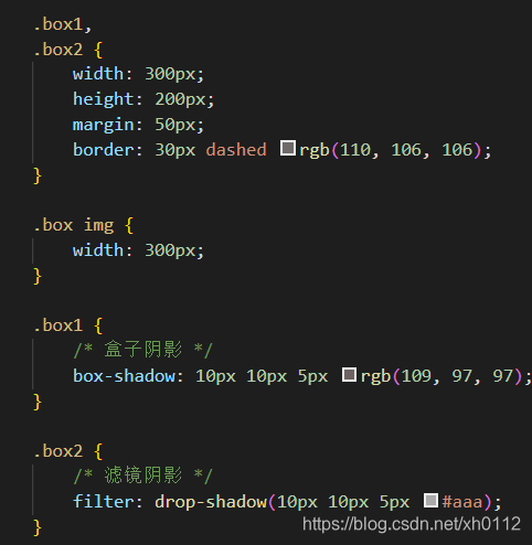
直接来看对比效果


 扫一扫
扫一扫


 2055
2055

 被折叠的 条评论
为什么被折叠?
被折叠的 条评论
为什么被折叠?
 到【灌水乐园】发言


