


 本文深入讲解ConstraintLayout的使用方法,通过实例对比传统布局,展示如何利用ConstraintLayout减少布局层级,提高性能。并介绍了ConstraintLayout的基本属性及其应用技巧。
前言
A ConstraintLayout is a ViewGroup which allows you to position and size widgets in a flexible way.
简言:ConstraintLayout是可以灵活设置其内控件位置和大小的ViewGroup。
支持API 9 (Gingerbread)及以上,官方后续仍将对其API和功能进行扩展。
添加
1、 Android Studio版本至少2.3,我用的是AS 3.1.3
2、 在build.gradle中添加依赖,如下:
dependencies {
compile ‘com.android.support.constraint:constraint-layout:1.1.3’
}
正题
开局一张图,博客全靠编:
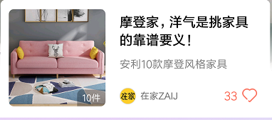
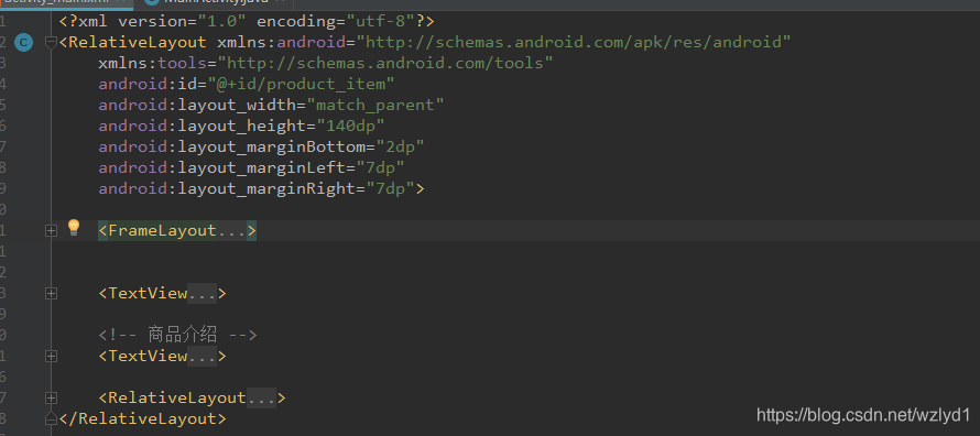
该布局如果以传统布局方式来写的话是这样的(由于显示逻辑问题实际情况更复杂,demo略做精简)
<?xml version="1.0" encoding="utf-8"?>
<RelativeLayout xmlns:android="http://schemas.android.com/apk/res/android"
    xmlns:tools="http://schemas.android.com/tools"
    android:id="@+id/product_item"
    android:layout_width="match_parent"
    android:layout_height="140dp"
    android:layout_marginBottom="2dp"
    android:layout_marginLeft="7dp"
    android:layout_marginRight="7dp">

    <FrameLayout
        android:id="@+id/product_img_container"
        android:layout_width="117dp"
        android:layout_height="117dp"
        android:layout_alignParentLeft="true"
        android:layout_centerVertical="true"
        android:layout_marginBottom="7dp"
        android:layout_marginLeft="10dp"
        android:layout_marginTop="7dp">
        <!-- 商品图片 -->
        <ImageView
            android:id="@+id/sku_img"
            android:layout_width="match_parent"
            android:layout_height="match_parent"
            android:scaleType="centerCrop"
            tools:src="@drawable/ic_launcher_background" />

        <TextView
            android:id="@+id/sku_num"
            android:layout_width="wrap_content"
            android:layout_height="20dp"
            android:layout_gravity="end|right|bottom"
            android:paddingBottom="2dp"
            android:paddingLeft="6dp"
            android:paddingRight="6dp"
            android:paddingTop="2dp"
            android:textColor="#ffffff"
            android:textSize="11dp"
            tools:text="4件" />
    </FrameLayout>


    <TextView
        android:id="@+id/title"
        android:layout_width="wrap_content"
        android:layout_height="wrap_content"
        android:layout_alignParentRight="true"
        android:layout_marginLeft="17dp"
        android:layout_marginRight="17dp"
        android:layout_marginTop="15dp"
        android:layout_toRightOf="@id/product_img_container"
        android:ellipsize="end"
        android:gravity="center_vertical"
        android:maxLines="2"
        android:textColor="#ff000000"
        android:textSize="16dp"
        android:textStyle="bold"
        tools:text="飞利浦干湿两a~须a abc def" />

    <!-- 商品介绍 -->
    <TextView
        android:id="@+id/desc"
        android:layout_width="match_parent"
        android:layout_height="wrap_content"
        android:layout_alignLeft="@id/title"
        android:layout_below="@+id/title"
        android:layout_marginRight="17dp"
        android:layout_marginTop="9.5dp"
        android:ellipsize="end"
        android:gravity="center_vertical"
        android:lineSpacingMultiplier="1.1"
        android:maxLines="1"
        android:textColor="#818181"
        android:textSize="13dp"
        tools:text="西装作为职场必备 ITEM其修身线条,挺括的外观,舒适的穿着西装作为职场必备 ITEM其修身线条,挺括的外观" />

    <RelativeLayout
        android:layout_width="wrap_content"
        android:layout_height="wrap_content"
        android:layout_alignLeft="@id/title"
        android:layout_marginBottom="12dp">

        <ImageView
            android:id="@+id/author_img"
            android:layout_width="20dp"
            android:layout_height="20dp"
            android:layout_alignBottom="@id/author_name"
            android:layout_marginBottom="2dp"
            tools:src="@drawable/ic_launcher_background" />

        <TextView
            android:id="@+id/author_name"
            android:layout_width="wrap_content"
            android:layout_height="25dp"
            android:layout_alignParentBottom="true"
            android:layout_marginLeft="5dp"
            android:layout_toRightOf="@+id/author_img"
            android:ellipsize="end"
            android:gravity="center_vertical"
            android:maxLength="6"
            android:textColor="#6A6A6A"
            android:textSize="11sp"
            tools:text="美丽教主" />

        <!--喜欢人数&点赞-->
        <TextView
            android:id="@+id/common_like_view"
            android:layout_width="wrap_content"
            android:layout_height="wrap_content"
            android:layout_marginBottom="10dp"
            android:textSize="13dp"
            android:textColor="@color/colorAccent"
            android:layout_alignParentBottom="true"
            android:layout_alignParentRight="true"
            android:layout_marginRight="6dp"
            tools:text="300人喜欢"/>
    </RelativeLayout>
</RelativeLayout>
可以看到,这个简单的布局已经做了两层嵌套
如果我们用ContraintLayout,就一层布局足以,不用嵌套。之前写的布局我们可以以这种方式简单转化一下:在desin中右击
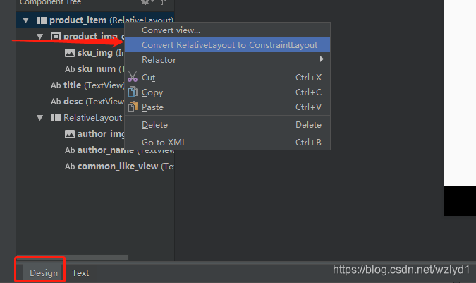
转化完成后,我们的布局会乱,因为会把我们所有的嵌套布局删掉,如Relativelayout,FrameLayout等。所以我们需要手动调整一下。
当然,你可以直接用contraintLayout布局编写,在gradle文件中添加依赖即可。
implementation 'com.android.support.constraint:constraint-layout:1.1.3'
在编写XML文件之前,我们需要了解一下ConstraintLayout的基本属性:
layout_constraintLeft_toLeftOf
layout_constraintLeft_toRightOf
layout_constraintRight_toLeftOf
layout_constraintRight_toRightOf
layout_constraintTop_toTopOf
layout_constraintTop_toBottomOf
layout_constraintBottom_toTopOf
layout_constraintBottom_toBottomOf
layout_constraintBaseline_toBaselineOf
layout_constraintStart_toEndOf
layout_constraintStart_toStartOf
layout_constraintEnd_toStartOf
layout_constraintEnd_toEndOf
通常情况下,这些属性足够让我们编译一套复杂的布局。其实这些属性很简单,你完全可以当做加强版本的RelativeLayout来使用,Left_toLeftOf的意思就是我的左边跟xxid的左边相邻,其他意思类推。
例如假设你的textview要在imageView的右边,那么代码就这么写 在textView控件中 app:layout_constraintLeft_toRightOf="@图片控件的id"
所以改变完后的代码如下:
<?xml version="1.0" encoding="utf-8"?>
<android.support.constraint.ConstraintLayout xmlns:android="http://schemas.android.com/apk/res/android"
    xmlns:app="http://schemas.android.com/apk/res-auto"
    xmlns:tools="http://schemas.android.com/tools"
    android:id="@+id/product_item"
    android:layout_width="match_parent"
    android:layout_height="wrap_content"
    android:layout_marginBottom="2dp"
    android:layout_marginLeft="7dp"
    android:layout_marginRight="7dp">

    <!-- 商品图片 -->
    <ImageView
        android:id="@+id/sku_img"
        android:layout_width="wrap_content"
        android:layout_height="wrap_content"
        android:scaleType="centerCrop"
        tools:src="@drawable/ic_launcher_background" />

    <TextView
        android:id="@+id/sku_num"
        android:layout_width="wrap_content"
        android:layout_height="wrap_content"
        android:paddingBottom="2dp"
        android:paddingLeft="6dp"
        android:paddingRight="6dp"
        android:paddingTop="2dp"
        android:textColor="#ffffff"
        android:textSize="13dp"
        app:layout_constraintBottom_toBottomOf="@id/sku_img"
        app:layout_constraintRight_toRightOf="@id/sku_img"
        tools:text="4件" />


    <TextView
        android:id="@+id/title"
        android:layout_width="0dp"
        android:layout_height="wrap_content"
        android:layout_marginLeft="16dp"
        android:ellipsize="end"
        android:gravity="center_vertical"
        android:maxLines="2"
        android:textColor="#ff000000"
        android:textSize="16dp"
        android:textStyle="bold"
        app:layout_constraintLeft_toRightOf="@id/sku_img"
        app:layout_constraintRight_toRightOf="parent"
        tools:text="飞利浦干湿两a~须a abc def飞利浦干湿两a~须a abc def飞利浦干湿两a~须a abc de" />

    <!-- 商品介绍 -->
    <TextView
        android:id="@+id/desc"
        android:layout_width="0dp"
        android:layout_height="wrap_content"
        android:layout_marginTop="10dp"
        android:ellipsize="end"
        android:lineSpacingMultiplier="1.1"
        android:maxLines="1"
        android:textColor="#818181"
        android:textSize="13dp"
        app:layout_constraintLeft_toLeftOf="@id/title"
        app:layout_constraintRight_toRightOf="parent"
        app:layout_constraintTop_toBottomOf="@id/title"
        tools:text="西装作为职场必备 ITEM其修身线条,挺括的外观,舒适的穿着西装作为职场必备 ITEM其修身线条,挺括的外观" />


    <ImageView
        android:id="@+id/author_img"
        android:layout_width="30dp"
        android:layout_height="30dp"
        app:layout_constraintBottom_toBottomOf="@id/sku_img"
        app:layout_constraintLeft_toLeftOf="@id/title"
        tools:src="@drawable/ic_launcher_background" />

    <TextView
        android:id="@+id/author_name"
        android:layout_width="wrap_content"
        android:layout_height="wrap_content"
        android:ellipsize="end"
        android:gravity="center_vertical"
        android:maxLength="6"
        android:textColor="#6A6A6A"
        android:textSize="11sp"
        app:layout_constraintBottom_toBottomOf="@id/author_img"
        app:layout_constraintLeft_toRightOf="@id/author_img"
        tools:text="美丽教主" />

    <!--喜欢人数&点赞-->
    <TextView
        android:id="@+id/common_like_view"
        android:layout_width="wrap_content"
        android:layout_height="wrap_content"
        android:textSize="13dp"
        app:layout_constraintBottom_toBottomOf="@id/sku_img"
        app:layout_constraintRight_toRightOf="parent"
        tools:text="300人喜欢" />

</android.support.constraint.ConstraintLayout>
布局截图如下:
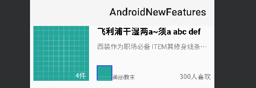
可以看到,我们不用嵌套任何一个布局即可完成该布局的编码工作,所以在性能上,尤其是更加复杂的布局,岂不是很爽。
当然,有可能你在布局的过程中会遇到以下几种情况:
1. 两个控件之间怎么居中对齐?
2. 我设置了android:ellipsize="end"为什么没生效
3. 在某些逻辑下我要隐藏很多控件,为了方便,我在传统布局里可以将这些控件设置在一个ViewGroup里,就可以达到隐藏ViewGroup来简化单独的控件隐藏逻辑,现在新布局不让用布局嵌套了,我难道要一个个控件单独隐藏?
4. 我所依赖的一个控件在某些逻辑下setVisibiltyGone后,自身的位置发生了重大偏差,怎么办?
这些问题,我们都可以解决,篇幅问题,我们下期会依依解决这些问题,同时引出更多的高级用法,高级属性。


 扫一扫
扫一扫


 2286
2286


 到【灌水乐园】发言


