


 本文详细介绍SuperTextView的使用方法,包括如何添加依赖、设置各种属性实现不同样式,如圆角矩形、圆形、边框、文字描边、渐变背景及文字、图片边框等,并提供代码示例。
下面是 SuperTextView 简单使用,以及常用的方法。
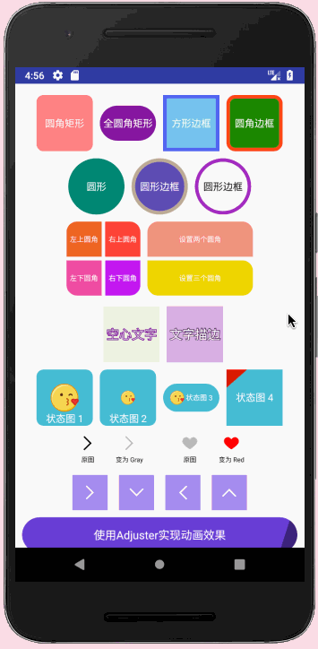
首先看一下 SuperTextView 效果图:
1. 添加依赖
在项目的 gradle 中加入下面内容:
allprojects {
    repositories {
        google()
        jcenter()

        maven { url 'https://jitpack.io' }
    }
}
在 app 下的 gradle 中加入下面代码:
dependencies {
    compile 'com.github.chenBingX:SuperTextView:v3.1.4'
}
2. SuperTextView 所支持的属性
首先在 xml 文件中加入下面代码:
            <com.coorchice.library.SuperTextView
                android:layout_width="60dp"
                android:layout_height="60dp"
                android:gravity="center"
                android:text="圆角矩形"
                android:textColor="#FFFFFF"
                android:textSize="10dp"
                app:stv_corner="10dp"
                app:stv_solid="@color/colorPrimaryDark" />
以下是目前 SuperTextView 所支持的所有属性:
<SuperTextView
  //设置圆角。会同时作用于填充和边框(如果边框存在的话)。
  //如果要设置为圆形,只需要把该值设置为宽或长的1/2即可。
  app:stv_corner="25dp"

  //设置左上角圆角
  app:stv_left_top_corner="true"

  //设置右上角圆角
  app:stv_right_top_corner="true"

  //设置左下角圆角
  app:stv_left_bottom_corner="true"

  //设置右下角圆角
  app:stv_right_bottom_corner="true"

  //设置填充颜色
  app:stv_solid="@color/red"

  //设置边框颜色
  app:stv_stroke_color="@color/black"

  //设置边框的宽度。
  app:stv_stroke_width="2dp"

  //放置一个drawable在背景层上。默认居中显示。
  //并且默认大小为SuperTextView的一半。
  app:stv_state_drawable="@drawable/emoji"

  //设置drawable的显示模式。可选值如下:
  // left、top、right、bottom、center(默认值)、
  //leftTop、rightTop、leftBottom、rightBottom、
  //fill(充满整个SuperTextView,此时会使设置drawable的大小失效)
  app:stv_state_drawable_mode="center"

  //设置drawable的height
  app:stv_state_drawable_height="30dp"

  //设置drawable的width
  app:stv_state_drawable_width="30dp"

  //设置drawble相对于基础位置左边的距离
  app:stv_state_drawable_padding_left="10dp"

  //设置drawble相对于基础位置上边的距离
  app:stv_state_drawable_padding_top="10dp"

  // boolean类型。是否显示drawable。
  //如果你想要设置的drawable显示出来,必须设置为true。
  //当不想让它显示时,再设置为false即可。
  app:stv_isShowState="true"

  // 是否将state_drawable作为背景图
  // 将state_drawable作为背景图可以让SuperTextView具备展示图片的能力
  // 通过调节corner、stroke等属性,可以给图片设置圆角、边框等
  app:stv_drawableAsBackground="true"

  //放置一个drawable在背景层上。默认居中显示。
  //并且默认大小为SuperTextView的一半。
  app:stv_state_drawable2="@drawable/emoji"

  //与state_drawable类似
  app:stv_state_drawable2_mode="center"

  //与state_drawable_height类似
  app:stv_state_drawable2_height="30dp"

  //与state_drawable_width类似
  app:stv_state_drawable2_width="30dp"

  //与state_drawable_padding_left类似
  app:stv_state_drawable2_padding_left="10dp"

  //与state_drawable_padding_top类似
  app:stv_state_drawable2_padding_top="10dp"

  //与isShowState类似
  app:stv_isShow2State="true"

  # 修改 drawable 的颜色
  app:stv_state_drawable_tint="@color/gray"

  # 修改 drawable2 的颜色
  app:stv_state_drawable2_tint="@color/red"

  # 修改 drawable 的旋转角度
  app:stv_state_drawable_rotate="90"

  # 修改 drawable2 的旋转角度
  app:stv_state_drawable2_rotate="90"

  //是否开启文字描边功能。
  //注意,启用这个模式之后通过setTextColor()设置的颜色将会被覆盖。
  //你需要通过text_fill_color来设置文字的颜色。
  app:stv_text_stroke="true"

  // 文字的描边颜色。默认为Color.BLACK。
  app:stv_text_stroke_color="@color/black"

  // 文字描边的宽度。
  app:stv_text_stroke_width="1dp"

  // 文字填充的颜色。默认为Color.BLACK。
  app:stv_text_fill_color="@color/blue"

  // boolean类型。是否启用Adjuster功能。
  //具体干什么,需要在Java中为SuperTextView实现一个Adjuster。
  //当你启用这个功能而没有实现自己的Adjuster时,
  //SuperTextView会启用默认的Adjuster。它会按照一定的规则调整文字大小。
  app:stv_autoAdjust="true"

  // 必须设置为true才能启用渐变功能。这意味着你可以灵活的控制这一功能。
  app:stv_shaderEnable="true"

  // 设置起始颜色。
  app:stv_shaderStartColor="@color/main_blue"

  // 设置结尾颜色。
  app:stv_shaderEndColor="@color/pink"

  // 设置渐变模式。如上图可见,一共支持4中模式:
  // topTopBottom, bottomToTop, leftToRight, rightToLeft
  app:stv_shaderMode="rightToLeft"

  // 设置按压时的背景色
  app:stv_pressBgColor="@color/red"

  // 设置按压时的文字颜色
  app:stv_pressTextColor="@color/white"

  // 修改 drawable 的颜色
  app:stv_state_drawable_tint="@color/gray"

  // 修改 drawable2 的颜色
  app:stv_state_drawable2_tint="@color/red"

  // 修改 drawable 的旋转角度
  app:stv_state_drawable_rotate="90"

  // 修改 drawable2 的旋转角度
  app:stv_state_drawable2_rotate="90"

  // 是否启用渐变色文字
  app:stv_textShaderEnable="true"

  // 设置文字的起始渐变色
  app:stv_textShaderStartColor="@color/red"

  // 设置文字的结束渐变色
  app:stv_textShaderEndColor="@color/yellow"

  // 设置文字的渐变的模式
  // leftToRight:左 -> 右
  // rightToLeft:右 -> 左
  // topToBottom:上 -> 下
  // bottomToTop:下 -> 上
  app:stv_textShaderMode="leftToRight"
  />
3. SuperTextView 简单使用
下面来看一下 SuperTextView 简单使用;先实现一个圆角矩形:

圆角大小为10dp,颜色为灰绿色,加入代码:
                app:stv_corner="10dp"
                app:stv_solid="@color/colorPrimaryDark"
圆形:
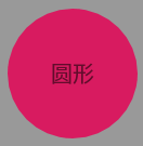
颜色为红色的圆,代码加入:
                app:stv_corner="30dp"
                app:stv_solid="@color/colorAccent"
圆形边框:

边框大小为5dp,颜色为深绿色的边框,代码加入:
                app:stv_corner="30dp"
                app:stv_solid="@color/colorAccent"
                app:stv_stroke_color="@color/colorPrimary"
                app:stv_stroke_width="5dp"
圆角:

左上角为圆角并且圆角大小为15dp,代码加入:
                app:stv_corner="15dp"
                app:stv_left_top_corner="true"
                app:stv_solid="@color/colorAccent"
两个圆角:

左上角和右下角为圆角并且圆角大小都为15dp,代码加入:
                app:stv_corner="15dp"
                app:stv_left_top_corner="true"
                app:stv_right_bottom_corner="true"
                app:stv_solid="@color/colorAccent"
文字描边:
白色的文字上黑色描边,stv_text_fill_color 文字颜色为白色;stv_text_stroke 开启文字描边;stv_text_stroke_color 文字描边的颜色;stv_text_stroke_width 描边大小;代码加入:
            app:stv_solid="#FFFFFF"
            app:stv_text_fill_color="#FFFFFF"
            app:stv_text_stroke="true"
            app:stv_text_stroke_color="#000000"
            app:stv_text_stroke_width="3dp"
方形图片边框:
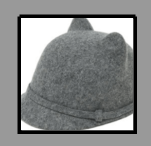
颜色为黑色并且大小为2dp的黑色方形边框,stv_drawableAsBackground 开启图片边框;stv_state_drawable 设置图片;stv_stroke_color 边框颜色;stv_stroke_width 边框大小;代码加入:
                app:stv_drawableAsBackground="true"
                app:stv_state_drawable="@drawable/maozi"
                app:stv_stroke_color="#000000"
                app:stv_stroke_width="2dp"
圆角图片边框:
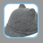
在上面方形边框基础上,再设置 stv_corner 圆角大小即可,代码加入:
                app:stv_drawableAsBackground="true"
                app:stv_state_drawable="@drawable/maozi"
                app:stv_stroke_color="#78C3ED"
                app:stv_stroke_width="2dp"
                app:stv_corner="10dp"
圆形边框:

在上面圆角基础上,将 stv_corner 圆角大小修改为宽度的一半即可,代码加入:
                app:stv_corner="30dp"
                app:stv_drawableAsBackground="true"
                app:stv_state_drawable="@drawable/maozi"
                app:stv_stroke_color="#5166ED"
                app:stv_stroke_width="2dp"
添加状态图:
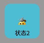
设置状态图片并设置大小,stv_isShowState 开启显示状态图;stv_state_drawable 设置状态图;stv_state_drawable_height 设置图片高度;stv_state_drawable_width 设置图片宽度;代码加入:
                app:stv_corner="10dp"
                app:stv_isShowState="true"
                app:stv_solid="#4CBDD2"
                app:stv_state_drawable="@drawable/face"
                app:stv_state_drawable_height="15dp"
                app:stv_state_drawable_width="15dp"
添加状态图:
stv_state_drawable_mode 设置图片位置;添加代码:
                app:stv_corner="30dp"
                app:stv_isShowState="true"
                app:stv_solid="#4CBDD2"
                app:stv_state_drawable="@drawable/face"
                app:stv_state_drawable_height="15dp"
                app:stv_state_drawable_mode="left"
                app:stv_state_drawable_padding_left="10dp"
                app:stv_state_drawable_width="15dp"
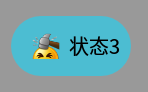
设置状态图旋转:
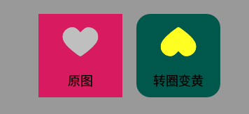
灰色的心为原图,红色图片代码为:
                app:stv_isShowState="true"
                app:stv_state_drawable="@drawable/like"
                app:stv_state_drawable_padding_top="-10dp"
将灰色的心设置为黄色并且旋转180度,stv_state_drawable_rotate 图片旋转;stv_state_drawable_tint 图片颜色;代码为:
                app:stv_isShowState="true"
                app:stv_solid="@color/colorPrimaryDark"
                app:stv_state_drawable="@drawable/like"
                app:stv_state_drawable_padding_top="-10dp"
                app:stv_state_drawable_rotate="180"
                app:stv_state_drawable_tint="#FFFF22"
添加两张状态图:
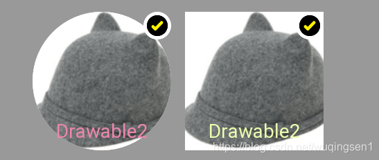
上图中,帽子为一张图片,对号为另一张图片,stv_drawableAsBackground 将第一张图片作为背景图;stv_isShowState2 开启显示第二张状态图;第一张图片代码如下:
                app:stv_corner="50dp"

                #配置第一张图片
                app:stv_drawableAsBackground="true"
                app:stv_state_drawable="@drawable/maozi"

                #配置第二张图片
                app:stv_isShowState2="true"
                app:stv_state_drawable2="@drawable/dui"
                app:stv_state_drawable2_height="20dp"
                app:stv_state_drawable2_mode="rightTop"
                app:stv_state_drawable2_width="20dp"
第二张图片代码如下:
                #设置第一张状态图
                app:stv_isShowState="true"
                app:stv_state_drawable="@drawable/maozi"

                #设置第二张状态图
                app:stv_isShowState2="true"
                app:stv_state_drawable2="@drawable/dui"
                app:stv_state_drawable2_height="20dp"
                app:stv_state_drawable2_mode="rightTop"
                app:stv_state_drawable2_width="20dp"
点击效果:
其中 stv_pressBgColor 点击背景色,stv_pressTextColor 点击字体颜色;代码加入:
            app:stv_pressBgColor="@color/colorAccent"
            app:stv_pressTextColor="#FFFFFF"
            app:stv_corner="10dp"
            app:stv_isShowState="true"
            app:stv_solid="#BFF2"
            app:stv_state_drawable="@drawable/face"
            app:stv_state_drawable_height="30dp"
            app:stv_state_drawable_width="30dp"
            app:stv_isShowState2="true"
            app:stv_state_drawable2="@drawable/dui"
            app:stv_state_drawable2_height="10dp"
            app:stv_state_drawable2_width="10dp"
            app:stv_state_drawable2_mode="rightTop"
背景颜色渐变:
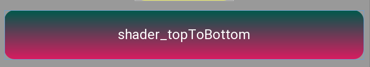
其中 stv_shaderEnable 开启颜色渐变;stv_shaderEndColor 渐变结束颜色;stv_shaderMode 渐变方向;stv_shaderStartColor 渐变开始颜色;代码加入:
            app:stv_shaderEnable="true"
            app:stv_shaderEndColor="@color/colorAccent"
            app:stv_shaderMode="topToBottom"
            app:stv_shaderStartColor="@color/colorPrimaryDark"
文字颜色渐变:

其中 stv_textShaderEnable 开启文字颜色渐变;stv_textShaderEndColor 渐变结束颜色;stv_textShaderMode 渐变方向;stv_textShaderStartColor 渐变开始颜色;代码加入:
            app:stv_textShaderEnable="true"
            app:stv_textShaderEndColor="@color/colorAccent"
            app:stv_textShaderMode="leftToRight"
            app:stv_textShaderStartColor="@color/colorPrimaryDark"
SuperTextView 简单使用就这些,当然还有很多没有说到的,比如加载网络图片等;
完整的开发指南请看这篇文章:
https://misterye.com/archives/5050.html
下面是 GitHub 地址:
https://github.com/chenBingX/SuperTextView/blob/master/README_CN.md


 扫一扫
扫一扫


 2517
2517

 被折叠的 条评论
为什么被折叠?
被折叠的 条评论
为什么被折叠?
 到【灌水乐园】发言


