


目录
3.3.1 使用bindContentCover构建全屏模态转场效果
8.1.3 使用backgroundBlurStyle为组件添加背景模糊效果
8.1.5 使用foregroundBlurStyle为组件添加内容模糊效果
1 动画概述
UI(用户界面)中包含开发者与设备进行交互时所看到的各种组件(如时间、壁纸等)。属性作为接口,用于控制组件的行为
动画的目的包括:
- 使界面的过渡自然流畅。
- 增强用户从界面获得的反馈感和互动感。
- 在内容加载等场景中,增加用户的耐心,缓解等待带来的不适感。
- 引导用户了解和操作设备。
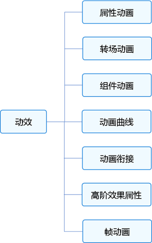
属性动画:最基础的动画类型,按照动画参数逐帧驱动属性的变化,产生一帧帧的动画效果。除其中的自定义属性动画外,动画过程的驱动由系统完成,应用侧不感知动画过程。
转场动画:为组件在出现和消失时添加过渡动画。为了保证动画一致性,部分接口动画曲线已内置,不支持开发者自定义。
- 不推荐在应用内使用UIAbility组合所有的界面:UIAbility是一个任务,会在多任务界面独立显示一个卡片,UIAbility之间的跳转是任务之间的跳转。以应用内查看大图的典型场景为例,不建议应用内调用图库的UIAbility去打开图片查看大图,会导致任务的跳转,图库的UIAbility也会加入多任务界面中。正确的方式是应用内构建大图组件,通过模态转场去调起大图组件,一个任务内的所有的界面都在一个UIAbility内闭环。
- 导航转场中,应使用Navigation组件实现转场动画。过去的page+router方式在实现导航转场过程中,因为page和page之间相互独立,其联动动画效果受限。不仅容易导致页面之间的割裂,并且不支持一次开发多端部署。
组件动画:组件提供默认动效(如List的滑动动效)便于开发者使用,同时部分组件还支持定制化动效。
动画曲线:介绍传统曲线和弹簧曲线的特点和使用方式。动画曲线影响属性值的运动规律,进而决定界面的动画效果。
动画衔接:介绍如何实现动画与动画之间、手势与动画之间的自然过渡。
高阶动画效果:介绍模糊、大阴影和颜色渐变等高阶效果接口的使用方法。
帧动画:系统侧提供在动画过程中的插值结果,由开发者每帧修改属性值产生动画,相比于属性动画,有可实现暂停的优点,但性能不如属性动画。
2 属性动画
2.1 属性动画概述
属性接口(以下简称属性)包含尺寸属性、布局属性、位置属性等多种类型,用于控制组件的行为。
根据变化时是否能够添加动画,可以将属性分为可动画属性和不可动画属性。判断一种属性是否适合作为可动画属性主要有两个标准:
属性接口分类说明:
-
可动画属性:
-
系统可动画属性:
分类 说明 布局属性 位置、大小、内边距、外边距、对齐方式、权重等。 仿射变换 平移、旋转、缩放、锚点等。 背景 背景颜色、背景模糊等。 内容 文字大小、文字颜色,图片对齐方式、模糊等。 前景 前景颜色等。 Overlay Overlay属性等。 外观 透明度、圆角、边框、阴影等。 ... ... -
自定义可动画属性:通过自定义属性动画机制抽象出的可动画属性。
-
-
不可动画属性:zIndex、focusable等。
对于可动画属性,系统不仅提供通用属性,还支持自定义可动画属性。
系统可动画属性:组件自带的支持改变UI界面的属性接口,如位置、缩放、模糊等。
自定义可动画属性:ArkUI提供@AnimatableExtend装饰器用于自定义可动画属性。开发者可从自定义绘制的内容中抽象出可动画属性,用于控制每帧绘制的内容,如自定义绘制音量图标。通过自定义可动画属性,可以为ArkUI中部分原本不支持动画的属性添加动画。
2.2 实现属性动画
通过可动画属性改变引起UI上产生的连续视觉效果,即为属性动画。属性动画是最基础易懂的动画,ArkUI提供两种属性动画接口animateTo和animation驱动组件属性按照动画曲线等动画参数进行连续的变化,产生属性动画。
| 属性动画接口 | 作用域 | 原理 | 使用场景 |
|---|---|---|---|
| animateTo | 闭包内改变属性引起的界面变化。 作用于出现消失转场。 | 通用函数,对闭包前界面和闭包中的状态变量引起的界面之间的差异做动画。 支持多次调用,支持嵌套。 | 适用对多个可动画属性配置相同动画参数的动画。 需要嵌套使用动画的场景。 |
| animation | 组件通过属性接口绑定的属性变化引起的界面变化。 | 识别组件的可动画属性变化,自动添加动画。 组件的接口调用是从下往上执行,animation只会作用于在其之上的属性调用。 组件可以根据调用顺序对多个属性设置不同的animation。 | 适用于对多个可动画属性配置不同参数动画的场景。 |
2.2.1 使用animateTo产生属性动画
animateTo(value: AnimateParam, event: () => void): voidanimateTo接口参数中,value指定AnimateParam对象(包括时长、Curve等)event为动画的闭包函数,闭包内变量改变产生的属性动画将遵循相同的动画参数。
说明
直接使用animateTo可能导致实例不明确的问题,建议使用getUIContext获取UIContext实例,并使用animateTo调用绑定实例的animateTo。
import { curves } from '@kit.ArkUI';

@Entry
@Component
struct AnimateToDemo {
  @State animate: boolean = false;
  // 第一步: 声明相关状态变量
  @State rotateValue: number = 0; // 组件一旋转角度
  @State translateX: number = 0; // 组件二偏移量
  @State opacityValue: number = 1; // 组件二透明度

  // 第二步:将状态变量设置到相关可动画属性接口
  build() {
    Row() {
      // 组件一
      Column() {
      }
      .rotate({ angle: this.rotateValue })
      .backgroundColor('#317AF7')
      .justifyContent(FlexAlign.Center)
      .width(100)
      .height(100)
      .borderRadius(30)
      .onClick(() => {
        this.getUIContext()?.animateTo({ curve: curves.springMotion() }, () => {
          this.animate = !this.animate;
          // 第三步:闭包内通过状态变量改变UI界面
          // 这里可以写任何能改变UI的逻辑比如数组添加,显隐控制,系统会检测改变后的UI界面与之前的UI界面的差异,对有差异的部分添加动画
          // 组件一的rotate属性发生变化,所以会给组件一添加rotate旋转动画
          this.rotateValue = this.animate ? 90 : 0;
          // 组件二的透明度发生变化,所以会给组件二添加透明度的动画
          this.opacityValue = this.animate ? 0.6 : 1;
          // 组件二的translate属性发生变化,所以会给组件二添加translate偏移动画
          this.translateX = this.animate ? 50 : 0;
        })
      })

      // 组件二
      Column() {

      }
      .justifyContent(FlexAlign.Center)
      .width(100)
      .height(100)
      .backgroundColor('#D94838')
      .borderRadius(30)
      .opacity(this.opacityValue)
      .translate({ x: this.translateX })
    }
    .width('100%')
    .height('100%')
    .justifyContent(FlexAlign.Center)
  }
}
2.2.2 使用animation产生属性动画
相比于animateTo接口需要把要执行动画的属性的修改放在闭包中,animation接口无需使用闭包,把animation接口加在要做属性动画的可动画属性后即可。animation只要检测到其绑定的可动画属性发生变化,就会自动添加属性动画,animateTo则必须在动画闭包内改变可动画属性的值从而生成动画。
import { curves } from '@kit.ArkUI';

@Entry
@Component
struct AnimationDemo {
  @State animate: boolean = false;
  // 第一步: 声明相关状态变量
  @State rotateValue: number = 0; // 组件一旋转角度
  @State translateX: number = 0; // 组件二偏移量
  @State opacityValue: number = 1; // 组件二透明度

  // 第二步:将状态变量设置到相关可动画属性接口
  build() {
    Row() {
      // 组件一
      Column() {
      }
      .opacity(this.opacityValue)
      .rotate({ angle: this.rotateValue })
      // 第三步:通过属性动画接口开启属性动画
      .animation({ curve: curves.springMotion() })
      .backgroundColor('#317AF7')
      .justifyContent(FlexAlign.Center)
      .width(100)
      .height(100)
      .borderRadius(30)
      .onClick(() => {
        this.animate = !this.animate;
        // 第四步:闭包内通过状态变量改变UI界面
        // 这里可以写任何能改变UI的逻辑比如数组添加,显隐控制,系统会检测改变后的UI界面与之前的UI界面的差异,对有差异的部分添加动画
        // 组件一的rotate属性发生变化,所以会给组件一添加rotate旋转动画
        this.rotateValue = this.animate ? 90 : 0;
        // 组件二的translate属性发生变化,所以会给组件二添加translate偏移动画
        this.translateX = this.animate ? 50 : 0;
        // 父组件column的opacity属性有变化,会导致其子节点的透明度也变化,所以这里会给column和其子节点的透明度属性都加动画
        this.opacityValue = this.animate ? 0.6 : 1;
      })

      // 组件二
      Column() {
      }
      .justifyContent(FlexAlign.Center)
      .width(100)
      .height(100)
      .backgroundColor('#D94838')
      .borderRadius(30)
      .opacity(this.opacityValue)
      .translate({ x: this.translateX })
      .animation({ curve: curves.springMotion() })
    }
    .width('100%')
    .height('100%')
    .justifyContent(FlexAlign.Center)
  }
}
说明
2.3 自定义属性动画
-
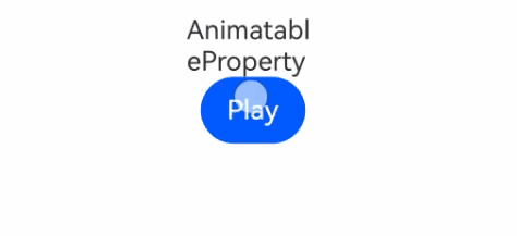
使用number数据类型和@AnimatableExtend装饰器改变Text组件宽度实现逐帧布局的效果
// 第一步:使用@AnimatableExtend装饰器,自定义可动画属性接口
@AnimatableExtend(Text)
function animatableWidth(width: number) {
  .width(width) // 调用系统属性接口,逐帧回调函数每帧修改可动画属性的值,实现逐帧布局的效果。
}

@Entry
@Component
struct AnimatablePropertyExample {
  @State textWidth: number = 80;

  build() {
    Column() {
      Text("AnimatableProperty")
        .animatableWidth(this.textWidth)// 第二步:将自定义可动画属性接口设置到组件上
        .animation({ duration: 2000, curve: Curve.Ease }) // 第三步:为自定义可动画属性接口绑定动画
      Button("Play")
        .onClick(() => {
          this.textWidth = this.textWidth == 80 ? 160 : 80; // 第四步:改变自定义可动画属性的参数,产生动画
        })
    }.width("100%")
    .padding(10)
  }
}
- 使用自定义数据类型和@AnimatableExtend装饰器改变图形形状
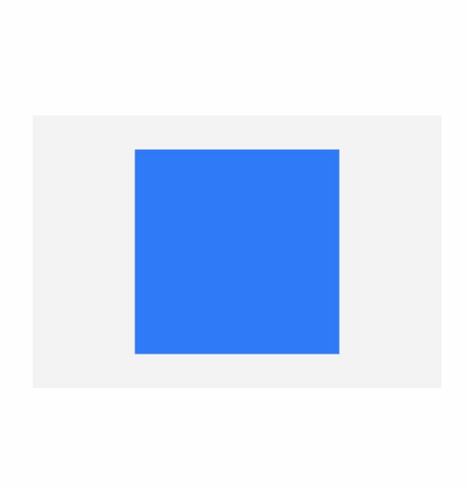
declare type Point = number[];

// 定义可动画属性接口的参数类型,实现AnimatableArithmetic<T>接口中加法、减法、乘法和判断相等函数
class PointClass extends Array<number> {
  constructor(value: Point) {
    super(value[0], value[1])
  }

  add(rhs: PointClass): PointClass {
    let result: Point = new Array<number>() as Point;
    for (let i = 0; i < 2; i++) {
      result.push(rhs[i] + this[i])
    }
    return new PointClass(result);
  }

  subtract(rhs: PointClass): PointClass {
    let result: Point = new Array<number>() as Point;
    for (let i = 0; i < 2; i++) {
      result.push(this[i] - rhs[i]);
    }
    return new PointClass(result);
  }

  multiply(scale: number): PointClass {
    let result: Point = new Array<number>() as Point;
    for (let i = 0; i < 2; i++) {
      result.push(this[i] * scale)
    }
    return new PointClass(result);
  }
}

// 定义可动画属性接口的参数类型,实现AnimatableArithmetic<T>接口中加法、减法、乘法和判断相等函数
// 模板T支持嵌套实现AnimatableArithmetic<T>的类型
class PointVector extends Array<PointClass> implements AnimatableArithmetic<Array<Point>> {
  constructor(initialValue: Array<Point>) {
    super();
    if (initialValue.length) {
      initialValue.forEach((p: Point) => this.push(new PointClass(p)))
    }
  }

  // implement the IAnimatableArithmetic interface
  plus(rhs: PointVector): PointVector {
    let result = new PointVector([]);
    const len = Math.min(this.length, rhs.length)
    for (let i = 0; i < len; i++) {
      result.push(this[i].add(rhs[i]))
    }
    return result;
  }

  subtract(rhs: PointVector): PointVector {
    let result = new PointVector([]);
    const len = Math.min(this.length, rhs.length)
    for (let i = 0; i < len; i++) {
      result.push(this[i].subtract(rhs[i]))
    }
    return result;
  }

  multiply(scale: number): PointVector {
    let result = new PointVector([]);
    for (let i = 0; i < this.length; i++) {
      result.push(this[i].multiply(scale))
    }
    return result;
  }

  equals(rhs: PointVector): boolean {
    if (this.length !== rhs.length) {
      return false;
    }
    for (let index = 0, size = this.length; index < size; ++index) {
      if (this[index][0] !== rhs[index][0] || this[index][1] !== rhs[index][1]) {
        return false;
      }
    }
    return true;
  }
}

// 自定义可动画属性接口
@AnimatableExtend(Polyline)
function animatablePoints(points: PointVector) {
  .points(points)
}

@Entry
@Component
struct AnimatedShape {
  squareStartPointX: number = 75;
  squareStartPointY: number = 25;
  squareWidth: number = 150;
  squareEndTranslateX: number = 50;
  squareEndTranslateY: number = 50;
  @State pointVec1: PointVector = new PointVector([
    [this.squareStartPointX, this.squareStartPointY],
    [this.squareStartPointX + this.squareWidth, this.squareStartPointY],
    [this.squareStartPointX + this.squareWidth, this.squareStartPointY + this.squareWidth],
    [this.squareStartPointX, this.squareStartPointY + this.squareWidth]
  ]);
  @State pointVec2: PointVector = new PointVector([
    [this.squareStartPointX + this.squareEndTranslateX, this.squareStartPointY + this.squareStartPointY],
    [this.squareStartPointX + this.squareWidth + this.squareEndTranslateX,
      this.squareStartPointY + this.squareStartPointY],
    [this.squareStartPointX + this.squareWidth, this.squareStartPointY + this.squareWidth],
    [this.squareStartPointX, this.squareStartPointY + this.squareWidth]
  ]);
  @State color: Color = Color.Green;
  @State fontSize: number = 20.0;
  @State polyline1Vec: PointVector = this.pointVec1;
  @State polyline2Vec: PointVector = this.pointVec2;

  build() {
    Row() {
      Polyline()
        .width(300)
        .height(200)
        .backgroundColor("#0C000000")
        .fill('#317AF7')
        .animatablePoints(this.polyline1Vec)
        .animation({ duration: 2000, delay: 0, curve: Curve.Ease })
        .onClick(() => {

          if (this.polyline1Vec.equals(this.pointVec1)) {
            this.polyline1Vec = this.pointVec2;
          } else {
            this.polyline1Vec = this.pointVec1;
          }
        })
    }
    .width('100%').height('100%').justifyContent(FlexAlign.Center)
  }
} 
3 转场动画
3.1 转场动画概述
转场动画是指对将要出现或消失的组件做动画,对始终出现的组件做动画应使用属性动画。转场动画主要为了让开发者从繁重的消失节点管理中解放出来,如果用属性动画做组件转场,开发者需要在动画结束回调中删除组件节点。同时,由于动画结束前已经删除的组件节点可能会重新出现,还需要在结束回调中增加对节点状态的判断。
转场动画分为基础转场和高级模板化转场,有如下几类:
出现/消失转场:对新增、消失的控件实现动画效果,是通用的基础转场效果。
导航转场:页面的路由转场方式,对应一个界面消失,另外一个界面出现的动画效果,如设置应用一级菜单切换到二级界面。
模态转场:新的界面覆盖在旧的界面之上的动画,旧的界面不消失,新的界面出现,如弹框就是典型的模态转场动画。
共享元素转场 (一镜到底):共享元素转场是一种界面切换时对相同或者相似的元素做的一种位置和大小匹配的过渡动画效果。
页面转场动画(不推荐):页面的路由转场方式,可以通过在pageTransition函数中自定义页面入场和页面退场的转场动效。为了实现更好的转场效果,推荐使用导航转场和模态转场。
旋转屏动画:旋转屏动画主要分为两类:布局切换的旋转屏动画和透明度变化的旋转屏动画,旨在实现屏幕显示方向变化时的自然过渡。
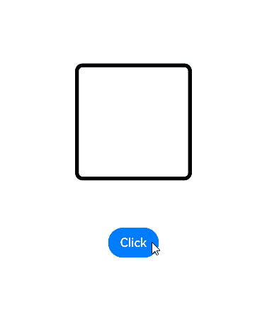
3.2 出现/消失转场
transition是基础的组件转场接口,用于实现一个组件出现或者消失时的动画效果。可以通过TransitionEffect对象的组合使用,定义出各式效果。
表1 转场效果接口
| 转场效果 | 说明 | 动画 |
|---|---|---|
| IDENTITY | 禁用转场效果。 | 无。 |
| OPACITY | 默认的转场效果,透明度转场。 | 出现时透明度从0到1,消失时透明度从1到0。 |
| SLIDE | 滑动转场效果。 | 出现时从窗口左侧滑入,消失时从窗口右侧滑出。 |
| translate | 通过设置组件平移创建转场效果。 | 出现时为translate接口设置的值到默认值0,消失时为默认值0到translate接口设置的值。 |
| rotate | 通过设置组件旋转创建转场效果。 | 出现时为rotate接口设置的值到默认值0,消失时为默认值0到rotate接口设置的值。 |
| opacity | 通过设置透明度参数创建转场效果。 | 出现时为opacity设置的值到默认透明度1,消失时为默认透明度1到opacity设置的值。 |
| move | 通过TransitionEdge创建从窗口哪条边缘出来的效果。 | 出现时从TransitionEdge方向滑入,消失时滑出到TransitionEdge方向。 |
| asymmetric | 通过此方法组合非对称的出现消失转场效果。 - appear:出现转场的效果。 - disappear:消失转场的效果。 | 出现时采用appear设置的TransitionEffect出现效果,消失时采用disappear设置的TransitionEffect消失效果。 |
| combine | 组合其他TransitionEffect。 | 组合其他TransitionEffect,一起生效。 |
| animation | 定义转场效果的动画参数: - 如果不定义会跟随animateTo的动画参数。 - 不支持通过控件的animation接口配置动画参数。 - TransitionEffect中animation的onFinish不生效。 | 调用顺序时从上往下,上面TransitionEffect的animation也会作用到下面TransitionEffect。 |
-
创建TransitionEffect。
// 出现时会是所有转场效果的出现效果叠加,消失时会是所有消失转场效果的叠加
// 用于说明各个effect跟随的动画参数
private effect: object =
  TransitionEffect.OPACITY // 创建了透明度转场效果,这里没有调用animation接口,会跟随animateTo的动画参数
    // 通过combine方法,添加缩放转场效果,并指定了springMotion(0.6, 1.2)曲线
    .combine(TransitionEffect.scale({ x: 0, y: 0 }).animation({ curve: curves.springMotion(0.6, 1.2) }))
    // 添加旋转转场效果,这里的动画参数会跟随上面的TransitionEffect,也就是springMotion(0.6, 1.2)
    .combine(TransitionEffect.rotate({ angle: 90 }))
    // 添加平移转场效果,动画参数会跟随其之上带animation的TransitionEffect,也就是springMotion(0.6, 1.2)
    .combine(TransitionEffect.translate({ x: 150, y: 150 })
    // 添加move转场效果,并指定了springMotion曲线
    .combine(TransitionEffect.move(TransitionEdge.END)).animation({curve: curves.springMotion()}))
    // 添加非对称的转场效果,由于这里没有设置animation,会跟随上面的TransitionEffect的animation效果,也就是springMotion
    .combine(TransitionEffect.asymmetric(TransitionEffect.scale({ x: 0, y: 0 }), TransitionEffect.rotate({ angle: 90 })));
2. 将转场效果通过transition接口设置到组件。
Text('test')
  .transition(this.effect)
3. 新增或者删除组件触发转场。
@State isPresent: boolean = true;
// ...
if (this.isPresent) {
  Text('test')
    .transition(this.effect)
}
// ...
// 控制新增或者删除组件
// 方式一:将控制变量放到animateTo闭包内,未通过animation接口定义动画参数的TransitionEffect将跟随animateTo的动画参数
this.getUIContext()?.animateTo({ curve: curves.springMotion() }, () => {
  this.isPresent = false;
})

// 方式二:直接控制删除或者新增组件,动画参数由TransitionEffect的animation接口配置
this.isPresent = false;
完整的示例代码和效果如下,示例中采用直接删除或新增组件的方式触发转场,也可以替换为在animateTo闭包内改变控制变量触发转场。
import { curves } from '@kit.ArkUI';

@Entry
@Component
struct TransitionEffectDemo {
  @State isPresent: boolean = false;
  // 第一步,创建TransitionEffect
  private effect: TransitionEffect =
    // 创建默认透明度转场效果,并指定了springMotion(0.6, 0.8)曲线
    TransitionEffect.OPACITY.animation({
      curve: curves.springMotion(0.6, 0.8)
    })// 通过combine方法,这里的动画参数会跟随上面的TransitionEffect,也就是springMotion(0.6, 0.8)
      .combine(TransitionEffect.scale({
        x: 0,
        y: 0
      }))// 添加旋转转场效果,这里的动画参数会跟随上面带animation的TransitionEffect,也就是springMotion(0.6, 0.8)
      .combine(TransitionEffect.rotate({ angle: 90 }))// 添加平移转场效果,这里的动画参数使用指定的springMotion()
      .combine(TransitionEffect.translate({ y: 150 })
        .animation({ curve: curves.springMotion() }))// 添加move转场效果,这里的动画参数会跟随上面的TransitionEffect,也就是springMotion()
      .combine(TransitionEffect.move(TransitionEdge.END))

  build() {
    Stack() {
      if (this.isPresent) {
        Column() {
          Text('ArkUI')
            .fontWeight(FontWeight.Bold)
            .fontSize(20)
            .fontColor(Color.White)
        }
        .justifyContent(FlexAlign.Center)
        .width(150)
        .height(150)
        .borderRadius(10)
        .backgroundColor(0xf56c6c)
        // 第二步:将转场效果通过transition接口设置到组件
        .transition(this.effect)
      }

      // 边框
      Column()
        .width(155)
        .height(155)
        .border({
          width: 5,
          radius: 10,
          color: Color.Black
        })

      // 第三步:新增或者删除组件触发转场,控制新增或者删除组件
      Button('Click')
        .margin({ top: 320 })
        .onClick(() => {
          this.isPresent = !this.isPresent;
        })
    }
    .width('100%')
    .height('60%')
  }
}
对多个组件添加转场效果时,可以通过在animation动画参数中配置不同的delay值,实现组件渐次出现消失的效果:

3.3 模态转场
模态转场是新的界面覆盖在旧的界面上,旧的界面不消失的一种转场方式。
表1 模态转场接口
| 接口 | 说明 | 使用场景 |
|---|---|---|
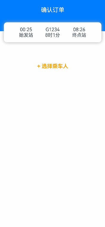
| bindContentCover | 弹出全屏的模态组件。 | 用于自定义全屏的模态展示界面,结合转场动画和共享元素动画可实现复杂转场动画效果,如缩略图片点击后查看大图。 |
| bindSheet | 弹出半模态组件。 | 用于半模态展示界面,如分享框。 |
| bindMenu | 弹出菜单,点击组件后弹出。 | 需要Menu菜单的场景,如一般应用的“+”号键。 |
| bindContextMenu | 弹出菜单,长按或者右键点击后弹出。 | 长按浮起效果,一般结合拖拽框架使用,如桌面图标长按浮起。 |
| bindPopup | 弹出Popup弹框。 | Popup弹框场景,如点击后对某个组件进行临时说明。 |
| if | 通过if新增或删除组件。 | 用来在某个状态下临时显示一个界面,这种方式的返回导航需要由开发者监听接口实现。 |
3.3.1 使用bindContentCover构建全屏模态转场效果
bindContentCover接口用于为组件绑定全屏模态页面,在组件出现和消失时可通过设置转场参数ModalTransition添加过渡动效。
-
定义全屏模态转场效果bindContentCover。
-
定义模态展示界面。
// 通过@Builder构建模态展示界面
@Builder MyBuilder() {
  Column() {
    Text('my model view')
  }
  // 通过转场动画实现出现消失转场动画效果,transition需要加在builder下的第一个组件
  .transition(TransitionEffect.translate({ y: 1000 }).animation({ curve: curves.springMotion(0.6, 0.8) }))
}
3. 通过模态接口调起模态展示界面,通过转场动画或者共享元素动画去实现对应的动画效果。
// 模态转场控制变量
@State isPresent: boolean = false;

Button('Click to present model view')
  // 通过选定的模态接口,绑定模态展示界面,ModalTransition是内置的ContentCover转场动画类型,这里选择None代表系统不加默认动画,通过onDisappear控制状态变量变换
  .bindContentCover(this.isPresent, this.MyBuilder(), {
            modalTransition: ModalTransition.NONE,
            onDisappear: () => {
              if (this.isPresent) {
                this.isPresent = !this.isPresent;
              }
            }
          })
  .onClick(() => {
    // 改变状态变量,显示模态界面
    this.isPresent = !this.isPresent;
  })
完整示例代码和效果如下。
import { curves } from '@kit.ArkUI';

interface PersonList {
  name: string,
  cardnum: string
}

@Entry
@Component
struct BindContentCoverDemo {
  private personList: Array<PersonList> = [
    { name: '王**', cardnum: '1234***********789' },
    { name: '宋*', cardnum: '2345***********789' },
    { name: '许**', cardnum: '3456***********789' },
    { name: '唐*', cardnum: '4567***********789' }
  ];
  // 第一步:定义全屏模态转场效果bindContentCover
  // 模态转场控制变量
  @State isPresent: boolean = false;

  // 第二步:定义模态展示界面
  // 通过@Builder构建模态展示界面
  @Builder
  MyBuilder() {
    Column() {
      Row() {
        Text('选择乘车人')
          .fontSize(20)
          .fontColor(Color.White)
          .width('100%')
          .textAlign(TextAlign.Center)
          .padding({ top: 30, bottom: 15 })
      }
      .backgroundColor(0x007dfe)

      Row() {
        Text('+ 添加乘车人')
          .fontSize(16)
          .fontColor(0x333333)
          .margin({ top: 10 })
          .padding({ top: 20, bottom: 20 })
          .width('92%')
          .borderRadius(10)
          .textAlign(TextAlign.Center)
          .backgroundColor(Color.White)
      }

      Column() {
        ForEach(this.personList, (item: PersonList, index: number) => {
          Row() {
            Column() {
              if (index % 2 == 0) {
                Column()
                  .width(20)
                  .height(20)
                  .border({ width: 1, color: 0x007dfe })
                  .backgroundColor(0x007dfe)
              } else {
                Column()
                  .width(20)
                  .height(20)
                  .border({ width: 1, color: 0x007dfe })
              }
            }
            .width('20%')

            Column() {
              Text(item.name)
                .fontColor(0x333333)
                .fontSize(18)
              Text(item.cardnum)
                .fontColor(0x666666)
                .fontSize(14)
            }
            .width('60%')
            .alignItems(HorizontalAlign.Start)

            Column() {
              Text('编辑')
                .fontColor(0x007dfe)
                .fontSize(16)
            }
            .width('20%')
          }
          .padding({ top: 10, bottom: 10 })
          .border({ width: { bottom: 1 }, color: 0xf1f1f1 })
          .width('92%')
          .backgroundColor(Color.White)
        })
      }
      .padding({ top: 20, bottom: 20 })

      Text('确认')
        .width('90%')
        .height(40)
        .textAlign(TextAlign.Center)
        .borderRadius(10)
        .fontColor(Color.White)
        .backgroundColor(0x007dfe)
        .onClick(() => {
          this.isPresent = !this.isPresent;
        })
    }
    .size({ width: '100%', height: '100%' })
    .backgroundColor(0xf5f5f5)
    // 通过转场动画实现出现消失转场动画效果
    .transition(TransitionEffect.translate({ y: 1000 }).animation({ curve: curves.springMotion(0.6, 0.8) }))
  }

  build() {
    Column() {
      Row() {
        Text('确认订单')
          .fontSize(20)
          .fontColor(Color.White)
          .width('100%')
          .textAlign(TextAlign.Center)
          .padding({ top: 30, bottom: 60 })
      }
      .backgroundColor(0x007dfe)

      Column() {
        Row() {
          Column() {
            Text('00:25')
            Text('始发站')
          }
          .width('30%')

          Column() {
            Text('G1234')
            Text('8时1分')
          }
          .width('30%')

          Column() {
            Text('08:26')
            Text('终点站')
          }
          .width('30%')
        }
      }
      .width('92%')
      .padding(15)
      .margin({ top: -30 })
      .backgroundColor(Color.White)
      .shadow({ radius: 30, color: '#aaaaaa' })
      .borderRadius(10)

      Column() {
        Text('+ 选择乘车人')
          .fontSize(18)
          .fontColor(Color.Orange)
          .fontWeight(FontWeight.Bold)
          .padding({ top: 10, bottom: 10 })
          .width('60%')
          .textAlign(TextAlign.Center)
          .borderRadius(15)// 通过选定的模态接口,绑定模态展示界面,ModalTransition是内置的ContentCover转场动画类型,这里选择DEFAULT代表设置上下切换动画效果,通过onDisappear控制状态变量变换。
          .bindContentCover(this.isPresent, this.MyBuilder(), {
            modalTransition: ModalTransition.DEFAULT,
            onDisappear: () => {
              if (this.isPresent) {
                this.isPresent = !this.isPresent;
              }
            }
          })
          .onClick(() => {
            // 第三步:通过模态接口调起模态展示界面,通过转场动画或者共享元素动画去实现对应的动画效果
            // 改变状态变量,显示模态界面
            this.isPresent = !this.isPresent;
          })
      }
      .padding({ top: 60 })
    }
  }
}
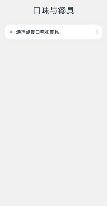
3.3.2 使用bindSheet构建半模态转场效果
bindSheet属性可为组件绑定半模态页面,在组件出现时可通过设置自定义或默认的内置高度确定半模态大小。构建半模态转场动效的步骤基本与使用bindContentCover构建全屏模态转场动效相同。
完整示例和效果如下。
@Entry
@Component
struct BindSheetDemo {
  // 半模态转场显示隐藏控制
  @State isShowSheet: boolean = false;
  private menuList: string[] = ['不要辣', '少放辣', '多放辣', '不要香菜', '不要香葱', '不要一次性餐具', '需要一次性餐具'];

  // 通过@Builder构建半模态展示界面
  @Builder
  mySheet() {
    Column() {
      Flex({ direction: FlexDirection.Row, wrap: FlexWrap.Wrap }) {
        ForEach(this.menuList, (item: string) => {
          Text(item)
            .fontSize(16)
            .fontColor(0x333333)
            .backgroundColor(0xf1f1f1)
            .borderRadius(8)
            .margin(10)
            .padding(10)
        })
      }
      .padding({ top: 18 })
    }
    .width('100%')
    .height('100%')
    .backgroundColor(Color.White)
  }

  build() {
    Column() {
      Text('口味与餐具')
        .fontSize(28)
        .padding({ top: 30, bottom: 30 })
      Column() {
        Row() {
          Row()
            .width(10)
            .height(10)
            .backgroundColor('#a8a8a8')
            .margin({ right: 12 })
            .borderRadius(20)

          Column() {
            Text('选择点餐口味和餐具')
              .fontSize(16)
              .fontWeight(FontWeight.Medium)
          }
          .alignItems(HorizontalAlign.Start)

          Blank()

          Row()
            .width(12)
            .height(12)
            .margin({ right: 15 })
            .border({
              width: { top: 2, right: 2 },
              color: 0xcccccc
            })
            .rotate({ angle: 45 })
        }
        .borderRadius(15)
        .shadow({ radius: 100, color: '#ededed' })
        .width('90%')
        .alignItems(VerticalAlign.Center)
        .padding({ left: 15, top: 15, bottom: 15 })
        .backgroundColor(Color.White)
        // 通过选定的半模态接口,绑定模态展示界面,style中包含两个参数,一个是设置半模态的高度,不设置时默认高度是Large,一个是是否显示控制条DragBar,默认是true显示控制条,通过onDisappear控制状态变量变换。
        .bindSheet(this.isShowSheet, this.mySheet(), {
          height: 300,
          dragBar: false,
          onDisappear: () => {
            this.isShowSheet = !this.isShowSheet;
          }
        })
        .onClick(() => {
          this.isShowSheet = !this.isShowSheet;
        })
      }
      .width('100%')
    }
    .width('100%')
    .height('100%')
    .backgroundColor(0xf1f1f1)
  }
}
3.3.3 使用bindMenu实现菜单弹出效果
bindMenu为组件绑定弹出式菜单,通过点击触发。
完整示例和效果如下。
class BMD{
  value:ResourceStr = ''
  action:() => void = () => {}
}
@Entry
@Component
struct BindMenuDemo {

  // 第一步: 定义一组数据用来表示菜单按钮项
  @State items:BMD[] = [
    {
      value: '菜单项1',
      action: () => {
        console.info('handle Menu1 select')
      }
    },
    {
      value: '菜单项2',
      action: () => {
        console.info('handle Menu2 select')
      }
    },
  ]

  build() {
    Column() {
      Button('click')
        .backgroundColor(0x409eff)
        .borderRadius(5)
          // 第二步: 通过bindMenu接口将菜单数据绑定给元素
        .bindMenu(this.items)
    }
    .justifyContent(FlexAlign.Center)
    .width('100%')
    .height(437)
  }
}
3.3.4 使用bindContextMenu实现菜单弹出效果
bindContextMenu为组件绑定弹出式菜单,通过长按或右键点击触发。
完整示例和效果如下。
@Entry
@Component
struct BindContextMenuDemo {
private menu: string[] = ['保存图片', '收藏', '搜一搜'];
private pics: Resource[] = [$r('app.media.icon_1'), $r('app.media.icon_2')];
// 通过@Builder构建自定义菜单项
@Builder myMenu() {
Column() {
ForEach(this.menu, (item: string) => {
Row() {
Text(item)
.fontSize(18)
.width('100%')
.textAlign(TextAlign.Center)
}
.padding(15)
.border({ width: { bottom: 1 }, color: 0xcccccc })
})
}
.width(140)
.borderRadius(15)
.shadow({ radius: 15, color: 0xf1f1f1 })
.backgroundColor(0xf1f1f1)
}
build() {
Column() {
Row() {
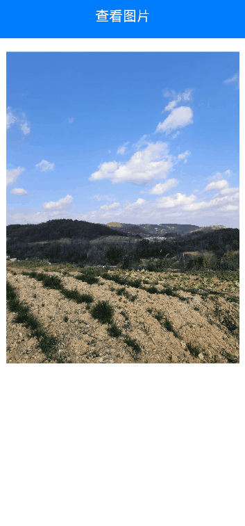
Text('查看图片')
.fontSize(20)
.fontColor(Color.White)
.width('100%')
.textAlign(TextAlign.Center)
.padding({ top: 20, bottom: 20 })
}
.backgroundColor(0x007dfe)
Column() {
ForEach(this.pics, (item: Resource) => {
Row(){
Image(item)
.width('100%')
.draggable(false)
}
.padding({ top: 20, bottom: 20, left: 10, right: 10 })
.bindContextMenu(this.myMenu, ResponseType.LongPress)
})
}
}
.width('100%')
.alignItems(HorizontalAlign.Center)
}
}
3.3.5 使用bindPopUp实现气泡弹窗效果
bindpopup属性可为组件绑定弹窗,并设置弹窗内容,交互逻辑和显示状态。
完整示例和代码如下。
@Entry
@Component
struct BindPopupDemo {

  // 第一步:定义变量控制弹窗显示
  @State customPopup: boolean = false;

  // 第二步:popup构造器定义弹框内容
  @Builder popupBuilder() {
    Column({ space: 2 }) {
      Row().width(64)
        .height(64)
        .backgroundColor(0x409eff)
      Text('Popup')
        .fontSize(10)
        .fontColor(Color.White)
    }
    .justifyContent(FlexAlign.SpaceAround)
    .width(100)
    .height(100)
    .padding(5)
  }

  build() {
    Column() {

      Button('click')
        // 第四步:创建点击事件,控制弹窗显隐
        .onClick(() => {
          this.customPopup = !this.customPopup;
        })
        .backgroundColor(0xf56c6c)
          // 第三步:使用bindPopup接口将弹窗内容绑定给元素
        .bindPopup(this.customPopup, {
          builder: this.popupBuilder,
          placement: Placement.Top,
          maskColor: 0x33000000,
          popupColor: 0xf56c6c,
          enableArrow: true,
          onStateChange: (e) => {
            if (!e.isVisible) {
              this.customPopup = false;
            }
          }
        })
    }
    .justifyContent(FlexAlign.Center)
    .width('100%')
    .height(437)
  }
}
3.3.6 使用if实现模态转场
上述模态转场接口需要绑定到其他组件上,通过监听状态变量改变调起模态界面。同时,也可以通过if范式,通过新增/删除组件实现模态转场效果。
完整示例和代码如下。
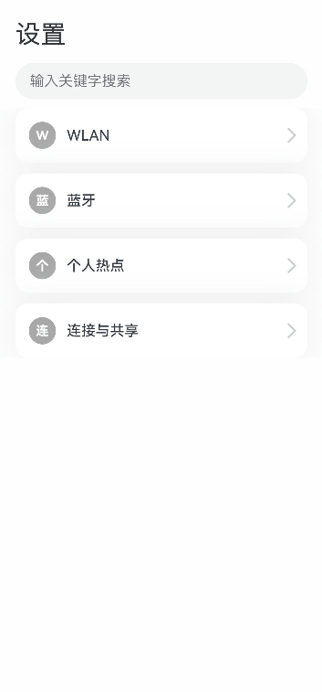
@Entry
@Component
struct ModalTransitionWithIf {
  private listArr: string[] = ['WLAN', '蓝牙', '个人热点', '连接与共享'];
  private shareArr: string[] = ['投屏', '打印', 'VPN', '私人DNS', 'NFC'];
  // 第一步:定义状态变量控制页面显示
  @State isShowShare: boolean = false;
  private shareFunc(): void {
    this.getUIContext()?.animateTo({ duration: 500 }, () => {
      this.isShowShare = !this.isShowShare;
    })
  }

  build(){
    // 第二步:定义Stack布局显示当前页面和模态页面
    Stack() {
      Column() {
        Column() {
          Text('设置')
            .fontSize(28)
            .fontColor(0x333333)
        }
        .width('90%')
        .padding({ top: 30, bottom: 15 })
        .alignItems(HorizontalAlign.Start)

        TextInput({ placeholder: '输入关键字搜索' })
          .width('90%')
          .height(40)
          .margin({ bottom: 10 })
          .focusable(false)

        List({ space: 12, initialIndex: 0 }) {
          ForEach(this.listArr, (item: string, index: number) => {
            ListItem() {
              Row() {
                Row() {
                  Text(`${item.slice(0, 1)}`)
                    .fontColor(Color.White)
                    .fontSize(14)
                    .fontWeight(FontWeight.Bold)
                }
                .width(30)
                .height(30)
                .backgroundColor('#a8a8a8')
                .margin({ right: 12 })
                .borderRadius(20)
                .justifyContent(FlexAlign.Center)

                Column() {
                  Text(item)
                    .fontSize(16)
                    .fontWeight(FontWeight.Medium)
                }
                .alignItems(HorizontalAlign.Start)

                Blank()

                Row()
                  .width(12)
                  .height(12)
                  .margin({ right: 15 })
                  .border({
                    width: { top: 2, right: 2 },
                    color: 0xcccccc
                  })
                  .rotate({ angle: 45 })
              }
              .borderRadius(15)
              .shadow({ radius: 100, color: '#ededed' })
              .width('90%')
              .alignItems(VerticalAlign.Center)
              .padding({ left: 15, top: 15, bottom: 15 })
              .backgroundColor(Color.White)
            }
            .width('100%')
            .onClick(() => {
              // 第五步:改变状态变量,显示模态页面
              if(item.slice(-2) === '共享'){
                this.shareFunc();
              }
            })
          }, (item: string): string => item)
        }
        .width('100%')
      }
      .width('100%')
      .height('100%')
      .backgroundColor(0xfefefe)

      // 第三步:在if中定义模态页面,显示在最上层,通过if控制模态页面出现消失
      if(this.isShowShare){
        Column() {
          Column() {
            Row() {
              Row() {
                Row()
                  .width(16)
                  .height(16)
                  .border({
                    width: { left: 2, top: 2 },
                    color: 0x333333
                  })
                  .rotate({ angle: -45 })
              }
              .padding({ left: 15, right: 10 })
              .onClick(() => {
                this.shareFunc();
              })
              Text('连接与共享')
                .fontSize(28)
                .fontColor(0x333333)
            }
            .padding({ top: 30 })
          }
          .width('90%')
          .padding({bottom: 15})
          .alignItems(HorizontalAlign.Start)

          List({ space: 12, initialIndex: 0 }) {
            ForEach(this.shareArr, (item: string) => {
              ListItem() {
                Row() {
                  Row() {
                    Text(`${item.slice(0, 1)}`)
                      .fontColor(Color.White)
                      .fontSize(14)
                      .fontWeight(FontWeight.Bold)
                  }
                  .width(30)
                  .height(30)
                  .backgroundColor('#a8a8a8')
                  .margin({ right: 12 })
                  .borderRadius(20)
                  .justifyContent(FlexAlign.Center)

                  Column() {
                    Text(item)
                      .fontSize(16)
                      .fontWeight(FontWeight.Medium)
                  }
                  .alignItems(HorizontalAlign.Start)

                  Blank()

                  Row()
                    .width(12)
                    .height(12)
                    .margin({ right: 15 })
                    .border({
                      width: { top: 2, right: 2 },
                      color: 0xcccccc
                    })
                    .rotate({ angle: 45 })
                }
                .borderRadius(15)
                .shadow({ radius: 100, color: '#ededed' })
                .width('90%')
                .alignItems(VerticalAlign.Center)
                .padding({ left: 15, top: 15, bottom: 15 })
                .backgroundColor(Color.White)
              }
              .width('100%')
            }, (item: string): string => item)
          }
          .width('100%')
        }
        .width('100%')
        .height('100%')
        .backgroundColor(0xffffff)
        // 第四步:定义模态页面出现消失转场方式
        .transition(TransitionEffect.OPACITY
          .combine(TransitionEffect.translate({ x: '100%' }))
          .combine(TransitionEffect.scale({ x: 0.95, y: 0.95 })))
      }
    }
  }
}
3.4 共享元素转场
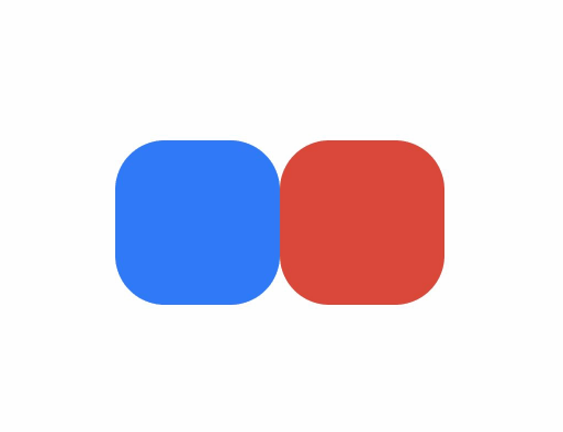
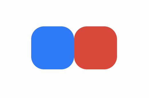
共享元素转场是一种界面切换时对相同或者相似的两个元素做的一种位置和大小匹配的过渡动画效果,也称一镜到底动效。
如下例所示,在点击图片后,该图片消失,同时在另一个位置出现新的图片,二者之间内容相同,可以对它们添加一镜到底动效。左图为不添加一镜到底动效的效果,右图为添加一镜到底动效的效果,一镜到底的效果能够让二者的出现消失产生联动,使得内容切换过程显得灵动自然而不生硬。
|
|
|


一镜到底的动效有多种实现方式,在实际开发过程中,应根据具体场景选择合适的方法进行实现。
以下是不同实现方式的对比:
| 一镜到底实现方式 | 特点 | 适用场景 |
|---|---|---|
| 不新建容器直接变化原容器 | 不发生路由跳转,需要在一个组件中实现展开及关闭两种状态的布局,展开后组件层级不变。 | 适用于转场开销小的简单场景,如点开页面无需加载大量数据及组件。 |
| 新建容器并跨容器迁移组件 | 通过使用NodeController,将组件从一个容器迁移到另一个容器,在开始迁移时,需要根据前后两个布局的位置大小等信息对组件添加位移及缩放,确保迁移开始时组件能够对齐初始布局,避免出现视觉上的跳变现象。之后再添加动画将位移及缩放等属性复位,实现组件从初始布局到目标布局的一镜到底过渡效果。 | 适用于新建对象开销大的场景,如视频直播组件点击转为全屏等。 |
| 使用geometryTransition共享元素转场 | 利用系统能力,转场前后两个组件调用geometryTransition接口绑定同一id,同时将转场逻辑置于animateTo动画闭包内,这样系统侧会自动为二者添加一镜到底的过渡效果。 | 系统将调整绑定的两个组件的宽高及位置至相同值,并切换二者的透明度,以实现一镜到底过渡效果。因此,为了实现流畅的动画效果,需要确保对绑定geometryTransition的节点添加宽高动画不会有跳变。此方式适用于创建新节点开销小的场景。 |
3.4.1 不新建容器并直接变化原容器
该方法不新建容器,通过在已有容器上增删组件触发transition,搭配组件属性动画实现一镜到底效果。
对于同一个容器展开,容器内兄弟组件消失或者出现的场景,可通过对同一个容器展开前后进行宽高位置变化并配置属性动画,对兄弟组件配置出现消失转场动画实现一镜到底效果。基本步骤为:
构建需要展开的页面,并通过状态变量构建好普通状态和展开状态的界面。
将需要展开的页面展开,通过状态变量控制兄弟组件消失或出现,并通过绑定出现消失转场实现兄弟组件转场效果。
以点击卡片后显示卡片内容详情场景为例:
class PostData {
avatar: Resource = $r('app.media.flower');
name: string = '';
message: string = '';
images: Resource[] = [];
}
@Entry
@Component
struct Index {
@State isExpand: boolean = false;
@State @Watch('onItemClicked') selectedIndex: number = -1;
private allPostData: PostData[] = [
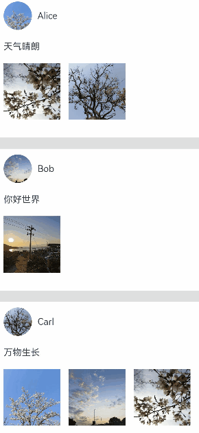
{ avatar: $r('app.media.flower'), name: 'Alice', message: '天气晴朗',
images: [$r('app.media.spring'), $r('app.media.tree')] },
{ avatar: $r('app.media.sky'), name: 'Bob', message: '你好世界',
images: [$r('app.media.island')] },
{ avatar: $r('app.media.tree'), name: 'Carl', message: '万物生长',
images: [$r('app.media.flower'), $r('app.media.sky'), $r('app.media.spring')] }];
private onItemClicked(): void {
if (this.selectedIndex < 0) {
return;
}
this.getUIContext()?.animateTo({
duration: 350,
curve: Curve.Friction
}, () => {
this.isExpand = !this.isExpand;
});
}
build() {
Column({ space: 20 }) {
ForEach(this.allPostData, (postData: PostData, index: number) => {
// 当点击了某个post后,会使其余的post消失下树
if (!this.isExpand || this.selectedIndex === index) {
Column() {
Post({ data: postData, selecteIndex: this.selectedIndex, index: index })
}
.width('100%')
// 对出现消失的post添加透明度转场和位移转场效果
.transition(TransitionEffect.OPACITY
.combine(TransitionEffect.translate({ y: index < this.selectedIndex ? -250 : 250 }))
.animation({ duration: 350, curve: Curve.Friction}))
}
}, (postData: PostData, index: number) => index.toString())
}
.size({ width: '100%', height: '100%' })
.backgroundColor('#40808080')
}
}
@Component
export default struct Post {
@Link selecteIndex: number;
@Prop data: PostData;
@Prop index: number;
@State itemHeight: number = 250;
@State isExpand: boolean = false;
@State expandImageSize: number = 100;
@State avatarSize: number = 50;
build() {
Column({ space: 20 }) {
Row({ space: 10 }) {
Image(this.data.avatar)
.size({ width: this.avatarSize, height: this.avatarSize })
.borderRadius(this.avatarSize / 2)
.clip(true)
Text(this.data.name)
}
.justifyContent(FlexAlign.Start)
Text(this.data.message)
Row({ space: 15 }) {
ForEach(this.data.images, (imageResource: Resource, index: number) => {
Image(imageResource)
.size({ width: this.expandImageSize, height: this.expandImageSize })
}, (imageResource: Resource, index: number) => index.toString())
}
// 展开态下组件增加的内容
if (this.isExpand) {
Column() {
Text('评论区')
// 对评论区文本添加出现消失转场效果
.transition( TransitionEffect.OPACITY
.animation({ duration: 350, curve: Curve.Friction }))
.padding({ top: 10 })
}
.transition(TransitionEffect.asymmetric(
TransitionEffect.opacity(0.99)
.animation({ duration: 350, curve: Curve.Friction }),
TransitionEffect.OPACITY.animation({ duration: 0 })
))
.size({ width: '100%'})
}
}
.backgroundColor(Color.White)
.size({ width: '100%', height: this.itemHeight })
.alignItems(HorizontalAlign.Start)
.padding({ left: 10, top: 10 })
.onClick(() => {
this.selecteIndex = -1;
this.selecteIndex = this.index;
this.getUIContext()?.animateTo({
duration: 350,
curve: Curve.Friction
}, () => {
// 对展开的post做宽高动画,并对头像尺寸和图片尺寸加动画
this.isExpand = !this.isExpand;
this.itemHeight = this.isExpand ? 780 : 250;
this.avatarSize = this.isExpand ? 75: 50;
this.expandImageSize = (this.isExpand && this.data.images.length > 0)
? (360 - (this.data.images.length + 1) * 15) / this.data.images.length : 100;
})
})
}
}
3.4.2 新建容器并跨容器迁移组件
通过NodeContainer自定义占位节点,利用NodeController实现组件的跨节点迁移,配合属性动画给组件的迁移过程赋予一镜到底效果。这种一镜到底的实现方式可以结合多种转场方式使用,如导航转场(Navigation)、半模态转场(bindSheet)等。
3.4.3 结合Stack使用
可以利用Stack内后定义组件在最上方的特性控制组件在跨节点迁移后位z序最高,以展开收起卡片的场景为例,实现步骤为:
展开卡片时,获取节点A的位置信息,将其中的组件迁移到与节点A位置一致的节点B处,节点B的层级高于节点A。
对节点B添加属性动画,使之展开并运动到展开后的位置,完成一镜到底的动画效果。
收起卡片时,对节点B添加属性动画,使之收起并运动到收起时的位置,即节点A的位置,实现一镜到底的动画效果。
在动画结束时利用回调将节点B中的组件迁移回节点A处。
// Index.ets
import { createPostNode, getPostNode, PostNode } from "../PostNode"
import { componentUtils, curves } from '@kit.ArkUI';

@Entry
@Component
struct Index {
  // 新建一镜到底动画类
  @State AnimationProperties: AnimationProperties = new AnimationProperties();
  private listArray: Array<number> = [1, 2, 3, 4, 5, 6, 7, 8 ,9, 10];

  build() {
    // 卡片折叠态,展开态的共同父组件
    Stack() {
      List({space: 20}) {
        ForEach(this.listArray, (item: number) => {
          ListItem() {
            // 卡片折叠态
            PostItem({ index: item, AnimationProperties: this.AnimationProperties })
          }
        })
      }
      .clip(false)
      .alignListItem(ListItemAlign.Center)
      if (this.AnimationProperties.isExpandPageShow) {
        // 卡片展开态
        ExpandPage({ AnimationProperties: this.AnimationProperties })
      }
    }
    .key('rootStack')
    .enabled(this.AnimationProperties.isEnabled)
  }
}

@Component
struct PostItem {
  @Prop index: number
  @Link AnimationProperties: AnimationProperties;
  @State nodeController: PostNode | undefined = undefined;
  // 折叠时详细内容隐藏
  private showDetailContent: boolean = false;

  aboutToAppear(): void {
    this.nodeController = createPostNode(this.getUIContext(), this.index.toString(), this.showDetailContent);
    if (this.nodeController != undefined) {
      // 设置回调,当卡片从展开态回到折叠态时触发
      this.nodeController.setCallback(this.resetNode.bind(this));
    }
  }
  resetNode() {
    this.nodeController = getPostNode(this.index.toString());
  }

  build() {
        Stack() {
          NodeContainer(this.nodeController)
        }
        .width('100%')
        .height(100)
        .key(this.index.toString())
        .onClick( ()=> {
          if (this.nodeController != undefined) {
            // 卡片从折叠态节点下树
            this.nodeController.onRemove();
          }
          // 触发卡片从折叠到展开态的动画
          this.AnimationProperties.expandAnimation(this.index);
        })
  }
}

@Component
struct ExpandPage {
  @Link AnimationProperties: AnimationProperties;
  @State nodeController: PostNode | undefined = undefined;
  // 展开时详细内容出现
  private showDetailContent: boolean = true;

  aboutToAppear(): void {
    // 获取对应序号的卡片组件
    this.nodeController = getPostNode(this.AnimationProperties.curIndex.toString())
    // 更新为详细内容出现
    this.nodeController?.update(this.AnimationProperties.curIndex.toString(), this.showDetailContent)
  }

  build() {
    Stack() {
      NodeContainer(this.nodeController)
    }
    .width('100%')
    .height(this.AnimationProperties.changedHeight ? '100%' : 100)
    .translate({ x: this.AnimationProperties.translateX, y: this.AnimationProperties.translateY })
    .position({ x: this.AnimationProperties.positionX, y: this.AnimationProperties.positionY })
    .onClick(() => {
      this.getUIContext()?.animateTo({ curve: curves.springMotion(0.6, 0.9),
        onFinish: () => {
          if (this.nodeController != undefined) {
            // 执行回调,折叠态节点获取卡片组件
            this.nodeController.callCallback();
            // 当前展开态节点的卡片组件下树
            this.nodeController.onRemove();
          }
          // 卡片展开态节点下树
          this.AnimationProperties.isExpandPageShow = false;
          this.AnimationProperties.isEnabled = true;
        }
      }, () => {
        // 卡片从展开态回到折叠态
        this.AnimationProperties.isEnabled = false;
        this.AnimationProperties.translateX = 0;
        this.AnimationProperties.translateY = 0;
        this.AnimationProperties.changedHeight = false;
        // 更新为详细内容消失
        this.nodeController?.update(this.AnimationProperties.curIndex.toString(), false);
      })
    })
  }
}

class RectInfo {
  left: number = 0;
  top: number = 0;
  right: number = 0;
  bottom: number = 0;
  width: number = 0;
  height: number = 0;
}

// 封装的一镜到底动画类
@Observed
class AnimationProperties {
  public isExpandPageShow: boolean = false;
  // 控制组件是否响应点击事件
  public isEnabled: boolean = true;
  // 展开卡片的序号
  public curIndex: number = -1;
  public translateX: number = 0;
  public translateY: number = 0;
  public positionX: number = 0;
  public positionY: number = 0;
  public changedHeight: boolean = false;
  private calculatedTranslateX: number = 0;
  private calculatedTranslateY: number = 0;
  // 设置卡片展开后相对父组件的位置
  private expandTranslateX: number = 0;
  private expandTranslateY: number = 0;

  public expandAnimation(index: number): void {
    // 记录展开态卡片的序号
    if (index != undefined) {
      this.curIndex = index;
    }
    // 计算折叠态卡片相对父组件的位置
    this.calculateData(index.toString());
    // 展开态卡片上树
    this.isExpandPageShow = true;
    // 卡片展开的属性动画
    animateTo({ curve: curves.springMotion(0.6, 0.9)
    }, () => {
      this.translateX = this.calculatedTranslateX;
      this.translateY = this.calculatedTranslateY;
      this.changedHeight = true;
    })
  }

  // 获取需要跨节点迁移的组件的位置,及迁移前后节点的公共父节点的位置,用以计算做动画组件的动画参数
  public calculateData(key: string): void {
    let clickedImageInfo = this.getRectInfoById(key);
    let rootStackInfo = this.getRectInfoById('rootStack');
    this.positionX = px2vp(clickedImageInfo.left - rootStackInfo.left);
    this.positionY = px2vp(clickedImageInfo.top - rootStackInfo.top);
    this.calculatedTranslateX = px2vp(rootStackInfo.left - clickedImageInfo.left) + this.expandTranslateX;
    this.calculatedTranslateY = px2vp(rootStackInfo.top - clickedImageInfo.top) + this.expandTranslateY;
  }

  // 根据组件的id获取组件的位置信息
  private getRectInfoById(id: string): RectInfo {
    let componentInfo: componentUtils.ComponentInfo = componentUtils.getRectangleById(id);

    if (!componentInfo) {
      throw Error('object is empty');
    }

    let rstRect: RectInfo = new RectInfo();
    const widthScaleGap = componentInfo.size.width * (1 - componentInfo.scale.x) / 2;
    const heightScaleGap = componentInfo.size.height * (1 - componentInfo.scale.y) / 2;
    rstRect.left = componentInfo.translate.x + componentInfo.windowOffset.x + widthScaleGap;
    rstRect.top = componentInfo.translate.y + componentInfo.windowOffset.y + heightScaleGap;
    rstRect.right =
      componentInfo.translate.x + componentInfo.windowOffset.x + componentInfo.size.width - widthScaleGap;
    rstRect.bottom =
      componentInfo.translate.y + componentInfo.windowOffset.y + componentInfo.size.height - heightScaleGap;
    rstRect.width = rstRect.right - rstRect.left;
    rstRect.height = rstRect.bottom - rstRect.top;

    return {
      left: rstRect.left,
      right: rstRect.right,
      top: rstRect.top,
      bottom: rstRect.bottom,
      width: rstRect.width,
      height: rstRect.height
    }
  }
}
// PostNode.ets
// 跨容器迁移能力
import { UIContext } from '@ohos.arkui.UIContext';
import { NodeController, BuilderNode, FrameNode } from '@ohos.arkui.node';
import { curves } from '@kit.ArkUI';
class Data {
item: string | null = null
isExpand: Boolean | false = false
}
@Builder
function PostBuilder(data: Data) {
// 跨容器迁移组件置于@Builder内
Column() {
Row() {
Row()
.backgroundColor(Color.Pink)
.borderRadius(20)
.width(80)
.height(80)
Column() {
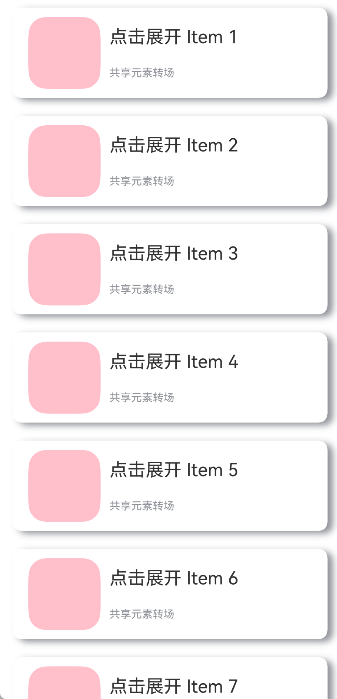
Text('点击展开 Item ' + data.item)
.fontSize(20)
Text('共享元素转场')
.fontSize(12)
.fontColor(0x909399)
}
.alignItems(HorizontalAlign.Start)
.justifyContent(FlexAlign.SpaceAround)
.margin({ left: 10 })
.height(80)
}
.width('90%')
.height(100)
// 展开后显示细节内容
if (data.isExpand) {
Row() {
Text('展开态')
.fontSize(28)
.fontColor(0x909399)
.textAlign(TextAlign.Center)
.transition(TransitionEffect.OPACITY.animation({ curve: curves.springMotion(0.6, 0.9) }))
}
.width('90%')
.justifyContent(FlexAlign.Center)
}
}
.width('90%')
.height('100%')
.alignItems(HorizontalAlign.Center)
.borderRadius(10)
.margin({ top: 15 })
.backgroundColor(Color.White)
.shadow({
radius: 20,
color: 0x909399,
offsetX: 20,
offsetY: 10
})
}
class __InternalValue__{
flag:boolean =false;
};
export class PostNode extends NodeController {
private node: BuilderNode<Data[]> | null = null;
private isRemove: __InternalValue__ = new __InternalValue__();
private callback: Function | undefined = undefined
private data: Data | null = null
makeNode(uiContext: UIContext): FrameNode | null {
if(this.isRemove.flag == true){
return null;
}
if (this.node != null) {
return this.node.getFrameNode();
}
return null;
}
init(uiContext: UIContext, id: string, isExpand: boolean) {
if (this.node != null) {
return;
}
// 创建节点,需要uiContext
this.node = new BuilderNode(uiContext)
// 创建离线组件
this.data = { item: id, isExpand: isExpand }
this.node.build(wrapBuilder<Data[]>(PostBuilder), this.data)
}
update(id: string, isExpand: boolean) {
if (this.node !== null) {
// 调用update进行更新。
this.data = { item: id, isExpand: isExpand }
this.node.update(this.data);
}
}
setCallback(callback: Function | undefined) {
this.callback = callback
}
callCallback() {
if (this.callback != undefined) {
this.callback();
}
}
onRemove(){
this.isRemove.flag = true;
// 组件迁移出节点时触发重建
this.rebuild();
this.isRemove.flag = false;
}
}
let gNodeMap: Map<string, PostNode | undefined> = new Map();
export const createPostNode =
(uiContext: UIContext, id: string, isExpand: boolean): PostNode | undefined => {
let node = new PostNode();
node.init(uiContext, id, isExpand);
gNodeMap.set(id, node);
return node;
}
export const getPostNode = (id: string): PostNode | undefined => {
if (!gNodeMap.has(id)) {
return undefined
}
return gNodeMap.get(id);
}
export const deleteNode = (id: string) => {
gNodeMap.delete(id)
}
3.5 旋转屏动画
旋转屏动画主要分为两类:布局切换的旋转屏动画和透明度变化的旋转屏动画,旨在实现屏幕显示方向变化时的自然过渡。布局切换的旋转屏动画实现较为简便,例如在module.json5中配置自动旋转(或设置窗口显示方向)即可实现。而透明度变化的旋转屏动画则需在module.json5配置的基础上,预备两套视图,在屏幕旋转时,通过视图切换,使消失的视图呈现渐隐效果,新出现的视图则渐显,从而营造流畅的视觉体验。
3.5.1 布局切换的旋转屏动画
布局切换时的旋转屏动画,是在屏幕显示方向改变时,为窗口与应用视图同步旋转而设计的大小和位置过渡动画。这种布局切换的旋转屏动画是系统默认的,便于开发者实现。当屏幕显示方向变化时,系统会生成窗口旋转动画,并自动调整窗口大小以匹配旋转后的尺寸。在此过程中,窗口会通知对应的应用,要求其根据新的窗口大小重新布局,产生与窗口旋转动画参数相同的布局动画。
切换屏幕方向即可实现布局切换的旋转屏动画效果。
// xx.ets
import { display } from '@kit.ArkUI';

@Entry
@Component
struct rotation {

  build() {
    Stack() {
      Image($r('app.media.tree'))
        .position({ x: 0, y: 0 })
        .size({ width: 100, height: 100 })
        .id('image1')
    }
    .backgroundColor(Color.White)
    .size({ width: '100%', height: '100%' })
  }
}需要在项目的module.json5文件中的abilities列表里添加"orientation",指定为"auto_rotation"。
"orientation": "auto_rotation",布局切换的旋转屏动画,会对同步旋转的窗口与应用视图做大小和位置的过渡。
3.5.2 透明度变化的旋转屏动画
透明度变化的旋转屏动画在屏幕显示方向变化时启用,当窗口进行旋转动画时,为旋转过程中新增或删除的组件添加默认透明度转场,以实现组件的优雅出现和消失。此功能通过监听窗口旋转事件,在事件中切换组件的视图效果,如果消失视图的根节点和新出现视图的根节点未设置转场效果,会为其自动添加默认透明度转场(即TransitionEffect.OPACITY),展现出透明度的渐隐和渐显效果。
// xx.ets
import { display } from '@kit.ArkUI';

@Entry
@Component
struct rotation {

  // 获取通过监听窗口的windowsSizeChange事件得到的屏幕显示方向
  @StorageLink('orientation') myOrientation: display.Orientation = display.Orientation.PORTRAIT;

  build() {
    Stack() {

      // 当屏幕显示方向变化时,切换组件的视图效果
      if (this.myOrientation == display.Orientation.PORTRAIT || this.myOrientation == display.Orientation.PORTRAIT_INVERTED) {
        Image($r('app.media.sky'))
          .size({ width: 100, height: 100 })
          .id('image1')

          // 开发者也可以通过自行设置transition的TransitionEffect.OPACITY转场效果来实现旋转屏动画的透明度变化
          // .transition(TransitionEffect.OPACITY)
      } else {
        Image($r('app.media.tree'))
          .position({ x: 0, y: 0 })
          .size({ width: 200, height: 200 })
          .id('image2')

          // 开发者也可以通过自行设置transition的TransitionEffect.OPACITY来实现旋转屏动画的透明度变化
          // .transition(TransitionEffect.OPACITY)
      }
    }
    .backgroundColor(Color.White)
    .size({ width: '100%', height: '100%' })
  }
}监听窗口旋转的同步事件windowsSizeChange来实现视图的切换。例如可在EntryAbility.ets文件的onWindowStageCreate方法中添加处理逻辑以获取屏幕的显示方向
onWindowStageCreate(windowStage: window.WindowStage): void {

    hilog.info(0x0000, 'testTag', '%{public}s', 'Ability onWindowStageCreate');

    let mainWindow: window.Window;
    try {
      mainWindow = windowStage.getMainWindowSync();
      let displayClass: display.Display = display.getDefaultDisplaySync();
      AppStorage.setOrCreate('orientation', displayClass.orientation);
      // 监听窗口的windowsSizeChange事件,旋转屏时会触发该事件
      mainWindow.on('windowSizeChange', (data) => {
        console.info('Succeeded in enabling the listener for window size changes. Data: ' + JSON.stringify(data));
        let displayClass: display.Display | null = null;
        try {
          displayClass = display.getDefaultDisplaySync();
          console.info('display orientation is ' + JSON.stringify(displayClass.orientation));
          // 获取屏幕的显示方向
          AppStorage.set('orientation', displayClass.orientation);
        } catch {
          return;
        }
      })
    } catch {
      hilog.info(0x0000, 'testTag', '%{public}s', 'error');
      return;
    }

    windowStage.loadContent('pages/Index', (err) => {
      if (err.code) {
        hilog.error(0x0000, 'testTag', 'Failed to load the content. Cause: %{public}s', JSON.stringify(err) ?? '');
        return;
      }
      hilog.info(0x0000, 'testTag', 'Succeeded in loading the content.');
    });
}
需要在项目的 module.json5 文件中的 abilities 列表里添加 "orientation",指定为 "auto_rotation"
"orientation": "auto_rotation",
透明度变化的旋转屏动画,会对窗口做大小和位置的过渡,并同时对应用视图做切换过渡,且为消失隐藏的应用视图做渐隐效果,对新出现的视图做渐显的效果。
4 粒子动画
粒子动画是通过在限定区域内随机生成大量粒子的运动,进而组合成的动画效果,通过Particle组件来实现。动画的基本构成元素为单个粒子,这些粒子可以表现为圆点或图片等形式。开发者能够通过对粒子在颜色、透明度、大小、速度、加速度、自旋角度等多个维度上的动态变化做动画,以营造特定的氛围,例如模拟下雪场景时,飘舞的雪花实际上是由一个个雪花粒子的动画效果所构成。
粒子动画的简单实现如下所示。
@Entry
@Component
struct ParticleExample {
  build() {
    Stack() {
      Text()
        .width(300).height(300).backgroundColor('rgb(240, 250, 255)')
      Particle({ particles: [
        {
          emitter: {
            particle: {
              type: ParticleType.POINT, // 粒子类型
              config: {
                radius: 5 // 圆点半径
              },
              count: 100, // 粒子总数
            },
          },
          color:{
            range:['rgb(39, 135, 217)','rgb(0, 74, 175)'],//初始颜色范围
          },
        },
      ]
      }).width(250).height(250)
    }.width("100%").height("100%").align(Alignment.Center)
  }
}
4.1 实现粒子发射器
粒子发射器(Particle Emitter)主要定义粒子的初始属性(如类型、位置和颜色),控制粒子的生成速率,以及管理粒子的生命周期。可通过emitter方法调整粒子发射器的位置、发射速率和发射窗口的大小,实现发射器位置的动态更新。
// ...
@State emitterProperties: Array<EmitterProperty> = [
  {
    index: 0,
    emitRate: 100,
    position: { x: 60, y: 80 },
    size: { width: 200, height: 200 }
  }
]

Particle(...).width(300).height(300).emitter(this.emitterProperties) // 动态调整粒子发射器的位置
// ...
4.2 设置粒子颜色
可以通过range来确定粒子的初始颜色范围,而distributionType则用于指定粒子初始颜色随机值的分布方式,具体可选择均匀分布或者高斯(正态)分布。
// ...
color: {
  range: ['rgb(39, 135, 217)','rgb(0, 74, 175)'], // 初始颜色范围
  distributionType: DistributionType.GAUSSIAN // 初始颜色随机值分布
},
// ...
4.3 粒子的生命周期
粒子的生命周期(Lifecycle)是粒子从生成至消亡的整个过程,用于确定粒子的存活时间长度。粒子的生命周期可通过设置lifetime和lifetimeRange来指定。
// ...
emitter: {
  particle: {
    // ...
    lifetime: 300, // 粒子生命周期,单位ms
    lifetimeRange: 100 // 粒子生命周期取值范围,单位ms
  },
  emitRate: 10, // 每秒发射粒子数
  position: [0, 0],
  shape: ParticleEmitterShape.RECTANGLE // 发射器形状
},
color: {
  range: ['rgb(39, 135, 217)','rgb(0, 74, 175)'], // 初始颜色范围
},
// ...
4.4 设置粒子扰动场
扰动场(Disturbance Field)是一种影响粒子运动的机制。通过在粒子所在的空间区域内施加特定的力,扰动场能够改变粒子的轨迹和行为,进而实现更为复杂和自然的动画效果。扰动场的配置可以通过disturbanceFields方法来完成。
// ...
Particle({ particles: [
  {
    emitter: // ...
    color: // ...
    scale: {
      range: [0.0, 0.0],
      updater: {
        type: ParticleUpdater.CURVE,
        config: [
          {
            from: 0.0,
            to: 0.5,
            startMillis: 0,
            endMillis: 3000,
            curve: Curve.EaseIn
          }
        ]
      }
    },
    acceleration: { //加速度的配置,从大小和方向两个维度变化,speed表示加速度大小,angle表示加速度方向
      speed: {
        range: [3, 9],
        updater: {
          type: ParticleUpdater.RANDOM,
          config: [1, 20]
        }
      },
      angle: {
        range: [90, 90]
      }
    }

  }
]
}).width(300).height(300).disturbanceFields([{
  strength: 10,
  shape: DisturbanceFieldShape.RECT,
  size: { width: 100, height: 100 },
  position: { x: 100, y: 100 },
  feather: 15,
  noiseScale: 10,
  noiseFrequency: 15,
  noiseAmplitude: 5
}])
// ... 
5 组件动画
ArkUI为组件提供了通用的属性动画和转场动画能力的同时,还为一些组件提供了默认的动画效果。例如,List的滑动动效、Button的点击动效,是组件自带的默认动画效果。在组件默认动画效果的基础上,开发者还可以通过属性动画和转场动画对容器组件内的子组件动效进行定制。
5.1 使用组件默认动画
组件默认动效具备以下功能:
提示用户当前状态,例如用户点击Button组件时,Button组件默认变灰,用户即确定完成选中操作。
提升界面精致程度和生动性。
减少开发者工作量,例如列表滑动组件自带滑动动效,开发者直接调用即可。
示例代码和效果如下。
@Entry
@Component
struct ComponentDemo {
  build() {
    Row() {
      Checkbox({ name: 'checkbox1', group: 'checkboxGroup' })
        .select(true)
        .shape(CheckBoxShape.CIRCLE)
        .size({ width: 50, height: 50 })
    }
    .width('100%')
    .height('100%')
    .justifyContent(FlexAlign.Center)
  }
}
5.2 打造组件定制化动效
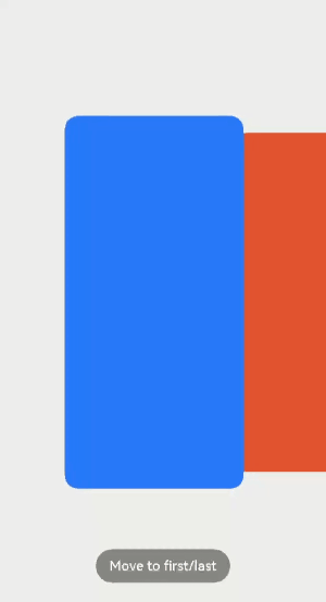
部分组件支持通过属性动画和转场动画自定义组件子Item的动效,实现定制化动画效果。例如,Scroll组件中可对各个子组件在滑动时的动画效果进行定制。
在滑动或者点击操作时通过改变各个Scroll子组件的仿射属性来实现各种效果。
如果要在滑动过程中定制动效,可在滑动回调onScroll中监控滑动距离,并计算每个组件的仿射属性。也可以自己定义手势,通过手势监控位置,手动调用ScrollTo改变滑动位置。
在滑动回调onScrollStop或手势结束回调中对滑动的最终位置进行微调。
定制Scroll组件滑动动效示例代码和效果如下。
import { curves, window, display, mediaquery } from '@kit.ArkUI';
import { UIAbility } from '@kit.AbilityKit';

export default class GlobalContext extends AppStorage{
  static mainWin: window.Window|undefined = undefined;
  static mainWindowSize:window.Size|undefined = undefined;
}
/**
 * 窗口、屏幕相关信息管理类
 */
export class WindowManager {
  private static instance: WindowManager|null = null;
  private displayInfo: display.Display|null = null;
  private orientationListener = mediaquery.matchMediaSync('(orientation: landscape)');

  constructor() {
    this.orientationListener.on('change', (mediaQueryResult: mediaquery.MediaQueryResult) => { this.onPortrait(mediaQueryResult) })
    this.loadDisplayInfo()
  }

  /**
   * 设置主window窗口
   * @param win 当前app窗口
   */
  setMainWin(win: window.Window) {
    if (win == null) {
      return
    }
    GlobalContext.mainWin = win;
    win.on("windowSizeChange", (data: window.Size) => {
      if (GlobalContext.mainWindowSize == undefined || GlobalContext.mainWindowSize == null) {
        GlobalContext.mainWindowSize = data;
      } else {
        if (GlobalContext.mainWindowSize.width == data.width && GlobalContext.mainWindowSize.height == data.height) {
          return
        }
        GlobalContext.mainWindowSize = data;
      }

      let winWidth = this.getMainWindowWidth();
      AppStorage.setOrCreate<number>('mainWinWidth', winWidth)
      let winHeight = this.getMainWindowHeight();
      AppStorage.setOrCreate<number>('mainWinHeight', winHeight)
      let context:UIAbility = new UIAbility()
      context.context.eventHub.emit("windowSizeChange", winWidth, winHeight)
    })
  }

  static getInstance(): WindowManager {
    if (WindowManager.instance == null) {
      WindowManager.instance = new WindowManager();
    }
    return WindowManager.instance
  }

  private onPortrait(mediaQueryResult: mediaquery.MediaQueryResult) {
    if (mediaQueryResult.matches == AppStorage.get<boolean>('isLandscape')) {
      return
    }
    AppStorage.setOrCreate<boolean>('isLandscape', mediaQueryResult.matches)
    this.loadDisplayInfo()
  }

  /**
   * 切换屏幕方向
   * @param ori 常量枚举值:window.Orientation
   */
  changeOrientation(ori: window.Orientation) {
    if (GlobalContext.mainWin != null) {
      GlobalContext.mainWin.setPreferredOrientation(ori)
    }
  }

  private loadDisplayInfo() {
    this.displayInfo = display.getDefaultDisplaySync()
    AppStorage.setOrCreate<number>('displayWidth', this.getDisplayWidth())
    AppStorage.setOrCreate<number>('displayHeight', this.getDisplayHeight())
  }

  /**
   * 获取main窗口宽度,单位vp
   */
  getMainWindowWidth(): number {
    return GlobalContext.mainWindowSize != null ? px2vp(GlobalContext.mainWindowSize.width) : 0
  }

  /**
   * 获取main窗口高度,单位vp
   */
  getMainWindowHeight(): number {
    return GlobalContext.mainWindowSize != null ? px2vp(GlobalContext.mainWindowSize.height) : 0
  }

  /**
   * 获取屏幕宽度,单位vp
   */
  getDisplayWidth(): number {
    return this.displayInfo != null ? px2vp(this.displayInfo.width) : 0
  }

  /**
   * 获取屏幕高度,单位vp
   */
  getDisplayHeight(): number {
    return this.displayInfo != null ? px2vp(this.displayInfo.height) : 0
  }

  /**
   * 释放资源
   */
  release() {
    if (this.orientationListener) {
      this.orientationListener.off('change', (mediaQueryResult: mediaquery.MediaQueryResult) => { this.onPortrait(mediaQueryResult)})
    }
    if (GlobalContext.mainWin != null) {
      GlobalContext.mainWin.off('windowSizeChange')
    }
    WindowManager.instance = null;
  }
}

/**
 * 封装任务卡片信息数据类
 */
export class TaskData {
  bgColor: Color | string | Resource = Color.White;
  index: number = 0;
  taskInfo: string = 'music';

  constructor(bgColor: Color | string | Resource, index: number, taskInfo: string) {
    this.bgColor = bgColor;
    this.index = index;
    this.taskInfo = taskInfo;
  }
}

export const taskDataArr: Array<TaskData> =
  [
    new TaskData('#317AF7', 0, 'music'),
    new TaskData('#D94838', 1, 'mall'),
    new TaskData('#DB6B42 ', 2, 'photos'),
    new TaskData('#5BA854', 3, 'setting'),
    new TaskData('#317AF7', 4, 'call'),
    new TaskData('#D94838', 5, 'music'),
    new TaskData('#DB6B42', 6, 'mall'),
    new TaskData('#5BA854', 7, 'photos'),
    new TaskData('#D94838', 8, 'setting'),
    new TaskData('#DB6B42', 9, 'call'),
    new TaskData('#5BA854', 10, 'music')

  ];

@Entry
@Component
export struct TaskSwitchMainPage {
  displayWidth: number = WindowManager.getInstance().getDisplayWidth();
  scroller: Scroller = new Scroller();
  cardSpace: number = 0; // 卡片间距
  cardWidth: number = this.displayWidth / 2 - this.cardSpace / 2; // 卡片宽度
  cardHeight: number = 400; // 卡片高度
  cardPosition: Array<number> = []; // 卡片初始位置
  clickIndex: boolean = false;
  @State taskViewOffsetX: number = 0;
  @State cardOffset: number = this.displayWidth / 4;
  lastCardOffset: number = this.cardOffset;
  startTime: number|undefined=undefined

  // 每个卡片初始位置
  aboutToAppear() {
    for (let i = 0; i < taskDataArr.length; i++) {
      this.cardPosition[i] = i * (this.cardWidth + this.cardSpace);
    }
  }

  // 每个卡片位置
  getProgress(index: number): number {
    let progress = (this.cardOffset + this.cardPosition[index] - this.taskViewOffsetX + this.cardWidth / 2) / this.displayWidth;
    return progress
  }

  build() {
    Stack({ alignContent: Alignment.Bottom }) {
      // 背景
      Column()
        .width('100%')
        .height('100%')
        .backgroundColor(0xF0F0F0)

      // 滑动组件
      Scroll(this.scroller) {
        Row({ space: this.cardSpace }) {
          ForEach(taskDataArr, (item:TaskData, index) => {
            Column()
              .width(this.cardWidth)
              .height(this.cardHeight)
              .backgroundColor(item.bgColor)
              .borderStyle(BorderStyle.Solid)
              .borderWidth(1)
              .borderColor(0xAFEEEE)
              .borderRadius(15)
                // 计算子组件的仿射属性
              .scale((this.getProgress(index) >= 0.4 && this.getProgress(index) <= 0.6) ?
                {
                  x: 1.1 - Math.abs(0.5 - this.getProgress(index)),
                  y: 1.1 - Math.abs(0.5 - this.getProgress(index))
                } :
                { x: 1, y: 1 })
              .animation({ curve: Curve.Smooth })
                // 滑动动画
              .translate({ x: this.cardOffset })
              .animation({ curve: curves.springMotion() })
              .zIndex((this.getProgress(index) >= 0.4 && this.getProgress(index) <= 0.6) ? 2 : 1)
          }, (item:TaskData) => item.toString())
        }
        .width((this.cardWidth + this.cardSpace) * (taskDataArr.length + 1))
        .height('100%')
      }
      .gesture(
        GestureGroup(GestureMode.Parallel,
          PanGesture({ direction: PanDirection.Horizontal, distance: 5 })
            .onActionStart((event: GestureEvent|undefined) => {
              if(event){
                this.startTime = event.timestamp;
              }
            })
            .onActionUpdate((event: GestureEvent|undefined) => {
              if(event){
                this.cardOffset = this.lastCardOffset + event.offsetX;
              }
            })
            .onActionEnd((event: GestureEvent|undefined) => {
              if(event){
                let time = 0
                if(this.startTime){
                  time = event.timestamp - this.startTime;
                }
                let speed = event.offsetX / (time / 1000000000);
                let moveX = Math.pow(speed, 2) / 7000 * (speed > 0 ? 1 : -1);

                this.cardOffset += moveX;
                // 左滑大于最右侧位置
                let cardOffsetMax = -(taskDataArr.length - 1) * (this.displayWidth / 2);
                if (this.cardOffset < cardOffsetMax) {
                  this.cardOffset = cardOffsetMax;
                }
                // 右滑大于最左侧位置
                if (this.cardOffset > this.displayWidth / 4) {
                  this.cardOffset = this.displayWidth / 4;
                }

                // 左右滑动距离不满足/满足切换关系时,补位/退回
                let remainMargin = this.cardOffset % (this.displayWidth / 2);
                if (remainMargin < 0) {
                  remainMargin = this.cardOffset % (this.displayWidth / 2) + this.displayWidth / 2;
                }
                if (remainMargin <= this.displayWidth / 4) {
                  this.cardOffset += this.displayWidth / 4 - remainMargin;
                } else {
                  this.cardOffset -= this.displayWidth / 4 - (this.displayWidth / 2 - remainMargin);
                }

                // 记录本次滑动偏移量
                this.lastCardOffset = this.cardOffset;
              }
            })
        ), GestureMask.IgnoreInternal)
      .scrollable(ScrollDirection.Horizontal)
      .scrollBar(BarState.Off)

      // 滑动到首尾位置
      Button('Move to first/last')
        .backgroundColor(0x888888)
        .margin({ bottom: 30 })
        .onClick(() => {
          this.clickIndex = !this.clickIndex;

          if (this.clickIndex) {
            this.cardOffset = this.displayWidth / 4;
          } else {
            this.cardOffset = this.displayWidth / 4 - (taskDataArr.length - 1) * this.displayWidth / 2;
          }
          this.lastCardOffset = this.cardOffset;
        })
    }
    .width('100%')
    .height('100%')
  }
}
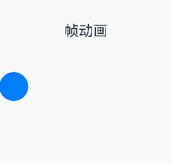
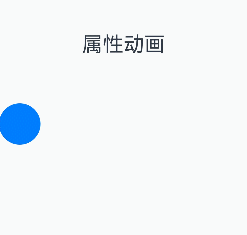
6 帧动画
帧动画具备逐帧回调的特性,便于开发者在每一帧中处理需调整的属性。通过向应用提供onFrame逐帧回调,帧动画使开发者能够在应用的每一帧设置属性值,从而实现组件属性值变化的自然过渡,营造出动画效果。
与属性动画相比,帧动画能让开发者实时感知动画进程,即时调整UI值,具备事件即时响应和可暂停的优势,但在性能上略逊于属性动画。当属性动画能满足需求时,建议优先采用属性动画接口实现。
| 名称 | 实现方式 | 事件响应方式 | 可暂停 | 性能 |
|---|---|---|---|---|
| 帧动画(ohos.animator) | 开发者可每帧修改UI侧属性值,UI侧属性实时更新 | 实时响应 | 是 | 较差 |
| 属性动画 | UI侧只计算动画最终状态,动画过程为渲染值在改变,UI侧一直为动画最终状态,不感知实时渲染值 | 按最终状态响应 | 否 | 较好 |
如图所示,帧动画在动画过程中即可实时响应,而属性动画按最终状态响应。
6.1 使用帧动画实现动画效果
使用如下步骤可以创建一个简单的animator,并且在每个帧回调中打印当前插值。
1. 引入相关依赖。
import { AnimatorOptions, AnimatorResult } from '@kit.ArkUI';2. 创建执行动画的对象。
// 创建动画的初始参数
let options: AnimatorOptions = {
  duration: 1500,
  easing: "friction",
  delay: 0,
  fill: "forwards",
  direction: "normal",
  iterations: 2,
  // 动画onFrame 插值首帧值
  begin: 200.0,
  // 动画onFrame 插值尾帧值
  end: 400.0
};
let result: AnimatorResult = this.getUIContext().createAnimator(options);
// 设置接收到帧时回调,动画播放过程中每帧会调用onFrame回调
result.onFrame = (value: number) => {
  console.log("current value is :" + value);
}
3. 播放动画。
// 播放动画
result.play();
4. 动画执行完成后手动释放AnimatorResult对象。
// 释放动画对象
result = undefined;
6.2 使用帧动画实现小球抛物运动
1. 引入相关依赖。
import { AnimatorOptions, AnimatorResult } from '@kit.ArkUI';2. 定义要做动画的组件。
Button()
  .width(60)
  .height(60)
  .translate({ x: this.translateX, y: this.translateY })
3. 在onPageShow中创建AnimatorResult对象。
onPageShow(): void {
//创建animatorResult对象
this.animatorOptions = this.getUIContext().createAnimator(options);
this.animatorOptions.onFrame = (progress: number) => {
this.translateX = progress;
if (progress > this.topWidth && this.translateY < this.bottomHeight) {
this.translateY = Math.pow(progress - this.topWidth, 2) * this.g;
}
}
//动画取消时执行方法
this.animatorOptions.onCancel = () => {
this.animatorStatus = '取消';
}
//动画完成时执行方法
this.animatorOptions.onFinish = () => {
this.animatorStatus = '完成';
}
//动画重复播放时执行方法
this.animatorOptions.onRepeat = () => {
console.log("动画重复播放");
}
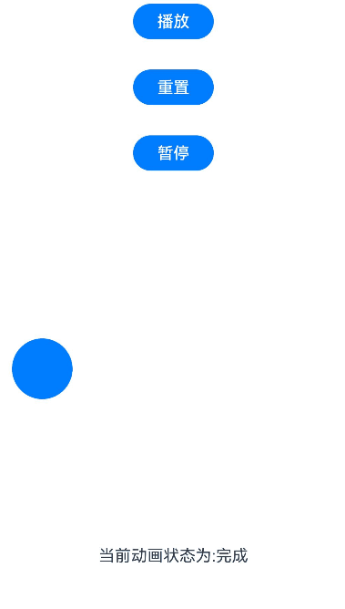
}4. 定义动画播放,重置,暂停的按钮。
Button('播放').onClick(() => {
  this.animatorOptions?.play();
  this.animatorStatus = '播放中'
}).width(80).height(35)
Button("重置").onClick(() => {
  this.translateX = 0;
  this.translateY = 0;
}).width(80).height(35)
Button("暂停").onClick(() => {
  this.animatorOptions?.pause();
  this.animatorStatus = '暂停'
}).width(80).height(35)
5. 在页面隐藏或销毁的生命周期中释放动画对象,避免内存泄漏。
onPageHide(): void {
  this.animatorOptions = undefined;
}
完整示例如下。
import { AnimatorOptions, AnimatorResult } from '@kit.ArkUI';

@Entry
@Component
struct Index {
  @State animatorOptions: AnimatorResult | undefined = undefined;
  @State animatorStatus: string = '创建';
  begin: number = 0;
  end: number = 300
  topWidth: number = 150;
  bottomHeight: number = 100;
  g: number = 0.18
  animatorOption: AnimatorOptions = {
    duration: 4000,
    delay: 0,
    easing: 'linear',
    iterations: 1,
    fill: "forwards",
    direction: 'normal',
    begin: this.begin,
    end: this.end
  };
  @State translateX: number = 0;
  @State translateY: number = 0;

  onPageShow(): void {
    this.animatorOptions = this.getUIContext().createAnimator(this.animatorOption)
    this.animatorOptions.onFrame = (progress: number) => {
      this.translateX = progress;
      if (progress > this.topWidth && this.translateY < this.bottomHeight) {
        this.translateY = Math.pow(progress - this.topWidth, 2) * this.g;
      }
    }
    this.animatorOptions.onCancel = () => {
      this.animatorStatus = '取消';
    }
    this.animatorOptions.onFinish = () => {
      this.animatorStatus = '完成';
    }
    this.animatorOptions.onRepeat = () => {
      console.log("动画重复播放");
    }
  }

  onPageHide(): void {
    this.animatorOptions = undefined;
  }

  build() {
    Column() {
      Column({ space: 30 }) {
        Button('播放').onClick(() => {
          this.animatorOptions?.play();
          this.animatorStatus = '播放中';
        }).width(80).height(35)
        Button("重置").onClick(() => {
          this.translateX = 0;
          this.translateY = 0;
        }).width(80).height(35)
        Button("暂停").onClick(() => {
          this.animatorOptions?.pause();
          this.animatorStatus = '暂停';
        }).width(80).height(35)
      }.width("100%").height('25%')

      Stack() {
        Button()
          .width(60)
          .height(60)
          .translate({ x: this.translateX, y: this.translateY })
      }
      .width("100%")
      .height('45%')
      .align(Alignment.Start)

      Text("当前动画状态为:" + this.animatorStatus)
    }.width("100%").height('100%')
  }
}
7 动画曲线
动画曲线是属性关于时间的变化函数,决定属性变化时产生动画的运动轨迹。某一时刻下动画曲线的斜率代表动画的速度,对应属性变化的快慢。一条优秀的动画曲线具备连续光滑、符合用户意图、符合物理世界客观规律的特点。
根据动画曲线是否符合物理世界客观规律,可将其分为物理曲线(ArkUI当前提供了多种物理弹簧曲线)和传统曲线两种类型。相比于传统曲线,物理曲线产生的运动轨迹更加符合用户认知,有助于创造自然生动的动画效果,建议开发者优先使用物理曲线。
7.1 传统曲线
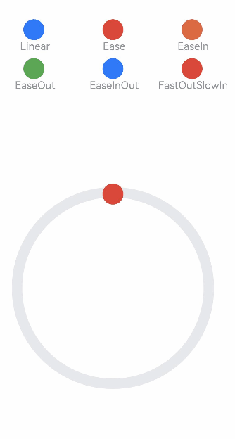
ArkUI提供了贝塞尔曲线、阶梯曲线等传统曲线接口。
传统曲线的示例和效果如下:
class MyCurve {
  public title: string;
  public curve: Curve;
  public color: Color | string;

  constructor(title: string, curve: Curve, color: Color | string = '') {
    this.title = title;
    this.curve = curve;
    this.color = color;
  }
}

const myCurves: MyCurve[] = [
  new MyCurve(' Linear', Curve.Linear, '#317AF7'),
  new MyCurve(' Ease', Curve.Ease, '#D94838'),
  new MyCurve(' EaseIn', Curve.EaseIn, '#DB6B42'),
  new MyCurve(' EaseOut', Curve.EaseOut, '#5BA854'),
  new MyCurve(' EaseInOut', Curve.EaseInOut, '#317AF7'),
  new MyCurve(' FastOutSlowIn', Curve.FastOutSlowIn, '#D94838')
]

@Entry
@Component
export struct CurveDemo {
  @State dRotate: number = 0; // 旋转角度

  build() {
    Column() {
      // 曲线图例
      Grid() {
        ForEach(myCurves, (item: MyCurve) => {
          GridItem() {
            Column() {
              Row()
                .width(30)
                .height(30)
                .borderRadius(15)
                .backgroundColor(item.color)
              Text(item.title)
                .fontSize(15)
                .fontColor(0x909399)
            }
            .width('100%')
          }
        })
      }
      .columnsTemplate('1fr 1fr 1fr')
      .rowsTemplate('1fr 1fr 1fr 1fr 1fr')
      .padding(10)
      .width('100%')
      .height(300)
      .margin({ top: 50 })

      Stack() {
        // 摆动管道
        Row()
          .width(290)
          .height(290)
          .border({
            width: 15,
            color: 0xE6E8EB,
            radius: 145
          })

        ForEach(myCurves, (item: MyCurve) => {
          // 小球
          Column() {
            Row()
              .width(30)
              .height(30)
              .borderRadius(15)
              .backgroundColor(item.color)
          }
          .width(20)
          .height(300)
          .rotate({ angle: this.dRotate })
          .animation({
            duration: 2000,
            iterations: -1,
            curve: item.curve,
            delay: 100
          })
        })
      }
      .width('100%')
      .height(200)
      .onClick(() => {
        this.dRotate ? null : this.dRotate = 360;
      })
    }
    .width('100%')
  }
}
7.2 弹簧曲线
阻尼弹簧曲线(以下简称弹簧曲线)对应的阻尼弹簧系统中,偏离平衡位置的物体一方面受到弹簧形变产生的反向作用力,被迫发生振动。另一方面,阻尼的存在为物体振动提供阻力。除阻尼为0的特殊情况,物体在振动过程中振幅不断减小,且最终趋于0,其轨迹对应的动画曲线自然连续。
采用弹簧曲线的动画在达终点时动画速度为0,不会产生动画“戛然而止”的观感,以避免影响用户体验。
ArkUI提供了四种阻尼弹簧曲线接口。
-
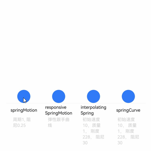
springMotion:创建弹性动画,动画时长由曲线参数、属性变化值大小和弹簧初速度自动计算,开发者指定的动画时长不生效。
springMotion不提供速度设置接口,速度通过继承获得,无需开发者指定。对于某个属性,如果当前存在正在运行的springMotion或者responsiveSpringMotion类型动画,新创建的弹簧动画将停止正在运行的动画,并继承其当前时刻的动画属性值和速度作为新建动画的初始状态。此外,接口提供默认参数,便于开发者直接使用。
function springMotion(response?: number, dampingFraction?: number, overlapDuration?: number): ICurve;
- responsiveSpringMotion:是springMotion动画的一种特例,仅默认参数不同。一般用于跟手做成动画的场景,离手时可用springMotion创建动画,此时离手阶段动画将自动继承跟手阶段动画速度,完成动画衔接。
- 当新动画的overlapDuration参数不为0,且当前属性的上一个springMotion动画还未结束时,response和dampingFraction将在overlapDuration指定的时间内,从旧动画的参数值过渡到新动画的参数值。
function responsiveSpringMotion(response?: number, dampingFraction?: number, overlapDuration?: number): ICurve;- interpolatingSpring:适合于需要指定初速度的动效场景,动画时长同样由接口参数自动计算,开发者在动画接口中指定的时长不生效。
- 曲线接口提供速度入参,且由于接口对应一条从0到1的阻尼弹簧曲线,实际动画值根据曲线进行插值计算。所以速度也应该为归一化速度,其值等于动画属性改变的绝对速度除以动画属性改变量。因此不适合于动画起点属性值和终点属性值相同的场景,此时动画属性改变量为0,归一化速度不存在。
function interpolatingSpring(velocity: number, mass: number, stiffness: number, damping: number): ICurve;- springCurve:适合于需要直接指定动画时长的场景。springCurve接口与interpolatingSpring接口几乎一致,但是对于采用springCurve的动画,会将曲线的物理时长映射到指定的时长,相当于在时间轴上拉伸或压缩曲线,破坏曲线原本的物理规律,因此不建议开发者使用。
function springCurve(velocity: number, mass: number, stiffness: number, damping: number): ICurve;弹簧曲线的示例代码和效果如下。
import { curves } from '@kit.ArkUI';

class Spring {
  public title: string;
  public subTitle: string;
  public iCurve: ICurve;

  constructor(title: string, subTitle: string, iCurve: ICurve) {
    this.title = title;
    this.iCurve = iCurve;
    this.subTitle = subTitle;
  }
}

// 弹簧组件
@Component
struct Motion {
  @Prop dRotate: number = 0
  private title: string = ""
  private subTitle: string = ""
  private iCurve: ICurve | undefined = undefined

  build() {
    Column() {
      Circle()
        .translate({ y: this.dRotate })
        .animation({ curve: this.iCurve, iterations: -1 })
        .foregroundColor('#317AF7')
        .width(30)
        .height(30)

      Column() {
        Text(this.title)
          .fontColor(Color.Black)
          .fontSize(10).height(30)
        Text(this.subTitle)
          .fontColor(0xcccccc)
          .fontSize(10).width(50)
      }
      .borderWidth({ top: 1 })
      .borderColor(0xf5f5f5)
      .width(80)
      .alignItems(HorizontalAlign.Center)
      .height(100)

    }
    .height(110)
    .margin({ bottom: 5 })
    .alignItems(HorizontalAlign.Center)
  }
}

@Entry
@Component
export struct SpringCurve {
  @State dRotate: number = 0;
  private springs: Spring[] = [
    new Spring('springMotion', '周期1, 阻尼0.25', curves.springMotion(1, 0.25)),
    new Spring('responsive' + '\n' + 'SpringMotion', '弹性跟手曲线', curves.responsiveSpringMotion(1, 0.25)),
    new Spring('interpolating' + '\n' + 'Spring', '初始速度10,质量1, 刚度228, 阻尼30',
      curves.interpolatingSpring(10, 1, 228, 30)),
    new Spring('springCurve', '初始速度10, 质量1, 刚度228, 阻尼30', curves.springCurve(10, 1, 228, 30))
  ];

  build() {
    Row() {
      ForEach(this.springs, (item: Spring) => {
        Motion({
          title: item.title,
          subTitle: item.subTitle,
          iCurve: item.iCurve,
          dRotate: this.dRotate
        })
      })
    }
    .justifyContent(FlexAlign.Center)
    .alignItems(VerticalAlign.Bottom)
    .width('100%')
    .height(437)
    .margin({ top: 20 })
    .onClick(() => {
      this.dRotate = -50;
    })
  }
}
8 动画效果
8.1 模糊
动画效果可以丰富界面的细节,提升UI界面的真实感和品质感。例如,模糊和阴影效果可以让物体看起来更加立体,使得动画更加生动。
模糊可以用来体现界面空间的纵深感,区分前后元素的层级关系。
| 接口 | 说明 |
|---|---|
| backdropBlur | 为当前组件添加背景模糊效果,入参为模糊半径。 |
| blur | 为当前组件添加内容模糊效果,入参为模糊半径。 |
| backgroundBlurStyle | 为当前组件添加背景模糊效果,入参为模糊样式。 |
| foregroundBlurStyle | 为当前组件添加内容模糊效果,入参为模糊样式。 |
| motionBlur | 为当前组件添加由缩放大小或位移变化引起的运动过程中的动态模糊效果,入参为模糊半径和锚点坐标。 |
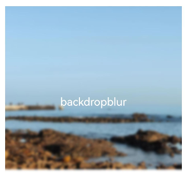
8.1.1 使用backdropBlur为组件添加背景模糊
@Entry
@Component
struct BlurEffectsExample {
  build() {
    Column({ space: 10 }) {
      Text('backdropBlur')
        .width('90%')
        .height('90%')
        .fontSize(20)
        .fontColor(Color.White)
        .textAlign(TextAlign.Center)
        .backdropBlur(10)// 对背景进行模糊
        .backgroundImage($r('app.media.share'))
        .backgroundImageSize({ width: 400, height: 300 })
    }
    .width('100%')
    .height('50%')
    .margin({ top: 20 })
  }
}
8.1.2 使用blur为组件添加内容模糊
@Entry
@Component
struct Index1 {
@State radius: number = 0;
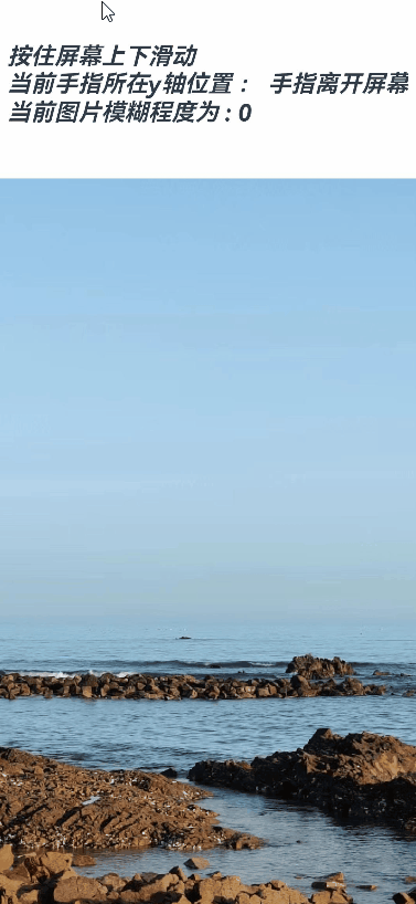
@State text: string = '';
@State y: string = '手指不在屏幕上';
aboutToAppear() {
this.text = "按住屏幕上下滑动\n" + "当前手指所在y轴位置 : " + this.y +
"\n" + "当前图片模糊程度为 : " + this.radius;
}
build() {
Flex({ direction: FlexDirection.Column, alignItems: ItemAlign.Center, justifyContent: FlexAlign.SpaceBetween }) {
Text(this.text)
.height(200)
.fontSize(20)
.fontWeight(FontWeight.Bold)
.fontFamily("cursive")
.fontStyle(FontStyle.Italic)
Image($r("app.media.wall"))
.blur(this.radius)// 使用blur接口为照片组件添加内容模糊效果
.height('100%')
.width("100%")
.objectFit(ImageFit.Cover)
}.height('100%')
.width("100%")
.onTouch((event?: TouchEvent) => {
if (event) {
if (event.type === TouchType.Move) {
this.y = Number(event.touches[0].y.toString()).toString();
this.radius = Number(this.y) / 10; // 根据跟手过程中的滑动距离修改模糊半径,配合模糊接口,形成跟手模糊效果
}
if (event.type === TouchType.Up) {
this.radius = 0;
this.y = '手指离开屏幕';
}
}
this.text = "按住屏幕上下滑动\n" + "当前手指所在y轴位置 : " + this.y +
"\n" + "当前图片模糊程度为 : " + this.radius;
})
}
}
8.1.3 使用backgroundBlurStyle为组件添加背景模糊效果
@Entry
@Component
struct BackDropBlurStyleDemo {
  build() {
    Grid() {
      GridItem() {
        Column() {
          Column() {
            Text('原图')
              .fontSize(20)
              .fontColor(Color.White)
              .textAlign(TextAlign.Center)
              .width('100%')
              .height('100%')
          }
          .height(100)
          .aspectRatio(1)
          .borderRadius(10)
          .backgroundImage($r('app.media.share'))

          Text('原图')
            .fontSize(12)
            .fontColor(Color.Black)
        }
        .height('100%')
        .justifyContent(FlexAlign.Start)
      }
      .width(200)
      .height(200)

      GridItem() {
        Column() {
          Column() {
            Text('Thin')
              .fontSize(20)
              .fontColor(Color.White)
              .textAlign(TextAlign.Center)
              .width('100%')
              .height('100%')
          }
          .height(100)
          .aspectRatio(1)
          .borderRadius(10)
          .backgroundImage($r('app.media.share'))
          // BlurStyle.Thin: 为组件添加轻薄材质模糊效果
          // ThemeColorMode.LIGHT: 固定使用浅色模式效果
          // AdaptiveColor.DEFAULT: 不使用取色模糊,使用默认的颜色作为蒙版颜色
          // scale: 背景材质模糊效果程度,默认值是1
          .backgroundBlurStyle(BlurStyle.Thin, {
            colorMode: ThemeColorMode.LIGHT,
            adaptiveColor: AdaptiveColor.DEFAULT,
            scale: 0.1
          })

          Text('Thin')
            .fontSize(12)
            .fontColor(Color.Black)
        }
        .height('100%')
        .justifyContent(FlexAlign.Start)
      }
      .width(200)
      .height(200)

      GridItem() {
        Column() {
          Column() {
            Text('Regular')
              .fontSize(20)
              .fontColor(Color.White)
              .textAlign(TextAlign.Center)
              .width('100%')
              .height('100%')
          }
          .height(100)
          .aspectRatio(1)
          .borderRadius(10)
          .backgroundImage($r('app.media.share'))
          .backgroundBlurStyle(BlurStyle.Regular, {
            colorMode: ThemeColorMode.LIGHT,
            adaptiveColor: AdaptiveColor.DEFAULT,
            scale: 0.1
          })

          Text('Regular')
            .fontSize(12)
            .fontColor(Color.Black)
        }
        .height('100%')
        .justifyContent(FlexAlign.Start)
      }
      .width(200)
      .height(200)

      GridItem() {
        Column() {
          Column() {
            Text('Thick')
              .fontSize(20)
              .fontColor(Color.White)
              .textAlign(TextAlign.Center)
              .width('100%')
              .height('100%')
          }
          .height(100)
          .aspectRatio(1)
          .borderRadius(10)
          .backgroundImage($r('app.media.share'))
          .backgroundBlurStyle(BlurStyle.Thick, {
            colorMode: ThemeColorMode.LIGHT,
            adaptiveColor: AdaptiveColor.DEFAULT,
            scale: 0.1
          })

          Text('Thick')
            .fontSize(12)
            .fontColor(Color.Black)
        }
        .height('100%')
        .justifyContent(FlexAlign.Start)
      }
      .width(200)
      .height(200)

      GridItem() {
        Column() {
          Column() {
            Text('BACKGROUND_THIN')
              .fontSize(12)
              .fontColor(Color.White)
              .textAlign(TextAlign.Center)
              .width('100%')
              .height('100%')
          }
          .height(100)
          .aspectRatio(1)
          .borderRadius(10)
          .backgroundImage($r('app.media.share'))
          .backgroundBlurStyle(BlurStyle.BACKGROUND_THIN, {
            colorMode: ThemeColorMode.LIGHT,
            adaptiveColor: AdaptiveColor.DEFAULT,
            scale: 0.1
          })

          Text('BACKGROUND_THIN')
            .fontSize(12)
            .fontColor(Color.Black)
        }
        .height('100%')
        .justifyContent(FlexAlign.Start)
      }
      .width(200)
      .height(200)

      GridItem() {
        Column() {
          Column() {
            Text('BACKGROUND_REGULAR')
              .fontSize(12)
              .fontColor(Color.White)
              .textAlign(TextAlign.Center)
              .width('100%')
              .height('100%')
          }
          .height(100)
          .aspectRatio(1)
          .borderRadius(10)
          .backgroundImage($r('app.media.share'))
          .backgroundBlurStyle(BlurStyle.BACKGROUND_REGULAR, {
            colorMode: ThemeColorMode.LIGHT,
            adaptiveColor: AdaptiveColor.DEFAULT,
            scale: 0.1
          })

          Text('BACKGROUND_REGULAR')
            .fontSize(12)
            .fontColor(Color.Black)
        }
        .height('100%')
        .justifyContent(FlexAlign.Start)
      }
      .width(200)
      .height(200)

      GridItem() {
        Column() {
          Column() {
            Text('BACKGROUND_THICK')
              .fontSize(12)
              .fontColor(Color.White)
              .textAlign(TextAlign.Center)
              .width('100%')
              .height('100%')
          }
          .height(100)
          .aspectRatio(1)
          .borderRadius(10)
          .backgroundImage($r('app.media.share'))
          .backgroundBlurStyle(BlurStyle.BACKGROUND_THICK, {
            colorMode: ThemeColorMode.LIGHT,
            adaptiveColor: AdaptiveColor.DEFAULT,
            scale: 0.1
          })

          Text('BACKGROUND_THICK')
            .fontSize(12)
            .fontColor(Color.Black)
        }
        .height('100%')
        .justifyContent(FlexAlign.Start)
      }
      .width(200)
      .height(200)

      GridItem() {
        Column() {
          Column() {
            Text('BACKGROUND_ULTRA_THICK')
              .fontSize(12)
              .fontColor(Color.White)
              .textAlign(TextAlign.Center)
              .width('100%')
              .height('100%')
          }
          .height(100)
          .aspectRatio(1)
          .borderRadius(10)
          .backgroundImage($r('app.media.share'))
          .backgroundBlurStyle(BlurStyle.BACKGROUND_ULTRA_THICK, {
            colorMode: ThemeColorMode.LIGHT,
            adaptiveColor: AdaptiveColor.DEFAULT,
            scale: 0.1
          })

          Text('BACKGROUND_ULTRA_THICK')
            .fontSize(12)
            .fontColor(Color.Black)
        }
        .height('100%')
        .justifyContent(FlexAlign.Start)
      }
      .width(200)
      .height(200)
    }
    .columnsTemplate('1fr 1fr')
    .rowsTemplate('1fr 1fr 1fr 1fr')
    .width('100%')
    .height('100%')
    .margin({ top: 40 })
  }
}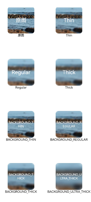
8.1.5 使用foregroundBlurStyle为组件添加内容模糊效果
@Entry
@Component
struct ForegroundBlurStyleDemo {
  build() {
    Grid() {
      GridItem() {
        Column() {
          Column() {
            Text('原图')
              .fontSize(20)
              .fontColor(Color.White)
              .textAlign(TextAlign.Center)
              .width('100%')
              .height('100%')
          }
          .height(100)
          .aspectRatio(1)
          .borderRadius(10)
          .backgroundImage($r('app.media.share'))

          Text('原图')
            .fontSize(12)
            .fontColor(Color.Black)
        }
        .height('100%')
        .justifyContent(FlexAlign.Start)
      }
      .width(200)
      .height(200)

      GridItem() {
        Column() {
          Column() {
            Text('Thin')
              .fontSize(20)
              .fontColor(Color.White)
              .textAlign(TextAlign.Center)
              .width('100%')
              .height('100%')
          }
          .height(100)
          .aspectRatio(1)
          .borderRadius(10)
          .backgroundImage($r('app.media.share'))
          // BlurStyle.Thin: 为组件添加轻薄材质模糊效果
          // ThemeColorMode.LIGHT: 固定使用浅色模式效果
          // AdaptiveColor.DEFAULT: 不使用取色模糊,使用默认的颜色作为蒙版颜色
          // scale: 背景材质模糊效果程度,默认值是1
          .foregroundBlurStyle(BlurStyle.Thin, {
            colorMode: ThemeColorMode.LIGHT,
            adaptiveColor: AdaptiveColor.DEFAULT,
            scale: 0.1
          })

          Text('Thin')
            .fontSize(12)
            .fontColor(Color.Black)
        }
        .height('100%')
        .justifyContent(FlexAlign.Start)
      }
      .width(200)
      .height(200)

      GridItem() {
        Column() {
          Column() {
            Text('Regular')
              .fontSize(20)
              .fontColor(Color.White)
              .textAlign(TextAlign.Center)
              .width('100%')
              .height('100%')
          }
          .height(100)
          .aspectRatio(1)
          .borderRadius(10)
          .backgroundImage($r('app.media.share'))
          .foregroundBlurStyle(BlurStyle.Regular, {
            colorMode: ThemeColorMode.LIGHT,
            adaptiveColor: AdaptiveColor.DEFAULT,
            scale: 0.1
          })

          Text('Regular')
            .fontSize(12)
            .fontColor(Color.Black)
        }
        .height('100%')
        .justifyContent(FlexAlign.Start)
      }
      .width(200)
      .height(200)

      GridItem() {
        Column() {
          Column() {
            Text('Thick')
              .fontSize(20)
              .fontColor(Color.White)
              .textAlign(TextAlign.Center)
              .width('100%')
              .height('100%')
          }
          .height(100)
          .aspectRatio(1)
          .borderRadius(10)
          .backgroundImage($r('app.media.share'))
          .foregroundBlurStyle(BlurStyle.Thick, {
            colorMode: ThemeColorMode.LIGHT,
            adaptiveColor: AdaptiveColor.DEFAULT,
            scale: 0.1
          })

          Text('Thick')
            .fontSize(12)
            .fontColor(Color.Black)
        }
        .height('100%')
        .justifyContent(FlexAlign.Start)
      }
      .width(200)
      .height(200)

      GridItem() {
        Column() {
          Column() {
            Text('BACKGROUND_THIN')
              .fontSize(12)
              .fontColor(Color.White)
              .textAlign(TextAlign.Center)
              .width('100%')
              .height('100%')
          }
          .height(100)
          .aspectRatio(1)
          .borderRadius(10)
          .backgroundImage($r('app.media.share'))
          .foregroundBlurStyle(BlurStyle.BACKGROUND_THIN, {
            colorMode: ThemeColorMode.LIGHT,
            adaptiveColor: AdaptiveColor.DEFAULT,
            scale: 0.1
          })

          Text('BACKGROUND_THIN')
            .fontSize(12)
            .fontColor(Color.Black)
        }
        .height('100%')
        .justifyContent(FlexAlign.Start)
      }
      .width(200)
      .height(200)

      GridItem() {
        Column() {
          Column() {
            Text('BACKGROUND_REGULAR')
              .fontSize(12)
              .fontColor(Color.White)
              .textAlign(TextAlign.Center)
              .width('100%')
              .height('100%')
          }
          .height(100)
          .aspectRatio(1)
          .borderRadius(10)
          .backgroundImage($r('app.media.share'))
          .foregroundBlurStyle(BlurStyle.BACKGROUND_REGULAR, {
            colorMode: ThemeColorMode.LIGHT,
            adaptiveColor: AdaptiveColor.DEFAULT,
            scale: 0.1
          })

          Text('BACKGROUND_REGULAR')
            .fontSize(12)
            .fontColor(Color.Black)
        }
        .height('100%')
        .justifyContent(FlexAlign.Start)
      }
      .width(200)
      .height(200)

      GridItem() {
        Column() {
          Column() {
            Text('BACKGROUND_THICK')
              .fontSize(12)
              .fontColor(Color.White)
              .textAlign(TextAlign.Center)
              .width('100%')
              .height('100%')
          }
          .height(100)
          .aspectRatio(1)
          .borderRadius(10)
          .backgroundImage($r('app.media.share'))
          .foregroundBlurStyle(BlurStyle.BACKGROUND_THICK, {
            colorMode: ThemeColorMode.LIGHT,
            adaptiveColor: AdaptiveColor.DEFAULT,
            scale: 0.1
          })

          Text('BACKGROUND_THICK')
            .fontSize(12)
            .fontColor(Color.Black)
        }
        .height('100%')
        .justifyContent(FlexAlign.Start)
      }
      .width(200)
      .height(200)

      GridItem() {
        Column() {
          Column() {
            Text('BACKGROUND_ULTRA_THICK')
              .fontSize(12)
              .fontColor(Color.White)
              .textAlign(TextAlign.Center)
              .width('100%')
              .height('100%')
          }
          .height(100)
          .aspectRatio(1)
          .borderRadius(10)
          .backgroundImage($r('app.media.share'))
          .foregroundBlurStyle(BlurStyle.BACKGROUND_ULTRA_THICK, {
            colorMode: ThemeColorMode.LIGHT,
            adaptiveColor: AdaptiveColor.DEFAULT,
            scale: 0.1
          })

          Text('BACKGROUND_ULTRA_THICK')
            .fontSize(12)
            .fontColor(Color.Black)
        }
        .height('100%')
        .justifyContent(FlexAlign.Start)
      }
      .width(200)
      .height(200)
    }
    .columnsTemplate('1fr 1fr')
    .rowsTemplate('1fr 1fr 1fr 1fr')
    .width('100%')
    .height('100%')
    .margin({ top: 40 })
  }
}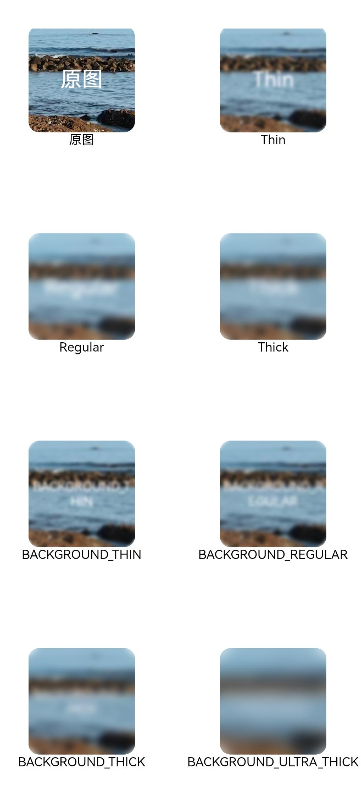
8.1.6 使用motionBlur为组件添加运动模糊效果
import { curves } from '@kit.ArkUI';

@Entry
@Component
struct motionBlurTest {
  @State widthSize: number = 400
  @State heightSize: number = 320
  @State flag: boolean = true
  @State radius: number = 0
  @State x: number = 0
  @State y: number = 0

  build() {
    Column() {
      Column() {
        Image($r('app.media.testImg'))
          .width(this.widthSize)
          .height(this.heightSize)
          .onClick(() => {
            this.radius = 5;
            this.x = 0.5;
            this.y = 0.5;
            if (this.flag) {
              this.widthSize = 100;
              this.heightSize = 80;
            } else {
              this.widthSize = 400;
              this.heightSize = 320;
            }
            this.flag = !this.flag;
          })
          .animation({
            duration: 2000,
            curve: curves.springCurve(10, 1, 228, 30),
            onFinish: () => {
              this.radius = 0;
            }
          })
          .motionBlur({ radius: this.radius, anchor: { x: this.x, y: this.y } })
      }
    }.width('100%').margin({ top: 5 })
  }
}
8.2 阴影
阴影接口shadow可以为当前组件添加阴影效果,该接口支持两种类型参数,开发者可配置ShadowOptions自定义阴影效果。ShadowOptions模式下,当radius = 0 或者 color 的透明度为0时,无阴影效果。
@Entry
@Component
struct ShadowOptionDemo {
  build() {
    Row() {
      Column() {
        Column() {
          Text('shadowOption').fontSize(12)
        }
        .width(100)
        .aspectRatio(1)
        .margin(10)
        .justifyContent(FlexAlign.Center)
        .backgroundColor(Color.White)
        .borderRadius(20)
        .shadow({ radius: 10, color: Color.Gray })

        Column() {
          Text('shadowOption').fontSize(12)
        }
        .width(100)
        .aspectRatio(1)
        .margin(10)
        .justifyContent(FlexAlign.Center)
        .backgroundColor('#a8a888')
        .borderRadius(20)
        .shadow({
          radius: 10,
          color: Color.Gray,
          offsetX: 20,
          offsetY: 20
        })
      }
      .width('100%')
      .height('100%')
      .justifyContent(FlexAlign.Center)
    }
    .height('100%')
  }
}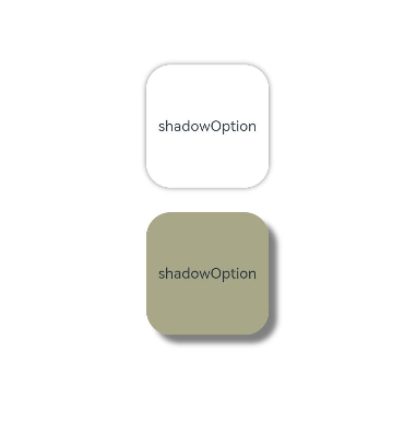
8.3 色彩
通过颜色渐变接口,可以设置组件的背景颜色渐变效果,实现在两个或多个指定的颜色之间进行平稳的过渡。
| 接口 | 说明 |
|---|---|
| linearGradient | 为当前组件添加线性渐变的颜色渐变效果。 |
| sweepGradient | 为当前组件添加角度渐变的颜色渐变效果。 |
| radialGradient | 为当前组件添加径向渐变的颜色渐变效果。 |
8.3.1 为组件添加线性渐变效果
@Entry
@Component
struct LinearGradientDemo {
  build() {
    Grid() {
      GridItem() {
        Column() {
          Text('angle: 180')
            .fontSize(15)
        }
        .width(100)
        .height(100)
        .justifyContent(FlexAlign.Center)
        .borderRadius(10)
        .linearGradient({
          // 0点方向顺时针旋转为正向角度,线性渐变起始角度的默认值为180°
          colors: [
            [0xf56c6c, 0.0], // 颜色断点1的颜色和比重,对应组件在180°方向上的起始位置
            [0xffffff, 1.0],// 颜色断点2的颜色和比重,对应组件在180°方向上的终点位置
          ]
        })
      }

      GridItem() {
        Column() {
          Text('angle: 45')
            .fontSize(15)
        }
        .width(100)
        .height(100)
        .justifyContent(FlexAlign.Center)
        .borderRadius(10)
        .linearGradient({
          angle: 45, // 设置颜色渐变起始角度为顺时针方向45°
          colors: [
            [0xf56c6c, 0.0],
            [0xffffff, 1.0],
          ]
        })
      }

      GridItem() {
        Column() {
          Text('repeat: true')
            .fontSize(15)
        }
        .width(100)
        .height(100)
        .justifyContent(FlexAlign.Center)
        .borderRadius(10)
        .linearGradient({
          repeating: true, // 在当前组件内0.3到1.0区域内重复0到0.3区域的颜色渐变效果
          colors: [
            [0xf56c6c, 0.0],
            [0xE6A23C, .3],
          ]
        })
      }

      GridItem() {
        Column() {
          Text('repeat: false')
            .fontSize(15)
        }
        .width(100)
        .height(100)
        .justifyContent(FlexAlign.Center)
        .borderRadius(10)
        .linearGradient({
          colors: [
            [0xf56c6c, 0.0], // repeating默认为false,此时组件内只有0到0.3区域内存在颜色渐变效果
            [0xE6A23C, .3],
          ]
        })
      }
    }
    .columnsGap(10)
    .rowsGap(10)
    .columnsTemplate('1fr 1fr')
    .rowsTemplate('1fr 1fr 1fr')
    .width('100%')
    .height('100%')
  }
}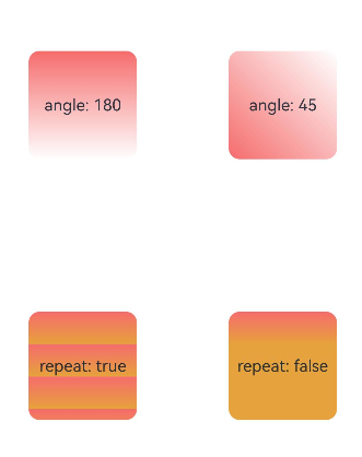
8.3.2 为组件添加角度渐变效果
@Entry
@Component
struct SweepGradientDemo {
  build() {
    Grid() {
      GridItem() {
        Column() {
          Text('center: 50')
            .fontSize(15)
        }
        .width(100)
        .height(100)
        .justifyContent(FlexAlign.Center)
        .borderRadius(10)
        .sweepGradient({
          center: [50, 50], // 角度渐变中心点
          start: 0, // 角度渐变的起点
          end: 360, // 角度渐变的终点。
          repeating: true, // 渐变效果在重复
          colors: [
          // 当前组件中,按照中心点和渐变的起点和终点值,
          // 角度区域为0-0.125的范围,从颜色断点1的颜色渐变到颜色断点2的颜色,
          // 角度区域0.125到0.25的范围,从颜色断点2的颜色渐变到颜色断点3的颜色,
          // 因为repeating设置为true,角度区域0.25到1的范围,重复区域0到0.25的颜色渐变效果
            [0xf56c6c, 0], // 颜色断点1的颜色和比重,对应角度为0*360°=0°,角点为中心点
            [0xffffff, 0.125], // 颜色断点2的颜色和比重
            [0x409EFF, 0.25]// 颜色断点3的颜色和比重
          ]
        })
      }

      GridItem() {
        Column() {
          Text('center: 0')
            .fontSize(15)
        }
        .width(100)
        .height(100)
        .justifyContent(FlexAlign.Center)
        .borderRadius(10)
        .sweepGradient({
          center: [0, 0], // 角度渐变中心点,当前为组件的左上角坐标
          start: 0,
          end: 360,
          repeating: true,
          colors: [
          // 当前组件中,因为角度渐变中心是组件的左上角,所以从颜色断点1到颜色断点3的角度范围,恰好可以覆盖整个组件
            [0xf56c6c, 0], // 颜色断点1的颜色和比重,对应角度为0*360°=0°
            [0xffffff, 0.125], // 色断点2的颜色和比重,对应角度为0.125*360°=45°
            [0x409EFF, 0.25]// 色断点3的颜色和比重,对应角度为0.25*360°=90°
          ]
        })
      }

      GridItem() {
        Column() {
          Text('repeat: true')
            .fontSize(15)
        }
        .width(100)
        .height(100)
        .justifyContent(FlexAlign.Center)
        .borderRadius(10)
        .sweepGradient({
          center: [50, 50],
          start: 0,
          end: 360,
          repeating: true,
          colors: [
            [0xf56c6c, 0],
            [0xffffff, 0.125],
            [0x409EFF, 0.25]
          ]
        })
      }

      GridItem() {
        Column() {
          Text('repeat: false')
            .fontSize(15)
        }
        .width(100)
        .height(100)
        .justifyContent(FlexAlign.Center)
        .borderRadius(10)
        .sweepGradient({
          center: [50, 50],
          start: 0,
          end: 360,
          repeating: false, //只在颜色断点角度覆盖范围内产生颜色渐变效果,其余范围内不重复
          colors: [
            [0xf56c6c, 0],
            [0xffffff, 0.125],
            [0x409EFF, 0.25]
          ]
        })
      }
    }
    .columnsGap(10)
    .rowsGap(10)
    .columnsTemplate('1fr 1fr')
    .rowsTemplate('1fr 1fr 1fr')
    .width('100%')
    .height(437)
  }
}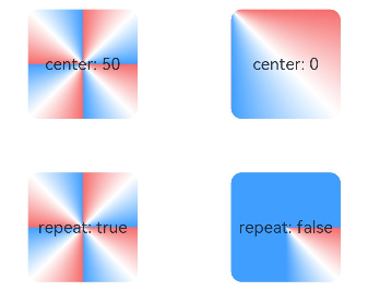
8.3.3 为组件添加径向渐变效果
@Entry
@Component
struct radialGradientDemo {
  build() {
    Grid() {
      GridItem() {
        Column() {
          Text('center: 50')
            .fontSize(15)
        }
        .width(100)
        .height(100)
        .justifyContent(FlexAlign.Center)
        .borderRadius(10)
        .radialGradient({
          center: [50, 50], // 径向渐变中心点
          radius: 100, // 径向渐变半径
          repeating: true, // 允许在组件内渐变范围外重复按照渐变范围内效果着色
          colors: [
          // 组件内以[50,50]为中心点,在半径为0到12.5的范围内从颜色断点1的颜色渐变到颜色断点2的颜色,
          // 在半径为12.5到25的范围内从颜色断点2的颜色渐变到颜色断点3的颜色,
          // 组件外其他半径范围内按照半径为0到25的渐变效果重复着色
            [0xf56c6c, 0], // 颜色断点1的颜色和比重,对应半径为0*100=0
            [0xffffff, 0.125], // 颜色断点2的颜色和比重,对应半径为0.125*100=12.5
            [0x409EFF, 0.25]// 颜色断点3的颜色和比重,对应半径为0.25*100=25
          ]
        })
      }

      GridItem() {
        Column() {
          Text('center: 0')
            .fontSize(15)
        }
        .width(100)
        .height(100)
        .justifyContent(FlexAlign.Center)
        .borderRadius(10)
        .radialGradient({
          center: [0, 0], // 径向渐变中心点,当前为组件左上角坐标
          radius: 100,
          repeating: true,
          colors: [
            [0xf56c6c, 0],
            [0xffffff, 0.125],
            [0x409EFF, 0.25]
          ]
        })
      }

      GridItem() {
        Column() {
          Text('repeat: true')
            .fontSize(15)
        }
        .width(100)
        .height(100)
        .justifyContent(FlexAlign.Center)
        .borderRadius(10)
        .radialGradient({
          center: [50, 50],
          radius: 100,
          repeating: true,
          colors: [
            [0xf56c6c, 0],
            [0xffffff, 0.125],
            [0x409EFF, 0.25]
          ]
        })
      }

      GridItem() {
        Column() {
          Text('repeat: false')
            .fontSize(15)
        }
        .width(100)
        .height(100)
        .justifyContent(FlexAlign.Center)
        .borderRadius(10)
        .radialGradient({
          center: [50, 50],
          radius: 100,
          repeating: false, // 在组件内渐变范围外不重复按照渐变范围内效果着色
          colors: [
            [0xf56c6c, 0],
            [0xffffff, 0.125],
            [0x409EFF, 0.25]
          ]
        })
      }
    }
    .columnsGap(10)
    .rowsGap(10)
    .columnsTemplate('1fr 1fr')
    .rowsTemplate('1fr 1fr 1fr')
    .width('100%')
    .height('100%')
  }
}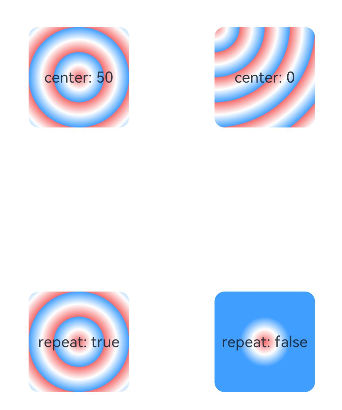


 扫一扫
扫一扫


 被折叠的 条评论
为什么被折叠?
被折叠的 条评论
为什么被折叠?
 到【灌水乐园】发言


