右箭头:
width: 7px;
height: 7px;
border-top: 2px solid black;
border-right: 2px solid black;
transform: rotate(45deg);
三角形:
-
.box{
    width:20px;
    height:20px;
    background-color:blue;
}

<div class='box'></div>

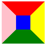
- 给 div 添加四条边框样式,边框设置的宽一点, 四条边框的颜色给不一样的值。
.box{
     width:50px;
     height:50px;
     background-color:blue;
     border-top:50px solid red;
     border-right:50px solid yellow;
     border-bottom:50px solid green;
     border-left:50px solid pink;
}
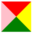
- 把 div 的宽高设置为 0px,去掉蓝色的背景色。
.box{
     width:0;
     height:0;
     border-top:50px solid red;
     border-right:50px solid yellow;
     border-bottom:50px solid green;
     border-left:50px solid pink;
}
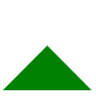
- 假设想要一个向上的三角形,只要把盒子上、右、左方向边框的颜色设置为透明。
.box{
      width:0px;
      height:0px;
      border-top:50px solid rgba(0,0,0,0);
      border-right:50px solid  rgba(0,0,0,0);
      border-bottom:50px solid green;
      border-left:50px solid  rgba(0,0,0,0);
}

// 简易代码:
.box{
      width:0px;
      height:0px;
      border: 50px solid transparent;
      border-bottom-color:  green;
}
旋转的正方体:
.box {
	width: 200px;
	height: 200px;
	margin: 100px auto;
	perspective: 20000px;
	position: relative;
	/* 透视强度 */
	perspective: 20000px;
	/* 设置所有子元素在 3D 空间呈现,否则旋转起来就是扁平的 */
	transform-style: preserve-3d;
	transition: transform 5s;
}
.box:hover {
	transform: rotateX(360deg) rotateY(360deg);
}
.side {
	width: 200px;
	height: 200px;
	position: absolute;
	top: 0;
	left: 0;
}
.side:nth-child(1) {
	background: rgba(225, 239, 30, 0.4);
	/* 前面 */
	transform: translateZ(100px);
}
.side:nth-child(2) {
	background: rgba(207, 250, 16, 0.4);
	/* 上面 */
	/* 旋转了 90 度之后,它的正前方就是朝上的,因此要使用 translateZ() */
	transform: rotateX(90deg) translateZ(100px);
}
.side:nth-child(3) {
	background:rgba(3, 51, 9, 0.4);
	/* 背面 */
	transform: translateZ(-100px);
}
.side:nth-child(4) {
	background: #2417d566;
	/* 下面 */
	transform: rotateX(-90deg) translateZ(100px);
}
.side:nth-child(5) {
	background: rgba(224, 14, 147, 0.4);
	/* 左侧面 */
	transform: rotateY(90deg) translateZ(100px);
}
.side:nth-child(6) {
	background: rgba(235, 17, 25, 0.4);
	/* 右侧面 */
	transform: rotateY(-90deg) translateZ(100px);
}

<div class="box">
	<!-- 正方体的六个面 -->
	<div class="side"></div>
	<div class="side"></div>
	<div class="side"></div>
	<div class="side"></div>
	<div class="side"></div>
	<div class="side"></div>
</div>
 CSS技巧:创建三角形与3D旋转立方体


 本文介绍如何使用CSS属性创建不同样式的三角形,包括通过设置边框颜色实现向上三角形的方法。此外,还详细展示了如何构建一个响应鼠标悬停事件的3D旋转立方体,涉及perspective、transform-style、transition等关键属性。


 扫一扫
扫一扫


 被折叠的 条评论
为什么被折叠?
被折叠的 条评论
为什么被折叠?
 到【灌水乐园】发言


