


 本文介绍了如何使用Echarts拼接一个柱形图和一个折线图,实现上下两个图表共享x轴但方向不同的效果。通过调整grid、设置轴刻度和标签,以及处理y轴刻度样式,成功地在一个图表实例中实现了所需的设计。
背景与需求:
在使用echarts实现前端显示的图表时想要实现如图所示的效果

一个图表,上面是数量的柱形图,下面是与上一年数据的比值,在官网上找不到这种效果的实例,百度也都不是我想要的效果,可能是我百度的不对。
在官网上找到效果比较接近的,如图:

于是就想着拼接两个图表实现这种效果
解决方法:
1.同一个echarts实例通过配置grid调整位置拼接两个图
2.两个不同的echarts实例通过配置grid调整位置拼接
从实现的效果来看,我是不建议方法2的,通过两个不同实例调整位置必然会导致图例位置不统一,如果想要通过调整grids来调整图例的位置就会导致两个图其中一个的图例不可互动(被上一层的echarts覆盖了)
看两个图对比就明白什么意思了(由于怕引起某些问题,图例被我打码了)
同一个echarts实例拼接

两个不同echarts实例拼接

实现代码与效果:
这里只讲方法1,因为我觉得法2不可取,如果有不同意见欢迎在评论区指出。
将官网的代码加以改造,即可得到想要的图效果
1.首先将x,y轴的刻度标签数据换一换,上方的图换成柱形图
比较重要的是设置两个xy轴的grid布局和 y轴翻转,以及在下方的y轴刻度标签的格式
   option = {
        tooltip: {
          trigger: 'axis'
        },
        toolbox: {
          feature: {
          }
        },
        //图例格式
        legend: {
          data: [
            { name: '柱形图1', icon: 'circle' },
            { name: '柱形图2', icon: 'circle' },
            '折线图'
          ],
          right: 90
        },
        //两个不同的布局
        grid: [{
          left: 50,
          right: 50,
          height: '35%'
        }, {
          left: 50,
          right: 50,
          top: '50%',
          height: '35%'
        }],
        //x轴
        xAxis: [
        //第一个x轴配置
          {
            type: 'category',
            data: [
              '1月',
              '2月',
              '3月',
              '4月',
              '5月',
              '6月',
              '7月'
            ],
            axisPointer: {
              type: 'shadow'
            },
            axisTick: { show: false }
          },
          //第二个x轴配置
          {
          //定义使用的grid布局
            gridIndex: 1,
            type: 'category',
            axisPointer: {
              type: 'shadow'
            },
            //设置x轴位置在图表上方
            position: 'top',
            axisTick: { show: false }
          }
        ],
        //y轴
        yAxis: [
        //第一个y轴配置
          {
            type: 'value',
            min: 0,
            max: 1000,
            interval: 100,
            splitLine: { show: false },
            axisTick: { show: false }
          },
          //第二个y轴配置
          {
          //同x轴使用第二个grid
            gridIndex: 1,
            type: 'value',
            min: 0,
            max: 100,
            //设置y轴反转
            inverse: true,
            interval: 20,
            splitLine: { show: false },
            //刻度标签显示格式
            axisLabel: {
              formatter:'{value}%'
            },

            axisTick: { show: false }
          }
        ],
        series: [
        //柱状图1定义及数据
          {
            name: '柱形图1',
            type: 'bar',
            barWidth: 14,
            itemStyle: {
              normal: {
                color: new echarts.graphic.LinearGradient(0, 0, 0, 1, [{
                  offset: 0,
                  color: '#2b8fff'
                },
                {
                  offset: 1,
                  color: '#1660ff'
                }
                ], false)
              }
            },
            barGap: '0%',
            data: [200, 300, 400, 500, 600, 700, 800]
          },
          //柱状图2定义及数据
          {
           //设置使用第一种xy轴布局,也可以不设置,默认使用第一种,如柱状图1
            xAxisIndex: 0,
            yAxisIndex: 0,
            name: '柱形图2',
            type: 'bar',
            barWidth: 14,
            barGap: '0%',
            itemStyle: {
              normal: {
                color: new echarts.graphic.LinearGradient(0, 0, 0, 1, [{
                  offset: 0,
                  color: '#5aceff'
                },
                {
                  offset: 1,
                  color: '#15bafe'
                }
                ], false)
              }
            },
            data: [100, 200, 300, 400, 500, 600, 700]
          },
          //折线图定义及数据
          {
            name: '折线图',
            type: 'line',
            //设置使用第二种xy轴布局
            xAxisIndex: 1,
            yAxisIndex: 1,
            symbolSize: 8,
            label: {
              show: true,
              formatter: '{c}%'
            },
            itemStyle: {
              color: 'lightgreen'
            },
            data: [75, 50, 60, 55, 70, 65, 55]
          }

        ]
      };
这时的效果(也可以复制到官网在线运行查看效果):
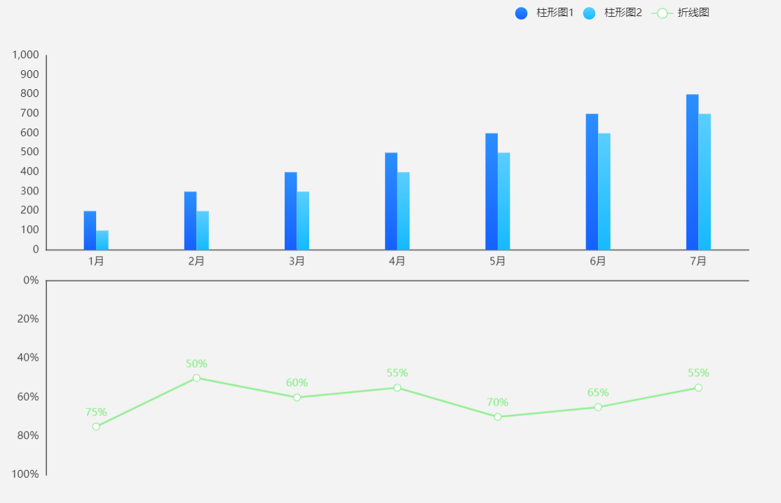
这步主要做显示的图表刻度和数据的格式
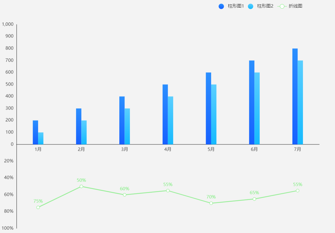
2.接下来就是要通过调整grids将两个图的x轴重合
调整option的grid属性:
    grid: [{
      left: 50,
      right: 50,
      height: '50%'
    }, {
      left: 50,
      right: 50,
      top: '59.5%',
      height: '35%'
    }]
依据你的echarts实例大小调整的grid可能有所不同,这里配置的是在官方的examples页面的编辑器可以重合的grid参数,如果不会配置可以看官方文档
接下来就会发现一个问题:柱状图y轴刻度0显示0,而折线图是0%,重合起来很丑,很不理想,怎么办?
3.最后设置一下折线图y轴的刻度标签样式
    yAxis: [
      {
        type: 'value',
        min: 0,
        max: 1000,
        interval: 100,
        splitLine: { show: false },
        axisTick: { show: false }
      },
      {
        gridIndex: 1,
        type: 'value',
        min: 0,
        max: 100,
        inverse: true,
        interval: 20,
        splitLine: { show: false },
        //设置第二个y轴数值为0时不显示刻度
        axisLabel: {
          formatter: function (item) {
            if (item === 0) {
              item = ''
            } else {
              item = item + '%'
            }
            return item
          },
        },
        axisTick: { show: false }
      }
    ],
如果觉得x轴重合看着怪怪的,甚至可以再进一步,将第二个x轴线隐藏
    xAxis: [
      {
        type: 'category',
        data: [
          '1月',
          '2月',
          '3月',
          '4月',
          '5月',
          '6月',
          '7月'
        ],
        axisPointer: {
          type: 'shadow'
        },
        axisTick: { show: false }
      },
      {
        gridIndex: 1,
        type: 'category',
        axisPointer: {
          type: 'shadow'
        },
        position: 'top',
        axisTick: { show: false },
        //隐藏第二个x轴线
        axisLine:{show:false}
      }
    ],
最后得到的代码如下:
可以复制到官网,在线运行
option = {
        tooltip: {
          trigger: 'axis'
        },
        toolbox: {
          feature: {
          }
        },
        legend: {
          data: [
            { name: '柱形图1', icon: 'circle' },
            { name: '柱形图2', icon: 'circle' },
            '折线图'
          ],
          right: 90
        },
        grid: [{
          left: 50,
          right: 50,
          height: '50%'
        }, {
          left: 50,
          right: 50,
          top: '59.5%',
          height: '35%'
        }],
        xAxis: [
          {
            type: 'category',
            data: [
              '1月',
              '2月',
              '3月',
              '4月',
              '5月',
              '6月',
              '7月'
            ],
            axisPointer: {
              type: 'shadow'
            },
            axisTick: { show: false }
          },
          {
            gridIndex: 1,
            type: 'category',
            axisPointer: {
              type: 'shadow'
            },
            position: 'top',
            axisTick: { show: false },
            axisLine:{show:false}
          }
        ],
        yAxis: [
          {
            type: 'value',
            min: 0,
            max: 1000,
            interval: 100,
            splitLine: { show: false },
            axisTick: { show: false }
          },
          {
            gridIndex: 1,
            type: 'value',
            min: 0,
            max: 100,
            inverse: true,
            interval: 20,
            splitLine: { show: false },
            axisLabel: {
              formatter: function (item) {
                if (item === 0) {
                  item = ''
                } else {
                  item = item + '%'
                }
                return item
              },
            },
            axisTick: { show: false }
          }
        ],
        series: [
          {
            name: '柱形图1',
            type: 'bar',
            barWidth: 14,
            itemStyle: {
              normal: {
                color: new echarts.graphic.LinearGradient(0, 0, 0, 1, [{
                  offset: 0,
                  color: '#2b8fff'
                },
                {
                  offset: 1,
                  color: '#1660ff'
                }
                ], false)
              }
            },
            barGap: '0%',
            data: [200, 300, 400, 500, 600, 700, 800]
          },
          {
            xAxisIndex: 0,
            yAxisIndex: 0,
            name: '柱形图2',
            type: 'bar',
            barWidth: 14,
            barGap: '0%',
            itemStyle: {
              normal: {
                color: new echarts.graphic.LinearGradient(0, 0, 0, 1, [{
                  offset: 0,
                  color: '#5aceff'
                },
                {
                  offset: 1,
                  color: '#15bafe'
                }
                ], false)
              }
            },
            data: [100, 200, 300, 400, 500, 600, 700]
          },
          {
            name: '折线图',
            type: 'line',
            xAxisIndex: 1,
            yAxisIndex: 1,
            symbolSize: 8,
            label: {
              show: true,
              formatter: '{c}%'
            },
            itemStyle: {
              color: 'lightgreen'
            },
            data: [75, 50, 60, 55, 70, 65, 55]
          }

        ]
      };
效果如图:


 532
532


 到【灌水乐园】发言


